Saturday, March 31, 2012

An Anatomy of Painter's Brushes, Part 1


Painter is famous for its brushes. Most are not duplicated anywhere else, despite some claims to the contrary. But what makes the brushes in Painter different? How do they work?

Well, I can't tell you how they work exactly, but I will share with you some of the decisions made in building Painter's brushes. And show you, hopefully, which brushes are good for what. And, along the way, I hope you will gain a better knowledge of how to use them to suit your artistic task.

Also, this could take several posts, so I will start with the basics, you know, Painter 1 and 2 brushes, and then work my way up to the much newer brushes.

Cover? Buildup?
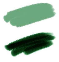
Painter uses some terms that describe some of the fundamental ways that the brushes lay their paint down onto the canvas. In the blog post on Color, I described different kinds of color mixing. You can think of cover methods as using interpolative color mixing, which is applied to additive color. Also, the buildup methods are using subtractive color mixing, in particular, they are using Beer's Law on the three components of the color, Red, Green, and Blue (this part is in the '620 patent, so it's public knowledge). But of course, it's more complicated than that.

Here you see cover (top) and buildup (bottom) strokes. Cover strokes tend to become flat opaque color, while buildup strokes increase their density.
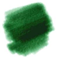
With buildup brushes, you choose colors that are less saturated, and contain all three color components in them. You must also set their opacity lower to get more levels of build-up. Here you see a version of that brush with the opacity lowered to 4%. As you can see, it takes much longer for the colors to darken.

You use cover methods for things like oils, airbrush, chalk, etc. So it is aptly named, since these media do tend to cover what's behind them.

Other media is more applied in a watery, transparent layer, like watercolors and felt pen. These media are more suited to modeling with the buildup methods. Sometimes colored pencils can behave this way as well. But don't confuse partitive mixing with buildup.

So, why does charcoal tend to build up when you use it? Charcoal builds up because the tiny grains of graphite get lodged in the crevices of the paper and the color partitively mixes with the color of the paper. Partitive mixing is also described in the color post. But what happens is more and more crevices and eventually even the tops of the grain get saturated with graphite and the color gets darker.

There should be more ways of mixing color in Painter, particularly since oil paints don't really mix in either of these ways. But wait... are we talking about mixing or simply laying down color?

Pickup, Mixing, and So Forth

Actual mixing of color on the canvas (and within the brush, it turns out) is modeled by Painter using a color well concept. This is not the same color well concept used by photo sensors that collect electrons. converted from photons by a photodiode. This is a concept by which RGB color is collected in a color well, and as other colors get put in, the well models what the mixture of the color is: a kind of local color accumulator.

The color well can be done on a whole-brush basis, or it can be down on a bristle-by-bristle basis.

Painter's modeling is quite sophisticated.
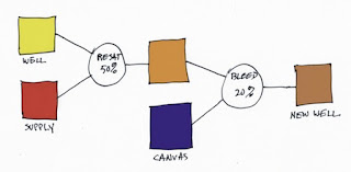
So let's look at how the color well performs. There are three parameters in the Brush Controls:Well section, and you need to know what they mean. Every time Painter lays down a brush dab or a bristle dab, the well is accessed. It knows about the supplied color (which is generally the current color, but it can also be the color from the original image when cloning) and it also knows about the canvas color underneath the dab or bristle. The color in the color well then becomes the brush color.

Resaturation is the capacity of the brush or bristle to be replenished with the supplied color with every dab or bristle that gets laid down. Bleed is a measure of the amount of canvas color that gets picked up by the brush (with every dab or bristle that gets laid down). And dryout is the distance over which the resaturation stops working.
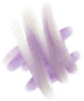
In the color well, resaturation tends to trump all other aspects of the well, and the most useful values for resaturation are generally down between 0 and 4%. This is where you get the fudgy, smeary mixtures of paint. You will need to combine this with the bleed setting. A low bleed setting tends to make the pickup take longer and thus the brush strokes get smearier. A high bleed setting causes less pickup and thus the smears become shorter, and, up around 50%, they become unnoticeable.

So both resaturation and bleed should be kept in the low ends of their ranges for the fullest degree of control. At resaturation of 2% and bleed of 28%, for instance, the bleed trumps the resaturation and causes consistent smears, seen here. The overstroke color is a dun color, barely discernible due to the low resaturation.
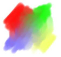
The best way to get a real admixture of color is to mix brushes. In other words, lay the color down first and do your admixture afterwards.

Here, I first drew unsullied patches of red, blue, green, and yellow using a higher resaturation (28%) and a comparable bleed (27%). Then I set resaturation to zero, creating a smear brush. Using the smear brush, I mixed the paints together to get the muddy mixtures in between.

Real mixtures with real paints usually keep a bit more saturation (in this case, I mean colorfulness). This is because the scattering term and the absorption term need to be kept separate. And also because actual colorant mixing can't really be properly modeled using only three wavelengths.

Future paint applications will need to do this, I believe. I would think that two-constant Kubelka-Munk theory should suffice as a good second-order approximation.

But, you know what? More and more artists are using digital paint applications. So they are going to expect the paint to mix more like RGB interpolative mixing, and less like actual oil paint mixing. And I am partly to blame for this, I know.

Paper Grain, and Grainy Soft, Flat, Edge, and Hard Methods
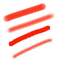
Painter's first real advance in 1991 was the paper grains. The way the brushes interact with the grains was also a serious advance over previous types of brush.

Here you see Grainy Flat Color, Grainy Soft Cover, Grainy Edge Flat Color, and Grainy Hard Cover methods. Note that I had to increase grain contrast to 400% so you could see the grain in the Grainy Soft Cover method's stroke. Each method has its own unique signature. Of particular interest to me is the Grainy Edge Flat Cover method.

This method can be adjusted by a few slider settings that you should be aware of, and can create a wealth of looks in this way.

Here you see the grain slider adjusted to 28%, 21%, 15%, and 8% (top to bottom).

This allows you to control, using this linear brush (with a profile that is straight and pointed at the tip), the size and graininess simultaneously. But what if you want the amount of grain penetration to be controlled while you make the brushstroke?

A couple of features may allow you to do this.

Right next to the grain slider (in the Brush Controls:General section) is an expression pop-up. This allows you to control directly how the grain is animated during the stroke. Grain will be controllable directly by stylus pressure when you use pressure to control grain expression with this method.
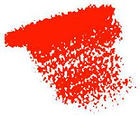
This shows a brush stroke created using this technique. But to get this level of expression out of it, I had to do another thing first. I had to go to Preferences:Brush Tracking and adjust the Pressure Power to a setting of 2.04. This makes more values that are closer to zero pressure in your brush stroke.

And therefore more grain, because as you saw above, it is the lower grain values that produce the most grainy edges.

When playing with paper grain, you can also adjust the grain itself to your taste as well. It is extremely convenient to be able to scale the grain. This works well with Grainy Edge Flat Cover brushes because it just makes the grains rounder. But you can also adjust the contrast (and thus how pronounced the grain will appear through the brush) and the brightness (in case your brush isn't actually touching the grain at all).

Of all the grainy brush methods, the Grainy Soft Cover method is probably the least useful, I would say. To make more sense of this soft method, you will probably need to adjust your paper texture characteristics.
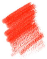
The Grainy Hard Cover method is about half way in-between the Grainy Soft Cover method and the Grainy Edge Flat Cover method. With this brush, both opacity and grain will have a bearing on how grainy the brush appears when you use it. It is probably the best method for simulating colored pencils.

Here I have set an opacity of 11% and a grain of 30%. This gives us good coverage and a nice grain taper with opacity. I have set grain expression to pressure and opacity expression to none. This one is also sensitive to the Preferences:Brush Tracking adjustments, particularly Pressure Power, because I'm using pressure. It's a pretty good chalk or colored pencil.

Cover Brushes and Opacity

It's time to discuss the problem of how to set the opacity of cover brushes. The problem with many cover brushes is that they use sequential dab overlay. This means that the dabs are laid out along the brush stroke according to the brush spacing. If you set the color to black, the brush spacing to 50% and the opacity to 38%, you get the pattern you see here. What this all means is that it is hard to set the opacity of an airbrush to get the actual opacity you want. It becomes an effective opacity of 100% way too quickly because of the sequential dab overlay effect.

By 50%, the spacing is measured in terms of the radius of the brush. I am using a one-pixel-edge brush so you can see the placement. So how dark does it get along the stroke? It depends upon the overlap, as you can see, and because of that, upon how many the dabs will overlay in one spot. Since the radius is 1/2 the diameter, we can calculate the number of times an overlap will happen as 1/(2*spacing). Each time an overlap happens, the color gets more opaque. The opacity of n overlaps is 1 - (1-opacity)^n. Using these formulas, you can compute the opacity of the brush stroke. In this case, n is clearly 4, and the transparency is 62% to the fourth power, or 14.8%, so the opacity ends up being 85.2%, which seems right.

How Corel Can Fix This

An aside: what Corel needs to do is to let the user specify the final opacity (called the desired opacity) they want and then invert these formulas to compute the proper opacity for the current spacing. It's easy, and so here's how it can be done:
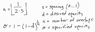
Here, the specified opacity is the one you used with each dab of the brush.

With airbrushes, that have a soft profile, this may be a more complicated formula. But it will be arranged according to powers of transparency, as I have indicated here. Perhaps the floor won't be necessary, making n a continuous parameter. It turns out that this can be measured empirically and then the opacity setting can be computed fro the desired opacity and the spacing using a table lookup. Really, the only coefficient that will need to change is the power term, so you could keep one coefficient per profile. Possibly, though, the spacing (with different profiles) will have a non-linear effect on the overlap and thus the opacity of the stroke. In this case, you might need one coefficient per profile per spacing. Since spacing is a continuous parameter, it must be quantized into a small table.

Oh, I love programming!

Next time, maybe I'll write about grain histogram equalization and the problem of getting consistent results with different paper texture patterns. It would really be nice to get a more ergonomic handle on brushes, grain, opacity, and all that jazz.

Wednesday, March 28, 2012

Thinking Backwards

Most of us naturally think of time as an arrow that always points from the past to the future. This is why it might be so difficult for us to think backwards. But, you might ask, why do it? There are reasons, and some of them are not only compelling, but also fundamentally necessary to our way of life.
When I write code, bugs inevitably happen. Bugs are unforeseen problems that result in a crash or some other detectable error. And there I am, in the debugger, looking at the error. So I have to think backwards: given that this happened, what could have caused it? There are only so many possibilities. As we rule them out, whatever is left, however improbable, is the answer. This allows us to catch the problem before it happens, and then we can trace backwards from that problem using the same sequence of deduction. This proceeds backwards in causality until we find the source of the problem: generally the small wrong thing that snowballed into the error or the crash.

Imagine a homicide detective, presented with a dead body. Or a National Transportation Safety Board inspector at a plane crash site. What begins innocuously as debugging becomes a troubleshooting process that can apply to a much more dramatic and even fatal series of events. Events which must be traced back to their root cause so we can figure out how to prevent them from happening again and continue to believe that the world is safe.

But there are creative reasons to think backwards as well. And these are also more than simply exercises for our minds.

Distortion Filters

The filters in PhotoBooth and other Core Image applications often allow us to distort images in interesting ways, like a fun-house mirror.

Once you have learned analytic geometry and also exercise a bit of creativity, it is relatively easy to develop a function that can, for instance, create a bulge in an image.

A circular bulge like the one that makes my nose way too big is a piecewise mathematical function that conceptually takes a point in the source and transforms it into a point in the destination.

To do this, we envision a circle or radius R about the center O of the distortion. Point P may lay inside the circle, and we create a vector V from O to P (which is simply P - O). Note that the vector actually has two components, an x and a y component.

With this in mind, we can build up the distortion as a function based on these things. For instance, we can compute the length of V, and this we will call D. A function that goes from 0 at the origin O to 1 at radius R is simply evaluated by f = D/R. Actually we want f to be 1 outside the circle, so f = min(D/R, 1). And we want f to be a smooth function as well, so we might want f = 3*f*f - 2*f*f*f (in other words three f squared minus two f cubed, which is the smoothstep function).

To create a distortion, we must alter the scale of the image. To increase the size in the center, we want the scale to be greater than 1, and to make the distortion mesh with the undistorted image at the edge, we want the scale to be exactly 1 at radius R. If we call the bulge factor at the center B (B is 1.5 or so at the center of the distorted image above), then we can define the scale of the distortion to be s = B + (1-B)*f. This arranges the scale to be B at the center O and it will smoothly transition to 1 at radius R from O.

And the distortion itself becomes P' = O + s*V. In other words we are scaling the vector displacement from O by the transitioning scale factor s. Since s becomes 1 at radius R and beyond, the image is left undistorted outside the circle of effect.

But wait, we have made a huge error! It turns out that we are evaluating each point of the destination and we need to map back to the source! So we need to think backwards to get to the source point from a point in the destination.

Well, we don't actually need to do that, it turns out. We can fake it by simply making the scale less than one at the center to make the bulge get bigger, and correspondingly make the scale greater than one at the center to make the bulge a pinch instead.

You see, all distortion filters work this way: they must work backwards from a point in the destination to a point in the source. This makes it an exercise in thinking backwards.

Backwards Guitar

When writing the song Not Enough Time (listen to it on soundcloud.com), I decided to make the second round solo an exercise in backwards guitar (which is at 1:29 in the song). To construct this, I had to do several things backwards. First, I had to create a time-reversed version of the song. Then I had to listen to it backwards and jam to the appropriate section of it until I had a basic idea of what I wanted the solo to sound like. This had to mesh with the forwards version, and so I constrained the start and the end notes to what I wanted to hear in the forwards version.

Sounds easy so far, right? Well, continuing, I mapped out the chords of the round, which is repeated twice, and reversed them. I have to say that the chords do sound eerie backwards because cadences are not what we expect them to be.

In fact, listening to and jamming to a backwards song is very unsettling. You feel like you are in a different world while you are doing it.

I recorded three solos in all, and then I reversed them again back into forwards time. Each one was then played with the song in its normal form. One sounded best, so I kept it.

Whew! Thinking backwards takes a lot of preparation in this case, and it's not an easy thing to do.

This all goes to show that thinking backwards is actually more useful than it appears at first thought. And our world is immeasurably better because we can do it.

Tuesday, March 27, 2012

Hackers, Part 3

There is no shortage of money at banks, usually. That's why criminals are motivated to rob them. But the act of robbing a bank is considerably less risky if you don't actually have to go there. Enter the hacker.

Money, It's a Hit

In previous installments of the Hackers posts we talked about the motivations of hackers. In the case, the motive is money. What drives computer programmers to steal money? Probably bad people with money that want more of it. Yet, a lot of them are overseas and I can't simply ask them, much less even identify them. I can speculate that some are state-supported, looking for handles on the US and other economies to exploit. Or they are criminal organizations that keep their own stable of indentured hackers in the back room, fed with Doritos and Mountain Dew. Or they are simply businesses that do things in shady ways, by contracting hackers to attack their competitors.

Either way, they typically employ a zero-day exploit and a chain of other buffer-overrun bugs to gain superuser access to a machine running Windows XP. At that point, they install a rootkit in the machine so they can gain superuser access at any point down the line. The machine becomes a bot.

Perhaps the most interesting and disconcerting fact is that there exist entities that sell and update rootkit programs. They need updating as Microsoft issues patches to the known exploits. But Microsoft's task is like trying to put your finger in the bottom of the boat when there are hundreds of holes. Ot thousands.

So there is a market, I expect, of zero-day exploits. These are bugs in software that make a system crash. And allow the hacker to upload code. That code might be part of a buffer overrun - the contents written into a buffer that's just too small to hold what's written. Since all machines are Von Neumann machines, this means that you can execute data just like you can execute code. Data and program are interchangeable. This is why the linker can exist, and dynamic linking of libraries can occur.

And it's also why it's possible to upload malware through websites.

Let's take a case in point: Microsoft has been fighting a war of attrition against the Zeus botnet. But, why do they call it the Zeus botnet?

First, a bunch of machines under control of one master hacker is called a botnet, a network of bots. Each machine can be activated by its master to do their bidding. With many machines under the hacker's control, operations like DDoS attacks can be run with greater effectiveness. Or they can use the botnet for sending ridiculous amount of spam emails advertising for fake Viagra. The botnets also give a certain degree of anonymity to their masters as well, because they are only, after all, operating by proxy.

It is apparent that a group of professional attackers maintains the Zeus code, which is code to help penetrate systems. How can such a group exist? They run their shop somewhere in Eastern Europe, away from the reach of the FBI and other law enforcement groups. I really wish that whatever country they are in would have the guts to shut them down. I'm not even sure Interpol has a presence there.

And maybe there is the question as to whether the construction of a tool to penetrate systems is even illegal at all, in and of itself. Still, selling the tool and supporting the tool seems like it is aiding in the commission of a crime.

Yes, the Zeus code costs money also. They charge between $700 and $15,000 US for their code and also for support, which includes updates to current zero-day exploits and also probably tech support via some anonymized IRC chat.

The presence of Zeus means that it's much easier for state-supported hacking and business-supported hacking to exist. These institutional hackers simply buy Zeus and then rent servers to make botnets.

And this is Microsoft's war of attrition: to take down the server farms (otherwise operating legally and used for housing websites and e-commerce operation, and possibly unaware that they house botnets) that have been converted into botnets. Some 13 million computers are used in this way. And this has resulted in the theft of about $100 million since 2007, that we know about.

Business as Usual

Another real problem is the rampant increase in hacking for the purposes of gaining a business advantage.

A really fascinating and discouraging piece of news showed up today. News Corporation, run by Rupert Murdoch, has been accused of another hacking scandal. This time it was purportedly hiring hackers to crack rival ITV network's smart card encryption scheme, and posting it online so most of ITV's customers could simply avoid paying them.

This put ITV out of business, which was just fine for News Corporation's Sky TV service, which likely picked up the customers.

News Corporation was found guilty of hacking one smart card for the DISH Network. And fined a piddling sum. But what actually happens is that they can post the hack (anonymously) and ruin their competitors.

Pretty sneaky, massively illegal, and very immoral.

The tiny fine was a classic Pyrrhic victory for the DISH Network.

4 teh Lulz

It is interesting to see a return of the splinter group LulzSec, so soon after Sabu, LulzSec's leader, was deftly converted to a mole and then turned on LulzSec itself. This had the useful effect of decreasing the hacker world's trust in itself.

Now, an enterprising hacker with the handle lalalalala has penetrated MilitarySingles.com and posted on pastebin all the information about the 171,000 dating servicemen (and women). As part of a new group. And they are calling themselves LulzSec Reborn.

Reborn, presumably, from the ashes of the FBI sting on the group.

This is the trending problem: that technology can change much faster than law enforcement. Tech is the fastest changing thing on the planet. So its a wonder that the FBI, Interpol, and MI-5 can barely keep up with it: they don't always have the tools they need to be effective. Why?

The real problem is that laws can't keep up with technology.

Saturday, March 24, 2012

Drawing On Your Creativity

Creative types are often visual people. And there is nothing more visual than drawing. As the voice is our one built-in instrument for our hearing, so is hand-drawing the main expression for vision.

Using our own hand to sketch out an idea is a natural step for our creativity.

So I constantly draw pictures, drawing on my creativity to help me visualize. And it is a salve for the rougher times of our lives. A bit of escapism. Good for what ails us.

3D Forms

Ironically, it is two-dimensional pen and paper that becomes the practice field for three-dimensional cognition. I know I am constantly drawing forms and shapes, trying to figure them out or reason about their volume. I imagine holding them in my hand, reorienting them, looking at them. And then I draw.

And when I draw, I try to find the proper orientation to depict the object and show its own characteristic features in the best light.

For a cube, I almost never draw it in such a way that I can't see its inherent dimensionality. For a snub cube, I show the snub facing the viewer. Otherwise I probably can't tell what it is. So I reorient the object in my mind to draw it.

I like the idea of something having a real three-dimensional heft to it. I can almost feel the edges around the missing corner.

Other objects are equally interesting. I like, for instance, to imagine how objects intersect, or how other objects can be contained inside them.

It isn't well-known, but the dodecahedrons - both the platonic one and the rhombic one - can superscribe a cube. This shape is the basis of a garnet crystal.

I show a rhombic dodecahedron superscribing a cube. Imagine a cube with short pyramids on each face. Constructing one with pencil and paper is easy, since the height of each pyramid is exactly one-half a cube edge length.

Rhombic dodecahedra can fit together and tile space perfectly like cubes, which I find interesting. And it's also obvious, since the vertex of the rhombic dodecahedron is actually at the center of a neighboring cube.

There are plenty of shapes that I have drawn over the years, most of them are found on the backs of meeting notes or on Excel spreadsheet printouts.

I can't even say what all the objects are, but I did find them interesting to imagine at one point. Perhaps this is a button from an old corduroy jacket.

On the same sheet I found another drawing. What is this trying to be? I imagine it is a folded bit of paper, arranged in a triangle. I never showed its other side, and so that remains a mystery.

At some point, though, three-dimensional figures need to be transcended. This is done by imagination and also by requirement. Imagination and simple tinkering can lead to the impossible figure. Requirement can lead to icons. They are both interesting pastimes and also they can be real work, as we will see.

John Derry and I spent many, many hours searching for the right icons for brushes, for features of brushes, for effects, for tools, for everything.

Impossible Figures

I have written about impossible figures before. But I created one in 1969 based on the impossible triangle. I drew the Triangular Symbol in summer 1969 when I was but 13 years old.

I drew it only a couple of months after my grandfather died, so it was clear that my obsession with impossible figures might have come from my need to process the situation.

It was drawn with a Flair pen on the harshest Olivetti copy paper, so it has colored a bit through time. And the felt pen I used wasn't exactly the best tool to use. I used a drafting set to make the basic shapes. And then I shaded it the best I could, given it is, after all, impossible.

The draftsmen at Lockheed, where my dad worked at the time, were quite impressed and put it up on their walls. But it was a time of downsizing for Lockheed and soon they were laid off.

That was the bad news. The good news was that we picked up a nice drafting table for me, cheap.

Here is the basic impossible figure it is based on. This was originally drawn in 1934 by Swedish artist Oscar Reutersvärd and later made popular by Lionel and Roger Penrose. Though it is impossible, you can create a version of it in real space, made so you can look at it from one angle and it will look real.

This is not so for all impossible figures, though. And these definitely defy imagination. Really, the first impossible figure I ever saw was in the Time-Life book about the Mind.

This impossible figure is the one that the draftsmen liked. Before I showed them the impossible triangle.

They had this figure up on their wall right next to the drafting table as a kind of joking reference to nonsense and I respected them for their humor in the matter.

This figure can't be constructed in three-space because inside and outside exchange places, obviously. If you look at one side and then the other, they are reasonable taken by themselves. But not together as a whole.

In the post Interlock, I discussed the Valknut, a cool figure used by the vikings around Gotland centuries ago to symbolize Odin's patronage of those who died in battle. It is a sacred mark of sorts.

I present here another impossible Valknut, one which intersects itself. This one took a couple of tries, I assure you. It is still a variation of the impossible triangle. I guess I never tire of making these variations.

In some ways, these figures are a tribute to M. C. Escher, the famous dutch artist that perfected the ever-ascending stairway and other impossible illusions.

I love his art! In some ways, I think maybe I'm almost as crazy, if not quite as detail oriented, as Escher. He used his hand to make all his art, and that makes me respect him.

I have often thought of the ever-ascending staircase, and so I have drawn overlapping planks to simulate the feel of the original Escher piece.

I show that they have to be bolted together to hold them in place. But I'm not quite clear on their shapes. I show some warping to the planks so they can fit, but I think it is a bit more difficult to make this work. Unlike Escher, I have preserved their proportions. Escher made his work by having a different number of stairs on the four sides of the stairway. I have used no such cheat.

Still, I try to imagine the exact shapes that will make this work. And to what end? To relieve myself of the boredom of a staff meeting. Heh.

Three-Dimensional Interfaces

In Detailer, which was Painter for painting on 3D objects, I was in the business of creating icons for tools that involved movement and rotation. This was an exercise in three-dimensional thinking and icon development. It's interesting, but Phil Clevenger ended up doing much the same thing when he worked on the Bryce and Poser interfaces. And his designs were much cleaner, I think. And in some ways, much more gothic.

Here you see a cylindrical rotation icon. For rotating a vase that you are painting, for instance. I think the cylinder in the center has to be a glass rod to make it sensible.

But this was only one of many icon tries for three-dimensional interfaces. I soon elicited John Derry's help in creating them.

I think I like three-dimensional interfaces because they simulate real objects that you can use. Like a folder that opens up when you move something to it and whoosh, the thing goes into it.

The virtual trackball for rotating three-dimensional objects on screen is an interesting task for icon creation. I think my first idea was on the left here.

But eventually, it all got screwy. Icon creation is a really hard problem in general, because you have to develop a design language that is consistent and clean and not easily misunderstood: hard to get wrong.

While sitting in endless meetings, my mind would wander. The endless progression of a grid of beans, each with their own shadow is a good depiction of boredom. And a symbol of the sure knowledge that the group will head all together in the same direction. I can see the words bean counter were almost certainly in my mind at this meeting.

This was drawn on the back of a spreadsheet that detailed the booth personnel hours for PC Expo in New York in 1996. It's really kind of funny, put into that perspective.

The Fractal Design sales personnel were well-meaning and extremely organized, so I shouldn't trivialize their hard work. After all, they were where the rubber hits the road! I will forever owe them a debt of gratitude!

At this point, I was still the CEO and we were a public company. But rust never sleeps, and I had products to create. And this includes being creative, even during sales meetings!

A page floats to the ground, its shadow beneath it and showing that it has just contacted the ground, or is about to. A corner is turned up. You can feel the rush of air beneath it, just before the page settles.

Three-dimensional forms in motion.

Nothing is static, all is moving. Trade shows and products must go on, as does life. At this point in January 1996, my life was changing, more like going over a waterfall, and I had just met some of the most interesting people I will ever meet in my life. Drawing, playing piano, writing songs, and even composing poetry: there were lots of issues to work out, and creativity was central to that process. Good times!

Icon Creation

It is very hard work creating icons and with its own design language, it can drive you a little crazy. John and I were designing Detailer icons one day, when we created this interesting bit of art. You can click it to get a larger version, which might be necessary to see it in all its crazy detail.

We were working on trackball icons. In the center, you see a prototype for the sphere with an arrow going around it. But John said that the arrow might best have two points on it, signifying that you could turn the object in any direction.

This led to a happy face with arrows on the mouth. I drew a vase with an arrow going around it, then drew a vase pouring out liquid with an arrow going around it! There is a cube with an arrow. And various circular arrows drawn and obliqued. Then John drew a brush with an arrow going around it. And it just got weirder from there.

Pretty soon there were atoms and icons for the funniest things. Like a dead fish icon. And a dead dog icon (?). And a lightning strike icon. And a tornado icon. The cow is floating around it, saying "moo", by the way.

We had gotten a bit crazy in the process; we tended to do this. How can you be serious when you are creating icons, after all?

You can see a scissors-cutting-paper icon, a road-into-the-distance icon, a submerged pyramid icon, and even a bleeding eyeball icon! I think the comment was that some of these icons were so bad, it made our eyes bleed! No, we weren't actually being serious at the time at all.

One of the icons is the pyramid with an eye in the tip. This symbol is actually on the US Dollar bill. Not sure why. But I liked it, as an impenetrable symbol of, like, a secret society.

I have one that, in its unedited form, says "I SEE ALL BUGS!!!". There is a bit of humor there, since I was talking about bugs in Painter: you know, mistakes in the code that needed to be fixed. We really needed to fix all of them before any release.

This is the standing order of things at a software company. And, as a primary developer, along with Tom, it was always my main responsibility to fix the problems. In the Painter 6 time frame, I did more bug fixing than usual because Tom was preoccupied with other issues.

John and I often made whimsical icons. Like a firecracker icon (John's). Or a lit match icon (mine). These weren't icons that had any purpose being in software, that's for sure! So we were just joking around. Entering the crazy phase. Getting really loony from being in icon hell too long. In think we tried to get more and more outrageous, just as a mode of escapism and perhaps as a kind of performance art: inappropriate art. We loved to do that.

Sometimes the icons were statements of our current situation. If we were buried in some problem that looked easy, but it was actually very, very hard, I'm sure that the iceberg icon could accurately depict our plight.

If we were outperforming our capabilities, or if we just wanted to show off, I'm also quite sure the "goes to 11" icon could make sense of it all. It is a reference to Rob Reiner's movie This Is Spinal Tap.

If we were under water or in deep seas, we might draw the ocean icon. If we were feeling angry at the world, we might draw the gun icon. Totally out of order, gentlemen! This is not allowed!

But at the bottom of it, it wasn't ever really obvious why we drew these. They were just a way of joking around while embedding ourselves and our mindsets in the art of icon creation: an art that has its own purgatory built right into it.

Sometimes Icons are just symbols for something, and can be borrowed from the icon language of, say road signs, or caution symbology.

We also liked to play that game, of borrowing the design language from some other task. It is, after all, what the paint can is based on, and so many other cool things from Fractal Design. It's where design gets fractal.

And at the end of the day, all that mattered is that we achieved our goals to ship a product. To have a product that could rise above the monotony of mundane software products. We showed them how to do it right. We were Fractal Design, after all.

We had a reputation to keep up!

Our brushes had to be the coolest. Our effects had to be the first on the block. Even layers came out first and we made hay with it with make up your mind again, and again, and again. Design is not a linear process, because of trial and error but even more because the client may not like your design. And you may have to produce several designs to show the client. We got that.

Our brushes were cool because we were always thinking of what the designer wanted out of a brush stroke. Not just what the artist wanted. Because we could simulate the natural tools, and we could also extend the capabilities of the artist directly through our new tools.

So what the designer wanted, and what we felt they would like in the future, mattered to us. We were practicing designers: we were Fractal Design.

Thursday, March 22, 2012

Color

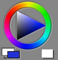
In Painter, there is nothing that is more iconic than its color picker. It was designed for the artist, and so it features a circular ring of hues (called a color wheel) and a triangle of single-hued color (called a color page) inside it.

Color Pickers for Artists

In Painter 3, I redesigned the color picker around the concept of the color wheel. Before Painter 3, it was a color triangle above a hue slider.

The pre-Painter 3 color picker was actually clumsy. But I chose the triangle because it was ergonomically easy to use, and it was approximately perceptually arranged. It is good that the triangle has a single point at the top and the bottom for white and black. This shows unambiguously where these colors are. Other color pickers show them as the top and bottom of a square, which is not a correct depiction of color space.

Here we have the Painter 1.2 color picker. My main problem with this is that the hue slider is not really big enough to represent all hues properly.

A set of color swatches is available for quick choice and drawing, like a mini-palette.

I don't like how the color ring on the triangle (that indicates the current color) actually gets hidden by the hue slider. It's a visually-conflicting thing.

In Painter 3, I chose the hue ring to be a little thick, like paint. But even so, I had some issues with it. The position of the colors on the wheel isn't really equally-spaced. Ideally, equal angular changes along the wheel would represent equal perceptual differences in the color.

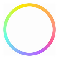
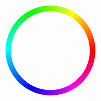
Look at an RGB color wheel, to the left, and a perceptual color wheel, to the right.

Two things have been done. First, the colors have been spaced perceptually equal. Second, the colors have been chosen to be at approximately the same luminance, of apparent lightness.

Notice on the RGB color wheel, where the colors red, yellow, green, cyan, blue, and magenta are equally spaced at 60-degree angles around the wheel, that the yellow area seems tight, and the green area seems grossly large in comparison. On the perceptual color wheel, care was taken to have equal color increments.

This means that a user can choose colors in the area they want with equal ease.

With the RGB color wheel, on the other hand, the artist always has to adjust the luminance's up and down to choose colors at the same apparent lightness, depending upon the hue.

So, if I were to do Painter again, I would probably do some work at making the color picker more ergonomic (or at least have an option for the artist to use an ergonomic color picker).

Color Mixing

Color works in some very interesting ways, that most people don't really think about every day.

There are several kinds of color mixture that we like to describe. The first, learned by children when they mix their crayons on white paper, is called subtractive color.

With subtractive color, the more color that gets deposited, the darker and more saturated the combination color gets. This is because the rays of light reflect off the paper. As color gets laid down, the light rays are absorbed by the pigments. The more kinds of colors you lay down, the more wavelengths of the light are blocked from reflecting by the absorption of the particular color of the light. So laying down two hues will muddy the color.

Subtractive color is the chosen mixing method for felt tip markers (buildup brushes), for instance.

The second kind of color mixing is additive color. With additive color, it's like you are starting with a dark room and shining lights of different colors.

In fact, in the Apply Lighting effect, this is the method of color mixing that is used.

This is quite different from the way that paints mix, but it does bely the way light can be split up into a spectrum by a prism: because white light actually consists of the addition of several spectral hues, it may also be broken down into those hues. This is done by a process of refraction. Dispersion is caused by the wavelength-dependence of the index of refraction of the prism material in question.

In Painter, cover brushes are another kind of brushes. How does that work?

The additive color model does apply, but it is complicated by more than just addition. the cover brushes use interpolative color mixing.

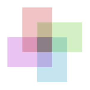
With interpolative mixing, suddenly the priority order matters. This actually becomes useful with brushes, and it makes it possible to cover things with successive brush strokes, and this is why they are called cover brushes.

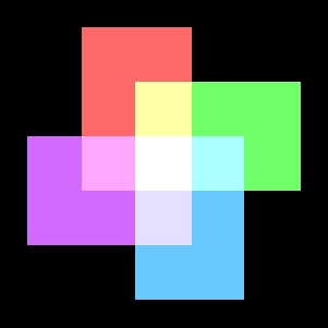
In this image, the ordering from back to front is red, green, turquoise, purple. So the purple color dominates the color in the center, where the four rectangles overlap. A 50% opacity is used in all rectangles.

It is true that, in a cover brush stroke, many dabs of paint overlap to create the final stroke's color. This means we have the luxury of keeping the opacity low for each dab, since multiple overlays quickly converge to near 100% coverage.

There is a strange kind of color mixing, called partitive color mixing. This is the formation of intermediate colors by dividing the view area into many tiny swatches of color, like a mosaic. Partitive color can and does apply to both additive and subtractive color. When it is applied to additive color, you get the very screen you are currently looking at. LCD or CRT, it doesn't matter. All of them use partitive mixing. When it is applied to subtractive color, you get CMYK halftone images.

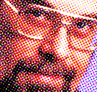
I have generated a halftone image of myself in 1995 using the Core Image filter CICMYKHalftone. When you overlay halftones of cyan, magenta, yellow, and black, each pixel of the result can be one of 16 possible colors (because 2 to the 4th power is 16).

Painterly Color Mixing

But, how should color mixing be done to simulate oil paints? Now we are getting into the complex world of actual paint physics simulation. This is done via Kubelka-Munk theory. In this theory, both absorption (which is responsible for subtractive color as mentioned earlier) and scattering (which is responsible for the color of the sky) are taken into account. A mixture pigment has absorption and scattering that is the linear mixture of the absorption and scattering of its component pigments, using the weights that come from the fractions of the pigments that are mixed together. Actually, this is very much like RGB mixing, except that absorption and scattering applies to every wavelength of light, not just the three primary wavelengths. Research has shown that 8 wavelengths produce a much more accurate result than the usual three wavelengths used by RGB mixing, and that not much more improvement is to be had by going to 100 wavelengths.

Then, a fellow named Saunderson produced a correction to this formula that allowed for the reflection of light off the transitional boundary between the pigments, when they are layered.

This combination is used for color mixing today, and it is called the two-constant method for color mixing. A single-constant method is also used to approximate the mixing estimation, which assumes absorption divided by scattering to be a single constant, and works from there. This method is less accurate.

Someday I would love to investigate color mixing again.