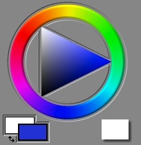
 In Painter, there is nothing that is more iconic than its color picker. It was designed for the artist, and so it features a circular ring of hues (called a color wheel) and a triangle of single-hued color (called a color page) inside it.
Color Pickers for Artists
In Painter 3, I redesigned the color picker around the concept of the color wheel. Before Painter 3, it was a color triangle above a hue slider.
The pre-Painter 3 color picker was actually clumsy. But I chose the triangle because it was ergonomically easy to use, and it was approximately perceptually arranged. It is good that the triangle has a single point at the top and the bottom for white and black. This shows unambiguously where these colors are. Other color pickers show them as the top and bottom of a square, which is not a correct depiction of color space.
 Here we have the Painter 1.2 color picker. My main problem with this is that the hue slider is not really big enough to represent all hues properly.
A set of color swatches is available for quick choice and drawing, like a mini-palette.
I don't like how the color ring on the triangle (that indicates the current color) actually gets hidden by the hue slider. It's a visually-conflicting thing.
In Painter 3, I chose the hue ring to be a little thick, like paint. But even so, I had some issues with it. The position of the colors on the wheel isn't really equally-spaced. Ideally, equal angular changes along the wheel would represent equal perceptual differences in the color.

 Look at an RGB color wheel, to the left, and a perceptual color wheel, to the right.
Two things have been done. First, the colors have been spaced perceptually equal. Second, the colors have been chosen to be at approximately the same luminance, of apparent lightness.
Notice on the RGB color wheel, where the colors red, yellow, green, cyan, blue, and magenta are equally spaced at 60-degree angles around the wheel, that the yellow area seems tight, and the green area seems grossly large in comparison. On the perceptual color wheel, care was taken to have equal color increments.
This means that a user can choose colors in the area they want with equal ease.
With the RGB color wheel, on the other hand, the artist always has to adjust the luminance's up and down to choose colors at the same apparent lightness, depending upon the hue.
So, if I were to do Painter again, I would probably do some work at making the color picker more ergonomic (or at least have an option for the artist to use an ergonomic color picker).
Color Mixing
Color works in some very interesting ways, that most people don't really think about every day.
 There are several kinds of color mixture that we like to describe. The first, learned by children when they mix their crayons on white paper, is called subtractive color.
With subtractive color, the more color that gets deposited, the darker and more saturated the combination color gets. This is because the rays of light reflect off the paper. As color gets laid down, the light rays are absorbed by the pigments. The more kinds of colors you lay down, the more wavelengths of the light are blocked from reflecting by the absorption of the particular color of the light. So laying down two hues will muddy the color.
Subtractive color is the chosen mixing method for felt tip markers (buildup brushes), for instance.
 The second kind of color mixing is additive color. With additive color, it's like you are starting with a dark room and shining lights of different colors.
In fact, in the Apply Lighting effect, this is the method of color mixing that is used.
This is quite different from the way that paints mix, but it does bely the way light can be split up into a spectrum by a prism: because white light actually consists of the addition of several spectral hues, it may also be broken down into those hues. This is done by a process of refraction. Dispersion is caused by the wavelength-dependence of the index of refraction of the prism material in question.
In Painter, cover brushes are another kind of brushes. How does that work?
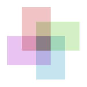
 The additive color model does apply, but it is complicated by more than just addition. the cover brushes use interpolative color mixing.
With interpolative mixing, suddenly the priority order matters. This actually becomes useful with brushes, and it makes it possible to cover things with successive brush strokes, and this is why they are called cover brushes.
In this image, the ordering from back to front is red, green, turquoise, purple. So the purple color dominates the color in the center, where the four rectangles overlap. A 50% opacity is used in all rectangles.
It is true that, in a cover brush stroke, many dabs of paint overlap to create the final stroke's color. This means we have the luxury of keeping the opacity low for each dab, since multiple overlays quickly converge to near 100% coverage.
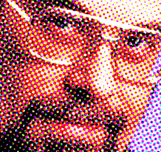
I have generated a halftone image of myself in 1995 using the Core Image filter CICMYKHalftone. When you overlay halftones of cyan, magenta, yellow, and black, each pixel of the result can be one of 16 possible colors (because 2 to the 4th power is 16).
Painterly Color Mixing
But, how should color mixing be done to simulate oil paints? Now we are getting into the complex world of actual paint physics simulation. This is done via Kubelka-Munk theory. In this theory, both absorption (which is responsible for subtractive color as mentioned earlier) and scattering (which is responsible for the color of the sky) are taken into account. A mixture pigment has absorption and scattering that is the linear mixture of the absorption and scattering of its component pigments, using the weights that come from the fractions of the pigments that are mixed together. Actually, this is very much like RGB mixing, except that absorption and scattering applies to every wavelength of light, not just the three primary wavelengths. Research has shown that 8 wavelengths produce a much more accurate result than the usual three wavelengths used by RGB mixing, and that not much more improvement is to be had by going to 100 wavelengths.
Then, a fellow named Saunderson produced a correction to this formula that allowed for the reflection of light off the transitional boundary between the pigments, when they are layered.
This combination is used for color mixing today, and it is called the two-constant method for color mixing. A single-constant method is also used to approximate the mixing estimation, which assumes absorption divided by scattering to be a single constant, and works from there. This method is less accurate.
Someday I would love to investigate color mixing again.
Excelent!
ReplyDeleteAn optional CMYK color wheel (well that would mean CMYK support) would be handy.
But definitively you did an awesome work there. Our Corel folks have done a good work too, making it more ergonomic.
A CMYK color wheel? Well, I suppose that is a possible thing. Perhaps it should be halftoned as well? I think it would depend upon the particular variant of CMYK you are using. There are several, you know. Each is heavily dependent upon the four inks' chromaticities (real-world-colors). You would want perceptual spacing of colors as well, to make it possible to get the right color easily.
ReplyDeleteThe Corel folks have indeed improved on the ergonomics of the color wheel, by using a rectangular window on the color wheel to show the current hue.
Well I hate every "like in Photoshop" request but I would like "any" CMYK support "at least like in Photoshop" A color picker which changed with the selected color mode would be awesome.
ReplyDeleteBut that simple "CMYK colours only checkbox" would be handy.
But it is such a complex world (I can not say yet how all of Painter brushes make interact color) that I´m sure what can and what cannot be effectively improved in that matter in Painter.
We found that just having this check box was a good start, because the worst of it was simply drawing with colors that are outside the printable gamut.
DeleteThere are buildup brushes like the felt pen that can increase saturation outside the printable gamut even when starting with printable colors, so its not a perfect solution.
One thing that Corel could do would be to have an option to limit the colors in the image to the printable set (you would have to choose a printer, and somehow be able to interrogate it about its color gamut).
"Someday I would love to investigate color mixing again."
ReplyDeleteWow, be very interesting to see you unleashed from corporate control and in the unrestricted creative zone again, like at the small Fractal Design I remember. Then again, I suppose you have a lot of creative freedom at Apple and Apple has tremendous resources. Btw, I noticed your Apple graphics patents a couple of years ago. (not stalking you, just saw something on the net that caused me to search deeper)
I am having a reoccurring thought reading your blogs over the past few months, that if your work could be open-sourced in small reusable modules, then perhaps a million applications could be spawned.
I am currently reading your blog, Who We Are, about how you lost control over your baby and the psychological impact on your life (perhaps even the hip injury could have been an artifact of internalized stress). The thought pops in my mind that top-down control has a short-half life.
Inverse Commons (written by Eric Raymond, who claims a 150 - 160 IQ):
http://www.catb.org/~esr/writings/magic-cauldron/magic-cauldron-5.html
While I can't comment on what I do at Apple, there are ample breadcrumbs in patents granted and patent applications that become public.
DeleteI keep the subjects in my blog quite separate from my work at Apple, for obvious reasons.
I like to revel in ideas, as this is the primary fuel for creativity. And some ideas are simply outside the scope of a normal cocktail party discussion. That's why they end up here.
Actually, I would like to inspire others to use the ideas I have creatively. Perhaps this can have an effect on the appsphere. Even without my ideas (which others can have quite independently on their own) there are plenty of apps that go down some of the same alleyways as I have.
It seems that the App Store has changed applications forever, since it has opened up an incredible number of applications to us. Literally, if something can be done it probably has been done. Well, not really. But it has probably made the time-to-market much sorter and therefore ideas can get into our hands much faster.
Once again, technology is accelerating like never before.
The Who We Are post is simultaneously a cautionary tale, a confession, and a recipe for emotional survival.
Managers much more capable than me, with a genius for management, can make top-down construction work much better than I did. There are so many management styles that are needed for each task, and they change as the task increases in size. Matrix management, stakeholders, liaison management, there are so many.
At Fractal I had a simple philosophy, a social contract right out of a beer commercial: work hard, play hard. And it led to an incredibly productive team. When people arrived that took themselves way too seriously, things got complicated. When people took advantage of the fact that we didn't need to take ourselves seriously, then things got even more complicated.
So simple philosophies necessarily get more complex over time.
The Inverse Commons experience of open source is indeed an interesting one. But managing a bit of code or even a whole operating system is quite different from managing an organization.
People have individual wills and that tangle of contrasting and conflicting wills can quickly become the Gordian Knot. Sometimes the knot must be cut, and people with greatly negative effect have to be expunged. But usually it's a matter of managing the knot as it is constructed, as it grows in complexity. Once in a while it will be necessary to realign and partially reconstruct the knot to the desired task at hand (here the analogy has lost its meaning, sorry!).
Someday I do hope to do more color investigation. I work with color every day in my work, and so I have learned several new tricks. Color mixing within a natural frame of reference has been a Holy Grail in the past, and it will probably remain so for a few years yet.
I wish for it to become perceptually correct.
I find color picking to be non-intuitive. Perhaps I have more success with the cards (e.g. Pantone?) at the paint store. I guess the difficulty stems from adjusting the (e.g. HSV) variables of colors separately. So I am searching a multidimensional space by moving N different controls. Reminds me of that drawing toy in the 1970s (remember you shake it to erase the drawing), where we turned separate knobs for vertical and horizontal movement. I couldn't draw curves very well. Contrast that with the direct action of drawing on a Wacom tablet.
DeleteMixing color might be an intuitive model for artists accustomed to mixing paints, but it probably won't help me.
The Theory of the Firm says that the demand for management (and thus firms) exists due to the frictional and risk costs of collaboration of participants, as you describe. To the degree that these costs can be eliminated or reduced, then the management can be, or vice versa. For example, a key participant abandons a key component of a collaborative project. The firm exists to manage this risk.
I think the firm obviously also exists due to necessary economies-of-scale, e.g. Apple's ability to bargain with media owners and carriers to generate income.
Yeah, so if all one you wants to produce is code, then maybe a firm is becoming less necessary. Maybe the Fractal model was no that far off from the ideal for producing code, except that you had to tell them what to work on and deal with whether they were serious or not. In the idealization of the Inverse Commons, the interested parties find your work, they don't have to managed. I am thinking a Holy Grail is very fined grained modularity, so it doesn't matter so much what other participants do or don't do. Everyone is free to do what they want, without messing up anyone else's work. Any way, that is what I am investigating now with programming language research, and not sure if I will make any major breakthrough.
Regarding the half-life of open source, Eric Raymond's gif code from decades ago is becoming more widely used today, e.g. in every Android smartphone. Ditto Unix code (as reformulated in Linux). I wonder if some Painter ideas are in GIMP.
I am not wishing for free (as in no profit) software business models. I am wishing the economy-of-scale problem could be reduced, so that programmers could be independent and work on what they are serious about without binding each other in knots.
"that drawing toy in the 1970s (remember you shake it to erase the drawing), where we turned separate knobs for vertical and horizontal movement"
Deletehttp://en.wikipedia.org/wiki/Etch_A_Sketch
ReplyDeleteDhankesari Lottery Result today is updated on the above side of this page and you can download Dhankesari Lottery Result today. Dhankesari lottery is one of the most famous lottery across India. Dhankesari lottery ticket buyers are increasing day by day. As you know, the Dhankesari state lottery draw is scheduled three times as (Dhankesari Morning) 11:00 AM, (Dhankesari Day) 4:00 PM &(Dhankesari Night) 8:00 PM.
https://dhankesariresults.in/dhankesari-lottery-result-08-00-pm.html