Showing posts with label brush strokes. Show all posts

Saturday, April 7, 2012

An Anatomy of Painter's Brushes, Part 4

Expression is a very useful capability of Painter, and it enables you to control your brush stroke in real time. I will mix this with some more of the brushes from Painter 6's new brush engine, as well as some older brushes.

The line airbrush is a very cool brush for creating brushed gradients. Here I set the clone source to a gradient, black at the bottom and white at the top, and used the line airbrush with a spread of 70 degrees. I used a Wacom stylus with a fairly heavy tilt and left-to-right strokes with different colors. In the Brush Controls: Size palette, size expression is set to Source. This means that, the lower I brush in the image, the shorter the lines will be, and therefore, the tighter the gradient.

I drew about 10 lines with colors taken from my estimation of the black body curve (in other words, yellow, through the oranges, to red and then towards black). The result appears brushed, producing a very nicely textured gradient. You can also adjust the spread to make it smaller, in which case the lines become more aligned with each other, like in brushed aluminum.

Another brush done during the Painter 6 timeframe is the pattern pen. This one uses the Rendered dab type. Here I have set up a source that is a pattern and used the Pattern Repeat technique, and I set brush size expression to Source, like in the previous image. This causes the pattern to modulate the size of the brush, creating a sort of alien beadwork that I interpreted to be some kind of sea weed stalks. To make use of this, I drew some vertical lines and then filled the image with black at 50% opacity, fading back the previous image. Then I drew some more vertical lines. And repeated the process a few times. This creates a murky depth cueing to the stalks, making them seem a bit more three-dimensional.

You can adjust the size and min size from the Brush Controls: Size palette to control the exaggeration of the objects on each stalk.

The spatter airbrush is a very cool capability, because it really does work a lot like a real airbrush when you use it. The individual spats are deposited using the same three-dimensional projection technique as the camel hair brush, but this time it makes a very convincing spray. To accentuate the results, I set brush size expression to Source and operated in a clone of a gradient with black at the bottom and white at the top. This automatically controls size in such a way that smaller sizes are at the bottom and larger sizes are at the top. Anyway, it's a great way to demo a brush!

The main controls you want to tune are the sizemin size, and size expression from the Brush Controls: Size palette. Also, adjust the flow from the Brush Controls:Airbrush palette.

There are various useful options for controlling the size of the stroke in real time. And this is done in the Brush Controls: Size palette. One, as I showed, was to allow the size expression to be controlled by the source (in this case, the clone source).

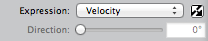
Controlling the size expression with Velocity is another interesting option. For this one, you might not want too much change in the size of the brush, so set min size to greater than 25%.

When you do this, the brush becomes bigger as the velocity gets slower (at the ends and sharp turns of the stroke). This creates a highly expressive and designerly stroke. Here I am using it with the digital airbrush, a soft cover variant.

So, the faster the brush moves, the thinner the stroke. This can be combined with a buildup method to produce a very natural kind of marker. It seems to spread when you slow down, like a real marker that absorbs into the paper.

This type of brush stroke is good for handwriting, I believe.

What Can Be Controlled By Expression

It turns out that there are a limited number of brush attributes that can be modulated by expression. When expression is set up to modify an attribute, it may change in real time in response to the stylus, clone source, etc. You will find these controls right under the attribute that has the option of being expressed. I got the idea for Expression controllers from the patch cords in the early synthesizers.

The Expression pop-up controls the option you choose to express the brush attribute. This means that the option is used to modulate the brush attribute in real time in response to the stroke. Next to the pop-up is an Invert box. This allows you to invert the value of the option (so 1 becomes 0 and 0 becomes 1) before using it to modulate the expressed brush attribute. When the option is Direction, a 1 value is produced when the stroke moves in the direction associated Direction slider and a 0 value is produced when the brush stroke moves in a direction that is perpendicular to this.

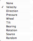
The Velocity, Direction, Pressure, Wheel, Tilt, Bearing, and Rotation options are all derived from the stylus itself or from the physical motion of the stylus. With Velocity, the faster your brush moves, the smaller the value. With Direction, the maximum value is achieved when the brush stroke goes in the direction chosen by the Direction slider. Pressure, Wheel, Tilt, Bearing, and Rotation are all attributes of the stylus. If you have a mouse, check out the Brush Controls: Mouse palette to set these values.

The Source option means to use the clone source luminance. Here black means a 0 value and white means a 1 value. The Random option allows the expressed parameter to modulate through random values between 0 and 1 with each dab of the brush or each increment of motion for a computed brush like the airbrush.

Size

In the Brush Controls: Size palette, the size and min size attributes help control the changing size of the brush in response to expression. Note that min size is expressed as a percent of size. Size is controlled by pressure in the example shown here, a buildup brush.

Feature

Also in the Brush Controls: Size palette, the feature attribute controls the feature size of the airbrush spatters and the static bristles. This can be controlled by expression, which is interesting.

Opacity

In the Brush Controls: General palette, you control the opacity of the brush and thus you can adjust it in real time in response to your brush stroke by using expression. Commonly, opacity is controlled using pressure in a digital airbrush.

Grain

Also in the Brush Controls: General palette, you can control the grain penetration of the brush into the paper using this slider. This might be the perfect use for pressure, along with the Grainy Edge Flat Cover method, for instance.

Here, though, I have set the grain expression to Source, checked the invert box, and used a clone source that is white at the top and black at the bottom. This creates a direct grain expression in the brush stroke that trends from top to bottom and is cleanly varying.

When using grain penetration and expressing it using pressure, it is sometimes useful to use Preferences: Brush Tracking and then adjust the pressure power until you can get the intermediate levels.

Jitter

In the Brush Controls: Jitter palette, you control the jitter, which allows you to create a jumpy brush where each dab is placed randomly. This can be controlled by expression as well, which makes it convenient to set jitter to a low value when your brush is traveling slowly. Set expression to Velocity and check the Invert box. This can be convenient when expressing Size with Velocity, as shown with a Buildup brush. It is kind of like grain.

Angle

In the Brush Controls: Angle palette, you control the angle of a squeezed circular dab. The best way is to control it using Bearing, and then it will be oriented with your brush, no matter how you hold it.

Flow

For the airbrush, you can use the flow and min flow parameters in the Brush Controls: Airbrush palette to control the number of spatters that come out as you wield an airbrush stylus. This is like a flow wheel on a real airbrush. So you might want to use Wheel to control it, but Pressure works quite well also.

Depth

In the Brush Controls: Impasto palette, you control the depth of your impasto brush. This means you can express Pressure into depth and press harder to dig harder into the thick paint! It's natural for that.

Volume

In the Brush Controls: Liquid Ink palette, you control the volume of the liquid in your liquid ink brush. This can make it easy to control the stickiness of your ink with Pressure, and other stylus parameters. A liquid ink camel hair brush is shown with Volume set to be expressed using pressure. You can get the inimitable effects of a brush stroke that breaks up as you let up a little. Very nice.

Resaturation

In the Brush Controls: Well palette, the resaturation controls the amount of color retransferred into the brush as it mixes with wet paint in the canvas. This may be controlled by several parameters that work, like Velocity and Pressure. Set your resaturation slider to a low value to make it more useful.

Bleed

Also in the Brush Controls: Well palette, the bleed controls the amount of color picked up off the canvas. You can define your clone source to be white in the wet areas of your image and black in the dry areas. Then set Expression to Source. Hmm.

Image Hose Ranks 1, 2 and 3

Expression is used to control the ranks of an image hose. Each rank is usually set up with some attribute such as size, angle, color, or another variety. You can create arrows that point based on direction, for instance. Or you can use pressure to control size or the number of leaves in each clump. The image hose has unlimited uses. Here is one where Direction is used to control Rank 2, which is the color and pressure is used to control Rank 1, which is the size. I used the Mixed Cubes nozzle from the GEOMETRX.NZL legacy nozzle library, which shipped with Painter 4, I believe.

Color Expression

This one has its own palette at Brush Controls: Color Expression. And to controls the color expression. In other words, it controls the color you are drawing with, in a continuous gradation from the foreground color to the background color.


An Anatomy of Painter's Brushes, Part 3

The bristle brushes are definitely a very nice kind of brush in Painter, and it seems Corel has indeed been busy implementing more kinds of bristle brushes. Let's look at the actual output of the bristle brushes now.

The original Van Gogh brush does indeed have a nice quality all to itself. Here I use the original brush, with some color jitter applied, and a bit of artistic fakery to create a bit of Starry Night magic. This shows how it was originally intended to work. You can use this technique with cloning as well, to great effect.

Here I am using Dab Type Circular, Stroke Type Multi, with a Soft Cover method. Jitter is set to the maximum, and Bristles (under Rake) set to 30.

This produces the original Van Gogh brush effect. I used this in several images released with Painter 1.0, and offered to the press.

In particular, I took this image of myself with a video frame grabber on September 9, 1991, and applied the Van Gogh brush look to the image, using clone color.

You may notice that I missed the eye. Oops! Well, I didn't release this one to the press. It was drawn on September 17, 1991. Painter had only been released the previous month.

So this is me, right at the time that Painter 1.0 came out. And look, I still had some hair! OK, it doesn't show my pony tail...

I probably should have done a still-life instead. I think I was a little embarrassed at my proud pose. And self-conscious about my left eye, which opens a bit larger than my right. And look at those huge glasses! Weren't the 90s fun?

I think there's too much color jitter. But it certainly illustrated the cloning capabilities of the Van Gogh brush.


The rake brush was the next attempt at bristle brushes, and it was the rake brush that was used to recode the Van Gogh brush once Painter 2.0 was released. Actually I think it may have taken another release before we did this. Here you can see it has been set so the brush appears to turn as the direction of the brush stroke changes.

Also note that the rake brush has a separate color for each prong of the rake, which is compatible with color jitter. It made for a nice effect, and it was also a bit useful for cloning.

But, as you can see, it was limited to parallel lines, and this limited the scope of the brush tremendously to me. Of course, you can make the size change using pressure.

In Painter 3, I invented the bristle brush. It is now available under the Static Bristle Dab Type. I have used this brush as a smear brush to smudge around some color I also applied with the same brush, but with resaturation set to 1.0. Also, the spacing for the static bristle brush needs to be set to a very small amount - perhaps 1 or 2 percent. This is because the bristles are quite small compared to the radius.

It does indeed produce a nice smeary result, with the effect of bristles. But, with only one color well, this was a limited approach, and I think it is most useful for smearing. As a result of only having one color well, it can smear more than the camel hair brush, simply because the well color is applied to a larger area. This is the same effect, essentially, that made Just Add Water so useful in the early days of Painter.

In Painter 6, we went wild with the new brush engine. This resulted in several new kinds of brushes. In particular, the camel hair brush shows the value of this new approach. Now the color can be smeared by each bristle of the brush, and so there are streaks along the brush strokes that make it seem much more realistic.

Here you see the camel hair blend brush, which obviously uses a better internal color well to keep its color around. The brush quickly gets muddied by the colors of the canvas, and this makes is very useful indeed.

But the most important part of the camel hair brush is that each bristle gets its own life. As you can see in this example, each bristle has its own path through the canvas, its own color, its own color well (and thus smearing and color loading potential), and its own identity.

With all the work on bristle modeling, sometimes I forget that I was also creating things that were never seen before, like the line airbrush. This brush used the spatter airbrush model for 3D position of the stylus and also its projection technique for positioning each spatter of paint, but instead rendered the spatter as a line in the direction it was projected.

This created some of the more interesting art I have ever created.

Here you see one stroke of the line airbrush, with spread set to 72 degrees. I held the stylus at a significant tilt from the vertical to get this result, in the same exact manner you would direct an airbrush to overspray.

But the lines give it an extra added dimension that really can't be had in any other application.

In the next post on Painter's brushes, I'll talk about more of the style-extending reality-defying brushes and some of the craziness that occurred during the late 90s at Fractal Design.

We were just plain out of control!


Monday, April 2, 2012

An Anatomy of Painter's Brushes, Part 2

Blogging during Spring break is tough without a Mac, especially when blogger.com eats your post! I'm using blogsy on an iPad to lay out my post, and, I must confess I am using Paper by fifty-three to illustrate this post. When I need to crop, straighten, or adjust, I then use iPhoto. I try out all the mobile paint apps and I am quickly becoming a veteran of many trials and tribulations of the mobile environment.

Normally I use traditional ultra-fine Sharpie on 30# paper so it doesn't leak through. In Preview, I scan the line art using a Canon scanner that sits on my home network. Also in Preview, I tonally adjust and scale to appropriate dimensions for the blog. Quite often, somewhere in between, I use Painter to adjust, clean up stray lines, and apply coloring on a gel layer.

Sometimes I do my illustrations entirely in Painter because, along with the Wacom tablet, it is really an excellent drawing environment, rivaling the natural medium. But often I do my scribbling on a clipboard because, as you know, I am always sketching. When I get an idea, I like, to sketch it out.

This post concerns a unique aspect of Painter's brushes: the constant work done improving and re-improving upon the bristle brush model. It all started in 1991, when I was working on the very first version of Painter. One day I got the idea that it might not be all that difficult to create multi-bristle brush strokes.

My first try, which users got a look at in September 1991, when Painter was initially released, was the Van Gogh brush. This brush (1) recorded the brush stroke and then (2) played it back several times with some locational jitter applied to each stroke, and some color jitter (in HSV) applied to each stroke about the center color. This really was a magical amplifier to a brush stroke and it served to show me how powerful multi-bristle brushes could be. It could produce some great results. And it's not to be confused with the Auto Van Gogh effect, which extracts directions from the image and then re-renders it using thin dabs of multi-colored paint. That is one effect that can benefit from all the advances in direction vector field extraction and vector field visualization.

My second try came in Painter 2.0 with the rake brush. I worked on this in late 1992, while Tom Hedges and Bob Lansdon were working on the first version of watercolors. You can see the notes I drew for the initial idea. The bristles are placed on the circumference of a circle (cylinder) and the brush direction becomes the primary angle that determines which bristles are in contact with the canvas. That's the first sheet. In the second sheet, we see a bit about how we compute the exact points of contact for the brush stroke. In the third sheet I introduces a splay parameter that widens the potential number of bristles that come in contact. On the first sheet on the bottom row, I detail how opacity can fall off at the edge of the stroke and also how turning the brush (meaning changing brush stroke direction) can sequence through the bristles that contact the canvas. The last two sheets show the effect of curving the brush stroke and how the bristles exit and enter.

The rake brush was an interesting look, yet it really was only good at creating parallel arrangements of contact between the brush and the canvas. And, it only had one color well.

My next attempt was in the Painter 3 timeframe in 1994, and it was the bristle brush. This brush simply took a speckle, which is a random set of mutually-avoiding points in the plane, and used it to model the tight-packing of bristles within a brush itself. So I took the contact area of the brush, which I modeled as a circle, and used it to clip the speckle. The color of the brush was then rendered in the current well color, and there was, once again, only one color well for the brush. This was really just a shortcut for capturing a brush that contained multiple bristles in it. I think the reason I went for these simplistic solutions was that the compute power of the machines Painter was targeted for was quite limited. It's hard for me to think in those terms today, unless I start thinking more about the limits to the compute power of the iPhone and iPad environments.

Also during the Painter 3 timeframe, I made the Van Gogh brush work in real time while drawing the brush stroke. This probably didn't improve the look of the results, however.

There were plenty of brush advances in the Painter 4 and 5 timeframes, but I didn't really return to bristle brushes until Painter 6.

In 1998, I began working on brushes again using a separate environment from Painter, an environment called the San Marco development environment. Eventually this entire development framework was simply thrown away. But in the meanwhile, I used it to mock up the multi-bristle brush, the spatter airbrush, and the brush where an image, masked by its alpha channel, was mapped into the space of the brush, like a raster version of Alex Hsu's Expression brush. He called his technology Skeletal Strokes, but this shows what engineers do poorly: name their technology. It's lucky I was part marketer too.

The new code was implemented using C++, unlike Painter, which was implemented entirely in C and assembler (!). When we got to the Power PC, we raised the assembler used for the inner loop of the brush code back into C.

So there was a period in 1999 when Painter 6 was being written when I was gluing these technologies together. And the result was excellent. The camel hair brush was the result. This brush was great because it modeled every bristle separately and rendered it using a single pixel line. The line was colored according to its own color well, so each bristle effectively had its own color well. This meant the brush could be loaded with color, potentially a different color per bristle. Also, each bristle could keep a slightly different color in it, using color jitter.

But more importantly, each bristle had its own path across the canvas. To remedy the problem that there weren't really enough samples from the mouse or stylus, I built a way to smooth the path of the brush stroke. And introduce new samples, to avoid the visible vector stepping in the stroke. To do this, I created a FIFO to implement cubic interpolation. For every 4 points, I could create however many points I wanted in between the middle two points. I think I created three points in between them. This made the strokes much smoother but also introduced some squirrelly behavior. So I turned off interpolation when the speed of the brush went below a certain velocity or when the stroke made a sharp turn.

Another problem that needed to be solved in multi-bristle brushes was the stickiness of the paint and it's effect on controlling the brush bristles, and keeping them in check. To do this, I used a form of exponential damping (which also can describe part of the way the color well works). If you keep an accumulator for each scalar quantity, in this case, one for x and one for y, and call it a, and you receive a new x or y value (called s) periodically, you can update the accumulator in the following way: a' = a*(1-d) + s*d. Here d represents the fraction towards which we interpolate to the new value of s. The lower the value of d, the more relaxation on the sample values.

The problem of projecting the bristle positions individually onto the canvas was handled by computing the Frenet frame of the stylus and projecting a speckle of bristles in 3D onto the canvas, forming the updated bristle positions. The frame of the stylus was computed using the tilt and bearing values produced in real time by the Wacom stylus. It also had a pressure, and high pressure could be used to keep the tip closer to the canvas, while low pressure would signify greater distance from the canvas.

I used the same principles for the spatter airbrush, to great effect.

Along with the damping, the positions of the bristles could be known and relaxed into a very natural brush stroke.

Painter has a feature slider. This is used to control the average minimum distance between the bristles in both the bristle brush and the camel hair brush.

I know that Corel has also advanced the state of the art with their new bristle brush, but I can't play with it at the moment. On the next post in this series, I will discuss it, and also show some examples of the various bristle brush strokes.


Wednesday, February 22, 2012

Respecting the User's Input

I had the privilege of working at a Computer-Aided Design (CAD) company, Calma, in the late 70s, and thus I experienced first-hand the early years of computer graphics. And it was at Calma that I learned a principle that has served me well ever since: respect the user's input.

The users of the Calma workstations used a CalComp Talos table digitizer. You would tape your sheet of VLSI artwork down on the digitizer and then you could digitize the traces (conduits of electrons on the surface of the chip you were designing) using a puck. Digitizing was a tedious process and eventually this process was eliminated by allowing the designer to build their design directly on the CAD system in the first place. Which is obvious, of course. But computers were really primitive back then and so this was a necessary stepping stone.

It was considered massively incorrect to require the operator (what the user was called back then) to digitize a point more than once. The problem occurred so often, that the users called it double digitizing. This was clear to me, since when I wrote something, I was also its first user when testing it. And double digitizing was incredibly bad because it required extra work. And it didn't respect the user's input.

As time went on, I became the author of the graphic editor (GED) on the Calma GDS-II system. You may not recognize this system, bit it was used to design the Motorola 68000, so you probably know its effects. GED fulfilled the promise of digitizing the geometry within the system, although it wasn't unique, and we all considered this requirement to be obvious. When I wrote it, I paid particular attention to caching the user's input so I wouldn't require anything at all to be entered twice. Even a closure point. Because by then, tablets were being used (but with wire-connected styluses) and often it was hard to hit the same point twice. So, I invented a snapping distance specifically so you only had to get close to the starting point and still specify closure.

Constraint-based systems were still in their infancy in 1978.

Programming

As I did more programming, I became aware of another corollary to the principle of respecting the user's input. It was called the Perlin principle of modular programming: we hide the similarities and highlight the differences. Sometimes the similarities are simply encapsulated in classes or modules. Usually the differences become parameters to the modules, or the differences are wrapped up in the way you call the modules or use the classes. Here the user is the programmer and their input is respected in some ways because they won't have to write something twice. There is another way to respect the programmer's input: transparency. When an API (application programming interface) is complicated, then it becomes less transparent and the possibility of bugs can increase. On the other hand, when an interface is clean and well-defined, the programmer doesn't have to learn too many things, or understand the assumptions made by the writer of the API. All these things make fewer problems and also fewer chances for bugs, because the user's model of the code is very close to the way the code actually works. In this way, the programmers intent is better respected.

MIDI

Later on, in the late 1980s the user input became more complex. In 1988, I built a program for recording and playing back MIDI data from keyboards and drum machines. I called it MIDI '88 and it's a project that really has never seen the light of day, except for in my studio. Well, I did show it to Todd Rundgren once. And, of course, John Derry.

To get the MIDI data, I had to interface to a driver and write an input spooler. This spooler, implemented as a ring buffer (seen to right), kept all the data around without dropping samples and events. In this way, I was respecting my input to the keyboard and allowing me to record it. I recorded the events with a millisecond-accurate timestamp. And this was the beginning of my quest to accurately preserve the user's input and faithfully reproduce the user's gestures, allowing the style of the user to come through.

Tablets

When I first got a Wacom tablet in 1990, I sought to do the exact same thing: create an input spooler for the tablet data, and timestamp the data accurately. But with the Wacom, there was pressure data also that needed to be captured. And then there was tilt and bearing information.

The input spooler captured all these things.

But I soon learned that the data I got from the tablet wasn't perfect. It didn't really accurately capture the user's input at all. One source of the error was temporal aliasing. So I learned that input data often had to be massaged.

Some tablets had very few samples per second and others had quite a few. But, if you assumed the data from these tablets are regularly spaced, you could get kinks and ugly straight lines in your brush strokes. So I invented a limited FIFO that smoothed out these time-and-space irregularities. And I had to pay special attention to the tight turns in the path of the stylus. Changing the extrema of a brush stroke was highly undesirable since it made common actions like cross-hatching very hard. And sketching simply looked wrong if too much processing was done on the user's input. Usually, but not always, the extrema of the stylus' path was a place where velocity was at a minimum.

But, conversely, when the stylus was moving fast, less control was exerted on the actual position of the brush. So I could afford to use parametric cubic interpolation to create more points in the brush stroke in fast-moving sections of the brush stroke. This was a good thing, because there were fewer points per inch in fast-moving sections due to the fixed sampling interval: when your hand moves the stylus faster, the sample points are spaced farther apart.

All this made for smoother scribbling in Painter.

When John Derry came to Fractal Design in 1992, his enthusiasm for mark-making actually meshed quite well with my desire to accurately capture the input. It made Painter a very good tool indeed for an artist for these reasons.

We perfected the motto with respect to mark-making: to accurately capture the nuances of human expression and faithfully reproduce them, allowing the artist's style to come through.

It is this statement that I stumble through towards the end the video in my early post Creativity and Painter, Part 1. Ah, the early days.