Mark Zimmer: Creativity + Technology = Future
Please enter your email address and click submit to follow this blog
Tuesday, December 25, 2012
Observing Microsoft, Part 2
Some of the most important assets a company has are its brands. A brand distinguishes a product from its competitors and can spread out like an umbrella to encompass several related products. But it must be coherent, meaningful, and inspire trust and signify value. You don't want a brand to become unclear. Brand management is a vital aspect of business.
Microsoft's main brand is Windows, an operating system. It is an umbrella brand, covering Windows 8 and Windows Server, though many people still are running Windows XP and Windows 7. The company also has the Office brand, which is an umbrella brand covering various pieces of software, like Word, Excel, PowerPoint, and Outlook. The brands specifically spell out what Microsoft is known for, and by inference what it is good at: operating systems and software.
It is abundantly clear that Microsoft is stepping out of its circle of expertise by creating hardware. It seeks to add another brand, Surface. But the Surface product is actually Microsoft Surface with Windows RT.
Let's look at the Windows brand. The billion or so Windows users are all familiar with Windows user interface. This includes such items as the taskbar, the start menu, and the desktop, with the plethora of blue-topped rectangular windows, from which the brand gets its moniker. Icons on the desktop, really just aliases to actual files, are called shortcuts.
But by creating a touch-based interface for Windows 8, really just a start-up screen veneer on desktop systems, those one billion users are led into into unfamiliar territory by the new user interface. There are reports of users being uncomfortable with the user interface and putting off the upgrade to Windows 8. Perhaps the main problem is that there are now two user interfaces, and they are quite different.
In some sense, this splits the brand, fracturing what Windows actually means. And that's not good. Furthermore, using the Windows brand on their hardware products actually stretches the Windows umbrella brand to include hardware, which has dire consequences for their OEMs like Sony, Toshiba, Acer, Asus, Dell, and HP. Reports are emerging that Dell urged Microsoft not to use the Windows brand for their Surface product. This causes confusion as to what Windows itself actually is: is it an operating system or a computer? Oh, man.
Some even claim that Microsoft is abusing the Windows brand.
All this, combined with the apparent lack of Surface sales, has investors in the same boat as the Windows user base: should they invest in Microsoft now?
Many users seem content to wait for Windows 9. There are some indications that Windows 8 could be like Windows Vista, which was met with whole-hearted scorn from users, who hung onto their prized Windows XP systems. Only with Windows 7, captained by recently-fired Steven Sinofsky, did the users finally resume their upgrades.
Arguments in favor of Microsoft's current Windows 8/Surface strategy center around three concepts. The first is, because they covet the Apple revenue model, that by integrating their software with their own hardware, they can do the same. The second is that they can't abandon the Windows brand and simultaneously they must make a move into the mobile space with it. And the third is that they are bridging the gap between tablets and laptops.
Perhaps, if they can do any one of these things right, they will survive. But right now, analysts have been noticing that PC sales have been dropping off. This is because the mobile market is disrupting it. Notice I didn't say that the tablet market is disrupting the PC market. More and more users are using mobile devices. By making their tablet more like a laptop, Microsoft doesn't really get what's happening.
The Holiday Season
The holiday season accounts for a large amount of retailers' sales annually. Indications are that online sales have surged 16% this season over last year. However, retail sales in brick-and-mortar have only risen by about 2.5%. But, to me, there is no doubt that the malls are crowded. Yesterday, it took me about 40 minutes to find a parking spot at the ValleyFair mall in Silicon Valley! This could mean that retailers are selling, but just not the big ticket items. This testifies to economic troubles or perhaps the widespread purchase of discounted items after hurricane Sandy.
The sales of Windows 8 depends partly upon the purchase of new computers. This is because those who purchase the new, exciting computers are essentially a captive audience. And if consumers (and possibly businesses) aren't buying the big-ticket items, then that could be a reason.
Let's analyze that for a moment. If computers are more expensive than tablets, then the consumers will buy tablets. Businesses will rush to construct low-cost business solutions using tablets as well because they can save on expenses - and the apps are there. And even if they aren't, the cost of developing corporation-local apps will make the conversion worth it. Nitro Mobile is one such company that specializes in creating corporation-local solutions on mobile platforms, like iOS.
Another sign that sales for Windows 8 aren't quite up to snuff is this article about Microsoft stores in the metropolitan New York Area, which states again that Microsoft stores were sparsely populated when the aisles at the mall were practically impossible to get through. In Silicon Valley, I noticed the same thing: Microsoft stores were just not filling up or selling their wares as fast as Apple stores. Perhaps Ballmer's idea of putting Microsoft stores right next to Apple stores wasn't so good after all: it invites unfavorable comparison. For PC sales to be lackluster in the holiday season is more than just a slow start. It's a definite problem. The market is changing fast.
Sunday, December 16, 2012
Disorganization
Why is it that we need things to be a little disorganized to understand them properly? Because perfect order doesn't really exist and it is most certainly the flaws that draw our gaze and make us think.
Mistakes are classic examples of disorder: an accidental paint spill, or a hand slips and draws an errant line. Perhaps they are intentional: on a whim, we decide to take a different path home, or we try a different turn of phrase or melody line so we can convey our thoughts in a novel way.
Even the need to convey disorder is useful to us. The Firm, in their song Radioactive, evoke a kind of complexity and disorder in the solo with what appear to be random notes.
In fact, I'm not sure that any perfectly ordered world would even be desirable. Consider Pleasantville: when everything is perfect, it becomes irrelevant, and the intrusion of the real world causes things to turn upside-down very quickly. To make the best music, perhaps we have to have trauma and discontent. One of my favorite of this genre is Everclear's Wonderful: childhood trauma makes for the best songs, right?
So music is clearly affected by this notion that increasing entropy is inspirational. But drawings and painting are not immune to this. Recently I wrote about the nail that sticks out, and this testifies to the effect of disorder on progress and disruption. Really, the world wouldn't be the way it is without the crazy ones.
In fact, Darwin would almost certainly agree that humans wouldn't even exist if it weren't for disorder. If DNA just replicated perfectly and everything was stable, we would never evolve. If that stray cosmic ray didn't wreak havoc in somebody's gene, we would still be amoebas. Or, more likely, amoebas wouldn't even have existed at all.
Some say that the stray rays also come from the earth itself. This is true. We have radioactive elements in the earth's crust and so they contribute as well. Trace impurities thus become central to essential change.
Order implies lack of change and therefore stagnancy. Perhaps this is why it is so seldom that I clean up my office! Yet I like to solve the Rubik's cube. This inherently is an act of finding patterns in randomness and restoring order, like solving a jigsaw puzzle.
We can see patterns and images in disorder. Little things become noticeable. Our imagination wanders. We are all looking to make sense of randomness, like when we see familiar shapes in the clouds. Perhaps it's a kind of wishful emotional need.
Let me tell you a short story. Kai Krause and I were visiting Steve Jobs to show him our recent advances in human interface in 1999. I showed the Idea Processor, which was almost all the joint work of myself and John Derry. It featured the concept of disorganization. There were stacks of unsorted pages that could overlap into little messy piles that, once they were in a pile, you could straighten them up. Or clip them together. One could be double-clicked to spread it out for perusal.
Of course, Steve instantly showed us that it wasn't scaleable. But he also made a comment about disorder. "People don't need computers to make messes. They need them to organize." That's one of the things I liked about Steve: he always got right to the point.
But, of course, it wasn't thirty days before Steve walked into our booth at a Seybold show in San Jose, located me in our press room, and set up a one-on-one meeting so he could recruit me.
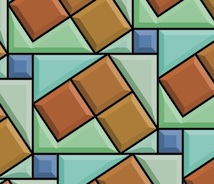
When I make patterns and texture, I'm looking for another kind of disorder. Well, the patterns repeat and therefore they are by definition ordered. But they look disordered to the eye. What I want is an artful kind of disorganization that is pleasing to the eye. So once again creativity is involved in the crossroads between order and disorganization. Like in the annealing pattern above.
And once again I have applied some principles that don't seem to apply (the principle of disorganization to the process of creating order) and it leads to a creative result.
Tuesday, December 4, 2012
Observing Microsoft
Microsoft doesn't hang quite as straight as it used to. What has happened to Microsoft? If the question is even being asked, things can't be going well.
The media are definitely asking the question. For instance, an interesting article in businessinsider asks whether Steve Ballmer's nightmare is coming true.
I don't know if it's poor execution or just the fact that Microsoft has been classically a software company (its name literally means microcomputer software) but I wonder at the missteps in their Surface strategy. We'll get to that in a moment.
I pointed to Microsoft's corporate culture in my blog post The Nail That Sticks Out. I am positive that they are fabulous about research in the ranks but at the top levels I believe their management is grimly despotic and unimaginative. In that case, what they need is a great leader. A few days ago, Microsoft CEO Steve Ballmer said, "We see nothing but a sea of upside". But they need a leader that doesn't need to boil the ocean to come up with the gold. One that has a vision for what can work. And, more importantly, what people will buy.
They need two things: focus and simplicity.
It is sad that, today, there are more than a few trends that point to the beginnings of a death spiral for Microsoft. To name a few: tablets start to eat the PC market, mobile computing succeeds for others but not for them, gigantic software bloat like Excel and Word are being replaced in the industry by small, mobile apps that cost a only a few of bucks, and companies are starting to use a Bring Your Own Device (BYOD) policy for their IT connectivity.
Individually, any of these trends would be quite bad for Microsoft. Taken together, these things are terrible.
Getting Into the Hardware Game
So, why is Microsoft, a software company, also becoming a hardware company? Simple: both Apple and Google have the ability to craft their software and hardware together. In Apple's case, this core competence specifically led to the disruptive, record-breaking products such as the iPod, iPhone, and iPad that consumers just can't get enough of. In the process, these products and the ability to execute has led to a profit model that is unparalleled in the business and now the envy of Microsoft.
And this is exactly where Microsoft wants to be: back on top.
Which means they must build hardware so they can create the whole product. Microsoft knows from experience that their OEMs willfully do what they want. And lag behind Microsoft's wishes and suggestions. Furthermore, the developers will have a larger set of hardware configurations to support. This has always been a problem with Windows: its generality. And it is the current problem with Android. If Microsoft wants to take a page from Apple, it must control the hardware configuration as well.
Microsoft's act of angering the OEMs by creating its own home-grown hardware is dangerous and can backfire on its revenue stream. For one thing, this doesn't build on its core competence. In retrospect it might have been better to take the Google approach and simply buy one of the OEMs, perhaps Sony or HP. Still, Microsoft clearly knows that mergers are not an easy process so it foolishly started building hardware.
Nonetheless, it's must be fortunate that Microsoft's strategy is moving towards the mobile space, right? I would say that it's an absolute necessity. Let's look at that.
Windows 8 features a new modern user interface (UI) that features live tiles and supports touch. At first glance this new UI looks like the first real competitor to the elegance and clarity of iOS. Yet, I have two questions:
How Well Does It Work?
A friend brought in his Microsoft Surface RT this last week and I spent some more time playing with it and comparing it to my gen 3 iPad. Microsoft claims the text is sharper and better. The displaymate.com shootout shows that it really isn't. To me, the Surface is certainly not clearer. It seems designed to look good to PC users who have been using Microsoft fonts for years. Come on! In a side-by-side comparison there was no comparison: the iPad looked way better. Hell, even an iPad Mini text looked better. I compared the nytimes.com site directly.
I played around with it some more and found that browsing was an almost completely keyboard-centric experience. I had to have the keyboard attached. And type in the URLs (there was auto-complete). Which meant that I had to use it in the landscape format pretty much all the time because that's the way the keyboard works.
With that keyboard on it resembles a laptop in form factor. I found that, with its built-in kickstand, it really has to sit on a desk to be used. On your lap, it just doesn't work in this form factor. It's just not stable enough. So, it's a laptop that doesn't work on your lap. Hmm.
I am used to holding my iPad on my lap while I am at the couch, with the magnetic cover folded into its triangular shape and the screen therefore at an ergonomic angle to type on. Or using the iPad to read to my son at night with the lights off when he goes to bed. I use landscape for browsing, portrait for reading.
There were some interesting features that I was able to find and use, since I had read a few articles on Surface usability (that mostly came to the conclusion that it was very bad indeed). But it would have been difficult to figure them out if I had to discover them. I actually wondered is there was a user's manual available.
On Surface, swiping from the side and back brings up a task manager of sorts. Then you have to swipe down to change the app you are reading. On the iPad I can double-click the home button for that purpose or, even easier, use a four fingered swipe from side-to-side to get to the next app.
In fairness, on both devices, the gestures and actions need to be discovered. So it is really about how easy these actions are to accomplish.
Won't It Be Confusing For Desktop Users?
Windows 8 becomes the default mode for the desktop systems as well. But doesn't that mean there are two UIs being used and that the users have to switch their brains between them?
Yes, and yes.
In a recent article, venerable PCWorld talked to some usability experts on Windows 8 (before Surface had come out) and so it only deals with the bipolar design of the desktop version.
The overall tone is grim. Users are confused as to what to do. Commands aren't where they used to be. Mouse actions (replacing touch and swipe actions) are unobvious and hard to discover.
In InfoWorld, they call it bad. "Guaranteed to disappoint nearly everyone".
Jakob Nielsen reports that it the disparity between the two UIs is bad for many classes of users, both power and novice.
Live Tiles
This seems like a pretty good feature. And my experiences with Surface indicated that they are useful. Yet Microsoft doesn't really exercise enough control in their usability guidelines. Or they exercise the wrong control, which would be worse.
In an excellent summary article, Jakob Nielsen reports that unfortunately live tiles' implicit call to action creates "an incessantly blinking, unruly environment that feels like dozens of carnival barkers yelling at you simultaneously". That's not a good thing.
So let's just say that understated is not a term I would use with the Windows 8 user interface.
Perhaps this is one good reason why Apple curates the apps that can be run on their devices.
What's Going On With Surface Pro?
You can't use current Intel-based Windows apps on Surface RT because it uses an ARM processor, like the iPhone, iPad, and nearly all other mobile devices. This is generally because of the economical power consumption of the ARM. So you have to wait for the Surface Pro, which supports Intel-based applications, arriving in 2013.
The latest on the Surface Pro is, since Microsoft states it will use an Intel "Ivy Bridge" Core i5 processor, it will get about half the battery life of an iPad. Microsoft could have used an Atom "Clover Trail" processor or even one of the newer-generation Core "Haswell" processors. Either one would have required significantly less power.
It is becoming increasingly clear that power management becomes the main issue with designing a new gadget. After all, you can't just keep adding cores.
Hey, it hasn't shipped yet. They could still change it, right?
I think they really need their first full-featured Intel tablet to be a winner. But that battery life issue could be a real deal killer. Brian X. Chen from the New York Times, tweeted RIP in advance.
Surface Pro comes out at $899 for the 64GB model and $999 for the 128 MB model. And I believe you will need a keyboard for it. My experience trying out the two keyboards is that you will want to $120 Type Cover.
So, why not buy a MacBook Air, which actually costs less than the Surface Pro/Type Cover combination?
You can certainly use a MacBook Air in your lap.
Going Mobile
The claim is that by 2014, mobile internet usage will overtake desktop internet usage. So Microsoft needs a mobile solution as soon as possible. Like yesterday. Some argue that Microsoft may simply be too late.
Star power testimonials, like that of Oprah, were rendered famously laughable because they were tweeted on an iPad. Maybe they should have gotten Ashton Kutcher, or somebody like him with much more social media cred. And knowledge.
And BTW Oprah, you can tweet from the browser in Surface. Be careful how you (or your flotilla of social media minions) make testimonials. Sometimes it's the little things that matter!
What's Keeping It Propped Up?
Microsoft is being kept afloat because its revenue stream, with Windows, Office, Xbox, Server, and support, is not going to fall through the floor any time soon. There are plenty of loyal users. Who have iPhones and iPads and use them day in and day out. Even at work now that they started this BYOD stuff. Hmm.
Microsoft makes about 30% of their revenue from Office products and 55% of their revenue from Windows, Windows Server and Tools. The other odd 15% comes from their Entertainment division (Xbox) and their online services (support).
So if Windows begins to tail off, they can still exist merely by keeping Office relevant in the mobile environment. I hear an iOS version of Office is in the works.
The media are definitely asking the question. For instance, an interesting article in businessinsider asks whether Steve Ballmer's nightmare is coming true.
I don't know if it's poor execution or just the fact that Microsoft has been classically a software company (its name literally means microcomputer software) but I wonder at the missteps in their Surface strategy. We'll get to that in a moment.
I pointed to Microsoft's corporate culture in my blog post The Nail That Sticks Out. I am positive that they are fabulous about research in the ranks but at the top levels I believe their management is grimly despotic and unimaginative. In that case, what they need is a great leader. A few days ago, Microsoft CEO Steve Ballmer said, "We see nothing but a sea of upside". But they need a leader that doesn't need to boil the ocean to come up with the gold. One that has a vision for what can work. And, more importantly, what people will buy.
They need two things: focus and simplicity.
It is sad that, today, there are more than a few trends that point to the beginnings of a death spiral for Microsoft. To name a few: tablets start to eat the PC market, mobile computing succeeds for others but not for them, gigantic software bloat like Excel and Word are being replaced in the industry by small, mobile apps that cost a only a few of bucks, and companies are starting to use a Bring Your Own Device (BYOD) policy for their IT connectivity.
Individually, any of these trends would be quite bad for Microsoft. Taken together, these things are terrible.
Getting Into the Hardware Game
Microsoft's CEO Steve Ballmer laughed at, then roundly criticized the iPhone in September 2007 after it was introduced by Steve Jobs. It is clear that he simply didn't understand what was going to happen to the mobile space in a short five years.
Microsoft should have been working on Surface from that moment onwards. But clearly that didn't happen, since they only introduced Surface one month ago. To build mobile devices, Microsoft has to undergo a major transformation.
Microsoft claims that they are a hardware company. Mice and keyboards do not count. Comparing Microsoft to Apple, Dell, or HP in hardware prowess would be like comparing someone who dipped their toe into the pool with an olympic swimming champion. So that leaves the Xbox, which plugs into the wall. This doesn't exactly point to expertise miniaturizing hardware or really building any mobile computing technology. And their Xbox gaming platform is also under siege by mobile. They should never have let this happen. A whopping 61% of mobile phone owners use them for games. It is noted that iOS is the world's leading gaming platform.
And this is exactly where Microsoft wants to be: back on top.
Which means they must build hardware so they can create the whole product. Microsoft knows from experience that their OEMs willfully do what they want. And lag behind Microsoft's wishes and suggestions. Furthermore, the developers will have a larger set of hardware configurations to support. This has always been a problem with Windows: its generality. And it is the current problem with Android. If Microsoft wants to take a page from Apple, it must control the hardware configuration as well.
Microsoft's act of angering the OEMs by creating its own home-grown hardware is dangerous and can backfire on its revenue stream. For one thing, this doesn't build on its core competence. In retrospect it might have been better to take the Google approach and simply buy one of the OEMs, perhaps Sony or HP. Still, Microsoft clearly knows that mergers are not an easy process so it foolishly started building hardware.
Windows 8
Microsoft says they sold some 40 million licenses (hologram stickers). So Windows 8 is going great, right? Well, no. Firstly, this only represents Windows 8 PCs that have been shipped to retailers or distribution points, not end-user licenses (I can't believe they don't report end-user licenses!). Secondly, StatCounter reports that the Windows 8 usage share is falling behind Windows 7 in a comparable period from the launch. At only about 33% of Windows 7 usage, Windows 8 usage is in a serious lag. The firm NetApplications is telling the same story. Perhaps this is the effect of hurricane Sandy, as they said. But it's already one full month since the October 26th launch (and the hurricane). Things should have equalized by now.
On Black Friday, the busiest shopping day of the year, I would have expected the new, exciting Microsoft Surface RT to be a top seller, fulfilling several weeks of pent-up demand. Indications are just the opposite. When I have thrice visited the Microsoft and Apple stores in the Santa Clara Valley Fair mall since, I have consistently seen that customers in the Apple store outnumber those in the Microsoft store at least two-to-one. Though I did see my first Microsoft bag yesterday, being carried by a woman in Nordstrom.
Another force limiting Microsoft sales of Windows 8 has been the OEMs such as Toshiba, Sony, and Dell. The situation is this: both Windows 8 and appropriate OEM hardware must be in sync to produce the large numbers Microsoft is really expecting. My suspicion is that the enthusiasm of the OEMs has been dampened by Microsoft's entry into the hardware market. It has essentially become their competitor. I doubt that is going to help the relationship between Microsoft and the OEM. And they need to co-operate closely to get the numbers going. The OEMs, because there are several and they work to outdo each other in price, already operate on small margins and so it has become a dog-eat-dog world.
So PC sales are sluggish, and reportedly sales of Windows laptop and desktop devices have dropped 21% year-over-year since the Windows 8 launch, led by a 24% drop-off in laptop sales.
Windows 8 features a new modern user interface (UI) that features live tiles and supports touch. At first glance this new UI looks like the first real competitor to the elegance and clarity of iOS. Yet, I have two questions:
How Well Does It Work?
A friend brought in his Microsoft Surface RT this last week and I spent some more time playing with it and comparing it to my gen 3 iPad. Microsoft claims the text is sharper and better. The displaymate.com shootout shows that it really isn't. To me, the Surface is certainly not clearer. It seems designed to look good to PC users who have been using Microsoft fonts for years. Come on! In a side-by-side comparison there was no comparison: the iPad looked way better. Hell, even an iPad Mini text looked better. I compared the nytimes.com site directly.
I played around with it some more and found that browsing was an almost completely keyboard-centric experience. I had to have the keyboard attached. And type in the URLs (there was auto-complete). Which meant that I had to use it in the landscape format pretty much all the time because that's the way the keyboard works.
With that keyboard on it resembles a laptop in form factor. I found that, with its built-in kickstand, it really has to sit on a desk to be used. On your lap, it just doesn't work in this form factor. It's just not stable enough. So, it's a laptop that doesn't work on your lap. Hmm.
I am used to holding my iPad on my lap while I am at the couch, with the magnetic cover folded into its triangular shape and the screen therefore at an ergonomic angle to type on. Or using the iPad to read to my son at night with the lights off when he goes to bed. I use landscape for browsing, portrait for reading.
There were some interesting features that I was able to find and use, since I had read a few articles on Surface usability (that mostly came to the conclusion that it was very bad indeed). But it would have been difficult to figure them out if I had to discover them. I actually wondered is there was a user's manual available.
On Surface, swiping from the side and back brings up a task manager of sorts. Then you have to swipe down to change the app you are reading. On the iPad I can double-click the home button for that purpose or, even easier, use a four fingered swipe from side-to-side to get to the next app.
In fairness, on both devices, the gestures and actions need to be discovered. So it is really about how easy these actions are to accomplish.
Won't It Be Confusing For Desktop Users?
Windows 8 becomes the default mode for the desktop systems as well. But doesn't that mean there are two UIs being used and that the users have to switch their brains between them?
Yes, and yes.
In a recent article, venerable PCWorld talked to some usability experts on Windows 8 (before Surface had come out) and so it only deals with the bipolar design of the desktop version.
The overall tone is grim. Users are confused as to what to do. Commands aren't where they used to be. Mouse actions (replacing touch and swipe actions) are unobvious and hard to discover.
In InfoWorld, they call it bad. "Guaranteed to disappoint nearly everyone".
Jakob Nielsen reports that it the disparity between the two UIs is bad for many classes of users, both power and novice.
Live Tiles
This seems like a pretty good feature. And my experiences with Surface indicated that they are useful. Yet Microsoft doesn't really exercise enough control in their usability guidelines. Or they exercise the wrong control, which would be worse.
In an excellent summary article, Jakob Nielsen reports that unfortunately live tiles' implicit call to action creates "an incessantly blinking, unruly environment that feels like dozens of carnival barkers yelling at you simultaneously". That's not a good thing.
So let's just say that understated is not a term I would use with the Windows 8 user interface.
Perhaps this is one good reason why Apple curates the apps that can be run on their devices.
What's Going On With Surface Pro?
You can't use current Intel-based Windows apps on Surface RT because it uses an ARM processor, like the iPhone, iPad, and nearly all other mobile devices. This is generally because of the economical power consumption of the ARM. So you have to wait for the Surface Pro, which supports Intel-based applications, arriving in 2013.
The latest on the Surface Pro is, since Microsoft states it will use an Intel "Ivy Bridge" Core i5 processor, it will get about half the battery life of an iPad. Microsoft could have used an Atom "Clover Trail" processor or even one of the newer-generation Core "Haswell" processors. Either one would have required significantly less power.
It is becoming increasingly clear that power management becomes the main issue with designing a new gadget. After all, you can't just keep adding cores.
Hey, it hasn't shipped yet. They could still change it, right?
I think they really need their first full-featured Intel tablet to be a winner. But that battery life issue could be a real deal killer. Brian X. Chen from the New York Times, tweeted RIP in advance.
Surface Pro comes out at $899 for the 64GB model and $999 for the 128 MB model. And I believe you will need a keyboard for it. My experience trying out the two keyboards is that you will want to $120 Type Cover.
So, why not buy a MacBook Air, which actually costs less than the Surface Pro/Type Cover combination?
You can certainly use a MacBook Air in your lap.
Going Mobile
The claim is that by 2014, mobile internet usage will overtake desktop internet usage. So Microsoft needs a mobile solution as soon as possible. Like yesterday. Some argue that Microsoft may simply be too late.
Star power testimonials, like that of Oprah, were rendered famously laughable because they were tweeted on an iPad. Maybe they should have gotten Ashton Kutcher, or somebody like him with much more social media cred. And knowledge.
And BTW Oprah, you can tweet from the browser in Surface. Be careful how you (or your flotilla of social media minions) make testimonials. Sometimes it's the little things that matter!
What's Keeping It Propped Up?
Microsoft is being kept afloat because its revenue stream, with Windows, Office, Xbox, Server, and support, is not going to fall through the floor any time soon. There are plenty of loyal users. Who have iPhones and iPads and use them day in and day out. Even at work now that they started this BYOD stuff. Hmm.
Microsoft makes about 30% of their revenue from Office products and 55% of their revenue from Windows, Windows Server and Tools. The other odd 15% comes from their Entertainment division (Xbox) and their online services (support).
So if Windows begins to tail off, they can still exist merely by keeping Office relevant in the mobile environment. I hear an iOS version of Office is in the works.
Friday, November 30, 2012
Patterns, Part 7
The Tile Pattern Designer is coming along. In it, you design a tile pattern in a parallelogram repeat block. This gives you quite a bit of leeway, with the ability to design triangular and hexagonal tiles, as shown in Patterns, Part 5. Using a grid to design tile patterns in this way is sufficient to plot out most of the tile patterns from the floor of the San Marco Basilica in Venice, as shown in Patterns, Part 6.
Now I will show you some of its features, all based on complex analytic geometry, which you can learn about in How Does It Work, Part 2.
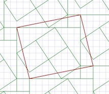
First I design a pattern by drawing lines between grid points. This one took only eight lines, using a slightly rotated rectangle as the basis. I am careful to leave a few unusual shapes for open areas. This is so I can show you how the beveling works later.
I base it on a staggered block pattern, but I also place some rotated rectangles inside the largest rectangle.
I suppose I could have been a little more fancy in my design, but I wanted to show a few of the characteristics that you can control to render your tile patterns. The first, which you are familiar with, is the automatic recognition of closed polygonal areas.
Here I show the polygon areas.
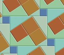
There is a tool to put color into each of the polygons directly. I have chosen an "earth and aqua" color scheme: surf and turf.
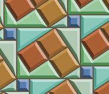
Next I bevel the edges of the polygons. This is actually complicated. It involves a gabling operation as we will see in a moment.
A bevel is shaded using an interesting model which predicts its color in HSV space based on the base color of the polygon and shading from the angle of the edge it is derived from. You can adjust the overall light angle in the interface.
The cool thing about polygonal display is that you only need to create the polygons once. Then you just need to evaluate all the copies on screen within the view. It's a bit messy to do that!
The bevel width is controllable, allowing you to magically adjust the look of the tiles directly with a slider. For me, it's a bit disorienting to change the bevel width, because I am not used to seeing this occur in real time in the real world.
I have made the computation of the bevel geometries bulletproof, a thing I was not able to accomplish at Fractal Design (and Metacreations) when I was trying to create the first version of this tool.
It appears that I've learned a few things since then! With previous posts, I have created the bevels by hand, by designing polygons on the grid. Now The bevels can be created automatically from the source polygons using a non-destructive procedural process. In other words, they can also be turned off if you like.
There is also a grout control. This means you can change the grout width in real time with a slider as well. This can make tiles that look a bit more real, since real tiles do have grout in between them.
The grout operation uses the beveling engine, so even if a tile disappears because the grout is so large, it knows not to output it.
And yes, it is disorienting to change the grout width in real time as well! When you move the slider fast, it's just crazy!
And, of course, you can turn the grout off if you like.
The beveling is completely general. If you crank up the beveling width until it is large enough, the center parts of the tiles disappear. This is why I call this a gabling operation.
The actual polygons output are really equivalent to the computations required by architects when they are producing gables for a roof of an oddly-shaped house.
I'm glad it works, because sometimes the polygon shapes are non-intuitive! It seems to be bulletproof now, and works in the general case. Like I said, I use this same engine for the grout computation as well.
One more problem presented itself when I was building this tool: the matte edge problem. When rendering polygons that abut each other, you get a tiny matte edge. I have made the background black to make this more obvious.
This problem occurs because I am using a standard polygon renderer (CoreGraphics bezierPath) and each polygon is output with anti-aliasing. This means that the edges will have a one-pixel-thick one-quarter-intensity dropout between them.
I remedy this by enlarging each polygon by 0.24 pixels before I render it. This can't really be done properly by stroking the edge (as in Postscript). It must be done by widening the polygon. So I built a widening engine into my tile engine.
All of the other diagrams show the result of this widening setting.
I think next I will do some work in refraction. With just a bit of work, it could look just like stained glass. This would require me to make the results actually 3D. Actually, that's not too hard, given the gabling model I use to compute the bevels.
Perhaps one tile could shade its neighbor. Or a global illumination model could give the rendering a bit more life.
Now, what does real marble look like?
Now I will show you some of its features, all based on complex analytic geometry, which you can learn about in How Does It Work, Part 2.
First I design a pattern by drawing lines between grid points. This one took only eight lines, using a slightly rotated rectangle as the basis. I am careful to leave a few unusual shapes for open areas. This is so I can show you how the beveling works later.
I base it on a staggered block pattern, but I also place some rotated rectangles inside the largest rectangle.
I suppose I could have been a little more fancy in my design, but I wanted to show a few of the characteristics that you can control to render your tile patterns. The first, which you are familiar with, is the automatic recognition of closed polygonal areas.
Here I show the polygon areas.
The pattern is really made up of line segments that are automatically divided up. Then they are arranged into a graph, with nodes at the places where the segment ends meet. Then I mark each segment so both sides of it get visited. And start tracing counterclockwise to collect closed polygon areas. The complex part is how to handle holes and stand-alone polygons, but we'll talk about that some other time.
By the way, the graph is special because it wraps around just like the pattern does.
There is a tool to put color into each of the polygons directly. I have chosen an "earth and aqua" color scheme: surf and turf.
Next I bevel the edges of the polygons. This is actually complicated. It involves a gabling operation as we will see in a moment.
A bevel is shaded using an interesting model which predicts its color in HSV space based on the base color of the polygon and shading from the angle of the edge it is derived from. You can adjust the overall light angle in the interface.
The cool thing about polygonal display is that you only need to create the polygons once. Then you just need to evaluate all the copies on screen within the view. It's a bit messy to do that!
The bevel width is controllable, allowing you to magically adjust the look of the tiles directly with a slider. For me, it's a bit disorienting to change the bevel width, because I am not used to seeing this occur in real time in the real world.
I have made the computation of the bevel geometries bulletproof, a thing I was not able to accomplish at Fractal Design (and Metacreations) when I was trying to create the first version of this tool.
It appears that I've learned a few things since then! With previous posts, I have created the bevels by hand, by designing polygons on the grid. Now The bevels can be created automatically from the source polygons using a non-destructive procedural process. In other words, they can also be turned off if you like.
There is also a grout control. This means you can change the grout width in real time with a slider as well. This can make tiles that look a bit more real, since real tiles do have grout in between them.
The grout operation uses the beveling engine, so even if a tile disappears because the grout is so large, it knows not to output it.
And yes, it is disorienting to change the grout width in real time as well! When you move the slider fast, it's just crazy!
And, of course, you can turn the grout off if you like.
The beveling is completely general. If you crank up the beveling width until it is large enough, the center parts of the tiles disappear. This is why I call this a gabling operation.
The actual polygons output are really equivalent to the computations required by architects when they are producing gables for a roof of an oddly-shaped house.
I'm glad it works, because sometimes the polygon shapes are non-intuitive! It seems to be bulletproof now, and works in the general case. Like I said, I use this same engine for the grout computation as well.
One more problem presented itself when I was building this tool: the matte edge problem. When rendering polygons that abut each other, you get a tiny matte edge. I have made the background black to make this more obvious.
This problem occurs because I am using a standard polygon renderer (CoreGraphics bezierPath) and each polygon is output with anti-aliasing. This means that the edges will have a one-pixel-thick one-quarter-intensity dropout between them.
I remedy this by enlarging each polygon by 0.24 pixels before I render it. This can't really be done properly by stroking the edge (as in Postscript). It must be done by widening the polygon. So I built a widening engine into my tile engine.
All of the other diagrams show the result of this widening setting.
I think next I will do some work in refraction. With just a bit of work, it could look just like stained glass. This would require me to make the results actually 3D. Actually, that's not too hard, given the gabling model I use to compute the bevels.
Perhaps one tile could shade its neighbor. Or a global illumination model could give the rendering a bit more life.
Now, what does real marble look like?
Labels:
beveling,
design,
geometry,
graph theory,
grout,
patterns,
San Marco Basilica,
shading,
tiles
Sunday, November 25, 2012
The Nail That Sticks Out
There is a rule in conformist societies (and companies) that implicitly limits their evolution: the nail that sticks out gets hammered down. This rule almost single-handedly leads to stagnation.
Why Hammer It Down?
When a civilization is structured, the nature of specialization helps to build an intricate machine of the society, where individuals must do their specific part to keep society going.
And when various winnowing forces such as feudal warfare, disease, or sequestering on an island keep a society's population constant, or force it to grapple with a shrinking base, the structure of society must be tested and tempered. The machine that society has become must operate in lockstep to survive. The pressure on an individual to carry on his parents' trade and role models becomes very strong indeed. An individual with new thoughts, swerving from traditional roles and creating disruption, cannot be tolerated. And such rules are born.
Culture thus evolves to accommodate and sustain this pressure on the individual.
However, this doesn't happen quite as easily when a civilization's population is sufficiently large during its structure-formation stages. When services can be performed by a small fraction of the population base, there is actually pressure to move away or to do something different. Progress is rewarded, not squelched.
For the same reasons, competition also leads to progress.
On an island there is practically nowhere to go, since the barrier to moving away is essentially life in exile. But consider for a minute the case study of San Francisco, where the population has held nearly constant since the 1950s. There it is possible to move away but sweeping changes are still difficult to accomplish. Yet culture continues to evolve. Mass transit was developed. Even urban renovation continues.
Cultural forces can also promote or prevent stagnation. San Francisco's culture has changed over the last few decades significantly, and this has prevented stagnation. Pockets of culture remain and provide alternatives to what could have been a regimented, conformist society. Particularly after the 1906 earthquake and two world wars acted as winnowing forces.
Culture and Its Influence
Culture can also be a force that leads to societal stagnation because culture provides us with laws, through morality, and peer pressure, and thus imposes its will on individual behavior. When culture is too regimented and strict, this can lead to suppression of new ideas. In the middle ages, Copernicus' views of a solar-centric astronomical neighborhood were suppressed in favor of an established view. Even Galileo, whose views were provable in ten minutes with common everyday objects, had his views suppressed.
Culture can come from religion, this is true. But it can also be influenced by war and other external forces. After a war, for instance, a local culture's survival can be threatened and so the pressure of sticking around to keep the culture alive can become paramount.
The conformist society also promotes a rigid class structure with despotic rulers. The fear of being hammered down is constantly reinforced by this.
So, what does a structured, conformist society do when it is presented with external forces that threaten to overcome it?
It evolves.
But it does so by examining the advantages of its external threat and duplicating them. In this process the society applies its machine-like efficiency to survival. The society is already efficiently shaped for the purpose of retooling and adapting. Feudal warfare and the constant advances of weapon-making have shaped the society to this task.
What a society must never do is to kill off its talent, and thus its greatest advantage. It is this capability that keeps it alive during times of adversity. It is the talent that keeps a society mobile and adaptable.
Disruption Then
But there are inherent adversarial forces that even the talented cannot surmount: disruptive forces.
Technology can provide disruption like no other force.
I have talked about disruptive technology before and its effects on brick-and-mortar, the dissemination of information, the replacement of old gadgets by new ones (cameras, televisions, games, and music media).
I have also talked about the disruption of fossil fuels and their eventual replacement by battery energy storage.
Disruption Now
Right now there is a disruption in mobile technologies that is challenging the old guard of desktop systems. This is a serious problem for the old guard. Either they must embrace the change or they must use disinformation to fight it. And the second option only really postpones their inevitable death. Adapt or die. Never was this more at issue than at Microsoft.
Their core talents were in the desktop Wintel paradigm, which is quickly fading. Megalithic applications like Office and Word are quickly being replaced by the lighter mobile applications, which can be sold over the air. The advantages of an adaptable, mobile enterprise are obvious.
Now Microsoft is being criticized for implementing two different interfaces in Windows 8, provoking some usability researchers to declare that users should just wait for Windows 9.
As for the advantages of the mobile enterprise, consider for a moment the Apple store and the Microsoft store.
Here's a YouTube video contrasting the traffic of the two stores on Black Friday, the massive shopping day after the American holiday, Thanksgiving.
Microsoft copied the spartan wood tables and lighter ambience of the Apple store, yet their inability to embrace mobile point-of-sale systems seems to be costing them.
At Apple stores, the salespeople help you one-on-one, and use an iPhone with an integrated credit-card reader to complete your transaction. You even sign for the credit card transaction on the iPhone. The first time I visited an Apple store, I got the sense that it was the future of the in-store buying experience.
Let's contrast that with the Microsoft store experience. A friend of mine went to a Microsoft store to buy a Surface tablet. He was directed to a single place where the sales took place (sounds a bit like a cash register doesn't it?). The point-of-sale system crashed, complicating the transaction significantly.
While Microsoft stores might start using iPhones with integrated credit card readers, it seems improbable that a Microsoft employee would actually suggest that. Perhaps there is a Windows 8 Phone alternative? Well, if so, why aren't they using it?
My point is this: Microsoft has almost 100,000 employees. They should have some fraction of those employees building apps for their Windows 8 Phone ecosystem. They can't afford to catch up by attracting developers at this point! That would take precious time. They should already have such a point-of-sale system in their bag of tricks. Don't these guys think ahead?
My suspicion is that somebody probably wanted to do just that, but he got hammered down.
New ideas and new concepts replace old ones. Many of the trends that shaped the progress on the desktop simply do not work in the mobile computing space. Even Moore's law seems outdated, as I mention in one of my more recent posts Keep Adding Cores? It's clear that computers are simply built differently as a result of this disruption. When you consider that batteries are the power source, then power management becomes central. Efficient and targeted computation becomes highly desirable, rather than general processor computing.
What Disruption Comes From
Disruption comes from people.
People with new ideas.
New ideas whose value can easily be demonstrated to a large number of people.
If everybody sees the value then they want it.
When everybody gets it, this results in significant change.
Change in how people spend their time. Change in what people buy. Change in how people think.
So disruption comes from that nail that didn't get hammered down: an individual with radical new ideas and a conviction that his or her ideas can succeed like nothing else.
Thursday, November 22, 2012
How Does It Work, Part 2
Earlier this year I wrote a post about analytic geometry. In that blog post I introduced you to the coordinate plane, points, vectors, segments, and all sorts of useful operations in 2D. The dot and codot operators, and their relation to being able to say things like "to left of" and "to right of" were discussed. Also, the relationship between polygon area and its orientation. In this post, we'll go a bit further into the 2D analytic geometry domain, discuss why it is important, and show a few results. And I will actually explain how to use dot and codot.
In 1975, Tom Schaefer introduced me to these concepts while clicking his ball-point pen nervously.
Yet his guidance was like gold to me. I had just received the keys to the kingdom of analytic geometry.
I was familiar with the dot and cross products from my schooling in 3D analytic geometry I received from an ex-Lockheed employee named Mr. Pearson who taught at De Anza near where I lived. But I was still naive about 2D analytic geometry. At Calma, programming CAD software for chip-makers, I learned that the dot and the codot were very useful in 2D as well.
The 2D dot product (explained in my earlier post) can determine whether two vectors point in the same direction.
When they do, the dot product is positive. By the way, if you divide the dot product by the product of the lengths of the two vectors, you get the cosine of the angle between the vectors. The resulting quantity is exactly one when the vectors point in the exact same direction. And it is exactly zero when the two vectors are perpendicular.
This is quite the same as dotting two normalized vectors (vectors that have been divided by their lengths so that their new length is exactly one).
If the dot product is negative, however, then the vectors point in opposite directions. In clearer terms, v2 is more than ninety degrees away (in absolute value) from v1's direction when the dot product is negative.
So we can use the sign of the dot product to determine in which half-plane the endpoint of v2 resides. We will make use of this fact later in this post.
The dot product is easy to evaluate: given two vectors you multiply the x's together to make one product, multiply the y's together to make a second product, and add the two products together to make the dot product.
The 2D cross product (codot) shows whether two vectors define a counterclockwise or a clockwise angle.
When the codot is positive, the vectors make a counterclockwise (mathematically positive) angle. And similarly to the dot product, if you divide the codot product by the product of the lengths of the two vectors, you get the sine of the angle between the vectors. The resulting quantity is exactly zero when the vectors point in the exact same direction.
This fact can be used to determine whether the endpoint of v2 is to the left or to the right of vector v1.
If the codot is negative, then v2 lies to the right of vector v1, making a clockwise angle. This means we can use the codot to determine which half-plane that the endpoint of v2 lies. Another useful thing!
Evaluating the codot is a bit more complicated, but still easy to describe. The first product is the x from the first vector multiplied by the y from the second vector. The second product is the y from the first vector multiplied by the x from the second vector. Then the codot is computed by subtracting the second product from the first product.
With these newfound capabilities, I was suddenly empowered!
For instance, I was able now to compute the distance of a point from a segment easily, using the scalar cross product (also known as the codot operator). Why would I need this?
For one, when I needed to implement pick. To pick something is to click or tap and be able to determine the nearest thing. This is useful when you need to select something to delete it, to edit it, or to move it. And in those days I was working with segments and polygons.
Point-Segment Distance
To compute the distance between a point and a segment, we must consider all the cases. With a segment from point p1 to point p2, there are three cases. Either the point p is closest to point p1, it is closest to point p2, or it in in the middle and it is closest to the segment. We can see these three cases in this diagram.
Isolines of equal distance from the segment basically look like a sausage, since they are rounded at the ends.
But how do we determine which case a new point will be?
We start by evaluating three vectors, v1, v2, and v3. We start with v1, the vector from the start of the segment (point p1) to the end of the segment (point p2).
Vectors v2 and v3 are the vectors from point p1 to our point p and point p2 to our point p respectively. These will be used to determine locations and distances, the relationship of point p with the segment.
We can immediately see which case we are by using a dot product.
Dot v1 with v2 to determine which side of point p1 the new point p lies.
Similarly, dot v1 with v3 to decide which side of point p2 the new point p must lie.
If it is within neither area A nor B, then it is in area C by the exclusion principle (which Sherlock Holmes was so fond of).
But what if the point is in area B? Then we must perform some slightly more complex computation.
Here we see vectors v1 and v2, which can also be used to determine the point segment distance. By using the codot (scalar cross product) we can determine the sine of angle theta (shown in red).
As you can see, the dot and codot products are now becoming useful!
But this little diagram can give you a clue how to accomplish the computation. And also how to compute the signed distance.
Note that the sign of the distance is positive if the point p is to the left of the line from point p1 to point p2. And it is negative if p is to the right.
Thus, the point-segment distance in the most usual sense is the absolute value of D.
Note also that D is simply the length of v2 when p is in area A (closest to p1). If p is in the area C (closest to p2), then D is simply the length of v3 instead.
Geometry is Complicated
Yes, geometry is quite complicated! Any kind of interesting operation usually becomes a miasma of cases and complexity. Just imagine how complex it is to determine if a point is inside or outside a polygon?
Well, you won't have to imagine because it is our next problem. First, a word on polygon representation.
Where, Oh Where Has Polly Gone?
So let's return to the polygon. A polygon is a ring of points connected by segments. Internally to a computer we represent it as a list of points, which is usually our first mistake. Well, at least it's the first thing that can go wrong, that lends it complexity, etc.
You see, a list has a start and an end, but a ring does not. This means we need to do one of two things: (Method 1) make the list longer by one element and thus represent the start and the end points redundantly, or (Method 2) make a simplifying implicit assumption that the last point of the list is actually followed by the first in the list (though it is not recorded redundantly).
The first method has the dubious advantage of having all the segments represented as a contiguous pair of points, but the disadvantage that the count of items in the list is one larger than the count of points in the polygon. This means you will always have to be adding or subtracting one whenever you deal with the polygon's points, and this is the root of so many errors!
The second method has the advantage that the number of points is correct, but the disadvantage that one of the segments is not contiguous (the last one). This means that, whenever you have to enumerate the segments (in particular, the last one) you will have to do something special to see both points.
I prefer the second method. Because using the first method has come back to bite me more times than I can count! In fact, whenever I try to count the times, I always seem to be off by one! Ouch.
To solve this problem we need only draw a ray east from point p. If we count the number of intersections of this ray with segments of the polygon, we can determine if point p is inside or outside. If the polygon isn't self-intersecting, then it is pretty easy to see that the number of intersections of this ray with the polygon segments will be an odd number only when point p is inside the polygon.
But how many cases are there to consider?
What happens when the ray is collinear with a horizontal segment?
If the ray is a clean intersection with the edge, it's easy to see it will count. But when the ray intersects at a vertex, then it is more complicated to decide if the intersection counts. But there is a simple trick that can help us decide how to count these unusual intersections.
Here a ray is shown intersecting a vertex in different ways. Some intersections count, like the leftmost one, which goes from the inside of the polygon to the outside. Other intersections do not count, which merely graze the polygon in some way.
The clever trick is to consider the top vertex and the bottom vertex of the edge. If the intersection occurs at the top vertex, then it counts. If it occurs at the bottom vertex, then it doesn't count. In the leftmost case, only one of the two segments would then intersect the ray, which is correct. In the middle case, both segments would intersect the ray, and since we are looking at the parity of the intersections, that would mean that they cancel each other out. In the right case, no intersection would count since both intersections are at the bottom vertex of the two segments.
When the polygon is self-intersecting, however, this method produces an answer that enforces the even-odd rule, since we are looking at the parity of the number of intersections.
And this is where polygon orientation comes in.
To implement the non-zero winding number rule, we must consider how the ray crosses a segment. If the segment crosses the ray in an upwards direction, then we add one to the winding number. If the segment crosses the ray in a downwards direction, then we subtract one from the winding number.
At the end, if the winding number is zero, then the point is outside the polygon. Otherwise if it is positive or negative (non-zero) then the point is considered to be inside the polygon. This is a good reason to orient a polygon's holes in the opposite direction as their outside boundaries.
The winding number rule works correctly with the top-counts bottom-doesn't rule, also, and so we have a solution!
Lastly, an inside-ouside tester might also want to return a value of "on edge" in some cases.
Sharp, Distance
A distance function can be used to shade a polygon and this has an application to the tiling patterns I have been working with recently. It also has a bearing on a problem in printing.
Printers often want to spread or choke a given shaded area. This is because ink isn't perfect and tends to spread a bit when it is printed on paper. So a shaded area is often choked first, which enables the natural spread that occurs in printing to produce the right-sized result.
This technique is also used in e-beam lithography, which is the first place I encountered the problem of insetting a polygon.
You can consider the inset of a polygon to be the set of points that occur at a fixed distance inside the boundaries of the polygon. So the outside boundary gets choked and holes get spread.
Things like insetting and outsetting are fairly well understood, but did you know that the way we construct gables for the roof of a house is actually completely related to the distance function and thus can help us compute any inset?
Here is a simple house's gabling as viewed from above. On a roof of a house, lines of equal elevation represent specific insets of the perimeter of the house.
So if I produce the gabling for an arbitrary polygon, I can use that information to produce any inset I want. And also any beveling I want.
You can compute the gabling of an arbitrary polygon. The boundaries between facets are actually the bisectors between successive edges of the polygon. But when the bisectors meet, then we need to bisect the edges that are farther apart.
Computing the gabling for an arbitrary polygon is complex indeed! It borders on graph theory.
But it is useful in both beveling and also for computing the grout of a tiled pattern! More on this in my next installment of the Patterns series.
In 1975, Tom Schaefer introduced me to these concepts while clicking his ball-point pen nervously.
Yet his guidance was like gold to me. I had just received the keys to the kingdom of analytic geometry.
I was familiar with the dot and cross products from my schooling in 3D analytic geometry I received from an ex-Lockheed employee named Mr. Pearson who taught at De Anza near where I lived. But I was still naive about 2D analytic geometry. At Calma, programming CAD software for chip-makers, I learned that the dot and the codot were very useful in 2D as well.
The 2D dot product (explained in my earlier post) can determine whether two vectors point in the same direction.
When they do, the dot product is positive. By the way, if you divide the dot product by the product of the lengths of the two vectors, you get the cosine of the angle between the vectors. The resulting quantity is exactly one when the vectors point in the exact same direction. And it is exactly zero when the two vectors are perpendicular.
This is quite the same as dotting two normalized vectors (vectors that have been divided by their lengths so that their new length is exactly one).
If the dot product is negative, however, then the vectors point in opposite directions. In clearer terms, v2 is more than ninety degrees away (in absolute value) from v1's direction when the dot product is negative.
So we can use the sign of the dot product to determine in which half-plane the endpoint of v2 resides. We will make use of this fact later in this post.
The dot product is easy to evaluate: given two vectors you multiply the x's together to make one product, multiply the y's together to make a second product, and add the two products together to make the dot product.
The 2D cross product (codot) shows whether two vectors define a counterclockwise or a clockwise angle.
When the codot is positive, the vectors make a counterclockwise (mathematically positive) angle. And similarly to the dot product, if you divide the codot product by the product of the lengths of the two vectors, you get the sine of the angle between the vectors. The resulting quantity is exactly zero when the vectors point in the exact same direction.
This fact can be used to determine whether the endpoint of v2 is to the left or to the right of vector v1.
If the codot is negative, then v2 lies to the right of vector v1, making a clockwise angle. This means we can use the codot to determine which half-plane that the endpoint of v2 lies. Another useful thing!
Evaluating the codot is a bit more complicated, but still easy to describe. The first product is the x from the first vector multiplied by the y from the second vector. The second product is the y from the first vector multiplied by the x from the second vector. Then the codot is computed by subtracting the second product from the first product.
With these newfound capabilities, I was suddenly empowered!
For instance, I was able now to compute the distance of a point from a segment easily, using the scalar cross product (also known as the codot operator). Why would I need this?
For one, when I needed to implement pick. To pick something is to click or tap and be able to determine the nearest thing. This is useful when you need to select something to delete it, to edit it, or to move it. And in those days I was working with segments and polygons.
Point-Segment Distance
To compute the distance between a point and a segment, we must consider all the cases. With a segment from point p1 to point p2, there are three cases. Either the point p is closest to point p1, it is closest to point p2, or it in in the middle and it is closest to the segment. We can see these three cases in this diagram.
Isolines of equal distance from the segment basically look like a sausage, since they are rounded at the ends.
But how do we determine which case a new point will be?
We start by evaluating three vectors, v1, v2, and v3. We start with v1, the vector from the start of the segment (point p1) to the end of the segment (point p2).
Vectors v2 and v3 are the vectors from point p1 to our point p and point p2 to our point p respectively. These will be used to determine locations and distances, the relationship of point p with the segment.
We can immediately see which case we are by using a dot product.
Dot v1 with v2 to determine which side of point p1 the new point p lies.
Similarly, dot v1 with v3 to decide which side of point p2 the new point p must lie.
If it is within neither area A nor B, then it is in area C by the exclusion principle (which Sherlock Holmes was so fond of).
But what if the point is in area B? Then we must perform some slightly more complex computation.
Here we see vectors v1 and v2, which can also be used to determine the point segment distance. By using the codot (scalar cross product) we can determine the sine of angle theta (shown in red).
As you can see, the dot and codot products are now becoming useful!
But this little diagram can give you a clue how to accomplish the computation. And also how to compute the signed distance.
Note that the sign of the distance is positive if the point p is to the left of the line from point p1 to point p2. And it is negative if p is to the right.
Thus, the point-segment distance in the most usual sense is the absolute value of D.
Note also that D is simply the length of v2 when p is in area A (closest to p1). If p is in the area C (closest to p2), then D is simply the length of v3 instead.
Geometry is Complicated
Yes, geometry is quite complicated! Any kind of interesting operation usually becomes a miasma of cases and complexity. Just imagine how complex it is to determine if a point is inside or outside a polygon?
Well, you won't have to imagine because it is our next problem. First, a word on polygon representation.
Where, Oh Where Has Polly Gone?
So let's return to the polygon. A polygon is a ring of points connected by segments. Internally to a computer we represent it as a list of points, which is usually our first mistake. Well, at least it's the first thing that can go wrong, that lends it complexity, etc.
You see, a list has a start and an end, but a ring does not. This means we need to do one of two things: (Method 1) make the list longer by one element and thus represent the start and the end points redundantly, or (Method 2) make a simplifying implicit assumption that the last point of the list is actually followed by the first in the list (though it is not recorded redundantly).
The first method has the dubious advantage of having all the segments represented as a contiguous pair of points, but the disadvantage that the count of items in the list is one larger than the count of points in the polygon. This means you will always have to be adding or subtracting one whenever you deal with the polygon's points, and this is the root of so many errors!
The second method has the advantage that the number of points is correct, but the disadvantage that one of the segments is not contiguous (the last one). This means that, whenever you have to enumerate the segments (in particular, the last one) you will have to do something special to see both points.
I prefer the second method. Because using the first method has come back to bite me more times than I can count! In fact, whenever I try to count the times, I always seem to be off by one! Ouch.
AC/DC Polygons?
The orientation of a polygon, which connotes whether it is clockwise or counterclockwise, can be determined by taking the sign of its area computed using the trapezoidal rule.
Some operations do not require the orientation to be known, like the test for whether a point is inside or outside the polygon. But if we need to make a local test for a point being inside or outside a particular edge of a polygon, orientation must be known. For instance, on a counterclockwise polygon, a right edge of the polygon goes in the upwards direction and the left edge goes in the downwards direction.
Some conditions confuse orientation, like self-intersecting polygons.
When you examine an ordinary (non-self-intersecting) polygon, that is oriented counterclockwise, you will find the right edges go from south to north and the left edges go from north to south. On a self-intesecting polygon this might not be the case.
Rules exist for deciding whether a point is inside or outside any polygon, including self-intersecting polygons. This includes the even-odd rule and the non-zero winding number rule. We will show how to implement these in the next section.
Holes are another quality that complicates polygons. Clearly you can't just treat a hole exactly like any other outside boundary polygon. But there are rules that can simplify our approach to holes.
When a polygon has holes, the convention is to orient the holes in the opposite way from the outer border of the polygon. So, a counterclockwise polygon has clockwise holes by convention.
And then there is the issue of islands. You can have a counterclockwise island inside the hole. And so forth and so on. So holes can have holes, but they are really outlines.
I told you that geometry was complicated!
Knowledge of orientation makes possible some of the more complex operations on a polygon, like fracturing into convex pieces.
But before we can do something as complicated as fracturing, we have to have an intuitive notion of what is locally concave and what is locally convex. Fortunately the codot comes to the rescue.
In this diagram you see the right edges of two counterclockwise polygons. The one on the left is locally convex at point p2. The one on the right is locally concave at point p2.
I form vector v1 by subtracting p2 from p1 and vector v2 by subtracting p3 from p2. We can just use the "to left of" and "to right of" measures to decide whether the polygon is convex or concave at point p2.
You see, v1 codot v2 will be positive if the polygon is convex at point p2 and negative if the polygon is concave at point p2. This is another reason that the dot and codot operators are so useful.
Inside and Outside
Now we can look at the problem of deciding whether point p is inside or outside of a polygon.
To solve this we really have to ask ourselves whether polygon orientation is important to this crucial test. It's not as easy as all that to answer this question.
To solve this problem we need only draw a ray east from point p. If we count the number of intersections of this ray with segments of the polygon, we can determine if point p is inside or outside. If the polygon isn't self-intersecting, then it is pretty easy to see that the number of intersections of this ray with the polygon segments will be an odd number only when point p is inside the polygon.
But how many cases are there to consider?
What happens when the ray is collinear with a horizontal segment?
If the ray is a clean intersection with the edge, it's easy to see it will count. But when the ray intersects at a vertex, then it is more complicated to decide if the intersection counts. But there is a simple trick that can help us decide how to count these unusual intersections.
Here a ray is shown intersecting a vertex in different ways. Some intersections count, like the leftmost one, which goes from the inside of the polygon to the outside. Other intersections do not count, which merely graze the polygon in some way.
The clever trick is to consider the top vertex and the bottom vertex of the edge. If the intersection occurs at the top vertex, then it counts. If it occurs at the bottom vertex, then it doesn't count. In the leftmost case, only one of the two segments would then intersect the ray, which is correct. In the middle case, both segments would intersect the ray, and since we are looking at the parity of the intersections, that would mean that they cancel each other out. In the right case, no intersection would count since both intersections are at the bottom vertex of the two segments.
When the polygon is self-intersecting, however, this method produces an answer that enforces the even-odd rule, since we are looking at the parity of the number of intersections.
And this is where polygon orientation comes in.
To implement the non-zero winding number rule, we must consider how the ray crosses a segment. If the segment crosses the ray in an upwards direction, then we add one to the winding number. If the segment crosses the ray in a downwards direction, then we subtract one from the winding number.
At the end, if the winding number is zero, then the point is outside the polygon. Otherwise if it is positive or negative (non-zero) then the point is considered to be inside the polygon. This is a good reason to orient a polygon's holes in the opposite direction as their outside boundaries.
The winding number rule works correctly with the top-counts bottom-doesn't rule, also, and so we have a solution!
Lastly, an inside-ouside tester might also want to return a value of "on edge" in some cases.
Sharp, Distance
A distance function can be used to shade a polygon and this has an application to the tiling patterns I have been working with recently. It also has a bearing on a problem in printing.
Printers often want to spread or choke a given shaded area. This is because ink isn't perfect and tends to spread a bit when it is printed on paper. So a shaded area is often choked first, which enables the natural spread that occurs in printing to produce the right-sized result.
This technique is also used in e-beam lithography, which is the first place I encountered the problem of insetting a polygon.
You can consider the inset of a polygon to be the set of points that occur at a fixed distance inside the boundaries of the polygon. So the outside boundary gets choked and holes get spread.
Things like insetting and outsetting are fairly well understood, but did you know that the way we construct gables for the roof of a house is actually completely related to the distance function and thus can help us compute any inset?
Here is a simple house's gabling as viewed from above. On a roof of a house, lines of equal elevation represent specific insets of the perimeter of the house.
So if I produce the gabling for an arbitrary polygon, I can use that information to produce any inset I want. And also any beveling I want.
You can compute the gabling of an arbitrary polygon. The boundaries between facets are actually the bisectors between successive edges of the polygon. But when the bisectors meet, then we need to bisect the edges that are farther apart.
Computing the gabling for an arbitrary polygon is complex indeed! It borders on graph theory.
But it is useful in both beveling and also for computing the grout of a tiled pattern! More on this in my next installment of the Patterns series.
Labels:
analytic geometry,
Calma,
codot,
coordinate plane,
dot product,
point,
point line distance,
point segment distance,
polygon area,
polygon orientation,
scalar cross product,
segment,
Tom Schaefer,
vector
Thursday, November 15, 2012
Patterns, Part 6
Tiling patterns are the subject of an application I have written specifically for exploring the San Marco Basilica tiling patterns I recorded in my notebooks in May, 1997.
The original tilings were simply sketched. This is not because I was without a camera. I certainly had a very good one with me. No, I sketched the tilings by hand because the church authorities would not allow photographs in the Basilica!
What mathematicians and others have done is to buy the post cards (I think I have a few of them as well), scan them, and post their pictures online. Usually as a challenge for students to determine which repeating group is represented in the tiling.
You can find all about the regular pattern repeating groups in the Handbook of Regular Patterns. My copy of this book is well dog-eared.
The pattern of five-square C-tiles from an earlier post of mine, Different Perspectives, is seen here. This was an early test case for my new application, which I call Tile Patterns.
This C-tile is one of the twelve pentominoes. All of the pentominoes can tile the plane in one way or another, though some of the tiling bases are a bit larger than this one.
For information on the grid, basis, and segments used to define the tiles, consult my last post, Patterns, Part 5.
My test cases for this application make pretty designs. And some are rather busy in an op-art fashion.
Here is one, which has tiles that seem to simulate cut jewels, which must certainly qualify as a 1990's video game background!
This one broke my program a few times before I got it to work. Mostly because some of the polygons actually have holes in them!
Since the last post, I have implemented a few new things. Before, the application had the ability to set a grid, adjust and specify a basis parallelogram, and draw segments. As you draw, segments appear in all repeats of the basis area.
I have added the ability to divide up the segments when they touch or cross. Then I extracted a set of nodes (all on grid points) that bound each segment. Then I added the code to identify all closed polygon areas. As I mentioned, this includes some holes as well, particularly in the jewel tiling. Finally, the ability to specify the color for each closed polygonal area has been added. This allowed me to create all the tiling patterns you see here.
When I work this way, I only have to specify each polygon's color once, and all repeats of that polygon get colored. So I don't have to (laboriously) do the coloring in Painter. I get a cleaner result also. With this tiling, you can just see the parallelogram basis in red. Oops, I left it in!
The ability to save and restore patterns was the first feature I made. Then, when I built the extraction of polygons, I had to write save and restore of the polygons and their colors. This was an exercise in versioning, since I had saved several patterns already, but only the segments were stored.
Really what is needed (beyond what I have written so far) is the ability to maintain a palette of colors that is easy to pick from. And an easy way to deposit color into the polygons, with just a click.
The traditional way of doing this, along with adding segments, is a toolbox. Which is kind of passé, when you look at modern multitouch UI.
Without that feature, I would have to clear and start over. Very troublesome!
So a segment selection and adjustment capability was necessary to implement. The requirement was either moving the entire segment or moving one of its ends. I just snapped the mouse point to the grid and looked for a segment end at that point.
For picking in the middle of a segment, I used a pick tolerance (really just a few pixels) to decide if I was close enough to the center of the line to pick it. Still, I had to implement point-to-segment distance, which is the only hard geometric computation.
Having implemented Shapes as part of Painter (and part of ColorStudio), I am very familiar with grid snapping and geometry editing. Actually very little coding was required.
I also used the San Marco Basilica tiling patterns as test cases. The first few patterns are really not as three-dimensional as some of the patterns. I think these were some of the first patterns laid down on the Basilica floor.
This pattern shows a black field with interspersed gray and light brown rectangles. Or you could view it as a checkerboard with turned gray squares inside the black ones.
The challenge for the tilers was to create diamonds that are just rotated squares. The larger light brown diamonds have an edge length that is sqrt(2) times larger than the smaller gray squares. That must have been fun.
The next pattern shows a lattice design.
This design has a brown field with small black squares inside it. Each black square has a gray diamond inside it.
Clearly, the later the tile work was designed, the more complicated it becomes. Notice here that the brown field is actually made of hexagons that interlock. It's hard to show that here, though.
In the real Basilica, the tiles are all made of marble. So there is a strong texture to all of them, and also quite a bit of color variation.
That may be the next thing for me to implement, to simulate the marble texture. Of course I have some ideas on how to do that. Also, simulating the grout will be of importance. That turns out to be pretty easy, since I already have a way to render that (as I showed in the previous post).
With this one, the patterns are getting a bit more three-dimensional.
There's just the suggestion of a square box with a white bottom. This is inside a kind of square corner.
Of course, all the tile work is two-dimensional since it is just a floor.
The tilers took on the challenge of making their work more and more three-dimensional with time. By the time we get to the renaissance, most of the designs were faux three-dimensional designs, as we will see with later examples. Perhaps this one is more like a coat of arms.
The next one shows a feature that is quite common on the Basilica floor: the checkerboard.
Checkerboard occur most commonly in frieze work (borders) and often go around curves on the Basilica floor.
This shows the artisan's skill more than ever.
This pattern is found on the floor, along with some that only feature four checkers on a side.
I figure the high contrast of the checkerboard was a visual stimulant. But in reality, the tilers were influenced by what they could get from the quarries. In the year this was made, there was probably a surplus of white and black marble.
No patterns on the Basilica floor are more striking, or more difficult to create, than the ones that feature circles.
Here I have approximated the circular arcs with polygons, but you get the picture.
The really cool thing about this one is the way the circles intersect each other so perfectly.
Oh, and by the way, you see the pattern is incomplete at the top. Its another bug I'm chasing! You will see this on three or four of the tile images in this post.
Nonetheless, this image shows the magic of tile patterns.
This shows another kind of tile pattern. I think the design has the downwards diagonals in a kind of three-dimensional design to indicate some kind of depth.
And traditionally, the black field allows you to see the other elements as objects on that field.
In this case, the black is less used for shading than for simple depth.
This is another example of a half-drop pattern, as it would be called in Painter. Half-drop patterns are typically used for wallpaper. But wallpaper is really not very long-lasting. Not compared with a marble tile floor, which has been known to last thousands of years.
This pattern was featured in my last post. Here the colors are a little closer to the actual pattern taken from the Basilica floor.
With this one, the illusion of depth and three-dimensional structure is excellent.
The black diamond tile is used to show the inside of a box. The top of the box is shown in two colors, giving it a kind of silvery sheen. The side of the box is in natural wood colors. In all, it is an exquisite pattern.
This one was probably sixteenth century.
This next pattern shows clearly the three-dimensional structure.
The rendering of this pattern also shows clearly the grid at the top, the guide lines, and then the tile colors below.
Actually this is a bug, but I find it to be instructional.
With this pattern, the gray diamonds are the bottom of diamond-shaped pits. The white rectangles are the tops of the lattice. And something new: black diamonds form the intersections of the lattice.
It is visually interesting and also something quite new. Each tiling shows the style of its creator. It shows that the Basilica floor was designed by many artisans over the centuries, and that they were influenced by each other.
This tile pattern is an exquisitely detailed one. It is entirely three-dimensional. One thing about these tilings is that they have the concept of an assumed light source.
This imposes a rule that allows the designer to consistently shade the shapes. Of course this means that several different colors of tile are needed. In varying quantities also!
Various pyramidal shapes inhabit this one and so you see it is a different kind of surface depiction than we have seen so far.
Like the black diamonds of the previous tiling, this one features smaller pyramids (or indentations?) at each intersection. So most likely this one was created after the previous one.
Minecrafters will probably recognize this pattern: the corner cube pattern.
It was certainly not invented in Minecraft, which certainly appeared a few centuries earlier on tile floors in Italy.
It shows most clearly that consistent shading is required to get the best illusion of three-dimensional shape.
This is one of my favorite patterns due to its simplicity and its optically convincing form.
So this pattern is one of the more mature three-dimensional forms, rivaled closely by the next pattern.
This pattern is like the previous, but entirely in pyramids.
Ever seen the pyramids at Giza in a satellite reconnaissance photo? What I want to see here are the shadows of each pyramid being cast on their neighbors.
Well, perhaps that was beyond the thirteenth-century tile masters.
One thing needs mentioning. The tile patterns are quite similar to modern quilt patterns. I have even seen some of the San Marco tile patterns worked carefully into quilts (even with the marbled textures in the cloth). I can imagine them in latch-hook rugs as well.
I think this tile pattern shows that the tile masters were both aware and interested in shadows. The black triangle could be one facet of the three-dimensional geometry. But I think it's a shadow.
I see it as a shadow being cast into the trough that has been carved into the floor only in dark squares of the checkerboard pattern.
Walking on a floor with this kind of tiling, or in fact any three-dimensional depiction in a tile floor, would be a trip!
Literally. I would be worried about getting my foot caught in the apparent holes!
I found many depictions of this pattern on the floors in the old churches of Byzantium. This one differs from the earlier one both in color (four colors are used, subtly) and also in the angles of the squares.
Thus also in the width of the diamonds. They liked to use sixty-degree angles, so the diamonds would be "double triangles".
This one is shown at about fifty degrees. Mostly because I used a relatively small grid to construct it. It almost reminds me of the harlequin pattern, which is really only a diamond grid in a two-tone checkerboard. When you shade it in this way, it becomes three-dimensional, and can fool you into thinking it is a real surface.
This ornament is found on the floor at the San Marco Basilica. It is quite complex!
It reminds me of the American Indian rug patterns found at the Ahwahnee hotel in Yosemite.
But the Venetian tile floor will be still there long after the American Indian tapestries have turned to dust.
Unless, of course, global warming takes its toll and submerges the Piazza San Marco in the Adriatic.
In the meanwhile, let's keep the art and science of tiling patterns alive!
Patterns are a part of our lives. Our clothes, our wallpaper, our tapestries and hangings, our rugs, and many touchstones in our very existence show the influence of art and mathematics. The art of making patterns promotes spatial reasoning and creativity.
These are some of the reasons that I have featured textures and patterns in my blog. Also, of course, they dazzle our eyes and provide for wonderful illusions: the illusion of depth, the illusion of interlock, the illusion of spatial connectedness and completeness.
When a tiling pattern has a flaw, we automatically see it.
Patterns are literally built right into our consciousness.
Subscribe to:
Posts (Atom)