 The first session where we worked on the Painter 3 design and theme was on May 27, 1994. You can see my initials and John Derry's initials at the upper right.
Some of the suggested taglines are a little off - like nothing is sacred anymore. We were thinking of having historical items defaced by paint. I drew a pyramid dripped with paint. Somewhat irreverent! But I can't quite figure what we meant by we won't back down.
In the end, we used pour it on. We wanted the ad copy to take on a historical perspective, matching the pyramid. But it looks like antediluvian didn't make it. And I misspelled it too!
 When it came to the ad format, we clearly envisioned a can pouring out paint. It seems like an obvious notion given the tagline we chose.
We had the ideas for a full-page ad and a sidebar ad. You see both of these to left. Sidebar ads were less expensive and thus we could place more of them, particularly in the monthlies like MacUser and MacWorld.
These do quite clearly match the ads we came up with. We also had an idea of coming up with a sidebar that extended into the page. We were keen on this kind of design that tricked you into thinking the format was smaller.
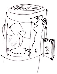
 You see the idea to left. The sidebar cleverly clips the pouring paint, but the can bleeds out into the area beyond it, becoming an over-under illusion.
For the can itself (to the right), the first thing you might notice is that we were originally going to call it Painter 3.0. Thankfully, we dropped the ".0" before we shipped it.
We had the idea of adding a little informational booklet to the can, hanging from the handle. Fill it with cool art and a what's new section.
I think operations decided against it because it raised the cost of goods sold. Oh, well.
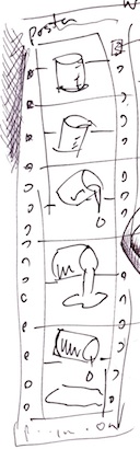 We had the idea of creating the Painter 3 poster as a filmstrip. This actually matches the look of the Painter 3 poster, even to the point of having the sprocket holes on the side. Well, they were just pictures of holes, of course.
Also shown is the keyframe animation idea, that the positions of the cans from image to image (or frame to frame) were designed to show the can pouring out paint.
Each image was to be done by a different artist. Although I did do a poster image for Painter 1, 2, 4, 5, and 6, I didn't do a poster image for Painter 3. I was too busy reshuffling the interface.
And making the image hose work.
 We continued to think about the brochure. Our first idea was to make it can-shaped. When opened up, it would show a brush (just so there won't be confusion about what Painter actually does) and have some other cool graphics and informational text. But Steve Manousos, our operations and marketing guy mentioned that the brochure had better have a tear-off mail-in section that conformed to postal standards.
 So, here is the basic design for that, with a tear-off section that can be filled out and mailed in. A call to action must be included, of course.
John Derry and I sometimes wished we could do all the artwork for these pieces, but we knew that we couldn't. So we found artists and managed them. Or rather, Mary Mathis-Meltzer (then, we nicknamed her M3, but now she is just known as Mary Zimmer), our intrepid production person, managed them. For at least Painter 3, 4, and 5!
 To create the manual was a huge task, and involved managing writers, editors, artists, and designers. Also, it meant securing printers and doing make-ready checks. A Painter manual was always color, always, lushly designed, and always perfect.
But John and I weren't done. While design and production worked on brochures, ads, the can, the poster, and the manual, we worked on the UI. For Painter 3, we had the can done in a golden color. It turned out to be essentially free to do this, since a typical paint can had this treatment on the inside. We just had them turn over the metal and put the golden treatment on the outside. And we stamped Painter in brush script on the lid as well.
 John Derry and I met again on June 2, 1994 to design the UI. There were several palettes that we wanted to coalesce into a small set of palettes with easy icons to access their features. We figured that almost all Painter users were visual people: not a bad assumption.
So this is where we decided to put papers, patterns, nozzles, weavings, and gradients together and call them materials. Not sure what happened to the inspector.
 First we had to decide what a palette would look like. We initial thought that five icons would look about right, and wouldn't be too daunting to the user. I think this decision kin of forced a lot of stuff into 5's to begin with.
When an icon was chosen, the rest of the palette would configure into that particular palette.
Our idea was that the 5 most used items would be on the palette and a drawer would open up that would give you access to other ones. The new ones you chose would go into the least used spot.

In retrospect, it was kind of clunky. Painter 4 saw the drawer mechanism and the icons get smaller and more streamlined. The entire thing was based on our experiences designing an interface for Dabbler, the low-end product in the Painter line.
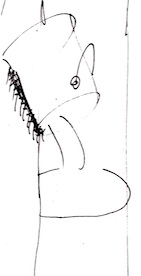
 A major concern for our design was: what would the Brush Controls look like? Painter's brushes were the most complex and involved part of the product. We really wanted to make it easier to access.
Initially we had icons with some kind of scroll bar so you could get to all the different controls.
This led to an unprecedented situation, where each and every kind of control had to have an icon associated with it.
This became icon hell. A place where you have to create and make sense of all kinds of icons. We chose a kind of black-and-white visual language for the brush controls. On June 6, 1994, we got back together and started to hash out the icons.
 Most of the sections became pretty easy to depict, though.
For instance, the bristle controls became a set of dots arranged like the contact mark of a brush. The spacing controls showed different spacings in three lines. The random controls became a pair of dice.
OMG! Complex visual language! You could see that we couldn't come up with an icon for the method controls.
Still, most of these sections are still around. But now, Painter uses words instead of icons. That started with Painter 6, of course.
 The objects palette was a new concept. We wanted selections, floating selections, the portfolio, and the selections portfolio to be in a single palette. I don't think the visual language broke down with these. I think it worked pretty well, actually.
In the end, Painter 3 was a radical redesign. But it was only a stepping stone to the final design.
In Painter 4, we actually used a similar design for the interface, but we tightened up the icons, simplified the drawers, and made the palette accessories smaller in size, to conserve screen space. Remember that screens were smaller then and screen real estate was at a premium.
 I will leave you with a drawing I did on the first day of the design collaboration with John Derry. It's my drawing style. This one had a can of paint pouring onto a cubical earth. Its kind of a disturbing concept, actually. Especially since the cubical earth is on top of what looks like a Mac IIci. But instead of an Apple icon, there is a bomb icon. Truly I was a disturbed fellow in those days.
The design on the left shows an artist before Painter: all angles and robotic in nature. After Painter, the artist looks more like a shabby Van Gogh. With a big beard.
On the right another kind of headline type for the pour it on tagline is shown. But I think it was kind of tired.
This is fascinating Mark. I remember walking by MetaCreations when you were located in ScottsValley and always wondered what they did, I soon found out and never looked back. Great blog and thank you for the memories.
ReplyDeleteHi Karen,
DeleteI have checked out your various sites and I am impressed! You might want to stay tuned because at some point I will be posting on how paper textures can be created. In Painter, I was responsible for creating the paper textures, and I always felt that there was plenty more to do.
Perhaps the most interesting way I created seamless paper textures was to take an existing texture and pass it back through the Fourier domain, while randomizing its phase. This assured a texture with all the appropriate bumps of the specified sizes, but with a completely random look and a perfect wrap-around.
Another technique that I used was to create a tiled partitioning of the plane using Voronoi maps. Then each partition was filled with its own texture, using a crossfade with its neighbors.
These techniques could be mixed with what I called speckles - mutually avoiding points in the plane, set up to tile. When using a speckle, a beautiful stippling texture could be created. This was usually used to drive the Voronoi partitioning, or just to place elements, like dots or rings.
I actually created an entire secret application, called "texture" that could create all these, and almost all of Painter's textures were made with this program.
I have been preparing to post this for some time, and it will be a big one. So it may take some time to complete, especially since resurrecting old code can be troublesome.
Still, the patterns I have been creating lately were pretty easy to crank out.
--Mark