Sunday, April 29, 2012

Interlock, Part 2

Interlocking pieces serve us well in many ways. In relationships, parts that fit together to make an integral whole keep us together. In furniture, like in relationships, parts and the way they fit are critical in the integrity of the final result. A simple dovetail joint is not as simple as I thought at first. It will come apart unless we engineer it correctly.

And it won't go together if we over-engineer it. Here is an example of a correctly engineered dovetail joint. One degree of freedom is prevented from slipping by making the pegs into wedges that cannot slip out from left to right.

This dovetail joint is engineered correctly. I can imagine knocking it together with a rubber mallet.

Interlocking components are common in everyday life, but sometimes interlock is too complex to actually engineer. M. C. Escher showed interlocking prison bars in Belvedere. It's one of his more interesting impossible figures.

So I did my best to draw some. When I saw them, I knew that they were impossible to actually engineer. But they could exist in real life, because there's nothing to prevent it physically, once it has been made.

It's just not clear to me how they can go together, since assembly becomes a chicken-an-egg problem. This is an example of something that has been over-engineered so much that it cannot be assembled, I think. No, in order to make this: it must be grown.

It is possible, however, to connect four cotter pins so they interlock. This was no problem for me to construct, but it isn't M. C. Escher's impossible prison bars. It shows also that slippage is possible in interlocking figures: it is not necessary that all degrees of freedom are eliminated.

It is heavily interlocking. And you can make several figures that can never really be assembled out of independent pieces. For example, a relative of the rectangular trefoil knot can be constructed from three pieces that interlock.

Like the impossible prison bars, each piece holds the next piece, which holds the next. This one can actually exist physically. And if it did exist, it can be slipped wider and smaller, a bit like a slip knot.

This is exactly the same as the cotter pins, which can be slipped apart in pairs quite easily.

Actually the image of the three interlocking pieces comes from the mutual overlapping slats that I used to construct when I was a kid. Was it my grandfather that showed me? I can't remember.

We used to make these kinds of interlocking models out of popsicle sticks and toothpicks. Since wood can bend, it made the ideal material.

I remember making models that could also remain rigid by tensegrity, a Buckminster Fuller concept. I considered it to be the work of genius.

Eventually, I constructed geodesic models using thick plastic sheets, using an X-Acto knife and a protractor to get all the angles right and the shapes the right size. Then I used gaffer's tape to put the triangles together and complete the geodesic dome. I was probably 13 when I did this.

Most of my models when I was a child were geometric inventions, a celebration of form. But I also understood function. It's just that I chose not to employ it!

I have created an interlocking monogram for Painter 4 (at the end of the post The Miracle of the Paint Can) and also for Painter 5.

I have created an interlocking monogram for my initials here. As usual, an over-under rule is used, alternating pass-over and pass-under along the line of the letter.

I have designed many chop marks over the years, but I haven't really been satisfied with any of them.

Interlock continues to fascinate me, intuitively. It is a brain teaser that incites us to come up with ways to make these objects in real life. I imagine some of the principles used are useful in industrial design.

It turns out that interlock, useful for locks and keys in the traditional sense, doesn't always imply items that touch and constrain each others movements. We have shown this in the first post on Interlock. I will now continue this theme with some interlocking items which do not touch at all.

Some interlocking items have many degrees of freedom, as these atomic rings show. There used to be a depict for an atom, used in the early days of atomic power, that showed three electrons circling a nucleus. This was naive optimism at its most simplistic and iconic. Especially when you consider the inherent dangers and value of nuclear power. I guess they figured that if you gave it an iconic face, a designer-friendly symbol, you could demystify it in a similarly friendly way.

Anyway, here I have shown three interlocking rings. These do not use the over-under rule, but they are nonetheless interlocked in an inseparable way. No two of them are actually interlocked. Remove the third and they fall apart. This is the most powerful and synergistic form of interlock.


Friday, April 27, 2012

Drawing On Your Creativity, Part 2

More than anything, creativity comes from our artwork. It is our mark-making capabilities that make us inimitably human (though, isn't it cool that some elephants can paint?).

Of late, I have taken up drawing again, partly for use in this blog, and I have been exploring some old and some new avenues of illustration. Painter, since I wrote it, has been one of my main conduits of expression when drawing. Before that, I used pencil and paper, felt pen, ball-point pen, and whatever I had at hand. I even used scratchboard (a medium acquired when building Painter, at the suggestion of John Derry).

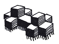
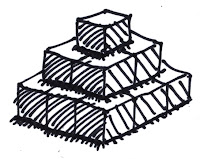
Nowadays I use an Ultra-Fine Sharpie. Usually black, on very thick paper (28#) so it won't leak through. This was the medium I used for the blocks image at the top of this blog. And also for the pyramid image.

Here I draw some blocks on top of each other. I made this image as an anti-minecraft homage, since the blocks do not really line up with each other from level to level. Here you see the original Sharpie drawing, scanned directly.

My usual method for illustration in this blog is to scan the image and read it into Painter. At that point, I clean up all the mistakes and funny ends, and lines that should meet but don't, and also the lines that overshoot. But I usually don't move the lines much. This retains the sketchiness of the original.

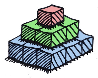
I also like to color the illustrations, using a gel layer in Painter.

You can see the effect of this kind of editing here, on a new version of this pyramid image. You can see exactly what I was drawing, for one thing. But it still retains the informal sketchy look that my illustrations need.

I employ hand-drawn and edited illustrations and I am quite sure that none of these will infringe on copyrights. After all, I drew them. I also retain all the original drawings for future reference. If necessary, I could scan them again at higher resolution and use that result for a new illustration. If I wanted a new color scheme, or some substantial edit, for instance.

My work with fabric has led me to do quite a bit of hand-drawn art lately. I even continued this with a considerably-more-challenging follow-up post. In this, I have sought to create a more realistic sketch look. For fabric, I start with a picture, clone it, and then add sketchy shading and highlights. It is an involved process, but it has been tuning up my sketching chops.

When doing work directly in Painter, using a Wacom tablet and pressure-sensitive stylus, sketchwork becomes very interesting because you can capture the essence of human expression, and yet it remains editable and adjustable.

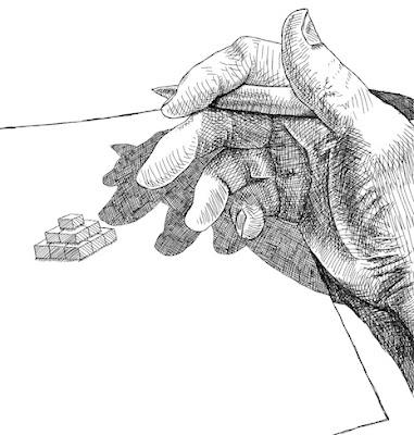
Here I show some work I did this evening using Painter and nothing else. I took a picture of my hand with an iPhone (it was quite blurry) and cloned it, but really I didn't use the clone colors. Instead, I cleared out the clone and used the tracing paper for reference to sketch the outlines. Then I looked at the original to get a better feeling for the shading and put it all in by hand.

So this is a hand-drawn hand, having drawn the pyramid.

When drawing something, it is important to think creatively, and have an intuitive feeling of what you want the drawing to look like.

Thursday, April 26, 2012

Words, Part 1

It is always interesting to play games with words. To me, that's because the rules are easily described using grammars. Generative grammars, used by linguists to analyze what is and what isn't correct, can be turned around to synthesize phrases that are made to order. Thus the pedantic rule-system we are taught to follow in grade school transforms into a creativity tool. And that's the kind of table-turning I enjoy.

This game is going to be a fun one!

Let's take this grammar, chosen to be a bit cerebral:

phrase = subject in status
subject = ideas | poetry | concepts | meaning | life | creativity | invention | theories | discovery
status = motion | progress | mind | place | you | action

This is a very small grammar indeed, but it can synthesize the following example phrases:

poetry in motion
creativity in mind
theories in mind
invention in action
ideas in progress
discovery in motion
creativity in motion
ideas in place
meaning in you
concepts in action
life in motion

Actually, ideas in motion is a phrase from GTE, now used by Cisco for WebEx, the virtual meeting site. The phrase creativity in motion is used by just about everybody, including certified art therapist Gretchen Miller, whose blog of the same name is quite inspirational.

But, of course, you can change the subject to be a bit more corporate, by substituting this rule:

subject = results | growth | structure | expansion | profit | strategy | industry | disruption

I have included a simple transition diagram for this grammar, indicating the flow. And now, the synthesized phrases have a different feel about them:

strategy in mind
profit in motion
expansion in action
results in mind
structure in mind
growth in action
industry in place
disruption in motion
strategy in action

Strategy in action is a global business consulting firm, for instance. And, you can naturally also play on strengths and values:

subject = freedom | excellence | teamwork | attitude | courage | stamina | mastery

And this produces some cool inspirational cliché phrases:

excellence in action
teamwork in place
attitude in motion
stamina in you
mastery in action
courage in mind
freedom in motion

So far, nearly all of the example phrases are worthy of one of those inspirational posters. Actually, that's where I got those subjects!

Now let's look at another grammar that has a verb. This one is more about design, and one's relationship to the universe.

phrase = verb your object
verb = create | make | build | speak | shout | find
object = dreams | style | self | senses | ideas | future

This one can synthesize several interesting things also:

create your dreams
speak your ideas
build your future
shout your dreams
find your style
make your future
create your self
shout your senses

OK I'm not sure about that last one, but these are interesting phrases that can be generated by a simple grammar. In short, you can change your grammar to suit several kinds of purposes. I would wager you could create a grammar for ransom notes also, but that's not my thing.

Tuesday, April 24, 2012

Fabric, Part 2

Fabric sure does take a long time to sketch! I can't let a single feature of it go unmodified or un-enhanced.

So I took a picture of my son with a loose striped shirt and worked on it. I wanted to highlight the folds of the fabric, the way the light catches the folds, the highlights on the ridges, and even the way the shadows mute the highlights. I wanted it to be a cool sketch. And I was willing to take the time.

I first took the picture with the iPhone and did a little contrast enhancement using Preview on a Mac. Then, in Painter, I cloned it with a Digital Airbrush set to 2.5 pixels in size and set it to use Clone Color. I specifically didn't want to use straight cloning, which just makes a photographic copy of the image. I paid attention to where the features were. When I had a fold, I brushed against the direction of the fold, so the edge took on a bit more complexity. If you go with the direction of the fold, often you will get the position of the fold wrong because of where the colors are sampled from. But sometimes, on a high-contrast fold, you have to do what you can to get it to look right.

Then I used the tiniest brush (size 1.0) with a very desaturated purple. This brush was set to Buildup:Soft Buildup in Painter. And I used a very light opacity, at 18%. Then I simply sketched into the stripes with lines at different angles. When I wanted the sketchy result to be smaller, I pressed harder. And I often went over the same area with strokes at different angles. This is one way I shade, particularly with a Sharpie.

So I went over each of the purple stripes to add clarity and a little sketchy look to it. You can see The results of this in all the examples.

I changed the color to a desaturated blue-green and went over the other stripes. By the time I was done accentuating the depth of the folds, the sketchy look was coming together quite nicely.

Then I switched the brush method to Eraser:Paint Remover at the same width and opacity to do my highlight work on top. When I created a highlight, I woke as lightly with my hand as possible so the highlights wouldn't be too brazen and abrupt.

When I add highlights, I am careful to take light and shadow into account. As the folds go from right to left across the kid's torso, the highlights become catchlights and then become much more muted in the shadow.

I was going for the feeling of a kind of not-too-shiny, yet still-a-bit-matte fabric. I think you can see the look I was going for. The original picture does not have this kind of detail. Especially after I cloned it away. But the detail was taken from the original, at least from what the original suggested. That's the way I like to do it.

This image took hours and hours of time, mostly at night, and it taught me a few more things about rendering fabric. Probably, the next time I will choose a more shiny fabric like leather (not actually woven fabric, but you know what I mean!).

The final piece really brings out the look of the fabric. And it gets my hand ready for more sketching.

Once again, Painter is up to the task.

Sunday, April 22, 2012

Fabric

It has always been an interest of mine to draw fabric. In a piece I once did, called The Miracle of the Paint Can, I took a low-resolution frame grab of fabric and used it as a guide to create long flowing robes. Actually, I quite enjoyed the long hours of work that went into this piece. But since it was intended to be a mosaic, I didn't really work too hard at creating fine detail of the fabric.

The other day I began to wonder how and why the look of fabric has drawn artists in. Vermeer, Dürer, Rembrandt, Da Vinci, and many others all clearly enjoyed depicting the lush fold and sinuous shadings of fabric.

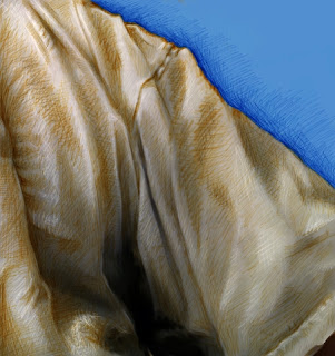
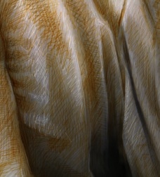
So I drew this small piece. I used my iPad to get a frame grab of a part of my shirt. One with lots of twists and turns.

The first thing I did was to move it to the new iPhoto application on iPad. Then I used the lighten and darken there to enhance the natural shading. This increased the contrast of the frame grab and also allowed me to artistically pick areas I wanted to feature or drop back. It felt like fingerprinting meets the darkroom enlarger. Really I was just dodging and burning.

Then I moved it into Painter on my Mac Pro. Using a Wacom stylus, I chose the standard digital airbrush, changed its size to a few pixels, and cloned the image. Then, with the color set to clone, I sketched the image directly using clone color.

Now, this method is really the "cheating" way of creating an image, and so, once it was cloned, I switched back to standard color, chose some blue, and masked out the background, which was irrelevant to my intended creation.

Then, I changed the size of the brush to 1.0 pixels, changed the brush method to Buildup:Soft Buildup, and lowered the opacity to about 18%. Now I was ready to really sketch. I chose a ruddy orange to give it a bit of color and sketched in the darker sections with millions of brush strokes, like I was scribbling but really I was just enhancing the actual shading of the fabric itself.

Then I changed the brush method to Eraser:Paint Remover, which actually removes density rather than just being a white brush, and, with a size of 1.0 pixels again, I sketched in the highlights. This is very much the same method used in the 15th century by artists that preferred the silverpoint method of highlighting their subjects in a sketch.

Finally I chose a darker, redder, less saturated brown and went back to the Soft Buildup method to sketch in the darker lines and also the darker shadings of the fabric. This gives the fabric a multi-tone scale that approximates the renaissance sketches I have seen.

It is a nice test of my technique and also of my vision of a fabric sketch. Although the subject is unremarkable, of course!

It also shows how I like to take a standard brush, and change the internals of it to suit my style. Really I am only using one brush and, mutatis mutandis, the brush becomes a buildup sketch pencil, a fill-in brush, a cloner, and a silverpoint brush. Knowing the internals of the Painter brushes probably helps me to keep my art honest.

I think I'll try to draw some more fabric! Now, where is that velour bedspread? Maybe a still-life?

Friday, April 20, 2012

Factoring Numbers In My Head


I do have some fun hobbies: writing songs, drawing, thinking about the future, piano improvisation, and even some marketing. But the oddest hobby I have is this: I like to factor numbers in my head. While going to work, I pass by Summit Road, where the numbers are five digits long. I pick the odd size of the street, find a number, and factor it into the canonical product of prime numbers. While driving.

So I'm going to tell you how I do it.

The prime numbers are a sequence of whole numbers that are not divisible by any number other than 1 and itself. And 1 is not a prime number (for our purposes) because otherwise a canonical factorization could contain any number of powers of 1. The prime numbers are 2, 3, 5, 7, 11, 13, 17, 19, 23, 29, 31, ....

So, the canonical factorization of 100 would be 2*2*5*5, or two squared times five squared.

When I factor a target number, I keep the factors I have extracted so far in my short term memory. The result of dividing out those factors is then called the new target number, and I only have to remember that one. The original target number doesn't matter. Only the factors matter (and the current target number). If I need the original target number, I can multiply all the factors by each other to recompute it.

So, rule number 1:

• minimize the number of things you have to remember

Small Factors

You can quickly rule out some small prime factors quickly using some tests that allow you to avoid long division. There are a number of shortcuts to factoring. They involve some simple numerical tricks that are a natural consequence of our numbering system (base 10) and the whole numbers themselves. The first rule is:

• if the last digit is even, then the number is divisible by two

This one is obvious. Of course, after you have been using the rules for years, they all are obvious. To explain, because 2 and 5 evenly divide 10, the base of our number system, it is trivial to determine if 2 and 5 are factors just by looking at the last digit of the target number, as shown here. For 5, the rule is really simple, by virtue that our number base (10) is divisible by 5:

• if the number ends in a five or a zero, then the number is divisible by five

You can look for multiple of four, eight, and so forth:

• if the last two digits are divisible by four, then the number is divisible by four

• if the last three digits are divisible by eight, then the number is divisible by eight

Here are some 3-related rules. These two rules are as old as the hills, and there are probably millions of people that know them.

• if the sum of the number's digits is divisible by three, then the number is divisible by three

• if the sum of the number's digits is divisible by nine, then the number is divisible by nine

So the number 23181 has a digit sum of 2+3+1+8+1 which is 15. If I use these rules, I can see 23181 is divisible by 3, but not by 9. But most people don't know this rule about 11:

• if the number's odd-position digits minus the number's even-position digits is divisible by eleven, then the number is divisible by eleven

For instance, the target number 81796 has an odd-position digit (green) sum of 8+7+6 =21 and an even-position digit (red) sum of 1+9=10, and their difference is 11 (which is divisible by 11), so therefore the number 81796 is evenly divisible by 11. In the diagram, you can also see this method show that 40247 is not evenly divisible by 11.

There are some clever rules for 7 and 13, but they are probably too complicated to perform in your head while driving.

The second part of extracting small factors is dividing by the small factor, once you have determined that the number is divisible. I guess I have become an expert at dividing by two, and three since I have the multiples of two and three memorized. To divide by five is easy: just multiply by two and divide by ten (shift out a zero). For the rest of the small factors, it really helps if you know your multiples of 7, 11, 13, 17, etc. inside and out.

Strategies

The standard method for factoring a target number is to divide it by all primes less than or equal to its square root. If you find a prime that divides it evenly, then you compute the quotient and factor the lesser number. If the number isn't divisible by any of the potential factors, then the target number is itself prime.

So that's the next step, if you have exhausted the small factor tests. Start trying to divide the number by successive prime numbers. But wait, what about strategy? There is one target number we are trying to factor, and lots of small prime numbers we would like to try to divide into it. So, actually we would like to rule out as many prime factors as possible. We want to quickly be able to say that a particular prime does not divide into the number.

So we word our interrogation like this: if the number is divisible by this prime then the following must be true. For instance: if I subtract a multiple of 7 from the number, then the number is divisible by 7 if and only if the remainder is divisible by 7.

Now, doing long division in your head can get a little complicated. So, even with long division there are a few tricks that I use. At this point, I have an odd number that I know isn't divisible by 2, 3, 5, or 11.

All the target numbers that are left must end in 1, 3, 7, or 9.

And any quotient I will get by dividing my number by such a prime must also end in 1, 3, 7, or 9. This is because the target number must be a product of primes or it must be a prime itself. This knowledge in and of itself is useful.

For instance, if I'm trying to divide 23181 by a prime ending in 7, I know that the last digit of the quotient must be a 3 because 7 times 3 ends in a 1. Or, symmetrically, if I'm trying to divide 23181 by a prime ending in a 3, I know that the last digit of the quotient must be a 7.

Here is a quick diagram of all the last digits of a factor ending in 1, 3, 7, or 9 (columns) and the numbers 0 through 9 (rows). Like a sudoku, each column contains all ten possible digits exactly once. With 0 and 5 being in predetermined places.

So, just by knowing my multiplication table, I have narrowed down the long division quotient by one digit. And I can repeat this, because I'm only trying to see if the potential factor divides the number of not (emphasis on the not, because it's the common case).

So, you can perform the long division from the top digits down, which requires doing lexical comparisons, or better yet, from the bottom digits up, which requires only matching the last digit. Your choice. With any particular number and any particular prime you are dividing it by, one of the two ways will be easier than the other.

Usually, I find long division easier when dividing up from the right. Especially if we are only trying to reject the factor.

Let's see if 23181 is divisible by 13. Most likely it is not (12 times out of 13).

To be divisible by 13, since the number's last digit is 1, and 13 ends in a 3, we can see that the quotient must end in a 7. So, we want to subtract 7 times 13 or 91 from the number. If I subtract it off, I get 23090. I know that if 23090 is divisible by 13, then 2309 must be divisible by 13 (uhh... since 10 and 13 share no common factors). Now, 2309 ends in a 9, so for 2309 to be divisible by 13, the quotient must end in an 3. So I need 3 times 13, which is 39 to be subtracted from 2309, which makes 2270. I know that if 2270 is divisible by 13, then 227 must be divisible by 13. So, 227 ends in a 7 digit, and this means that the quotient must end on a 9. So I must subtract 9 times 13 or 117 from 227. This leaves 110. In order for 110 to be divisible by 13, then 11 must be divisible by 13. And I can stop here because I know 11 is not divisible by 13. So therefore the number 23181 is not divisible by 13.

This is called deductive reasoning by mathematical induction.

You will note that the dividend always loses one digit when I do long division from the right. This is not so when you do long division from the left. But it is effectively so, because the subtrahend always moves right by one digit each time. But note that you have to memorize the multiples of 13 in order to make the decision of which multiple to subtract. This is not so when you are doing long division from the right. In that case, you only have to know the last-digit rules.

If however I get to the end and determine that the number is divisible by the prime, then I will have to perform long division to get the quotient and then go to the next step. Well, actually I have already performed long division, backwards. I reverse the digits and that's the quotient.

Sometimes I do long division in the left-to-right order instead. I can make use of the bottom-up technique to predict what the remainder should be at the last digit. And sometimes this saves me time. Or, I can look at the remainder and recognize it as a prime, and then I know that it is not divisible by the candidate factor.

The most important thing about long-division in the left-to-right order is that you don't have to keep the quotient around. Remember, you are only trying to see if the divisor evenly divides the quotient, and so, when you subtract something off of one end of the quotient or the other, you can reduce the size of the quotient. Then long division gets easier as you progress.

Of course, once you decide that a factor does divide the number evenly, then you have to perform an actual divide and then the quotient does matter, because it's about to become the next target number.

Lots of shortcuts abound that make the process of factoring easier. And possible to do entirely in my head.

Estimating Square Roots and Cube Roots

When you are dividing a target number by a prime dividend and you get a quotient that is less than the dividend, then you have exceeded the square root of the target number and you are done.

Note that if we don't keep the quotient around, then it isn't possible to decide easily if you have passed the square root of the target number. So I like to estimate the square root before I begin the process of factoring a target number, and after I have ruled out as many small factors as possible. I am familiar with small squares and cubes just because I've obsessed on numbers most of my life. These aid me in estimating square root and cube root. But, for you, I have reproduced a table of small squares and cubes. Very handy!

To estimate square root, you remove pairs of digits from the right end of the target number until only you have 1 or 2 digits, and the digits left give you the first digit of the square root by comparing it with the x squared table shown here. I find that there's not enough accuracy between 1 and 2, so I sometimes look at the rightmost three digits when the first digit is a 1 through 4. Each pair of digits that you removed from the right end of the number means you multiply your estimate by 10.

Example: what is the square toot of 23181? Remove a pair of digits to get 231 (or 232 if you like to round up) and I decide that the answer is between 15 and 16. But probably nearer 15. Multiply it by 10 and you get 150. Probably somewhere around 153. According to my iPhone, the correct square root is 152.253... Not a bad estimate, it seems!

One strategic thing is that, when you get past the cube root of your target number, there can only be two factors. And since both factors must be prime, this often reduces the possible number of factors you need to consider. It depends upon the sparsity of primes, and specifically where they are sparse.

Estimating cube root is similar, except you remove triples of digits from the right end of your target number. And you end up with 1, 2, or 3 digits (sometimes 4 when the first digit is 1 through 8). Of course, for every triple of digits you removed, you have to multiply the result by 10 again to scale it properly.

Example: what is the cube root of 23181? I first remove three digits to get 23. The answer is between 2 and 3, but much closer to 3. Multiply by ten and you get, say, 29. The exact answer is 28.513... Again, I'm pretty close.

But then, numbers are my specialty.

Sunday, April 15, 2012

An Anatomy of Painter's Brushes, Part 5

Liquid media was always visually stunning. During the Painter 5-7 timeframe, my work on the brushes literally went into a different dimension, a different state of matter. In the Painter 7 timeframe, Corel had taken it over and was just beginning to pwn it. In those releases I created some of the most interesting brushes ever to be created, and some of the most useful and expressive brushes.

I have talked about the Painter 6 brushes, with the bristle brushes that got their own life, the line airbrush, the spatter airbrush, and the pattern pen. But before those new brush engine additions, there were some very interesting developments in Painter 5.

Liquid Media Take 1

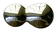
One class of brush was made up by the liquid metal and the water drop brushes. These were actually dynamic plugins, which featured their own layer (or layers!) and a dialog with the ability to draw and adjust. The really cool thing was that these brushes produced objects that were editable. I have done this before, with the mosaic brush, and I like the model somehow, because it extends the possibilities available to me.

What makes this tick? ...you might ask. Well, when I was touring with Painter 5, I made no secret of the fact that I was using two-dimensional metaballs to achieve the look.

Without getting into details, each dab of the brush is really just a procedural point with a radius and a height. You can, for instance lay down some liquid metal and put another drop next to it and watch as they merge into a single droplet. Then you can adjust size, volume, and smoothness to create different looks with your drops. This was the ultimate in procedural description, allowing non-destructive editing. But of course, liquid metal wasn't the only look. There was also another aspect to it, refraction.

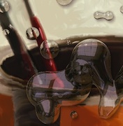
The most cool thing about refraction was the possibility of creating the look of water droplets. We often showed this when we toured with the product. You can see that the picture behind the liquid layer actually refracts and is visible inside of each droplet. I was able to use my experience in the early 80s with building ray tracers to figure out how this could be done.

Notice also that each drop can reflect an environment map on its surface. This complexity and depth lent itself to quite a visual interest. This in combination with the blobby combination of the droplets in a smooth, seamless result gave the user something to think about.

I was always interested in the look of raindrops on glass. As a child, when we drove across country, I would look through a water drop endlessly. Hey, my brothers thought I was peculiar.

So, for Liquid Metal, I created a Rain button. This randomly deposited drops onto the layer. And as they land, they merge like real raindrops. Eventually it fills up with a wavy surface. Use refraction to see what's underneath it. Here I placed some red text in the background. The refraction produces wavy letters that match the reflections in the surface. Think of it as your private ray tracer. With a brush.

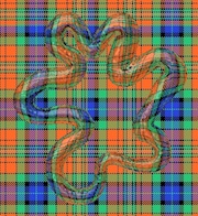
But, speaking of the brush, you can use it to create the same look, but under your direct hand control. Here, a tartan weave fills the canvas but the liquid metal stroke (which is mostly transparent and thus looks like clear gelatin squeezed out of a tube) shows the refraction of the weaving.

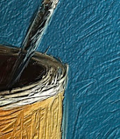
There was a theme going: take the paint and use it like a three-dimensional surface. In Painter 5, we had the ability to create impasto. Although we were just beginning to work on it and it would become a truly great feature of Painter 6, you could see the value in it in the can image.

The Painter can hero image showed impasto effects, and we even had to relax them a bit so they wouldn't get too pronounced. I did the graphic of the Painter 5 can with the impasto surface.

We were always doing something with the paint can, since it was our product's identity and brand mark. More liquid brushes were featured in Painter 5's palette. And these were quite familiar to the users of Kai's Power Goo. Use a brush stroke to stir the surface of your painting like it's made from liquid itself. Bulges, spirals all of it can be done there. It merely works like a vector field, with each pixel containing a two-dimensional displacement that yields where the source pixel comes from, or at least the vector from the pixel to the source point.

Painter 5 also contained some new brushes that were more conventional because they operate directly on the canvas. For instance the Turbulence brush is a great way of stirring an image like the cream in a coffee. What it does is to place many dabs of the brush randomly into the image (using jitter, of course), where each dab contains a spiral distortion.

This brilliantly simulates turbulent flow, which actually is decomposable into a series of vortices. Actually, that's exactly what the brush does as well! It pays to read up on vector fields.

Painter 5 also contained brushes for dodging and burning, for sharpening and softening, and also for creating a very brushy smear.

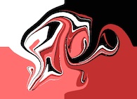
These brushes, like Grainy Mover and the like all use Cellular automata at their core. While other brushes, namely the distort brushes actually were based on marbling. An example of hand-marbled texture is seen here, using Distorto at a large scale, first passed one way, and then perpendicular to it. Several times. Each time, the pattern gets more complicated and more folds appear. Like the finest steel that is tamped and folded over again and again to create a very hard and sharp edge.

So the liquid brushes in Painter 5 utilized a range of technologies to accomplish their liquid looks: cellular automata, vector field advection, ray tracing of reflections and refraction, and two-dimensional metaballs. Friends John Derry, Udo Gauss, and Alex Hsu were all witness to these brushes while in development at Fractal Design.

Liquid Brushes Take 2

During the Painter 7 development period, some new liquid media were developed that really provided some visually beautiful results.

The basic technology of two-dimensional metaballs was to build up a height field with small functions, perhaps a little like dabs of the airbrush, and create a floating point height field that could then be zerosetted to produce liquid-like edges. But In Painter 7, I added a color value to the height field so that each pixel could have a color. When the dabs intersected, their colors would have to intersect and interpolate as well. This created a bit of color bleed where the ink intersected. The edge of the ink was hard-edged, using a similar technology to liquid metal, and the same blobbiness and merging is present, but the colors mix in a more diffuse way when the broad ink strokes meet.

Unlike Liquid Metal, this brush could work with bristles and it had a secret weapon: resist. With resist, you can paint with negative ink. This removes the ink and can thin out areas to create more of a suggestion of the actual ink strokes. It is the equivalent of working scratchboard with ink again. But really, infinitely adjustable.

Here, liquid bristle ink strokes are gone over with liquid bristle resist, which carves away the strokes. But the heavy strokes remain longer than the light ones. This is because the liquid ink actually uses a height field. Such a technique, if done even better, might be good for sgraffito strokes as well, where multiple colors can get revealed depending upon how deep you cut with the resist.

I suppose at some point I will have to go into watercolors.

Saturday, April 14, 2012

How Does It Work, Part 1

Analytic geometry is one of the most useful kinds of mathematics I have ever learned. Painter was built on it. But the average person has little idea what makes it tick, much less what makes it relevant. This post will simplify two-dimensional analytic geometry and present it so anybody can understand it. I'll build you up from understanding points on the plane to segments and vectors. And then to angles, directions, orientation, area, really you name it (if it has to do with analytic geometry) and I can help you understand it.

The Plane, the Plane!

Pixels and points are two ways of looking at the plane. But both of them involve a two-dimensional address system, and the two dimensions are usually called X and Y, but sometimes also columns and rows.

We see here a right-handed coordinate system. On the compass, the X-axis points east and the Y-axis points north. In the center is the origin, the point where X and Y are both zero. We like to write a coordinate as an ordered pair, in this case (0, 0). The axes also split the plane into four quadrants (shown in color and with their conventional Roman numerals).

If you are working in columns and rows instead of X and Y, then you are actually using a left-handed coordinate system, because larger rows are below the smaller ones, and so the direction of increasing rows points south. Pixels in an image are usually laid out in rows and columns.

A coordinate system is the basis for all analytic geometry. A point is an infinitely small location in the plane. A pixel is really a small rectangle covering a (usually square) area in the plane. The center of the pixel is a point.

Vegments and Sectors

Wait, I meant segments and vectors (I'm just trying to confuse you with doubletalk, hee hee)! Join two points with a small straight line and you get a segment. If you join two points in the same way, but the join actually has a direction, then you have a vector. Segments and vectors may be measured and quantified in different ways. And each has their own use.

Here I show a segment from point P1 (X1, Y1) to P2 (X2, Y2). A segment is rooted (meaning it has a real position on the plane) because both endpoints have locations.

Segments may be chained end-to-end to create polygons. Most commonly, a polygon is closed, in which case it has an inside and an outside. You can compute a closed polygon's area also. More (much more!) on this later.

Here is a vector from point P3 (X3, Y3) to point P4 (X4, Y4). But a vector, which we have conveniently defined to be the straight path between these two endpoints is really not rooted and consists of only an X and a Y delta. A vector is pretty much the same no matter where you put it.

A vector's measure starts by computing the X and Y deltas that make it up. Once you perform the subtraction, any notion of being rooted in the plane goes away. Why? This is intuitively true because you subtract away the start point of the vector, removing its home base.

Length and Stuff (No, It Isn't Spelled Lenght! Grrr!)

Simple subtraction creates the vector, as you can see. This is why a vector is oriented. A vector from P3 to P4 is quite different from the vector from P4 to P3. In fact, it is the negative of it. Or inverse.

Its length may be easily calculated using Pythagoras' rule by making the segment the hypotenuse of a right triangle (you probably wondered when that rule was going to be useful to you in everyday life, right? Well, just wait until you get to trigonometry!).


So here is the easy way to compute the length of a segment. You move the "right angle" of the imaginary right triangle (kind of shown shaded in a very light peach color) directly to the origin. This translation is effectively performing a subtraction, in this case, of the lesser of the two X's, which happens to be X4, from the two points, and also a subtraction of the lesser of the two Y's, Y3, from the two points. Anyway, the base and height of the right triangle are now known, so we may compute its hypotenuse length using Pythagoras' rule.

Note that, when you square them, the deltas that make up a vector can be either positive or negative. This is because their signs get lost when you square them: they always end up non-negative (also coincidentally why the square root of a negative number is not a real number). So we can define the length of the vector to be the square root of the sum of the squares of the vector's deltas.

If you imagine a segment to be a vector, then you can compute its length in exactly the same way. Length doesn't depend upon the position of the segment. That's why it works to think of the segment as a vector in this case.

OMG Do I Have To Know This Stuff?!?

If you already know about all the kinds of numbers, then you can skip this section. However, just bear in mind that I had to know about all these things before I could develop Painter! And now it's your turn! Waahahahahaa!

There are various kinds of numbers that it is useful to know. The integers are the whole numbers, zero, and their negatives. On a computer, there may be a smallest integer and a largest integer. That is what we like to call an implementation detail in the business. If you need more accuracy, you might want to use a real number. Real numbers can represent the integers, and all the numbers in between as well, like 9.57212947621.... On computers, these are represented by things called floats and doubles. These have various numbers of bits of accuracy.

When you divide one integer by another integer, you get a rational number (but please don't divide by zero!). There is really quite a spectrum of numbers that can be represented by rational numbers, called a Markov spectrum (but I digress). On a computer, real numbers can't really represent all rational numbers with 100% accuracy. For instance, you can represent 123/128 exactly, but 1/3 is hopeless to represent accurately. This turns out to be true because computers use power-of-two (binary) representations, and 128 just happens to be two to the seventh power.

Some numbers can't be represented exactly as a rational number or by floats and doubles on the computer. One example of these is an algebraic number: a number that is the root of some polynomial with integer coefficients, like the square root of two. If a segment has its endpoints at points whose X and Y are integers, then the segment's length is an algebraic number.

Another example is a transcendental number. Such a number can't be represented as an algebraic number or a rational number. Well, pi and e, the base of natural logarithms, are two examples of transcendental numbers.

OK, computers really only approximate these, but it's good enough for government work.

Back to the Vector

A vector then has a length and also an angle. Mathematicians have for ages thought of angles as being rooted in a vector that points east. This is the zero angle, and it corresponds with the X axis. Angles increase counter-clockwise, starting at zero and increasing until they become 360 degrees back at the X axis again. Although mathematicians actually think in radians. A radian is about 57.3 degrees. This means that 360 degrees is actually two pi radians.

Pi, by the way, is the magic ratio of the circumference of a circle to its diameter. It has a value of about 3.14159.... Yes, I memorized pi to 100 places and I used to recite it. Jeez, was I a geek!

But radians are a pure mathematical way of looking at things. Using radians instead of degrees saves you a multiply each time you do a trig function. Uh-oh. Trig functions!

Well, anyway, when you have a vector, and you divide its X and Y components by its length, you get a unit vector that points in the same direction. This unit vector consists of the cosine and the sine of the direction angle, by the way.

I remember when I was introduced to this fact. It was, to me, an "aha" moment. Now I understood why trigonometry was important! Actually, a few things fell into place that day in 1974. I ended up using it later on a test given to me by Joe Sukonick, a clever programmer at Calma Company. That bearded MIT graduate fellow ended up with a patent on the XOR for cursors in raster systems, by the way. But it was another guy at Calma, Tom Schaefer, that taught me some really useful things about analytic geometry. Without this information, it would have been seriously difficult to create Painter, or build the mosaic brush. Or really anything I do today.

What's Dot?

At Calma, segments definitely got connected end-to-end to create polygons. Calma built very good CAD (computer-aided design) systems for the very first VLSI (very large scale integration) components. In other words, microchips like the Motorola 68000 were designed on our systems. Yep, the original Macintosh's CPU.

I remember thinking about the notion of concave and convex and clockwise and counterclockwise. How could I determine these attributes for a polygon? It seemed like concavity was a local thing, and could be determined by looking at three consecutive points. But clockwise and counterclockwise were much more complicated, and were clearly a global thing. Or were they?

So there I was at the tender age of 19 at Calma, thinking abstractly about analytic geometry. It turns out I was smart enough and up to the challenge!

Tom Schaefer clicked his pen a few times and then drew a few figures on a piece of Calma stationery. Tom Schaefer was responsible for the all-angle fracturing software that enabled e-beam devices to render arbitrary geometries onto silicon, so I believed he could help me.

First there were three points, P1, P2, and P3. You could subtract the points' X's and Y's to make two vectors, V1 and V2.

But note that, the two vectors, if rooted at the same origin, created an angle between them, called theta. The angle is measured in counterclockwise degrees (or radians!).

That's when he introduced two operators, dot and codot. Dot is really the dot product and codot is sometimes called the scalar cross product. I found the operators' definition to be unusually simple and low-cost computationally. You just multiplied the X and Y components of the two vectors together in different ways. Wow!

Then he proceeded to show me that these operators could actually be used to compute the sine and the cosine of the angle theta. It was all beginning to come together. But I was a little hazy on my trig, so he made it absolutely clear to me. It's all about which side P2 is with respect to the line that passes through P0 and P1.

In fact, the sign of the codot could be used to determine this useful bit of information. And here's how to do just that.

OMG I thought this was incredibly clever. With this one operation, I could decide if a polygon is concave or convex, and even whether to not a polygon was clockwise or counterclockwise (as long is it's not self-intersecting).

But, of course, my brain was thinking several steps ahead.

It also occurred to me that, if V1 and V2 were unit vectors, that the dot and codot operators would simply produce the cosine and the sine of theta directly. In fact, I could see now that the rule about a vector's angle was simply a special case of this.

The dot product, it turned out, was useful in determining whether the two vectors were pointing in the same basic direction (if the dot is positive) or the opposite direction (if the dot is negative). And, by the way, if the dot product is zero, then the two vectors are at right angles to each other (perpendicular).

Area, Orientation, and Lobster Bisque

Polygons are a connected and closed chain of points in the plane. Between any two neighboring points is a segment. So, how do we compute the area of a polygon? Well, we make use of a clever technique called the trapezoidal rule. If a polygon is clockwise, then we just have to make trapezoids from each segment by dropping lines to the Y axis as we see in this diagram. Note that, on the bottom of the polygon, when the segments are going in the other direction, then the trapezoid areas become negative, because the X terms are going from right-to-left instead of from left-to-right as they are here. And that makes polygon area work by first computing the integral under the top of the polygon and subtracting the integral below the bottom of the polygon.

This has an interesting side effect. The clockwise polygons have a positive area and the counterclockwise polygons have a negative area.

So, really, to get the area, we have to take the absolute value of the computed area. And the sign is the orientation of the polygon. This turns out to be a very convenient way to compute polygon area! Once you see it, you will wonder how it can be so simple.

This turned out to be a question on Joe Sukonick's aptitude test at Calma. I took that test, and I got it right. But another guy, Bruce Holloway, got the job. Because, I was going to college at Caltech. The very next spring, when in Chemistry lab at Caltech, I got a call from Art Collmeyer. He saw the test and decided I might be interested in a summer job at Calma. It's good he called. I met Tom Hedges at Calma.

Oh, and by the way, the lobster bisque at Hula's Grille in Santa Cruz is excellent!