 Fabric sure does take a long time to sketch! I can't let a single feature of it go unmodified or un-enhanced.
So I took a picture of my son with a loose striped shirt and worked on it. I wanted to highlight the folds of the fabric, the way the light catches the folds, the highlights on the ridges, and even the way the shadows mute the highlights. I wanted it to be a cool sketch. And I was willing to take the time.
I first took the picture with the iPhone and did a little contrast enhancement using Preview on a Mac. Then, in Painter, I cloned it with a Digital Airbrush set to 2.5 pixels in size and set it to use Clone Color. I specifically didn't want to use straight cloning, which just makes a photographic copy of the image. I paid attention to where the features were. When I had a fold, I brushed against the direction of the fold, so the edge took on a bit more complexity. If you go with the direction of the fold, often you will get the position of the fold wrong because of where the colors are sampled from. But sometimes, on a high-contrast fold, you have to do what you can to get it to look right.
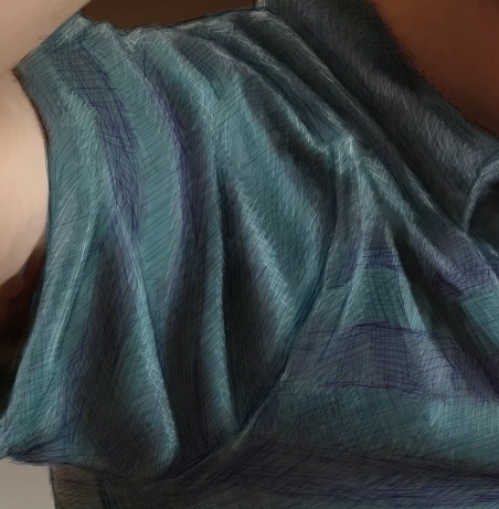 Then I used the tiniest brush (size 1.0) with a very desaturated purple. This brush was set to Buildup:Soft Buildup in Painter. And I used a very light opacity, at 18%. Then I simply sketched into the stripes with lines at different angles. When I wanted the sketchy result to be smaller, I pressed harder. And I often went over the same area with strokes at different angles. This is one way I shade, particularly with a Sharpie.
So I went over each of the purple stripes to add clarity and a little sketchy look to it. You can see The results of this in all the examples.
I changed the color to a desaturated blue-green and went over the other stripes. By the time I was done accentuating the depth of the folds, the sketchy look was coming together quite nicely.
 Then I switched the brush method to Eraser:Paint Remover at the same width and opacity to do my highlight work on top. When I created a highlight, I woke as lightly with my hand as possible so the highlights wouldn't be too brazen and abrupt.
When I add highlights, I am careful to take light and shadow into account. As the folds go from right to left across the kid's torso, the highlights become catchlights and then become much more muted in the shadow.
I was going for the feeling of a kind of not-too-shiny, yet still-a-bit-matte fabric. I think you can see the look I was going for. The original picture does not have this kind of detail. Especially after I cloned it away. But the detail was taken from the original, at least from what the original suggested. That's the way I like to do it.
 This image took hours and hours of time, mostly at night, and it taught me a few more things about rendering fabric. Probably, the next time I will choose a more shiny fabric like leather (not actually woven fabric, but you know what I mean!).
The final piece really brings out the look of the fabric. And it gets my hand ready for more sketching.
Once again, Painter is up to the task.
No comments:
Post a Comment