 It has always been an interest of mine to draw fabric. In a piece I once did, called The Miracle of the Paint Can, I took a low-resolution frame grab of fabric and used it as a guide to create long flowing robes. Actually, I quite enjoyed the long hours of work that went into this piece. But since it was intended to be a mosaic, I didn't really work too hard at creating fine detail of the fabric.
The other day I began to wonder how and why the look of fabric has drawn artists in. Vermeer, Dürer, Rembrandt, Da Vinci, and many others all clearly enjoyed depicting the lush fold and sinuous shadings of fabric.
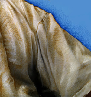
So I drew this small piece. I used my iPad to get a frame grab of a part of my shirt. One with lots of twists and turns.
The first thing I did was to move it to the new iPhoto application on iPad. Then I used the lighten and darken there to enhance the natural shading. This increased the contrast of the frame grab and also allowed me to artistically pick areas I wanted to feature or drop back. It felt like fingerprinting meets the darkroom enlarger. Really I was just dodging and burning.
Then I moved it into Painter on my Mac Pro. Using a Wacom stylus, I chose the standard digital airbrush, changed its size to a few pixels, and cloned the image. Then, with the color set to clone, I sketched the image directly using clone color.
Now, this method is really the "cheating" way of creating an image, and so, once it was cloned, I switched back to standard color, chose some blue, and masked out the background, which was irrelevant to my intended creation.
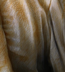
Then, I changed the size of the brush to 1.0 pixels, changed the brush method to Buildup:Soft Buildup, and lowered the opacity to about 18%. Now I was ready to really sketch. I chose a ruddy orange to give it a bit of color and sketched in the darker sections with millions of brush strokes, like I was scribbling but really I was just enhancing the actual shading of the fabric itself.
 Then I changed the brush method to Eraser:Paint Remover, which actually removes density rather than just being a white brush, and, with a size of 1.0 pixels again, I sketched in the highlights. This is very much the same method used in the 15th century by artists that preferred the silverpoint method of highlighting their subjects in a sketch.
Finally I chose a darker, redder, less saturated brown and went back to the Soft Buildup method to sketch in the darker lines and also the darker shadings of the fabric. This gives the fabric a multi-tone scale that approximates the renaissance sketches I have seen.
It is a nice test of my technique and also of my vision of a fabric sketch. Although the subject is unremarkable, of course!
It also shows how I like to take a standard brush, and change the internals of it to suit my style. Really I am only using one brush and, mutatis mutandis, the brush becomes a buildup sketch pencil, a fill-in brush, a cloner, and a silverpoint brush. Knowing the internals of the Painter brushes probably helps me to keep my art honest.
I think I'll try to draw some more fabric! Now, where is that velour bedspread? Maybe a still-life?
No comments:
Post a Comment