Showing posts with label icons. Show all posts

Friday, September 28, 2012

Developing a Style

In 1992, when John Derry joined Fractal Design, he introduced me to the traditional scratchboard tool. And the art of designing icons! The scratchboard tool was a tool that could scratch a thin layer of black paint off a white board. It was a very specialized traditional process, involving specially-prepared scratchboard and a special tool, like a crow-quill pen, with a changeable nib for scratching the black paint off.

In 1993, when Painter 2.0 came out, Fractal Design introduced the Scratchboard Tool to digital media. This tool had a very hard 1-pixel anti-aliased edge and also a width-changing ability that helped you create tapering lines very easily in response to pressure.

The above image is a redrawing of one of my original scratchboard sketches (then using traditional media), as depicted in Style and the Digital Era.

The scratchboard tool and its digital version pushed me to create more high-contrast art that came very close to a woodcut look. Some of my pieces from 1994 and 1995 are shown in Art From Deep Inside the Psyche.

This piece is from 1993 and shows some of my first work with Painter's Scratchboard Tool.

It also shows my Neuland Inline-inspired chop mark from that era.

It exhibits use of positive and negative space, even showing it several levels deep. Also, my preference for texture is shown in the overly-obsessive wood grain. I have cleaned this image up and colored it for display here.

You are acquainted with my modern woodcut style, having seen a few posts in this blog, and I present for you here some interesting icons I sketched in 1999 but have now completed in this style. This set of icons is the Disasters of Nature set.

Here is the "Earthquake" icon. Really the ground doesn't crack open in an earthquake, though! Why is it that most earthquakes seem to happen on bright cheerful sunny days? Because I have only been in an earthquake in California, thats why!

Yes, I was here for the 1989 earthquake, a 7.1 on the Richter scale. Although it was known as the San Francisco quake, it's actual epicenter was in Aptos, about 5 miles from where I lived, in the forest of Nisene Marks.

My friend Tom Hedges was actually hiking in that very forest when the earthquake hit! He said the trees shook and a huge amount of pollen and chaff came down from them.

The next is the "Wildfire" icon. A raging fire is another disaster, particularly here in California where every summer and autumn the fires come very close to homes.

There have even been some terrible fires close to my home, some as close as a half-mile.

You see, earthquakes strike without warning, and quickly start moving. It's really unnerving. Wildfire is also terrifying, because you can see it coming closer. Our firefighters always do their best and always contain them, but sometimes there is no way to prevent them from burning our homes.

California forests are all about renewal. After a fire, the wooded area grows back.

Lightning is another disastrous force of nature that can have devastating effects. Living near the coast, we find that many weather systems traveling frictionless over the ocean will suddenly release their energy quite close to us, as they reach land. This means torrential rain and, occasionally, lightning.

Such a powerful electrical discharge is really a grounding of the enormous potential energy stored in storm cloud systems.

A particularly strong lightning strike can easily possess a hundred thousand amps of current.

Humankind cannot yet duplicate the voltage and current of lighting, evidence that we still have a ways to go.

A hurricane icon depicts a fierce wind, blowing trees over and flooding with its massive overpowering storm surge waves.

Typhoons and hurricanes cause incalculable damage, sometimes flooding huge areas of cities, like New Orleans' Ninth Ward.

Although hurricanes never attack California north of the tip of Baja California, we do get some heavy weather here. Trees have been known to fall in the heavy weather.

And lightning has been known to strike the field outside my house as well, splitting trees from time to time. This is the consequence of living near the coast.

Tornados are a major destructive force of nature! Their winds lift objects weighing tons and throw them through the air, leaving a path of destruction sometimes a half-mile wide, like a scar on the earth.

The US is famous for its "tornado alley" stretching from Abilene to Fargo where one week can sometimes see hundreds of tornadoes.

I have seen a tornado in Japan. I was driving back from Hakone to Tokyo and one appeared less than a mile to my left. At one point it struck a lake and turned into a shiny silver waterspout. I was in no danger because the terrain was a bit mountainous and its vortex was trapped in a little valley while I drove by.

I will get back to these icons in the future, because it's clear that I have forgotten avalanches and volcanoes, both of which I have first-hand knowledge!


Sunday, September 16, 2012

Why I Like to Draw


Drawing seems like something that is just built in. When I want to visualize something, I just put pen to paper. But why do I like to do that?

It exercises my creativity, for one. And my right brain needs a bit of exercise and use after doing programming all day. But it's more than just exercise I seek.

I also seek to bring what I see inside into some kind of reality. I like the interrelationships between the spaces I see. Positive space and negative space. Three-dimensional space. Containment. Folding. Entrances and exits. Liquid spaces.

All these qualities are enfolded into a single unit: the illustration. I feel there should always be more than one way to look at it because is multi-sided.

It Starts With Media

I have been drawing for quite a while. But I think I learned most of my craft in early grade school. When I went into High School, as a freshman, a friend and I took an advanced Art class and this is when I started drawing ever more ambitious projects. Mostly I worked in felt pen, which suits me even now, since I have been using Sharpie on thick white paper as my main medium. Or at least my main traditional medium.

But I also liked to use pencil. I bought Faber Castell Ebony pencils and thick, rough paper.

It's really this medium that got me started on Painter in 1990. I loved the rough grain and the progressive overlay of strokes to create shading. Shading brought out the spaces I could see in my mind, and made then into real objects.

My main medium has become something quite different now. It is Painter.

Disrupting the Art World?

What happened when Painter was introduced? Well, there were a lot of artists who didn't need to go to art stores any more. This was a form of disruption, I think. But I doubt that art stores will go away any time soon. The traditional media are still quite compelling. And they are probably the quickest way to learn.

Yet disruption is like chopping off the golden tip of the pyramid and walking away with it. The old one crumbles slowly, having lost its luster, and the new one becomes a smaller, faster, better version of the old. And because it's mobile, you can have it in your hand rather than having to go out to the old brick-and-mortar to see the pyramid. In the digital world, this is like digital delivery: you can read the book on your iPad without having to go to the library or bookstore. The advantages are easy to see.

In the same way, Painter has all but eliminated my need to buy pencils. The Ebony pencils I own are ten years old at least.

The Mechanics of Replacing Traditional Styles

I learned to shade in Painter, using one of my first creations, the Just Add Water brush. I would apply colored pencils, which gave me a varied color with grain. In a shade that wasn't too primary. And then I would use the Just Add Water brush and smooth it out into a cohesive shading, like watercolors.

Recently I have taken to a woodcut-like shading technique. It's a bit like engraving. Usually black lines delineate the subject and the shading is applied in a manner similar to the way a linoleum-cutting tool works.

In Painter, I sculpt each of these shading lines separately, often going over the edge of it five or six times.

Drawing From the Mind

But the main thing for me is the form I am drawing, like a two-dimensional sculpture. Many times a drawing is really a projection of a three-dimensional concept onto a two-dimensional surface.

To enhance the rendering, I sometimes employ a "watercolor overlay", which is a layer with a Gel composite method. I can draw into this layer to add color to the illustration. I can use Just Add Water to soften the edges of a color change.

While traditional media are still the easiest way to learn illustration, Painter may be the easiest way to experiment with different media.

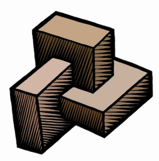
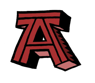
Most of my recent illustrations concentrate on three-dimensional relationships. The letter A with some depth, but hand-wrought. Interconnected boxes. A pyramid with an eye in it. Some of these are new versions of my older sketches. But all of them feature some overlap, folding, interlock, or holes.

Take for example this piece. Two S-shaped pieces of rebar interconnect, showing a very small weaving. There is over and under, interlock, shadows, and also shading. It's all tied up in the way I think about things, and what I find interesting.

I draw because I want to show what I'm thinking about. I want to freeze the thoughts and make then concrete.

And the way the illustration interweaves with my text is also quite important. Sometimes the drawing gives me ideas, and even defines the discourse.

Sometimes drawing can be like solving a puzzle to me. I must figure out where the pieces have to go before I can compose them properly. Painter saves me because in the digital world I can draw construction lines and totally erase them afterwards. Or I can draw crudely and then rework edges to make them straighter after the fact. The digital medium is extremely malleable. It has changed the habits of artists since Painter came out. Features like mixed media all in one package, undo, and perfect erase make the digital medium the ideal place to try stuff out for your next illustration.

Inspiring Sources

When I draw, it is therapeutic to me. And the good thing is to produce something you can look at.

The style I choose is a bit like engraving, as I have mentioned. These are inspired in part by the Flora Danica prints and illuminated manuscripts.

Chet Phillips, who has inspired me by his creativity, also likes to use the scratchboard-watercolor style. His imagination in creating characters seems to be unparalleled. And much like in the old work of Fractal Design, old items are repurposed in style and substance to make new fantasies of illustration and storytelling. He even uses magically-transformed packaging to build his works.

More Than an Illustration

The whole package, extending illustration into more than just pictures, is also why I like to write. While an illustration can leave me hanging by a thread when I look at it, a full-blown explanation can cinch the knot tight around your subject and create an artful connection to the reader's mind.


Saturday, May 5, 2012

Iconic Things

The pursuit of simplification of a drawing or a concept is a very useful tool. You can get to the heart of an idea really quick by distilling it into its purest form. This is one dependable way in which you can tell if its a good or a bad idea.

An Iconic Knot

I was writing a blog post on knots when I began thinking about how simple a depiction of a knot could be. For me, the simplest knot is the overhand knot. I don't think a knot can be simpler than that one.

So the first thing I did was to draw it in several forms. The one I preferred was the pretzel format used by bakers in Europe. This presents it in the most readable format.

Here is my initial sketch of the overhand knot. Aside from some clumsy shading and a few thick spots, this one seemed to have the right proportions at least.

When designing a logo, the first thing is to make the figure into the simplest line art you can get away with. This meant removing the extra space of the loops (really this is tightening the knot). And it also meant losing the shading, but not the essential feeling of intertwining. So I used some tracing paper to make a crisp black-and-white version of the knot.

Here you see the second iteration of the knot. All elements of shading have been removed. The only thin lines are the ones that lead us to believe it is intertwined. The lines lead us to feel the overlap and the 3D precedence of the rope. But only that. There is nothing else left. A uniform thickness is used for the rope, and the outline is carefully moulded to give the impression of a smooth figure.

Even the place where the strands touch, in the center, has been simplified into what I believe is its simplest form. This iconic knot is a perfect stepping stone for other depictions.

For instance, I can color the knot to give it a playful design. Like the logo for a yarn company, this piece really exudes creativity and simplicity. Perfect for a crafts company.

Another possible departure from the clean logo-form is the woodcut, shown at the top. This one was inverted from the hand-colored logo form and then shading lines were cut into the form to give it a rough feeling of a linoleum cut.

For the original knot, I used a Sharpie on thick cotton bond paper, scanned it into Preview on Lion, and left it unmodified so you could see what I actually had to work with. For the logo form in black and white, I used another think piece of cotton bond paper and a sharpie to trace it. Then I scanned it into Preview and color corrected and rotated it. Then I brought it into Painter as a .jpg file and hand-edited it into the form you see here. I didn't do anything to clean up or flatten the black areas. They still had various shades of black in it from the Sharpie.

To color the second version, I used a New Layer set up with the Screen layer method in Painter. And then I drew into the black areas. The white areas are essentially left untouched by this method even if you intrude into them.

The woodcut was inverted in Painter and this produced the dirty white you see, which I liked and kept around. I added the tiger-stripe shading using lots of handwork with the goal of making it feel like a woodcut or a linoleum cut. I used my clever techniques from my scratchboard days to get the feeling right. In some cases I had to work and rework the shading stripes when they didn't fit. But I was going for an informal, hand-made look.

Iconic Forms

I like to investigate form in 3D, and the knot is certainly a way of looking at 3D forms in a new way. After all, with some slight modifications, the knot could be made into an iconic trefoil knot as well. Perhaps in my next post. A class 3D form is the cuboctahedron.

Here you see I drew a cube in perspective and then inscribed a cuboctahedron, bounded by squares and triangles. This form has 14 faces all made up of regular polygons. And since it is regularly convex, you can see seven of them here.

Shade it and you can see the form more clearly. But I think I will have to remove the lines of shading in order to simplify it more.

I love these forms. For a more complete exposition of them, see this link.

Iconic Sayings

I have noticed a lot of bands with the word One in them. In particular One Republic and One Direction, to mention just two. But it reminds me how easy it is to create iconic sayings by using the word One. As for me, I have only one eye that really works properly. But the catchphrase One Eye would not be truly great for a band. But One Vision would. Also things like One Leg would similarly not be good, being less preferable than One Step Ahead, or even One Step Behind.

In the iconic image category, One Vision leads to the all-seeing eye. This symbol, used on the dollar bill, is the symbol for vision in the larger sense. Rather than depict it as a pyramid, I have removed the third dimension and so I show it inside a triangle. Once again, it is black and white with hard edges: line art.

The eye is shiny, of course, and this is indicated by the triangular divot taken out of the iris form. The rounded form of the eye is reversed out from its triangular enclosure. Size-wise it intersects the edge and so leaves its full extent to the imagination. A clever design trick. This image may also be colored. I would suggest the iris. But this may lead to the pupil becoming colored, which will be wrong, since it must be left black. So I have left this logo form completely uncolored. Or, you can color the whole thing in a Pantone shade.

Also along these lines, the phrase One Lie occurred to me. And immediately a symbol occurred to me: a hand with the index and middle fingers crossed. Kind of a white lie, a fib.

Even such simple concepts can be iconized into a line art form, as seen here. It probably couldn't get much simpler without losing something.

Still, iconic catchphrases such as One Voice don't immediately bring an image to mind even though it is a good kernel of a thought.

Iconic Hand

The symbolic hand reaching up for help is another icon I have sought to create. I like hands, so this one seemed like a good choice.

To create the symbolism of reaching up, I wanted the hand to shadow itself and have light leak through the fingers. The light from above symbolizes hope.

The hand reaching symbolizes need, and desperation. Grasping for straws.

Here I took a photo with my iPhone, imported it directly into Preview, and saved it to a .jpg file for import into Painter. Once in Painter, i cloned it and created a line drawing. This line drawing was adjusted again and again until it seemed reasonable to my eyes. Then created a New Layer, made its layer method Gel, and used a shade of brown to add shading to the hand, using the original photo as a reference.

I did this again with a slightly redder brown, and created a darker shading layer on top. Finally, I processed the original image into a set of grainy splotches using soften and equalize. I did this repeatedly, adjusting the equalize levels so I got just the right amount of flecks of texture. Then I edited the texture image so it only covered the hand. I placed it on top as another layer and used the Darken layer method with a very small opacity to make the texture subtle enough so it wouldn't detract from the theme.

This piece is intended to be expressive, and gritty. But really only the hand form and position is iconic.

Iconic Texture

When John Derry and I used to talk about textures, one texture he liked to draw was what he called the Good 'n' Plenty texture. This was made up of lozenges placed in such a pattern so they avoided each other in a pleasing visual way.

These kinds of textures get even more interesting when the figure has a direction to it, like a triangle. So even a texture can be shown in a basic, minimalist way. The ultimate minimalist texture is the speckle, introduced and explained in the post Texture, Part 1.

Iconization

In short, the boiling down of an idea into its component parts, the exclusion of the unnecessary ones, and the most economical depiction of what's left forms the entire process of iconization. Sometimes all you have left is a silhouette. Sometimes it is a clean rendering. But always, it evokes a single iconic idea.

Iconic Bestiary - More Like This

In this blog, I have presented many iconic items. In Interlock, Part 2, I presented the iconic three intersecting rings, the atomic rings.

The post An Anatomy of Painter's Brushes, Part 3 contains a very nice iconic brush stroke, complete with grain.

In the post New Ideas, Old Ideas pretty much every picture is an iconic depiction of something.

The entire post Drawing On Your Creativity is about iconic depictions in 3D forms, many of them impossible figures.

My post on Color is filled with the iconic color overlap diagrams. Most of the figures in Interlock (the original post) are extremely iconic, and especially the Valknuts.

My post The Things We Throw Away has the iconic floating mountain.

It is clear that Art From Deep Inside The Psyche draws on all my inner troubles to produce the most interesting of all the iconic figures, some with variations, that I produced in the 90s.

My article Where Do Ideas Come From? contains a wealth of iconic imagery, from lightning bolts to letterforms.

In Patterns, Part 3 I explore the iconic looping structures and show a grammar to construct them.

In the post The Most Useful Painter Feature, the whole concept of X2 is iconized and presented in many ways.

My post on Three-Dimensional Thinking has some very clean, iconized items.

An interesting iconic item, the burning ice cube, was covered in extenso in Creativity and Painter, Part 3.

Saturday, March 24, 2012

Drawing On Your Creativity

Creative types are often visual people. And there is nothing more visual than drawing. As the voice is our one built-in instrument for our hearing, so is hand-drawing the main expression for vision.

Using our own hand to sketch out an idea is a natural step for our creativity.

So I constantly draw pictures, drawing on my creativity to help me visualize. And it is a salve for the rougher times of our lives. A bit of escapism. Good for what ails us.

3D Forms

Ironically, it is two-dimensional pen and paper that becomes the practice field for three-dimensional cognition. I know I am constantly drawing forms and shapes, trying to figure them out or reason about their volume. I imagine holding them in my hand, reorienting them, looking at them. And then I draw.

And when I draw, I try to find the proper orientation to depict the object and show its own characteristic features in the best light.

For a cube, I almost never draw it in such a way that I can't see its inherent dimensionality. For a snub cube, I show the snub facing the viewer. Otherwise I probably can't tell what it is. So I reorient the object in my mind to draw it.

I like the idea of something having a real three-dimensional heft to it. I can almost feel the edges around the missing corner.

Other objects are equally interesting. I like, for instance, to imagine how objects intersect, or how other objects can be contained inside them.

It isn't well-known, but the dodecahedrons - both the platonic one and the rhombic one - can superscribe a cube. This shape is the basis of a garnet crystal.

I show a rhombic dodecahedron superscribing a cube. Imagine a cube with short pyramids on each face. Constructing one with pencil and paper is easy, since the height of each pyramid is exactly one-half a cube edge length.

Rhombic dodecahedra can fit together and tile space perfectly like cubes, which I find interesting. And it's also obvious, since the vertex of the rhombic dodecahedron is actually at the center of a neighboring cube.

There are plenty of shapes that I have drawn over the years, most of them are found on the backs of meeting notes or on Excel spreadsheet printouts.

I can't even say what all the objects are, but I did find them interesting to imagine at one point. Perhaps this is a button from an old corduroy jacket.

On the same sheet I found another drawing. What is this trying to be? I imagine it is a folded bit of paper, arranged in a triangle. I never showed its other side, and so that remains a mystery.

At some point, though, three-dimensional figures need to be transcended. This is done by imagination and also by requirement. Imagination and simple tinkering can lead to the impossible figure. Requirement can lead to icons. They are both interesting pastimes and also they can be real work, as we will see.

John Derry and I spent many, many hours searching for the right icons for brushes, for features of brushes, for effects, for tools, for everything.

Impossible Figures

I have written about impossible figures before. But I created one in 1969 based on the impossible triangle. I drew the Triangular Symbol in summer 1969 when I was but 13 years old.

I drew it only a couple of months after my grandfather died, so it was clear that my obsession with impossible figures might have come from my need to process the situation.

It was drawn with a Flair pen on the harshest Olivetti copy paper, so it has colored a bit through time. And the felt pen I used wasn't exactly the best tool to use. I used a drafting set to make the basic shapes. And then I shaded it the best I could, given it is, after all, impossible.

The draftsmen at Lockheed, where my dad worked at the time, were quite impressed and put it up on their walls. But it was a time of downsizing for Lockheed and soon they were laid off.

That was the bad news. The good news was that we picked up a nice drafting table for me, cheap.

Here is the basic impossible figure it is based on. This was originally drawn in 1934 by Swedish artist Oscar Reutersvärd and later made popular by Lionel and Roger Penrose. Though it is impossible, you can create a version of it in real space, made so you can look at it from one angle and it will look real.

This is not so for all impossible figures, though. And these definitely defy imagination. Really, the first impossible figure I ever saw was in the Time-Life book about the Mind.

This impossible figure is the one that the draftsmen liked. Before I showed them the impossible triangle.

They had this figure up on their wall right next to the drafting table as a kind of joking reference to nonsense and I respected them for their humor in the matter.

This figure can't be constructed in three-space because inside and outside exchange places, obviously. If you look at one side and then the other, they are reasonable taken by themselves. But not together as a whole.

In the post Interlock, I discussed the Valknut, a cool figure used by the vikings around Gotland centuries ago to symbolize Odin's patronage of those who died in battle. It is a sacred mark of sorts.

I present here another impossible Valknut, one which intersects itself. This one took a couple of tries, I assure you. It is still a variation of the impossible triangle. I guess I never tire of making these variations.

In some ways, these figures are a tribute to M. C. Escher, the famous dutch artist that perfected the ever-ascending stairway and other impossible illusions.

I love his art! In some ways, I think maybe I'm almost as crazy, if not quite as detail oriented, as Escher. He used his hand to make all his art, and that makes me respect him.

I have often thought of the ever-ascending staircase, and so I have drawn overlapping planks to simulate the feel of the original Escher piece.

I show that they have to be bolted together to hold them in place. But I'm not quite clear on their shapes. I show some warping to the planks so they can fit, but I think it is a bit more difficult to make this work. Unlike Escher, I have preserved their proportions. Escher made his work by having a different number of stairs on the four sides of the stairway. I have used no such cheat.

Still, I try to imagine the exact shapes that will make this work. And to what end? To relieve myself of the boredom of a staff meeting. Heh.

Three-Dimensional Interfaces

In Detailer, which was Painter for painting on 3D objects, I was in the business of creating icons for tools that involved movement and rotation. This was an exercise in three-dimensional thinking and icon development. It's interesting, but Phil Clevenger ended up doing much the same thing when he worked on the Bryce and Poser interfaces. And his designs were much cleaner, I think. And in some ways, much more gothic.

Here you see a cylindrical rotation icon. For rotating a vase that you are painting, for instance. I think the cylinder in the center has to be a glass rod to make it sensible.

But this was only one of many icon tries for three-dimensional interfaces. I soon elicited John Derry's help in creating them.

I think I like three-dimensional interfaces because they simulate real objects that you can use. Like a folder that opens up when you move something to it and whoosh, the thing goes into it.

The virtual trackball for rotating three-dimensional objects on screen is an interesting task for icon creation. I think my first idea was on the left here.

But eventually, it all got screwy. Icon creation is a really hard problem in general, because you have to develop a design language that is consistent and clean and not easily misunderstood: hard to get wrong.

While sitting in endless meetings, my mind would wander. The endless progression of a grid of beans, each with their own shadow is a good depiction of boredom. And a symbol of the sure knowledge that the group will head all together in the same direction. I can see the words bean counter were almost certainly in my mind at this meeting.

This was drawn on the back of a spreadsheet that detailed the booth personnel hours for PC Expo in New York in 1996. It's really kind of funny, put into that perspective.

The Fractal Design sales personnel were well-meaning and extremely organized, so I shouldn't trivialize their hard work. After all, they were where the rubber hits the road! I will forever owe them a debt of gratitude!

At this point, I was still the CEO and we were a public company. But rust never sleeps, and I had products to create. And this includes being creative, even during sales meetings!

A page floats to the ground, its shadow beneath it and showing that it has just contacted the ground, or is about to. A corner is turned up. You can feel the rush of air beneath it, just before the page settles.

Three-dimensional forms in motion.

Nothing is static, all is moving. Trade shows and products must go on, as does life. At this point in January 1996, my life was changing, more like going over a waterfall, and I had just met some of the most interesting people I will ever meet in my life. Drawing, playing piano, writing songs, and even composing poetry: there were lots of issues to work out, and creativity was central to that process. Good times!

Icon Creation

It is very hard work creating icons and with its own design language, it can drive you a little crazy. John and I were designing Detailer icons one day, when we created this interesting bit of art. You can click it to get a larger version, which might be necessary to see it in all its crazy detail.

We were working on trackball icons. In the center, you see a prototype for the sphere with an arrow going around it. But John said that the arrow might best have two points on it, signifying that you could turn the object in any direction.

This led to a happy face with arrows on the mouth. I drew a vase with an arrow going around it, then drew a vase pouring out liquid with an arrow going around it! There is a cube with an arrow. And various circular arrows drawn and obliqued. Then John drew a brush with an arrow going around it. And it just got weirder from there.

Pretty soon there were atoms and icons for the funniest things. Like a dead fish icon. And a dead dog icon (?). And a lightning strike icon. And a tornado icon. The cow is floating around it, saying "moo", by the way.

We had gotten a bit crazy in the process; we tended to do this. How can you be serious when you are creating icons, after all?

You can see a scissors-cutting-paper icon, a road-into-the-distance icon, a submerged pyramid icon, and even a bleeding eyeball icon! I think the comment was that some of these icons were so bad, it made our eyes bleed! No, we weren't actually being serious at the time at all.

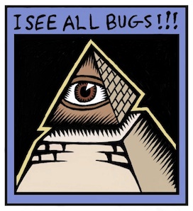
One of the icons is the pyramid with an eye in the tip. This symbol is actually on the US Dollar bill. Not sure why. But I liked it, as an impenetrable symbol of, like, a secret society.

I have one that, in its unedited form, says "I SEE ALL BUGS!!!". There is a bit of humor there, since I was talking about bugs in Painter: you know, mistakes in the code that needed to be fixed. We really needed to fix all of them before any release.

This is the standing order of things at a software company. And, as a primary developer, along with Tom, it was always my main responsibility to fix the problems. In the Painter 6 time frame, I did more bug fixing than usual because Tom was preoccupied with other issues.

John and I often made whimsical icons. Like a firecracker icon (John's). Or a lit match icon (mine). These weren't icons that had any purpose being in software, that's for sure! So we were just joking around. Entering the crazy phase. Getting really loony from being in icon hell too long. In think we tried to get more and more outrageous, just as a mode of escapism and perhaps as a kind of performance art: inappropriate art. We loved to do that.

Sometimes the icons were statements of our current situation. If we were buried in some problem that looked easy, but it was actually very, very hard, I'm sure that the iceberg icon could accurately depict our plight.

If we were outperforming our capabilities, or if we just wanted to show off, I'm also quite sure the "goes to 11" icon could make sense of it all. It is a reference to Rob Reiner's movie This Is Spinal Tap.

If we were under water or in deep seas, we might draw the ocean icon. If we were feeling angry at the world, we might draw the gun icon. Totally out of order, gentlemen! This is not allowed!

But at the bottom of it, it wasn't ever really obvious why we drew these. They were just a way of joking around while embedding ourselves and our mindsets in the art of icon creation: an art that has its own purgatory built right into it.

Sometimes Icons are just symbols for something, and can be borrowed from the icon language of, say road signs, or caution symbology.

We also liked to play that game, of borrowing the design language from some other task. It is, after all, what the paint can is based on, and so many other cool things from Fractal Design. It's where design gets fractal.

And at the end of the day, all that mattered is that we achieved our goals to ship a product. To have a product that could rise above the monotony of mundane software products. We showed them how to do it right. We were Fractal Design, after all.

We had a reputation to keep up!

Our brushes had to be the coolest. Our effects had to be the first on the block. Even layers came out first and we made hay with it with make up your mind again, and again, and again. Design is not a linear process, because of trial and error but even more because the client may not like your design. And you may have to produce several designs to show the client. We got that.

Our brushes were cool because we were always thinking of what the designer wanted out of a brush stroke. Not just what the artist wanted. Because we could simulate the natural tools, and we could also extend the capabilities of the artist directly through our new tools.

So what the designer wanted, and what we felt they would like in the future, mattered to us. We were practicing designers: we were Fractal Design.