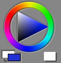
 In Painter, there is nothing that is more iconic than its color picker. It was designed for the artist, and so it features a circular ring of hues (called a color wheel) and a triangle of single-hued color (called a color page) inside it.
Color Pickers for Artists
In Painter 3, I redesigned the color picker around the concept of the color wheel. Before Painter 3, it was a color triangle above a hue slider.
The pre-Painter 3 color picker was actually clumsy. But I chose the triangle because it was ergonomically easy to use, and it was approximately perceptually arranged. It is good that the triangle has a single point at the top and the bottom for white and black. This shows unambiguously where these colors are. Other color pickers show them as the top and bottom of a square, which is not a correct depiction of color space.
 Here we have the Painter 1.2 color picker. My main problem with this is that the hue slider is not really big enough to represent all hues properly.
A set of color swatches is available for quick choice and drawing, like a mini-palette.
I don't like how the color ring on the triangle (that indicates the current color) actually gets hidden by the hue slider. It's a visually-conflicting thing.
In Painter 3, I chose the hue ring to be a little thick, like paint. But even so, I had some issues with it. The position of the colors on the wheel isn't really equally-spaced. Ideally, equal angular changes along the wheel would represent equal perceptual differences in the color.

 Look at an RGB color wheel, to the left, and a perceptual color wheel, to the right.
Two things have been done. First, the colors have been spaced perceptually equal. Second, the colors have been chosen to be at approximately the same luminance, of apparent lightness.
Notice on the RGB color wheel, where the colors red, yellow, green, cyan, blue, and magenta are equally spaced at 60-degree angles around the wheel, that the yellow area seems tight, and the green area seems grossly large in comparison. On the perceptual color wheel, care was taken to have equal color increments.
This means that a user can choose colors in the area they want with equal ease.
With the RGB color wheel, on the other hand, the artist always has to adjust the luminance's up and down to choose colors at the same apparent lightness, depending upon the hue.
So, if I were to do Painter again, I would probably do some work at making the color picker more ergonomic (or at least have an option for the artist to use an ergonomic color picker).
Color Mixing
Color works in some very interesting ways, that most people don't really think about every day.
 There are several kinds of color mixture that we like to describe. The first, learned by children when they mix their crayons on white paper, is called subtractive color.
With subtractive color, the more color that gets deposited, the darker and more saturated the combination color gets. This is because the rays of light reflect off the paper. As color gets laid down, the light rays are absorbed by the pigments. The more kinds of colors you lay down, the more wavelengths of the light are blocked from reflecting by the absorption of the particular color of the light. So laying down two hues will muddy the color.
Subtractive color is the chosen mixing method for felt tip markers (buildup brushes), for instance.
 The second kind of color mixing is additive color. With additive color, it's like you are starting with a dark room and shining lights of different colors.
In fact, in the Apply Lighting effect, this is the method of color mixing that is used.
This is quite different from the way that paints mix, but it does bely the way light can be split up into a spectrum by a prism: because white light actually consists of the addition of several spectral hues, it may also be broken down into those hues. This is done by a process of refraction. Dispersion is caused by the wavelength-dependence of the index of refraction of the prism material in question.
In Painter, cover brushes are another kind of brushes. How does that work?
 The additive color model does apply, but it is complicated by more than just addition. the cover brushes use interpolative color mixing.
With interpolative mixing, suddenly the priority order matters. This actually becomes useful with brushes, and it makes it possible to cover things with successive brush strokes, and this is why they are called cover brushes.
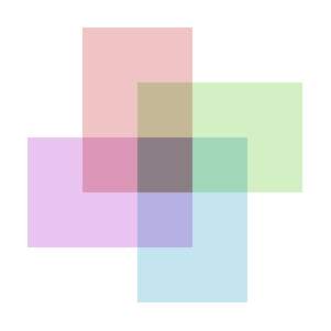
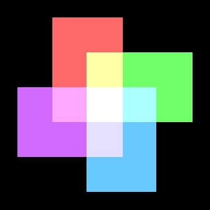
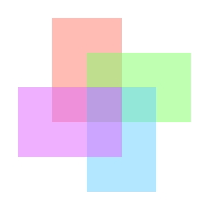
In this image, the ordering from back to front is red, green, turquoise, purple. So the purple color dominates the color in the center, where the four rectangles overlap. A 50% opacity is used in all rectangles.
It is true that, in a cover brush stroke, many dabs of paint overlap to create the final stroke's color. This means we have the luxury of keeping the opacity low for each dab, since multiple overlays quickly converge to near 100% coverage.
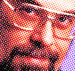
I have generated a halftone image of myself in 1995 using the Core Image filter CICMYKHalftone. When you overlay halftones of cyan, magenta, yellow, and black, each pixel of the result can be one of 16 possible colors (because 2 to the 4th power is 16).
Painterly Color Mixing
But, how should color mixing be done to simulate oil paints? Now we are getting into the complex world of actual paint physics simulation. This is done via Kubelka-Munk theory. In this theory, both absorption (which is responsible for subtractive color as mentioned earlier) and scattering (which is responsible for the color of the sky) are taken into account. A mixture pigment has absorption and scattering that is the linear mixture of the absorption and scattering of its component pigments, using the weights that come from the fractions of the pigments that are mixed together. Actually, this is very much like RGB mixing, except that absorption and scattering applies to every wavelength of light, not just the three primary wavelengths. Research has shown that 8 wavelengths produce a much more accurate result than the usual three wavelengths used by RGB mixing, and that not much more improvement is to be had by going to 100 wavelengths.
Then, a fellow named Saunderson produced a correction to this formula that allowed for the reflection of light off the transitional boundary between the pigments, when they are layered.
This combination is used for color mixing today, and it is called the two-constant method for color mixing. A single-constant method is also used to approximate the mixing estimation, which assumes absorption divided by scattering to be a single constant, and works from there. This method is less accurate.
Someday I would love to investigate color mixing again.