Showing posts with label ideas. Show all posts

Sunday, November 25, 2012

The Nail That Sticks Out


There is a rule in conformist societies (and companies) that implicitly limits their evolution: the nail that sticks out gets hammered down. This rule almost single-handedly leads to stagnation.

Why Hammer It Down?

When a civilization is structured, the nature of specialization helps to build an intricate machine of the society, where individuals must do their specific part to keep society going.

And when various winnowing forces such as feudal warfare, disease, or sequestering on an island keep a society's population constant, or force it to grapple with a shrinking base, the structure of society must be tested and tempered. The machine that society has become must operate in lockstep to survive. The pressure on an individual to carry on his parents' trade and role models becomes very strong indeed. An individual with new thoughts, swerving from traditional roles and creating disruption, cannot be tolerated. And such rules are born.

Culture thus evolves to accommodate and sustain this pressure on the individual.

However, this doesn't happen quite as easily when a civilization's population is sufficiently large during its structure-formation stages. When services can be performed by a small fraction of the population base, there is actually pressure to move away or to do something different. Progress is rewarded, not squelched.

For the same reasons, competition also leads to progress.

On an island there is practically nowhere to go, since the barrier to moving away is essentially life in exile. But consider for a minute the case study of San Francisco, where the population has held nearly constant since the 1950s. There it is possible to move away but sweeping changes are still difficult to accomplish. Yet culture continues to evolve. Mass transit was developed. Even urban renovation continues.

Cultural forces can also promote or prevent stagnation. San Francisco's culture has changed over the last few decades significantly, and this has prevented stagnation. Pockets of culture remain and provide alternatives to what could have been a regimented, conformist society. Particularly after the 1906 earthquake and two world wars acted as winnowing forces.

Culture and Its Influence

Culture can also be a force that leads to societal stagnation because culture provides us with laws, through morality, and peer pressure, and thus imposes its will on individual behavior. When culture is too regimented and strict, this can lead to suppression of new ideas. In the middle ages, Copernicus' views of a solar-centric astronomical neighborhood were suppressed in favor of an established view. Even Galileo, whose views were provable in ten minutes with common everyday objects, had his views suppressed.

Culture can come from religion, this is true. But it can also be influenced by war and other external forces. After a war, for instance, a local culture's survival can be threatened and so the pressure of sticking around to keep the culture alive can become paramount.

The conformist society also promotes a rigid class structure with despotic rulers. The fear of being hammered down is constantly reinforced by this.

Copying

So, what does a structured, conformist society do when it is presented with external forces that threaten to overcome it?

It evolves.

But it does so by examining the advantages of its external threat and duplicating them. In this process the society applies its machine-like efficiency to survival. The society is already efficiently shaped for the purpose of retooling and adapting. Feudal warfare and the constant advances of weapon-making have shaped the society to this task.

What a society must never do is to kill off its talent, and thus its greatest advantage. It is this capability that keeps it alive during times of adversity. It is the talent that keeps a society mobile and adaptable.

Disruption Then

But there are inherent adversarial forces that even the talented cannot surmount: disruptive forces.

Technology can provide disruption like no other force.

I have talked about disruptive technology before and its effects on brick-and-mortar, the dissemination of information, the replacement of old gadgets by new ones (cameras, televisions, games, and music media).

I have also talked about the disruption of fossil fuels and their eventual replacement by battery energy storage.

Disruption Now

Right now there is a disruption in mobile technologies that is challenging the old guard of desktop systems. This is a serious problem for the old guard. Either they must embrace the change or they must use disinformation to fight it. And the second option only really postpones their inevitable death. Adapt or die. Never was this more at issue than at Microsoft.

Their core talents were in the desktop Wintel paradigm, which is quickly fading. Megalithic applications like Office and Word are quickly being replaced by the lighter mobile applications, which can be sold over the air. The advantages of an adaptable, mobile enterprise are obvious.

Now Microsoft is being criticized for implementing two different interfaces in Windows 8, provoking some usability researchers to declare that users should just wait for Windows 9.

As for the advantages of the mobile enterprise, consider for a moment the Apple store and the Microsoft store.

Here's a YouTube video contrasting the traffic of the two stores on Black Friday, the massive shopping day after the American holiday, Thanksgiving.

Microsoft copied the spartan wood tables and lighter ambience of the Apple store, yet their inability to embrace mobile point-of-sale systems seems to be costing them.

At Apple stores, the salespeople help you one-on-one, and use an iPhone with an integrated credit-card reader to complete your transaction. You even sign for the credit card transaction on the iPhone. The first time I visited an Apple store, I got the sense that it was the future of the in-store buying experience.

Let's contrast that with the Microsoft store experience. A friend of mine went to a Microsoft store to buy a Surface tablet. He was directed to a single place where the sales took place (sounds a bit like a cash register doesn't it?). The point-of-sale system crashed, complicating the transaction significantly.

While Microsoft stores might start using iPhones with integrated credit card readers, it seems improbable that a Microsoft employee would actually suggest that. Perhaps there is a Windows 8 Phone alternative? Well, if so, why aren't they using it?

My point is this: Microsoft has almost 100,000 employees. They should have some fraction of those employees building apps for their Windows 8 Phone ecosystem. They can't afford to catch up by attracting developers at this point! That would take precious time. They should already have such a point-of-sale system in their bag of tricks. Don't these guys think ahead?

My suspicion is that somebody probably wanted to do just that, but he got hammered down.

New ideas and new concepts replace old ones. Many of the trends that shaped the progress on the desktop simply do not work in the mobile computing space. Even Moore's law seems outdated, as I mention in one of my more recent posts Keep Adding Cores? It's clear that computers are simply built differently as a result of this disruption. When you consider that batteries are the power source, then power management becomes central. Efficient and targeted computation becomes highly desirable, rather than general processor computing.


What Disruption Comes From

Disruption comes from people.

People with new ideas.

New ideas whose value can easily be demonstrated to a large number of people.

If everybody sees the value then they want it.

When everybody gets it, this results in significant change.

Change in how people spend their time. Change in what people buy. Change in how people think.

So disruption comes from that nail that didn't get hammered down: an individual with radical new ideas and a conviction that his or her ideas can succeed like nothing else.


Sunday, June 17, 2012

Look Out Any Window

What you see depends upon where you are. But it also depends upon who you are. If you are here you will see day. If you are there, you will see night. Sometimes there is a sun, sometimes there is a moon. An ocean surrounds an island, but dry land surounds a lake.

But, hey, windows are a metaphor, right? And it is what our minds see that distinguishes us from other people. Some literal person might say that red is red no matter what and that is that. But I say that your point of view makes a huge difference.

And though the concept that red is red is strictly true within statistical perception parameters, it is also unbearably unimaginative.

This is why it is certainly good to look at the same old thing and yet have a totally new outlook. Something clicks!

Shapes are not shapes, but three-dimensional objects. Displacements in reality.

Shadows are holes in a light field.

The sky is a scattering of more blue light and the absorption of less red and green light. Oh, and I almost forgot: some air.

A hole is really a door in space through which you might reach.

Objects fall into two categories: the possible and the impossible. But all ideas are possible in our mind.

A vertex is a discontinuity in curvature. It can be the meeting of any number of faces, even one.

What happens when you cross a cube and a sphere? Is that like squaring the circle?

Though we can imagine an impossible figure, and people can make them, from one perspective, they still can't make it hook up. But our minds can.

What is magic about the pyramid's shape? It just seems like another five-sided solid. But wait, shapes are more than just shapes.

Is the inside of a solid conceptually similar to its outside? What about a torus?

Passing a polygon through a curve not lying in is plane creates a three-dimensional extrusion, like a prism. If you pass a solid through space, does it make a four-dimensional extrusion?

Dr. Seuss once said it best: if there are flashlights for when it's dark, are there flashdarks for when it's light?

Take three cylinders at right angles to each others and with centerlines passing through a single point and intersect them. What shape do you get?

I was once impressed by the Wankel engine and how a shape other than a circle still possessed a constant width when rotated. How many other kinds of shapes can do this?

If the magnetic field is uneven over the face of the earth, then what does that imply about the shape of the liquid iron core? If gravitation is uneven over the face of the earth, then what does that imply about the mass distribution internal to the earth?

What would gravitation on a torus-shaped (or a cube-shaped) world look like? And, by the way, what transmits gravity from point A to point B? Is gravity transported using the states of dark energy?


My point is that sometimes the technical and the fantastical face off and somewhere in the middle is a thing of beauty. And sometimes that thing can be a realization, a lightning bolt of discovery.

Mixing one field with another can result in the creation of something much more useful than something created for one field alone. And it all depends upon your point of view. Look out any window, but first look out through your mind's window.

Sunday, May 20, 2012

Drawing On Your Creativity, Part 3

I like to draw. I just can't help it. The process of sketching and drawing has always interested me. As with music, if I stop for a while and then start again, it all comes pouring out!

As the original author of Painter, of course, I had to study drawing from many angles. Now, when I draw, I feel a certain freedom in simply returning to the art without the burden of analysis. And I can begin to realize just why I started drawing in the first place.

Doing the Clean Line-Art Style

I keep thick pieces of standard-size paper around to sketch on, my favorite creative weapon being an ultra-fine Sharpie (retractable!). Drawing, for me, is a way to exercise my creativity.

My process for making art has been documented in this blog post series before: scan into Preview using a networked scanner, tonally adjust and crop, export to JPEG, import into Painter, clean up, resize to blog-compatible sizes using Preview again. Sometimes I will use a gel layer in Painter to colorize, particularly when I'm doing a technical illustration.

One of my styles is thus a clean, line art style with the hand-wrought look that is usually lost with Adobe Illustrator. A little like a woodcut. All of the pieces shown here were done in this manner, in the last few days. I have been practicing my implied edges: a cool form of negative space.

I like to use my desktop for most of my posts because it simplifies my process and allows me some very nice editing opportunities. I like to edit using the Wacom tablet in Painter.

Rotating the Image for Sketching

One of the reasons I like this is because I can rotate the image, making all my hand work more natural and ergonomic. In Painter, you can hold down the space bar and the option (alt) key and rotate your image by direct click-and-drag in the image. With the same keys held down, a single click restores the normal orientation. But, as I draw and clean up lines, I generally keep the drawing rotated at whatever angle most makes sense.

I learned this workflow with sketching by watching Disney artists in studio. Their old-school sketch workstations had a turnable easel. I would bet that they have something much more like Painter these days. Because I thought to migrate that workflow to the computer.

Ideation

So, I'll get an idea and ponder over how to express it in this style. When I get an idea, I like it to be one that's out of the box, not in the box.

Sometimes I will go back to the old sketches from the Painter days and I'll get an idea that I might have pursued once, but is lost to me now. And to re-examine it and explore it afresh is exhilarating. So much has been packed away. There is so much to rediscover.

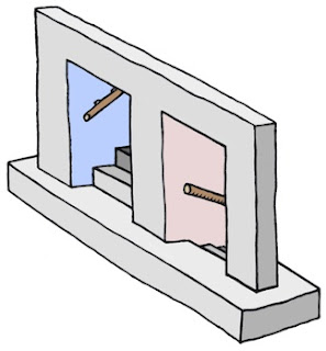
Other times I will think of an idea, like Up and Down and have an internal vision for how I would like it to appear. When it intersects another of my favorite pastimes, like impossible figures, then it is settled. I begin to draw. So it's all in the perspective: how you look at it.

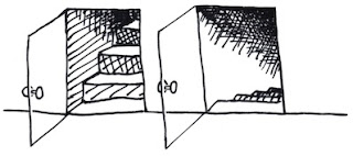
With Up and Down, I actually drew it a few times before I got the right shape for it.

I chose the impossible picture, with entrances going into space that simply can't exist, to make the sketch more of a personal expression, more my style.

When I was a kid, I used to have my room in the upper floor, and then later in the basement. So I know the feeling of going up and down stairs quite well, and the feelings when it changes from up to down.

I chose to let the color connote shading in this one. And the blue for sky and red for, well, the fiery depths. More allegory. Just a tiny bit of symbolism. But in my house as a kid, the upper floors had more sunlight or overcast light, which had a bluer color temperature. The lower floors had a redder light, because we used incandescents there.

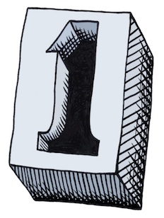
In my post about iconic things, I draw several figures that derive from the concept of One. When I was drawing them, I imagined a mould that you could pour lead into that could make a three-dimensional one.

Some Technique

This is what I could envision. I just now drew it but I used a creative technique for the cross-hatching. This time, when I sketched it, I did the cross-hatching by hand. Then when I brought it into Painter, I brought each of the different directions of hatching into a separate layer so I could sculpt their shapes separately.

I tend to use a tiger-stripe technique for simulating woodcut looks. This comes from the V-shaped tool that is used to carve out linoleum and wood blocks and the shapes that they make in the blocks.

In scratchboard, a similar look is achieved. This ease of width-control was the reason I created the original scratchboard tool in Painter.

So this sketch actually comes from a six-layer image.

Iconic Patterns

I demonstrated in the iconic things post that there were speckles that didn't just use dots when you render them. The old Good'n'Plenty design. Here we have a design where there is a complete 360-degree freedom to each placed item, which is the ultimate speckle. Even the hatchings that I demonstrated before only had a 180-degree freedom to their placement.

I can imagine controlling the direction of each item by a random process, like the one I used to create the hatchings, or by using the directions from a vector field. You could create random flockings of bird-symbols in this way.

Often, in architectural renderings, random tree placement, with different sizes, is used to stylistically symbolize a grouping of trees. Sometimes this kind of pattern was used in the formica tables of the 1960s. It's worth looking up. Thinking about patterns and the way they fit together is one of those little creative things you can do.

Liquids and Different Perspectives

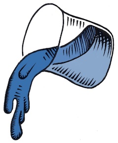
In a continuation of the earlier pieces here, I thought I would do more liquid stuff, because I have been doing that kind of rendering since I was young. It was always an excuse for shading, and as you may know by now, I do like to shade things.

Drops of water or oil are fascinating to me. When I was a kid, I would sometimes look at the world through the drops or rainwater on the outside of the car window. I could see the world as a microcosm of distorted figures, and back then it was a good exercise for my brain to see things from a different perspective. I love the pattern of raindrops on a windshield: the way they avoid each other, the way they coalesce, the natural pattern of their look.

Real raindrops don't actually look like these. They are really globules of liquid, and they move and wobble as they fall. Kind of like metaballs, they have a shape defined by surface tension and equilibrium. Water drops are free from many forces, when they are in flight.

I used to look at liquid mercury, and marvel at the shines. I think that reflection and refraction have always been of interest to artists' perceptions. I'm thinking Vermeer, of course.

But these liquid renderings are more about stark shading than reflections and refractions.

Rendering the quality of reflection and refraction in line art is rather complex but a laudable goal. When you hold a drop of water on your finger, I often have watched the fingerprints beneath become magnified to a huge extent, and the skin also took on an interesting glow inside the drop, due to the caustics (concentration of light by the bending of rays by refraction) created by the shape of the bead of water.

Along with a bright shine on the drop, it creates a marvelous miniature scene, allowing us to watch yet another perspective: one magnified instead of the one viewed through the car window that seems to shrink the entire world into a single drop of rainwater.

As a small kid, I was nearsighted, and so things like this would constantly be of interest to me.

Other perspectives interested me as well, as a kid.

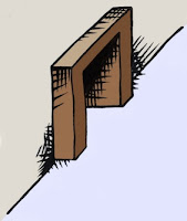
Like the doorway. Both entrance and exit, it was the thing that kept the kids captive in the schoolroom, or kept them out. Being the guardian of in and out, a door seemed more profound to me than just a block of wood on hinges.

And, while I was at it, what made the inside in and the outside out? Why couldn't things switch? Another perspective change, quite relevant in the 1960s.

After all, I watched Star Trek, so I knew that doorways could be more than just a way in and out. A door could be a portal to another planet or even to another dimension.

So, when I tried my hand at Up and Down, initially I thought of something we were looking into directly, even with glass doors.

This is the original sketch for Up and Down. Actually, unlike the final product, it didn't really have any magic. That's when I thought about the impossible version.

It is the change of perspective that makes this kind of piece work. When you get to drawing, liquify your workflow to make your sketching smoother. And pour on the creativity!

Saturday, May 5, 2012

Iconic Things

The pursuit of simplification of a drawing or a concept is a very useful tool. You can get to the heart of an idea really quick by distilling it into its purest form. This is one dependable way in which you can tell if its a good or a bad idea.

An Iconic Knot

I was writing a blog post on knots when I began thinking about how simple a depiction of a knot could be. For me, the simplest knot is the overhand knot. I don't think a knot can be simpler than that one.

So the first thing I did was to draw it in several forms. The one I preferred was the pretzel format used by bakers in Europe. This presents it in the most readable format.

Here is my initial sketch of the overhand knot. Aside from some clumsy shading and a few thick spots, this one seemed to have the right proportions at least.

When designing a logo, the first thing is to make the figure into the simplest line art you can get away with. This meant removing the extra space of the loops (really this is tightening the knot). And it also meant losing the shading, but not the essential feeling of intertwining. So I used some tracing paper to make a crisp black-and-white version of the knot.

Here you see the second iteration of the knot. All elements of shading have been removed. The only thin lines are the ones that lead us to believe it is intertwined. The lines lead us to feel the overlap and the 3D precedence of the rope. But only that. There is nothing else left. A uniform thickness is used for the rope, and the outline is carefully moulded to give the impression of a smooth figure.

Even the place where the strands touch, in the center, has been simplified into what I believe is its simplest form. This iconic knot is a perfect stepping stone for other depictions.

For instance, I can color the knot to give it a playful design. Like the logo for a yarn company, this piece really exudes creativity and simplicity. Perfect for a crafts company.

Another possible departure from the clean logo-form is the woodcut, shown at the top. This one was inverted from the hand-colored logo form and then shading lines were cut into the form to give it a rough feeling of a linoleum cut.

For the original knot, I used a Sharpie on thick cotton bond paper, scanned it into Preview on Lion, and left it unmodified so you could see what I actually had to work with. For the logo form in black and white, I used another think piece of cotton bond paper and a sharpie to trace it. Then I scanned it into Preview and color corrected and rotated it. Then I brought it into Painter as a .jpg file and hand-edited it into the form you see here. I didn't do anything to clean up or flatten the black areas. They still had various shades of black in it from the Sharpie.

To color the second version, I used a New Layer set up with the Screen layer method in Painter. And then I drew into the black areas. The white areas are essentially left untouched by this method even if you intrude into them.

The woodcut was inverted in Painter and this produced the dirty white you see, which I liked and kept around. I added the tiger-stripe shading using lots of handwork with the goal of making it feel like a woodcut or a linoleum cut. I used my clever techniques from my scratchboard days to get the feeling right. In some cases I had to work and rework the shading stripes when they didn't fit. But I was going for an informal, hand-made look.

Iconic Forms

I like to investigate form in 3D, and the knot is certainly a way of looking at 3D forms in a new way. After all, with some slight modifications, the knot could be made into an iconic trefoil knot as well. Perhaps in my next post. A class 3D form is the cuboctahedron.

Here you see I drew a cube in perspective and then inscribed a cuboctahedron, bounded by squares and triangles. This form has 14 faces all made up of regular polygons. And since it is regularly convex, you can see seven of them here.

Shade it and you can see the form more clearly. But I think I will have to remove the lines of shading in order to simplify it more.

I love these forms. For a more complete exposition of them, see this link.

Iconic Sayings

I have noticed a lot of bands with the word One in them. In particular One Republic and One Direction, to mention just two. But it reminds me how easy it is to create iconic sayings by using the word One. As for me, I have only one eye that really works properly. But the catchphrase One Eye would not be truly great for a band. But One Vision would. Also things like One Leg would similarly not be good, being less preferable than One Step Ahead, or even One Step Behind.

In the iconic image category, One Vision leads to the all-seeing eye. This symbol, used on the dollar bill, is the symbol for vision in the larger sense. Rather than depict it as a pyramid, I have removed the third dimension and so I show it inside a triangle. Once again, it is black and white with hard edges: line art.

The eye is shiny, of course, and this is indicated by the triangular divot taken out of the iris form. The rounded form of the eye is reversed out from its triangular enclosure. Size-wise it intersects the edge and so leaves its full extent to the imagination. A clever design trick. This image may also be colored. I would suggest the iris. But this may lead to the pupil becoming colored, which will be wrong, since it must be left black. So I have left this logo form completely uncolored. Or, you can color the whole thing in a Pantone shade.

Also along these lines, the phrase One Lie occurred to me. And immediately a symbol occurred to me: a hand with the index and middle fingers crossed. Kind of a white lie, a fib.

Even such simple concepts can be iconized into a line art form, as seen here. It probably couldn't get much simpler without losing something.

Still, iconic catchphrases such as One Voice don't immediately bring an image to mind even though it is a good kernel of a thought.

Iconic Hand

The symbolic hand reaching up for help is another icon I have sought to create. I like hands, so this one seemed like a good choice.

To create the symbolism of reaching up, I wanted the hand to shadow itself and have light leak through the fingers. The light from above symbolizes hope.

The hand reaching symbolizes need, and desperation. Grasping for straws.

Here I took a photo with my iPhone, imported it directly into Preview, and saved it to a .jpg file for import into Painter. Once in Painter, i cloned it and created a line drawing. This line drawing was adjusted again and again until it seemed reasonable to my eyes. Then created a New Layer, made its layer method Gel, and used a shade of brown to add shading to the hand, using the original photo as a reference.

I did this again with a slightly redder brown, and created a darker shading layer on top. Finally, I processed the original image into a set of grainy splotches using soften and equalize. I did this repeatedly, adjusting the equalize levels so I got just the right amount of flecks of texture. Then I edited the texture image so it only covered the hand. I placed it on top as another layer and used the Darken layer method with a very small opacity to make the texture subtle enough so it wouldn't detract from the theme.

This piece is intended to be expressive, and gritty. But really only the hand form and position is iconic.

Iconic Texture

When John Derry and I used to talk about textures, one texture he liked to draw was what he called the Good 'n' Plenty texture. This was made up of lozenges placed in such a pattern so they avoided each other in a pleasing visual way.

These kinds of textures get even more interesting when the figure has a direction to it, like a triangle. So even a texture can be shown in a basic, minimalist way. The ultimate minimalist texture is the speckle, introduced and explained in the post Texture, Part 1.

Iconization

In short, the boiling down of an idea into its component parts, the exclusion of the unnecessary ones, and the most economical depiction of what's left forms the entire process of iconization. Sometimes all you have left is a silhouette. Sometimes it is a clean rendering. But always, it evokes a single iconic idea.

Iconic Bestiary - More Like This

In this blog, I have presented many iconic items. In Interlock, Part 2, I presented the iconic three intersecting rings, the atomic rings.

The post An Anatomy of Painter's Brushes, Part 3 contains a very nice iconic brush stroke, complete with grain.

In the post New Ideas, Old Ideas pretty much every picture is an iconic depiction of something.

The entire post Drawing On Your Creativity is about iconic depictions in 3D forms, many of them impossible figures.

My post on Color is filled with the iconic color overlap diagrams. Most of the figures in Interlock (the original post) are extremely iconic, and especially the Valknuts.

My post The Things We Throw Away has the iconic floating mountain.

It is clear that Art From Deep Inside The Psyche draws on all my inner troubles to produce the most interesting of all the iconic figures, some with variations, that I produced in the 90s.

My article Where Do Ideas Come From? contains a wealth of iconic imagery, from lightning bolts to letterforms.

In Patterns, Part 3 I explore the iconic looping structures and show a grammar to construct them.

In the post The Most Useful Painter Feature, the whole concept of X2 is iconized and presented in many ways.

My post on Three-Dimensional Thinking has some very clean, iconized items.

An interesting iconic item, the burning ice cube, was covered in extenso in Creativity and Painter, Part 3.

Friday, April 6, 2012

New Ideas, Old Ideas

We have talked about where ideas come from, and that serves to illuminate the process of how new ideas come about. But what of old ideas? And how can old become new?

Old ideas can still be of use, but they must be constantly rethought. Legacy gets boiled away in the frying pan of technology, leaving only the useful bits. The best practices of technology are constantly changing, though, which has a drastic effect on what is possible, and also on how much the consumer must spend keeping up with it.

Tastes can change or differ between demographics as well, which leads studios to make and remake the same old plot line, songwriters to rearrange their songs, and DJs to remix them. What was great on a PC can be even better using the interface advantages of Mac OS X, and now it can be more widely used by moving it to the multitouch environment of iOS.

So old ideas are generally only of use when they represent something that a user still wants to do, but which has not yet been possible with current technology, or has not been ported to a new platform. Oh, there are plenty of these things, like flying cars and instant elsewhere. And porting desktop software, like Painter, to iOS might also provide a tool that is useful to a wider class of users. But is that the only way legacy can continue to be useful?

No. There is the real world to consider. In the gadget world, things can only change so fast because of the constraints placed on technology. We have talked about what accelerates technological advancements, and also what holds them back. Are some of the constraints placed on technology actually valuable?

Standards

Light bulbs serve to illustrate this issue. While the electric light is over a century old, it can now be reinvented with such technologies as compact fluorescents and even LED lighting. But new ideas aren't enough. They must still screw into the same old sockets, have the same form factor, and utilize the same electricity, otherwise they won't be useful in the standard enclosures. Sockets and enclosures have been designed to standards that come from the 1950s and 1960s.

OK standards aren't the same worldwide. For instance power plugs have different standards from country to country. But they are still standards, and they must be considered when building something new.

The persistence of a standard helps us in one very important way: it lets us build to a specification. This balances customization against factory production. If we can build something in a factory, it can lead to cheaper, more plentiful goods. When you are building homes, for instance, it is necessary to source your building materials. Things like light bulb sockets all meet a certain set of specifications. These are important, because without them, each house would have to be designed using custom parts. Standards and specifications lead to modularity and thus ease of building.

While standards persist, they can still be changed over time. All these cars using gasoline don't have to be retrofit to use Hydrogen fuel cells or batteries: rather, they will become obsolete and then recycled. Each car has an obsolescence period that means that, even if adoption of a new fuel source were to happen right now, it would only mean a slow transition.

So standards changes must be evolutionary to make economic sense.

Ergonomics

Some specifications come right from our own bodies: ergonomics.

While standard can change evolutionarily, there is no changing the ergonomic requirements. These are set in stone. This can involve some differences from person to person, true. Otherwise there would not be several sizes of clothes, shoes, and even hats. But there is such a thing as a standard observer that controls how displays, detail, and color should appear. And there are standard sizes, sometimes referred to as the canon, for target audiences, like children, adults, men, women, and so forth.

There are preferences that differ from region to region. I heard once that European magazines print skin tone quite a bit darker than Americans, for instance, in beauty models. What I considered garish in an ad for suntan lotion was considered normal in Germany. But preferences change a bit like standards. This process has been known as westernization in the literature, though there have been other kinds of changing preference trends over the years.

Preferences also can be the a matter of taste, and can be specific to a given demographic, as I have mentioned before. These do change, and can be influenced. Runaway leaders in any given area, like Apple in the gadget world, like the Beatles, Lady Gaga, or Adele in the music world, like Toyota's Prius in the automotive world, even Emperor Augustus in the world of infrastructure, security, and political stability, do influence taste and preference. This has been happening for thousands of years, but it is happening much faster now than it was in Emperor Augustus' time!

Ah, to have a slice of that kind of fame: the persistent kind.

Physical Limitations

We probably take for granted that there is one thing that are the same for all people: gravity. But even a "given" like gravity may have to be re-examined in the light of something like space travel. For instance, those aboard the ISS live in a microgravity environment. Air and the presence of oxygen is another thing that must be quite similar for all people. Sure, it can be thinner at high elevations.

All these things present the basic boundary conditions of all technology: constraints that they must exist under. And some of them are more than constraints, but actually requirements, like oxygen. This is why there are portable oxygen cylinders for exploring under the ocean, oxygen bars for people who want to invigorate their brains at the end of the day, and such. It is interesting that gravity represents both a limitation and a requirement.

Still, anti-gravity technology would still be extremely useful. Or anti-momentum. Or anti-entropy.

We think of this aspect as design constraints. They are the fixed givens that represent things we can't change. Which is why changing them would be such a game-changer. Nothing would ever be the same if we figure out how to polarize gravity or extract free power from dark energy.

Revolution, Evolution

How could something like lighting change even further, now that the world is changing quickly towards LEDs and even simpler technologies? Well, you might need a standard for a light panel.

No, I'm not talking about color panels. I'm talking about a part of the wall that produces light. Touch what initially appears to be an inert wall and a UI appears where you touch it. Slide the right widget and the light turns on, ramping from low brightness to useable light, promoting accessibility. This is the kind of panel that doubles as a wall and also as a television. And make it the kind of material that's durable enough for kids to bounce basketballs off of.

A standard might not actually depend upon the technology. For instance, such a panel could have LED lighting or perhaps even some kind of future lighting that uses OLEDs or new technologies, like nanotechnology. Or variable-opacity materials using polarization like liquid crystals.

My point is that we should consider what we want when constructing new standards. Not what exists currently. This will take time to become adopted, of course, which is why it is evolutionary.

Why does some science fiction become dated, even though the ideas are sound? Simple. The ideas and their portrayal no longer match our understanding of how they must work given modern technology. They must evolve along with the world.

Even with Apple's designs, evolution is the ticket to revolution, it seems.

Revolutionary changes like electric vehicles are a great concept, and we must really understand them more so we can make the great leaps and bounds. But you should have a standard first, which addresses what you want to do with them. For instance: how do you charge them? How does it fit into the existing infrastructure? How long do the components last? How can they be replaced?

Tesla seems to be asking those questions and making informed decisions that help to solve the real problems implied by these questions. But there are areas in this field where technology really needs to catch up.

You have to ask the questions that the users will ask, and also the ones that they will ask once they have bought and have used the product. Your standards must be arranged around the best answers to these questions.

Technology Finally Caught Up

Nobody can miss the exhilaration of the first iPhone, of the first iPad. Technology finally caught up with what I want to do!

Ideas abound. They are first called fantasies, like science fiction. Slates that you can view videos on (in 2001: A Space Osyssey) or that you can review documents on (Star Trek: The Next Generation). This shows that they can be mocked up by designers and clever futurists well ahead of the possibility of one being actually made to work. Then, someday, they are called reality. When technology catches up.

This is probably why you can't patent what you want to do, only how it actually can be done: it shouldn't be possible to patent fantasy.

With Painter, there are several instances of this principle. When I started working on Painter in September 1990, I was using a 16 MHz single-core 68030 in my Mac II. By 1998, my PowerMac G3 on my desk was using a 300 MHz PowerPC RISC processor, which was probably 25 times faster when you consider processor speed, the number of clocks per instruction, the memory speeds, and improvement to caches. When I started, to get the brushes to work in real time I had to code the inner loops in 68020 assembler. So the inner loop of depositing a dab of the brush within a stroke could be as fast as possible. But with 25 times the compute power, I could do huge amounts of computation when depositing a dab of a brush, and even completely rewrite how the brush stroke was rendered. Without even resorting to assembler recoding. Some ideas that I had earlier that weren't practical had finally become possible. Technology had caught up with my ideas. At least some of them.

The machine I'm using right now is about 3000 times as powerful than the Mac II I was using in 1990 (or more, because of multiple cores and also a massively parallel GPU). So, if I were to write Painter today, I would make an entirely new set of design decisions. And they would be based on what I want to accomplish, not nearly as much on the limitations of the hardware I'm using.

Moore's Law is not guaranteed to continue, without rearranging the ways we compute. We must begin to use massively parallel and also individually powered (meaning individually able to be turned off) architectures. This has already begun in the GPU and gadget worlds.

Soon enough computation will produce more heat than we can handle, and the conversion of waste heat to more power to compute is also going to count.

Everything that is happening now points to the indisputable fact that local computing is necessary. Some years ago there was a theory that computing would be done somewhere else and all you would need is a dumb terminal and a fast internet connection to do anything you wanted. Now it is becoming clear that local computing is important, and so we will continue to push the limits of Moore's law and also the limits of the minimization of power consumption.

Even in server farms, in the cloud, we will continue to push the limits of these two pacing factors for the technology of computation. Speed, memory, and power consumption will be paramount, while the moving of more and more data in pipes with more and more bandwidth will also be a pacing factor for the cloud.

People still have plenty of ideas with which technology is yet to catch up. You see, old ideas do still count. But they may need to evolve a bit.

Saturday, March 3, 2012

Intense Development

There are periods of time during a project when I don't even want to sleep. Others around me get very annoyed. But when I come out the other end, something magical can be seen. This is partly because I, thankfully, work in the realm of computer graphics. And partly because I'm a visual person who can imagine a visual result that others can appreciate.

And it's all in the demo.

There is no sleight of hand in a demo. Not when people are to be impressed. But sometimes people just don't get the value in what you construct. This is where you have to educate them, to show them the value, to connect it to something they can understand. You have to make all that obsessive development time mean something.

You need to become tolerable again.

I have talked about where ideas come from. About the different frames of mind we can be in. About how to foster creativity in the first place. But, once you get the idea and reason out how it can be implemented, there is a new phase that needs to be explored. How does this process unfold, this intense development? How does the large feature or the complex technique get implemented? How can we, as mere humans, even manage something like this? What tools do we use to do the seemingly impossible? What parts of our brains do we have to use to accomplish our goals?

Organization

The best method to tackle a large project is to get organized. I do this by taking notes, drawing pictures, and building tools.

I have found that some of the best notes to take are these:

  • new ideas or features that you would like to explore
  • problems that need to be resolved
  • places to look when updating to some new arrangement of the code
For most people, the note-taking process is a hassle. But you really need to start taking those notes to accomplish a project that is so big you can't keep it all in your head!

When drawing a picture, sometimes a flowchart is useful. Here we have the basic step in constructing a Laplacian pyramid. The objective is to decompose the step into smaller operations, a process known as top-down decomposition.

Here the basic step gets split into reduction, expansion, and difference substeps.

The reduction step is the process of converting an image into another image that is half the size in both width and height. And one which thus does not contain any of the highest-frequency information in the original image. The expansion step is the process of resizing the half-sized image back into full size. This image will be blurrier than the original by definition. The difference step is the process of determining the differences between the original full-sized image and the blurred full-sized image. These differences form the highest frequency detail in the image.

This step can be repeated to create a quarter-sized image and a half-sized detail image.

So not only is the image decomposed into various frequency bands, but the process of decomposing the image has also been decomposed into steps!


Rational Processes

Using your rational mind is partly deduction, and partly experience. For instance, when you implement a gradient operation, experience tells you that the center of a line has a zero gradient, and either side of the line has a non-zero gradient. As a practical demonstration of this, consider the Painter brush stroke. It is from an airbrush at high opacity with a 2 pixel diameter: a typical thin line.

If you compute the gradient using a Sobel technique, each 3x3 neighborhood of the image is convolved with two 3x3 kernels. There are variations on this theme, but usually the kernels will look something like this:

 1  2  1                   -1  0  1
 0  0  0      and       -2  0  2
-1 -2 -1                  -1  0  1

The first kernel is for computing gradients in the y direction (horizontally-oriented edges) and the second gradient is for computing gradients in the x direction (vertically-oriented edges).

Convolution means multiplying each element of the kernel with  corresponding pixel in the actual neighborhood in the image and forming a sum of the products.

You do that for both kernels, producing two sums, which you can imagine to be the x and y value of a vector field. The gradient is simply the magnitude of that vector.

The result of this is a gradient like you see here. Notice that the center of the line has an empty space in it, corresponding to a zero edge.

My rational mind already knows this through experience. So this means that if I want to use the gradient as a mask, and process the center pixels of the line, I will have to do something to fill in the center of the gradient. Like an annealing operation (a blur followed by an increase of the contrast or exposure of the gradient).

A rational mind mixed with the ability to visualize is probably the best way to get image processing operations done the quickest. But there are times when visualizing is not enough. We must see the intermediate results and check that they are being produced correctly and effectively. This brings us to the next technique: building tools.

Building Tools For Visualizing and Debugging

Any process in image processing, no matter what it is, will have intermediate results. There will be a blurred buffer, morphology applied to something, a gradient, a vector field, some representation that needs to be visualized. And we may need to verify that each step is being accomplished correctly, or verify that the step is even doing what we imagined it would, and is thus useful in the process of finding a solution.

So we need to construct a tool to see the intermediate results, to study them, to inspect them, and to debug their construction when your idea of what they should look like does not match what you get.

I have done this time and time again with large projects I have worked on, and it has enabled me to make much faster progress on a large project. And with a tool such as this, it becomes another thing: your demo environment. Not only can you see what's happening, but others can as well.

In order for a demo to come off smoothly, your implementation has to be fast as well. This means that you will need to implement selective update, and also you will need to make it go as fast as possible through optimization.

It doesn't matter what kind of project you are working on. You will always need to demo to justify your continued work. You will need to show progress. You will need to convince people that it can be done.

Tool construction (a testbed with demo capability) is your best tool to accomplish this!

Choosing the Best System to Build On

When constructing an image processing tool that involves steps, intermediate results, complex staging, or heavy computation, you need to choose a system to build it all on top of. For my purposes, I am considering a Macintosh as my system platform. But there are APIs and methodology that apply to any task.

Core Image is a good API for image processing, when your result is constructed one pixel at a time. It can allow you to utilize a GPU or a multi-core CPU to get the job done, and it can render the task of constructing a pass on your data into a simple thing. This is highly desirable when you have a lot of passes to construct. Core Image kernels are pretty easy to construct. You can reference any number of source images, but you may produce only one pixel in the destination image. This conceptually works pretty easy for blurs, color operations, compositing operations, and even transitions. You can build Core Image filters on top of your operations, and their parameters are entire images. And settings for your operations.

OpenGL is a good system for doing computation and presenting that computation inside a texture on screen. When this texture is transformed in 3D, as in "onto a 3D object" then this is the ideal API to accomplish the task. OpenGL may also be used for computing results on 2D flats that are presented using an orthographic projection. The computation can occur using almost any OpenGL operation or it can occur using a fragment program. This is conceptually the same as Core Image, so there is not much value in going the OpenCL route unless textures are going to be transformed in 3D.

OpenCL is a good system for doing arbitrary computation using the GPU and the CPU. You can support multiple output buffers as well as multiple input buffers. This means that come simulation operations are easier. Also, things like scatter and gather to and from planar color formats are much more natural. For instance, conversion of RGB to YCC where the Y is kept separate from the CbCr information can be supported very easily. One RGB image input, two images, one Y ands the other CbCr output.

Multi-core CPU computation is another good method to get things done fast. Here you can use Grand Central Dispatch to easily queue your computation on multiple CPUs. It has never been easier.


The Dangers of Obsession

You can get buried in a project. It can overcome you. This can have a very confusing effect. Unless you disentangle yourself from it for a while and take a step back, you run the risk of becoming irrevocably lost.

Back in my Caltech days, there were those people who were interested in Dungeons and Dragons (D&D). This sometimes resulted in people becoming obsessed with the rule systems and the immersive game-play.

And sometimes people just got lost. First they forgot to shower, neglecting their basic cleanliness. Then they showed the effects of malnutrition: the endless supply of Coke and little white powdered-sugar donuts. They started talking about fifth-level clerics and trolls. They always carried those little clear twelve- and twenty-sided dice around with them. And one day they didn't come to class. And never appeared again.

These were good, perhaps weak-willed people who were casualties of war. The war against obsession.

Yet I also saw people get obsessed in technical and scientific matters. These were called grad students. They would work on their thesis obsessively, disappearing into a dark cave until they came out with something hard and shiny like a diamond. I observed that obsession had its value, it seems.

Buried in Complexity

You can add more and more to a program over a period of many months. This is called add-on programming. And it can lead to another problem: complexity. A haphazard programmer can continue to kludge up a piece of code using branching and questionable data structures. This can lead to spaghetti code: twisty passages all alike.

The only solution to this problem is rethinking it: it must be rewritten. There is no other way if it is to be modified in the future. If you were adding more and more stuff to it, then this is a virtual certainty. At this point it is time to develop the right control structures and data structures to render the solution in the most effective and extensible way.

Immersive Programming

At some point you will need to debug what you have created and make it work. This requires total immersion. The better you have organized your code, the easier it will be to understand the processes it uses and thus to figure out which steps are correct and which are incorrect. This is the process of debugging.

It's like putting your head into the code and visiting codeland.

One thing is sure: you better have your head on straight when you debug a large project the first time. This will be when your organization and rethinking of control and data structures will pay off.

SOmetimes when debugging a project it becomes clear that there is a logic flaw in the code. This can be a small one, like an off-by-one error, or some statements that are out of order.

Or it can be a very large problem indeed. One with huge ramifications for the code.

My advice is to fix it before going any further, no matter how sweeping the implied changes are.

To Sum It All Up

Once you have been through fifty or so large projects, you begin to see patterns much more clearly. Perhaps you can profit from some of the patterns I have found, and some of the cautionary tales.

All I know is that I mostly had to learn these things the hard way.

Sigh.


Thursday, February 16, 2012

Writing Songs

Creativity serves us well, as a source of ideas. Sometimes it comes from the cross-pollenation of ideas between disciplines. Sometimes it seemingly comes from the blue when our minds work when we are asleep or when we are idle, mentally. And sometimes creativity is a visceral thing, springing forth from situations of trauma or intense joy, as our souls try to heal themselves or simply work to process what they have gone through.

This last source is so often the one that makes us sing.

When I get overwhelmed or troubled, I usually turn to the piano to work out my angst. And heaven help me if I don't have something to record it. I have captured these improvisations from time to time, and some days there are two or three.

I like to write songs, because I'm somebody who feels things. They are a great outlet. You can find some of my songs on Soundcloud. Check out Not Enough Time for instance.

Starting Songs

How do I write songs? I start three ways. The first way, I have something to say. If it needs to get out, melody and words will occur to me simultaneously. The second way, I think up a melody and I then need to put words to it. The third way, I write a song instrumentally, and I record it and play it back, writing words and framing phrases as I sing to it. But these three methods are only how it all starts.

Once it's started, then it needs to be completed.

Songs are typically made up of sections. You probably know these: verse, refrain, bridge, intro, outro, hook, etc.

Verse

Verses are the body of the song, where most of the matter of a song occurs. But what's in a verse?

A song can tell a story. Then the verses do the telling, scene by scene. A good example of this is Rocky Raccoon, by the Beatles. No doubt that's what is going on in that song!

A verse can tell a point of view; a later verse can alter that point of view. One verse can have my point of view, and the second can have your point of view. A third verse can apply to a group.

Verses can be similar in form and structure. For instance, Joni Mitchell's Clouds has three verses with similar structure. The first is about clouds, the second is about life, the third is about love. This is a common pattern, because, as listeners, we want to see where the songwriter is going with it. The similarity forms a comfort zone, a familiarity that helps us absorb each verse. Also, a principle of songwriting is: if you repeat something, do something different with it. So, for instance, you might bring in the drums and the bass on the second verse, for example. This is called buildup.

Sometimes having a similar structure can simply mean repeating the same words at the beginning of the verse (like Dear Prudence).

There is plenty of creativity in verses.

Verse patterns can also be interesting. Countless songs have two verses of vocals and the third verse is taken up by the solo. Then, the fourth verse often returns to vocals.

Refrain

Usually a hit song will have a refrain, or chorus. A refrain is most commonly a headline phrase, like Here Comes the Sun. A songwriter will save the most catchy melody or chord change for the refrain. It is generally the most memorable part of the song, and this is by design.

Sometimes the refrain is a round, or a four or eight bar phrase that gets repeated. Think Hey Jude. Even when the refrain is not a round, it can get repeated, so be prepared to rework the end of the refrain for the purpose of dovetailing with the beginning of the next repeat.

Usually you won't repeat the refrain the first time you introduce it. Repeats of the refrain are simply more common at the end of the song, because you want to leave the listener with the best and most catchy part in their mind when the song is done.

Bridge

The bridge, or middle eight, can link the verse to the refrain, or just be a nice contrast with the repetitive nature of the song. Sometimes the bridge is the jewel of the song. In my song Tagman, the bridge is a flash of virtuosity.

Often, in the bridge, I modulate to another key, for instance the relative minor. Then the trick is to modulate back into the main key of the song.

I like the texture of the bridge to be different from the rest of the song. This can mean a different rhythm (say, triplets), a more edgy drum beat, or even a totally different treatment like a classical version or a blues version.

Intro

The intro of the song is the part that gets the listener's attention. This is usually something novel. In Wish U Were Here, Pink Floyd begins their song with an AM radio-compressed guitar solo that another guitar, seemingly more live, begins to jam with. Now that's novel.

Some songs don't have an intro, like Ruby Tuesday, by the Rolling Stones. It just begins with the first verse directly. Other songs use the hook as their intro, which is quite common. Think Day Tripper, Satisfaction, and I Want To Tell You.

One particularly useful kind of intro is the rhythm intro, where the drums begin the rhythm of the song and it gets amplified with each repeat. Here, songs like Steve Winwood's Higher Love and Rob Thomas' Her Diamonds are good examples.

Some songs have two intros, like Queen's Somebody To Love. You get an a cappella section followed by a short piano intro.

Outro

Many songs use a modified intro as their outro. This provides a sense of closure, and is often poetic.

I think an outro is essential, because I tire of songs that just repeat a round at the end. Well, Hey Jude did it and others followed ad nauseam. But it seems like the sign of a song that isn't finished, when it just fades out at the end. But even epic, classic songs like Procol Harum's Whiter Shade of Pale do this.

The traditional musical term for outro is actually coda.

Hook

A hook is a riff that catches the ear directly because it has a novel rhythm and melody. Rock music is so full of good hooks. The opening bars of Tom Petty's Mary Jane's Last Dance certainly suffice as a simple example: a guitar riff that helps to build the rhythm of the song while catching the ear. The Beatles' Day Tripper also has the quintessential prime example.

But a hook must be integral with the song. If it is stand-alone then the song can seem manufactured, or formula.

I traditional music, the hook is often called the motiv.

An Example

Here I will take apart one of my songs. It's a bit like the reverse of what I did to put it together, and it's also a bit like how I put it together in the first place. But you can take apart any song, really. I think it makes me a little odd: instead of listening to a song in an unbiased way, I take it apart. "Oh, listen to that bridge!" "Wow - third verse a cappella, very interesting!" That sort of stuff. I probably drive people crazy with this.

The song Not Enough Time shows I have some organization when I write my songs. To the right you see page 1 of the lyric sheet. These were not just written the way you see them here. They were changed, listened to, endlessly edited, tried out, and rearranged.

First, I usually just get a verse idea in my head. Then it's just a problem of making sure its a good lead-in verse. For this one, the really big problem was getting the second two lines of the first verse right.

Then one day, it just occurred to me that dictionary could be pronounced the British way, and it all fit together. I was trying to get the cadence of accents of the syllables to fit into my meter.

One day, probably a year after I wrote the basic verse melody (which also fits the round) I figured out a nice bridge format. Then I sat down at the piano and put some chords down. Pretty soon I could play it reasonably well. This is the first step in becoming comfortable with a new section in a song.

The second lyric sheet has very few lyrics, but it highlights another problem with Not Enough Time.

How do you end a piece?

I referenced a concept before called an outro, which is a modern term for coda, the end of a composition. At the end there might be some kind of definitive statement. The Beatles used to sometimes end their songs on an unusual chord, like the fourth of the scale. This is used to great effect in And Your Bird Can Sing.

Interspersed in the lyrics is a reference to a round. This serves as the refrain in this piece.

You see, the more I played with the verse, the more I wanted to sculpt it into a 4-chord round.

Modern commercials are the home of the 4-chord round these days. And it does kind of make me a little ill. In the case of this song, it took probably three years before I had it right enough to produce.

Here you see the score sheet for the round. The piano part is very foursquare. That's to contrast with the rest of it, which tends to be syncopated.

Vocals 1 to 3 are harmony vocals that define the chord structure of the round: D - A - Gadd2 - A.

The 3 flutes are additional orchestration that adds color to the round.

The bass is highly idiosyncratic and natural. It bounces at first and then proceeds in small scales. Note that the bass has a different ending for the second repeat of the round.

The drums add a fast beat to the round, giving it energy. The kick and snare are flammed: in other words doubled.

The other two vocals actually wrap around the round, stretching into the next repeat. This is a nice trick if you can carry it off, and it makes the round seem much more natural.

Here we have the structure of the song. I always write a structure sheet out so I can remember the chords. If you forget the chords, all is lost!

Also notice the exact timing of the song is given, in mm (stands for Maelzel Metronome) and it is the number of beats per minute. In this case, it is the number of quarter notes per minute.

Here I give the round as D - A - G - A twice in a row. This also serves as the chord sequence of the verse. Except that the back end of the verse has a quite different set of chords.

The bridge is notable, with a chromatic bassline in the tail end.

The secret chords of the coda are revealed here, and they are quite a parallel harmony indeed.

For the back end of the verse, I did some harmonization using multi tracked vocals. This required some planning beforehand, to get the chords right, particularly when the G is compressed into a G2 chord, since the third of the scale (B) becomes replaced with the second (A) in the chord.
Here you can see that I did three vocals. My trick is to double-track each of the backing vocals to give a bit of chorusing to the sound. It makes the backing vocal fatter and slightly more ethereal.

Other vocals were multi tracked, and required a bit of preparation as well.

When you look at the structure, you see that the round serves as the intro, and the second round backs up the solo.

If you listen to the song, you might notice the backwards guitar solo in the second round, just before verse 3. I reversed the entire section, recorded three solos to it, and chose the one that sounded the best when I re-reversed the section (with the solos) back to forwards.

It is a bit disorienting to listen and practice to music that has been reversed. You should try it sometime. It really has a spooky feel to it.

This serves to show a bit about how I write songs. Most of it is hard work and meticulous planning. And the real ideas come after quite a while of letting the piece percolate into you brain.

I have a confession: this song is not typical. Most songs I can crank out in a couple of days. But songs always sound better when you sit back and listen to them after leaving them alone for a while. And new ideas are easier to come up with too.

When I write songs now, I usually start by singing them into an iPhone while driving. I use VoiceNotes for this, because it is simple and very handy for capturing ideas. Then, when I get home, and I have a moment of relative silence, I create a piano backing for the song. This I record using an iPad or some other handy tool, just so I can comp up the song in GarageBand. Quick and dirty.

I have used tools like ProTools in the past, for multitracking. I find that modern hardware has more than enough horsepower to do the same task without expensive outboard DSP cards.

I do love living in the future.