Showing posts with label design. Show all posts

Friday, November 30, 2012

Patterns, Part 7

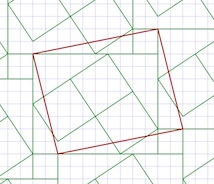
The Tile Pattern Designer is coming along. In it, you design a tile pattern in a parallelogram repeat block. This gives you quite a bit of leeway, with the ability to design triangular and hexagonal tiles, as shown in Patterns, Part 5. Using a grid to design tile patterns in this way is sufficient to plot out most of the tile patterns from the floor of the San Marco Basilica in Venice, as shown in Patterns, Part 6.

Now I will show you some of its features, all based on complex analytic geometry, which you can learn about in How Does It Work, Part 2.

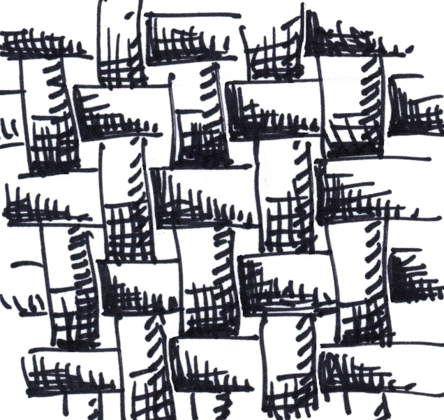
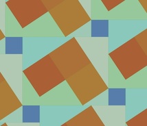
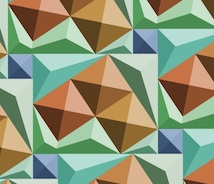
First I design a pattern by drawing lines between grid points. This one took only eight lines, using a slightly rotated rectangle as the basis. I am careful to leave a few unusual shapes for open areas. This is so I can show you how the beveling works later.

I base it on a staggered block pattern, but I also place some rotated rectangles inside the largest rectangle.

I suppose I could have been a little more fancy in my design, but I wanted to show a few of the characteristics that you can control to render your tile patterns. The first, which you are familiar with, is the automatic recognition of closed polygonal areas.

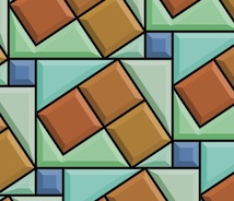
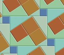
Here I show the polygon areas.

The pattern is really made up of line segments that are automatically divided up. Then they are arranged into a graph, with nodes at the places where the segment ends meet. Then I mark each segment so both sides of it get visited. And start tracing counterclockwise to collect closed polygon areas. The complex part is how to handle holes and stand-alone polygons, but we'll talk about that some other time.


By the way, the graph is special because it wraps around just like the pattern does.


There is a tool to put color into each of the polygons directly. I have chosen an "earth and aqua" color scheme: surf and turf.

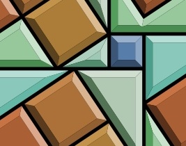
Next I bevel the edges of the polygons. This is actually complicated. It involves a gabling operation as we will see in a moment.

A bevel is shaded using an interesting model which predicts its color in HSV space based on the base color of the polygon and shading from the angle of the edge it is derived from. You can adjust the overall light angle in the interface.

The cool thing about polygonal display is that you only need to create the polygons once. Then you just need to evaluate all the copies on screen within the view. It's a bit messy to do that!

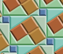
The bevel width is controllable, allowing you to magically adjust the look of the tiles directly with a slider. For me, it's a bit disorienting to change the bevel width, because I am not used to seeing this occur in real time in the real world.

I have made the computation of the bevel geometries bulletproof, a thing I was not able to accomplish at Fractal Design (and Metacreations) when I was trying to create the first version of this tool.

It appears that I've learned a few things since then! With previous posts, I have created the bevels by hand, by designing polygons on the grid. Now The bevels can be created automatically from the source polygons using a non-destructive procedural process. In other words, they can also be turned off if you like.

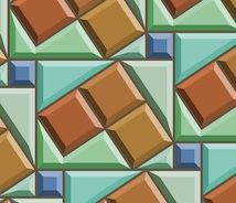
There is also a grout control. This means you can change the grout width in real time with a slider as well. This can make tiles that look a bit more real, since real tiles do have grout in between them.

The grout operation uses the beveling engine, so even if a tile disappears because the grout is so large, it knows not to output it.

And yes, it is disorienting to change the grout width in real time as well! When you move the slider fast, it's just crazy!

And, of course, you can turn the grout off if you like.

The beveling is completely general. If you crank up the beveling width until it is large enough, the center parts of the tiles disappear. This is why I call this a gabling operation.

The actual polygons output are really equivalent to the computations required by architects when they are producing gables for a roof of an oddly-shaped house.

I'm glad it works, because sometimes the polygon shapes are non-intuitive! It seems to be bulletproof now, and works in the general case. Like I said, I use this same engine for the grout computation as well.

One more problem presented itself when I was building this tool: the matte edge problem. When rendering polygons that abut each other, you get a tiny matte edge. I have made the background black to make this more obvious.

This problem occurs because I am using a standard polygon renderer (CoreGraphics bezierPath) and each polygon is output with anti-aliasing. This means that the edges will have a one-pixel-thick one-quarter-intensity dropout between them.

I remedy this by enlarging each polygon by 0.24 pixels before I render it. This can't really be done properly by stroking the edge (as in Postscript). It must be done by widening the polygon. So I built a widening engine into my tile engine.

All of the other diagrams show the result of this widening setting.

I think next I will do some work in refraction. With just a bit of work, it could look just like stained glass. This would require me to make the results actually 3D. Actually, that's not too hard, given the gabling model I use to compute the bevels.

Perhaps one tile could shade its neighbor. Or a global illumination model could give the rendering a bit more life.

Now, what does real marble look like?

Friday, November 2, 2012

Different Perspectives

You can look at things from different points of view. And this can help in almost everything you do.

Look at each new point of view as a degree of freedom in understanding. The more degrees of freedom, the more independently your thoughts can move.

With each new degree of freedom, concepts that you once thought of as constant can now change. Perhaps things you once took for granted can become emergent truths of your new frame of mind.

Or become surprisingly refutable.

One thing is certainly true: if you don't at least try to look at things from different perspectives, you become stagnant.

Degrees of Freedom

Look for a dimension along which there is some give and take. Perhaps things are not completely fixed and immutable.

When technology changes, for instance, slippage occurs and a new dimension of possibility opens up. This can cause disruption.

Once it was cheap to send megabytes through the Internet, intangibles like music and movies could be easily sent.

Record stores and video stores died.

So find that degree of freedom before it finds you.

Human Interface

With true-color displays and greater ability to compute, transparency became possible in interfaces. A new dimension opened up: opacity. But in this case, a little overuse quickly showed that things could get confusing.

Nonetheless, in modeless situations that are optional, such as heads-up displays, inspectors, and the like, transparency does still get used.

In UI, transparency really refers to whether the use of a control is obvious. Aside from this attribute, ergonomics and simplicity are also paramount design considerations.

To make an interface item cool without regard to its function is simply gratuitous. I have certainly done that from time to time, but I suspect those days are over. Or are they?

The use of three-dimensional interfaces is another interesting design consideration.

There have been a few attempts at creating fully three-dimensional interfaces, such as SGI's button-fly interface. Our approach to three-dimensional interface is much more sophisticated today, and integrated into our workflow.

Two-year-olds and grandmas alike have been brought to the computer as never before by glass and multitouch.

Nonetheless, Minecraft is quite popular, as is Spore and The Sims, all three-dimensional worlds manipulated directly. It's important to teach three-dimensional thinking.

And it is true that some interfaces appear to be three-dimensional, like Apple's cover flow. Put simply, magic counts.

But form still follows function.

Fit Together

Things must fit together and dovetail perfectly. Seamlessness counts. When human interfaces are inconsistent, something feels wrong. Even to two-year-olds and grandmas.

Both workmanship and workflow fall into one category now: fit.

Once again, when you consider fit as a guide rule, suddenly things might reorganize themselves in a wholly different way. A new pattern emerges because you discovered the right degree of freedom to work from. You found the right perspective.

Did things ever line up quite so right?

The value of your creative output is at stake.

Saturday, September 22, 2012

Three-Dimensional Design

It takes awhile for a design to unfold in my mind. It starts with a dream of how something can best function, and, with real work, iterates into the optimal form for that workflow. Yet it's not until it assumes real form that I can say whether I'm satisfied with it.

When designing, I often consider the benefit of workflow I have experienced in the past. Consider maps. When I was a kid, driving across the US in summer, I collected maps from gas stations (back when they still had them). I was trying to collect a map for each state. This is when I became familiar with the basics of functional design. A map had to be compact, and yet describe many places with sufficient accuracy for navigation.

I observed how both sides of a map were useful for different purposes. How many locations of interest were indicated with icons. A legend indicated what the icons meant. This was a time of real curiosity for me. Of essential discovery.

Such hobbies as building geodesic domes and technical illustration kept me focused on function for the longest time. But eventually, in high school, I discovered Graphis, an international magazine of graphic design. This struck a chord with my innate drawing talents. And suddenly I was also focused on form.

And then it was impossible function that caught my eye. At Fractal Design, I continued this design philosophy. Here is an illustration from those days, reinterpreted in my modern style that expresses form. A wooden block penetrates through glass. This is ostensibly impossible, of course, but it was in tune with my sense of materials and their simulation in UI.

At the time, I was lost in a maze of twisty passages, all alike: the labyrinth of UI design.

John Derry and I were concentrating on media, and had been since Dabbler introduced wooden drawers into paint program interfaces. Like the paint can, it was a return to the physical in design. Interfaces needed something for users to conceptually grab onto: a physical connotation that made the interface obvious to the user.

One project I was developing at the time was Headline Studio. This was an application specifically intended to create moving banners for web ads. It concentrated on moving text. So when working on a hero logotype, I sketched out these letters. The idea was that, in a static illustration, the letters might appear to be walking in. And the addition of the cursor was a functional cue. This ended up being pretty much what we used.

Every bit of Headline Studio was designed in minute detail. This included many designs that were not used. For instance, I show here a palette that was rejected because it was thought to be too dark.

This brings up the subject of visual cues. To visually cue the user to thinking of a palette as something to adjust the image, we chose simpler designs that those we used for windows. But sometimes we went overboard on palettes, as you know from the Painter UI design.

In the Headline Studio timeframe, we started thinking about three-dimensional UI. We considered different three-dimensional functions. For instance, we considered the window shade.


A window shade is hidden when you want to see out, and you pull it down when you want to block the view. At the time, there was a trend to make a window collapse to just its title bar when when you double-clicked it there. I considered that to be an extension of the window shade.

And by extension, we could turn palettes into window shades so their controls could be accessed only when they were needed.

Eventually this technique was replaced by the expanding list with the disclosure triangle. We liked this because when the list was closed, certain crucial data could be displayed in the list element. The user could thus discover the current state of the most important controls in a quick glance, even when the list was closed.

You get a bit of that here where the current color is displayed even when the palette is rolled up.

And like a real window shade, a small amount is shown to grab and slide down. This sort of technique would work even now in the multi-touch era.

You can also see a nod to the three-dimensional look, because the palette bar has depth. This makes it more sensible to the user that it can somehow contain the rolled-up shade.

The real cost of producing a three-dimensional UI is the need to develop an visual language of controls. Take for example the humble check box.

It has been a box with an X, a box with a check coming out of it, even a simple bump that becomes a different-colored indentation. Eventually the box with the X became a close square in a typical window (though Mac OS X uses little colored balls. Which really are very nice, I think. The close ball uses an X, of course).

But the check box is really an on-off item. It could easily be a ball in a box that just changes color when you tap on it, for instance. On and Off? Red and Green? Or it could be a 1 and a 0.

You become endlessly mired in an array of choices when it comes to this necessary visual language. And some things just don't make sense. Eventually we came to the conclusion that objects were more useful than icons. Because the objects become more readable and their behavior is already known.

When we came to sliders, we realized that they were also used as visual indicators. Having played a pipe organ from time to time when I was a teenager, I found that drawbars might make a nice physical metaphor.

Here is a prototype for the actual sliders themselves. One of the metaphors used was like a ruler with a dot at the end. This dot marked a grab-point. You could tap and grab at that location to extend the slider to the right. This would increase its value. The marks at the bottom give you an indication of the magnitude of the slider's value. Another more drawbar-like metaphor is the glass semicylindrical rod. You can see its magnitude based on the number of lines you cross (and which refract into the rod as you drag them over).

This was an example of form leading function, but it was compelling enough to experiment with. If you turn this one into a real control, it must be possible to have several of them, like drawbars on an organ.

Another way to look at them is as a bar chart. Each parameter has a magnitude that is indicated by the length of the glass rod. The interface is three-dimensional, as you can see. The section to the left of the bars is thick enough for the bars to be embedded into.

Probably the inclusion of even more shadows would make it visually more interesting and also more easy and obvious to interpret.

These are re-drawings of my original sketches from 1999, colored and rendered using a woodcut look.

The idea of using a sticky note that sticks out of the edge of a three-dimensional pad was one simple physical construction that seemed useful. But how? In real life it is used to mark a place. Sometimes it is used to specify where in a large document you need to sign.

Either way, it was similar to a bookmark in the web: a quick way to get back to a specific place that you want to remember

The pad signifies a multi-page document, like a PDF. So, how might this be envisioned in actual use? I actually drew out a few examples. And here is one.

This shows an idea for a storyboard project. The storyboard is the multi-page document, with frames showing in sequential order. Different scenes might be marked using colored tags. The blue arrows allow the user to sequence through the pages in the normal linear ordering.

Probably the colored tags would live in small piles like a sticky pad. The user can click and drag a sticky note from the pad to tear one off and continue to drag the note to the document for use as a placeholder on the current page.

A nice, clean three-dimensional interface for non-linear access to a linear document!

Here's another three-dimensional interface, used for a document window. It's kind of a gratuitous use of 3D though, as you can see. Still, it features an infinitely thin document, like paper, stretched in a frame made up of the scroll bars and the title bar.

Perhaps the red item in the corner is a close box.

Down in the corner is a kind of tactile device used for adjusting the window size. All of these parallel what a window has in it right now, of course, and has always had in it.

It's all about using a different visual language for the UI elements, which is something you have to choose before developing a UI in general.

Here is another, more generic example, devoid of the accoutrements of a title bar. It shows that it might be possible to put transparent stuff into an interface as well.

It is unlikely that I had any idea why I wanted a transparent element in the interfaces (I have colored it green to single it out). It is another example of form leading function.

I am still interested in how such an element can be used, though. It does look cool. It is also possible to make the document itself transparent. This might even be a nice frame for a layer in a touch environment. Consider touching the layer, and then having some controls appear around it. In this case, the three-dimensional interface makes more sense since they are like objects that appear on touch command.

But you can consider elements like the blue arrows in the storyboard example above. They could be made transparent easily, with no real loss of readability. And that would look cool as well.

And what, I wonder, is the shadow being cast on? The elements seem to float in space in the example. It is an example of a visually interesting impossibility. If we were going for true realism, this wouldn't qualify.

And that, in a nutshell, is one of the endearing qualities of three-dimensional UI. It doesn't have to simulate something totally real. It can be magic, simply transcending reality.

The amazing thing is that, as a user, you still get it.

When it came to the Headline Studio packaging, I needed to come up with a way of showing animation on the box: a completely non-moving way of showing animation. I came up with several ideas, but this one stuck in my mind as a good way to show it.

Once again, three dimensional design becomes a useful tool, because it helps to replace the missing dimension of time.

Saturday, May 5, 2012

Iconic Things

The pursuit of simplification of a drawing or a concept is a very useful tool. You can get to the heart of an idea really quick by distilling it into its purest form. This is one dependable way in which you can tell if its a good or a bad idea.

An Iconic Knot

I was writing a blog post on knots when I began thinking about how simple a depiction of a knot could be. For me, the simplest knot is the overhand knot. I don't think a knot can be simpler than that one.

So the first thing I did was to draw it in several forms. The one I preferred was the pretzel format used by bakers in Europe. This presents it in the most readable format.

Here is my initial sketch of the overhand knot. Aside from some clumsy shading and a few thick spots, this one seemed to have the right proportions at least.

When designing a logo, the first thing is to make the figure into the simplest line art you can get away with. This meant removing the extra space of the loops (really this is tightening the knot). And it also meant losing the shading, but not the essential feeling of intertwining. So I used some tracing paper to make a crisp black-and-white version of the knot.

Here you see the second iteration of the knot. All elements of shading have been removed. The only thin lines are the ones that lead us to believe it is intertwined. The lines lead us to feel the overlap and the 3D precedence of the rope. But only that. There is nothing else left. A uniform thickness is used for the rope, and the outline is carefully moulded to give the impression of a smooth figure.

Even the place where the strands touch, in the center, has been simplified into what I believe is its simplest form. This iconic knot is a perfect stepping stone for other depictions.

For instance, I can color the knot to give it a playful design. Like the logo for a yarn company, this piece really exudes creativity and simplicity. Perfect for a crafts company.

Another possible departure from the clean logo-form is the woodcut, shown at the top. This one was inverted from the hand-colored logo form and then shading lines were cut into the form to give it a rough feeling of a linoleum cut.

For the original knot, I used a Sharpie on thick cotton bond paper, scanned it into Preview on Lion, and left it unmodified so you could see what I actually had to work with. For the logo form in black and white, I used another think piece of cotton bond paper and a sharpie to trace it. Then I scanned it into Preview and color corrected and rotated it. Then I brought it into Painter as a .jpg file and hand-edited it into the form you see here. I didn't do anything to clean up or flatten the black areas. They still had various shades of black in it from the Sharpie.

To color the second version, I used a New Layer set up with the Screen layer method in Painter. And then I drew into the black areas. The white areas are essentially left untouched by this method even if you intrude into them.

The woodcut was inverted in Painter and this produced the dirty white you see, which I liked and kept around. I added the tiger-stripe shading using lots of handwork with the goal of making it feel like a woodcut or a linoleum cut. I used my clever techniques from my scratchboard days to get the feeling right. In some cases I had to work and rework the shading stripes when they didn't fit. But I was going for an informal, hand-made look.

Iconic Forms

I like to investigate form in 3D, and the knot is certainly a way of looking at 3D forms in a new way. After all, with some slight modifications, the knot could be made into an iconic trefoil knot as well. Perhaps in my next post. A class 3D form is the cuboctahedron.

Here you see I drew a cube in perspective and then inscribed a cuboctahedron, bounded by squares and triangles. This form has 14 faces all made up of regular polygons. And since it is regularly convex, you can see seven of them here.

Shade it and you can see the form more clearly. But I think I will have to remove the lines of shading in order to simplify it more.

I love these forms. For a more complete exposition of them, see this link.

Iconic Sayings

I have noticed a lot of bands with the word One in them. In particular One Republic and One Direction, to mention just two. But it reminds me how easy it is to create iconic sayings by using the word One. As for me, I have only one eye that really works properly. But the catchphrase One Eye would not be truly great for a band. But One Vision would. Also things like One Leg would similarly not be good, being less preferable than One Step Ahead, or even One Step Behind.

In the iconic image category, One Vision leads to the all-seeing eye. This symbol, used on the dollar bill, is the symbol for vision in the larger sense. Rather than depict it as a pyramid, I have removed the third dimension and so I show it inside a triangle. Once again, it is black and white with hard edges: line art.

The eye is shiny, of course, and this is indicated by the triangular divot taken out of the iris form. The rounded form of the eye is reversed out from its triangular enclosure. Size-wise it intersects the edge and so leaves its full extent to the imagination. A clever design trick. This image may also be colored. I would suggest the iris. But this may lead to the pupil becoming colored, which will be wrong, since it must be left black. So I have left this logo form completely uncolored. Or, you can color the whole thing in a Pantone shade.

Also along these lines, the phrase One Lie occurred to me. And immediately a symbol occurred to me: a hand with the index and middle fingers crossed. Kind of a white lie, a fib.

Even such simple concepts can be iconized into a line art form, as seen here. It probably couldn't get much simpler without losing something.

Still, iconic catchphrases such as One Voice don't immediately bring an image to mind even though it is a good kernel of a thought.

Iconic Hand

The symbolic hand reaching up for help is another icon I have sought to create. I like hands, so this one seemed like a good choice.

To create the symbolism of reaching up, I wanted the hand to shadow itself and have light leak through the fingers. The light from above symbolizes hope.

The hand reaching symbolizes need, and desperation. Grasping for straws.

Here I took a photo with my iPhone, imported it directly into Preview, and saved it to a .jpg file for import into Painter. Once in Painter, i cloned it and created a line drawing. This line drawing was adjusted again and again until it seemed reasonable to my eyes. Then created a New Layer, made its layer method Gel, and used a shade of brown to add shading to the hand, using the original photo as a reference.

I did this again with a slightly redder brown, and created a darker shading layer on top. Finally, I processed the original image into a set of grainy splotches using soften and equalize. I did this repeatedly, adjusting the equalize levels so I got just the right amount of flecks of texture. Then I edited the texture image so it only covered the hand. I placed it on top as another layer and used the Darken layer method with a very small opacity to make the texture subtle enough so it wouldn't detract from the theme.

This piece is intended to be expressive, and gritty. But really only the hand form and position is iconic.

Iconic Texture

When John Derry and I used to talk about textures, one texture he liked to draw was what he called the Good 'n' Plenty texture. This was made up of lozenges placed in such a pattern so they avoided each other in a pleasing visual way.

These kinds of textures get even more interesting when the figure has a direction to it, like a triangle. So even a texture can be shown in a basic, minimalist way. The ultimate minimalist texture is the speckle, introduced and explained in the post Texture, Part 1.

Iconization

In short, the boiling down of an idea into its component parts, the exclusion of the unnecessary ones, and the most economical depiction of what's left forms the entire process of iconization. Sometimes all you have left is a silhouette. Sometimes it is a clean rendering. But always, it evokes a single iconic idea.

Iconic Bestiary - More Like This

In this blog, I have presented many iconic items. In Interlock, Part 2, I presented the iconic three intersecting rings, the atomic rings.

The post An Anatomy of Painter's Brushes, Part 3 contains a very nice iconic brush stroke, complete with grain.

In the post New Ideas, Old Ideas pretty much every picture is an iconic depiction of something.

The entire post Drawing On Your Creativity is about iconic depictions in 3D forms, many of them impossible figures.

My post on Color is filled with the iconic color overlap diagrams. Most of the figures in Interlock (the original post) are extremely iconic, and especially the Valknuts.

My post The Things We Throw Away has the iconic floating mountain.

It is clear that Art From Deep Inside The Psyche draws on all my inner troubles to produce the most interesting of all the iconic figures, some with variations, that I produced in the 90s.

My article Where Do Ideas Come From? contains a wealth of iconic imagery, from lightning bolts to letterforms.

In Patterns, Part 3 I explore the iconic looping structures and show a grammar to construct them.

In the post The Most Useful Painter Feature, the whole concept of X2 is iconized and presented in many ways.

My post on Three-Dimensional Thinking has some very clean, iconized items.

An interesting iconic item, the burning ice cube, was covered in extenso in Creativity and Painter, Part 3.

Sunday, March 18, 2012

Interlock

Interlock is part of the language of design. It has been around for centuries. It can symbolize love, war, and the cycles of nature. Our furniture, machines, and even our clothes depend upon it. Indeed, interlock may be designed into the very fabric of the universe.

We have talked about patterns that may be constructed by having several tiles to choose from and the cool interlocking looks that come from that. We have even started talking about the grammar of tiles and the kinds of changes to the tiling patterns that come from even-odd rules.

For instance, a simple plainweave uses an even-odd rule.

And this is the most common form of interlock. Plainweave is the basis of modern cloth and thus clothing. Weaving was discovered millennia ago, and is still done today by handcraft artists and by full-scale Jacquard looms in factories as well, worldwide.

Some interlock was designed as a symbol of the gods, like the viking Valknut, the predecessor of the modern trefoil knot and also of the Borromean rings.

I have constructed a Valknut out of the basis for an impossible figure I used to sketch when I was a kid. This interlocking figure is called unicursal because in its simplest form, it can be drawn from one unbroken line, if you ignore that it must pass in front of and behind itself, of course. And this shows the even-odd rule in is most primitive form. Each time we cross over, we alternate going over and under.

The plainweave also does this, but in a regular manner. If you number each row (weft) and each column (warp), then you can see that the warp passes over on each location where the row number plus the column number adds up to an even number, and the weft passes over when the sum is odd.

The Valknut, of course, it the predecessor of the trefoil knot, which is sometimes known as the love-knot. This is in a direct conflict with the original meaning of the Valknut, which is as a symbol of Odin's patronage of the valiant fighters who die in battle.

Still, to me, the trefoil means an endless connection. Something continuous and intertwined, even entangled. Metacreations used a trefoil knot for their logo at first, until it was replaced by an uninteresting and uncreative logo by the new CEO.

I think I prefer to remember the trefoil as an endless connection.

A second form of Valknut is organized like interlocking Borromean rings, but with triangles. This shows the basic interlock, which also follows the even-odd rule scrupulously.

A very tight version of this occurs on various viking-era runestones, such as the Stora Hammar stone and the Tängelgårda stone in Lärbro, Gotland. 

I am a bit of a fan of runestones. I have visited the large Jelling stone, in Jelling, Denmark and wondered at its intertwining, which dates from the tenth century. It contains several trefoil knots.

Actually the vikings did influence a lot of art that contains intertwining. It's possible they had their influence on the famous Book of Kells, housed in Trinity College, Dublin, Ireland.

I have shown that we can construct patterns from rectangular pieces that we piece together like a jigsaw puzzle. Here again, the even-odd rule helps us create a standard interlocking pattern line plainweave.

On a two-dimensional lattice, the even-odd rule is exemplified by the checkerboard.

Interlocking figures in 3D are not hard to come by. I have drawn one here and I reproduce it at a larger scale now. It shows three interlocking slabs. If each slab is actually constructed of a 1x3x5 form factor, with a 1x1x3 hole in the center of it, then they should just fit together, leaving a 1x1x1 void in the center.

The original version of this I drew while bored in a Metacreations management meeting where we were discussing a highly relevant problem. I found it on the back of a sheet of copy paper with the reverse side inscribed with ideas for improvements on the "MetaWorlds" family of products. These included Kai's Power Goo, Kai's Photo Soap, etc. Some of my best drawings are on the back of that page!

I have also been interested in the interlocking logotype. This interest has led me to produce interlocking forms for P4 and P5 (symbols for Painter 4 and Painter 5). One of them got reproduced in the Painter 4 manual.

I implemented this logotype in mosaics and it was definitely influenced by medieval letterforms.

The P4 logotype might have been a little bit different, but it certainly got its point across. Our theme for Painter 4, Painter Through The Ages, was the inspiration for this creation.

Also, the royal monogram for Danish king Christian the Fourth caught my eye one day when visiting the Domkirche at Roskilde, Denmark.

The construction of logotypes and monograms is a cool art. It is still in use today and practitioners of the art can be found at all design studios.

Interlock is still something that stirs people's imaginations. The Lego toys are the best way to get started thinking about interlocking and its application to building.

Even today, science is fascinated with interlocking. In particular quantum entanglement is a classic expression of interlock. Two photons become entangled: their quantum states become interlocked. Even when they are separated, they continue to interlock: when you change the quantum state of one, the other's quantum state must also change to match.

Perhaps interlock is built into the very fabric of space-time.