Showing posts with label John Derry. Show all posts

Sunday, February 2, 2014

The New Brand

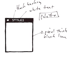
In my notes from 1997 and 1998 I found this graphic from the last days of Fractal Design, immediately after the merger with MetaTools, and the start of the newly-formed company, which was to be called MetaCreations. It shows my irreverent take on typography, with letters verging on an alien alphabet. Perhaps this was my thinking in those days, clearly influenced by Star Trek: The Next Generation design and increasingly beginning to think that aliens were taking over my company.

The graphic was a last hurrah, buried in my logo-search stack. These were the papers that detail the search for a new company name and logo, begun as a result of merger. Those were turbulent days, full of interesting ideas that never made it. Here is another little sketch from that collection of the doodles drawn in those days when the meetings were long and the bickering was uncomfortable. I was already thinking about the metaphors for the idea processor.
Name search

First came the name search. The first edict, from John Wilczak (the MetaTools CEO and soon to be replaced) was that the name should contain "Meta". Once you put that flag in the ground, there are only so many names that can be chosen. We all bought into it.

John Derry and I thought up several meta-rooted names for the company. We centered around various concepts, like making: names like metaforge, metafactory, and metaforce. We also tried words around branding: names like metabrand, metaware, metafactor, and metacraft. Next we covered concept names like metapath, metaform, and metadesign. Of course, we also looked at location names like metaworld, metastage, metasphere, metawave, and metalevel. Combination names sometimes became useful, like metalith and metastar. We were going for simplicity and pith.

We had a hundred names to choose from, and three or four made the top of the list. But it turned out that they were always taken by one company or another, and so proved themselves to be unsuitable for our purposes.

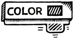
In the end, the root word meta (meaning "on another level") was merged with "create" and we somehow found MetaCreations as our new name. We worked out the typestyle, using a PR branding firm called 30SIXTY, contracted by Sallie Olmstead. The result was a very good type treatment. One of their designs stuck, seen here. MetaCreations passed the trademark search and so we found ourselves in the position of needing a good catchphrase to go with it.

Catchphrase and Logo

At this point, we hired a new CEO and the branding began afresh. This cast us into disarray: the implications of three separate groups pushing in different directions. Let me introduce you to the three groups:

One group was Gary Lauer's group. Gary was the new CEO, hired by the board and taking on the challenge of merging two cultures with a third culture of his own. The second group was Kai Krause's group. Kai was the design thinker from MetaTools and the creative face of the company. The third group was John Derry and myself, Mark Zimmer. But, frankly, I took the lead because I was the representative to the logo group. As you will see, the three groups couldn't agree less. And yet we eventually found a logo. Here I show a doodle from a page drawn during the endless logo meetings.

The catchphrase Gary preferred was staid and traditional: The Visual Computing Software Company. The logos from his group were not unlike the ones from Claris in style. The other two groups saw the logos as pedestrian and frankly uninteresting. Here you can see one of the color schemes of his final logo set. The earlier ones were considerably more amateurish. This one features an M-shape with a bit of a shine nestling into it. My comments on this particular logo are unprintable, sadly: I will leave them to your imagination. Kai felt pretty much the same about this logo.
The catchphrase Kai preferred was genuinely clever: where great ideas are born. Also, John Wilczak, before he left, preferred start the migration, though I'm still not sure where he was going with that one. The logos from Kai's group initially centered on an egg - with the idea of hatching a new idea. Other groups just kept thinking "Meta lays an egg" as the headline. After a brief trademark search, we discovered Software Ventures had an egg with a shadow as its logo, and that was the final crack.
In the sessions for my group, John and I tossed around the creativity concept endlessly. One catchphrase was bringing creativity to you. Another was changing the way people think. Our final try was sparking your creativity. While fascinating and very ambitious, I still think Kai's catchphrase was best. Our logo designs centered on a hand - for software that was human-centric. The hand was the artist's signature from the days of the cave-painters. Other groups just saw "stop" - a hand telling you not to enter. Here, we placed it inside an oval form to suggest an egg.
All three groups had a basic problem - the other two groups opposed their design. So Gary, thinking his group was more equal than the other two, decided to make a presentation of his logo. Allowing us to choose the color scheme. Ah, that was a rough meeting.

This required Kai and I to work together on a new logo. I dredged up an old design: the trefoil knot. I had made this design in 1983 when working as a consultant for Auto-Trol (I was building them a 3D system for computer-aided engineering). I had resurrected this design when working on Detailer, the 3D Paint Program, adding a mirrored surface to it. Here we see a small version of this knot, produced in Detailer using a brassy look. Kai's people used Bryce to create a much cleaner, smoother nicely-tilted version of this knot, and added a slight soft shadow underneath it.

This shadow was eventually omitted and the catchphrase was changed once again.

This time I wasn't asked. As you can see, it became The Creative Web Company. The times were changing, and at this time, before the dot-com boom and collapse, everything had to be  naively covered with web-web-web. The trefoil knot had a nice reflection and self-shadowing, though. Kai and I approved the form.

After Kai and I decided to redesign the logo, he had his people design some new forms. Many of them were based on threefold symmetry, which I also tend to prefer. One designer, Athena Kekenes, produced some iconic figures that still hold up today. The first figures were triangular-symmetry organic forms that had a very interesting, yet somehow alien, lilt to them. With tree-like branching properties and spherical ends, it looked a bit like some strange form of sea-weed. You can see one of the designs here. We asked for some more ideas.

One was a cube that had a sphere subtracted from it. This, when viewed from the direction of a corner, had a six-fold symmetry that was quite pleasing.

Here you can see the cube, with the sphere subtracted. With Boolean operations in Bryce, this stuff just jumped right out of the imagination into the page.

When you look at it, it's a bit busy. It has a shadow, the three visible sides of the cube have different shades. The sphere has gradations. The objects even shadows itself!

I'm sure this is what Kai and Athena were thinking when they came up with the simpler version of the logo.


Here we can see the flower logo. It's very clean, simple, stylistic, and suggestive of 3D.

Negative space is used in two ways: the sphere is negative space when subtracted from the cube, and the flower is the result of looking through the negative space of the 3D form and coloring in the holes.

In some way, though, we found these cube-based logos to be too derivative of the Silicon Graphics logo. I even found the SGI logo in my notes right next to this one.

Kai's group never really gave up on the egg, until the trefoil knot became our focus. By that time we were tired of the process of logo search.

Here is an egg-derived logo that used the shape several times in negative and positive space to form an op-art logo. This held up better because it could be reproduced in black-and-white. As any good logo should.

But eventually we centered on the trefoil knot. It's iconic form was clear. Before any of his people had a chance to perfect the trefoil with reflections and shadows, he had his people do special black-and-white versions of the trefoil.

This version is exceptionally clever, using rotated versions of the knot silhouette in alternating colors, then subtracting out the middle.

Though we liked the line art reproduce-ability of this form, we thought it looked a bit too much like the woolmark logo.

In all, we spent too much time working on the logo. Gary, in his desperation, did an end-around and created his own logo and placed it on our products. This was done because, after all, we had to have something to put on shipping products. This was another logo based on the M (and, it seems, on Freddy Krueger).

As you can see, Gary even replaced the typeface we selected! His quest for a unified package design was next. This actually made us mad, because each product was a brand of its own and the entire concept of unified product packaging design seemed wrong.

What did we do to deserve this?

In all, I wasn't really satisfied with what came out of this process. Personally, I doubt Kai was either. Meta continued to create great products, nonetheless. Bryce, Painter, KPT, and Poser saw fantastic new versions. And Ray Dream Designer metamorphosed into Carrara, which was a very ambitious project and a great product in its own right.

And I just kept drawing new iconic logo designs. I knew that someday they might be useful to me. And someday the story would be told.

Saturday, September 22, 2012

Three-Dimensional Design

It takes awhile for a design to unfold in my mind. It starts with a dream of how something can best function, and, with real work, iterates into the optimal form for that workflow. Yet it's not until it assumes real form that I can say whether I'm satisfied with it.

When designing, I often consider the benefit of workflow I have experienced in the past. Consider maps. When I was a kid, driving across the US in summer, I collected maps from gas stations (back when they still had them). I was trying to collect a map for each state. This is when I became familiar with the basics of functional design. A map had to be compact, and yet describe many places with sufficient accuracy for navigation.

I observed how both sides of a map were useful for different purposes. How many locations of interest were indicated with icons. A legend indicated what the icons meant. This was a time of real curiosity for me. Of essential discovery.

Such hobbies as building geodesic domes and technical illustration kept me focused on function for the longest time. But eventually, in high school, I discovered Graphis, an international magazine of graphic design. This struck a chord with my innate drawing talents. And suddenly I was also focused on form.

And then it was impossible function that caught my eye. At Fractal Design, I continued this design philosophy. Here is an illustration from those days, reinterpreted in my modern style that expresses form. A wooden block penetrates through glass. This is ostensibly impossible, of course, but it was in tune with my sense of materials and their simulation in UI.

At the time, I was lost in a maze of twisty passages, all alike: the labyrinth of UI design.

John Derry and I were concentrating on media, and had been since Dabbler introduced wooden drawers into paint program interfaces. Like the paint can, it was a return to the physical in design. Interfaces needed something for users to conceptually grab onto: a physical connotation that made the interface obvious to the user.

One project I was developing at the time was Headline Studio. This was an application specifically intended to create moving banners for web ads. It concentrated on moving text. So when working on a hero logotype, I sketched out these letters. The idea was that, in a static illustration, the letters might appear to be walking in. And the addition of the cursor was a functional cue. This ended up being pretty much what we used.

Every bit of Headline Studio was designed in minute detail. This included many designs that were not used. For instance, I show here a palette that was rejected because it was thought to be too dark.

This brings up the subject of visual cues. To visually cue the user to thinking of a palette as something to adjust the image, we chose simpler designs that those we used for windows. But sometimes we went overboard on palettes, as you know from the Painter UI design.

In the Headline Studio timeframe, we started thinking about three-dimensional UI. We considered different three-dimensional functions. For instance, we considered the window shade.


A window shade is hidden when you want to see out, and you pull it down when you want to block the view. At the time, there was a trend to make a window collapse to just its title bar when when you double-clicked it there. I considered that to be an extension of the window shade.

And by extension, we could turn palettes into window shades so their controls could be accessed only when they were needed.

Eventually this technique was replaced by the expanding list with the disclosure triangle. We liked this because when the list was closed, certain crucial data could be displayed in the list element. The user could thus discover the current state of the most important controls in a quick glance, even when the list was closed.

You get a bit of that here where the current color is displayed even when the palette is rolled up.

And like a real window shade, a small amount is shown to grab and slide down. This sort of technique would work even now in the multi-touch era.

You can also see a nod to the three-dimensional look, because the palette bar has depth. This makes it more sensible to the user that it can somehow contain the rolled-up shade.

The real cost of producing a three-dimensional UI is the need to develop an visual language of controls. Take for example the humble check box.

It has been a box with an X, a box with a check coming out of it, even a simple bump that becomes a different-colored indentation. Eventually the box with the X became a close square in a typical window (though Mac OS X uses little colored balls. Which really are very nice, I think. The close ball uses an X, of course).

But the check box is really an on-off item. It could easily be a ball in a box that just changes color when you tap on it, for instance. On and Off? Red and Green? Or it could be a 1 and a 0.

You become endlessly mired in an array of choices when it comes to this necessary visual language. And some things just don't make sense. Eventually we came to the conclusion that objects were more useful than icons. Because the objects become more readable and their behavior is already known.

When we came to sliders, we realized that they were also used as visual indicators. Having played a pipe organ from time to time when I was a teenager, I found that drawbars might make a nice physical metaphor.

Here is a prototype for the actual sliders themselves. One of the metaphors used was like a ruler with a dot at the end. This dot marked a grab-point. You could tap and grab at that location to extend the slider to the right. This would increase its value. The marks at the bottom give you an indication of the magnitude of the slider's value. Another more drawbar-like metaphor is the glass semicylindrical rod. You can see its magnitude based on the number of lines you cross (and which refract into the rod as you drag them over).

This was an example of form leading function, but it was compelling enough to experiment with. If you turn this one into a real control, it must be possible to have several of them, like drawbars on an organ.

Another way to look at them is as a bar chart. Each parameter has a magnitude that is indicated by the length of the glass rod. The interface is three-dimensional, as you can see. The section to the left of the bars is thick enough for the bars to be embedded into.

Probably the inclusion of even more shadows would make it visually more interesting and also more easy and obvious to interpret.

These are re-drawings of my original sketches from 1999, colored and rendered using a woodcut look.

The idea of using a sticky note that sticks out of the edge of a three-dimensional pad was one simple physical construction that seemed useful. But how? In real life it is used to mark a place. Sometimes it is used to specify where in a large document you need to sign.

Either way, it was similar to a bookmark in the web: a quick way to get back to a specific place that you want to remember

The pad signifies a multi-page document, like a PDF. So, how might this be envisioned in actual use? I actually drew out a few examples. And here is one.

This shows an idea for a storyboard project. The storyboard is the multi-page document, with frames showing in sequential order. Different scenes might be marked using colored tags. The blue arrows allow the user to sequence through the pages in the normal linear ordering.

Probably the colored tags would live in small piles like a sticky pad. The user can click and drag a sticky note from the pad to tear one off and continue to drag the note to the document for use as a placeholder on the current page.

A nice, clean three-dimensional interface for non-linear access to a linear document!

Here's another three-dimensional interface, used for a document window. It's kind of a gratuitous use of 3D though, as you can see. Still, it features an infinitely thin document, like paper, stretched in a frame made up of the scroll bars and the title bar.

Perhaps the red item in the corner is a close box.

Down in the corner is a kind of tactile device used for adjusting the window size. All of these parallel what a window has in it right now, of course, and has always had in it.

It's all about using a different visual language for the UI elements, which is something you have to choose before developing a UI in general.

Here is another, more generic example, devoid of the accoutrements of a title bar. It shows that it might be possible to put transparent stuff into an interface as well.

It is unlikely that I had any idea why I wanted a transparent element in the interfaces (I have colored it green to single it out). It is another example of form leading function.

I am still interested in how such an element can be used, though. It does look cool. It is also possible to make the document itself transparent. This might even be a nice frame for a layer in a touch environment. Consider touching the layer, and then having some controls appear around it. In this case, the three-dimensional interface makes more sense since they are like objects that appear on touch command.

But you can consider elements like the blue arrows in the storyboard example above. They could be made transparent easily, with no real loss of readability. And that would look cool as well.

And what, I wonder, is the shadow being cast on? The elements seem to float in space in the example. It is an example of a visually interesting impossibility. If we were going for true realism, this wouldn't qualify.

And that, in a nutshell, is one of the endearing qualities of three-dimensional UI. It doesn't have to simulate something totally real. It can be magic, simply transcending reality.

The amazing thing is that, as a user, you still get it.

When it came to the Headline Studio packaging, I needed to come up with a way of showing animation on the box: a completely non-moving way of showing animation. I came up with several ideas, but this one stuck in my mind as a good way to show it.

Once again, three dimensional design becomes a useful tool, because it helps to replace the missing dimension of time.

Saturday, March 24, 2012

Drawing On Your Creativity

Creative types are often visual people. And there is nothing more visual than drawing. As the voice is our one built-in instrument for our hearing, so is hand-drawing the main expression for vision.

Using our own hand to sketch out an idea is a natural step for our creativity.

So I constantly draw pictures, drawing on my creativity to help me visualize. And it is a salve for the rougher times of our lives. A bit of escapism. Good for what ails us.

3D Forms

Ironically, it is two-dimensional pen and paper that becomes the practice field for three-dimensional cognition. I know I am constantly drawing forms and shapes, trying to figure them out or reason about their volume. I imagine holding them in my hand, reorienting them, looking at them. And then I draw.

And when I draw, I try to find the proper orientation to depict the object and show its own characteristic features in the best light.

For a cube, I almost never draw it in such a way that I can't see its inherent dimensionality. For a snub cube, I show the snub facing the viewer. Otherwise I probably can't tell what it is. So I reorient the object in my mind to draw it.

I like the idea of something having a real three-dimensional heft to it. I can almost feel the edges around the missing corner.

Other objects are equally interesting. I like, for instance, to imagine how objects intersect, or how other objects can be contained inside them.

It isn't well-known, but the dodecahedrons - both the platonic one and the rhombic one - can superscribe a cube. This shape is the basis of a garnet crystal.

I show a rhombic dodecahedron superscribing a cube. Imagine a cube with short pyramids on each face. Constructing one with pencil and paper is easy, since the height of each pyramid is exactly one-half a cube edge length.

Rhombic dodecahedra can fit together and tile space perfectly like cubes, which I find interesting. And it's also obvious, since the vertex of the rhombic dodecahedron is actually at the center of a neighboring cube.

There are plenty of shapes that I have drawn over the years, most of them are found on the backs of meeting notes or on Excel spreadsheet printouts.

I can't even say what all the objects are, but I did find them interesting to imagine at one point. Perhaps this is a button from an old corduroy jacket.

On the same sheet I found another drawing. What is this trying to be? I imagine it is a folded bit of paper, arranged in a triangle. I never showed its other side, and so that remains a mystery.

At some point, though, three-dimensional figures need to be transcended. This is done by imagination and also by requirement. Imagination and simple tinkering can lead to the impossible figure. Requirement can lead to icons. They are both interesting pastimes and also they can be real work, as we will see.

John Derry and I spent many, many hours searching for the right icons for brushes, for features of brushes, for effects, for tools, for everything.

Impossible Figures

I have written about impossible figures before. But I created one in 1969 based on the impossible triangle. I drew the Triangular Symbol in summer 1969 when I was but 13 years old.

I drew it only a couple of months after my grandfather died, so it was clear that my obsession with impossible figures might have come from my need to process the situation.

It was drawn with a Flair pen on the harshest Olivetti copy paper, so it has colored a bit through time. And the felt pen I used wasn't exactly the best tool to use. I used a drafting set to make the basic shapes. And then I shaded it the best I could, given it is, after all, impossible.

The draftsmen at Lockheed, where my dad worked at the time, were quite impressed and put it up on their walls. But it was a time of downsizing for Lockheed and soon they were laid off.

That was the bad news. The good news was that we picked up a nice drafting table for me, cheap.

Here is the basic impossible figure it is based on. This was originally drawn in 1934 by Swedish artist Oscar Reutersvärd and later made popular by Lionel and Roger Penrose. Though it is impossible, you can create a version of it in real space, made so you can look at it from one angle and it will look real.

This is not so for all impossible figures, though. And these definitely defy imagination. Really, the first impossible figure I ever saw was in the Time-Life book about the Mind.

This impossible figure is the one that the draftsmen liked. Before I showed them the impossible triangle.

They had this figure up on their wall right next to the drafting table as a kind of joking reference to nonsense and I respected them for their humor in the matter.

This figure can't be constructed in three-space because inside and outside exchange places, obviously. If you look at one side and then the other, they are reasonable taken by themselves. But not together as a whole.

In the post Interlock, I discussed the Valknut, a cool figure used by the vikings around Gotland centuries ago to symbolize Odin's patronage of those who died in battle. It is a sacred mark of sorts.

I present here another impossible Valknut, one which intersects itself. This one took a couple of tries, I assure you. It is still a variation of the impossible triangle. I guess I never tire of making these variations.

In some ways, these figures are a tribute to M. C. Escher, the famous dutch artist that perfected the ever-ascending stairway and other impossible illusions.

I love his art! In some ways, I think maybe I'm almost as crazy, if not quite as detail oriented, as Escher. He used his hand to make all his art, and that makes me respect him.

I have often thought of the ever-ascending staircase, and so I have drawn overlapping planks to simulate the feel of the original Escher piece.

I show that they have to be bolted together to hold them in place. But I'm not quite clear on their shapes. I show some warping to the planks so they can fit, but I think it is a bit more difficult to make this work. Unlike Escher, I have preserved their proportions. Escher made his work by having a different number of stairs on the four sides of the stairway. I have used no such cheat.

Still, I try to imagine the exact shapes that will make this work. And to what end? To relieve myself of the boredom of a staff meeting. Heh.

Three-Dimensional Interfaces

In Detailer, which was Painter for painting on 3D objects, I was in the business of creating icons for tools that involved movement and rotation. This was an exercise in three-dimensional thinking and icon development. It's interesting, but Phil Clevenger ended up doing much the same thing when he worked on the Bryce and Poser interfaces. And his designs were much cleaner, I think. And in some ways, much more gothic.

Here you see a cylindrical rotation icon. For rotating a vase that you are painting, for instance. I think the cylinder in the center has to be a glass rod to make it sensible.

But this was only one of many icon tries for three-dimensional interfaces. I soon elicited John Derry's help in creating them.

I think I like three-dimensional interfaces because they simulate real objects that you can use. Like a folder that opens up when you move something to it and whoosh, the thing goes into it.

The virtual trackball for rotating three-dimensional objects on screen is an interesting task for icon creation. I think my first idea was on the left here.

But eventually, it all got screwy. Icon creation is a really hard problem in general, because you have to develop a design language that is consistent and clean and not easily misunderstood: hard to get wrong.

While sitting in endless meetings, my mind would wander. The endless progression of a grid of beans, each with their own shadow is a good depiction of boredom. And a symbol of the sure knowledge that the group will head all together in the same direction. I can see the words bean counter were almost certainly in my mind at this meeting.

This was drawn on the back of a spreadsheet that detailed the booth personnel hours for PC Expo in New York in 1996. It's really kind of funny, put into that perspective.

The Fractal Design sales personnel were well-meaning and extremely organized, so I shouldn't trivialize their hard work. After all, they were where the rubber hits the road! I will forever owe them a debt of gratitude!

At this point, I was still the CEO and we were a public company. But rust never sleeps, and I had products to create. And this includes being creative, even during sales meetings!

A page floats to the ground, its shadow beneath it and showing that it has just contacted the ground, or is about to. A corner is turned up. You can feel the rush of air beneath it, just before the page settles.

Three-dimensional forms in motion.

Nothing is static, all is moving. Trade shows and products must go on, as does life. At this point in January 1996, my life was changing, more like going over a waterfall, and I had just met some of the most interesting people I will ever meet in my life. Drawing, playing piano, writing songs, and even composing poetry: there were lots of issues to work out, and creativity was central to that process. Good times!

Icon Creation

It is very hard work creating icons and with its own design language, it can drive you a little crazy. John and I were designing Detailer icons one day, when we created this interesting bit of art. You can click it to get a larger version, which might be necessary to see it in all its crazy detail.

We were working on trackball icons. In the center, you see a prototype for the sphere with an arrow going around it. But John said that the arrow might best have two points on it, signifying that you could turn the object in any direction.

This led to a happy face with arrows on the mouth. I drew a vase with an arrow going around it, then drew a vase pouring out liquid with an arrow going around it! There is a cube with an arrow. And various circular arrows drawn and obliqued. Then John drew a brush with an arrow going around it. And it just got weirder from there.

Pretty soon there were atoms and icons for the funniest things. Like a dead fish icon. And a dead dog icon (?). And a lightning strike icon. And a tornado icon. The cow is floating around it, saying "moo", by the way.

We had gotten a bit crazy in the process; we tended to do this. How can you be serious when you are creating icons, after all?

You can see a scissors-cutting-paper icon, a road-into-the-distance icon, a submerged pyramid icon, and even a bleeding eyeball icon! I think the comment was that some of these icons were so bad, it made our eyes bleed! No, we weren't actually being serious at the time at all.

One of the icons is the pyramid with an eye in the tip. This symbol is actually on the US Dollar bill. Not sure why. But I liked it, as an impenetrable symbol of, like, a secret society.

I have one that, in its unedited form, says "I SEE ALL BUGS!!!". There is a bit of humor there, since I was talking about bugs in Painter: you know, mistakes in the code that needed to be fixed. We really needed to fix all of them before any release.

This is the standing order of things at a software company. And, as a primary developer, along with Tom, it was always my main responsibility to fix the problems. In the Painter 6 time frame, I did more bug fixing than usual because Tom was preoccupied with other issues.

John and I often made whimsical icons. Like a firecracker icon (John's). Or a lit match icon (mine). These weren't icons that had any purpose being in software, that's for sure! So we were just joking around. Entering the crazy phase. Getting really loony from being in icon hell too long. In think we tried to get more and more outrageous, just as a mode of escapism and perhaps as a kind of performance art: inappropriate art. We loved to do that.

Sometimes the icons were statements of our current situation. If we were buried in some problem that looked easy, but it was actually very, very hard, I'm sure that the iceberg icon could accurately depict our plight.

If we were outperforming our capabilities, or if we just wanted to show off, I'm also quite sure the "goes to 11" icon could make sense of it all. It is a reference to Rob Reiner's movie This Is Spinal Tap.

If we were under water or in deep seas, we might draw the ocean icon. If we were feeling angry at the world, we might draw the gun icon. Totally out of order, gentlemen! This is not allowed!

But at the bottom of it, it wasn't ever really obvious why we drew these. They were just a way of joking around while embedding ourselves and our mindsets in the art of icon creation: an art that has its own purgatory built right into it.

Sometimes Icons are just symbols for something, and can be borrowed from the icon language of, say road signs, or caution symbology.

We also liked to play that game, of borrowing the design language from some other task. It is, after all, what the paint can is based on, and so many other cool things from Fractal Design. It's where design gets fractal.

And at the end of the day, all that mattered is that we achieved our goals to ship a product. To have a product that could rise above the monotony of mundane software products. We showed them how to do it right. We were Fractal Design, after all.

We had a reputation to keep up!

Our brushes had to be the coolest. Our effects had to be the first on the block. Even layers came out first and we made hay with it with make up your mind again, and again, and again. Design is not a linear process, because of trial and error but even more because the client may not like your design. And you may have to produce several designs to show the client. We got that.

Our brushes were cool because we were always thinking of what the designer wanted out of a brush stroke. Not just what the artist wanted. Because we could simulate the natural tools, and we could also extend the capabilities of the artist directly through our new tools.

So what the designer wanted, and what we felt they would like in the future, mattered to us. We were practicing designers: we were Fractal Design.