Showing posts with label art. Show all posts

Friday, September 28, 2012

Developing a Style

In 1992, when John Derry joined Fractal Design, he introduced me to the traditional scratchboard tool. And the art of designing icons! The scratchboard tool was a tool that could scratch a thin layer of black paint off a white board. It was a very specialized traditional process, involving specially-prepared scratchboard and a special tool, like a crow-quill pen, with a changeable nib for scratching the black paint off.

In 1993, when Painter 2.0 came out, Fractal Design introduced the Scratchboard Tool to digital media. This tool had a very hard 1-pixel anti-aliased edge and also a width-changing ability that helped you create tapering lines very easily in response to pressure.

The above image is a redrawing of one of my original scratchboard sketches (then using traditional media), as depicted in Style and the Digital Era.

The scratchboard tool and its digital version pushed me to create more high-contrast art that came very close to a woodcut look. Some of my pieces from 1994 and 1995 are shown in Art From Deep Inside the Psyche.

This piece is from 1993 and shows some of my first work with Painter's Scratchboard Tool.

It also shows my Neuland Inline-inspired chop mark from that era.

It exhibits use of positive and negative space, even showing it several levels deep. Also, my preference for texture is shown in the overly-obsessive wood grain. I have cleaned this image up and colored it for display here.

You are acquainted with my modern woodcut style, having seen a few posts in this blog, and I present for you here some interesting icons I sketched in 1999 but have now completed in this style. This set of icons is the Disasters of Nature set.

Here is the "Earthquake" icon. Really the ground doesn't crack open in an earthquake, though! Why is it that most earthquakes seem to happen on bright cheerful sunny days? Because I have only been in an earthquake in California, thats why!

Yes, I was here for the 1989 earthquake, a 7.1 on the Richter scale. Although it was known as the San Francisco quake, it's actual epicenter was in Aptos, about 5 miles from where I lived, in the forest of Nisene Marks.

My friend Tom Hedges was actually hiking in that very forest when the earthquake hit! He said the trees shook and a huge amount of pollen and chaff came down from them.

The next is the "Wildfire" icon. A raging fire is another disaster, particularly here in California where every summer and autumn the fires come very close to homes.

There have even been some terrible fires close to my home, some as close as a half-mile.

You see, earthquakes strike without warning, and quickly start moving. It's really unnerving. Wildfire is also terrifying, because you can see it coming closer. Our firefighters always do their best and always contain them, but sometimes there is no way to prevent them from burning our homes.

California forests are all about renewal. After a fire, the wooded area grows back.

Lightning is another disastrous force of nature that can have devastating effects. Living near the coast, we find that many weather systems traveling frictionless over the ocean will suddenly release their energy quite close to us, as they reach land. This means torrential rain and, occasionally, lightning.

Such a powerful electrical discharge is really a grounding of the enormous potential energy stored in storm cloud systems.

A particularly strong lightning strike can easily possess a hundred thousand amps of current.

Humankind cannot yet duplicate the voltage and current of lighting, evidence that we still have a ways to go.

A hurricane icon depicts a fierce wind, blowing trees over and flooding with its massive overpowering storm surge waves.

Typhoons and hurricanes cause incalculable damage, sometimes flooding huge areas of cities, like New Orleans' Ninth Ward.

Although hurricanes never attack California north of the tip of Baja California, we do get some heavy weather here. Trees have been known to fall in the heavy weather.

And lightning has been known to strike the field outside my house as well, splitting trees from time to time. This is the consequence of living near the coast.

Tornados are a major destructive force of nature! Their winds lift objects weighing tons and throw them through the air, leaving a path of destruction sometimes a half-mile wide, like a scar on the earth.

The US is famous for its "tornado alley" stretching from Abilene to Fargo where one week can sometimes see hundreds of tornadoes.

I have seen a tornado in Japan. I was driving back from Hakone to Tokyo and one appeared less than a mile to my left. At one point it struck a lake and turned into a shiny silver waterspout. I was in no danger because the terrain was a bit mountainous and its vortex was trapped in a little valley while I drove by.

I will get back to these icons in the future, because it's clear that I have forgotten avalanches and volcanoes, both of which I have first-hand knowledge!


Sunday, June 10, 2012

Back to Drawing

After a hiatus, I like to start drawing again to clear my mind. Usually it starts with pen on paper. And eventually it finishes with a tablet and stylus in Painter.

I have been on a big project with lots of details recently, and hence the lack of posts. I must apologize, but sometimes work does call!

And when drawing comes back, like when music comes back, there is a lightning bolt moment of realization, like I have been swimming in a deep sea and I finally washed up on dry land: that drawing is a golden touchstone of my existence and how could I ever live without it for so long? The end of dark days and the start of a golden age, a renaissance of expression.

There is something ineffable to this moment. So I have attempted to create a smart banner to show my inner joy. This is the first piece I did after joining the living again at the end of the long dark tunnel.

In this work, like so many others I have done recently, I am attempting to create clean lines. Lines in search of a woodcut or linoleum cut look. Lines sculpted and individually shaped. But still irregular and hand-made. I can't see the value of perfection in this kind of work, like someone used illustrator to create the design.

If I used Illustrator to do this, I would have to continually play with the result because it would look too regular. Perfection still has a hand-made look, to me.

The second piece I created in celebration of having time to solve the Rubik's cube again, which I find to be another touchstone of my inner self, is this one.

In this piece, each line is once again sculpted. Drawn and re-drawn. Tapered, carved from left and right.

I created this by setting up a clone and drawing using crude, fat lines wherever I saw an edge I wanted to keep. This produced a very dumb-looking drawing in black lines on a white page. being unsatisfied with the look, I began to sculpt the lines to create a look that simulates using a ductal carving implement in soft linoleum. It took hours and hours before I had a piece that was worthy of coloring. It was in black-and-white and actually made a pretty nice drawing in and of itself.

Then I colored the cube. But I switched around the colors, which were originally yellow on top, green to left, and orange to right.

To shade the hand, I created a layer of the original picture and set it to gel, pasted it on top of the image, and carved away all the other parts of the image using the eraser.

Then I processed the remaining image, with locked transparency, using Just Add Water to create a smooth shaded version of the image. Because it was a gel layer, it preserved the black lines underneath it. I think I lowered the opacity as well, to give it an ethereal look and also to favor the lines.

I also started using a chop mark, which also smacks of a woodcut. I imagined the woodblock coated with orange and red paint to give it more of a hand-work look.

The original piece is almost three thousand pixels high, by the way, since it comes from an iPhone 4S frame grab.

Siri, where did I put my tablet?

Sunday, April 22, 2012

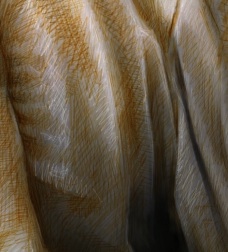
Fabric

It has always been an interest of mine to draw fabric. In a piece I once did, called The Miracle of the Paint Can, I took a low-resolution frame grab of fabric and used it as a guide to create long flowing robes. Actually, I quite enjoyed the long hours of work that went into this piece. But since it was intended to be a mosaic, I didn't really work too hard at creating fine detail of the fabric.

The other day I began to wonder how and why the look of fabric has drawn artists in. Vermeer, Dürer, Rembrandt, Da Vinci, and many others all clearly enjoyed depicting the lush fold and sinuous shadings of fabric.

So I drew this small piece. I used my iPad to get a frame grab of a part of my shirt. One with lots of twists and turns.

The first thing I did was to move it to the new iPhoto application on iPad. Then I used the lighten and darken there to enhance the natural shading. This increased the contrast of the frame grab and also allowed me to artistically pick areas I wanted to feature or drop back. It felt like fingerprinting meets the darkroom enlarger. Really I was just dodging and burning.

Then I moved it into Painter on my Mac Pro. Using a Wacom stylus, I chose the standard digital airbrush, changed its size to a few pixels, and cloned the image. Then, with the color set to clone, I sketched the image directly using clone color.

Now, this method is really the "cheating" way of creating an image, and so, once it was cloned, I switched back to standard color, chose some blue, and masked out the background, which was irrelevant to my intended creation.

Then, I changed the size of the brush to 1.0 pixels, changed the brush method to Buildup:Soft Buildup, and lowered the opacity to about 18%. Now I was ready to really sketch. I chose a ruddy orange to give it a bit of color and sketched in the darker sections with millions of brush strokes, like I was scribbling but really I was just enhancing the actual shading of the fabric itself.

Then I changed the brush method to Eraser:Paint Remover, which actually removes density rather than just being a white brush, and, with a size of 1.0 pixels again, I sketched in the highlights. This is very much the same method used in the 15th century by artists that preferred the silverpoint method of highlighting their subjects in a sketch.

Finally I chose a darker, redder, less saturated brown and went back to the Soft Buildup method to sketch in the darker lines and also the darker shadings of the fabric. This gives the fabric a multi-tone scale that approximates the renaissance sketches I have seen.

It is a nice test of my technique and also of my vision of a fabric sketch. Although the subject is unremarkable, of course!

It also shows how I like to take a standard brush, and change the internals of it to suit my style. Really I am only using one brush and, mutatis mutandis, the brush becomes a buildup sketch pencil, a fill-in brush, a cloner, and a silverpoint brush. Knowing the internals of the Painter brushes probably helps me to keep my art honest.

I think I'll try to draw some more fabric! Now, where is that velour bedspread? Maybe a still-life?

Wednesday, February 1, 2012

Where Do Ideas Come From?

Sometimes I have too many ideas. The problem becomes: which ideas might pan out, and how do they interrelate? But for most, it's more a question of: where do ideas come from? Let's talk about the various places.

Spontaneous Head Combustion

Sometimes an idea just pops into your head. I think this is because brains are always processing in the background. I had a calculus teacher in high school, Mr. Pearson, who said that the solution to a particular differential equation he had been working on would sometimes come to him while shaving.

Though that was a fairly nerdy thing to say, he wasn't far off my point.

The process of spontaneous idea generation is related to why we dream: the brain always wants to exercise in periods of disuse. When shaving or driving, your brain is not fully engaged. This means there are cycles that can be put to use. We will return to this later. But some people dream in ways that are connected to stuff they are working on. During my most productive periods when I get a cool idea and then rush to implement it (especially a very complex one that will probably take several days of constant work) I am told that I sometimes talk in my sleep: I'm mumbling variables and data structures. This definitely happened to me when I was working on Mosaics in Painter.

Hmm. Maybe I work too much!

But a simple way to use this is to think about a problem before you go to sleep, and your mind may come up with a solution while you sleep. In fact, I used to listen to music in my head right when I was going to sleep. I liked to listen to Beethoven's 9th Symphony in this state. Not really listening, per se. Actually just hearing it in my mind, every note and phrase. It was great practice for musical composition.

Sketch It Up

I like to sketch things out, and get ideas that way too. I guess it's because I'm a visual person. But, for me, lots of graphical ideas work themselves out on paper. A doodle can quickly become something larger.

I was working on borders and corners one day when I realized, as many people have, that you could represent the corners as four image pieces and the edges as another four image pieces. And the edges could be stretched or repeated. So I drew one of my favorite things, and I have reproduced it at left. I suppose it's a good example of three-dimensional thinking.

I draw in guide lines that showed the corner pieces and the edge pieces succinctly. Then I realized that these corners and edges could be filled with pretty much any image.

So i drew cylinders with pipes interconnecting them, like you see at right here. I realized that even shadows could be part of these clipped images. Note: this 3 x 3 partitioning is used to create buttons and other UI elements, also. In fact, that was what I was using it for at the time.

But I didn't want the UI to be constrained to be a rectangle. No matter! These pieces will still work, as long as all the corners are squarish. For instance:

At right, I have shown something that can be made out of the usual eight pieces, just rearranged in a different fashion from the typical arrangement I have shown so far.

This goes to show that it doesn't matter how you design it. If you take a little care, that design can service a much larger class of objects.

This design really hinged on two things: the corners and the edges. So I concentrated on the corners. What could the corner possibly be? A number of three-dimensional things popped into my head, and I sketched them up.

Here are a number of possibilities that occurred to me, drawn as corners. To left: a gabled approach that exhibits shading and has pyramidal corners. To right: that same approach, but with different edges. The edges can have their own articulations as well.  There are plenty of three-dimensional things that can grace the corner of a design.

Here, I explore the use of cubes and balls. To right I considered using a stake at each corner and a taut piece of rope in between. And knots on the rope in between the corners.

Of course, there are a number of articulations on the edge that can be used in addition to knots and spikes. Really, any repeating line pattern can be employed along the edge.
Here are some line patterns: wavy lines, beads, and twisted rope. Of course braids and yarn motifs are useful as well. But plain patterns, like stripes and diagonal "candy" stripes are also useful.


Exercising Your Brain

When I am otherwise not mentally engaged, I use that time for practice. Sometimes I do something tedious like factoring five-digit numbers in my head. You know, I like prime numbers. For instance, today I passed a house on San Jose-Soquel Road that had a number of 24,769. (I look on the right side as I'm driving home and there are often odd numbers like this one, which means they won't be divisible by 2.) I'll cut to the chase and tell you that it's 17 x 31 x 47. It took me about 4 minutes to determine that, performing long division in my head. Then, when I got home, I checked it using Siri.

It may be tedious, but it does help to keep my brain sharp when it comes to numbers. Another activity I do while driving is writing songs. I compose the melody and lyrics simultaneously. When I get an idea, I record it into Voice Notes, an iPhone app. I will go over the lyrics a few times and record a verse or a refrain.

This process keeps my creativity working while I would otherwise be bored. Exercising the right side of my brain. I used to turn on the radio while driving. I don't do that any more. I let my mind fill the silence.

I also got a great idea for a novel while driving. So I used Voice Notes to get it all down.

And, by the way, it might be a good idea to pull over, if you get too involved in an idea while driving!

Know Your Subject?

When I am wracking my brain for ideas on a particular thing, I can easily come to a standstill. It is at moments such as this that I take a step back. Specifically, this is called meta-level thinking. This process can actually be impeded by knowing too much about a subject. You can get into the mindset of thinking that it's all been said and done.

When writing a novel, it can be as simple as taking a step back and considering a character's arc. When writing music, this can manifest itself as rearranging the structure. Or adding in a full break or another device that so often makes songs interesting to our ears.

The Beatles practiced this. In We Can Work It Out, for instance, there is a section that breaks into triplets in an otherwise foursquare piece. On the back side of Abbey Road, they ran all the songs together into a single homogenous piece, a structural device.  In Getting Better, one of the verses becomes one long melody instead of several broken up melodies. On All You Need Is Love, the verses contain an extra half-measure per phrase, which helps to offset the otherwise foursquare melody (the Beatles called it the Dirge), the device of changing the time signature.  Or just having two authors can create a cognitive dissonance that can make a piece remarkable. On I've Got A Feeling, arguably the last composition that Lennon and McCartney wrote together (unless you consider the back side of Abbey Road to be a single piece), their contributions are quite different, and improve the song immeasurably. It goes on and on.

When programming, it helps to look at the problem in a different way. This can be a meta-level approach when you look at multiple ways of solving the problem, or you find a way to combine what would otherwise be different methods. This is particularly good when there is something you are missing.

Sometimes it's just a matter of employing multiple modes of thought at the same time.

Ideas Travel In Groups

When finding another person that is likewise creative, it is often possible to have a huge idea session. This has happened to me countless times with various people, including Tom Hedges and John Derry, the co-authors of early Painter.

A single session can generate hundreds of good ideas, I have found. When you get onto an interesting or fruitful subject, the result can be a veritable treasure trove of ideas.

This may be the Lennon and McCartney effect: the influence of two brains on creation is synergistically better than if the two created separately.

I have experienced this effect with John Derry on several occasions. Together we thought up Painter's image hose, for instance.

Combining Expertise

When you become an expert on one subject, it can help to give you the ability to solve problems in that subject. But is thorough research a ticket to stagnation?

I have found that it helps to be an expert on several subjects and then to combine the knowledge between the subjects. I'm a pretty good programmer, for instance, and I know how to draw. Combining them produced Painter.

Anyway, it's hard to ignore the profound influence of general thinking: knowing a reasonable amount about several subjects and thinking about how they relate.

Grist For the Mill

I'm not sure why it is, but I am equally sure that this is true: when we have emotional experiences, we are driven to create. This is typified by Lord Byron clutching his forehead at the top of the stair: the tortured artist. Or by Michelangelo undergoing great pains to complete the Sistene Chapel's frescoes: the agony and the ecstasy. Is it a cliché that only through pain can we create?

No, I don't think that it is. After hitting a patch of black ice and crashing my car in Denmark on the night of December 28, 1995, I sat down and wrote 7 really good poems. Sure, I write song lyrics, but poems? I was in a rare mood that evening after some wonderful "Good Samaritan" Danes stopped to pick me up and kindly delivered me to my Hotel in Copenhagen. Note that this near-death experience is not chronicled in my post Handling Serious Events. It seems I have more than my share of such events.

But, seriously, how many love songs are there? How many my baby done left me songs are there? I tell you: there's something to this theory of emotional distress and creativity. It's grist for the mill.

Friday, January 13, 2012

Style and the Digital Era

Before there was Painter, what was my style like? Did Painter change my style? Or did it just extend it into new media?

When I was young, I was obsessive at drawing. And, as you can see with this self-portrait, done when I was 19 or so, I had considerably more hair. And this as my look: a white button-down shirt with a collar, photo-gray glasses, a mustache, and near-shoulder-length hair. For a nerd, I was a bit cooler than most. This was drawn using a photograph as a reference, and you can see my left eye opened a bit wider than my right eye. It still does.

My obsession with drawing became valuable to me as I moved onto the computer. When I was 25, I developed my first paint program. This was at Tricad, a company that made computer-aided design (CAD) workstations for architects, engineers, and construction. It was doomed to failure because only a few years later all that kind of work was destined to be done on PCs and not VAXs.

But, in those years, I had access to frame buffers and raster displays that allowed me to start working on paint. Five years later, that business had failed (I wasn't running it) and I had joined with Tom Hedges in our partnership, Fractal Software. That was when I created ImageStudio, my second paint program. ColorStudio, created a few years later, was my third. Although Tom was the lead programmer on ColorStudio, I was responsible for all the painting and color primitives. So I was the artistic side, and Tom was the systems architecture side.

One and a half years after that, I started work on Painter, my fourth paint program. That one persists to this day, and I am proud of it. Corel sells Painter 12, currently. But the main reason I created it in the first place was so that my drawing talents could migrate onto the computer. I knew it wasn't going to happen overnight.

I was into landscapes, fantasy intertwinings, three-dimensional visualizations, positive and negative space, and so many other things before I ever got into computers.

Here is a sketch for a planned painting I was doing. There are mountain ranges, valleys, and rivers. There is a planned cloudscape with swirling and directions, indicated by arrows. The foreground of the scene is intended to be a terrain ledge, a vantage point. Click to zoom in. The location of the sun and its effects are made plain.

When this transferred into Painter, there were initial limitations with the medium. The works I did were sketches that were smudged around using Painter's Just Add Water tool. But I did do quite a bit of sketching with the Wacom tablet and using pencils in Painter as well.

It is funny. My art became the first Painter screen shots that were distributed to the press. I considered them naive, but they were all I had to offer at the moment, as I improved relentlessly on Painter's capabilities. You can see my style come through, although the hand-drawn traditional art was certainly more complex.

Another bit of art from my younger days, perhaps in 1975, was done in an EBONY pencil on plain old cotton bond. I liked my paper to have a little bit of grain so I could get the extra high density and therefore the high contrast. You see a stream with a stone in it.

The main things to look at are the reflections and the shading. You can see the unfinished hills in the back where I hadn't yet applied the shading. There is an overall shadowing in the stream that is shown as a swath of darker shading towards the right bank.

The way I portrayed light and shadow was something that did translate into my painter work.

Here, a rough sketch for a paint can is dated in 1991, when Painter was being finished. The reflection of the can can be seen, and it shows a similar kind of attention to shadows and reflections. The background is shaded just for the sake of having texture. One thing that interested me was using the eraser in Painter to create negative shading: highlights.

Artists used to use silverpoint and also white charcoal to create highlights in their drawings. I used the density eraser to achieve similar effects without just creating white streaks.

So my drawing style had to adapt to the new tools I created in Painter. The arrival of John Derry at Fractal Design led to the creation of the Wet Lab, a place for exploring traditional media and studying both their effects and the manner in which traditional artists use them. In the Wet Lab, we explored scratchboard, silk screen, acrylic paint, airbrush, and many other tools.

I found scratchboard to be very satisfying indeed, and I used it to explore my preference for positive and negative space in a new way.

Here, in the very first scratchboard piece I ever did, you can see the scratching away of the black ink layer, leaving the white enamel layer. I worked on perfecting the light strokes and also the overlaying of strokes. At the bottom right is a gradation using hatching that I experimented with.

While drawing in scratchboard was initially, for me, just a way to draw in negative, I eventually got into finding ways to surround dark objects and define their edges.

This is a follow-up piece with the cat. My black cat at the time was named Cheshire, and he was a bit scruffy. Cheshire had the habit of defending his territory. Once, Tom Hedges with his (then) wife Caroline, came to our house and entered with their dog. Pokey (kind of a pathetic name for a full-size German Shepherd) was immediately cowed into the corner by the door by a very aggressive Cheshire. We found it hilarious.

Cheshire the fearless cat!

So here we have 3-dimensional form, perspective, and just enough light and shadow to make it convincing. I was always looking for ways to increase the number of levels of any image I worked on. I quickly decided that scratchboard required a lot of planning, due to its write-once nature.

Once we finished the scratchboard tool, it became a part of the new toolset for Painter 2.0. This attracted some new artists to the Painter stable, including the fabulous Chet Phillips. It seems scratchboard and watercolor were wonderful to use together. I guess Painter, with undo and easy re-inking, became a much easier way to create scratchboard.

My earlier art often had high-contrast figures, but they were almost always dark-on-light. I had to turn my brain around to make scratchboard work.

Here you see some of my more hard-edged work. This one is from 1978 and shows me at a Hazeltine Honeybee terminal (which had amber letters on a black screen) with a listing opened beside me on the table.

A single hanging incandescent bulb lights the scene, in harsh light.

There was no mouse in those days, just a keyboard. But there were mouse holes, it appears!

While defining positive and negative space were part of my style in one way, they also were in another. Often I would draw with lines instead of areas. And the negative space would simply be constructed in 3D. Then the negative space would appear as real holes in 3D objects, or niches that were carved out of them

For instance, I could start with a cube and take away sections of it, like knocking away cubes in minecraft.

Then maybe I could make something new from the leftover cubes. In this case a symmetric pattern is etched out of a cube, and a rotationally-symmetric pattern surrounds another cube, with some rectangular "pipes" passing through the center of it in three different directions. Unlike with scratchboard, I could erase pencil marks when necessary. This made it easier to explore the possibilities. Perhaps that's why Painter got undo!

Roads, tunnels, spires, bridges, and upside-down mountains might describe this piece, although it is named "city". The tunnels are the negative space. There are also holes and even a keyhole.

The upside-down mountains are just another one of my signatures: looking for different directions. Freeing myself from physical limitations.

Drawing doesn't have to be literal, and that is its advantage.

With Painter, the line drawing seemed to no longer be my concern. Instead I dwelt on shape and shading. So the line drawing was just the medium. And Painter, with lots more media, became a place to explore. It enabled me to try new things.

In a similar vein, this wild image shows that forms are plastic and interchangeable with human features.

Note the dark clouds at the top. I loved to create rounded shading. But I knew that they would look even better with catchlights on their edge: the silver lining.

Note next the windows in the leaning building. They are specifically designed to not be straight.

A shaded skyline is visible in the background. And there is also another one, upside-down at the bottom.

Another stylistic signature feature was the water drop. At the lower left, below the tongue, are some drops. Below them are buildings that just appear to be blocks in space, disjointed and floating.

Holes appear as negative space, and often the roads find them.

In Painter in 1991, some similar stylistic points appear in this piece that was used for so many press kits and was used for the original announcement of Painter in MacWeek, when Connie Guglielmo first wrote us up.

You see the clouds (this time with catchlights, courtesy of airbrush and frisket) at the top. Also, you see the water droplets (this time transparent, also tanks to airbrush and frisket).

Painter's tools provided me more depth in this way, allowing me to express my style in new and different ways. But you can see that some of the complexity is gone. It was early, folks!

Some elements of my early style went beyond positive and negative space, and traveled into the domain of the impossible.

This image, "inside/outside", shows the dual nature of inside and outside.

The last image (found below) is called "many views", and it shows the join in of a water hose with a landscape, and then finally with a scroll of paper. Shapes, shading, and knots adorn it. It can be viewed, like so many other of my early images, both right-side-up and upside-down.

I'm glad I got a chance to make Painter. It taught me a few things. And it set me on a journey to meet great artists, find friends, and expand my style. And at least some of the stylistic expression of the hairy 19-year-old me came through.

Three-Dimensional Thinking

I have never seemed to have any problem thinking in 3D. What should you look for in kids that are good at this? Perhaps I can give a few pointers.

Back in 1968 I was tested for intelligence and they told me I scored very high on visual-spatial processing. This was no surprise to me, because I was always making things. I made geodesic domes, for instance, using some Buckminster Fuller designs I found in a library. I was always drawing objects, working them out in 3D, learning how to shade them, or to draw shadows.

Other kids thought I was a bit different. And I guess they were right. I constantly drew in class, much to the chagrin of my teachers. The drawing was a useful talent when it came to such courses as geometry and art. But it did cost me some grades in history and English. Fortunately the spatial reasoning helped connect me to mathematics and I also found I had a head for numbers and symbol processing. I guess that's why I ended up a programmer.

My early drawings were simplistic, but that soon changed to the fantastic. By the time I was in high school, my drawings were simply out there.

Take, for example, this drawing of roads intertwining. Some roads can be seen spiraling. Or the lines on the road can be seen coming off into space. Or merging.

My favorite illusion is the lines on the road becoming a thing unto themselves and floating in space. Even casting shadows.

My point is, if you see a kid drawing this kind of stuff, you might want to encourage it. Or at least try to understand what it is getting at.

In my case, my brain just wanted to make something interesting. The real world was kind of boring compared to what the imagination can provide.

The holes are interesting too. They represent negative space, and provide some contrast.

For me, eventually, fantasy generally gave way to impossibility. Impossible figures were the rage when I was a kid, and I turned it into a science. For instance, in this small sketch, It becomes important to me to generate the most convincing illusion, or to provide a "correct" interpretation of the impossible figure.

But even impossible figures can lead to wild speculation of interweaving. This image, done on light aqua paper, was actually more a design than a convincing illusion.

So really it's more of an intellectual exercise. And its triangular clipped format makes it even more of an art piece.

All this was actually done without grid paper of any kind. Rather, I relied upon a ruler, a protractor, and a pencil. And I did have to erase some of my construction lines.

Hey, nobody's perfect!


But I did buy some grid paper, that was designed for gaming. This was hexagonal grid paper that gamers used to design their worlds. I found such games tedious. In Caltech, several people "disappeared" into the game Dungeons and Dragons. And they were never heard from again. So I was wary of that obsession, and you should be too, when it comes to your kids.

Still, minecraft is an excellent game for teaching spatial reasoning.

In this image, the hexagonal paper is used to create a fractal-like pattern. Really, it's closer to a space-filling curve. It's an example of the kind of fun I had in the 1980s.

The colors were simply drawn in with a set of felt pens. I don't think I have used the minimum number of colors. As we all know, four should suffice.


But back in 1978, I was interested in meshes long before I did any 3D programming.

Shown on this yellow note paper sheet is a mesh construction of a face, a Hamiltonian unwrapping of a dodecahedron, and a picture of a dodecahedron (at the bottom) which has been stretched.

In the center is a rhombic dodecahedron constructed around a nesting cube, which can barely be made out.

To the left is a Hamltonian unwrapping of the same rhombic dodecahedron.

The notes are simply device addresses on a VAX 11-780, I think. Good times!

Even better was a paper-folding project I did for no particular reason. Perhaps it was for a fold-out birthday card. I simply can't remember now.

Here are my sketched plans for it. It appears to be a corner-nested construction made of cubes. This should be familiar to any minecraft user.

Below it I have figured out how it can be folded flat (and this is one of the more interesting tasks that might be used to test spatial reasoning).

You cut the horizontal lines, and fold on the vertical lines to create the result. I was proud enough to save an actual example of the final product, which I unfolded and photographed.


So you can see the result of my labors to the left. Yes, there is a little creasing in the paper, but it has been folded flat for many years.

Actually I was kind of surprised it has survived.

And for my final trick, I have my self-portrait with copy machine. That's me at 16 or so. Probably about the time I went to UC Berkeley on the National Science Foundation seminar. And met Professor Lehmer. And got tear-gassed in a demonstration near the campus. And had to duck into Harry's Hofbrau. Where I was served a beer. But that's a story for another day.