Showing posts with label patterns. Show all posts

Sunday, June 2, 2013

Mastering Nature's Patterns: Basalt Formations

I love patterns. This all originally stems from my observations of nature's patterns. A lot of the objects I draw (and develop in code mathematically) come directly from nature.

Strikingly, nature will often conspire to produce objects of great beauty, ones which we cannot match without tremendous effort. An example of this are the basalt formations. Created by volcanic upwelling, great pressure leading to crystallization, and fracturing during cooling, they are nature's brilliant tessellations, awe-inspiring extrusions, and mad ravings simultaneously.

They resemble three-dimensional bar graphs. Their fracture pattern, in two dimensions, is a natural Voronoi diagram. I first saw this pattern in nature while observing the way that soap bubbles join. Without fully understanding it, this observation introduced me to the mathematical laws of geometry when I was very young. Little did I know that I would never stop trying to duplicate it.

In this post, I show you how I duplicated this particular kind of nature. And I did it in my style, as you can see.

To create a drawing of a basalt formation, I actually used a rendered Voronoi diagram, which you see here, transformed it into a subtle perspective, establishing two vanishing points. Then I made three copies arranged as layers in a way that approximated placing them on three-dimensional transparent layers at various depths. This was so I could see the levels, and so the third vanishing point could be right.

Of course, I used Painter's Free Transform to do this!

I kept each layer a little bit transparent so I could get an intuitive feeling for which layer was on the top and which layer was on the bottom. This technique is called depth-cueing.

As you can see, it worked pretty well. I stopped at three layers because I didn't want the drawing project to get too complicated. But, of course, like all of my projects, it soon did!


Next, on a new layer, I drew lines on top of the the lines that I wanted to represent the three-dimensional surface of the basalt formation. This meant choosing a three-dimensional height for each cell. The base layer that extended to the outside of the drawing was the lowest height, of course, and a second and third layer was built on top of it.

This causes cells to raise out of the base layer and appear to become extruded.

When I consulted some real images of basalt formations as a guide, I found that they were quite imperfect and usually were cracked, damaged, or eroded in some way.

I really wanted my drawing to represent a perfect un-eroded result.

I used an extra transparent layer (behind the layer with the lines) and marked each cell with a three-dimensional height index so I could be sure which heights corresponded with each cells. This told me where to put the shading and also told me how to interpret the extrusion lines.

This layer was for informational purposes only. You see here the original small layer with crudely drawn lines. It's actually kind of hard to see the three-dimensional relative positions of the cells in some cases, which is another reason I labelled each cell with a height index.

Once I had designed it, I found that the drawing was way too small to shade the way I like to (using a woodcut technique) and so I resized the image and went over each of the lines by hand to make it crystal clear at the new resolution.

That only took a few days.

Why? After resizing the image, I found that each line was unusually soft. This meant that I had to go over the lines with a small brush, darkening and resolving the line. Then I had to go around it with white to create a clean edge. This is what really took the time!

Naturally I do lots of other things than just draw all the time, and so I had to use extra minutes here and there. I kept the Painter file on my laptop and brought my Wacom tablet with me in my bag.

I spent probably ten or twenty hours drawing this image.

Once the lines were perfect, the next step was shading. But of course it had to be in my style, and this also took quite a bit of time.

I used woodcut shading to create shadows and accessibility shading. This created a very nice look.

To do this, I drew parallel lines at a desired spacing, taking care to make them correspond in length and position to the shading and shadows that would result from a light coming from the left side.

I thickened the lines at their base, and made them a bit triangular. Then at the end, I used a small white brush to erode and sharpen the point and clean the sides of each shading line to get the right appearance.

The final step was coloring the tops and the sides, using a gel layer.

I colored each layer using a different shade of slightly bluish gray. The top layer got the lightest shade.

Here you can see a close-up of the final image, which was very high resolution indeed.

Even though I started out with a computer-generated fracturing pattern, I was able to retain a hand-wrought look to the final image. None of the lines are really computer-prefect

Yes, nature's patterns often take a bit of time to master!

Monday, March 25, 2013

Seven

After my post on five-fold symmetry, I can hardly keep myself from writing about seven. It seems unlikely, but the number seven does have some surprising properties, which I will illustrate. For instance, despite being called an octave, the diatonic musical scale really consists of seven notes: C, D, E, F, G, A, and B. With a remarkable sense of synesthesia, some people like to think each note has a color to it. I have folded my concept of the colors of notes into a paper aperture for your amusement.

Musicians like Alexander Scriabin developed systems to assign colors to key signatures based on the circle of fifths. The famous Hungarian composer and piano virtuoso, Franz Liszt, had a famous quarrel with Russian composer Nikolai Rimsky-Korsakov about the colors of the various key signatures; they saw them quite differently.

Seven is an odd prime number. Because it divides evenly into 1001 (and 1001*999 is one less than one million) its reciprocal has a six-digit repeat block, and thus seven the first number to have a repeat block that has length equal to the number minus one. It is a noble prime.

999999 = 3*3*3*7*11*13*37

Note that 7 and 13 have six-digit reciprocals, but 7 is often associated with good luck and 13 is often associated with bad luck.

An odd, prime number like 7 would seem to be impossibly irregular until you try to lay out seven pennies upon the table, as I did when I was five or so. I was surprised that it made the most elegant, regular arrangement possible.

And the seven pennies introduced young me to hexagonal packing. You can see that seven hexagons can make a hexagonal cluster. This is because it is a hexagonal number. The numbers 1, 7, 19, 37, ... , expressed as

1 + 6*T(n)

(where T(n) is the nth triangular number), are called hexagonal numbers because they give the exact number of smaller hexagons that can be put together to form a larger hexagon.

The clusters themselves can be fitted together. into an elegant offset packing, here shown using my Tile Patterns application. And a little help from Painter.

When I constructed this tiling, I had to work it out by hand first before I could enter it properly into Tile Patterns.

Here is my sketch of this tiling, giving some indication of the way I wanted to see it. Perhaps if we had hexagonally-packed eyes like the honeybee, and saw everything in these patterns, we would make our homes like they make their honeycombs.

It is only because my eyes are not hexagonally packed, I know, that I couldn't quite get the proportions right.

The green dashed parallelogram shows the repeat block of the offset tile pattern. It is because I like to think in squares and cubes that I can see it.

Seven is an interesting number for cubes as well, because it is one less than the cube of two.

Here I have illustrated that concept for you. It's always easier to see it visually than to just read it, I think.

Put one cube in the missing corner and you can make a 2x2x2 block. Two cubed is eight. So this shows seven cubes. Plus, I like a good graphic!

When it comes to seven, we do spend a bit of time dancing around six and eight.

The first diagram I showed was a folded paper aperture with seven sides. Its outline is a seven-sided regular polygon, called a heptagon.

Connect the corners of a heptagon and you can make various forms of seven-pointed stars.

Many countries use five-, six-, seven-, and eight-pointed stars as their symbols. Normally there are the wide star and the thin star. The Sheriff's Badge symbol uses a seven-pointed star that's somewhere in-between the two.

Other than these I don't really know other ways that the seven-pointed star gets used. This illustration I have created is a mandala form. I have applied a little color so you can see the various shapes better.

Seven dots on a grid can be situated in several different ways. But if you look at seven as two times four minus one, then you can see how a corner of one square may be shared with the corner of another square.

Each number is unique and interesting. In music, there is more to seven than just the diatonic scale. There is also music that features seven beats per measure, like Money by Pink Floyd, Solsbury Hill by Peter Gabriel, and the final Precipitato from Prokofiev's Piano Sonata No. 7 in B-flat. When I get in a mood, I will use this time signature. Usually it is broken up into two-two-three.

Finally, did you know that graph theory is based upon Leonhard Euler's solution to the problem of the Seven Bridges of Königsberg? Walk through the city, crossing each of the seven bridges exactly once. Once again the number seven provokes thought. Euler abstracted the two sides of the river and the two islands into four nodes and the bridges were thus abstracted into the seven arcs between them. The number of arcs attached to each node is called the degree of the node. If a node has even degree, then any path can enter and leave the node in an equal pairing. But if a node has an odd degree, then either the path must start or end there. It is easy to see that if more then two nodes have odd degree it is impossible for a single path to traverse all nodes, using the arcs between them. This is because a path must have only two endpoints. Königsberg's graph has four nodes of odd degree. Thus no such walk can exist.

So the number seven was actually the doorway to graph theory in the eighteenth century!

Friday, November 30, 2012

Patterns, Part 7

The Tile Pattern Designer is coming along. In it, you design a tile pattern in a parallelogram repeat block. This gives you quite a bit of leeway, with the ability to design triangular and hexagonal tiles, as shown in Patterns, Part 5. Using a grid to design tile patterns in this way is sufficient to plot out most of the tile patterns from the floor of the San Marco Basilica in Venice, as shown in Patterns, Part 6.

Now I will show you some of its features, all based on complex analytic geometry, which you can learn about in How Does It Work, Part 2.

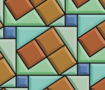
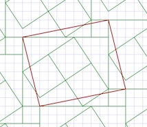
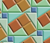
First I design a pattern by drawing lines between grid points. This one took only eight lines, using a slightly rotated rectangle as the basis. I am careful to leave a few unusual shapes for open areas. This is so I can show you how the beveling works later.

I base it on a staggered block pattern, but I also place some rotated rectangles inside the largest rectangle.

I suppose I could have been a little more fancy in my design, but I wanted to show a few of the characteristics that you can control to render your tile patterns. The first, which you are familiar with, is the automatic recognition of closed polygonal areas.

Here I show the polygon areas.

The pattern is really made up of line segments that are automatically divided up. Then they are arranged into a graph, with nodes at the places where the segment ends meet. Then I mark each segment so both sides of it get visited. And start tracing counterclockwise to collect closed polygon areas. The complex part is how to handle holes and stand-alone polygons, but we'll talk about that some other time.


By the way, the graph is special because it wraps around just like the pattern does.


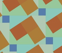
There is a tool to put color into each of the polygons directly. I have chosen an "earth and aqua" color scheme: surf and turf.

Next I bevel the edges of the polygons. This is actually complicated. It involves a gabling operation as we will see in a moment.

A bevel is shaded using an interesting model which predicts its color in HSV space based on the base color of the polygon and shading from the angle of the edge it is derived from. You can adjust the overall light angle in the interface.

The cool thing about polygonal display is that you only need to create the polygons once. Then you just need to evaluate all the copies on screen within the view. It's a bit messy to do that!

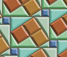
The bevel width is controllable, allowing you to magically adjust the look of the tiles directly with a slider. For me, it's a bit disorienting to change the bevel width, because I am not used to seeing this occur in real time in the real world.

I have made the computation of the bevel geometries bulletproof, a thing I was not able to accomplish at Fractal Design (and Metacreations) when I was trying to create the first version of this tool.

It appears that I've learned a few things since then! With previous posts, I have created the bevels by hand, by designing polygons on the grid. Now The bevels can be created automatically from the source polygons using a non-destructive procedural process. In other words, they can also be turned off if you like.

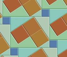
There is also a grout control. This means you can change the grout width in real time with a slider as well. This can make tiles that look a bit more real, since real tiles do have grout in between them.

The grout operation uses the beveling engine, so even if a tile disappears because the grout is so large, it knows not to output it.

And yes, it is disorienting to change the grout width in real time as well! When you move the slider fast, it's just crazy!

And, of course, you can turn the grout off if you like.

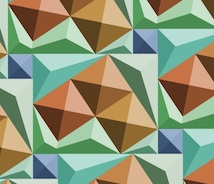
The beveling is completely general. If you crank up the beveling width until it is large enough, the center parts of the tiles disappear. This is why I call this a gabling operation.

The actual polygons output are really equivalent to the computations required by architects when they are producing gables for a roof of an oddly-shaped house.

I'm glad it works, because sometimes the polygon shapes are non-intuitive! It seems to be bulletproof now, and works in the general case. Like I said, I use this same engine for the grout computation as well.

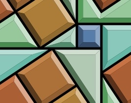
One more problem presented itself when I was building this tool: the matte edge problem. When rendering polygons that abut each other, you get a tiny matte edge. I have made the background black to make this more obvious.

This problem occurs because I am using a standard polygon renderer (CoreGraphics bezierPath) and each polygon is output with anti-aliasing. This means that the edges will have a one-pixel-thick one-quarter-intensity dropout between them.

I remedy this by enlarging each polygon by 0.24 pixels before I render it. This can't really be done properly by stroking the edge (as in Postscript). It must be done by widening the polygon. So I built a widening engine into my tile engine.

All of the other diagrams show the result of this widening setting.

I think next I will do some work in refraction. With just a bit of work, it could look just like stained glass. This would require me to make the results actually 3D. Actually, that's not too hard, given the gabling model I use to compute the bevels.

Perhaps one tile could shade its neighbor. Or a global illumination model could give the rendering a bit more life.

Now, what does real marble look like?

Thursday, November 15, 2012

Patterns, Part 6

Tiling patterns are the subject of an application I have written specifically for exploring the San Marco Basilica tiling patterns I recorded in my notebooks in May, 1997.

The original tilings were simply sketched. This is not because I was without a camera. I certainly had a very good one with me. No, I sketched the tilings by hand because the church authorities would not allow photographs in the Basilica!

What mathematicians and others have done is to buy the post cards (I think I have a few of them as well), scan them, and post their pictures online. Usually as a challenge for students to determine which repeating group is represented in the tiling.

You can find all about the regular pattern repeating groups in the Handbook of Regular Patterns. My copy of this book is well dog-eared.

The pattern of five-square C-tiles from an earlier post of mine, Different Perspectives, is seen here. This was an early test case for my new application, which I call Tile Patterns.

This C-tile is one of the twelve pentominoes. All of the pentominoes can tile the plane in one way or another, though some of the tiling bases are a bit larger than this one.

For information on the grid, basis, and segments used to define the tiles, consult my last post, Patterns, Part 5.

My test cases for this application make pretty designs. And some are rather busy in an op-art fashion.

Here is one, which has tiles that seem to simulate cut jewels, which must certainly qualify as a 1990's video game background!

This one broke my program a few times before I got it to work. Mostly because some of the polygons actually have holes in them!

Since the last post, I have implemented a few new things. Before, the application had the ability to set a grid, adjust and specify a basis parallelogram, and draw segments. As you draw, segments appear in all repeats of the basis area.

I have added the ability to divide up the segments when they touch or cross. Then I extracted a set of nodes (all on grid points) that bound each segment. Then I added the code to identify all closed polygon areas. As I mentioned, this includes some holes as well, particularly in the jewel tiling. Finally, the ability to specify the color for each closed polygonal area has been added. This allowed me to create all the tiling patterns you see here.

When I work this way, I only have to specify each polygon's color once, and all repeats of that polygon get colored. So I don't have to (laboriously) do the coloring in Painter. I get a cleaner result also. With this tiling, you can just see the parallelogram basis in red. Oops, I left it in!

Each of these patterns represents a new test case that broke the new application in some way.

The ability to save and restore patterns was the first feature I made. Then, when I built the extraction of polygons, I had to write save and restore of the polygons and their colors. This was an exercise in versioning, since I had saved several patterns already, but only the segments were stored.

Really what is needed (beyond what I have written so far) is the ability to maintain a palette of colors that is easy to pick from. And an easy way to deposit color into the polygons, with just a click.

The traditional way of doing this, along with adding segments, is a toolbox. Which is kind of passé, when you look at modern multitouch UI.

The ability to edit segments (in case I make a mistake) was another important feature to add.


Without that feature, I would have to clear and start over. Very troublesome!

So a segment selection and adjustment capability was necessary to implement. The requirement was either moving the entire segment or moving one of its ends. I just snapped the mouse point to the grid and looked for a segment end at that point.

For picking in the middle of a segment, I used a pick tolerance (really just a few pixels) to decide if I was close enough to the center of the line to pick it. Still, I had to implement point-to-segment distance, which is the only hard geometric computation.

Having implemented Shapes as part of Painter (and part of ColorStudio), I am very familiar with grid snapping and geometry editing. Actually very little coding was required.

I also used the San Marco Basilica tiling patterns as test cases. The first few patterns are really not as three-dimensional as some of the patterns. I think these were some of the first patterns laid down on the Basilica floor.

This pattern shows a black field with interspersed gray and light brown rectangles. Or you could view it as a checkerboard with turned gray squares inside the black ones.

The challenge for the tilers was to create diamonds that are just rotated squares. The larger light brown diamonds have an edge length that is sqrt(2) times larger than the smaller gray squares. That must have been fun.

The next pattern shows a lattice design.

This design has a brown field with small black squares inside it. Each black square has a gray diamond inside it.

Clearly, the later the tile work was designed, the more complicated it becomes. Notice here that the brown field is actually made of hexagons that interlock. It's hard to show that here, though.

In the real Basilica, the tiles are all made of marble. So there is a strong texture to all of them, and also quite a bit of color variation.

That may be the next thing for me to implement, to simulate the marble texture. Of course I have some ideas on how to do that. Also, simulating the grout will be of importance. That turns out to be pretty easy, since I already have a way to render that (as I showed in the previous post).

With this one, the patterns are getting a bit more three-dimensional.

There's just the suggestion of a square box with a white bottom. This is inside a kind of square corner.

Of course, all the tile work is two-dimensional since it is just a floor.

The tilers took on the challenge of making their work more and more three-dimensional with time. By the time we get to the renaissance, most of the designs were faux three-dimensional designs, as we will see with later examples. Perhaps this one is more like a coat of arms.

The next one shows a feature that is quite common on the Basilica floor: the checkerboard.

Checkerboard occur most commonly in frieze work (borders) and often go around curves on the Basilica floor.

This shows the artisan's skill more than ever.

This pattern is found on the floor, along with some that only feature four checkers on a side.

I figure the high contrast of the checkerboard was a visual stimulant. But in reality, the tilers were influenced by what they could get from the quarries. In the year this was made, there was probably a surplus of white and black marble.

No patterns on the Basilica floor are more striking, or more difficult to create, than the ones that feature circles.

Here I have approximated the circular arcs with polygons, but you get the picture.

The really cool thing about this one is the way the circles intersect each other so perfectly.

Oh, and by the way, you see the pattern is incomplete at the top. Its another bug I'm chasing! You will see this on three or four of the tile images in this post.

Nonetheless, this image shows the magic of tile patterns.

This shows another kind of tile pattern. I think the design has the downwards diagonals in a kind of three-dimensional design to indicate some kind of depth.

And traditionally, the black field allows you to see the other elements as objects on that field.

In this case, the black is less used for shading than for simple depth.

This is another example of a half-drop pattern, as it would be called in Painter. Half-drop patterns are typically used for wallpaper. But wallpaper is really not very long-lasting. Not compared with a marble tile floor, which has been known to last thousands of years.

This pattern was featured in my last post. Here the colors are a little closer to the actual pattern taken from the Basilica floor.

With this one, the illusion of depth and three-dimensional structure is excellent.

The black diamond tile is used to show the inside of a box. The top of the box is shown in two colors, giving it a kind of silvery sheen. The side of the box is in natural wood colors. In all, it is an exquisite pattern.

This one was probably sixteenth century.


This next pattern shows clearly the three-dimensional structure.

The rendering of this pattern also shows clearly the grid at the top, the guide lines, and then the tile colors below.

Actually this is a bug, but I find it to be instructional.

With this pattern, the gray diamonds are the bottom of diamond-shaped pits. The white rectangles are the tops of the lattice. And something new: black diamonds form the intersections of the lattice.

It is visually interesting and also something quite new. Each tiling shows the style of its creator. It shows that the Basilica floor was designed by many artisans over the centuries, and that they were influenced by each other.

This tile pattern is an exquisitely detailed one. It is entirely three-dimensional. One thing about these tilings is that they have the concept of an assumed light source.

This imposes a rule that allows the designer to consistently shade the shapes. Of course this means that several different colors of tile are needed. In varying quantities also!

Various pyramidal shapes inhabit this one and so you see it is a different kind of surface depiction than we have seen so far.

Like the black diamonds of the previous tiling, this one features smaller pyramids (or indentations?) at each intersection. So most likely this one was created after the previous one.

Minecrafters will probably recognize this pattern: the corner cube pattern.

It was certainly not invented in Minecraft, which certainly appeared a few centuries earlier on tile floors in Italy.

It shows most clearly that consistent shading is required to get the best illusion of three-dimensional shape.

This is one of my favorite patterns due to its simplicity and its optically convincing form.

So this pattern is one of the more mature three-dimensional forms, rivaled closely by the next pattern.

This pattern is like the previous, but entirely in pyramids.

Ever seen the pyramids at Giza in a satellite reconnaissance photo? What I want to see here are the shadows of each pyramid being cast on their neighbors.

Well, perhaps that was beyond the thirteenth-century tile masters.

One thing needs mentioning. The tile patterns are quite similar to modern quilt patterns. I have even seen some of the San Marco tile patterns worked carefully into quilts (even with the marbled textures in the cloth). I can imagine them in latch-hook rugs as well.

I think this tile pattern shows that the tile masters were both aware and interested in shadows. The black triangle could be one facet of the three-dimensional geometry. But I think it's a shadow.

I see it as a shadow being cast into the trough that has been carved into the floor only in dark squares of the checkerboard pattern.

Walking on a floor with this kind of tiling, or in fact any three-dimensional depiction in a tile floor, would be a trip!

Literally. I would be worried about getting my foot caught in the apparent holes!

I found many depictions of this pattern on the floors in the old churches of Byzantium. This one differs from the earlier one both in color (four colors are used, subtly) and also in the angles of the squares.

Thus also in the width of the diamonds. They liked to use sixty-degree angles, so the diamonds would be "double triangles".

This one is shown at about fifty degrees. Mostly because I used a relatively small grid to construct it. It almost reminds me of the harlequin pattern, which is really only a diamond grid in a two-tone checkerboard. When you shade it in this way, it becomes three-dimensional, and can fool you into thinking it is a real surface.

This ornament is found on the floor at the San Marco Basilica. It is quite complex!

It reminds me of the American Indian rug patterns found at the Ahwahnee hotel in Yosemite.

But the Venetian tile floor will be still there long after the American Indian tapestries have turned to dust.

Unless, of course, global warming takes its toll and submerges the Piazza San Marco in the Adriatic.

In the meanwhile, let's keep the art and science of tiling patterns alive!

Patterns are a part of our lives. Our clothes, our wallpaper, our tapestries and hangings, our rugs, and many touchstones in our very existence show the influence of art and mathematics. The art of making patterns promotes spatial reasoning and creativity.

These are some of the reasons that I have featured textures and patterns in my blog. Also, of course, they dazzle our eyes and provide for wonderful illusions: the illusion of depth, the illusion of interlock, the illusion of spatial connectedness and completeness.

When a tiling pattern has a flaw, we automatically see it.

Patterns are literally built right into our consciousness.

Friday, November 9, 2012

Patterns, Part 5

I have decided to write an application to help me return to the original subject of this series of posts: tiling patterns. As you may remember, I was once impressed by the amazing floor of the San Marco Basilica in Venice. The floor is laid out in tiled marble, using a style referred to as Opus Sectile.

In one of my notebooks, I carefully transcribed the design and colors used by the tiles. You see tiling number 7 here, a wonderful pattern rendered in approximately the same shades as the original.

My first attempt at writing a tiling application became the origin of my San Marco series of applications that also saw the construction of the Painter 6 brushes.

For this app, I have simplified the method of how the patterns are constructed. First I lay down a square grid, similar to grid paper.

Most everything can be laid out on a grid. But grids may lead to inaccuracy of aspect ratio and relative sizes of the tiles. So I created the provision for doubling the grid in place on demand. This takes care of the need for additional accuracy and still keeps grid snapping.

Constraint-based systems make things easier, usually. Here is an example of the grid. All the examples are shown at 50% scale.

The next thing is to allow a basis to be designed on the grid.

A basis is a parallelogram that defines the repeat block of the tiling pattern. This repeat block can be any parallelogram shape.

Here it is a rotated square. You will see why the basis is required in a moment.

You will first notice that the basis is defined on the grid. It really consists of an origin and two vectors. One vector, (3, 1) defines the X axis of the basis, and the other vector (-1, 3) defines the Y axis.

Now, in my previous attempt to design a tiling program, I concentrated on a limited set of graph-theoretical operators. Upon reflection I have decided that this is too limiting.

Instead, I rely on simply drawing lines.

Here I draw a single line intersecting the origin of the basis (at the bottom) and extending over the entire width of it. This line gets replicated into all its instances: there is one for each repeat of the basis within the plane.

All the lines are constrained to fall on grid points. This turns out to be handy when it comes to making the line segments meet.

This tiling pattern only requires two lines, it turns out

The second line passes through the opposite (upper right) point of the basis and extends over its entire height.

It also gets replicated into all its instances. Each instance is defined to exist at one of the copies of the basis as it tiles the plane.

Together these lines form the tiling pattern. In this case, the pattern is a 3 by 3 square and a 1 by 1 square, perfectly fitting together.

Because the basis has edges that are length sqrt(10), and because it is square, the repeating elements in the tiling pattern must have area 10 square grid units by definition.

Next, I can remove the grid and basis, change the lines to black, and render it to create the desired tiling pattern.

I have chosen this tiling pattern to start with to show a useful kind of repeat that doesn't fall into the class of patterns easily designed in Painter.

In Painter 4, which was released in November 1995 (a very crucial period in my life!), I implemented the means to paint directly into a pattern and achieve seamless results. This included rectangular patterns and also patterns with horizontal and vertical half-drops.

In this new program, these kinds of patterns can be easily designed, but also both a horizontal and a vertical offset can be applied simultaneously. Sure, this kind of pattern could be designed in Painter. But you would need a square that is ten units on an edge to create it. Well, you could use a half-drop by using a rectangle that is ten units high and three units wide, and a half-drop offset of ten percent. But these are much messier ways of defining the pattern.

I bring the rendered tiling pattern into Painter so I can apply coloring to it. This gives me some ideas for new patterns.

But ideally I would do this inside the new program, which I call Tile Patterns.

It is easy to design a number of patterns using this fresh approach.

You might assume, just because the basis is a parallelogram, that it wouldn't be possible to design triangular shapes, hexagons, or perhaps strangely interlocking shapes.

That would not be a correct assumption. Here a triangular pattern is designed using the grid and a parallelogram whose shape matches the appropriate shape (two triangles attached).

So in this case, the repeat pattern is actually two triangles.

Here I have used an approximation for sqrt(3)/2 which I arrived at using continued fractions. The actual number is 0.8660254... but it can be successively approximated by these fractions:

1/1, 6/7, 13/15, 84/97, ...

I have chosen 6/7, an approximation equal to 0.857... to represent the irrational number, so it's only off by about 1%.

Hexagons can also be designed using this program. Here I am using the same rational approximation to sqrt(3)/2. As with the triangular design, this design uses three lines (which you can see inside the basis parallelogram).

But, unlike the triangular design, the area of the basis is equal to the area of the hexagon.

So far I have only shown convex shapes, but it is also possible to design interlocking concave shapes. This is another kind of interlock, of course, but one which is cyclical in another way: in a lattice.

Consider this pattern. Here I show interlocking plus symbols.

Yes, as you can see, the area of the plus symbol is five square grid units, and so the basis rectangle also has the same area, with edges that are sqrt(5) in length.

I can design interlocking patterns just as easily, but it does take a bit of planning beforehand.

I like to sketch out the pattern first and then draw the basis on top. This gives me a blueprint for how to proceed inside the Tile Patterns program.

Here you see a simple interlocking pattern.

You can see it is designed on the same basis as the first pattern I showed. There are an extremely large number of patterns on this one basis alone.

Tiling is an intellectual exercise. When I was younger, I used to buy grid paper in hexagons and triangles and then color inside the tiles to make patterns. You can see one of these in my three-dimensional thinking blog post. So in the same vein, I color the tiling patterns I create, looking for novel color combinations.

Here is an example of this kind of fun.

Sometimes I just line to make patterns that show color and delight the eyes, and sometimes I am in it for the pattern: really more of a contrasty dotted kind of thing.

It is useful to realize that the tiles do not have to fill the entire space within the plane. I can create individual structures with some separation in between them to give a kind of hand-designed formulation.

In Painter, I can soften and increase contrast (anneal) the pattern to get rounder forms when I want.

This is the technique I used to create this new pattern, a candy-coated array of dots.

They are quite pleasant!

I am not sure where I want to go with this application in the future. Most likely the next step is to have the app automatically enumerate the closed shapes that define the repeats (though, as you can see, there might not be any closed shapes, as in the case of the maze pattern below).

It seems like a merging of the San Marco application capabilities with the line-drawing capabilities of the new app would be a good way to proceed.

Perhaps a nice way to save out tiling patterns as Painter patterns would be useful.

As I referred to earlier, the ability to color the tiles inside the application is a capability I will code up very soon.

Here is a pseudo-maze pattern I have created using this application. This shows that I can control the thickness of the lines when rendering them in black-on-white.

And the final pattern I will show is another tiling pattern from my notebooks on the San Marco Basilica.

Of course the grout spacing is nearly zero in the actual Basilica floor. Those artisans in the twelfth century were actually quite good!