Showing posts with label my past. Show all posts

Monday, April 2, 2012

An Anatomy of Painter's Brushes, Part 2

Blogging during Spring break is tough without a Mac, especially when blogger.com eats your post! I'm using blogsy on an iPad to lay out my post, and, I must confess I am using Paper by fifty-three to illustrate this post. When I need to crop, straighten, or adjust, I then use iPhoto. I try out all the mobile paint apps and I am quickly becoming a veteran of many trials and tribulations of the mobile environment.

Normally I use traditional ultra-fine Sharpie on 30# paper so it doesn't leak through. In Preview, I scan the line art using a Canon scanner that sits on my home network. Also in Preview, I tonally adjust and scale to appropriate dimensions for the blog. Quite often, somewhere in between, I use Painter to adjust, clean up stray lines, and apply coloring on a gel layer.

Sometimes I do my illustrations entirely in Painter because, along with the Wacom tablet, it is really an excellent drawing environment, rivaling the natural medium. But often I do my scribbling on a clipboard because, as you know, I am always sketching. When I get an idea, I like, to sketch it out.

This post concerns a unique aspect of Painter's brushes: the constant work done improving and re-improving upon the bristle brush model. It all started in 1991, when I was working on the very first version of Painter. One day I got the idea that it might not be all that difficult to create multi-bristle brush strokes.

My first try, which users got a look at in September 1991, when Painter was initially released, was the Van Gogh brush. This brush (1) recorded the brush stroke and then (2) played it back several times with some locational jitter applied to each stroke, and some color jitter (in HSV) applied to each stroke about the center color. This really was a magical amplifier to a brush stroke and it served to show me how powerful multi-bristle brushes could be. It could produce some great results. And it's not to be confused with the Auto Van Gogh effect, which extracts directions from the image and then re-renders it using thin dabs of multi-colored paint. That is one effect that can benefit from all the advances in direction vector field extraction and vector field visualization.

My second try came in Painter 2.0 with the rake brush. I worked on this in late 1992, while Tom Hedges and Bob Lansdon were working on the first version of watercolors. You can see the notes I drew for the initial idea. The bristles are placed on the circumference of a circle (cylinder) and the brush direction becomes the primary angle that determines which bristles are in contact with the canvas. That's the first sheet. In the second sheet, we see a bit about how we compute the exact points of contact for the brush stroke. In the third sheet I introduces a splay parameter that widens the potential number of bristles that come in contact. On the first sheet on the bottom row, I detail how opacity can fall off at the edge of the stroke and also how turning the brush (meaning changing brush stroke direction) can sequence through the bristles that contact the canvas. The last two sheets show the effect of curving the brush stroke and how the bristles exit and enter.

The rake brush was an interesting look, yet it really was only good at creating parallel arrangements of contact between the brush and the canvas. And, it only had one color well.

My next attempt was in the Painter 3 timeframe in 1994, and it was the bristle brush. This brush simply took a speckle, which is a random set of mutually-avoiding points in the plane, and used it to model the tight-packing of bristles within a brush itself. So I took the contact area of the brush, which I modeled as a circle, and used it to clip the speckle. The color of the brush was then rendered in the current well color, and there was, once again, only one color well for the brush. This was really just a shortcut for capturing a brush that contained multiple bristles in it. I think the reason I went for these simplistic solutions was that the compute power of the machines Painter was targeted for was quite limited. It's hard for me to think in those terms today, unless I start thinking more about the limits to the compute power of the iPhone and iPad environments.

Also during the Painter 3 timeframe, I made the Van Gogh brush work in real time while drawing the brush stroke. This probably didn't improve the look of the results, however.

There were plenty of brush advances in the Painter 4 and 5 timeframes, but I didn't really return to bristle brushes until Painter 6.

In 1998, I began working on brushes again using a separate environment from Painter, an environment called the San Marco development environment. Eventually this entire development framework was simply thrown away. But in the meanwhile, I used it to mock up the multi-bristle brush, the spatter airbrush, and the brush where an image, masked by its alpha channel, was mapped into the space of the brush, like a raster version of Alex Hsu's Expression brush. He called his technology Skeletal Strokes, but this shows what engineers do poorly: name their technology. It's lucky I was part marketer too.

The new code was implemented using C++, unlike Painter, which was implemented entirely in C and assembler (!). When we got to the Power PC, we raised the assembler used for the inner loop of the brush code back into C.

So there was a period in 1999 when Painter 6 was being written when I was gluing these technologies together. And the result was excellent. The camel hair brush was the result. This brush was great because it modeled every bristle separately and rendered it using a single pixel line. The line was colored according to its own color well, so each bristle effectively had its own color well. This meant the brush could be loaded with color, potentially a different color per bristle. Also, each bristle could keep a slightly different color in it, using color jitter.

But more importantly, each bristle had its own path across the canvas. To remedy the problem that there weren't really enough samples from the mouse or stylus, I built a way to smooth the path of the brush stroke. And introduce new samples, to avoid the visible vector stepping in the stroke. To do this, I created a FIFO to implement cubic interpolation. For every 4 points, I could create however many points I wanted in between the middle two points. I think I created three points in between them. This made the strokes much smoother but also introduced some squirrelly behavior. So I turned off interpolation when the speed of the brush went below a certain velocity or when the stroke made a sharp turn.

Another problem that needed to be solved in multi-bristle brushes was the stickiness of the paint and it's effect on controlling the brush bristles, and keeping them in check. To do this, I used a form of exponential damping (which also can describe part of the way the color well works). If you keep an accumulator for each scalar quantity, in this case, one for x and one for y, and call it a, and you receive a new x or y value (called s) periodically, you can update the accumulator in the following way: a' = a*(1-d) + s*d. Here d represents the fraction towards which we interpolate to the new value of s. The lower the value of d, the more relaxation on the sample values.

The problem of projecting the bristle positions individually onto the canvas was handled by computing the Frenet frame of the stylus and projecting a speckle of bristles in 3D onto the canvas, forming the updated bristle positions. The frame of the stylus was computed using the tilt and bearing values produced in real time by the Wacom stylus. It also had a pressure, and high pressure could be used to keep the tip closer to the canvas, while low pressure would signify greater distance from the canvas.

I used the same principles for the spatter airbrush, to great effect.

Along with the damping, the positions of the bristles could be known and relaxed into a very natural brush stroke.

Painter has a feature slider. This is used to control the average minimum distance between the bristles in both the bristle brush and the camel hair brush.

I know that Corel has also advanced the state of the art with their new bristle brush, but I can't play with it at the moment. On the next post in this series, I will discuss it, and also show some examples of the various bristle brush strokes.


Saturday, March 10, 2012

Piano Improv

Software development can cause frustration: large projects run over, thorny problems seem intractable, bugs can be hard to find, leading to hours of hard, painstaking logical analysis.

And that's why I like to turn to music to gain perspective.

You can check out my relationship with music in my blog post, Music. You can learn a little bit about how I write songs in my blog post, Writing Songs. And now I will share with you some of the ways I create music ad libitum.

Years of Piano Playing

I taught myself to play the piano in 1973 and this led to years of constant obsession with piano-playing. I went through the catalogs of the Beatles, Pink Floyd, the Grateful Dead, and many other artists. But most of all, I learned to improvise.

I once read that Ludwig Van Beethoven was a master improviser. He could sit at the Hammerklavier and spin tales of music directly from his touch. I always found his music to be inspiring. I also read that Johann Sebastian Bach was a genius at improvisation. And also Schubert, Mozart, Franz Liszt, and others.

In 1973 I wondered if I could ever learn to do that. Just touching the keys of the piano that my parents had bought for my sister Susan to learn piano, but which she had rejected after a few lessons, I saw a tremendous regularity. A devilish simplicity and yet a complexity that defied simple rigorous analysis.

So in that summer when I was left alone in the house in Sunnyvale while the rest of the family went to New Mexico, I had nothing but time to myself.

I have mentioned that the upright piano we had was painted puke green and was tuned a half-semitone flat. The strings were too old to make them any sharper, which would require making them tighter. So it got tuned more flat so all the strings could at least be in tune with each other.

And when you teach yourself notes on such a piano, you can forget about having perfect pitch.

After going to college at Caltech, I found a piano in the practice room in Page house. I played it incessantly. And my abilities improved immediately. The quality of the instrument makes a huge difference, I found.

When I went to UC Berkeley in late 1975, it was as a music major, as I have mentioned. But in between assignments, I improvised. Sometimes 8 hours a day. This is what I meant by obsession.

There were a few years when I had to work and push the piano-playing aside, but I always returned to it. There was always just too much value to it, emotionally and intellectually. It's probably good I did, too, given the frustration capacity for the profession I finally landed in.

I played piano wherever I could find one. I found that the Yamahas and the Kawais were the best pianos. And in that generation, this was true. I played a Bösendorfer once, but I found it to be stiff and unexpressive. I also played Steinways but found them to be unremarkable and sometimes quite muddy. In retrospect, it was probably just how well they were tuned.

In the early 1980s I was improvising quite a bit, with quite a varied style. A little modern, a little freestyle. You can check out the following improvisation to see what I was playing like in September 1981. often my improvs are titled based on the date they were recorded, in this case 09-22-81 #1 shows it was the first recording I did on the 22nd of September, 1981.


As the 80s wore on, I continued to play and write pieces. Here is another improvisation that I worked into a full-blown piano piece, called Black Widow. This piece is much more structured and rhythmically interesting. My style was progressing.


Eventually in the late 1980s I got the Yamaha 7-footer that I use today. I also had, for a while, a Yamaha 7-foot Diskclavier, but I didn't like the way it worked. Yes, I had two grand pianos for a while. I'm serious about pianos, and I probably always will be. But I also worked with synthesizers. Including a weighted-key synthesizer that still works great after so many years, the Roland RD-500. Supposedly it was a roadie's dream because it was so stable and bulletproof. As a digital piano, it also featured various kinds of electric piano styles. In 1990, I played the following improvisation. This was when I was about two months into the secret work on Painter, before another living soul saw what I was cooking up. It is interesting to see the sonorous moods I had in those periods. This improvisation does a lot to tell you the story behind my early work on Painter: intricate, creative, and spontaneous. It's called 11-10-90 #2. Note: sometimes I recorded more than one improv a day, if I was on a roll.


My improvisation recordings are entirely unedited, so if I make a mistake: it's all on me!

Also from this era is an improvisation that features more interesting rhythm but also a melodic inner section that has a quote from one of my songs from the era (which I no longer have a recording of) called keys to your heart. It's not bad. It's called e piano improv, a rather undescriptive title it's true.


When I moved out by the beach, for a while I had a house with room for two pianos. It was there that I did most of my modern production work with ProTools. But I continued to improvise. Even in a smaller, more manageable house I still have a 7-foot grand. And I play piano every day. When I'm writing songs, I will improvise on the theme of the song. Usually I will work up the song and record it onto my iPhone which at least gets it down for posterity. My worst problem is that I don't record the songs that I compose from day to day.

So, the nature of improvisation is that most of it goes unrecorded, which is a pity when I do a particularly brilliant one. So maybe one in twenty gets recorded.

After 39 years of piano-playing, my fingers and my brain are entirely in sync. Does this mean every note is perfect? No. But it does mean that I can maintain a rhythm while modulating from key to key. All the chords have familiar hand shapes, so I don't really look at the keys any more. Sometimes I play in the dark, but usually only when I am alone.

How I Improvise

So, how do I do it? What is going through my mind when I'm playing?

If you were to watch, you would just see me sit down and play.

With my hands on the keyboard, I focus first on the key I'm playing in. And whether or not I want to start on a chord that is moving or stable. Moving chords are like sevenths: minor sevenths, major sevenths, inversions (particularly those with the seventh in the bass). This is because sevenths typically resolve into more plain chords in a cadence. Here we have an A minor seventh chord resolving into a D major chord. These chords also have very natural hand shapes to me, and I favor them. But, of course, they can be expressed in any key and their hand shapes might be a bit different. Also, suspended fourths are unstable, and tend to resolve fairly quickly.

Playing in different keys is important. At one point, in in the mid-80s, I forced myself to improvise in a different key each time I sat down at the piano. I had a little tally sheet. J S Bach used to do this, I suspect, since his Well-Tempered Clavier has two books with a piece in every key. Fréderic Chopin also did this with his Preludes and Études.

Anyway, it's also important to try out a few rhythms with a chord sequence I work out. And also to try a few chord inversions, so the notes on the top can begin to form a cohesive melody.

When it comes to the bassline, I will find ways to work chromatic descending bass into my improvisation. This sounds very good, and often forms a focus point for a chord sequence. Sometimes I put the third in the bass. Sometimes the seventh goes into the bass.

Here the bass descends to the seventh and down to the third of the C chord, to finally rest on F, with an added 2nd (G) added on top. This kind of sequence works best when the bass is very low indeed, perhaps one to two octaves below where I've written it here.

After a number of years playing, I have tried out pretty much all the chord sequences there are. But of course that is wrong because there are plenty of chord sequences that sound terrible. And I naturally avoid those after perhaps making the mistake of trying them. Once.

Another thing to remember is that the melody doesn't have to fit the chord. You may find that the melody contains suspended notes, or even notes that are entirely off-chord. This can be to great effect.

Chord inversions are of interest, when you are playing. They can help add color to the chord. And sometimes inversions are totally necessary in creating the feel you want.

Here I have shown some inversions of the C ninth chord, with the root of the chord (C) taken out. It's only fair that someone should play only four notes at a time, to avoid too much of a handful of notes. The one I favor lately is the third in the sequence, with the G being played by the thumb.

Ninth chords are in general interesting because they produce a thicker chord. In C alone, there are at least four interesting ninth chords. I have shown some of them here.

They really only differ in whether the E and the B are natural or flatted.

The C major ninth chord (or CM9) is bright, a bit dissonant, and often leads into a C chord by having the top two notes raise diatonically up to C and E.

The C minor ninth chord (Cm9) is soft and brooding. There is less dissonance because there is no B natural. But now the D and the Eb form a direct dissonance.

The C ninth (C9) chord has no semitone dissonance, and has a lush, cheerful sound. It is descended directly from the C seventh chord, but has an added D.

The C minor major ninth (CmM9) chord combines the darkness of the major chord with the dissonance of a C major ninth chord, and can be a bit ghastly and tragic.

So you can alter the color of your music by using the right chord. This is particularly so in the first chord of your verse. For instance, Pink Floyd, in their song Breathe, starts their verse off with an Em9 chord, resolving to an A chord. It is the minor ninth chord, with its sonorous sound, yet tainted by the added 2nd, creates the ambience of the entire song. In fact, that particular song has some of the most perplexing and powerful chord sequences in the repertoire.

A Question and an Answer

It has always been interesting to me, since improvisation and music generation is so completely hardwired into my brain, if it might not also be possible to write a computer program to do something similar. I think harmony is pretty easy to encode into a computer program. Indeed, in 1975 I did such a thing.

But it is an entirely different thing to encode the structure of music into a computer program. I am, of course referring to the high-level structure of music. The ABA format, the romantic period sonata form with its introduction, exposition, development, recapitulation, and coda sections. If we look at modern songs, there is the intro/verse/refrain/bridge/outro structure and all the common rearrangements of them.

My question is this: even if all these forms were to be faithfully duplicated by a songwriting program, would the computer be able to replicate the angst, emotions, and desires of the human composer?

The answer is simple actually. Such a songwriting program would not be able to write the songs. That would be the human user's job. Why do I say this? Because with Painter, our job was to accurately collect the artist's expression, and faithfully reproduce it, allowing the artist's style to come through. Because Painter and the computer running it are enablers for human creativity. They allow you to do more than you could do before.

And this is precisely what a songwriting program would do for a composer: enable them to compose bigger and better pieces, and let their emotions and creativity come through like never before.

And What About Improvisation?

Well, after many years of work at the piano, my brain is that channeler of creativity. That enabler of emotional expression.

Maybe Fractal Design Composer is what's needed. Maybe I can take my improvisational skills and build a program around it.

Maybe that's where music and me come full circle.

Hmm.

Sunday, February 12, 2012

The Miracle of the Paint Can

On September 2, 1995, I began work on a poster image for Painter 4. Our theme was decided: Painter Through the Ages. This was partly because I had implemented the mosaic tool. We began securing artists for the poster, which was to contain the usual 5 images. Our timetable was short, so we picked out some friends, Hal Rucker and Mark Jenkins from Rucker Design, the same designers that brought us the paint can design.

John Derry and Steve Guttman decided to do the other two pieces, because I was doing one of them this time. Remember, I was left out on the Painter 3 poster: too many things to do.

For Painter 4, I wanted to use the new mosaic tool. This was so I could show off the feature, partly. But, even more importantly, I needed to beat on it. I wanted to accomplish a real project so I could shake out the bugs in the mosaics feature. I had to be my own biggest critic.

I began implementing mosaics in the summer of 1995, while staying at the Hotel Skagen, at the tip of Jutland. Shortly after spending the summer solstice in Roskilde, after checking out the bonfires by the fjord, Ruth and I drove to Skagen to stay and rest. I had brought my black PowerBook 540c with me and I spent lots of time in the hotel working on mosaics. And we also spent time walking around the beaches at Skagen, looking for amber.

The mosaic problem was a very difficult one, because it involved chopping vector-outline shapes to other vector-outline shapes. Also, because mosaic has a grout, it also involved reliably creating outset shapes for each mosaic tile. These are hard problems, because they involve general polygon Boolean operations.

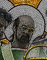
In July, I had tested the mosaic tool back in the Fractal Design offices in Aptos, using a comp'ed up version of the product, clipped from pictures of real mosaics from Ravenna.

You can see this to the right, here.

The letters' styles come from the Byzantine era, almost 900 years ago. It's actually amazing for me to think that something can last a thousand years.

This was just a test run, but I was seriously trying to create something with the tool. At this point, there was only very little control over the width.

I used this image as a clone source and sketched over it using the mosaic brush.

It's actually interesting to see how similar the tessellation is between the letters. Perhaps I used them as a guide.

With some trial runs, I turned back to the code and added the ability to vary with based on pressure, created a control panel for mosaics, and figured out what the modality of the mosaic control panel was to be. It was an unusual tool, because of the vector information that comes out of the brush as you draw. You get the point: lots to do!

Once September rolled around, I realized that I needed to be very careful and plan ahead in order to create a design with mosaics that was coherent enough to be seen as a Byzantine mosaic.

I drew a version of it on the whiteboard in the office shared by Tom Hedges, John Derry, and me. Suggestions from the various team members were made based on this strawman depiction of the idea.

Next, I created a small-size proxy that showed the basic organization of the piece. It was a very rough version. I was indicating white circles behind the heads, which showed saints in the original mosaics of the Byzantine era.

The paint can was to have a similar treatment, originally. Also, I showed John Derry (to far left) holding a burning ice cube, a reference to the theme used in Painter 2.0.

Initially there were only going to be four of us, but we thought to include the venerable Glenn Reid, who had just come onto the R&D staff at Fractal. So I had to modify the original design, but that was hardly a big issue.

The main problem was to get each of the figures in place. I decided to use layers to do this, because then I would only have to capture a photo of each one time. But I would have to make sure that each person was captured with the same lighting, of course.

So here you can see the original captures, done with a cruddy video camera, attached to a PowerMac 8100/80av. I supplied the facial angle for each person, and, as you can see, they were all being taken in the same location, so the lighting would match. The outer people (John Derry and Steve Guttman) I had hold their hands in a position of classical adoration.

I wanted the folds of the fabric in the shirts they were wearing to be visible, so I could use them in creating the folds of the garments that the figures were wearing. All of the portraits were done at appallingly low resolution, because it only had to be the resolution of the mosaic tiles themselves. They all worked except for Tom's frame grab, because he was staring at the camera in a classic thousand yard stare. Hmm.

Then I masked each of the photos and composited them in layers into a single image. This allowed me to move them around and adjust them to create a better pose. I adjusted their brightness and contrast a bit to create more visual cohesion.

I also adjusted each person so that their actual height was indicated as well. Tom Hedges was quite tall, so he got to be taller than the rest of us.

Here you can see how Tom Hedges' image sticks out because of his stare directly at the camera. But initially I thought I could work with it.

My next task was to choose the garment styles for each person. Their styles were taken from the mosaics of Emperor Justinian and his bishops and officers, depicted in the Basilica of San Vitale in Ravenna, which I have seen personally. My sash is actually designed based on that of one of his bishops.

But in mine, I replaced the cruciform figure with a 4 and a crude Fractal Design logo. My initial design for John Derry's robe was rather freeform. But you can see how I used the existing fabric folds to create the look of the folded garments. I extended them down using my brush.

I also adjusted Glenn Reid's height so that he showed the appropriate height. It also made his garments a bit more visible, which was another goal at the time.

I painted most of the robes on the night of September 12th, and I was up past 11 PM doing the brushwork. I used a small-radius airbrush that was adjusted to 90% opacity to sketch in the colors, which were approximated from those used in reference mosaics from the fourth century. I then used Just Add Water to blend the colors together and create smoother fabric. The gold background was added, a reference to the common practice in Byzantine mosaics.

But I had to fix that look on Tom Hedges face! I broke out the video camera again and persuaded him to stand for another portrait on September 13th, the next day.

The next iteration of the photo was done by 5:00 PM on the 13th: I had replaced Tom's head with a better frame grab that had a much better expression on his face. It was also focusing in the right direction, and I had reworked his shoulders to accommodate the new head position.

I placed an image of Painter's paint can in the image and put a nice glow around it, making it seem a little magical.

All I had was an image of the Painter 3 can, taken from a photo shoot we had done professionally. But I could see it all coming together. I made it unusually large to accentuate the fact that it was in front, and floating.

I was really not satisfied with John Derry's robes. I looked back at the San Vitale images I had in an old Dutch book on Mosaics I had found in Amsterdam the year before. I found a reasonable style to rework it into: a bishop's robes.

John is on the left. It was an arduous process reworking John's robes to make something that matched his style. I had noticed that the bishops often had a section in front drawn over and pinned near their collarbones. And on the font section they often had diagonal rectangular patches of color.

For John, I created a red pattern featuring a checkerboard pattern, one of John's signature style elements.

For Steve, on the right side, I knew I needed to extend the robes lower and complete the double-white borders of his sleeves. I did that, also creating subtle shadows under the hands to make them a bit more realistic.

I began to realize that real Byzantine mosaics didn't feature people with watches and glasses. But I wryly decided to leave them in, to give the piece an interesting tilt. And I had decided that a floating paint can was even more magical if it was floating above something.

So I created a red table with draped fabric, in order to make the floating even more realistic.

I had to put the shadows of John's and Steve's hands on the red velvet tablecloth, as if the shadows were cast by the magical light from the paint can.

At this point, I put in the halos as layers behind the people. I also put some Byzantine-style text behind the figures. The text is latin, and says "Natural Media Forever". It was kind of my Strawberry Fields Forever moment, so to speak. I had to be careful about the thickness of the letters, because I knew they would be rendered in mosaics. I also used my experience with the images near the top of this post to sculpt the letters. They were done three months before.

Above, a blue field with green circles suggests the vaulted ceiling of the Mausoleum of Galla Placidia in Ravenna.

I had to further extend John's and Steve's robes to the bottom of the image, which was designed to be the right shape for the Painter 4 poster entries.

It was a very lengthy task, and by midday on September 14th I had completed the proxies. But that was, unfortunately, only the beginning!

The next step was to clone the image using Effects:Esoterica:Make Mosaic which is still available in Painter 12, by the way for those of you who see this and want to travel down the same road). That night at about midnight, I started making the mosaic. The first thirty minutes were spent detailing the faces of John, Glenn, and Tom, and also the paint can. Then I gave up for the night.

The next morning, in the office, I started working on the image and I worked all day. At about three in the afternoon, it crashed and I lost all of my work for the day! I had finished most of John and his robes, my face and Steve's face. It was painstaking work. So I spent a couple of hours figuring out what went wrong: there was an error in the mosaic vector data structure pack and unpack. So it crashed on save!


To left, you see how much progress I had made. This image can be opened, but the mosaic data cannot be recognized. Imagine my chagrin!

Six hours of tedious, painstaking work was lost.

Anguished, I fixed that problem and went on. Since I and only I was responsible for the error, I had nobody to complain to but myself on this project!

Such is the life of a developer who uses his own tools on grandiose projects.

It is probably good that I found this error, though. Better that it happens to me than to a user of the product after it has shipped. In all, I found several bugs in mosaics during this process, and added several features that made it easier for me (and easier for future users as well).

Starting again from my only backup from 12:30 AM early that morning (to me the night before), I continued undaunted. Well, I would like to think I was undaunted but actually I was weary and crestfallen. And by 6 PM I had only finished additionally my face.

You see the state of it at the right.

Needless to say, at this point I started saving backups every hour.

I went home and continued my work there after a quick meal. I'm sure I was hell to get along with at this point.

Next I did the halos, which were fairly easy work, starting on the outside of the rings and filling in from there.

I continued to work, and by about 11 PM the night of September 15th, I had finally reached the point I had reached at 3 PM that afternoon when Painter had crashed.

If you look closely, you can see that I had to do it all over again, and made several different choices of placement, particularly with Steve's face. And the color of his glasses.

I was also much more careful in the placement of the mosaic tiles in the rendering of John's robes, which I wanted to be eye-catching.

You may be wondering why I left the faces and hands in grayscale colors. For the most part, this was what the Byzantines did in their mosaics. I did color the glasses though!

By the time I went to bed at about 12:30 AM, I had finished almost all of the central figures, as you can see here.

So far I had worked thirteen hours on the mosaic part of this task, and six of them had been wasted!

The strategy of saving once an hour was paying off. There were other crashes but they only caused me to lose a minimum of time. And they gave me an opportunity to fix other problems, as was my responsibility.

For the background, I wanted the glittery golden look of the Byzantine mosaics, and so I used color variation to create the look. I painted in a green background below, and finished Steve's robes.

Also, it took me several hours the next day to paint in the letters in the arch above the main figures. The letters were rendered in the crude, yet stylish typography used by the mosaic artists of the fourth century.

I still hadn't figured out what I wanted to do with the area above the arch. It was certainly unfinished.

At left is the state of the mosaic by about 5 PM on the 16th of September. By this time, I had spent about 20 hours of time on the mosaic part of this task.

I went home and, working from there, I spent another two hours recoloring the background at the bottom and drawing in the symbols above the arch. At the left, I put in a P4 (for Painter 4), and at the right, I put in a burning ice cube.

I cleverly allowed the dripping water from the burning ice cube to overlap the arch on the right hand side.

Two green diamonds, another common Byzantine symbol, filled the center portion above the arch.

I decided that the faces truly did lack some color, and so I added in a pale skin tone to their shading. Each mosaic tile has its own color assigned to it, and you can change tile colors after you place the tile.

I painstakingly redid every awkward mosaic section I could find, to make it more like a real artisan had placed the tiles, one by one, by hand.

Even still, there are things I would do to improve this picture. There is one errant green tile just next to the top of the U in NATURAE. That should be fixed!

By 6PM on September 17th, I was done working on the mosaic portion of the task. With some 22 hours of work on the mosaic. And probably ten or so working on the proxies before.

At this point, my main task was to resize the piece to be used at the resolution required by the poster. This was possible because the mosaic was vector art. It was stored in sub-pixel vector locations and rendered from that form into pixels.

So all I had to do was resize the picture and the mosaic art was also resized in place.

Then I used the mosaic information to create a mask (using Render Tiles Into Mask) and that mask was used to create a three-dimensional look to the tiles with Effects:Surface Control:Apply Surface Texture.

Whew! Only 29,000 tiles later, the mosaic was finished!

Painter 4 was a real success for us at Fractal Design: the world had never seen anything quite like it!

And, thankfully, several bugs were fixed in the process: at my expense!

Such is the life of a developer.


Here is an interlocking P and 4, designed based on the interlocking royal monogram of king Christian the 4th of Denmark. I saw this in the Cathedral at Roskilde back in June. A mosaic monogram was the result.

Ahhh, we were clever back then!

Painter Splash Screens

I have been able to resurrect my old History disk. I am amazed that it still works. But in the process I discovered some very rare splash screens and art that really brought back the memories! You might remember the Illustrated Evolution of Painter UI post I did last month. For that post, I had to get the screen shots from another web site. And that web site's author contacted me yesterday. It turns out he is the collector of all things Painter, Toshio Doi from Osaka!

After a correspondence with dddo (Toshio Doi), a Painter collector in Japan, I learned that he was missing the Painter X2 splash screen. So, after some luck, I found this image among my files. The Painter X2 splash screen was John Derry's work. Together, we designed the X2 logo form with its distinctive metallic beveled look and the raised 2 with the triangle beneath. He has used an earth-sky gradient as a reflection map to create the look. John loved to create skeuomorphism designs, and in this case, he has duplicated the look of a shiny metal plaque that we saw on the front of some building in New York. Even down to the screws that hold it to the wall!

We called Painter X2 "Painter 2.0 with Expert Extensions (hence the X2), although it was a completely new version of Painter that implemented layers. We were ahead of our time at Fractal Design.

I also came across the original splash screen for Painter 1.0. The Painter 1.2 splash screen was taken directly from this, but of course I had to change the version number and the copyright info.

I believe the image was taken from the original image of the paint can that appears on the actual paint can of version 1.0.

I have been getting the material together to do the definitive post on the creation of much of the complex Painter art that I have done over the years, including the original paint can image, the paint can image used for Painter 5, the Miracle of the Paint Can mosaic, Mount Brushmore, and other images.

I will post this soon, I think.

One of the real discoveries was the Detailer splash screen, which was the 3D paint program we released. It was originally called Voodoo. Perhaps it was a code name. Detailer began its life as Painter X3, a secret demo version. Back when the PowerPC was introduced and the Macintosh began the transition from Motorola 68000-based processors to IBM PowerPC based processors (fabricated by Motorola), I was in the habit of going around and demoing X3 to international crowds as part of a demonstration of what was new and possible on the fast floating point systems of PowerPCs.

This was a hard project to complete, and it eventually was called Detailer.

The Detailer look was changed from the Voodoo look as you can see. It's too bad. I really liked the shadows of the voodoo letters, sharp where they touched the world behind them, and soft as they drape back over it.

But I guess that marketing didn't think Voodoo was a good name. Eventually it became Detailer.

That's my hand holding the letters, by the way!

We went with a red design instead of green. Somebody wanted it to read darker, more professional.

With Painter 4, there as a separate splash screen for the Mac than there was for Windows. This Splash screen shows that,, for Windows, the particular JPEG technology we were using on the Mac wasn't available on Windows, and we had to use another solution.

That's why it is missing one line of text from the Painter 4 splash screen from the Mac.

With this splash screen, John Derry used the new Painter 4 mosaic tool, which was so much fun to create as well as use. A totally new medium! Well, one resurrected from antiquity, but nonetheless new on the computer.

For Painter 5, we had a provisional splash screen that was used for a while during development, a humorous treatment that showed that Painter 5 was just a reworked copy of Painter 4. Of course, each new revision was exactly that.

John Derry removed some tiles, decreased the shadow, and put a new numeral inside with its own textured background. You can also see the JPEG line in the boilerplate text below.

Painter 5 was a remarkable process in development, but also in visual theme. This took us from the look of the past to the looks of the future.

The Painter 5 splash screen shows exactly what this means. Elements of space, including motion-blurred stars and a comet. Golden shiny liquid metal letters. Water refracting the texture below it. Heavy texture of Impasto, and even fire!

We had an impressive new selection of brushes in Painter 5. It was Painter 5 and 6 where the brushes really took off in a big way.

You also see the influence of product management in the splash screens: Jon Bass.

Jon, as product manager for Painter, lost a few points from me by creating an art contest to "paint the hair on Mark Zimmer". I think it was around that time that I began to wonder about the value of being famous.

The Painter Classic splash screen was John Derry's creation from start to finish.

The first version of the splash screen was colorful and playful, but it just didn't have the panache that John usually put into his graphics. You can see the Classic letters in a chrome format similar to that of the logo of an old car.

The Painter brush logo, originally created by Cleo Huggins, is shown in puffy 3D letters. There's even some bloom on the shines to make them more interesting visually.

Also note the trefoil knot used for the MetaCreations logo.

Well, this splash screen look was only a placeholder, because John Derry had a much more ambitious idea in mind for the splash screen.

John created a still-life scene with draped fabric, a frame, and a paint pot. But what made this really interesting was that it was a sketch that was coming to life: in the process of being painted into reality.

Everything in this image was very painterly from the start. The only thing missing was the hand of the artist. But that wasn't quite right: it had to be the brush painting the picture!

This concept of a brush painting a picture that turns into reality is a very common theme in artists' minds. It occurs quite often, and I know I have seen a few treatments like this in the past.

John put a brush into the scene, and made it paint the picture. Very nice.

Perhaps you didn't notice, but the brush has the words Painter Classic pressed into it, in light detail. This hero shot, as John referred to it, was to be the basis of the Painter Classic splash screen. But the brush turned out to be a confusing issue and detract from the company logo, so it was removed.

Here is the preliminary splash screen. A nice design treatment of the letters was chosen, with a black background for the Painter brush script and a drop-out black for the Classic letters.

The authors names are inserted, and a blank space was carved out for the serial number and the customer's name.

The presence of the MetaCreations logotype and the boilerplate text underneath required John to remove the brush he had added to the hero shot.

The piece was cropped on top and on right.


But John complained about the loss of the chrome letterforms of the placeholder splash screen, and so he reinserted them and altered the gold treatment to be a bit more like brushed metal.

It was important to reference as many visual aspects of reality as possible, John thought.

The final piece went through review and he was required to put in the MetaCreations text above the Painter brush script, since it corresponded to the actual copyright that we had filed for.

And John put the brush back in, to the side.

This was better placement, and was actually similar to the insertion of my hand coming in from the side in the Detailer splash screen.

Placement operates subordinate to function in good designs.

Tuesday, January 31, 2012

Texture, Part 1

I am a bit of an expert on seamless tiling textures, since I created nearly all of the paper textures that ever shipped with Painter, Dabbler, Sketcher, and Detailer. But, how they were created?

This is the first post of many that actually resurrects the application, called Texture, which was used to create all the paper textures in Painter. This application hasn't run since 1996, and was forgotten until now. It was a secret application, that never saw the light of day outside the walls of Fractal Design and my house. But history is littered with lost arts. So now I will show you the art of making stuff that helps you to make art.

Speckles

It mixed tiling patterns with Fourier transforms with speckles. A speckle (or speckle pattern) is a set of points in the plane that repeats. But one where you almost can't see the tiles.

I show you one to the right, which has about 1.4 repeats of the tile in it. It does take some time to see the repeat, but it is there.

As opposed to the harsh repeat pattern of rectangular tiles, a speckle is visually pleasing and it is intended to be totally seamless.

It also seems like a very good start for creating paper textures because the texture has only one predominant spatial frequency. Now, a typical paper texture in Painter is 256x256 pixels, although they are scalable. This speckle has 1000 points in the tile, meaning that any derived paper texture will have about (256 x 256) / 1000 or about 65 pixels per item in the texture.

Creating a Speckle

First, the a tile is seeded with a number of random points. Lets say that you have constructed a function urand(), that returns a random floating point number on the range 0...1. Then the following code will suffice to create a random 1000-point speckle:

#define MAXSPECKLE 10000
int i, npoints = 1000;
point speckle[MAXSPECKLE];
for (i = 0; i < npoints; i++)
{
    speckle[i].x = urand();
    speckle[i].y = urand();
}

The random speckle is shown to the right. The dots are smaller because the average minimum distance is quite small, and we need to be able to see the individual dots.

Then we do an interesting trick. We iterate an anti-gravity transform to push the points apart in the plane. This uses a technique of mutual-avoidance to make them regularly spaced.

After about 10-12 iterations of the mutual-avoidance transform, this set of speckles looks like the one shown to the right. The spots are larger again because the average minimum distance has reached a steady state of about 6 to 8 pixels.

Tiling Math

On a wrap-around tile, certain things we take for granted like distance formulas become a bit different. For any two points p1 and p2, the distance can't be calculated in the normal way. We must account for the wrap-around.

To do that, we have to make a wrap-around rule that says if a point is more than one-half a tile forwards, then the image of that point behind us is really the one we want.

So, something like point-to-point distance becomes a bit more complicated:

float dist(point p1, point p2)
{
    float dx, dy;
    dx = p1.x - p2.x;
    if (dx > 0.5) dx -= 1.0; else if (dx < -0.5) dx += 1.0;
    dy = p1.y - p2.y;
    if (dy > 0.5) dy -= 1.0; else if (dy < -0.5) dy += 1.0;
    return sqrt(dx*dx + dy*dy);
}

The above function implements the wrap-around rule for a tile that repeats in both x and y.

To implement the mutual-avoidance iteration, we first make a pass over all the points in the speckle, looking for neighbors within a small distance. This optimum distance is usually computed in the following way:

effectRadius = 2.5 * sqrt(2 / (points * sqrt(3)));

This assumes that the tightest packing of points is a triangular packing. The 2.5 is thrown in as a fudge factor to make sure we get enough neighbors to do the right thing. Then we compute a motion vector for the point that is designed to push it away from its nearest neighbors. The following code shows this motion vector gathering pass. Note that, to right I have placed the initial state and the first six iterations of mutual avoidance, so you can see the effects of the iteration.


int i, j;

float d, mindist, avgmindist;
point *p1, *p2;
vector vs;
avgmindist = 0;
for (i = 0; i < npoints; i++)
{
    p1 = &speckle[i];
    vs = vector(0,0);
    mindist = 1;

    for (j = 0; j < npoints; j++)

    {
        if (j == i)
            continue;
        p2 = &speckle[j];
        d = dist(p1, p2);
        if (d > effectRadius)
            continue;
        if (d < mindist)
            min_d = d;
        vs += (*p1 - *p2) / (d*d);
    }

    p1->v = vs;

    p1->dv = length(vs);
    p1->mindist = mindist;
    avgmindist += mindist;
}
avgmindist /= npoints;

The above code also computes an average minimum distance, so we can properly scale the motion vectors for the points.

Next, we compute the sum over all motion vectors' velocities (lengths) and create a factor that helps us normalize the motion vectors.

float dvs, factor;

dvs = 0;

for (i = 0; i < npoints; i++)
{
    p1 = &speckle[i];
    dvs += p1->dv;
}
dvs /= npoints;
if (dvs == 0)
    factor = 1;
else
    factor = (effectRadius * 0.04) / dvs;

This factor can be used to scale the motion vectors to complete the avoidance iteration. The points are now moved. They must be placed back on the tile if they wander off, of course.

for (i = 0; i < npoints; i++)
{
    p1 = &speckle[i];
    p1 += factor * p1->v; // move the point

    if (p1->x < 0.0)
        p1->x += 1.0;
    else if (p1->x >= 1.0)
        p1->x -= 1.0;
    if (p1->y < 0.0)
        p1->y += 1.0;
    else if (p1->y >= 1.0)
        p1->y -= 1.0;
}

And that's how mutual avoidance works, in a nutshell.

The best thing about speckles is that they can also be used for so many other things. One of these is visually interesting, since it mimics the arrangement of cells in the back of your eye. For instance, to the right we can see a section of the human fovea, the dense cluster of photoreceptor cells in the back of your eye. It is interesting how often cells land in a hexagonal tight-packing.

One day, when implementing Texture, I came across a computation geometry trick called Voronoi maps. These are like a cellular partitioning of space around a set of points. Arranged so each point gets its own well-defined little capsule of space. This technique was very interesting visually.

Here you see a Voronoi map applied to a speckle. The speckle was created by starting with 100 random points and iterating the mutual avoidance iteration a mere 9 times.

Then a Voronoi map was created on the tiling plane. This is a bit trickier than constructing a Voronoi map in general, but really only the distance function needs to change.

I won't go into how I create them, but I will give a link to a remarkably efficient technique for creating them. Most techniques for creating these maps depend upon the simple in-circle test.

But there are other ways to treat points: connecting them. An example of this is called a tree of points.

Spanning Trees

A spanning tree is a single graph that connects all the points of the graph, but which does not contain a single loop. To construct one, maintain a tree number for each point. When you connect two points, set their tree numbers to the minimum of the two tree numbers of the two points. Do not connect them if they have the same tree number, since that would imply a loop.

So, the art in spanning trees can be put simply: in what order do we connect the points?

I call this the function type of the spanning tree.

This kind of function is used in constructing halftone dot patterns as well, but that's a post for another day!

Here we have one spanning tree, constructed so that the bonds are favored to fan out from the center.

This kind of tree is useful in producing growth-like looks. Really, it is more like the growth of bacteria or lichens, since it is constrained to lie in the plane.

Another kind of spanning tree is constructed on the same points, but in this case, it is designed so the bonds are favored in a direction perpendicular to those of the first spanning tree. This is useful in creating rose-petal patterns and even fingerprint patterns.

There are more things you can do with speckles, and bridging the gap between geometry and image processing is the key.

We will talk more about that in future Texture posts.

But, have no fear, I have taken step 1 in bringing the art of creating paper textures back from the dead!