Showing posts with label Tom Hedges. Show all posts

Tuesday, April 21, 2020

Notes on Goodbye My Friend

Writing and production history

This song was written in May, 2019 as a farewell to Tom Hedges who died in November of 2007. I worked with him for 30 years and we became business partners at Fractal Design, where we created Painter, ImageStudio, ColorStudio, and other great products. The song is all guitars, bass, and drums (aside from vocals). Tom was a Beatles fan, and he liked John Lennon. Lennon mainly respected rock songs that used the traditional rock instruments, so that's why I arranged the song this way. I also altered my voice like Lennon, who always wanted something different. The song chronicles many memories, and tries hard to show how much he influenced me.

It starts with a chorus, with the drum setting the tempo and an iconic guitar riff, subtly fuzzed. In the background are some descending chromatic vocals. Slow arpeggiations on a clean guitar trace out the harmony in a wistful way while the drum fills get your attention.

The first verse sets the scene. He was, at first, my mentor, but eventually I took over as lead coder. Apps took over in importance and salability. The B-section of the first verse chronicles our relationship - we fought over lots of things but always somehow remembered to be friends the next day.

The second verse talks about how we were the progenitors of our software Apps. But we didn’t write them all — others helped write them like John Derry (UI and brushes), Bob Lansdon (watercolors), Priscilla Shih (general coding), Shelby Moore (PC version, multi-point color fills), Glenn Reid (R&D Management), Christina Hall (general coding), Vahe Avedissian (general coding), Scott Cooper (general coding), Erik Johnson (general coding), and our Ray Dream friends, Damien Saint-Macary (web features), François Huet (web features), and Nicholas Barry (Web features). These were the people that actually touched the code (and there were a few more I can’t recall). These were “our loyal crew”. And they were awesome!

But our loyal crew also consisted of a few more people who were instrumental to the development of the complex software base. For instance, Michael Cinque, who headed QA and Steve Rathmann, an early hire that always adapted to the task.

In the B-section of the second verse, the tale of difficulties competing against the software giant Adobe gets told. We fought the Painter fight ten years. All through the time, Tom’s health got worse and worse. He was diagnosed with Non-Hodgkin’s lymphoma in 1989, went into remission, had it flare up in 1995, and went into remission again. However, his radiation therapy treatments ended up creating a spreading neuropathy that started with his hands, and eventually affected his lower arms, and then his whole arms (by 2005) and finally his lungs.

We believe what caused this was his brief tenure as KSJO’s chief engineer. He spent a lot of time in the Optimod room up near the peak of Mt. Hamilton, where their radio antennas and microwave transmitters resided. I went in there once (but only once). You could literally feel the radiation.


He also had a spectacular lack of good luck with the women in his life. And I’ll say no more about that (for now).

Reprise references

The reprise from this song contains a dozen references to arcana from Tom’s life and the time we shared. Here, I’ll pick it apart, line by line.

Remember the days in Boston town

Tom and I were Fractal Software, a partnership, in 1986-1989, with Letraset as our marketers. We often traveled to Boston for the MacWorld East show, to show our product. Letraset had demo artists and a medium-sized booth. Later on, Fractal Design, the company that Tom and I had a hand in founding (along with Steve Manousos, Lee Lorenzen, and Steve Thomas), had a much larger booth presence. Tom and I would arrive in August in Boston, set up shop in a nice hotel, hit the bar, and wait for the other people showing products to arrive. It became a growth period for both of us.

Remember the day we lost our friend

Bob Lansdon was our odd friend from academia. He was constantly in search of a PhD in math. There was no doubt he was smart. Bob introduced me to Fourier transforms, and taught me how to vary the phase of the frequency signal, an incredibly useful trick. He and I dreamt of laser interferometry for measuring paper surface texture. Bob wrote the first watercolor capability in Painter. One day in 1994, Bob came into Fractal Design the office on Spreckels Drive in Aptos, and into the suite where Tom, John Derry, and I had our desks, and we talked for a bit. He had completed his PhD, finally after all these years (his thesis advisor was Ralph Abraham). We were a busy group and he left. A few days later we learned of his suicide. When I announced it to the new at Fractal, that was one of the few times I actually cried in front of the company I ran.

Remember how Water Tank went down

In the early 1990s, Tom was married to Joanne Etheridge (née Stoner) and they became a couple. They had two kids, Colin and Broghan. By the late 1990s, the relationship between Tom and Joanne was strained for a reason I never knew. It might have been Tom’s personality, which was a wee bit crude for many people’s taste. I don’t know. But there was a point where Joanne hired her parents, both real estate agents, to get them a second home. They bought a house on Water Tank Road in La Selva. To me as an observer, I felt that their strained relations, compounded with the fact that Joanne was literally creating a bachelor pad for Tom, meant that they were headed for divorce. But somehow Tom never saw it.

Remember the goldfish bowl and then

WhenI first met Tom Hedges at Calma Company in 1974, he was an RA at Stanford with his first wife, Rabbit (I never learned her name). So he came in late because those were his remaining working hours. I had been hired at Calma (at 4 bucks an hour, by Art Collmeyer) as an applications programmer for a new APL-based language (called GPL) that Carl Smith was creating. I needed a real workstation to do the work I was doing (which usually involved not doing what I was supposed to do). I was working on a demo of a rotating dodecahedron with hidden lines suppressed that ran on a Tektronix storage scope. One night Tom and Bruce Holloway, high as a kite, entered the demo area at Calma, which was surrounded by glass, and hence its name “the goldfish bowl”. They hopped on to the wheeled chairs and scooted themselves across the demo space, very close to me, and said “boo!”. I barely looked up from my code, which irked them a tiny bit. But they just kept abusing the 5-wheeled chairs, skating to and fro. It was a funny time for me, to be sure.

Remember the wall-sized plots we made

Tom introduced me to Bob Lansdon as a one time co-resident of Ruddock house in their days at Caltech. I myself was a Page house resident, but a few years later on. Bob was a shy nerd who rarely spoke. But he knew his math. At Calma one night, with access to a brand new Versatec raster printer, with four-foot-wide rolls of paper, they decided to make a plot. Tom suggested that the plot be of a nice mathematical function. Bob suggested a Fourier transform of a set of points on the unit circle (I think it was 9-point). A gigantic plot was produced and it hung on the walls for a time. I've recreated the plot here.

The end of your set you played that song

Tom worked for KZSU, the Stanford radio station as a DJ for a while in the 1970s. He divorced his first wife Rabbit (she was unfaithful to him I heard) and married Carolyn Foster. At the end of his DJ set at KZSU, Tom always played a song “Sweet Caroline” by Neil Diamond as a tribute to her.

Remember how partner’s draw was great

Tom and I were partners in Fractal Software from 1985 to 1990. When we got Letraset as a marketer was when we met Marla Milne, a product manager from Soho in New York. She spotted my demo of Gray Paint at a party thrown by Marc Canter. Once we built our first image editing App, ImageStudio, the royalty checks started coming in once a quarter. When they arrived, we deposited the check and then each drew out half of the check in “partner’s draw”. We bought houses on those checks and bought our first BMWs.

Remember how Cheshire cowed your dog

Tom and Caroline had a large German Shepherd mix, Pokey. It was a huge dog. One day they came to visit me and Ruth Zimmer (née Rasmussen), my second wife at our house in Evergreen. Ruth’s old black cat was named Cheshire and it was, let’s say, a bit strong-willed. Once Pokey came through the door, Cheshire pounced! Cheshire, with one tenth the body mass of Pokey, soon had Pokey literally cowering in the corner by the door. Poor dog!

Remember the Gershwin rhapsody

Tom’s dad, who had passed by the time we became partners in Fractal Software, was an avid pianist. He often played the Gershwin Rhapsody in Blue. When Tom and I met Ed Bogas (Steve Capps introduced us, I think) and his crew of musicians and programmers in the mid-1980s (including Neil Cormia and Ty Roberts), we both got interested in the possibilities of music and computers. We were tasked to sample a piano, so we did exactly that and produced an 88-key set of sound samples. I had created a program that could play MIDI format, triggering sound samples, and mimicking the sustain pedal and Tom laboriously keyed in the Gershwin Rhapsody so we could play it back. He also keyed in Wasted on the Way by Crosby, Stills, and Nash. With the Rhapsody, I think Tom was literally constructing a tribute to his Dad.

Remember when Painter saved the day

Tom and I had both profited from ImageStudio and ColorStudio, both Letraset-branded products, because we received royalties from their international sales. One day in 1990, we got a call from Letraset’s General Manager Jack Forbes who told us they were getting out of the software business in North America. I had been working on Painter for 11 months at my home (in secret). I chose that day to introduce it to Tom. He and I both thought it had definite possibilities, so we contacted some friends and started Fractal Design.

Remember the exit strategy

Tom, John, and I worked on Painter for nearly ten years. The board of directors had hired me back as CEO (of MetaCreations) and ordered me to sell off the software. Which I proceeded to do. It was an unpleasant time for me. But as it happened, we sold Painter and associated products to Corel and set up a consulting gig with them for the three of us. That was our exit strategy. It wasn’t planned.

Remember neuropathy’s dismay

All through our time when Fractal Design was in Scotts Valley, Tom Hedges began experiencing neuropathy in his hands. This was a result of his radiation therapy in 1898 for Non-Hodgkin’s lymphoma, an aggressive cancer. Unfortunately his radiation therapy had to be concentrated on his lymph nodes in his neck. At first he had problems typing. Now, Tom was always a two-finger typist to begin with. Eventually it cost him his productivity. Later on, it cost him the use of his arms.

Remember the picture Marla made

In 1985, we built ImageStudio, to be distributed by Letraset. Marla Milne was our product manager. Tom had a picture of his family. Tom also had a chipped tooth. Marla, as a joke, scanned that image and applied Tom’s chipped tooth to all his other family members. When I saw it, I had a laugh for about an hour. What a crazy, disrespectful idea. After I had my laugh, I said “Bummer, man” to Tom and resumed my coding. It was a thing we did. The funny thing was that Tom had that chipped tooth fixed within a week.

Remember the sadness near the end

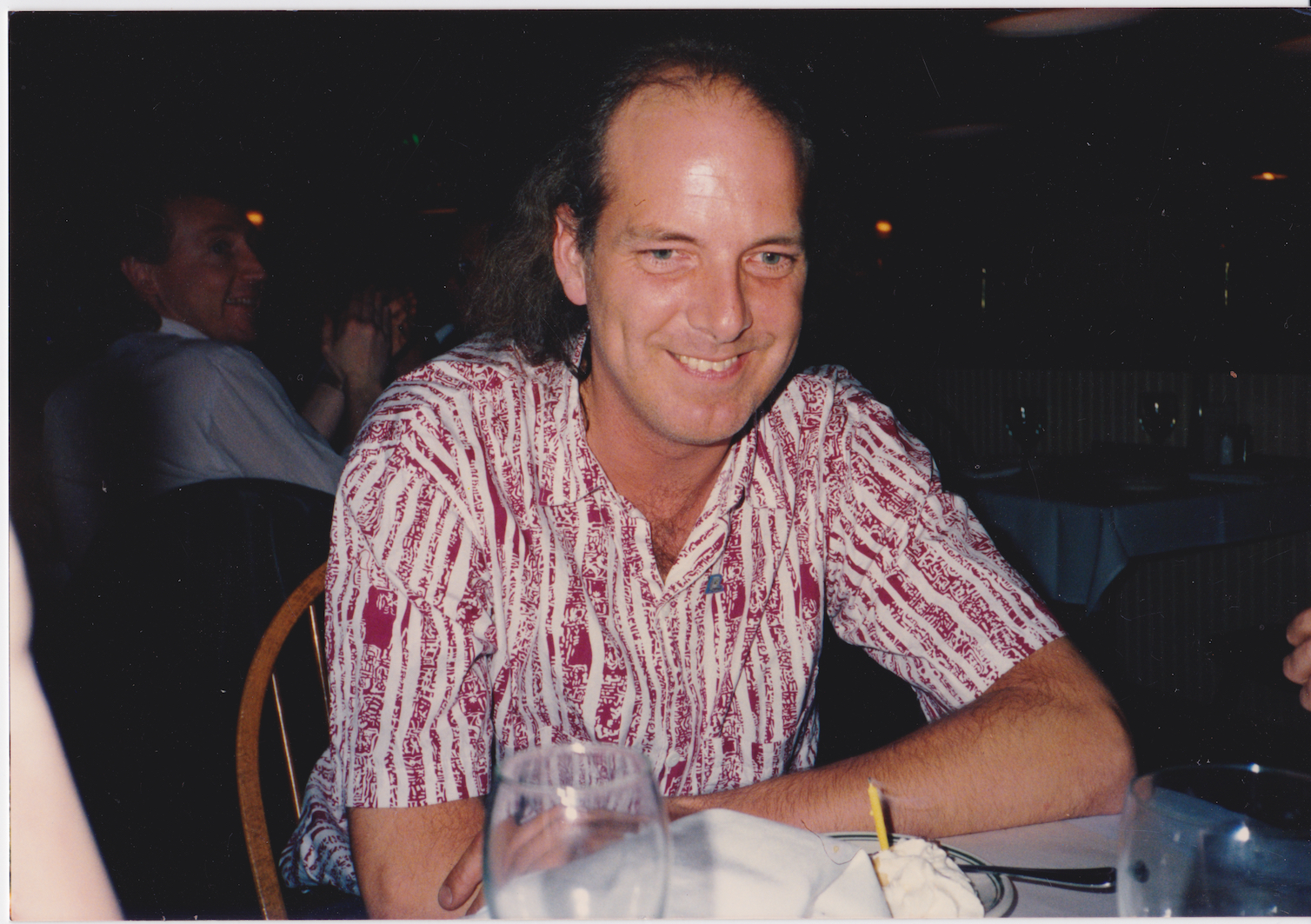
On Tom’s 57th birthday. He had a small gathering in his local pub, CB Hannigan’s. Tom’s arms hung limp at his sides because of his neuropathy. He and I spoke for fifteen minutes or so. His situation was not good since his lungs’ function was finally being impaired by his neuropathy. I listened to his situation and gave my final “Bummer, man” to him. He smiled (the only time that day I saw a smile from Tom) and we drank our beers. Mine was from a mug. His was from a tall glass with a long straw. It was a sad moment.

Remember the time you were betrayed

Really it was the “times” he was betrayed. But this line is referring to his months-long relationship with a woman known as “Yolanda”. She wasn’t straight with him. He took her to Tahiti on one vacation I remember, and lavished her with jewels and such. But as It turned out, she had never left her relationship with her previous boyfriend and actually brought him with them on the pretext of scuba training (for her). Later, when he wised up, he had a detective discover that she was still seeing him, with pictures and all. And that was it.

Remember I’ll always be your friend

Goodbye old friend.

Lyrics

Goodbye My Friend

Goodbye my friend
I said goodbye my friend

Though your time is gone
I look back upon
All those years we spent together
Working on and on

You were outta sight
And you taught me right
When you handed me the reins
I drove on through the night

Day by day
We learned to get along
Along the way
We remained strong

We both wrote the song
Others sang along
You know, even when the earth moved
We kept on keepin’ on

We worked to create
And our stuff was great
Yes our loyal crew was awesome
When they stepped up to the plate

Year by year
We fought the hardest fights
Have no fear
Soon comes the night

Goodbye my friend
Goodbye my friend
Goodbye my friend
I said goodbye my friend

Too much time in the radio station
Took its toll out on you
And even so it never made you blue

Too much trust in the ladies that found you
Left a few scars on you
Too bad that none of them could be true

Goodbye my friend
Goodbye my friend
Goodbye my friend
I said goodbye my friend

(Reprise)

Remember the days in Boston town
Remember the day we lost our friend
Remember how Water Tank went down
Remember the goldfish bowl and then

Remember the wall-sized plots we made
The end of your set you played that song
Remember how partner’s draw was great
Remember how Cheshire cowed your dog

Remember the Gershwin rhapsody
Remember when Painter saved the day
Remember the exit strategy
Remember neuropathy’s dismay

Remember the picture Marla made
Remember the sadness near the end
Remember the time you were betrayed
Remember I’ll always be your friend


Wednesday, June 4, 2014

Interesting Persons, Part 1

Back in the 1980s I was fascinated by sound synthesis and analysis. The most well-known work I did was a little application called SoundCap (for Sound Capture) that was coupled with an Analog-to-Digital converter initially sold by Fractal Software, my partnership with Tom Hedges, and eventually sold by MacNifty. It is fortunate for many of the early Macintosh developers that this box hooked up to the back of a Mac through the serial port. Several sound-producing apps were produced with it, including Airborne! by San Diego's Silicon Beach Software.

Stephen St. Croix was a friend of mine. He contacted me at Fractal Design in the 1990s and wow'ed me with a few of his wondrous stories. We spoke at length on several occasions about digital sound synthesis, one of my many hobbies. I was surprised to learn that he was one of the inventors, at Marshall Electronics, of the Time Modulator, the box that introduced digital delay line flanging to more than a few famous musicians.

The most interesting story he told me was about the job he did with Lay's. Yes, the people who make the potato chips. It seems that their spokesman, Jack Klugman (of Quincy fame), had lost his voice as a result of throat cancer. This really made a problem for them because his commercials for Lay's potato chips were pulling quite well. After all, he was a very recognizable and a well-loved actor. His voice was distinctive. People listened to him.

Stephen informed me that they invented a new kind of voice synthesis device to recreate his voice. It used formant synthesis. Incredibly, they could exactly duplicate the distinctive gravelly sound of his voice in this manner! It seems that the very low-frequency warbling of his vocal cords, though inimitable by human voice impersonators, was entirely imitable by digital synthesis techniques.

At Marshall Electronics, they spent quite some time analyzing sound. They had room analyzers. And so they also had room simulators. But the least known cleverness involved voice analyzers. Imagine picking apart someone's voice, layer by layer. Figuring out the pitch-profiles and the syllabic inflections. Hand-tuning the cadence of the words. My mind was boggled constantly by Stephen's work.

I informed him of my work in music extraction. I had a special application called Do-Re-Mi that allowed you to whistle a tune that could be output using MIDI in key duration format, complete with amplitude and pitch profiles suitable for modulating a pitch wheel and a volume pedal. It could tell you how many cents (hundredths of a semitone) sharp or flat you were when you whistled. I used a clever correlation technique that involved a time-delta histogram for correlation, pitch-multiple disambiguation, Lagrange peak-finding, and other techniques for isolating the pitch accurately. This work was all done in the 1980s, before Fractal Design, as part of Fractal Software's work.

Tom Hedges, of course, was the hardware designer of the first Macintosh sound sampling box and my contribution was the software, much of it written in Motorola 68000 assembler. Our work with sound continued when we did a bit of work with Bogas Productions, involving Ed Bogas, Ty Roberts, Neil Cormia and others. I met them through a mutual acquaintance, Steve Capps, who was working on the Finder in 1984.

I wrote a sequencing application in 1984 and Tom was fascinated by it. He modified it so it could sequence samples and then proceeded to digitize his piano, note for note. This was in a day when samplers existed, but were quite crude and expensive. He encoded Rhapsody in Blue (he was so proud of playing it) and also a perennial favorite, Wasted on the Way (a thickly vocal-harmonic piece from Crosby, Stills, and Nash). We were both musically literate, but in different ways. I was a composer who played piano and I was fully familiar with sheet music (actually, I had to teach the rudiments of it to Tom before he could digitize the songs, which took a week or so to get it just right). Tom was a DJ with KZSU Stanford and an advanced audiophile. And he had a very wide understanding of music. His father played piano (which explained Tom's interest in Gershwin's Rhapsody in Blue).

So when I began speaking with Stephen St. Croix, I was very deep into audio analysis and synthesis. And the author of a very popular application for sound manipulation on the coolest new computer around, the Macintosh.

It wasn't a big surprise at all that we spent hours and hours talking about sound synthesis, analysis, music, and the recording business. Crazy times and a really good guy.

Saturday, April 14, 2012

How Does It Work, Part 1

Analytic geometry is one of the most useful kinds of mathematics I have ever learned. Painter was built on it. But the average person has little idea what makes it tick, much less what makes it relevant. This post will simplify two-dimensional analytic geometry and present it so anybody can understand it. I'll build you up from understanding points on the plane to segments and vectors. And then to angles, directions, orientation, area, really you name it (if it has to do with analytic geometry) and I can help you understand it.

The Plane, the Plane!

Pixels and points are two ways of looking at the plane. But both of them involve a two-dimensional address system, and the two dimensions are usually called X and Y, but sometimes also columns and rows.

We see here a right-handed coordinate system. On the compass, the X-axis points east and the Y-axis points north. In the center is the origin, the point where X and Y are both zero. We like to write a coordinate as an ordered pair, in this case (0, 0). The axes also split the plane into four quadrants (shown in color and with their conventional Roman numerals).

If you are working in columns and rows instead of X and Y, then you are actually using a left-handed coordinate system, because larger rows are below the smaller ones, and so the direction of increasing rows points south. Pixels in an image are usually laid out in rows and columns.

A coordinate system is the basis for all analytic geometry. A point is an infinitely small location in the plane. A pixel is really a small rectangle covering a (usually square) area in the plane. The center of the pixel is a point.

Vegments and Sectors

Wait, I meant segments and vectors (I'm just trying to confuse you with doubletalk, hee hee)! Join two points with a small straight line and you get a segment. If you join two points in the same way, but the join actually has a direction, then you have a vector. Segments and vectors may be measured and quantified in different ways. And each has their own use.

Here I show a segment from point P1 (X1, Y1) to P2 (X2, Y2). A segment is rooted (meaning it has a real position on the plane) because both endpoints have locations.

Segments may be chained end-to-end to create polygons. Most commonly, a polygon is closed, in which case it has an inside and an outside. You can compute a closed polygon's area also. More (much more!) on this later.

Here is a vector from point P3 (X3, Y3) to point P4 (X4, Y4). But a vector, which we have conveniently defined to be the straight path between these two endpoints is really not rooted and consists of only an X and a Y delta. A vector is pretty much the same no matter where you put it.

A vector's measure starts by computing the X and Y deltas that make it up. Once you perform the subtraction, any notion of being rooted in the plane goes away. Why? This is intuitively true because you subtract away the start point of the vector, removing its home base.

Length and Stuff (No, It Isn't Spelled Lenght! Grrr!)

Simple subtraction creates the vector, as you can see. This is why a vector is oriented. A vector from P3 to P4 is quite different from the vector from P4 to P3. In fact, it is the negative of it. Or inverse.

Its length may be easily calculated using Pythagoras' rule by making the segment the hypotenuse of a right triangle (you probably wondered when that rule was going to be useful to you in everyday life, right? Well, just wait until you get to trigonometry!).


So here is the easy way to compute the length of a segment. You move the "right angle" of the imaginary right triangle (kind of shown shaded in a very light peach color) directly to the origin. This translation is effectively performing a subtraction, in this case, of the lesser of the two X's, which happens to be X4, from the two points, and also a subtraction of the lesser of the two Y's, Y3, from the two points. Anyway, the base and height of the right triangle are now known, so we may compute its hypotenuse length using Pythagoras' rule.

Note that, when you square them, the deltas that make up a vector can be either positive or negative. This is because their signs get lost when you square them: they always end up non-negative (also coincidentally why the square root of a negative number is not a real number). So we can define the length of the vector to be the square root of the sum of the squares of the vector's deltas.

If you imagine a segment to be a vector, then you can compute its length in exactly the same way. Length doesn't depend upon the position of the segment. That's why it works to think of the segment as a vector in this case.

OMG Do I Have To Know This Stuff?!?

If you already know about all the kinds of numbers, then you can skip this section. However, just bear in mind that I had to know about all these things before I could develop Painter! And now it's your turn! Waahahahahaa!

There are various kinds of numbers that it is useful to know. The integers are the whole numbers, zero, and their negatives. On a computer, there may be a smallest integer and a largest integer. That is what we like to call an implementation detail in the business. If you need more accuracy, you might want to use a real number. Real numbers can represent the integers, and all the numbers in between as well, like 9.57212947621.... On computers, these are represented by things called floats and doubles. These have various numbers of bits of accuracy.

When you divide one integer by another integer, you get a rational number (but please don't divide by zero!). There is really quite a spectrum of numbers that can be represented by rational numbers, called a Markov spectrum (but I digress). On a computer, real numbers can't really represent all rational numbers with 100% accuracy. For instance, you can represent 123/128 exactly, but 1/3 is hopeless to represent accurately. This turns out to be true because computers use power-of-two (binary) representations, and 128 just happens to be two to the seventh power.

Some numbers can't be represented exactly as a rational number or by floats and doubles on the computer. One example of these is an algebraic number: a number that is the root of some polynomial with integer coefficients, like the square root of two. If a segment has its endpoints at points whose X and Y are integers, then the segment's length is an algebraic number.

Another example is a transcendental number. Such a number can't be represented as an algebraic number or a rational number. Well, pi and e, the base of natural logarithms, are two examples of transcendental numbers.

OK, computers really only approximate these, but it's good enough for government work.

Back to the Vector

A vector then has a length and also an angle. Mathematicians have for ages thought of angles as being rooted in a vector that points east. This is the zero angle, and it corresponds with the X axis. Angles increase counter-clockwise, starting at zero and increasing until they become 360 degrees back at the X axis again. Although mathematicians actually think in radians. A radian is about 57.3 degrees. This means that 360 degrees is actually two pi radians.

Pi, by the way, is the magic ratio of the circumference of a circle to its diameter. It has a value of about 3.14159.... Yes, I memorized pi to 100 places and I used to recite it. Jeez, was I a geek!

But radians are a pure mathematical way of looking at things. Using radians instead of degrees saves you a multiply each time you do a trig function. Uh-oh. Trig functions!

Well, anyway, when you have a vector, and you divide its X and Y components by its length, you get a unit vector that points in the same direction. This unit vector consists of the cosine and the sine of the direction angle, by the way.

I remember when I was introduced to this fact. It was, to me, an "aha" moment. Now I understood why trigonometry was important! Actually, a few things fell into place that day in 1974. I ended up using it later on a test given to me by Joe Sukonick, a clever programmer at Calma Company. That bearded MIT graduate fellow ended up with a patent on the XOR for cursors in raster systems, by the way. But it was another guy at Calma, Tom Schaefer, that taught me some really useful things about analytic geometry. Without this information, it would have been seriously difficult to create Painter, or build the mosaic brush. Or really anything I do today.

What's Dot?

At Calma, segments definitely got connected end-to-end to create polygons. Calma built very good CAD (computer-aided design) systems for the very first VLSI (very large scale integration) components. In other words, microchips like the Motorola 68000 were designed on our systems. Yep, the original Macintosh's CPU.

I remember thinking about the notion of concave and convex and clockwise and counterclockwise. How could I determine these attributes for a polygon? It seemed like concavity was a local thing, and could be determined by looking at three consecutive points. But clockwise and counterclockwise were much more complicated, and were clearly a global thing. Or were they?

So there I was at the tender age of 19 at Calma, thinking abstractly about analytic geometry. It turns out I was smart enough and up to the challenge!

Tom Schaefer clicked his pen a few times and then drew a few figures on a piece of Calma stationery. Tom Schaefer was responsible for the all-angle fracturing software that enabled e-beam devices to render arbitrary geometries onto silicon, so I believed he could help me.

First there were three points, P1, P2, and P3. You could subtract the points' X's and Y's to make two vectors, V1 and V2.

But note that, the two vectors, if rooted at the same origin, created an angle between them, called theta. The angle is measured in counterclockwise degrees (or radians!).

That's when he introduced two operators, dot and codot. Dot is really the dot product and codot is sometimes called the scalar cross product. I found the operators' definition to be unusually simple and low-cost computationally. You just multiplied the X and Y components of the two vectors together in different ways. Wow!

Then he proceeded to show me that these operators could actually be used to compute the sine and the cosine of the angle theta. It was all beginning to come together. But I was a little hazy on my trig, so he made it absolutely clear to me. It's all about which side P2 is with respect to the line that passes through P0 and P1.

In fact, the sign of the codot could be used to determine this useful bit of information. And here's how to do just that.

OMG I thought this was incredibly clever. With this one operation, I could decide if a polygon is concave or convex, and even whether to not a polygon was clockwise or counterclockwise (as long is it's not self-intersecting).

But, of course, my brain was thinking several steps ahead.

It also occurred to me that, if V1 and V2 were unit vectors, that the dot and codot operators would simply produce the cosine and the sine of theta directly. In fact, I could see now that the rule about a vector's angle was simply a special case of this.

The dot product, it turned out, was useful in determining whether the two vectors were pointing in the same basic direction (if the dot is positive) or the opposite direction (if the dot is negative). And, by the way, if the dot product is zero, then the two vectors are at right angles to each other (perpendicular).

Area, Orientation, and Lobster Bisque

Polygons are a connected and closed chain of points in the plane. Between any two neighboring points is a segment. So, how do we compute the area of a polygon? Well, we make use of a clever technique called the trapezoidal rule. If a polygon is clockwise, then we just have to make trapezoids from each segment by dropping lines to the Y axis as we see in this diagram. Note that, on the bottom of the polygon, when the segments are going in the other direction, then the trapezoid areas become negative, because the X terms are going from right-to-left instead of from left-to-right as they are here. And that makes polygon area work by first computing the integral under the top of the polygon and subtracting the integral below the bottom of the polygon.

This has an interesting side effect. The clockwise polygons have a positive area and the counterclockwise polygons have a negative area.

So, really, to get the area, we have to take the absolute value of the computed area. And the sign is the orientation of the polygon. This turns out to be a very convenient way to compute polygon area! Once you see it, you will wonder how it can be so simple.

This turned out to be a question on Joe Sukonick's aptitude test at Calma. I took that test, and I got it right. But another guy, Bruce Holloway, got the job. Because, I was going to college at Caltech. The very next spring, when in Chemistry lab at Caltech, I got a call from Art Collmeyer. He saw the test and decided I might be interested in a summer job at Calma. It's good he called. I met Tom Hedges at Calma.

Oh, and by the way, the lobster bisque at Hula's Grille in Santa Cruz is excellent!

Tuesday, March 13, 2012

Hard Problems

I like to solve hard problems, which is good since that's my job. This involves significant analysis, and complex problem-solving time and time again.

I have been sharing some of the details of the complex problem solving required to produce features in Painter, but for once I will discuss a tiny, almost lost bit of work I did at my current job. This involves a problem I have been seeking to solve for at least ten years: the lofting problem.

You might be asking yourself how I can talk about it, since it involves my current work. The answer is that this work is now in the public domain, since the process I am about to describe is detailed quite explicitly in US Patents 7,227,551 and 7,460,129. It is also not particularly secret or unavailable since it can be had by using Core Image, part of Mac OS X, as I will indicate.

The Lofting Problem

A Text Mask to be Shaded
If you have a bit of masked information, like text, it is classic design to create a version of the text that is 3D. I'm not talking about extruded letters, which are kind of passé. I'm talking about surface texture that makes the letters look puffy. And stand out. Here you see some masked text. Optima extra bold.

While working on something quite different, another employee, Kok Chen, and I came across something truly amazing.

We solved the lofting problem.

The Wrong Answer
Now, to introduce you to this hard problem, let me show you what happens when you try to create puffy text in Painter.

Here is the result. To do this, I used Apply Surface Texture using Image Luminance, and cranked up the Softness slider.

But all this can do is soften the edge. It can't make the softness sharper near the edge, which is required to get a really classy rendering.
The Right Answer!
Using the lofting problem solution we thought of, you get a much better rendering. The corners have a shine that goes right into them, because the curvature of the surface is continuously approaching a sharp point at the corner. Yet remains pleasingly rounded in the center.

Think of a piece of rubber or flexible cloth tacked down to a hard surface at all points along its edge, and then puffed full of air from underneath: lofted.

I think you get the point. The difference is like night and day! Before I implemented this in Core Image, this was not an easy effect to achieve, and probably couldn't even be done without huge amounts of airbrushing.

In Core Image, you might use the Color Invert, Mask To Alpha, Height Field From Mask, and Shaded Material effects to achieve this. And you might have to use a shiny ball rendering as the environment map, like I did. By the way, you can mock up most of this in Core Image Fun House, an application that lives in the Developer directory. Core Image is a great tool to build an imaging application. Just look at Pixelmator!

But How Was This Solved?

Exactly! This was a very interesting problem in constraints. You see, the area outside the text is constrained to be at a height of zero. The area inside the text is initialized to be a height of 1. This is the first image in sequence.

Now blur the text with an 8-pixel radius. It creates softness everywhere, and puts some of the softness outside the text area, because blur actually is something that causes shades to bleed a bit. This is the second image in sequence.

Then you clamp the part outside the text to be zero height again. This recreates a hard edge, and creates the third image in sequence. I have recreated this process in Painter. The clamping was done by pasting in the original mask, choosing a compositing layer method of darken, and dropping the layer, collapsing it back onto the canvas.

Next I take that same image and blur it by a 4-pixel radius. This produces the fourth image in sequence.

I clamp it back to the limits of the original text by pasting, choosing a darken layer method, and dropping, producing the fifth image in sequence.

Notice after the clamp step, the edge remains hard but the inside is becoming more accommodating to the edge, yet remains smooth in its interior.

With the next images in the sequence, I blur with a 2-pixel radius, clamp to the edge of the original mask, then blur with a one pixel radius and clamp to the hard edge of the original mask again to get the final lofted mask.

The last image in sequence is the shaded result, using Apply Surface Texture in Painter.

I should confess that these images are done at a larger scale (3X) and then down sampled for your viewing pleasure. Also, Painter only keeps 8 bits per channel, so the result was a bit coarse, and had to be cleaned up using the softness slider in the Apply Surface Texture effect.

In Core Image, we use more than 8 bits per component and thus have plenty of headroom to create this cool effect at much higher resolution and with fewer artifacts.

It becomes clear that the last several frames of this sequence look practically the same. This is because the blurs are smaller and the effect of the clamping against the edge of the original mask is less prominent. Yet these last steps become very important when the result is shaded as a height field, because the derivatives matter.

Smart People and Hard Problems

It should seem obvious, but it really does take smart people to solve hard problems. And a lot of work. And trial and error. So I'm going to tender a bit of worship to the real brains that helped shepherd me on my way through life and career. To whom I owe so much. And I will explain their influences on me.

The first was Paul Gootherts. Paul is an extra smart guy, and, during high school, Paul taught me the basics of computer programming. He, in turn, got it from his dad, Jerome Gootherts. A competent programmer at 16 (or earlier, I suspect), I owe my livelihood to Paul and his wisdom; he also conveyed to me something that (I think his uncle told him): if you are good at one thing, you can find work. But if you can be good at two things, and apply what you know and cross-pollenate the two fields, then you can be a real success. I applied this to Painter, and almost all of my life. And perhaps someday I'll apply it to music as well. Paul helped me with problems in computation and number theory, and his superb competence led me to develop some of my first algorithms in collaboration with him.

The second was Derrick Lehmer, professor emeritus at UC Berkeley. He taught me that, though education is powerful, knowledge and how you apply it is even more powerful. And it's what you do with your life that is going to make the difference. This has guided me in far-reaching ways I can only begin to guess at. Professor Lehmer ("Don't call me Doctor; that's just an honorary degree") helped me with understanding continued fractions and their application to number theory and showed me that prime numbers and factorization are likely to remain the holy grail of mathematical pursuits. Oh, and his wife Emma (Trotskaia) Lehmer, who was also present, provided many hours of interesting conversation on our common subject: factoring repunits (numbers consisting of only ones). I must credit a few of my more clever number theoretic ideas to her.

Other smart people have also provided a huge amount of inspiration. Tom Hedges had a sharp eye and an insightful mind. He taught me that no problem was beyond solving and he showed me that persistence and a quick mind can help you get to the root of a problem. Even when nobody else can solve it. Tom helped me with Painter and validated so much that I did. Without Tom, it would have been hard to ship Painter at all!

I have probably never met as smart a person as Ben Weiss. When the merger between MetaTools and Fractal Design took place, I became aware of his talents and saw first hand how smart this guy is. He can think of things that I might never think of. He confirmed to me that the power of mathematical analysis is central to solving some of the really knotty problems in computer graphics. And he proceeded to famously solve the problem of making the median filter actually useful to computer graphics: a real breakthrough. I've seen Ben at work since Metacreations, and he is still just as clever.

While Bob Lansdon introduced me to Fourier-domain representation and convolutions, it was really Kok Chen that helped me understand intuitively the truly useful nature of frequency-domain computations. He introduced me to deconvolution and also showed me that there were whole areas of mathematics that I still needed to tap to solve even harder problems. Kok retired a few years back and I sincerely hope he is doing well up north! Kok basically put up with me when I came to Apple and helped me time and time again to solve the early problems that I was constantly being fed by Peter Graffagnino. When it came time to work with the GPU and later with demosaicing, Kok Chen consistently proved to be indispensable in his guidance.

There are plenty other people who I will always refer to as smarter than myself in various areas, but they will have to go unnamed until future posts.

Wednesday, February 29, 2012

Keeping It Cool

Initially, at Fractal Design we had our sights set on the Sunday painter market with Painter. But, as time went on, we took on the traditional design market as well: all those people who were using traditional tools to comp up their designs. This turned out to be an excellent area of growth for us.

To entice those new customers, we began to capitalize on the cachet of the paint can. First off, the designers were a more difficult market because their demands upon the quality of the can, the manuals, and the software were much higher. To solve this problem, we had Steve Manousos, a veteran publisher with a great feeling for what looked professional. The manuals up to Painter 2.0 were written by Karen Sperling of Write-Design Studio and produced by Steve Manousos.

In Painter 2.0, released in January 1993, the new features that caught the eye were:
  • apply lighting
  • glass distortion
  • watercolors
  • recording and playback of sessions
  • brush looks
As you can see, we were adding features at a fantastic pace and so manual design, writing, and production went in-house. But how did I come up with these features?

I drew on my experience in ray tracing for both the apply lighting and glass distortion effects. I also used that expertise when coming up with the apply surface texture effect, by the way. In 1983-1985, I was busy constructing a hybrid ray tracer/shaded 3D modeler/hidden line system for AutoTrol Technologies. I have often mentioned my ability to think three-dimensionally. Well, it helped out considerably during those years. And, once again when it came to effects for Painter. I continued to draw on this knowledge when I constructed Detailer, the amazing 3D paint program.

Also, the watercolor brushes (which also had an additional layer of information) was jointly developed by Tom Hedges and Bob Lansdon during the Painter 2.0 timeframe. It is lucky indeed that they were so inclined. I later visited watercolors again in Painter 7, which used an unprecedented 4 layers of information to propagate its pigments through the capillaries of the paper grain, and which also used a cellular automata-based diffusion process to accomplish this while the user watched.

But before even all this, and before even Painter 2.0, I was advancing a secret internal tool, Texture. This was the tool used to produce nearly all of Painter's innovative textures.

To right, you can see a test sheet with 48 textures, done in February, 1992. This showed that Texture was capable of producing speckle, z-buffered rendering, annealing, and anisotropic texture using Sequential Random Addition (coming in a future post, I promise!) even in early 1992. I recognized the need to provide textures early on, because scanning paper grain was so difficult and prone to flaws.

Right around PainterX2, Steve M hired Mary Mathis-Meltzer (now Mary Zimmer) who was the uncompromising, capable editor and manager of the manual production. She totally "got" what we were looking for and made it happen wonderfully, by building an excellent crew of designers, copywriters, and artists to make better and better (and award-winning) manuals with every revision of the product.

PainterX2, released in June 1993, was a version in between 2 and 3, that had some remarkable new features:
  • layers
  • layer palette with grouping of layers
  • brushing on layers and their masks
  • portfolio for storing layers that are used in a single project
  • editable sessions
You may have noticed that in Painter 2.0, I started building a session recording and playback feature. This was continued in PainterX2 with the ability to edit the sessions. I literally documented the format so people could drive Painter using programs they wrote.

But the really big addition to this version was layers. We called them floating selections in those days, or (unfortunately) floaters for short. John Derry came up with the Portfolio concept and I implemented it. We also pioneered grouping, painting on layers and their masks, and a palette to access the layers. This was the first commercially-available program that featured this capability.

Almost simultaneously, veteran paint system pioneer Alvy Ray Smith produced a similar capability in his revolutionary Composer program from Altamira software. His was probably working before mine, so I would say that he gets the credit. Plus, he's a lot smarter than me.

Nonetheless, Fractal Design was advancing so fast and with the professional look and the quality of our product, it all made us look a lot bigger than we actually were.

So we needed an edge to complement this. And we found one: keeping it cool.

The paint can product packaging had already put the perception of Fractal Design solidly in the cool and innovative category. With Painter 2.0, we continued that.

We needed to make sure that our corporate look was in resonance with the design community. So, John Derry and I consciously moved towards the cool side in Painter 2.0 with the So Hot So Cool campaign. You can see the artwork that John produced, reminiscent of a skateboard sticker, for Painter 2.0. A Burning Ice Cube. We also adorned the Painter 2.0 can with some of the art we compiled for this campaign.

Aside from including a burning ice cube sticker inside the Painter 2.0 can, the poster inside the can also had four renditions of a burning ice cube on it, and John and I were quite proud of our campaign. People loved our posters, and we often saw them posted on doors and office walls. For us, it was well worth the investment in word-of-mouth.

Yet, perhaps we went a bit too far. Karen Bria informed us that the east coast people weren't quite understanding the skateboard sticker theme. That perhaps it appeared to be too "California". John and I were actually amazed that they even noticed. We were happy that we could have an effect with our approach, but we learned from the event nonetheless. And never stopped creating new features.

Painter 3, released in November 1994, contained the following new features:
  • new drawer-based UI
  • frame stacks: rotoscoping video
  • onion-skinning for animation
  • the Image Hose
  • physical bristle modeling
  • multiple undo
For Painter 3, we intentionally chose a less avant-garde approach with Pour It On. Here we associated the icon of the paint can with an action that symbolized the designer's mind burgeoning with ideas: pouring their ideas onto the page (without explicitly saying or depicting it, which we considered gauche and way too literal). We intentionally packed Painter 3 with new effects as well, and we knew that such things were necessary for a designer to keep their designs fresh.

The Fractal Band singing Midnight Hour - June 1995
Shown: Laurie Hemnes (now Becker), Tad Shelby (bass),
Me (keyboard), Tim Thomas (vocals),
Mary Mathis-Meltzer (now Zimmer, vocals), and John Derry (guitar)
A lot of the newness of Painter 3 was the frame stack capability. This allow the user to import a movie, paint on every frame, or to use a movie as a close source and create rotoscoped animation using all of Painter's lifelike brushes. The Image Hose was also new in Painter 3. This allowed you to draw with life. John Derry and I used the layer masking capability to get pieces of an image, say individual clovers, masked out. Then we could apply shadows to them individually. And finally structure them so you could draw with them and produce an endless array of clover. The brush became a generator of image: a literal hose of image data. This was profoundly more valuable than texture, because it brought structure to the brush.

I also got busy implementing multiple undo, bringing Painter up to modern standards. This modification stretched over three revisions of the product, because it was so complicated.

For Painter 4, released in November 1995, our features were:
  • Shapes, so you can have layers of vector art
  • net painter
  • mosaics
  • seamless pattern tiling
  • reference layers - free transform
  • web painter - GIF and JPEG formats
The mosaic feature actually came from my earlier work in Boolean polygon operations. This is an insanely difficult problem to solve. The reference layers feature allowed layers under transfer to continue to be under transform, and consequently rotatable and scaleable. This allowed the designer to try out a lot of possibilities without committing to one. It meant that small adjustments could take place without recursive re-sampling of the image, which degrades the image over time. This can be viewed as my entry into non-destructive editing. Which, of course, was the entire concept of Altamira Composer.

Seamless pattern tiling was a useful feature for this who needed to create web pages and backgrounds that tiled in various ways. You could paint into a tile and that made it possible to produce completely seamless artistic results.

Net Painter, of course, leveraged Painter's scripting capabilities. By this time, everything done in Painter was being recorded locally to the artist's machine in real time.

When it came to marketing, we weren't running out of ideas at all. And because of the mosaics feature, we decided to play on history a bit, using the Painter Through the Ages theme. For this I created a beautiful mosaic frame for the poster, The Miracle of the Paint Can. John Derry created a beautiful image, reminiscent of Vermeer, in which Priscilla Shih (now Priscilla Cinque) posed for the image.

And the Painter Power Palette Picker was a powerful tool and an innovative bit of material to accompany the poster and the manual. That was definitely cool.

Painter 5 was released in June 1997, with the following new features:
  • impasto paint
  • liquid metal paint
  • refracting water droplet paint
  • dynamic layers - non-destructive editing (lens layers, dodge and burn layers, torn edges, etc.)
  • photo brushes
  • gooey brushes
Winter of Love 3 Poster
Artist: John Derry
Painter 5 was released approximately in sync with the merger with MetaTools, and it contained a veritable wealth of new brushes and layers. The concept of non-destructive editing was taken to the extreme by having layers you could dodge and burn into, layers that refracted the data below them, and even liquid metal layers.

Painter 5's theme was A Monument to Creativity. For this I created the Mount Brushmore image. The process of ideation for the Painter 5 logo form and ad concepts is detailed in Creativity and Painter, Part 4.

Painter 6, released in September 1999, had a set of new features that were quite brush-oriented:
  • next-generation multi-bristle brush engine
  • load brushes with multiple colors
  • leaner, clearer UI
  • life-like natural spray airbrushes
  • Interactive Image Hose, allowing changes to scale and rotation in real time
  • Painting with patterns, neon, tubes, and gradients
  • responsive palette knife
These led us to take an approach that featured brushes. Because Only Painter could do these things. This was less cool and more of a preservationist attitude. In response to products imitating Painter's capabilities. In response to Photoshop duplicating Painter's brushwork.

Painter 7 had a set of new features that I worked on as well, in the form of a consultant working for Corel:
  • liquid ink
  • watercolor version 2 (much more realistic)
  • animated absorption of pigment 
  • woodcut effect
So, the theme of producing great brushes and effects, combined with innovations like layers and interactive 3D lighting drove us to highlight the features with innovative campaigns. In each new release, we strove to maintain our creativity, and thus bolster the creativity of the artists who still choose Painter worldwide.

    Monday, February 20, 2012

    Magnitude Patterns

    Magnitude patterns arise from Fourier transforms.

    Bob Lansdon and Tom Hedges showed me magnitude patterns back at Calma in 1978. Tom had just finished a driver for the large-bed Versatec raster plotter. The plot was probably about 3 feet square and it was computed by using a 1024x1024 2D FFT of seven points evenly distributed about a circle. Bob had the program shade the magnitude of the result. FFTs work in the complex domain and by this he meant plotting for a+bi the result sqrt(a*a+b*b). Here to right you see a magnitude pattern. It is very much like a sort of puffy shape with black rivers wending and undulating through it.
    Perhaps we can see the convolutions of a human brain in it. When you notch higher frequencies, you get patterns that may include flowers, lines of beads, and really all sorts of symmetries. I got to thinking that I might be able to show the patterns more effectively, and so I decided to render the magnitude pattern to a texture and back to an FFT, moving to to the real channel of the data. Then I highpassed the result to remove the wide range of the bias. Once that  was done, I then transferred it back to a texture and annealed it to reveal all the patterns in a much higher-contrast format.
    Lines, beads, and strange patterns kind of like those we see in the convection patterns of the solar surface begin to appear.

    I really don't have any idea why these patterns are like this, save for one simple explanation. They are the magnitude patterns of a notch-filtered texture. This texture has really only one frequency of data in it, which makes it ring on only one wavelength. So the patterns are like waves on a pool with several disturbance points, all adding up to a chaotic, but highly band-limited pattern.

    Here you see the real component of the magnitude pattern at the top of this page. The dots are all in the same place, but the dark spots and the light spots in this version are both represented by light spots in the magnitude pattern. This is because the FFT, with its negative and positive values, was normalized to the black-white tonal range for display. Thus the dark spots are actually negative values and the light spots are positive. And both the negative and positive values have positive magnitude.

    So that does describe why the patterns have black rivers between them, but it doesn't say why there are higher-level patterns in the image: lines, rosettes, and chains.

    I call it happy coincidence.

    When your image has a particular kind of directionality to it, the magnitude patterns do as well.

    Here is a pattern from an image with some directionality to it. You can almost feel the sculpted surface, like some H.R. Giger style image. Dark, organic shapes.


    I was intrigued by magnitude. I took a hatching texture and annealed it into a sort of protoplasm you see to left here.

    This had the effect of generating a high-contrast image with individual randomly-shaped elements. The hatching was a nice touch since it generated protuberances on each element, kind of like cilia on a paramecium.

    Then I moved it to the FFT and did a highpass on it. The result was basically the same, but with the black and white moved to gray and the edges still visible as local contrast.


    Then I converted it to magnitude to reveal the edges as black lines on soft areas. I guess I was getting the hang of magnitude patterns. The edges of the elements become tiny black worms inside a pleasant glow. A bit like meandering rivers. I have seem the Mississippi river from the air, and it does have the same kind of undulations to it, especially down near Louisiana.
    I would like to show you some more slice-and-dice images now. I think a more proper term for these patterns is image in cell textures. Here a very large crossfade region is used for each cell, so that the cells tend to totally blend together. But of course I am also using z-buffering to merge the images together between the cells. This creates, as we have seen before, interpenetrating effects.
    Your choice of a source image can be varied for different results. Here, I just used a different part of the same source texture to get a stickery-spiny result instead of interlocking arches.

    The most interesting thing is to take these results and anneal them. Then you get some really interesting patterns. Each element can be similar to the others, but with a more organic placement and even some erosion. It becomes very natural for this reason.
    This came from a pattern that was recursively edited using slice and dice. Maybe ten times. After a while, the complexity of the individual elements is a bit like yarn. This complexity translates to even better images when you render them to very large textures.

    I think I will experiment with images that use the slice-and-dice technique using two image sources instead of only one in each cell. This will lead to areas that look one way and other areas that look in another way. Some sweaters are crocheted in patterns that vary the stitch in global ways, to create large-scale patterns. I think I will try this.