Showing posts with label Painter. Show all posts

Tuesday, April 21, 2020

Notes on Goodbye My Friend

Writing and production history
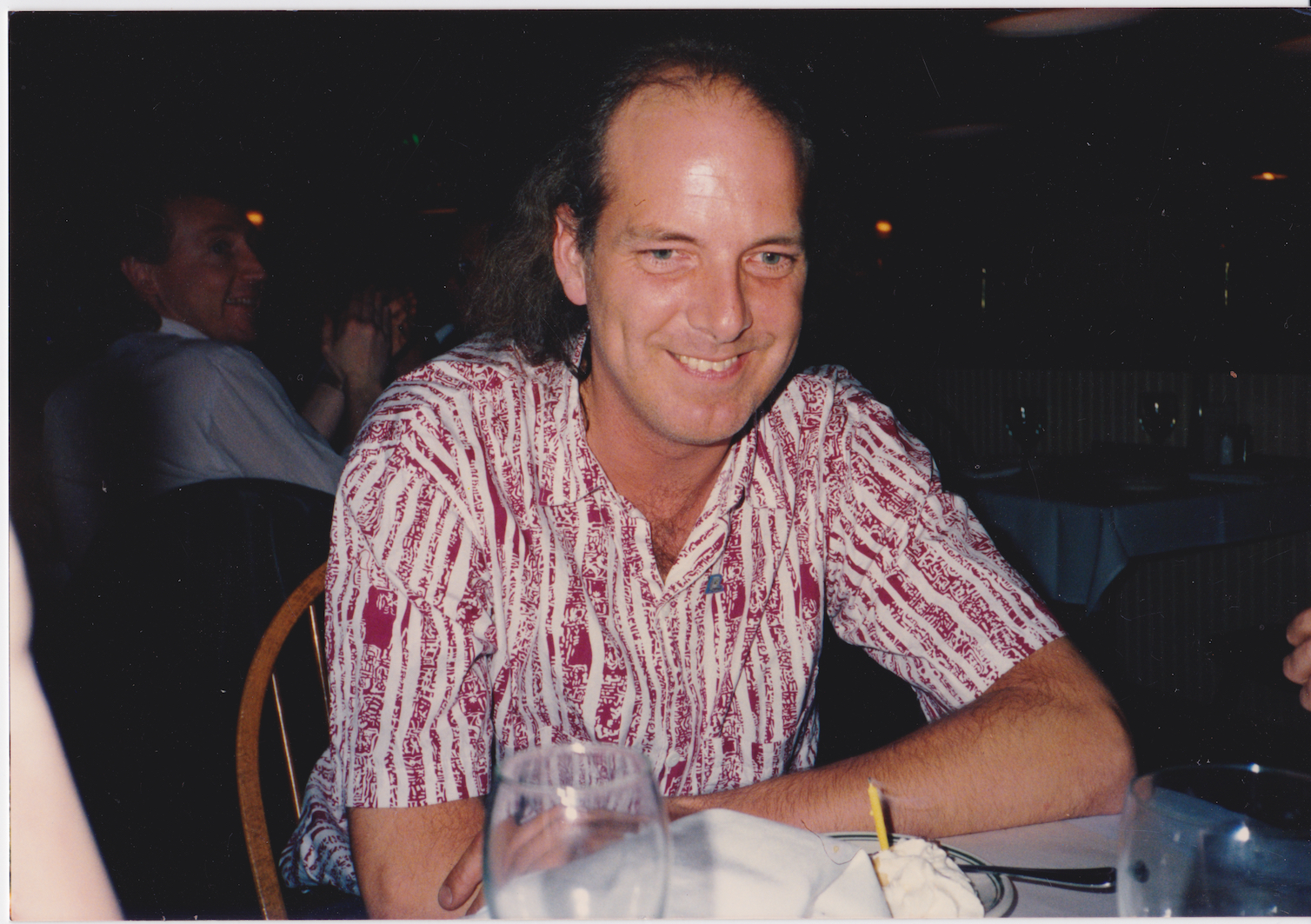
This song was written in May, 2019 as a farewell to Tom Hedges who died in November of 2007. I worked with him for 30 years and we became business partners at Fractal Design, where we created Painter, ImageStudio, ColorStudio, and other great products. The song is all guitars, bass, and drums (aside from vocals). Tom was a Beatles fan, and he liked John Lennon. Lennon mainly respected rock songs that used the traditional rock instruments, so that's why I arranged the song this way. I also altered my voice like Lennon, who always wanted something different. The song chronicles many memories, and tries hard to show how much he influenced me.

It starts with a chorus, with the drum setting the tempo and an iconic guitar riff, subtly fuzzed. In the background are some descending chromatic vocals. Slow arpeggiations on a clean guitar trace out the harmony in a wistful way while the drum fills get your attention.

The first verse sets the scene. He was, at first, my mentor, but eventually I took over as lead coder. Apps took over in importance and salability. The B-section of the first verse chronicles our relationship - we fought over lots of things but always somehow remembered to be friends the next day.

The second verse talks about how we were the progenitors of our software Apps. But we didn’t write them all — others helped write them like John Derry (UI and brushes), Bob Lansdon (watercolors), Priscilla Shih (general coding), Shelby Moore (PC version, multi-point color fills), Glenn Reid (R&D Management), Christina Hall (general coding), Vahe Avedissian (general coding), Scott Cooper (general coding), Erik Johnson (general coding), and our Ray Dream friends, Damien Saint-Macary (web features), François Huet (web features), and Nicholas Barry (Web features). These were the people that actually touched the code (and there were a few more I can’t recall). These were “our loyal crew”. And they were awesome!

But our loyal crew also consisted of a few more people who were instrumental to the development of the complex software base. For instance, Michael Cinque, who headed QA and Steve Rathmann, an early hire that always adapted to the task.

In the B-section of the second verse, the tale of difficulties competing against the software giant Adobe gets told. We fought the Painter fight ten years. All through the time, Tom’s health got worse and worse. He was diagnosed with Non-Hodgkin’s lymphoma in 1989, went into remission, had it flare up in 1995, and went into remission again. However, his radiation therapy treatments ended up creating a spreading neuropathy that started with his hands, and eventually affected his lower arms, and then his whole arms (by 2005) and finally his lungs.

We believe what caused this was his brief tenure as KSJO’s chief engineer. He spent a lot of time in the Optimod room up near the peak of Mt. Hamilton, where their radio antennas and microwave transmitters resided. I went in there once (but only once). You could literally feel the radiation.


He also had a spectacular lack of good luck with the women in his life. And I’ll say no more about that (for now).

Reprise references

The reprise from this song contains a dozen references to arcana from Tom’s life and the time we shared. Here, I’ll pick it apart, line by line.

Remember the days in Boston town

Tom and I were Fractal Software, a partnership, in 1986-1989, with Letraset as our marketers. We often traveled to Boston for the MacWorld East show, to show our product. Letraset had demo artists and a medium-sized booth. Later on, Fractal Design, the company that Tom and I had a hand in founding (along with Steve Manousos, Lee Lorenzen, and Steve Thomas), had a much larger booth presence. Tom and I would arrive in August in Boston, set up shop in a nice hotel, hit the bar, and wait for the other people showing products to arrive. It became a growth period for both of us.

Remember the day we lost our friend

Bob Lansdon was our odd friend from academia. He was constantly in search of a PhD in math. There was no doubt he was smart. Bob introduced me to Fourier transforms, and taught me how to vary the phase of the frequency signal, an incredibly useful trick. He and I dreamt of laser interferometry for measuring paper surface texture. Bob wrote the first watercolor capability in Painter. One day in 1994, Bob came into Fractal Design the office on Spreckels Drive in Aptos, and into the suite where Tom, John Derry, and I had our desks, and we talked for a bit. He had completed his PhD, finally after all these years (his thesis advisor was Ralph Abraham). We were a busy group and he left. A few days later we learned of his suicide. When I announced it to the new at Fractal, that was one of the few times I actually cried in front of the company I ran.

Remember how Water Tank went down

In the early 1990s, Tom was married to Joanne Etheridge (née Stoner) and they became a couple. They had two kids, Colin and Broghan. By the late 1990s, the relationship between Tom and Joanne was strained for a reason I never knew. It might have been Tom’s personality, which was a wee bit crude for many people’s taste. I don’t know. But there was a point where Joanne hired her parents, both real estate agents, to get them a second home. They bought a house on Water Tank Road in La Selva. To me as an observer, I felt that their strained relations, compounded with the fact that Joanne was literally creating a bachelor pad for Tom, meant that they were headed for divorce. But somehow Tom never saw it.

Remember the goldfish bowl and then

WhenI first met Tom Hedges at Calma Company in 1974, he was an RA at Stanford with his first wife, Rabbit (I never learned her name). So he came in late because those were his remaining working hours. I had been hired at Calma (at 4 bucks an hour, by Art Collmeyer) as an applications programmer for a new APL-based language (called GPL) that Carl Smith was creating. I needed a real workstation to do the work I was doing (which usually involved not doing what I was supposed to do). I was working on a demo of a rotating dodecahedron with hidden lines suppressed that ran on a Tektronix storage scope. One night Tom and Bruce Holloway, high as a kite, entered the demo area at Calma, which was surrounded by glass, and hence its name “the goldfish bowl”. They hopped on to the wheeled chairs and scooted themselves across the demo space, very close to me, and said “boo!”. I barely looked up from my code, which irked them a tiny bit. But they just kept abusing the 5-wheeled chairs, skating to and fro. It was a funny time for me, to be sure.

Remember the wall-sized plots we made

Tom introduced me to Bob Lansdon as a one time co-resident of Ruddock house in their days at Caltech. I myself was a Page house resident, but a few years later on. Bob was a shy nerd who rarely spoke. But he knew his math. At Calma one night, with access to a brand new Versatec raster printer, with four-foot-wide rolls of paper, they decided to make a plot. Tom suggested that the plot be of a nice mathematical function. Bob suggested a Fourier transform of a set of points on the unit circle (I think it was 9-point). A gigantic plot was produced and it hung on the walls for a time. I've recreated the plot here.

The end of your set you played that song

Tom worked for KZSU, the Stanford radio station as a DJ for a while in the 1970s. He divorced his first wife Rabbit (she was unfaithful to him I heard) and married Carolyn Foster. At the end of his DJ set at KZSU, Tom always played a song “Sweet Caroline” by Neil Diamond as a tribute to her.

Remember how partner’s draw was great

Tom and I were partners in Fractal Software from 1985 to 1990. When we got Letraset as a marketer was when we met Marla Milne, a product manager from Soho in New York. She spotted my demo of Gray Paint at a party thrown by Marc Canter. Once we built our first image editing App, ImageStudio, the royalty checks started coming in once a quarter. When they arrived, we deposited the check and then each drew out half of the check in “partner’s draw”. We bought houses on those checks and bought our first BMWs.

Remember how Cheshire cowed your dog

Tom and Caroline had a large German Shepherd mix, Pokey. It was a huge dog. One day they came to visit me and Ruth Zimmer (née Rasmussen), my second wife at our house in Evergreen. Ruth’s old black cat was named Cheshire and it was, let’s say, a bit strong-willed. Once Pokey came through the door, Cheshire pounced! Cheshire, with one tenth the body mass of Pokey, soon had Pokey literally cowering in the corner by the door. Poor dog!

Remember the Gershwin rhapsody

Tom’s dad, who had passed by the time we became partners in Fractal Software, was an avid pianist. He often played the Gershwin Rhapsody in Blue. When Tom and I met Ed Bogas (Steve Capps introduced us, I think) and his crew of musicians and programmers in the mid-1980s (including Neil Cormia and Ty Roberts), we both got interested in the possibilities of music and computers. We were tasked to sample a piano, so we did exactly that and produced an 88-key set of sound samples. I had created a program that could play MIDI format, triggering sound samples, and mimicking the sustain pedal and Tom laboriously keyed in the Gershwin Rhapsody so we could play it back. He also keyed in Wasted on the Way by Crosby, Stills, and Nash. With the Rhapsody, I think Tom was literally constructing a tribute to his Dad.

Remember when Painter saved the day

Tom and I had both profited from ImageStudio and ColorStudio, both Letraset-branded products, because we received royalties from their international sales. One day in 1990, we got a call from Letraset’s General Manager Jack Forbes who told us they were getting out of the software business in North America. I had been working on Painter for 11 months at my home (in secret). I chose that day to introduce it to Tom. He and I both thought it had definite possibilities, so we contacted some friends and started Fractal Design.

Remember the exit strategy

Tom, John, and I worked on Painter for nearly ten years. The board of directors had hired me back as CEO (of MetaCreations) and ordered me to sell off the software. Which I proceeded to do. It was an unpleasant time for me. But as it happened, we sold Painter and associated products to Corel and set up a consulting gig with them for the three of us. That was our exit strategy. It wasn’t planned.

Remember neuropathy’s dismay

All through our time when Fractal Design was in Scotts Valley, Tom Hedges began experiencing neuropathy in his hands. This was a result of his radiation therapy in 1898 for Non-Hodgkin’s lymphoma, an aggressive cancer. Unfortunately his radiation therapy had to be concentrated on his lymph nodes in his neck. At first he had problems typing. Now, Tom was always a two-finger typist to begin with. Eventually it cost him his productivity. Later on, it cost him the use of his arms.

Remember the picture Marla made

In 1985, we built ImageStudio, to be distributed by Letraset. Marla Milne was our product manager. Tom had a picture of his family. Tom also had a chipped tooth. Marla, as a joke, scanned that image and applied Tom’s chipped tooth to all his other family members. When I saw it, I had a laugh for about an hour. What a crazy, disrespectful idea. After I had my laugh, I said “Bummer, man” to Tom and resumed my coding. It was a thing we did. The funny thing was that Tom had that chipped tooth fixed within a week.

Remember the sadness near the end

On Tom’s 57th birthday. He had a small gathering in his local pub, CB Hannigan’s. Tom’s arms hung limp at his sides because of his neuropathy. He and I spoke for fifteen minutes or so. His situation was not good since his lungs’ function was finally being impaired by his neuropathy. I listened to his situation and gave my final “Bummer, man” to him. He smiled (the only time that day I saw a smile from Tom) and we drank our beers. Mine was from a mug. His was from a tall glass with a long straw. It was a sad moment.

Remember the time you were betrayed

Really it was the “times” he was betrayed. But this line is referring to his months-long relationship with a woman known as “Yolanda”. She wasn’t straight with him. He took her to Tahiti on one vacation I remember, and lavished her with jewels and such. But as It turned out, she had never left her relationship with her previous boyfriend and actually brought him with them on the pretext of scuba training (for her). Later, when he wised up, he had a detective discover that she was still seeing him, with pictures and all. And that was it.

Remember I’ll always be your friend

Goodbye old friend.

Lyrics

Goodbye My Friend

Goodbye my friend
I said goodbye my friend

Though your time is gone
I look back upon
All those years we spent together
Working on and on

You were outta sight
And you taught me right
When you handed me the reins
I drove on through the night

Day by day
We learned to get along
Along the way
We remained strong

We both wrote the song
Others sang along
You know, even when the earth moved
We kept on keepin’ on

We worked to create
And our stuff was great
Yes our loyal crew was awesome
When they stepped up to the plate

Year by year
We fought the hardest fights
Have no fear
Soon comes the night

Goodbye my friend
Goodbye my friend
Goodbye my friend
I said goodbye my friend

Too much time in the radio station
Took its toll out on you
And even so it never made you blue

Too much trust in the ladies that found you
Left a few scars on you
Too bad that none of them could be true

Goodbye my friend
Goodbye my friend
Goodbye my friend
I said goodbye my friend

(Reprise)

Remember the days in Boston town
Remember the day we lost our friend
Remember how Water Tank went down
Remember the goldfish bowl and then

Remember the wall-sized plots we made
The end of your set you played that song
Remember how partner’s draw was great
Remember how Cheshire cowed your dog

Remember the Gershwin rhapsody
Remember when Painter saved the day
Remember the exit strategy
Remember neuropathy’s dismay

Remember the picture Marla made
Remember the sadness near the end
Remember the time you were betrayed
Remember I’ll always be your friend


Saturday, October 27, 2012

Triangular Forms

Noteworthy

Looking through my notes, I have found several instances of triangular shapes that form an interesting group of figures. I have completed a rendering of the triangular form of the Borromean rings, featured earlier in Interlock. This time it's much cleaner and crisp. Here we can see the interlock a bit better and I have also added some woodcut-style shading and some sumptuous color that makes it resemble a real hand-crafted object.

This comes from an original rendering that was done of the triangular rings themselves, but without color and shading. The idea was to make a visual illusion. Without the color and shading it's almost too much to take in all at once. Some confusion sets in.


The Borromean rings are, of course, related to the Valknut. A fantastic impossible Valknut is featured in my blog post Drawing On Your Creativity. My old notes are full of the Valknut and also of impossible figures.

Yet, I have a few pages of handwritten notes where I dwell specifically on triangular figures.

The Borromean rings are remarkable as a three-way-dependent group. If you remove one, the other two fall apart. This is the essence of interlock, of course. The very definition.

Valknut

But the Borromean rings that were used by the Vikings had a very different overlap than this one. And they were usually shown pointing up, not down (though not always).

Here is the correct rendering (though some versions differ in left-to-right reflection from others), with bright colors for each ring. This is clearly distinguished from the first rendering because the insides of the triangles are V shapes.

There are many more ways to show it as well, each with its own overlap formula. If each successive overlap has an over-under-over pattern, though, there are only two, which you see here.

There are two forms for the Valknut, and here is another one. Sometimes this form is called the Triquetra. These two figures have existed for at least a thousand years or longer, in exactly these forms. Most depictions of it on runestones from the Viking age show it as thick and tightly formed. All apparitions of the Valknut are associated with Odin. It is said that it symbolizes Odin's promise that the dead Viking warriors have a place in Valhalla. Those who receive the Valknut are the chosen warriors. So, on thousand-year-old runestones in Denmark and Sweden, you often see a battle scene depicted and a Valknut appears marking the heroic figure.

As far as I'm concerned, though, the Valknut is a cool figure, exhibiting strong interweaving and geometry. My take on this Valknut is that it resembles, at least topologically, the trefoil knot.

Taking it Further

I drew this figure while trying to create a Valknut. But I hadn't allocated enough space for the inner portion, and so I had to join the triangles in the middle. I got another idea or two and sculpted it into its current format.

Isn't it interesting how triangular forms can so quickly become logo-worthy? They catch the eye. This form seems to express that the motion of the form is an internal force, rather than an outwards-moving force. It is closed in on itself, in a way.

One of the main issues with triangular figures is that it forces me to think before I draw. I have to plan ahead.

Here is another figure I drew recently. I think I was onto something with the three points on the right and bottom edge.

With such a triangular network, many possibilities exist. Sometimes I like the irregular forms, because they add character to the shape.

But usually the forms, as they were used in antiquity, were as regular as possible because that form clearly resonated with the ones who made them.

The form I was going for appears to be the Triquetra form with an interlocking triangle.

Inspired

Here is my rendering of this figure, with shadows to make the overlap a bit easier to grasp. By coloring each single thread, the interlocking nature of the figure becomes perfectly clear.

This form becomes almost inspiring in its simultaneous simplicity and complexity. It is no great surprise that this Triquetra form, in various mutations, has been used for so many thousands of years. Though usually the interconnected figure was a circle and the corners were rounded off to make it more like a trefoil knot.

The Book of Kells has one. A runestone on Gotland has a few. With the rise of Christianity in Scandinavia this figure became a cross by connecting four of them (the Carolingan cross). A round Triquetra is used to symbolize the holy trinity on some bibles.

But you can take this format even further. Imagine those who are fascinated by the Valknut (which, to me, symbolizes an idea), separated but entangled by their interest. Here is their symbol.

Nothing can break it.

It's almost like a heraldic mark or insignia.

A badge of fascination.

It shows that the interest for such things never dies. It gets carried on by those who discover the symbol anew. And so it has gone for thousands of years.

Those who practice the art of creating symbology know that there is an inherent interest built right into humanity for what graphic symbols convey to their observer.

The essence and practice of logo forms is rooted in our natural Jungian response to symbols. We can't help our response to them. Yet some logo forms come to stand for evil and other logo forms come to represent eternity. How does this happen? Will these forms forever be etched into our collective memories? The Valknut proves that a symbol can easily last thousands of years.

My sense is that forms are chosen by political groups and companies for a reason. A simple intelligent form can be chosen as a symbol that is easy to remember, to help propagate the brand by creating a catchy figure that can be expressed anywhere. That it can create such a strong impression often testifies to the strength of the designer and their understanding of how we respond to symbols.

Isn't graphic design wonderful?

Friday, September 28, 2012

Developing a Style

In 1992, when John Derry joined Fractal Design, he introduced me to the traditional scratchboard tool. And the art of designing icons! The scratchboard tool was a tool that could scratch a thin layer of black paint off a white board. It was a very specialized traditional process, involving specially-prepared scratchboard and a special tool, like a crow-quill pen, with a changeable nib for scratching the black paint off.

In 1993, when Painter 2.0 came out, Fractal Design introduced the Scratchboard Tool to digital media. This tool had a very hard 1-pixel anti-aliased edge and also a width-changing ability that helped you create tapering lines very easily in response to pressure.

The above image is a redrawing of one of my original scratchboard sketches (then using traditional media), as depicted in Style and the Digital Era.

The scratchboard tool and its digital version pushed me to create more high-contrast art that came very close to a woodcut look. Some of my pieces from 1994 and 1995 are shown in Art From Deep Inside the Psyche.

This piece is from 1993 and shows some of my first work with Painter's Scratchboard Tool.

It also shows my Neuland Inline-inspired chop mark from that era.

It exhibits use of positive and negative space, even showing it several levels deep. Also, my preference for texture is shown in the overly-obsessive wood grain. I have cleaned this image up and colored it for display here.

You are acquainted with my modern woodcut style, having seen a few posts in this blog, and I present for you here some interesting icons I sketched in 1999 but have now completed in this style. This set of icons is the Disasters of Nature set.

Here is the "Earthquake" icon. Really the ground doesn't crack open in an earthquake, though! Why is it that most earthquakes seem to happen on bright cheerful sunny days? Because I have only been in an earthquake in California, thats why!

Yes, I was here for the 1989 earthquake, a 7.1 on the Richter scale. Although it was known as the San Francisco quake, it's actual epicenter was in Aptos, about 5 miles from where I lived, in the forest of Nisene Marks.

My friend Tom Hedges was actually hiking in that very forest when the earthquake hit! He said the trees shook and a huge amount of pollen and chaff came down from them.

The next is the "Wildfire" icon. A raging fire is another disaster, particularly here in California where every summer and autumn the fires come very close to homes.

There have even been some terrible fires close to my home, some as close as a half-mile.

You see, earthquakes strike without warning, and quickly start moving. It's really unnerving. Wildfire is also terrifying, because you can see it coming closer. Our firefighters always do their best and always contain them, but sometimes there is no way to prevent them from burning our homes.

California forests are all about renewal. After a fire, the wooded area grows back.

Lightning is another disastrous force of nature that can have devastating effects. Living near the coast, we find that many weather systems traveling frictionless over the ocean will suddenly release their energy quite close to us, as they reach land. This means torrential rain and, occasionally, lightning.

Such a powerful electrical discharge is really a grounding of the enormous potential energy stored in storm cloud systems.

A particularly strong lightning strike can easily possess a hundred thousand amps of current.

Humankind cannot yet duplicate the voltage and current of lighting, evidence that we still have a ways to go.

A hurricane icon depicts a fierce wind, blowing trees over and flooding with its massive overpowering storm surge waves.

Typhoons and hurricanes cause incalculable damage, sometimes flooding huge areas of cities, like New Orleans' Ninth Ward.

Although hurricanes never attack California north of the tip of Baja California, we do get some heavy weather here. Trees have been known to fall in the heavy weather.

And lightning has been known to strike the field outside my house as well, splitting trees from time to time. This is the consequence of living near the coast.

Tornados are a major destructive force of nature! Their winds lift objects weighing tons and throw them through the air, leaving a path of destruction sometimes a half-mile wide, like a scar on the earth.

The US is famous for its "tornado alley" stretching from Abilene to Fargo where one week can sometimes see hundreds of tornadoes.

I have seen a tornado in Japan. I was driving back from Hakone to Tokyo and one appeared less than a mile to my left. At one point it struck a lake and turned into a shiny silver waterspout. I was in no danger because the terrain was a bit mountainous and its vortex was trapped in a little valley while I drove by.

I will get back to these icons in the future, because it's clear that I have forgotten avalanches and volcanoes, both of which I have first-hand knowledge!


Sunday, September 16, 2012

Why I Like to Draw


Drawing seems like something that is just built in. When I want to visualize something, I just put pen to paper. But why do I like to do that?

It exercises my creativity, for one. And my right brain needs a bit of exercise and use after doing programming all day. But it's more than just exercise I seek.

I also seek to bring what I see inside into some kind of reality. I like the interrelationships between the spaces I see. Positive space and negative space. Three-dimensional space. Containment. Folding. Entrances and exits. Liquid spaces.

All these qualities are enfolded into a single unit: the illustration. I feel there should always be more than one way to look at it because is multi-sided.

It Starts With Media

I have been drawing for quite a while. But I think I learned most of my craft in early grade school. When I went into High School, as a freshman, a friend and I took an advanced Art class and this is when I started drawing ever more ambitious projects. Mostly I worked in felt pen, which suits me even now, since I have been using Sharpie on thick white paper as my main medium. Or at least my main traditional medium.

But I also liked to use pencil. I bought Faber Castell Ebony pencils and thick, rough paper.

It's really this medium that got me started on Painter in 1990. I loved the rough grain and the progressive overlay of strokes to create shading. Shading brought out the spaces I could see in my mind, and made then into real objects.

My main medium has become something quite different now. It is Painter.

Disrupting the Art World?

What happened when Painter was introduced? Well, there were a lot of artists who didn't need to go to art stores any more. This was a form of disruption, I think. But I doubt that art stores will go away any time soon. The traditional media are still quite compelling. And they are probably the quickest way to learn.

Yet disruption is like chopping off the golden tip of the pyramid and walking away with it. The old one crumbles slowly, having lost its luster, and the new one becomes a smaller, faster, better version of the old. And because it's mobile, you can have it in your hand rather than having to go out to the old brick-and-mortar to see the pyramid. In the digital world, this is like digital delivery: you can read the book on your iPad without having to go to the library or bookstore. The advantages are easy to see.

In the same way, Painter has all but eliminated my need to buy pencils. The Ebony pencils I own are ten years old at least.

The Mechanics of Replacing Traditional Styles

I learned to shade in Painter, using one of my first creations, the Just Add Water brush. I would apply colored pencils, which gave me a varied color with grain. In a shade that wasn't too primary. And then I would use the Just Add Water brush and smooth it out into a cohesive shading, like watercolors.

Recently I have taken to a woodcut-like shading technique. It's a bit like engraving. Usually black lines delineate the subject and the shading is applied in a manner similar to the way a linoleum-cutting tool works.

In Painter, I sculpt each of these shading lines separately, often going over the edge of it five or six times.

Drawing From the Mind

But the main thing for me is the form I am drawing, like a two-dimensional sculpture. Many times a drawing is really a projection of a three-dimensional concept onto a two-dimensional surface.

To enhance the rendering, I sometimes employ a "watercolor overlay", which is a layer with a Gel composite method. I can draw into this layer to add color to the illustration. I can use Just Add Water to soften the edges of a color change.

While traditional media are still the easiest way to learn illustration, Painter may be the easiest way to experiment with different media.

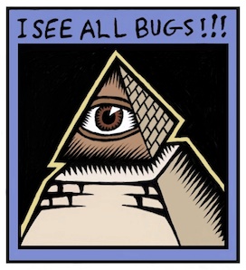
Most of my recent illustrations concentrate on three-dimensional relationships. The letter A with some depth, but hand-wrought. Interconnected boxes. A pyramid with an eye in it. Some of these are new versions of my older sketches. But all of them feature some overlap, folding, interlock, or holes.

Take for example this piece. Two S-shaped pieces of rebar interconnect, showing a very small weaving. There is over and under, interlock, shadows, and also shading. It's all tied up in the way I think about things, and what I find interesting.

I draw because I want to show what I'm thinking about. I want to freeze the thoughts and make then concrete.

And the way the illustration interweaves with my text is also quite important. Sometimes the drawing gives me ideas, and even defines the discourse.

Sometimes drawing can be like solving a puzzle to me. I must figure out where the pieces have to go before I can compose them properly. Painter saves me because in the digital world I can draw construction lines and totally erase them afterwards. Or I can draw crudely and then rework edges to make them straighter after the fact. The digital medium is extremely malleable. It has changed the habits of artists since Painter came out. Features like mixed media all in one package, undo, and perfect erase make the digital medium the ideal place to try stuff out for your next illustration.

Inspiring Sources

When I draw, it is therapeutic to me. And the good thing is to produce something you can look at.

The style I choose is a bit like engraving, as I have mentioned. These are inspired in part by the Flora Danica prints and illuminated manuscripts.

Chet Phillips, who has inspired me by his creativity, also likes to use the scratchboard-watercolor style. His imagination in creating characters seems to be unparalleled. And much like in the old work of Fractal Design, old items are repurposed in style and substance to make new fantasies of illustration and storytelling. He even uses magically-transformed packaging to build his works.

More Than an Illustration

The whole package, extending illustration into more than just pictures, is also why I like to write. While an illustration can leave me hanging by a thread when I look at it, a full-blown explanation can cinch the knot tight around your subject and create an artful connection to the reader's mind.


Tuesday, June 26, 2012

Winding River

Life is a winding river flowing through the events of our life and the river's course, its bends, and forks are like the decisions we make and also the ones we are compelled to make by external forces outside our control.

You see, metaphor is a very powerful method of depiction, indeed.

The presentation of symbols in illustration is a natural method, and it is used in more drawings than I can count. It has been used in paintings since the medium was invented. I suppose initial paintings were quite literal: pictures of animals that were hunted and the tribe and their weapons. But one iconic form appears: the outline of a human hand. This is the artist's signature and simple metaphor for "I painted this", usually done in berry juice. The hand is a symbol, a relic, of the artist himself or herself.


In a recent blog entry, Back to Drawing, I introduced a concept sketch of a banner which, laden with symbology, was a metaphor for a singular event. In this post, I present two more banners that also further the concept of metaphor in illustration.


Here is the first banner, the winding river. In the sky are the Pleiades, also known as the seven sisters (although eight are shown: what do you make of that?).

I have used a digital woodcut technique for this banner, as it is my style of late, and I also employed a technique of colored chiaroscuro for suggesting distance.

The river cuts deep channels through the rock, suggesting that, downstream, greater and greater effects are made as the river gains volume from the tributaries and momentum from its rush from the mountains. In this way our works gain momentum and have greater and greater effects through the course of our lives.

My symbolic suggestion is that the stars have some influence on the path of the river, and thus of life. The seven sisters are known for their ability to impart divine knowledge and wisdom. The wisdom that governs our works.

A river's flow is known and set, and rarely changes over the course of a hundred years. The lay of the land it flows through will determine its course, like the situation our lives occur in and also the examples set for us which can influence our own acts in life.

But sometimes a river meets a point where the terrain shifts suddenly, and the course is altered in an abrupt free fall. This is the subject of the second banner.

Ah, the waterfall. When something comes down as a result of the force of gravity, it always reminds me of an avalanche. Because I have survived one.

This notion of a river rushing and going over the edge is a powerful one. I have shown the waterfall with the steps leading up to it: a dangerous and tenuous set of stairs leading to the top. At the top, are railings so you can see the rushing river as it plunges.

It reminds me of Vernal falls in Yosemite. I have been to the top and I have seen the rushing river. The rock slopes to the river are a channel cut deep, with slopes that make them quite dangerous. Since the rock is wet, they can be slippery and people have been known to circumvent the railing so they could be photographed in a dangerous position, and then subsequently fall into the rushing river where they were simply and hopelessly carried over the edge to fall over 300 feet to their inevitable death.

The waterfall is the symbol of life out of control. Events which you cannot control force your life into a specific direction. The path seems implacable, cut deeply into rock. The forces that drag you along are unstoppable.

I have placed the moon in the dark sky to light the scene.

Using the digital woodcut technique, I employ lines of black against white or white against black. Then I sculpt them into channels that taper, by working from one end in white and the other end in black.
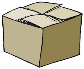
Here is a close-up of the first banner, done at a high resolution.

I find it interesting to create three-dimensional forms using this kind of shading. I then employ a gel layer to add the color. Usually its just a color-by-numbers kind of approach, using Digital Airbrush. But this time, I used Just Add Water to create a continuum of color in the river, and also in the hills in the foreground. It does resemble scratchboard-watercolor, a favorite look.

The gel layer allows me to rework the color without affecting the black-and-white shading layer, of course.

Actually one layer you don't see is the sketch layer that lays underneath. It contains the original sketch, which I shade over to create the image.

Here is the sketch for the Pleiades banner. My sketch is a rough indication of what I want, but I worked on a layer directly on top of the sketch to flesh out the banner.

As you can see, the river might have been drawn as a winding road, but I thought a river to be better because of the inevitable draw of gravity as the metaphorical force of destiny on our lives.

I added the small tributary (shown in the close-up above) as another allusion to the metaphor of decisions and their effect on the course of causality.

Someday, I might put a tassel onto the banner.

Oh, and I forgot my chop marks! ;-)

Sunday, June 10, 2012

Back to Drawing

After a hiatus, I like to start drawing again to clear my mind. Usually it starts with pen on paper. And eventually it finishes with a tablet and stylus in Painter.

I have been on a big project with lots of details recently, and hence the lack of posts. I must apologize, but sometimes work does call!

And when drawing comes back, like when music comes back, there is a lightning bolt moment of realization, like I have been swimming in a deep sea and I finally washed up on dry land: that drawing is a golden touchstone of my existence and how could I ever live without it for so long? The end of dark days and the start of a golden age, a renaissance of expression.

There is something ineffable to this moment. So I have attempted to create a smart banner to show my inner joy. This is the first piece I did after joining the living again at the end of the long dark tunnel.

In this work, like so many others I have done recently, I am attempting to create clean lines. Lines in search of a woodcut or linoleum cut look. Lines sculpted and individually shaped. But still irregular and hand-made. I can't see the value of perfection in this kind of work, like someone used illustrator to create the design.

If I used Illustrator to do this, I would have to continually play with the result because it would look too regular. Perfection still has a hand-made look, to me.

The second piece I created in celebration of having time to solve the Rubik's cube again, which I find to be another touchstone of my inner self, is this one.

In this piece, each line is once again sculpted. Drawn and re-drawn. Tapered, carved from left and right.

I created this by setting up a clone and drawing using crude, fat lines wherever I saw an edge I wanted to keep. This produced a very dumb-looking drawing in black lines on a white page. being unsatisfied with the look, I began to sculpt the lines to create a look that simulates using a ductal carving implement in soft linoleum. It took hours and hours before I had a piece that was worthy of coloring. It was in black-and-white and actually made a pretty nice drawing in and of itself.

Then I colored the cube. But I switched around the colors, which were originally yellow on top, green to left, and orange to right.

To shade the hand, I created a layer of the original picture and set it to gel, pasted it on top of the image, and carved away all the other parts of the image using the eraser.

Then I processed the remaining image, with locked transparency, using Just Add Water to create a smooth shaded version of the image. Because it was a gel layer, it preserved the black lines underneath it. I think I lowered the opacity as well, to give it an ethereal look and also to favor the lines.

I also started using a chop mark, which also smacks of a woodcut. I imagined the woodblock coated with orange and red paint to give it more of a hand-work look.

The original piece is almost three thousand pixels high, by the way, since it comes from an iPhone 4S frame grab.

Siri, where did I put my tablet?

Monday, May 28, 2012

Drawing On Your Creativity, Part 4

Just a small post on my birthday: a little present to you. In a world of Instagram snaps and Hipstamatic effects, actual hand work is undervalued these days, so I have sought a style for my blog posts which uses handmade illustrations. This also conveniently relieves me of the problems associated with copyright infringement.

Why Not Hand Illustrate?

All the logo work I have seen recently, for instance was done in Illustrator, a brilliant Bezier-spline-based tool for cleverly crafting the smooth edges of figures. And it has grown to be so much more, with its incredible control over negative and positive spaces. But, to me, there is a pleasure in crafting something by hand, shaping it, cleaning it up, styling it with real brush strokes, and hand-coloring it. There is so much more life in hand-illustrated artwork. Imperfection is simply part of the style.

Hand Work: Bridging the Domains

For me, hand work always starts with real paper and a real ink implement. This used to cause me some worry: worry about making mistakes, blotting out a section, making a line too thin or too fat. But I have learned to just start over until I get something which is approximately right. I use this same approach in songwriting.

The reason for the "just good enough" approach is that I can edit it later using digital means. For music, perhaps I can use ProTools, Ableton, or even GarageBand to shape the final result and re-record overdubs. For artwork, I have confidence that I can make it right using similar hand work in the digital environment. Suddenly it becomes possible to rework "permanent" ink lines and even to erase them. Work that was simply impossible in the pen-and-paper domain. Suddenly, in the digital domain, we are in the world of undo and pure unadulterated color.

I use Painter with a Wacom tablet for this work, but, of course, it can also be done in Photoshop or any paint program with good support for a tablet. I also envision doing an increasing amount of work on my iPad. In the mobile environment I use a Wacom Bamboo stylus to do my drawing. Drawing with a finger, while interesting and convenient, is a bit restrictive and inaccurate. Especially with my big fingers.

For hand-drawn traditional artwork good scanner is always important for bridging these domains, and with this comes some tonal compression and re-interpretation of the colors of the work, which is why I stick to black-and-white for my sketches. This means that simple equalization and gamma correction can convert your sketch to something that becomes useful in the digital domain.

Hand Work Entirely in the Digital Domain

OK I lied. Sometimes my hand work doesn't always start with pen and paper. This is because there is also extreme value in starting in the digital domain and staying there. In this environment you have several advantages that are not present in the pen-and-paper domain. For instance: cloning.

A specific example is shown here.

But instead of cloning, this is more to the tune of using the original as a reference.

I proceeded by opening an image captured using an iPhone. Then I cropped it to a good size and brought the smaller image into Painter.

Once there, I created five serigraphy layers using Effects:Surface Control:Serigraphy. This mimics a silk screen process, and creates layers that I can move into any priority that makes sense.

Then I collapsed all the serigraphy layers into a single layer and proceeded to rework every edge in the layer, selecting colors, redoing edges using a tiger stripe look characteristic of woodcut or linoleum cut.

I had to introduce several new shadings where there was none before.

And I am left with a self-portrait in woodcut style. I would like to say that it only took a few minutes. But in fact it took several hours. Actually, I'm still not completely satisfied. I figure about twenty hours of work should do it. But who has time for that?


Sunday, May 20, 2012

Drawing On Your Creativity, Part 3

I like to draw. I just can't help it. The process of sketching and drawing has always interested me. As with music, if I stop for a while and then start again, it all comes pouring out!

As the original author of Painter, of course, I had to study drawing from many angles. Now, when I draw, I feel a certain freedom in simply returning to the art without the burden of analysis. And I can begin to realize just why I started drawing in the first place.

Doing the Clean Line-Art Style

I keep thick pieces of standard-size paper around to sketch on, my favorite creative weapon being an ultra-fine Sharpie (retractable!). Drawing, for me, is a way to exercise my creativity.

My process for making art has been documented in this blog post series before: scan into Preview using a networked scanner, tonally adjust and crop, export to JPEG, import into Painter, clean up, resize to blog-compatible sizes using Preview again. Sometimes I will use a gel layer in Painter to colorize, particularly when I'm doing a technical illustration.

One of my styles is thus a clean, line art style with the hand-wrought look that is usually lost with Adobe Illustrator. A little like a woodcut. All of the pieces shown here were done in this manner, in the last few days. I have been practicing my implied edges: a cool form of negative space.

I like to use my desktop for most of my posts because it simplifies my process and allows me some very nice editing opportunities. I like to edit using the Wacom tablet in Painter.

Rotating the Image for Sketching

One of the reasons I like this is because I can rotate the image, making all my hand work more natural and ergonomic. In Painter, you can hold down the space bar and the option (alt) key and rotate your image by direct click-and-drag in the image. With the same keys held down, a single click restores the normal orientation. But, as I draw and clean up lines, I generally keep the drawing rotated at whatever angle most makes sense.

I learned this workflow with sketching by watching Disney artists in studio. Their old-school sketch workstations had a turnable easel. I would bet that they have something much more like Painter these days. Because I thought to migrate that workflow to the computer.

Ideation

So, I'll get an idea and ponder over how to express it in this style. When I get an idea, I like it to be one that's out of the box, not in the box.

Sometimes I will go back to the old sketches from the Painter days and I'll get an idea that I might have pursued once, but is lost to me now. And to re-examine it and explore it afresh is exhilarating. So much has been packed away. There is so much to rediscover.

Other times I will think of an idea, like Up and Down and have an internal vision for how I would like it to appear. When it intersects another of my favorite pastimes, like impossible figures, then it is settled. I begin to draw. So it's all in the perspective: how you look at it.

With Up and Down, I actually drew it a few times before I got the right shape for it.

I chose the impossible picture, with entrances going into space that simply can't exist, to make the sketch more of a personal expression, more my style.

When I was a kid, I used to have my room in the upper floor, and then later in the basement. So I know the feeling of going up and down stairs quite well, and the feelings when it changes from up to down.

I chose to let the color connote shading in this one. And the blue for sky and red for, well, the fiery depths. More allegory. Just a tiny bit of symbolism. But in my house as a kid, the upper floors had more sunlight or overcast light, which had a bluer color temperature. The lower floors had a redder light, because we used incandescents there.

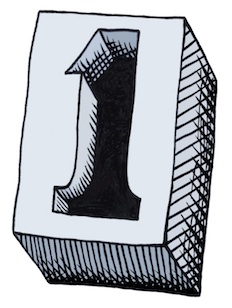
In my post about iconic things, I draw several figures that derive from the concept of One. When I was drawing them, I imagined a mould that you could pour lead into that could make a three-dimensional one.

Some Technique

This is what I could envision. I just now drew it but I used a creative technique for the cross-hatching. This time, when I sketched it, I did the cross-hatching by hand. Then when I brought it into Painter, I brought each of the different directions of hatching into a separate layer so I could sculpt their shapes separately.

I tend to use a tiger-stripe technique for simulating woodcut looks. This comes from the V-shaped tool that is used to carve out linoleum and wood blocks and the shapes that they make in the blocks.

In scratchboard, a similar look is achieved. This ease of width-control was the reason I created the original scratchboard tool in Painter.

So this sketch actually comes from a six-layer image.

Iconic Patterns

I demonstrated in the iconic things post that there were speckles that didn't just use dots when you render them. The old Good'n'Plenty design. Here we have a design where there is a complete 360-degree freedom to each placed item, which is the ultimate speckle. Even the hatchings that I demonstrated before only had a 180-degree freedom to their placement.

I can imagine controlling the direction of each item by a random process, like the one I used to create the hatchings, or by using the directions from a vector field. You could create random flockings of bird-symbols in this way.

Often, in architectural renderings, random tree placement, with different sizes, is used to stylistically symbolize a grouping of trees. Sometimes this kind of pattern was used in the formica tables of the 1960s. It's worth looking up. Thinking about patterns and the way they fit together is one of those little creative things you can do.

Liquids and Different Perspectives

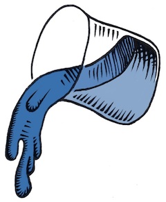
In a continuation of the earlier pieces here, I thought I would do more liquid stuff, because I have been doing that kind of rendering since I was young. It was always an excuse for shading, and as you may know by now, I do like to shade things.

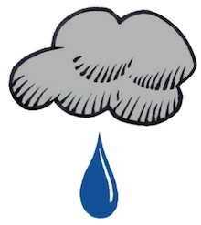
Drops of water or oil are fascinating to me. When I was a kid, I would sometimes look at the world through the drops or rainwater on the outside of the car window. I could see the world as a microcosm of distorted figures, and back then it was a good exercise for my brain to see things from a different perspective. I love the pattern of raindrops on a windshield: the way they avoid each other, the way they coalesce, the natural pattern of their look.

Real raindrops don't actually look like these. They are really globules of liquid, and they move and wobble as they fall. Kind of like metaballs, they have a shape defined by surface tension and equilibrium. Water drops are free from many forces, when they are in flight.

I used to look at liquid mercury, and marvel at the shines. I think that reflection and refraction have always been of interest to artists' perceptions. I'm thinking Vermeer, of course.

But these liquid renderings are more about stark shading than reflections and refractions.

Rendering the quality of reflection and refraction in line art is rather complex but a laudable goal. When you hold a drop of water on your finger, I often have watched the fingerprints beneath become magnified to a huge extent, and the skin also took on an interesting glow inside the drop, due to the caustics (concentration of light by the bending of rays by refraction) created by the shape of the bead of water.

Along with a bright shine on the drop, it creates a marvelous miniature scene, allowing us to watch yet another perspective: one magnified instead of the one viewed through the car window that seems to shrink the entire world into a single drop of rainwater.

As a small kid, I was nearsighted, and so things like this would constantly be of interest to me.

Other perspectives interested me as well, as a kid.

Like the doorway. Both entrance and exit, it was the thing that kept the kids captive in the schoolroom, or kept them out. Being the guardian of in and out, a door seemed more profound to me than just a block of wood on hinges.

And, while I was at it, what made the inside in and the outside out? Why couldn't things switch? Another perspective change, quite relevant in the 1960s.

After all, I watched Star Trek, so I knew that doorways could be more than just a way in and out. A door could be a portal to another planet or even to another dimension.

So, when I tried my hand at Up and Down, initially I thought of something we were looking into directly, even with glass doors.

This is the original sketch for Up and Down. Actually, unlike the final product, it didn't really have any magic. That's when I thought about the impossible version.

It is the change of perspective that makes this kind of piece work. When you get to drawing, liquify your workflow to make your sketching smoother. And pour on the creativity!