Painter is famous for its brushes. Most are not duplicated anywhere else, despite some claims to the contrary. But what makes the brushes in Painter different? How do they work?
Well, I can't tell you how they work
exactly, but I will share with you some of the decisions made in building Painter's brushes. And show you, hopefully, which brushes are good for what. And, along the way, I hope you will gain a better knowledge of how to use them to suit your artistic task.
Also, this could take
several posts, so I will start with the basics, you know, Painter 1 and 2 brushes, and then work my way up to the much newer brushes.
Cover? Buildup?
Painter uses some terms that describe some of the fundamental ways that the brushes lay their paint down onto the canvas. In the blog post on
Color, I described different kinds of color mixing. You can think of
cover methods as using interpolative color mixing, which is applied to additive color. Also, the
buildup methods are using subtractive color mixing, in particular, they are using Beer's Law on the three components of the color, Red, Green, and Blue (this part is in
the '620 patent, so it's public knowledge). But of course, it's more complicated than that.
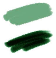
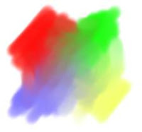
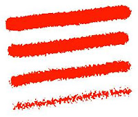
Here you see cover (top) and buildup (bottom) strokes. Cover strokes tend to become flat opaque color, while buildup strokes increase their density.
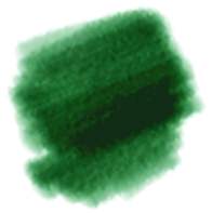
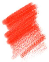
With buildup brushes, you choose colors that are less saturated, and contain all three color components in them. You must also set their opacity lower to get more levels of build-up. Here you see a version of that brush with the opacity lowered to 4%. As you can see, it takes much longer for the colors to darken.
You use cover methods for things like oils, airbrush, chalk, etc. So it is aptly named, since these media do tend to cover what's behind them.
Other media is more applied in a watery, transparent layer, like watercolors and felt pen. These media are more suited to modeling with the buildup methods. Sometimes colored pencils can behave this way as well. But don't confuse partitive mixing with buildup.
So, why does charcoal tend to build up when you use it? Charcoal builds up because the tiny grains of graphite get lodged in the crevices of the paper and the color partitively mixes with the color of the paper. Partitive mixing is also described in the color post. But what happens is more and more crevices and eventually even the tops of the grain get saturated with graphite and the color gets darker.
There should be more ways of mixing color in Painter, particularly since oil paints don't really mix in either of these ways. But wait... are we talking about mixing or simply laying down color?
Pickup, Mixing, and So Forth
Actual mixing of color on the canvas (and within the brush, it turns out) is modeled by Painter using a
color well concept. This is not the same color well concept used by photo sensors that collect electrons. converted from photons by a photodiode. This is a concept by which RGB color is collected in a color well, and as other colors get put in, the well models what the mixture of the color is: a kind of local color accumulator.
The color well can be done on a whole-brush basis, or it can be down on a bristle-by-bristle basis.
Painter's modeling is quite sophisticated.
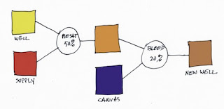
So let's look at how the color well performs. There are three parameters in the Brush Controls:Well section, and you need to know what they mean. Every time Painter lays down a brush dab or a bristle dab, the well is accessed. It knows about the
supplied color (which is generally the current color, but it can also be the color from the original image when cloning) and it also knows about the
canvas color underneath the dab or bristle. The color in the color well then becomes the
brush color.
Resaturation is the capacity of the brush or bristle to be replenished with the supplied color with every dab or bristle that gets laid down.
Bleed is a measure of the amount of canvas color that gets picked up by the brush (with every dab or bristle that gets laid down). And
dryout is the distance over which the resaturation stops working.
In the color well, resaturation tends to trump all other aspects of the well, and the most useful values for resaturation are generally down between 0 and 4%. This is where you get the fudgy, smeary mixtures of paint. You will need to combine this with the bleed setting. A low bleed setting tends to make the pickup take longer and thus the brush strokes get smearier. A high bleed setting causes less pickup and thus the smears become shorter, and, up around 50%, they become unnoticeable.
So both resaturation and bleed should be kept in the low ends of their ranges for the fullest degree of control. At resaturation of 2% and bleed of 28%, for instance, the bleed trumps the resaturation and causes consistent smears, seen here. The overstroke color is a dun color, barely discernible due to the low resaturation.
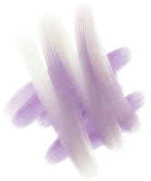
The best way to get a real admixture of color is to mix brushes. In other words, lay the color down first and do your admixture afterwards.
Here, I first drew unsullied patches of red, blue, green, and yellow using a higher resaturation (28%) and a comparable bleed (27%). Then I set resaturation to zero, creating a smear brush. Using the smear brush, I mixed the paints together to get the muddy mixtures in between.
Real mixtures with real paints usually keep a bit more saturation (in this case, I mean colorfulness). This is because the scattering term and the absorption term need to be kept separate. And also because actual colorant mixing can't really be properly modeled using only three wavelengths.
Future paint applications will need to do this, I believe. I would think that two-constant Kubelka-Munk theory should suffice as a good second-order approximation.
But, you know what? More and more artists are using digital paint applications. So they are going to expect the paint to mix more like RGB interpolative mixing, and less like actual oil paint mixing. And I am partly to blame for this, I know.
Paper Grain, and Grainy Soft, Flat, Edge, and Hard Methods
Painter's first real advance in 1991 was the paper grains. The way the brushes interact with the grains was also a serious advance over previous types of brush.
Here you see Grainy Flat Color, Grainy Soft Cover, Grainy Edge Flat Color, and Grainy Hard Cover methods. Note that I had to increase grain contrast to 400% so you could see the grain in the Grainy Soft Cover method's stroke. Each method has its own unique signature. Of particular interest to me is the Grainy Edge Flat Cover method.
This method can be adjusted by a few slider settings that you should be aware of, and can create a wealth of looks in this way.
Here you see the grain slider adjusted to 28%, 21%, 15%, and 8% (top to bottom).
This allows you to control, using this linear brush (with a profile that is straight and pointed at the tip), the size and graininess simultaneously. But what if you want the amount of grain penetration to be controlled while you make the brushstroke?
A couple of features may allow you to do this.
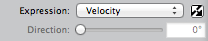
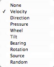
Right next to the grain slider (in the Brush Controls:General section) is an expression pop-up. This allows you to control directly how the grain is
animated during the stroke. Grain will be controllable directly by stylus pressure when you use pressure to control grain expression with this method.
This shows a brush stroke created using this technique. But to get this level of expression out of it, I had to do another thing first. I had to go to Preferences:Brush Tracking and adjust the Pressure Power to a setting of 2.04. This makes more values that are closer to zero pressure in your brush stroke.
And therefore more grain, because as you saw above, it is the lower grain values that produce the most grainy edges.
When playing with paper grain, you can also adjust the grain itself to your taste as well. It is extremely convenient to be able to scale the grain. This works well with Grainy Edge Flat Cover brushes because it just makes the grains rounder. But you can also adjust the contrast (and thus how pronounced the grain will appear through the brush) and the brightness (in case your brush isn't actually touching the grain at all).
Of all the grainy brush methods, the Grainy Soft Cover method is probably the least useful, I would say. To make more sense of this soft method, you will probably need to adjust your paper texture characteristics.
The Grainy Hard Cover method is about half way in-between the Grainy Soft Cover method and the Grainy Edge Flat Cover method. With this brush, both opacity and grain will have a bearing on how grainy the brush appears when you use it. It is probably the best method for simulating colored pencils.
Here I have set an opacity of 11% and a grain of 30%. This gives us good coverage and a nice grain taper with opacity. I have set grain expression to pressure and opacity expression to none. This one is also sensitive to the Preferences:Brush Tracking adjustments, particularly Pressure Power, because I'm using pressure. It's a pretty good chalk or colored pencil.
Cover Brushes and Opacity
It's time to discuss the problem of how to set the opacity of cover brushes. The problem with many cover brushes is that they use
sequential dab overlay. This means that the dabs are laid out along the brush stroke according to the brush spacing. If you set the color to black, the brush spacing to 50% and the opacity to 38%, you get the pattern you see here. What this all means is that it is hard to set the opacity of an airbrush to get the actual opacity you want. It becomes an effective opacity of 100% way too quickly because of the sequential dab overlay effect.
By 50%, the spacing is measured in terms of the radius of the brush. I am using a one-pixel-edge brush so you can see the placement. So how dark does it get along the stroke? It depends upon the overlap, as you can see, and because of that, upon how many the dabs will overlay in one spot. Since the radius is 1/2 the diameter, we can calculate the number of times an overlap will happen as 1/(2*spacing). Each time an overlap happens, the color gets more opaque. The opacity of n overlaps is 1 - (1-opacity)^n. Using these formulas, you can compute the opacity of the brush stroke. In this case, n is clearly 4, and the transparency is 62% to the fourth power, or 14.8%, so the opacity ends up being 85.2%, which seems right.
How Corel Can Fix This
An aside: what Corel needs to do is to let the user specify the final opacity (called the
desired opacity) they want and then invert these formulas to compute the proper opacity for the current spacing. It's easy, and so here's how it can be done:
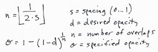
Here, the specified opacity is the one you used with each dab of the brush.
With airbrushes, that have a soft profile, this may be a more complicated formula. But it will be arranged according to powers of transparency, as I have indicated here. Perhaps the floor won't be necessary, making n a continuous parameter. It turns out that this can be measured empirically and then the opacity setting can be computed fro the desired opacity and the spacing using a table lookup. Really, the only coefficient that will need to change is the power term, so you could keep one coefficient per profile. Possibly, though, the spacing (with different profiles) will have a non-linear effect on the overlap and thus the opacity of the stroke. In this case, you might need one coefficient per profile per spacing. Since spacing is a continuous parameter, it must be quantized into a small table.
Oh, I love programming!
Next time, maybe I'll write about
grain histogram equalization and the problem of getting consistent results with different paper texture patterns. It would really be nice to get a more ergonomic handle on brushes, grain, opacity, and all that jazz.
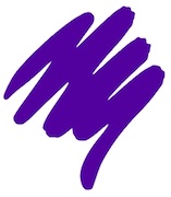
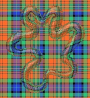
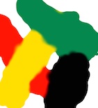
 Fabric sure does take a long time to sketch! I can't let a single feature of it go unmodified or un-enhanced.
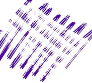
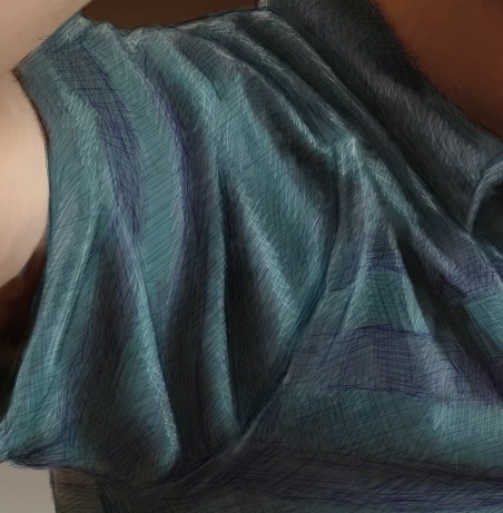 Then I used the tiniest brush (size 1.0) with a very desaturated purple. This brush was set to Buildup:Soft Buildup in Painter. And I used a very light opacity, at 18%. Then I simply sketched into the stripes with lines at different angles. When I wanted the sketchy result to be smaller, I pressed harder. And I often went over the same area with strokes at different angles. This is one way I shade, particularly with a Sharpie.
 Then I switched the brush method to Eraser:Paint Remover at the same width and opacity to do my highlight work on top. When I created a highlight, I woke as lightly with my hand as possible so the highlights wouldn't be too brazen and abrupt.
 This image took hours and hours of time, mostly at night, and it taught me a few more things about rendering fabric. Probably, the next time I will choose a more shiny fabric like leather (not actually woven fabric, but you know what I mean!).