 On September 2, 1995, I began work on a poster image for Painter 4. Our theme was decided: Painter Through the Ages. This was partly because I had implemented the mosaic tool. We began securing artists for the poster, which was to contain the usual 5 images. Our timetable was short, so we picked out some friends, Hal Rucker and Mark Jenkins from Rucker Design, the same designers that brought us the paint can design.
John Derry and Steve Guttman decided to do the other two pieces, because I was doing one of them this time. Remember, I was left out on the Painter 3 poster: too many things to do.
For Painter 4, I wanted to use the new mosaic tool. This was so I could show off the feature, partly. But, even more importantly, I needed to beat on it. I wanted to accomplish a real project so I could shake out the bugs in the mosaics feature. I had to be my own biggest critic.
I began implementing mosaics in the summer of 1995, while staying at the Hotel Skagen, at the tip of Jutland. Shortly after spending the summer solstice in Roskilde, after checking out the bonfires by the fjord, Ruth and I drove to Skagen to stay and rest. I had brought my black PowerBook 540c with me and I spent lots of time in the hotel working on mosaics. And we also spent time walking around the beaches at Skagen, looking for amber.
The mosaic problem was a very difficult one, because it involved chopping vector-outline shapes to other vector-outline shapes. Also, because mosaic has a grout, it also involved reliably creating outset shapes for each mosaic tile. These are hard problems, because they involve general polygon Boolean operations.
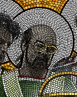
 In July, I had tested the mosaic tool back in the Fractal Design offices in Aptos, using a comp'ed up version of the product, clipped from pictures of real mosaics from Ravenna.
You can see this to the right, here.
The letters' styles come from the Byzantine era, almost 900 years ago. It's actually amazing for me to think that something can last a thousand years.
This was just a test run, but I was seriously trying to create something with the tool. At this point, there was only very little control over the width.
 I used this image as a clone source and sketched over it using the mosaic brush.
It's actually interesting to see how similar the tessellation is between the letters. Perhaps I used them as a guide.
With some trial runs, I turned back to the code and added the ability to vary with based on pressure, created a control panel for mosaics, and figured out what the modality of the mosaic control panel was to be. It was an unusual tool, because of the vector information that comes out of the brush as you draw. You get the point: lots to do!
 Once September rolled around, I realized that I needed to be very careful and plan ahead in order to create a design with mosaics that was coherent enough to be seen as a Byzantine mosaic.
I drew a version of it on the whiteboard in the office shared by Tom Hedges, John Derry, and me. Suggestions from the various team members were made based on this strawman depiction of the idea.
Next, I created a small-size proxy that showed the basic organization of the piece. It was a very rough version. I was indicating white circles behind the heads, which showed saints in the original mosaics of the Byzantine era.
The paint can was to have a similar treatment, originally. Also, I showed John Derry (to far left) holding a burning ice cube, a reference to the theme used in Painter 2.0.
Initially there were only going to be four of us, but we thought to include the venerable Glenn Reid, who had just come onto the R&D staff at Fractal. So I had to modify the original design, but that was hardly a big issue.
 The main problem was to get each of the figures in place. I decided to use layers to do this, because then I would only have to capture a photo of each one time. But I would have to make sure that each person was captured with the same lighting, of course.
So here you can see the original captures, done with a cruddy video camera, attached to a PowerMac 8100/80av. I supplied the facial angle for each person, and, as you can see, they were all being taken in the same location, so the lighting would match. The outer people (John Derry and Steve Guttman) I had hold their hands in a position of classical adoration.
I wanted the folds of the fabric in the shirts they were wearing to be visible, so I could use them in creating the folds of the garments that the figures were wearing. All of the portraits were done at appallingly low resolution, because it only had to be the resolution of the mosaic tiles themselves. They all worked except for Tom's frame grab, because he was staring at the camera in a classic thousand yard stare. Hmm.
 Then I masked each of the photos and composited them in layers into a single image. This allowed me to move them around and adjust them to create a better pose. I adjusted their brightness and contrast a bit to create more visual cohesion.
I also adjusted each person so that their actual height was indicated as well. Tom Hedges was quite tall, so he got to be taller than the rest of us.
Here you can see how Tom Hedges' image sticks out because of his stare directly at the camera. But initially I thought I could work with it.
My next task was to choose the garment styles for each person. Their styles were taken from the mosaics of Emperor Justinian and his bishops and officers, depicted in the Basilica of San Vitale in Ravenna, which I have seen personally. My sash is actually designed based on that of one of his bishops.
 But in mine, I replaced the cruciform figure with a 4 and a crude Fractal Design logo. My initial design for John Derry's robe was rather freeform. But you can see how I used the existing fabric folds to create the look of the folded garments. I extended them down using my brush.
I also adjusted Glenn Reid's height so that he showed the appropriate height. It also made his garments a bit more visible, which was another goal at the time.
I painted most of the robes on the night of September 12th, and I was up past 11 PM doing the brushwork. I used a small-radius airbrush that was adjusted to 90% opacity to sketch in the colors, which were approximated from those used in reference mosaics from the fourth century. I then used Just Add Water to blend the colors together and create smoother fabric. The gold background was added, a reference to the common practice in Byzantine mosaics.
But I had to fix that look on Tom Hedges face! I broke out the video camera again and persuaded him to stand for another portrait on September 13th, the next day.

I placed an image of Painter's paint can in the image and put a nice glow around it, making it seem a little magical.
All I had was an image of the Painter 3 can, taken from a photo shoot we had done professionally. But I could see it all coming together. I made it unusually large to accentuate the fact that it was in front, and floating.
I was really not satisfied with John Derry's robes. I looked back at the San Vitale images I had in an old Dutch book on Mosaics I had found in Amsterdam the year before. I found a reasonable style to rework it into: a bishop's robes.
 John is on the left. It was an arduous process reworking John's robes to make something that matched his style. I had noticed that the bishops often had a section in front drawn over and pinned near their collarbones. And on the font section they often had diagonal rectangular patches of color.
For John, I created a red pattern featuring a checkerboard pattern, one of John's signature style elements.
For Steve, on the right side, I knew I needed to extend the robes lower and complete the double-white borders of his sleeves. I did that, also creating subtle shadows under the hands to make them a bit more realistic.
I began to realize that real Byzantine mosaics didn't feature people with watches and glasses. But I wryly decided to leave them in, to give the piece an interesting tilt. And I had decided that a floating paint can was even more magical if it was floating above something.
 So I created a red table with draped fabric, in order to make the floating even more realistic.
I had to put the shadows of John's and Steve's hands on the red velvet tablecloth, as if the shadows were cast by the magical light from the paint can.
At this point, I put in the halos as layers behind the people. I also put some Byzantine-style text behind the figures. The text is latin, and says "Natural Media Forever". It was kind of my Strawberry Fields Forever moment, so to speak. I had to be careful about the thickness of the letters, because I knew they would be rendered in mosaics. I also used my experience with the images near the top of this post to sculpt the letters. They were done three months before.
Above, a blue field with green circles suggests the vaulted ceiling of the Mausoleum of Galla Placidia in Ravenna.
I had to further extend John's and Steve's robes to the bottom of the image, which was designed to be the right shape for the Painter 4 poster entries.
It was a very lengthy task, and by midday on September 14th I had completed the proxies. But that was, unfortunately, only the beginning!
 The next step was to clone the image using Effects:Esoterica:Make Mosaic which is still available in Painter 12, by the way for those of you who see this and want to travel down the same road). That night at about midnight, I started making the mosaic. The first thirty minutes were spent detailing the faces of John, Glenn, and Tom, and also the paint can. Then I gave up for the night.
The next morning, in the office, I started working on the image and I worked all day. At about three in the afternoon, it crashed and I lost all of my work for the day! I had finished most of John and his robes, my face and Steve's face. It was painstaking work. So I spent a couple of hours figuring out what went wrong: there was an error in the mosaic vector data structure pack and unpack. So it crashed on save!

To left, you see how much progress I had made. This image can be opened, but the mosaic data cannot be recognized. Imagine my chagrin!
Six hours of tedious, painstaking work was lost.
Anguished, I fixed that problem and went on. Since I and only I was responsible for the error, I had nobody to complain to but myself on this project!
Such is the life of a developer who uses his own tools on grandiose projects.
It is probably good that I found this error, though. Better that it happens to me than to a user of the product after it has shipped. In all, I found several bugs in mosaics during this process, and added several features that made it easier for me (and easier for future users as well).
 Starting again from my only backup from 12:30 AM early that morning (to me the night before), I continued undaunted. Well, I would like to think I was undaunted but actually I was weary and crestfallen. And by 6 PM I had only finished additionally my face.
You see the state of it at the right.
Needless to say, at this point I started saving backups every hour.
I went home and continued my work there after a quick meal. I'm sure I was hell to get along with at this point.
Next I did the halos, which were fairly easy work, starting on the outside of the rings and filling in from there.
 I continued to work, and by about 11 PM the night of September 15th, I had finally reached the point I had reached at 3 PM that afternoon when Painter had crashed.
If you look closely, you can see that I had to do it all over again, and made several different choices of placement, particularly with Steve's face. And the color of his glasses.
I was also much more careful in the placement of the mosaic tiles in the rendering of John's robes, which I wanted to be eye-catching.
You may be wondering why I left the faces and hands in grayscale colors. For the most part, this was what the Byzantines did in their mosaics. I did color the glasses though!

So far I had worked thirteen hours on the mosaic part of this task, and six of them had been wasted!
The strategy of saving once an hour was paying off. There were other crashes but they only caused me to lose a minimum of time. And they gave me an opportunity to fix other problems, as was my responsibility.
For the background, I wanted the glittery golden look of the Byzantine mosaics, and so I used color variation to create the look. I painted in a green background below, and finished Steve's robes.
 Also, it took me several hours the next day to paint in the letters in the arch above the main figures. The letters were rendered in the crude, yet stylish typography used by the mosaic artists of the fourth century.
I still hadn't figured out what I wanted to do with the area above the arch. It was certainly unfinished.
At left is the state of the mosaic by about 5 PM on the 16th of September. By this time, I had spent about 20 hours of time on the mosaic part of this task.
I went home and, working from there, I spent another two hours recoloring the background at the bottom and drawing in the symbols above the arch. At the left, I put in a P4 (for Painter 4), and at the right, I put in a burning ice cube.
 I cleverly allowed the dripping water from the burning ice cube to overlap the arch on the right hand side.
Two green diamonds, another common Byzantine symbol, filled the center portion above the arch.
I decided that the faces truly did lack some color, and so I added in a pale skin tone to their shading. Each mosaic tile has its own color assigned to it, and you can change tile colors after you place the tile.
I painstakingly redid every awkward mosaic section I could find, to make it more like a real artisan had placed the tiles, one by one, by hand.
Even still, there are things I would do to improve this picture. There is one errant green tile just next to the top of the U in NATURAE. That should be fixed!
By 6PM on September 17th, I was done working on the mosaic portion of the task. With some 22 hours of work on the mosaic. And probably ten or so working on the proxies before.
At this point, my main task was to resize the piece to be used at the resolution required by the poster. This was possible because the mosaic was vector art. It was stored in sub-pixel vector locations and rendered from that form into pixels.
 So all I had to do was resize the picture and the mosaic art was also resized in place.
Then I used the mosaic information to create a mask (using Render Tiles Into Mask) and that mask was used to create a three-dimensional look to the tiles with Effects:Surface Control:Apply Surface Texture.
Whew! Only 29,000 tiles later, the mosaic was finished!
Painter 4 was a real success for us at Fractal Design: the world had never seen anything quite like it!
And, thankfully, several bugs were fixed in the process: at my expense!
Such is the life of a developer.

Here is an interlocking P and 4, designed based on the interlocking royal monogram of king Christian the 4th of Denmark. I saw this in the Cathedral at Roskilde back in June. A mosaic monogram was the result.
Ahhh, we were clever back then!


