Showing posts with label paint can. Show all posts

Friday, January 27, 2012

The Painter Can

How did Painter come to be packaged in a paint can? Is it true you could smell fresh paint when you popped it open? Did the can change through the years?

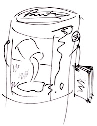
This post talks about the Painter can!

At Fractal Design, one of the most interesting stories is that of our innovative packaging. You see, we were into skeuomorphic design. And there's an easy explanation: we strove to make the entire product more like the real world because we were also doing the same thing with our paint and drawing tools.

In Dabbler (Art Dabbler in some countries) we worked on the wood grain of the interface. Sketcher shipped in a cigar box. This is because artists and designers often used a cigar box to store their art supplies (but they probably didn't smoke the cigars, at least while I watched). The paint can was just another reference to the real world of paint.

As for how this came about, well, it all started with a presentation from Hal Rucker and Cleo Huggins from Rucker/Huggins design to Fractal Design in 1991. Present from Fractal Design were myself, Tom Hedges, Steve Manousos, and Steve Thomas. At that time, we were most of the board of directors (along with Lee Lorenzen) and also most of the executive staff (I was President and CEO, Tom Hedges was VP or R&D, Steve Manousos was VP of Operations and Sales, and Steve Thomas was VP of Marketing).

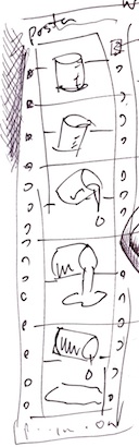
Anyway, in that presentation, we were shown six options for packaging. Our job was to choose one. They were all stored in bags so we couldn't see the mock-ups, and revealed one at a time.

The first option was a conventional "Adobe Style" turned-edge fiberboard box. Their comments were:

proven reliable manufacturing technology (few unknowns)

high quality look and feel: printing and dense material


Painter could get lost on the retail shelf: too similar to others


It worked out to between $7.00 to $12.00 per unit (plus inserts), and it of course depended upon quantity, size, printing extras, and manufacturing extras.

We could see that this was standard operating procedure. After all, ImageStudio, ColorStudio, Illustrator and Photoshop all used this mode of packaging. Others used cheaper kinds of packaging, with less panache, which was to follow.

The second option was a conventional "paperboard" box. And here, their comments were:

proven reliable manufacturing technology (few unknowns)

frugal and sensible appearance: feels flimsy, but not excessive


intentionally places Painter into the less expensive category


Here, a unit was estimated to be $2.00 to $4.00 (plus inserts), depending upon the same kinds of things as the first option.

Although our initial ideas were to make Painter cost considerably less than Photoshop and make it a nice add-on, we didn't think this option was really good enough. It cheapified our product.

The third option was a startling one: a paint can. I could tell that the designers, who had brought all the options mocked up, were uneasy about this one. But the very fact that they had thought of it turned out to be a really great thing! Their comments were:

a visual reference to paint: could be either clever/cute or corny/tiresome

stands out on retail shelf, but may not fit on standard displays 


no set-up or tooling required 


interesting and useful container after it has been opened


It worked out to between $0.75 to $2.00 per unit (plus labels and inserts), and it of course depended upon quantity and style of can.

This one was really different, we noticed. And it had a handle. I was thinking people walking away carrying a can of Painter. That seemed like a really noticeable thing: people would talk.

The fourth option was a wooden box. This was quite a distinctive look and the designers were quite proud they had been able to mock it up reasonably. Their comments were:
  • rustic, natural material has a "fine arts" appeal
  • a reference to  other containers found in fine art studios: wine crates/cigar boxes
  • stands out on retail displays, but still fits on a bookshelf
  • interesting and useful container after it has been opened
  • heavy, substantial feel
  • some unknowns because it has not been used for software packaging
It worked out to between $4.50 to $9.00 per unit (plus labels and inserts), and it of course depended upon quantity, type of wood, finish, size, assembly (nailing, stapling, gluing), type of lid (hinge or slide), and other things.

This one appeared to have a lot of unknowns and it could get messy. I was thinking: splinters!

The fifth option was a cardboard box with an accordion display. This one was kind of out there. But they had a plan. It looked like it needed some kind of plastic cover to keep the accordion intact, and I wasn't sure there would be a simple story on how to display it. Their comments were:
  • explains and shows off tools in a visually appealing way
  • accordion could also serve as a quick reference sheet
  • establishes a unique aesthetic which could translate to ads and brochures
  • makes it appear larger on the retail shelf, but smaller on user's shelf
It worked out to between $1.00 to $3.00 per unit in addition to the cardboard box (plus labels and inserts), and it depended upon quantity, the style of the cardboard box, and the availability of the plastic frame.

I was thinking: manufacturing nightmare. Poor designers.

The sixth and final option was actually kind of interesting: an archival paper box. Their comments were perceptive:
  • has a fine arts look with a reference to caring about preserving quality
  • is an exciting off the shelf product
  • is single-vendor dependent
It worked out to between $3.00 to $4.50 per unit (plus labels and inserts), and it depended upon number of units and the thickness of the material.

This was a visually interesting box, but I was thinking: shelve it. It was for putting stuff away. For a long, long time. Not what I wanted for the software we were making.

So, how did we come to the paint can conclusion? Steve Thomas mentioned that, although he liked it, he had his concerns because it wouldn't fit on the typical retailer's shelf. I liked the paint can because it was so different. It seemed innovative. And I could get over the juxtaposition of fine art paint in a tube versus house paint in a can. I figured that, if you saw it, you would just think paint. Steve Manousos liked that it was inexpensive, that it could look quite good, and that there were probably lots of ways you could change it. Perhaps you could stamp Painter onto the lid.

We had a multi-hour long discussion about the ergonomics of the paint can. I fished a quarter out of my pocket and popped the lid of the can open. OK, you didn't need a screwdriver to open it. We looked inside. The designers had carefully cleaned out a paint can, so there wasn't a smell. We wondered about the size of the manual. We checked how many floppies could fit inside (this was before CDs were used for software delivery, and certainly before online delivery via download). I was keen on having some kind of poster with the product. We figured out that it would have to be rolled up inside the can as the first insert.

We knew once we chose the can, that we would have to go with ring-bound manuals, if they got past a certain thickness.

We figured that we might need a label for the top of the can. We debated whether or not we would show a little metal on the side of the can, or whether the label would meet itself.

When Painter shipped in September 1991, it was a labor of love. But it was the first can of many.

And when the can shipped, it was a little more shiny than the one shown here. More than twenty years have tarnished its surface.

I painted the image of the paint can on the label. It looked so realistic when printed that we were forced to put the text Image of the can was created with Painter at the bottom. We were concerned that people would think it was a real painting, totally defeating its purpose.

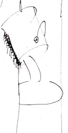
The Painter brush script was also provided by Rucker/Huggins. I'm not sure who actually did it, but I'm thinking Cleo. She was the designer responsible for Adobe's Sonata music font, by the way.

It became necessary to create a new brush script numeral for each version of Painter. Here you see the version created for 2.0.

As time went on, we continued to repurpose real objects in new technological ways, the essence of skeuomorphism. The reason was obvious: people already knew how to use the real objects. So there was nothing to learn.

This philosophy worked its way into our design inside the program as well, with icons that looked like real brushes, pencils, erasers, and such. One of my favorite cases was the Painter 2.0 splash screen, shown here.

I might have mentioned that this look comes from a real book that lived on our shelf: The CRC Handbook of Chemistry and Physics.

As you can see, John Derry did quite a good job of simulating the leather-grain red-and-green look with the pressed-in gold detail.

John obviously chose a warmer illumination when rendering his "book". It's uncanny!

And why did the can smell like fresh paint when it was opened? This was the result of the varnish layer on the poster, we understand.

One more thing about the can I should mention is that, for Painter 3, we wanted a golden look for the can and Steve Manousos had discovered that, normally, paint cans were varnished internally with a golden color sealer that didn't change the feel of the metal, but it did change its color. So we simply had the paint can maker turn the treated metal upside down and the result was that the gold was now on the outside instead of the inside!

We did finally do a metal emboss of the lid of the golden Painter 3 can with the Painter brush script. This actually saved us even more cost of goods, because we didn't have to print a label or glue it onto the lid! Simplicity is almost always the right answer!

More repurposing of real-worl objects: The Painter Power Palette Picker from the Painter 4 can. This came from an idea by Michael Everitt, an information design contractor. We knew that Pantone and other companies were showing their colors in this kind of format, so we decided that we would create a way to look at all the palettes and their options in a single quick-reference.

We were proud of our ingenuity. You could see all the art materials, look at the brush strokes over various images, get info on how all the palette UI worked, and of course there was a complete list of keyboard shortcuts.

Hmm. Some of those patterns look kind of familiar!

At some point, we will look at how the can progressed and what we did to keep it new and desirable.

And maybe a little about those posters...


Wednesday, January 25, 2012

Creativity and Painter, Part 5

Painter 3, mostly created in early 1994, was a busy time. John Derry and I had completely resolved to redo the UI. And we needed a tagline and an ad campaign.

The first session where we worked on the Painter 3 design and theme was on May 27, 1994. You can see my initials and John Derry's initials at the upper right.

Some of the suggested taglines are a little off - like nothing is sacred anymore. We were thinking of having historical items defaced by paint. I drew a pyramid dripped with paint. Somewhat irreverent! But I can't quite figure what we meant by we won't back down.

In the end, we used pour it on. We wanted the ad copy to take on a historical perspective, matching the pyramid. But it looks like antediluvian didn't make it. And I misspelled it too!

When it came to the ad format, we clearly envisioned a can pouring out paint. It seems like an obvious notion given the tagline we chose.

We had the ideas for a full-page ad and a sidebar ad. You see both of these to left. Sidebar ads were less expensive and thus we could place more of them, particularly in the monthlies like MacUser and MacWorld.

These do quite clearly match the ads we came up with. We also had an idea of coming up with a sidebar that extended into the page. We were keen on this kind of design that tricked you into thinking the format was smaller.

You see the idea to left. The sidebar cleverly clips the pouring paint, but the can bleeds out into the area beyond it, becoming an over-under illusion.

For the can itself (to the right), the first thing you might notice is that we were originally going to call it Painter 3.0. Thankfully, we dropped the ".0" before we shipped it.

We had the idea of adding a little informational booklet to the can, hanging from the handle. Fill it with cool art and a what's new section.

I think operations decided against it because it raised the cost of goods sold. Oh, well.

We had the idea of creating the Painter 3 poster as a filmstrip. This actually matches the look of the Painter 3 poster, even to the point of having the sprocket holes on the side. Well, they were just pictures of holes, of course.

Also shown is the keyframe animation idea, that the positions of the cans from image to image (or frame to frame) were designed to show the can pouring out paint.

Each image was to be done by a different artist. Although I did do a poster image for Painter 1, 2, 4, 5, and 6, I didn't do a poster image for Painter 3. I was too busy reshuffling the interface.

And making the image hose work.

We continued to think about the brochure. Our first idea was to make it can-shaped. When opened up, it would show a brush (just so there won't be confusion about what Painter actually does) and have some other cool graphics and informational text. But Steve Manousos, our operations and marketing guy mentioned that the brochure had better have a tear-off mail-in section that conformed to postal standards.

So, here is the basic design for that, with a tear-off section that can be filled out and mailed in. A call to action must be included, of course.

John Derry and I sometimes wished we could do all the artwork for these pieces, but we knew that we couldn't. So we found artists and managed them. Or rather, Mary Mathis-Meltzer (then, we nicknamed her M3, but now she is just known as Mary Zimmer), our intrepid production person, managed them. For at least Painter 3, 4, and 5!

To create the manual was a huge task, and involved managing writers, editors, artists, and designers. Also, it meant securing printers and doing make-ready checks. A Painter manual was always color, always, lushly designed, and always perfect.

But John and I weren't done. While design and production worked on brochures, ads, the can, the poster, and the manual, we worked on the UI. For Painter 3, we had the can done in a golden color. It turned out to be essentially free to do this, since a typical paint can had this treatment on the inside. We just had them turn over the metal and put the golden treatment on the outside. And we stamped Painter in brush script on the lid as well.

John Derry and I met again on June 2, 1994 to design the UI. There were several palettes that we wanted to coalesce into a small set of palettes with easy icons to access their features. We figured that almost all Painter users were visual people: not a bad assumption.

So this is where we decided to put papers, patterns, nozzles, weavings, and gradients together and call them materials. Not sure what happened to the inspector.

First we had to decide what a palette would look like. We initial thought that five icons would look about right, and wouldn't be too daunting to the user. I think this decision kin of forced a lot of stuff into 5's to begin with.

When an icon was chosen, the rest of the palette would configure into that particular palette.

Our idea was that the 5 most used items would be on the palette and a drawer would open up that would give you access to other ones. The new ones you chose would go into the least used spot.


A drawer kind of had this press bar that you could choose to open it up. It's visual language was like a disclosure button.

In retrospect, it was kind of clunky. Painter 4 saw the drawer mechanism and the icons get smaller and more streamlined. The entire thing was based on our experiences designing an interface for Dabbler, the low-end product in the Painter line.

A major concern for our design was: what would the Brush Controls look like? Painter's brushes were the most complex and involved part of the product. We really wanted to make it easier to access.

Initially we had icons with some kind of scroll bar so you could get to all the different controls.

This led to an unprecedented situation, where each and every kind of control had to have an icon associated with it.

This became icon hell. A place where you have to create and make sense of all kinds of icons. We chose a kind of black-and-white visual language for the brush controls. On June 6, 1994, we got back together and started to hash out the icons.

Most of the sections became pretty easy to depict, though.

For instance, the bristle controls became a set of dots arranged like the contact mark of a brush. The spacing controls showed different spacings in three lines. The random controls became a pair of dice.

OMG! Complex visual language! You could see that we couldn't come up with an icon for the method controls.

Still, most of these sections are still around. But now, Painter uses words instead of icons. That started with Painter 6, of course.

The objects palette was a new concept. We wanted selections, floating selections, the portfolio, and the selections portfolio to be in a single palette. I don't think the visual language broke down with these. I think it worked pretty well, actually.

In the end, Painter 3 was a radical redesign. But it was only a stepping stone to the final design.

In Painter 4, we actually used a similar design for the interface, but we tightened up the icons, simplified the drawers, and made the palette accessories smaller in size, to conserve screen space. Remember that screens were smaller then and screen real estate was at a premium.

I will leave you with a drawing I did on the first day of the design collaboration with John Derry. It's my drawing style. This one had a can of paint pouring onto a cubical earth. Its kind of a disturbing concept, actually. Especially since the cubical earth is on top of what looks like a Mac IIci. But instead of an Apple icon, there is a bomb icon. Truly I was a disturbed fellow in those days.

The design on the left shows an artist before Painter: all angles and robotic in nature. After Painter, the artist looks more like a shabby Van Gogh. With a big beard.

On the right another kind of headline type for the pour it on tagline is shown. But I think it was kind of tired.


Saturday, January 21, 2012

The Most Useful Painter Feature

In early 1993, we were finishing up Painter 2.0, I had several things on my mind. The Van Gogh and multi-bristle brush styles were made to be real-time.we had added sharpen, resize, soften, color separations, and previews to most effects so you could visualize the results before you committed them. Saving the user time and allowing for more flexibility was the theme we were working to implement. Painter 2.0 also implemented full scripting and playing back of scripts at a new higher resolution. New effects like apply lighting, glass distortion, and marbling brought even more new looks to designers. In short, we had expanded Painter on all fronts simultaneously.

Painter was being finished, debugged and cleaned up, mostly by Tom Hedges, when I broke from the development process to work on new features. This didn't sit well with Tom, but by then he had learned to give me a bit of leeway in my implementation. Mostly because I was on a roll.

We were proud of our new work on Painter 2.0 and I knew we would have a great story, and plenty to sell. But rust never sleeps, so I continued development.

Back in 1984, when MacPaint came out, it introduced the concept of a floating selection. You select, and then click into it to move it around. In April 1993, a friend, Daniel Clark, asked John Derry and I if we could implement multiple floating selections. If each one was floating and on a separate layer, then a lot of the design work might be made easier.

That was the beginning of the process of implementing layers in Painter, the most useful feature ever. We had heard that Micrografx had implemented multiple floating selections, but we found that their selections weren't antialiased or sub-pixel aligned. They had no list of floating selections. Accessing one was tough, and required sequencing through all of them. I found it to be a useless approach. They didn't even allow you to paint into the mask of the floating selection and extend it.

So we began working on a better way to do it. We knew that the users needed to have continuous tone layers with soft-edged masks, and sub-pixel accuracy to the mask edge. Fortunately our friskets (what we called selections, and which we're used for airbrush masking) already had this. Our feathering used a real Gaussian convolution.


And the result was Painter X2. It began working about 9 days after we talked with Daniel Clark.

We called it Painter X2 because we felt that multiple layers easily doubled the user's ability to design more freely. In those days we called them Floaters. The name was a mistake, because eventually Layers became the standard jargon for floating selections. I implemented grouping of layers, and a nice list with an open/closed state for the group of layers. I also added compositing methods, ways of compositing a layer with what was behind it.

Even more interesting was the Portfolio, a place where layers could be stored and reused, like clip art. This was John Derry's idea. We figured that designers had objects that could be used again and again, and that, given an original layer, many things could be tried on it. Without destroying the original piece.

In fact, it was this philosophy that we were trying to further: the ability to try things and to change your mind again and again and again. Picture a designer, a client, and an art director. The designer has to keep their options open because they need multiple designs to show their client using the same basic artwork. Also, the designer needs to keep their designs fluid to quickly respond to suggestions and design decisions of the art director.

This signaled a move of Painter towards the design ethic more than ever. Not only could you use the traditional tools of the designer, but we could also emulate paste-up better than any other application at the time.

It turns out that Photoshop introduced layers in September 1994, long after Painter X2 shipped.


Our logotype designs for X2 were bold and interesting. Here I show an X2 sketch that featured Neuland Inline-type letters and an early catchphrase, true 2 form. We were always thinking about the catchphrase. The concept of changing your mind again and again made it onto the box.

As shown above, Painter X2 came in a box, and was sold as an expert extension to Painter, intended for the expert designer. Of course, the features were all rolled into Painter 3 when it came along. And Painter X2 came so soon after Painter 2.0, that we were struggling to get a way for users to justify the expenditure. We had that problem a lot, when you consider Painter 1.2, Painter 3.1, and Painter 5.5 were all intermediate releases. We really wanted a new release to be loaded with new groundbreaking features, so we often saved the new numbers for what we considered to be major releases.


This sketch shows that we were considering our new features to be industrial strength, with a metallic beveled-edge logo form and even rivets in it. Other concepts included the atomic X2, where electrons whirled around the letters. And, strangely, even a radiation symbol with X2 underneath it.

What I was thinking, I will never know!

Perhaps there is even a hint at the biohazard symbol. But I guess I didn't quite know how to draw it. And that was probably a good thing.


In this sketch, we see a part of the final logo form for X2, with it's angular letters, the raised 2 with a triangle below it.

Other things were tried such as negative space letters, vertical alignments, and other such crazy treatments. I like the flying paint can that's dripping paint onto something that looks quite like a Mac IIci.

In the end, the angular letterforms and the beveled metal look won out and we had a logo form for X2. But John Derry was convinced we needed to do something new with the paint can. Not necessarily with the can we were actually shipping, but something that made it more animated.


Some of the ideas were just plain wacky: popping it's lid, a stir-stick with a tagline stir up your imagination. A can dripping with paint. And all of them with faces! I wasn't sure where he was going with it, but we did consider it for quite a while.

One of the cans is astonished, and exploding with paint. Perhaps like a user exploding with ideas when presented with the new range of ideas that come from the freedom to design like never before.

By the way, the stir stick has the letters OSH on it, which stands for Orchard Supply Hardware, a hardware store in Silicon Valley and also in Capitola and Watsonville where we sometimes went to look at paint cans and paint in general.


OK I will admit we were a bit out there! At the top is a triangle with an eye in it, like on the US dollar bill, but it's carrying paint cans. In the center is a paint can running away from freshly having applied a coat of dripping paint to a box clearly labeled ADOBE. At the bottom, a lens in a frame, part of the symbology used on the Adobe Photoshop box, with a pitchfork and a barbed devil-tail, examines a roll of 35-mm film on the ground. And it seems to be dragging a mouse. Note the blank space behind it where the frame has been lifted off the wall.

I think all that time designing and coding was taking its toll. This is John Derry's sketch, but I'm sure I felt very much the same at the time.


We even started thinking about X3 as you can see. Like I said, rust never sleeps. I think the most interesting thing here is the bill of floating selection rights, the declaration of floating selection independence, that your floating selections at no longer slaves to the deselect command (which previously always dropped the floating selection back into the canvas).

We were definitely onto something new!