Showing posts with label natural media. Show all posts

Tuesday, January 31, 2012

Texture, Part 1

I am a bit of an expert on seamless tiling textures, since I created nearly all of the paper textures that ever shipped with Painter, Dabbler, Sketcher, and Detailer. But, how they were created?

This is the first post of many that actually resurrects the application, called Texture, which was used to create all the paper textures in Painter. This application hasn't run since 1996, and was forgotten until now. It was a secret application, that never saw the light of day outside the walls of Fractal Design and my house. But history is littered with lost arts. So now I will show you the art of making stuff that helps you to make art.

Speckles

It mixed tiling patterns with Fourier transforms with speckles. A speckle (or speckle pattern) is a set of points in the plane that repeats. But one where you almost can't see the tiles.

I show you one to the right, which has about 1.4 repeats of the tile in it. It does take some time to see the repeat, but it is there.

As opposed to the harsh repeat pattern of rectangular tiles, a speckle is visually pleasing and it is intended to be totally seamless.

It also seems like a very good start for creating paper textures because the texture has only one predominant spatial frequency. Now, a typical paper texture in Painter is 256x256 pixels, although they are scalable. This speckle has 1000 points in the tile, meaning that any derived paper texture will have about (256 x 256) / 1000 or about 65 pixels per item in the texture.

Creating a Speckle

First, the a tile is seeded with a number of random points. Lets say that you have constructed a function urand(), that returns a random floating point number on the range 0...1. Then the following code will suffice to create a random 1000-point speckle:

#define MAXSPECKLE 10000
int i, npoints = 1000;
point speckle[MAXSPECKLE];
for (i = 0; i < npoints; i++)
{
    speckle[i].x = urand();
    speckle[i].y = urand();
}

The random speckle is shown to the right. The dots are smaller because the average minimum distance is quite small, and we need to be able to see the individual dots.

Then we do an interesting trick. We iterate an anti-gravity transform to push the points apart in the plane. This uses a technique of mutual-avoidance to make them regularly spaced.

After about 10-12 iterations of the mutual-avoidance transform, this set of speckles looks like the one shown to the right. The spots are larger again because the average minimum distance has reached a steady state of about 6 to 8 pixels.

Tiling Math

On a wrap-around tile, certain things we take for granted like distance formulas become a bit different. For any two points p1 and p2, the distance can't be calculated in the normal way. We must account for the wrap-around.

To do that, we have to make a wrap-around rule that says if a point is more than one-half a tile forwards, then the image of that point behind us is really the one we want.

So, something like point-to-point distance becomes a bit more complicated:

float dist(point p1, point p2)
{
    float dx, dy;
    dx = p1.x - p2.x;
    if (dx > 0.5) dx -= 1.0; else if (dx < -0.5) dx += 1.0;
    dy = p1.y - p2.y;
    if (dy > 0.5) dy -= 1.0; else if (dy < -0.5) dy += 1.0;
    return sqrt(dx*dx + dy*dy);
}

The above function implements the wrap-around rule for a tile that repeats in both x and y.

To implement the mutual-avoidance iteration, we first make a pass over all the points in the speckle, looking for neighbors within a small distance. This optimum distance is usually computed in the following way:

effectRadius = 2.5 * sqrt(2 / (points * sqrt(3)));

This assumes that the tightest packing of points is a triangular packing. The 2.5 is thrown in as a fudge factor to make sure we get enough neighbors to do the right thing. Then we compute a motion vector for the point that is designed to push it away from its nearest neighbors. The following code shows this motion vector gathering pass. Note that, to right I have placed the initial state and the first six iterations of mutual avoidance, so you can see the effects of the iteration.


int i, j;

float d, mindist, avgmindist;
point *p1, *p2;
vector vs;
avgmindist = 0;
for (i = 0; i < npoints; i++)
{
    p1 = &speckle[i];
    vs = vector(0,0);
    mindist = 1;

    for (j = 0; j < npoints; j++)

    {
        if (j == i)
            continue;
        p2 = &speckle[j];
        d = dist(p1, p2);
        if (d > effectRadius)
            continue;
        if (d < mindist)
            min_d = d;
        vs += (*p1 - *p2) / (d*d);
    }

    p1->v = vs;

    p1->dv = length(vs);
    p1->mindist = mindist;
    avgmindist += mindist;
}
avgmindist /= npoints;

The above code also computes an average minimum distance, so we can properly scale the motion vectors for the points.

Next, we compute the sum over all motion vectors' velocities (lengths) and create a factor that helps us normalize the motion vectors.

float dvs, factor;

dvs = 0;

for (i = 0; i < npoints; i++)
{
    p1 = &speckle[i];
    dvs += p1->dv;
}
dvs /= npoints;
if (dvs == 0)
    factor = 1;
else
    factor = (effectRadius * 0.04) / dvs;

This factor can be used to scale the motion vectors to complete the avoidance iteration. The points are now moved. They must be placed back on the tile if they wander off, of course.

for (i = 0; i < npoints; i++)
{
    p1 = &speckle[i];
    p1 += factor * p1->v; // move the point

    if (p1->x < 0.0)
        p1->x += 1.0;
    else if (p1->x >= 1.0)
        p1->x -= 1.0;
    if (p1->y < 0.0)
        p1->y += 1.0;
    else if (p1->y >= 1.0)
        p1->y -= 1.0;
}

And that's how mutual avoidance works, in a nutshell.
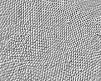
The best thing about speckles is that they can also be used for so many other things. One of these is visually interesting, since it mimics the arrangement of cells in the back of your eye. For instance, to the right we can see a section of the human fovea, the dense cluster of photoreceptor cells in the back of your eye. It is interesting how often cells land in a hexagonal tight-packing.

One day, when implementing Texture, I came across a computation geometry trick called Voronoi maps. These are like a cellular partitioning of space around a set of points. Arranged so each point gets its own well-defined little capsule of space. This technique was very interesting visually.

Here you see a Voronoi map applied to a speckle. The speckle was created by starting with 100 random points and iterating the mutual avoidance iteration a mere 9 times.

Then a Voronoi map was created on the tiling plane. This is a bit trickier than constructing a Voronoi map in general, but really only the distance function needs to change.

I won't go into how I create them, but I will give a link to a remarkably efficient technique for creating them. Most techniques for creating these maps depend upon the simple in-circle test.

But there are other ways to treat points: connecting them. An example of this is called a tree of points.

Spanning Trees

A spanning tree is a single graph that connects all the points of the graph, but which does not contain a single loop. To construct one, maintain a tree number for each point. When you connect two points, set their tree numbers to the minimum of the two tree numbers of the two points. Do not connect them if they have the same tree number, since that would imply a loop.

So, the art in spanning trees can be put simply: in what order do we connect the points?

I call this the function type of the spanning tree.

This kind of function is used in constructing halftone dot patterns as well, but that's a post for another day!

Here we have one spanning tree, constructed so that the bonds are favored to fan out from the center.

This kind of tree is useful in producing growth-like looks. Really, it is more like the growth of bacteria or lichens, since it is constrained to lie in the plane.

Another kind of spanning tree is constructed on the same points, but in this case, it is designed so the bonds are favored in a direction perpendicular to those of the first spanning tree. This is useful in creating rose-petal patterns and even fingerprint patterns.

There are more things you can do with speckles, and bridging the gap between geometry and image processing is the key.

We will talk more about that in future Texture posts.

But, have no fear, I have taken step 1 in bringing the art of creating paper textures back from the dead!


Sunday, January 8, 2012

My Early Painter Art

As Painter's creator, I was also its first user. You might remember the reason I created Painter: to satisfy my own desire to draw. The first benefit of this fact to Painter was that I was never really satisfied with the tool set.

And I had nobody to blame but myself in the early days before John Derry came to Fractal Design.

So I became a constant user. There was a demand for imagery in press kits, so I had to contribute what I could, and quick! As it happens, the first tools I successfully simulated were colored pencils. So in my early art, I shaded using Painter's colored pencils (mostly because they built up from lighter colors to darker, more saturated colors). I was already pretty good at shading, and I was pleased to see my style come right through.

This lonely-looking example was drawn in the earliest days of Painter. It exhibits my shading style about as good as any other image I can show.

I really needed the ability to clean up edges and to create sharper-looking items in the images I was drawing. Aside from creating chalk, charcoal, and felt pens, I created a little thing called the frisket tool. To an artist, a frisket is a mask that can help to guard some parts of the image from being touched. It is often used with airbrushes. Perhaps I should have called it a selection. That's what it really was. But unlike most selections, this one was anti-aliased, with a clean edge. This came from the benefits of having high-resolution information data for the brush stroke, which in turn came from the Wacom tablet. You could restrict your paint strokes to the inside of the frisket area, or to only the outside of the frisket area. It was convenient to be able to switch from one side to the other.

So I started using friskets in my work as well. This led to some images that often were used in screen shots in the early reviews of Painter. This image, done in red ochre using Painter's colored pencil, was drawn while looking at a real number 2 pencil and a Bic ballpoint pen. Notice the water droplet on in the lower right corner, which is drawn with a frisket and a soft cover brush in black and white.

It only took three or four passes with a soft brush to create the shading in the water droplet. I like to create catchlights on the edges of the objects I render this way. Still, it looks kind of naive to me now. Part of the shading style I had been using since high school!

On the very next day, I got a little more ambitious and did my best to create a cloud scene. I went back to mountains and big water droplets, which were a part of my visual signature at the time. Of course, the color picker worked in those days, but if you remember, it was a triangle with a hue slider at the bottom. Later I replaced this with a hue ring because I needed more accuracy in hue selection (particularly between red and yellow).

This scene ended up in several press reviews of Painter 1.0, mostly because it was in the screen shot in our press kit. The mist in the background was done with the eraser tool, which actually worked by subtracting density, a very different thing than overlaying white, which was how every other eraser worked as far as I could tell. The technology behind the colored pencil, the density-subtraction eraser, and the felt pens is covered by my '620 patent.

Another image to make it into the press kit at the time (for Painter 1.2) was the Splat image. This image showed how you could cut down on the density inside a frisket before shading it with a soft cover brush (which would now be known as a digital airbrush). Looking back at it, my control over the opacity of the brush was amateurish. But when you compare the results with any other paint program of its day, Painter's control over textures was really what made it stand out in versions 1 and 1.2. The texture technology was also covered in the '620 patent. I still remember trying to describe it to our patent attorney Jeffrey Hall. The ability to dim the area inside the frisket testified to one of the first effects that was added to Painter: fill. In its earliest form, it was actually a feature of the paint bucket. The transparency in the cover inside the frisket was the result of partial undo. That gave me the ability to fade back any operation I had just done. I think it was even called fade.

Soon thereafter, I invented a new kind of technology, that allowed the user to smear the canvas in color. This technology was radically faster than a pixel-by-pixel smear brush because the entire brush dab was given the same color. The color pick-up from the image was controlled by two mysterious color well parameters, called bleed (which controlled how much the colors on the canvas would be picked up by the brush) and resaturation (which controlled how much the current color continued to affect the color the brush deposits). If you set resaturation to 0, you would get pure smear. Then you could adjust bleed to control the length of the smear.

This Apple image was another image that graced the Mac press at the time. Painter 1.0 (really just known as Painter) was a Mac-only product. Painter 1.2 was released for both Mac and Windows simultaneously.

With the Just Add Water brush, my intent was to provide the feeling of smearing charcoal with a fingertip. For those of you who remember ImageStudio, you will remember that the smear brush icon was a fingertip. As it happened, ImageStudio (sold by Letraset from 1987 through 1990) was my first artist program, with charcoal and the fingertip. But there was no paper texture.

These mountains are very much a reminder to me of my style before Painter using real media. For these images, I put in the color using colored pencils, and then used Just Add Water to get the smeary look. I'm still waiting for the first iPad app that can get this look, by the way.

One day, I set up a 1024x1024 canvas and started to draw a large-format image. My subject was my left hand, always a convenient model. The background was just an ad-lib theme, kind of like a 3D fingerprint.

As I worked on it, I used a smaller-radius smear brush to even out the colored pencil. And I settled on a cubist style. You can see my style: relentless contrast improvement by shading.

This was the first larger image that I did; the rest of the images were 640 pixels wide or so (excepting the branch image at the top, which was an experiment).

This one also caught the eye of a few reviewers and graced the pages of MacWeek and other press. Again, as one of the only artists using Painter before its release, I could play to a captive audience!

But there were more brushes to create, and little time to do it. I got this idea that one stroke could be orchestrated to create multiple strokes that overlapped, and the VanGogh Brush was born. This was a "stroke of genius" according to several magazine reviewers that used the hackneyed phrase over and over again.

Here we see a Grainy Flat Cover brush being used using the VanGogh setting to create a faux VanGogh painting, complete with crows. Yes, I observed several VanGogh paintings in the Arles period to create this piece. Yes, I looked at the color sets he was using. This one made it into a few magazine art contests as well.

I was quite proud of Painter. And I was (naively) talented enough to have enough chops to test my own clever brushes as well...

Soon enough, it was time to ship a product and choose the packaging. Hal Rucker and Cleo Huggins showed me the Painter Can, amongst three other designs. Tom, Steve, Lee, and I all were brave enough to prefer the paint can approach, and the rest was history. I set about creating the image that would grace the front of the paint can itself.

The image came from a photograph by Rucker/Huggins. It took hours and hours because it was done at 300 dpi resolution, and so was 2400 pixels square. I did some brightness/contrast manipulation on the image and proceeded to paint onto it using a Grainy Hard Cover brush in VanGogh mode. The color was set to bleed 100% from the image, and resaturation was set to 0. In this way, I could draw in the colors from the image.

After it was completed, I went over it with a bit of a new effect, Surface Texture. There was a mode where the color variations in the image could be used to create the height field used for shading in surface texture. This image was used for the Painter can until Painter 4, in which John Derry did a mosaic rendition of the can.

When I first saw the paint can, I did this image showing the form as a basic shape. It used some grainy cover brush to put in the colors, and Just Add Water to smear them out again. No friskets were used in the production of this image. Or harmed!

At one point in 1994, John Derry and I thought up the slogan Painter can! This signified that Painter was a production tool and that Painter was up to nearly any design task you needed to get done. But it was nixed because it was too confusing. Steve Guttman responded "Hmm. Painter can! ... and it's in a can. Hmm." OK I got it, Steve! Hey, we were just being playful...

Actually, the can wasn't my first attempt at creating the VanGogh look on a real image. That has the distinction of being a landscape scanned from a slide on a Nikon slide scanner. I liked this image because it showed actual chiaroscuro.

I worked on the color variation used in the VanGogh brush. It uses the exact same brush and color pick-up technique as was used for the Painter can image. But I didn't apply any surface texture to this image after I was done painting it.

It was in the press kit, but I don't think it ever got used by the press.

Then came the time for going on the road. At Comdex in 1992, we were showing Painter 1.2 on Windows 3.1 for the first time. Tom Hedges and I got to meet Bill Gates and Steve Ballmer at that show, if I remember correctly. I doubt we were well-behaved.

Anyway, as the story goes, I was sitting at the Fractal Design booth at a huge monitor, sitting in a high chair with a Wacom tablet in my lap before the show started on the first day. It was in the Sands, I think, which was not the premiere venue at all. And I started drawing using a Grainy Hard Cover brush in a manner that I might have drawn with colored pencils. But this time, I was freely choosing colors every ten seconds while I drew. This actually drew a bit of a crowd of onlookers.

This has become one of my favorite modes for drawing: with many colors in an abstract color style that merely emphasizes the form without being too literal. I don't drink coffee, so I'm sure I wasn't drawing from life.

My usual technique of using white lines to delineate the shapes was used when contrast was lacking. I had to say it was fun to attract a crowd, and this gave me some ideas that were used later on in Fractal Design's booths. And, really, I didn't know how dumb my demos were until I saw John Derry demo Oasis at Macworld 1991. Now, that was a pro!

The next day, I created another painting using the same style. This time it was a vase. And kind of a crooked one at that. This time, as you can see, I was a bit more careful about which colors I chose.

And the same thing happened the second day: it attracted a crowd. Remember, I was a Mac developer at a Windows show. So I figured that our product was probably going to be a bit irrelevant to the Windows market. Boy, was I wrong.

Little did I realize just how hungry that market was for image editing and painting programs. Up to that point, paint programs were just pixels. Now paint programs were art.

And, with my naive style, I was lucky most Windows people were quite tolerant when they saw what an application could do. So it was even more groundbreaking on Windows!

When I got back to Aptos, I took that image and turned it into something quite different by using Just Add Water, again.

Now the colors took on the lilt of the California Plein Air style. If the colors used for the table were used for the sky, I'm quite sure it would have been better.

Oh, well.

As time went on, we secured more artists to do the demos, and the requirement for me to create example art was severely curtailed.

The talents of Chelsea Sammel, Corinne Okada, Rhoda Grossman, Diane Margolin, and Elise Huffman changed that by providing quite a stable of artists to draw from.

So, dear reader, that is the early history of my art on Painter. I have to say, my own style advanced considerably as time went on. Particularly when John Derry introduced me to scratchboard. But that is a story for another day.

My self portrait, shown to left, has a real tilt to it, which perhaps serves to indicate what an overbearing a**hole I could be in those days. Yes, I had an iconic beard, not much hair on top, and a pony tail. And what's with those glasses? The look was quite unusual for a CEO then. At least the investors thought so.

Hmm. Never ended up in the press kit. No wonder!


Saturday, December 31, 2011

Creativity and Painter, Part 2

The War for Painter 6

In early July of 1999, John Derry and I got together with Metacreations marketing people to create the theme for Painter 6. If you remember, this was a major revision of Painter. It had the next generation brush engine where every bristle was simulated. It had impasto, a new 3D-shaded way of viewing your painting and building up paint. It had airbrush, with full support for 6-axis control of the Wacom pen and a new spatter model. Essentially, it had all the features of the brush testbed I had been working on for a year or so on my own. And note that impasto was Tom's Big Feature.

Something this big in terms of creativity was, for Painter, a real return to painting and brushes.

So John and I put our heads together like we did for Painter 3 and 4 to create the best possible image for the product. We actually tried on several different things, and I have the notes to prove it!

But the funniest thing we did was to do a write-up on war and other violent themes. How could that apply to creativity? How could we do such a thing? We were that far out. When these ideas got drawn up, I was present, with John Derry and Mary Zimmer.

Among the catchphrases, themes, and ad ideas that we circulated were:

  • make art not war
  • the artist's finest hour
  • your creative victory
  • a paint can with a bandolier of brushes and pens coming out of it
  • Painter 6 your personal creative weapon
  • win the war of creativity
  • the brush is mightier than the sword
  • better brushes than bombs
  • target new clients (perhaps for the pro magazines)
  • "camo" paint can (manual is a field manual)
  • iwo jima photo with soldiers raising a brush instead of a flag
  • smart bomb photos. closer... closer... splat! painted lush oasis.
  • baby with a toy gun in one hand and a brush in the other. theme: which would you rather do? most of us decide pretty early which we prefer
  • Painter to the people (militant/revolutionary)

Yes, John and I were at the limits of poor taste, there's no doubt. At some point we decided against it, because marketing just couldn't get with the program. I'm glad they couldn't.

What other ideas did we try on the way to the final theme?

The worst was this: The phrase "we've got your art" in ransom-note letters, clipped out of a magazine. With a picture of an unfolded handkerchief. Inside is a severed brush head with some red paint.

OMG.

At some point, we got back on track and started to churn out more mainstream ideas.


  • pry open your creativity (style, art)
  • only Painter
  • always Painter
  • paint unique
  • uniquely Painter
  • paint distinctively
  • originally Painter
  • Painter quality
  • Painter for life
  • pure Painter
  • Painter power
  • Painter style
  • Find Your Style
  • Beyond Creativity
  • paint with an attitude
  • show your style
  • advocate the artist
  • pop the can (nice 3x3 arrangement)
  • spill the paint
  • the canvas is your playground
  • do the can thing

Personally, I liked Beyond Creativity. But that was just me. In the end, we used Only Painter, which signified uniqueness and an otherwise unattainable quality that marketing was going for.

For the paint can art, we had some ideas as well, but we kept coming back to showing a nice selection of tools, rendered by artists. I personally rendered the pencil and the technical pen in the set that ended up on the can. John Derry did the brush (using Impasto) and the airbrush as well. A third artist (whose first initial is B, but I can't remember much more) did the palette knife, the scratchboard, and the felt pen. In the end, my technical pen didn't make the cut. Oh, well! But the can design started with John Derry and myself.

In another stroke of creativity, we had dreamed up a four-way split can with the tagline Find Your Style. An additional catchphrase was With Painter 6 - you can. We were clever in those days. But it seemed like it would require a different form factor for the poster, and marketing was against it.

In the sketch you can see that we went through a few catchphrases before that one stuck.

We were so full of ideas in those days that we literally threw away 95% of them.