Tuesday, March 20, 2012

Patterns, Part 4

There are some patterns that just can't fit together without some kind of grammar: patterns in how the pieces interrelate. Like grammar in language, this usually means a set of rules. And this is the way most patterns work in the real world: patterns in the interaction of people, patterns in code, patterns in mathematical rules and groups, patterns in messages. We will examine a simple grammar: the even-odd grammar, and also a much more complex grammar, with a larger set of rules.

The even-odd grammar is an easy one: imagine a checkerboard. There is one rule for the black squares, and a second rule for the white squares. Let's look at a few examples.

even
odd
The first pattern, shown above, is not obviously an even-odd pattern. But its rule set says that in even squares, we must choose from the left basis set. These have a common trait. The yellow is in the upper left and the orange is in the lower right. The priority of the elements is the other aspect, and that's what makes for two elements in the even basis. In the odd basis (right) the common trait is that orange is in the upper right and yellow is in the lower left. And they have their own priority. This set was actually an image hose in Painter originally. But here I have dissected it further and given it a grammar.

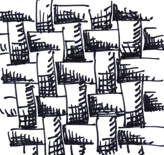
Now, we mentioned a checkerboard, which is also a pattern. This has an even rule consisting only of a black square and an odd rule consisting of only a white square. But all checkerboard-like patterns can be represented this way, for example this one.

Yes, this looks like the pattern used on non-slip metallic surfaces. You see it in industry and it is quite familiar. Like the plainweave pattern, it has a horizontal and a vertical symmetry about it, like the weft and the warp of a weaving.

The basis set for this is quite simple and ingenious.

even
odd
The even basis set consists of one image: the horizontal line. Because the lines intrude into the other square, you can see the ends of the vertical line in the horizontal piece. The odd basis set is similar, but rotated 90 degrees.

This illustrates the simplest form of even-odd pattern grammar, like the checkerboard but a little more interesting.

Now we are going to go a bit loopy. We can modify a simple plainweave grammar to include loops and such. You can see that the crossings behave in a completely entangled even-odd way, and this is enforced by the grammar we used to construct it.

My pattern program can generate these in a random fashion, but I can also draw them, using the grammar to enforce the placement of elements from my brush.

In this case, I carefully drew this one to avoid small loops and to include some knots. I was going for a particular aesthetic.

I just love loops and knots. There is a kind of secret language to them. And I guess this is what I am revealing here!

even
odd
The basis set for this contains the plainweave basis set as a subset. Then I have included some elements from my curved grammar. The common aspect to each element is that the lines meet at the center of the square edges and they all have a direction that, at the edge, becomes horizontal or vertical (orthogonal).

Just to show that we can create branching and tree-like patterns with an even-odd grammar, I have included this example. Unfortunately there are some cycles in it as well. But, all in all, a complex branching pattern exists that can branch in any direction.

Like the loopy pattern, this one has an aspect of visual complexity to it.

First, it's totally not obvious (to me) that it can be constructed from a pattern basis set. I discovered this one while playing with rendered pattern elements in my patterns application. This particular rendering is totally random.

even
odd
The basis elements are appallingly simple. They are T's. The even set has horizontal crossing and either an upwards or a downwards branch. The odd set is a 90-degree rotation of the even set, with a vertical crossing and either a leftwards or a rightwards branch. It's actually kind of clean the way it's constructed!

This pattern was one of the image hoses included with Painter 3 when it shipped. But with Use Brush Grid gone from the nozzles palette, this can't be done any more. Sad, actually.

I will leave it to you to figure out how it can be constructed as an even-odd grammar. There are two basis squares per rule, and two rules, one for even and one for odd.

This one is called the knobby pattern, by the way. It does contain some dots, and also some circular holes.

You might have noticed that there is a 45-degree tilt to many patterns that you can make with the even-odd rule. And a checkerboard becomes a regular lattice in some ways when you turn it 45 degrees.

Now let's turn to a more complex grammar. I had an idea that a lattice with square holes cut out of it in 3D could be a pattern.

Here is an example of the principle in action. You can see the square lattice and the holes cut out. Once they are cut out, the sides need to have dimension lines, giving them faux depth.

Once I drew this, I realized that there were several cases and the grammar would be complicated. In all, I counted eight possible shaded square cases, including the entirely inside and entirely outside squares. So let's look at how the elements are encoded as they are placed on a regular grid.

We can see that, to get the shaded look, we will have to tag a number to each case and allow them to be placed in a geometrically reasonable configuration.

So the real question becomes: what elements exist and what is the possible set of connections between the elements?

This means we will have to enumerate all the possible elements (8 elements as it turned out) and also enumerate all the ways the elements fit together. Of course, this turned out to be a time-consuming process. And, when it was implemented in patterns, it had a few bugs. But I am good at finding and fixing bugs in logic, fortunately!

Here you see the eight elements in schematic form and the connection diagrams that form the grammar that controls the placement and configuration of the elements.

Element 0 is the entirely inside square, and element 7 is the entirely outside square. I have used the same convention as the earlier diagram.

The left table shows what configurations are legal vertically, and the right table shows what configurations are legal horizontally.

There probably should be more obvious symmetry to the table, which might be had by reordering the numbering of the elements. But this grammar does work.

You can see a rendering from the patterns application, generated entirely by random placement and adhering to the grammar as advertised.

It definitely can achieve the proper appearance, which looks like an orthogonal shaded view of blocks with shading. Perhaps like a shaded bitmap.

So pattern grammars can be molded to solve real problems in configuration and generate looks that are interesting to our eyes.

But I have only scratched the surface, really.


Sunday, March 18, 2012

Interlock

Interlock is part of the language of design. It has been around for centuries. It can symbolize love, war, and the cycles of nature. Our furniture, machines, and even our clothes depend upon it. Indeed, interlock may be designed into the very fabric of the universe.

We have talked about patterns that may be constructed by having several tiles to choose from and the cool interlocking looks that come from that. We have even started talking about the grammar of tiles and the kinds of changes to the tiling patterns that come from even-odd rules.

For instance, a simple plainweave uses an even-odd rule.

And this is the most common form of interlock. Plainweave is the basis of modern cloth and thus clothing. Weaving was discovered millennia ago, and is still done today by handcraft artists and by full-scale Jacquard looms in factories as well, worldwide.

Some interlock was designed as a symbol of the gods, like the viking Valknut, the predecessor of the modern trefoil knot and also of the Borromean rings.

I have constructed a Valknut out of the basis for an impossible figure I used to sketch when I was a kid. This interlocking figure is called unicursal because in its simplest form, it can be drawn from one unbroken line, if you ignore that it must pass in front of and behind itself, of course. And this shows the even-odd rule in is most primitive form. Each time we cross over, we alternate going over and under.

The plainweave also does this, but in a regular manner. If you number each row (weft) and each column (warp), then you can see that the warp passes over on each location where the row number plus the column number adds up to an even number, and the weft passes over when the sum is odd.

The Valknut, of course, it the predecessor of the trefoil knot, which is sometimes known as the love-knot. This is in a direct conflict with the original meaning of the Valknut, which is as a symbol of Odin's patronage of the valiant fighters who die in battle.

Still, to me, the trefoil means an endless connection. Something continuous and intertwined, even entangled. Metacreations used a trefoil knot for their logo at first, until it was replaced by an uninteresting and uncreative logo by the new CEO.

I think I prefer to remember the trefoil as an endless connection.

A second form of Valknut is organized like interlocking Borromean rings, but with triangles. This shows the basic interlock, which also follows the even-odd rule scrupulously.

A very tight version of this occurs on various viking-era runestones, such as the Stora Hammar stone and the Tängelgårda stone in Lärbro, Gotland. 

I am a bit of a fan of runestones. I have visited the large Jelling stone, in Jelling, Denmark and wondered at its intertwining, which dates from the tenth century. It contains several trefoil knots.

Actually the vikings did influence a lot of art that contains intertwining. It's possible they had their influence on the famous Book of Kells, housed in Trinity College, Dublin, Ireland.

I have shown that we can construct patterns from rectangular pieces that we piece together like a jigsaw puzzle. Here again, the even-odd rule helps us create a standard interlocking pattern line plainweave.

On a two-dimensional lattice, the even-odd rule is exemplified by the checkerboard.

Interlocking figures in 3D are not hard to come by. I have drawn one here and I reproduce it at a larger scale now. It shows three interlocking slabs. If each slab is actually constructed of a 1x3x5 form factor, with a 1x1x3 hole in the center of it, then they should just fit together, leaving a 1x1x1 void in the center.

The original version of this I drew while bored in a Metacreations management meeting where we were discussing a highly relevant problem. I found it on the back of a sheet of copy paper with the reverse side inscribed with ideas for improvements on the "MetaWorlds" family of products. These included Kai's Power Goo, Kai's Photo Soap, etc. Some of my best drawings are on the back of that page!

I have also been interested in the interlocking logotype. This interest has led me to produce interlocking forms for P4 and P5 (symbols for Painter 4 and Painter 5). One of them got reproduced in the Painter 4 manual.

I implemented this logotype in mosaics and it was definitely influenced by medieval letterforms.

The P4 logotype might have been a little bit different, but it certainly got its point across. Our theme for Painter 4, Painter Through The Ages, was the inspiration for this creation.

Also, the royal monogram for Danish king Christian the Fourth caught my eye one day when visiting the Domkirche at Roskilde, Denmark.

The construction of logotypes and monograms is a cool art. It is still in use today and practitioners of the art can be found at all design studios.

Interlock is still something that stirs people's imaginations. The Lego toys are the best way to get started thinking about interlocking and its application to building.

Even today, science is fascinated with interlocking. In particular quantum entanglement is a classic expression of interlock. Two photons become entangled: their quantum states become interlocked. Even when they are separated, they continue to interlock: when you change the quantum state of one, the other's quantum state must also change to match.

Perhaps interlock is built into the very fabric of space-time.

Overly-ambitious Projects

Sometimes we underestimate how difficult a task is. Like nearly all of the time. But this is not why we choose overly-ambitious ways of solving problems. So let's talk about why.

I have tackled several overly-large projects and sometimes I have chosen to split them up along natural lines. When handling large projects, not all of them are easily split up by top-down decomposition.

Let's first look at a project that can be split up: Overhaul Painter's user interface (UI). First off, why did we do it?

Painter's interface was getting too complex, and needed organization. It also needed to be easier and more accessible. More items in the interface simply called for a better way of organizing it. So this was a redesign borne out of necessity.

But by then with the features of Painter 2.0 and also Painter/X2 in one program, it looked like a big task. We needed to split it up.

This could be divided up, a little bit, and, in the development time frame we had at our disposal, John Derry and I sought to split it up between design and implementation. Just so we could get to the independent implementation part of the job. It sounded like an easy task: just basic planning. But it wasn't easy at all.

Redesigning the Painter 3 Interface

First we examined the items that needed to be in the interface. Then we organized them according to function and sometimes according to property. We worked out some basic areas: choosing brushes to use, choosing materials to paint with or design with, adjusting brush properties, and other. You see, things like selections (which had just been renamed paths from the original term, friskets), layers (which were called floaters by some unfortunate consequence that they had come from floating selections), and scripts had no obvious organization.

We were looking at a five-color-icon organization for these palettes. Based on the problem of icon hell: too many icons made for a totally indecipherable interface. I think all interface designers go through this.

We knew colors could be detracting, so we laid out the palettes in predominantly dark gray, with a texture to them. We wanted things to be three-dimensional and basically understandable because they were analogs of the real thing. It is possible that color was a distracting feature of the user interface and added to the complexity and detracted from the accessibility. The modern version of Painter (12) use icons that are grayscale instead. The texture that backs the palettes is a precursor of skeuomorphic design.

You see the Materials palette. With colors, papers, grads (graduations), sets (color sets) and weaves. OK the weaves was less likely to be used, for sure. But the color picker redesign was clean, effective, and artist-centric. No problem understanding it at all. Actually, it became an iconic symbol of Painter.

The brushes were actually pretty easy. We figured five brushes was a pretty common number of brushes to work with. And may even be overkill. But these were brush categories, not variants. So this was a mistake, I think.

You see the Brushes palette, but this is an early mock-up with the pop-ups not yet functional. Our idea of putting the method up front was probably wrong as well.

But the topmost pop-up was the brush variant, and this was certainly a good thing to have here.

As time went on, it was the individual customized brush variants that the artist actually used and often switched between, and that should have been the list to choose from. Painter 12 gets this right, of course. Good job, Corel!

The brush controls turned out to have a lot of sections. But in Painter 3, we had an idea of having five icons per palette, so we worked the properties into ten areas. Five were in the Brush Controls palette. This became a fairly good split, with size, spacing, bristle, randomness (now called jitter), and nozzle sections, for the image hose.

But there were many more controls, and these got organized into the Advanced Controls palette. This contained sections for the rake brush, the color well (which affected mixing of paints in the canvas, and pick-up of color into the brush), looks (brush looks, which were a customized variant plus a paper texture), sliders (which allowed for many features to be controlled by the expression contained in your brush stroke), and water (for the water color brushes).

So far so good? No. We had already made a lot of bad decisions, I think. The next palette was the Objects palette. Here you can see the sections for paths (selections), a path list (for storing paths), floaters (this was the prototype for the portfolio, a place where you can store layers for reuse within a project), the floater list (like a layers palette), and scripts.

Painter was by now recording everything you did. So you could play it back, and also have a backup of your work. Of course, it got recorded to your Painter folder, in a Scripts subfolder. No - we weren't spying on you. We called these Sessions in Painter 3.

Materials (in the Materials palette) were an interesting case to the interface. Papers, Grads, Sets, and Weaves were all materials.

The Papers section shows a drawer, a user interface drawn from Dabbler and created by John and I. The current paper is shown, and some controls are present to adjust it for use.

So materials used a drawer with material swatches in them. The drawer face acts like a Recent Items list. So the most common items will be present to use again and again. When you open the drawer, you can access more, and also go to change the library. Eventually the Materials palette got bigger, with patterns and nozzles making it a bit more useful. But I think that was Painter 4.

The final palette was the Controls palette. And for this palette there was a separate pane for each tool. So you could think of this as a mini-inspector for tools. Useful features were located here. For the brush, the opacity and grain sliders were present. Also freehand vs. straight-line radio buttons were there so you could easily make straight lines. The color swatches were useful for switching between the foreground and background color.

It was really a whole redesign.

This took most of the time. Then individual elements were designed by the pixel-meister (John) and I designed the clever way of putting it all together, called the complied interface file.

So finally, we were able to split up the work. But in so doing, we had bit off more than we could chew in the original design and decision work.

In Painter 4, we did redesign it a bit, and it was more streamlined. But the redesign was also motivated by having more things in the program.

Once we had it planned out and split up, the implementation took at least a month of grueling work by both of us.

Multiple Undo

One project that was way too ambitious was the implementation of multiple levels of undo for Painter.

This project was so large that every single part of Painter had to be redesigned and retooled so that each operation could be undone. This was particularly difficult in Shapes, the vector illustration layers built into Painter during version 4, which became a graph theoretic problem of unprecedented proportions. This was because of grouping, ungrouping, and the operations of cutting up and joining shapes. Making holes. It just went on and on.

There wasn't any clean way to split this project up. But I did implement a set of primitives (kind of a library and an API) for building undo into each operation.

At one point, I sat down with another programmer, Priscilla Shih (now Priscilla Shih Cinque) and we went over huge areas to the program that needed to be retooled for undo.

It was kind of hopeless, we realized. Now there were two programmers that were overwhelmed by the problem. And I did a particularly crappy job of describing the problem. Perhaps it was just too incoherent. I liked in those days to keep a huge amount of details in my head and I made a gigantic list of primitives to tackle for each of us.

In the end, multiple undo took two revisions of Painter to implement it properly (versions 4 and 5) and eventually it was possible to simply implement undo on each new feature we added. I'm sure the legacy of multiple undo sticks to it with every revision that gets done.

In a future post, I will discuss the dangers of add-on programming. The issue of undo will return as a cautionary tale of something that should be designed in from the very start.

Wednesday, March 14, 2012

Post-PC

On June 1, 2010 at D8 Steve Jobs proclaimed that we were entering the post-PC era. This was quite a shock to some, but not terribly surprising to others. He had just introduced the magical iPad on January 27 and on April 3, Apple sold 300,000 iPads on the first day in the US. Still, when Steve mentioned that the post-PC era was coming, I totally got it.

He didn't mean that the desktop was dead, just that fewer and fewer people would be using them.

My take on it was that you could carry your digital life around with you wherever you went. On June 1, I was already using it for email, web browsing, and my calendar. I knew that this constituted much of what people do with computers. Yes, I figured the vast majority of users could do what they needed on an iPad.

On day one, the iPad was activated by connecting it to iTunes on your desktop, tethering it to your PC. But, on October 12, 2011, with iOS 5's release Apple rectified this by allowing you to activate your iOS devices over the air. They cut the cord. This was done synchronously with the iCloud release, which enabled users to sync their data to the cloud.

So, last year I was thinking, who needs a computer?

Well, that thought really only occurred to me in passing, because I used a desktop computer quite a bit for computer programming development. I wasn't your typical user.

But, for the average user, a desktop or laptop might not seem necessary at all. And this is the essence of the post-PC transition. This is evidenced in the cannibalization of desktop PC, laptop, and netbook sales by iPad.

With every release of iOS, the notion that you don't need a computer is becoming clearer and clearer. Recently, Apple released iPhoto for iPad and iPhone, and I can tell you it is quite effective.

Naysayers

It wasn't at all surprising that a few people were attempting to debunk Steve's point-of-view immediately. Take Steve Ballmer, Microsoft's CEO. I imagine they would have everything to lose if Steve Jobs' proclamation turned out to be true. So what did he say?

At the same conference, D8, two days later, Walt Mossberg asked "Is the iPad a PC?" and Steve Ballmer answered "of course it is". The buzz was that the iPad was for consumption of media and that Windows tablets would be appropriate for creation.

Of course, history shows that Apple came out with iWork and most of iLife on the iPad very quickly. And now iPhoto is available. These are all creation apps. And now there are many, many creation apps on iPad for bloggers, artists, composers, and others.

Another of my favorite incorrect predictions was from Microsoft's chief research and strategy officer, Craig Mundie in March, 2011, when he said, when referring to iPads and other tablets, "personally, I don't know whether I believe that that space will be a persistent one or not". And he continued with "Today those things are primarily being used in a consumptive model, because they're not very good for creating stuff".

So it's not surprising that Microsoft, with everything to lose, has applied a full court press to the iPad. What's surprising is that they have had so little effect.

It turns out to be hard to make a tablet that is as good as the iPad.

Having been around at the time, I can say it took years to modulate Mac OS X into iOS (yes, that's actually where it came from). So moving a huge boat anchor like Windows onto a tablet is going to be quite fun to watch. And, by the way, I wouldn't hold my breath waiting for it if I were you.

For Windows users, all the news is bad. First off, the interface is totally different. Second off, it can't run your Wintel applications. Third off, Microsoft is not building their own tablet, so it's just going to be a comedy of errors when it does come out. Oops, scrolling isn't smooth. Ooops, the baseband is too slow, and bogs down the processor. Ooooops, did you say you want pictures on this thing?

What I can't understand is why Microsoft hasn't fired Ballmer. Microsoft has lost position, profits, and prestige in both the smartphone and the tablet markets, all under Ballmer's watch.

But it gets weirder still.

When Steve Ballmer brought in Bill Gates to check out the ill-fated Courier tablet, Bill had "an allergic reaction" to the content creation side of the device, questioning the logic behind such a positioning.

So it's just possible that Ballmer's decisions were simply influenced by Bill Gates' bad call on tablets.

And it is also possible that Microsoft has gotten too large and entrenched in Windows-desktop-centric Office-using views to mobilize itself against the threat of the iPad, which they probably still will downplay using obviously stupid and childish observations until they become the purveyor of dead OS's.

Well, I'm not the only one to think this, apparently. Goldman, Sachs saw the iPad as a serious threat to Microsoft, and downgraded them in October 2010.

Multitouch Revolution

The thing about iPad and iPhone both is that they employ a radically new way of interacting: multitouch. This is as easy as using your fingers to type, scroll, browse the web, and pretty much everything else.

Really, as soon as the iPhone came out in June, 2007, competitors worked to duplicate the multitouch experience. Before the iPhone, smartphones were all keyboard. Buttons everywhere.

Perhaps its RIM with their Blackberry phone that has had the most difficult time, since typing on glass is pretty easy, and requires less movement of fingers. I don't have any problem at all typing on an iPad, especially if I am using the smart cover to tilt it to an ergonomic typing angle. Again, email is a pleasure on iPad.

But the main thing about multitouch is pretty clear: everything is going that way. All the laptops are going to multitouch, and it works pretty well.

Gadget Requirements

There are other things that make gadgets easier to use than desktop computers. The portability aspect makes it possible to take pictures of things you see. This is a big one. The integrated GPS makes it possible to find your way, check traffic, and even check in to social media sites like foursquare.

Battery life is a big issue with gadgets. Never mind changing the battery, If you have to carry an extra battery, the gadget simply isn't as useful as when it lasts all day.

Slow devices aren't useful. Scrolling must be seamless. Movies must be real-time. And, most importantly, it should turn on instantly. This implies that plenty of flash memory, essentially solid-state disks (SSDs) are a necessary feature.

Connectivity is key in any gadget. Without it, the device might just as well be an expensive paperweight. So, the more kinds of connectivity, the better. I'm talking about wi-fi, 3G, 4G, and LTE.

My point is that you can't just have one or two of these things. You have to have all of these things.

Where Is It All Going?

My take is that multitouch is here and it will continue to pervade everyday life. Pretty soon cars will have multitouch control panels (check out the Tesla Model S). But don't expect multitouch to make its way onto your desktop screen. Holding your hand up to the screen is just plain unergonomic, and becomes quickly tiring.

But touchscreens for common tasks like getting directions on the subway will be highly desirable.

Gadgets will have to replace wallets also. Use your iPhone to buy stuff at the grocery store and it debits your account. Walk into a restaurant and get the menu on your iPad. Near-field communication (NFC) technologies like RFID seem a likely option.

Apple shows us with Siri in the iPhone 4S that voice command technology is quickly maturing. I find it useful for dictation, when I want to write an email or speak a text message.

Several pundits are predicting that Siri will make its way into other common everyday objects.

The march of technology is relentless. And it's accelerating.

Who We Are

It's time to fess up. Because in order to move forwards, we must understand who we are.

Almost two years ago I was wrapped up in a cocoon of my job, my life, and no friends. My best friends for life, John Derry and Tom Hedges had moved away and passed away respectively. I had taken my past and buried it deep in the back yard, metaphorically. All my notes from the Painter days were on the shelf.

Why I Do Dat?

When I was CEO and main developer for Painter, I was on a roller coaster of positive emotions, of hard work, of constant reassurance from my friends. But when the Metacreations board decided to sell off the software, my baby, and I was chosen to do the deed, I accepted the hard task because I knew if anyone else did it all would be lost. This meant closing down the software division, really everything I had built. The people I knew and worked with, all of whom I valued deeply, needed a kind hand to shepherd them through the layoff process and moving on. Again, if someone else were to do it, it might have ended up far worse.

And in the process I was sure nobody would understand the sacrifice, yet some clearly did, which humbled me. So, as I went to consult for Corel for the final 18 months of my work on Painter, I wrapped myself up and closed myself off, and wound up insulated. Even from my friends.

And, as a CEO, I also found that many friends were really not friends, but really fair-weather friends. I have mentioned in my blog many who were not, but still, this realization is a hard fall to take.

So I put my past in boxes and stored them literally on the shelf. Which left me broken.

I can imagine many of us having to do things we don't want to do. Perhaps we do them because they are the lesser of two evils: Hobson's choice. Like going to the dentist or letting a cavity get worse. When it is our choice, we must accept the responsibility. We must own it. When, however, it is someone else's choice, we can more easily be scarred by the process.

Hard Problems

So about two years ago a kind friend started me on a path towards reconciling with my past. Because, in this case, the hard problem is me.

In conversation, I talked about my past and the crazy things that have happened to me. And slowly, I became unwrapped, and un-cocooned. Eventually I started this blog and have done my best to embrace my past so I could move forwards.

And you have seen some interesting posts along the way that talk about ideas, creativity, hard problems, intense development, and even the things we throw away. I have also been hoping that my way of looking at things will be of use to you, so I have given you thoughts on three-dimensional thinking, alternate reality, disruptive technology, and even shared with you my memories of Steve Jobs.

Most of these blog posts are decorated with stories from my past, part of the process of embracing it. Part of the healing process. My posts on Painter and the Fractal Design era are my present to the Painter users and the Fractal Design and Metacreations folk, who I must ask to forgive me.

Moving Forwards

Life is always moving forwards whether we want it to or not. At Apple, I have been moving my development chops forward at an astonishing rate. But I can't really talk about it, except to say that there might be a few patents with my name on them that can point you in the directions that I have gone.

So my job with this blog is to move the rest of me forwards. To continue to develop myself since the future waits for no one; rust never sleeps. I hope for you, gentle reader, to be entertained, to enjoy me revealing interesting topics, all so you can see a few things from my relativistic observation point.

I apologize here and now that you also have to put up with so much stuff that litters my past. It's just part of my therapy.

Some day I hope to figure out who I am. In the meanwhile, I think I understand the ramifications of my past and it has helped me.

But do remember that this blog only reveals one side of me: the part I can talk about. So that may be why it is so heavily strewn with recollection.

Still, I must continue to move forwards.

Let's Vote!

To be responsive to my users, I think now would be a good time to ask for comments on what I should post about. What do you love? What do you hate? What would you like to see? Do you value my point of view? Are my posts on creativity interesting?

Please add a comment on this, dear reader, and help me move forwards.

The relativistic observer,
Mark Zimmer

Tuesday, March 13, 2012

Hard Problems

I like to solve hard problems, which is good since that's my job. This involves significant analysis, and complex problem-solving time and time again.

I have been sharing some of the details of the complex problem solving required to produce features in Painter, but for once I will discuss a tiny, almost lost bit of work I did at my current job. This involves a problem I have been seeking to solve for at least ten years: the lofting problem.

You might be asking yourself how I can talk about it, since it involves my current work. The answer is that this work is now in the public domain, since the process I am about to describe is detailed quite explicitly in US Patents 7,227,551 and 7,460,129. It is also not particularly secret or unavailable since it can be had by using Core Image, part of Mac OS X, as I will indicate.

The Lofting Problem

A Text Mask to be Shaded
If you have a bit of masked information, like text, it is classic design to create a version of the text that is 3D. I'm not talking about extruded letters, which are kind of passé. I'm talking about surface texture that makes the letters look puffy. And stand out. Here you see some masked text. Optima extra bold.

While working on something quite different, another employee, Kok Chen, and I came across something truly amazing.

We solved the lofting problem.

The Wrong Answer
Now, to introduce you to this hard problem, let me show you what happens when you try to create puffy text in Painter.

Here is the result. To do this, I used Apply Surface Texture using Image Luminance, and cranked up the Softness slider.

But all this can do is soften the edge. It can't make the softness sharper near the edge, which is required to get a really classy rendering.
The Right Answer!
Using the lofting problem solution we thought of, you get a much better rendering. The corners have a shine that goes right into them, because the curvature of the surface is continuously approaching a sharp point at the corner. Yet remains pleasingly rounded in the center.

Think of a piece of rubber or flexible cloth tacked down to a hard surface at all points along its edge, and then puffed full of air from underneath: lofted.

I think you get the point. The difference is like night and day! Before I implemented this in Core Image, this was not an easy effect to achieve, and probably couldn't even be done without huge amounts of airbrushing.

In Core Image, you might use the Color Invert, Mask To Alpha, Height Field From Mask, and Shaded Material effects to achieve this. And you might have to use a shiny ball rendering as the environment map, like I did. By the way, you can mock up most of this in Core Image Fun House, an application that lives in the Developer directory. Core Image is a great tool to build an imaging application. Just look at Pixelmator!

But How Was This Solved?

Exactly! This was a very interesting problem in constraints. You see, the area outside the text is constrained to be at a height of zero. The area inside the text is initialized to be a height of 1. This is the first image in sequence.

Now blur the text with an 8-pixel radius. It creates softness everywhere, and puts some of the softness outside the text area, because blur actually is something that causes shades to bleed a bit. This is the second image in sequence.

Then you clamp the part outside the text to be zero height again. This recreates a hard edge, and creates the third image in sequence. I have recreated this process in Painter. The clamping was done by pasting in the original mask, choosing a compositing layer method of darken, and dropping the layer, collapsing it back onto the canvas.

Next I take that same image and blur it by a 4-pixel radius. This produces the fourth image in sequence.

I clamp it back to the limits of the original text by pasting, choosing a darken layer method, and dropping, producing the fifth image in sequence.

Notice after the clamp step, the edge remains hard but the inside is becoming more accommodating to the edge, yet remains smooth in its interior.

With the next images in the sequence, I blur with a 2-pixel radius, clamp to the edge of the original mask, then blur with a one pixel radius and clamp to the hard edge of the original mask again to get the final lofted mask.

The last image in sequence is the shaded result, using Apply Surface Texture in Painter.

I should confess that these images are done at a larger scale (3X) and then down sampled for your viewing pleasure. Also, Painter only keeps 8 bits per channel, so the result was a bit coarse, and had to be cleaned up using the softness slider in the Apply Surface Texture effect.

In Core Image, we use more than 8 bits per component and thus have plenty of headroom to create this cool effect at much higher resolution and with fewer artifacts.

It becomes clear that the last several frames of this sequence look practically the same. This is because the blurs are smaller and the effect of the clamping against the edge of the original mask is less prominent. Yet these last steps become very important when the result is shaded as a height field, because the derivatives matter.

Smart People and Hard Problems

It should seem obvious, but it really does take smart people to solve hard problems. And a lot of work. And trial and error. So I'm going to tender a bit of worship to the real brains that helped shepherd me on my way through life and career. To whom I owe so much. And I will explain their influences on me.

The first was Paul Gootherts. Paul is an extra smart guy, and, during high school, Paul taught me the basics of computer programming. He, in turn, got it from his dad, Jerome Gootherts. A competent programmer at 16 (or earlier, I suspect), I owe my livelihood to Paul and his wisdom; he also conveyed to me something that (I think his uncle told him): if you are good at one thing, you can find work. But if you can be good at two things, and apply what you know and cross-pollenate the two fields, then you can be a real success. I applied this to Painter, and almost all of my life. And perhaps someday I'll apply it to music as well. Paul helped me with problems in computation and number theory, and his superb competence led me to develop some of my first algorithms in collaboration with him.

The second was Derrick Lehmer, professor emeritus at UC Berkeley. He taught me that, though education is powerful, knowledge and how you apply it is even more powerful. And it's what you do with your life that is going to make the difference. This has guided me in far-reaching ways I can only begin to guess at. Professor Lehmer ("Don't call me Doctor; that's just an honorary degree") helped me with understanding continued fractions and their application to number theory and showed me that prime numbers and factorization are likely to remain the holy grail of mathematical pursuits. Oh, and his wife Emma (Trotskaia) Lehmer, who was also present, provided many hours of interesting conversation on our common subject: factoring repunits (numbers consisting of only ones). I must credit a few of my more clever number theoretic ideas to her.

Other smart people have also provided a huge amount of inspiration. Tom Hedges had a sharp eye and an insightful mind. He taught me that no problem was beyond solving and he showed me that persistence and a quick mind can help you get to the root of a problem. Even when nobody else can solve it. Tom helped me with Painter and validated so much that I did. Without Tom, it would have been hard to ship Painter at all!

I have probably never met as smart a person as Ben Weiss. When the merger between MetaTools and Fractal Design took place, I became aware of his talents and saw first hand how smart this guy is. He can think of things that I might never think of. He confirmed to me that the power of mathematical analysis is central to solving some of the really knotty problems in computer graphics. And he proceeded to famously solve the problem of making the median filter actually useful to computer graphics: a real breakthrough. I've seen Ben at work since Metacreations, and he is still just as clever.

While Bob Lansdon introduced me to Fourier-domain representation and convolutions, it was really Kok Chen that helped me understand intuitively the truly useful nature of frequency-domain computations. He introduced me to deconvolution and also showed me that there were whole areas of mathematics that I still needed to tap to solve even harder problems. Kok retired a few years back and I sincerely hope he is doing well up north! Kok basically put up with me when I came to Apple and helped me time and time again to solve the early problems that I was constantly being fed by Peter Graffagnino. When it came time to work with the GPU and later with demosaicing, Kok Chen consistently proved to be indispensable in his guidance.

There are plenty other people who I will always refer to as smarter than myself in various areas, but they will have to go unnamed until future posts.

Saturday, March 10, 2012

Piano Improv

Software development can cause frustration: large projects run over, thorny problems seem intractable, bugs can be hard to find, leading to hours of hard, painstaking logical analysis.

And that's why I like to turn to music to gain perspective.

You can check out my relationship with music in my blog post, Music. You can learn a little bit about how I write songs in my blog post, Writing Songs. And now I will share with you some of the ways I create music ad libitum.

Years of Piano Playing

I taught myself to play the piano in 1973 and this led to years of constant obsession with piano-playing. I went through the catalogs of the Beatles, Pink Floyd, the Grateful Dead, and many other artists. But most of all, I learned to improvise.

I once read that Ludwig Van Beethoven was a master improviser. He could sit at the Hammerklavier and spin tales of music directly from his touch. I always found his music to be inspiring. I also read that Johann Sebastian Bach was a genius at improvisation. And also Schubert, Mozart, Franz Liszt, and others.

In 1973 I wondered if I could ever learn to do that. Just touching the keys of the piano that my parents had bought for my sister Susan to learn piano, but which she had rejected after a few lessons, I saw a tremendous regularity. A devilish simplicity and yet a complexity that defied simple rigorous analysis.

So in that summer when I was left alone in the house in Sunnyvale while the rest of the family went to New Mexico, I had nothing but time to myself.

I have mentioned that the upright piano we had was painted puke green and was tuned a half-semitone flat. The strings were too old to make them any sharper, which would require making them tighter. So it got tuned more flat so all the strings could at least be in tune with each other.

And when you teach yourself notes on such a piano, you can forget about having perfect pitch.

After going to college at Caltech, I found a piano in the practice room in Page house. I played it incessantly. And my abilities improved immediately. The quality of the instrument makes a huge difference, I found.

When I went to UC Berkeley in late 1975, it was as a music major, as I have mentioned. But in between assignments, I improvised. Sometimes 8 hours a day. This is what I meant by obsession.

There were a few years when I had to work and push the piano-playing aside, but I always returned to it. There was always just too much value to it, emotionally and intellectually. It's probably good I did, too, given the frustration capacity for the profession I finally landed in.

I played piano wherever I could find one. I found that the Yamahas and the Kawais were the best pianos. And in that generation, this was true. I played a Bösendorfer once, but I found it to be stiff and unexpressive. I also played Steinways but found them to be unremarkable and sometimes quite muddy. In retrospect, it was probably just how well they were tuned.

In the early 1980s I was improvising quite a bit, with quite a varied style. A little modern, a little freestyle. You can check out the following improvisation to see what I was playing like in September 1981. often my improvs are titled based on the date they were recorded, in this case 09-22-81 #1 shows it was the first recording I did on the 22nd of September, 1981.


As the 80s wore on, I continued to play and write pieces. Here is another improvisation that I worked into a full-blown piano piece, called Black Widow. This piece is much more structured and rhythmically interesting. My style was progressing.


Eventually in the late 1980s I got the Yamaha 7-footer that I use today. I also had, for a while, a Yamaha 7-foot Diskclavier, but I didn't like the way it worked. Yes, I had two grand pianos for a while. I'm serious about pianos, and I probably always will be. But I also worked with synthesizers. Including a weighted-key synthesizer that still works great after so many years, the Roland RD-500. Supposedly it was a roadie's dream because it was so stable and bulletproof. As a digital piano, it also featured various kinds of electric piano styles. In 1990, I played the following improvisation. This was when I was about two months into the secret work on Painter, before another living soul saw what I was cooking up. It is interesting to see the sonorous moods I had in those periods. This improvisation does a lot to tell you the story behind my early work on Painter: intricate, creative, and spontaneous. It's called 11-10-90 #2. Note: sometimes I recorded more than one improv a day, if I was on a roll.


My improvisation recordings are entirely unedited, so if I make a mistake: it's all on me!

Also from this era is an improvisation that features more interesting rhythm but also a melodic inner section that has a quote from one of my songs from the era (which I no longer have a recording of) called keys to your heart. It's not bad. It's called e piano improv, a rather undescriptive title it's true.


When I moved out by the beach, for a while I had a house with room for two pianos. It was there that I did most of my modern production work with ProTools. But I continued to improvise. Even in a smaller, more manageable house I still have a 7-foot grand. And I play piano every day. When I'm writing songs, I will improvise on the theme of the song. Usually I will work up the song and record it onto my iPhone which at least gets it down for posterity. My worst problem is that I don't record the songs that I compose from day to day.

So, the nature of improvisation is that most of it goes unrecorded, which is a pity when I do a particularly brilliant one. So maybe one in twenty gets recorded.

After 39 years of piano-playing, my fingers and my brain are entirely in sync. Does this mean every note is perfect? No. But it does mean that I can maintain a rhythm while modulating from key to key. All the chords have familiar hand shapes, so I don't really look at the keys any more. Sometimes I play in the dark, but usually only when I am alone.

How I Improvise

So, how do I do it? What is going through my mind when I'm playing?

If you were to watch, you would just see me sit down and play.

With my hands on the keyboard, I focus first on the key I'm playing in. And whether or not I want to start on a chord that is moving or stable. Moving chords are like sevenths: minor sevenths, major sevenths, inversions (particularly those with the seventh in the bass). This is because sevenths typically resolve into more plain chords in a cadence. Here we have an A minor seventh chord resolving into a D major chord. These chords also have very natural hand shapes to me, and I favor them. But, of course, they can be expressed in any key and their hand shapes might be a bit different. Also, suspended fourths are unstable, and tend to resolve fairly quickly.

Playing in different keys is important. At one point, in in the mid-80s, I forced myself to improvise in a different key each time I sat down at the piano. I had a little tally sheet. J S Bach used to do this, I suspect, since his Well-Tempered Clavier has two books with a piece in every key. Fréderic Chopin also did this with his Preludes and Études.

Anyway, it's also important to try out a few rhythms with a chord sequence I work out. And also to try a few chord inversions, so the notes on the top can begin to form a cohesive melody.

When it comes to the bassline, I will find ways to work chromatic descending bass into my improvisation. This sounds very good, and often forms a focus point for a chord sequence. Sometimes I put the third in the bass. Sometimes the seventh goes into the bass.

Here the bass descends to the seventh and down to the third of the C chord, to finally rest on F, with an added 2nd (G) added on top. This kind of sequence works best when the bass is very low indeed, perhaps one to two octaves below where I've written it here.

After a number of years playing, I have tried out pretty much all the chord sequences there are. But of course that is wrong because there are plenty of chord sequences that sound terrible. And I naturally avoid those after perhaps making the mistake of trying them. Once.

Another thing to remember is that the melody doesn't have to fit the chord. You may find that the melody contains suspended notes, or even notes that are entirely off-chord. This can be to great effect.

Chord inversions are of interest, when you are playing. They can help add color to the chord. And sometimes inversions are totally necessary in creating the feel you want.

Here I have shown some inversions of the C ninth chord, with the root of the chord (C) taken out. It's only fair that someone should play only four notes at a time, to avoid too much of a handful of notes. The one I favor lately is the third in the sequence, with the G being played by the thumb.

Ninth chords are in general interesting because they produce a thicker chord. In C alone, there are at least four interesting ninth chords. I have shown some of them here.

They really only differ in whether the E and the B are natural or flatted.

The C major ninth chord (or CM9) is bright, a bit dissonant, and often leads into a C chord by having the top two notes raise diatonically up to C and E.

The C minor ninth chord (Cm9) is soft and brooding. There is less dissonance because there is no B natural. But now the D and the Eb form a direct dissonance.

The C ninth (C9) chord has no semitone dissonance, and has a lush, cheerful sound. It is descended directly from the C seventh chord, but has an added D.

The C minor major ninth (CmM9) chord combines the darkness of the major chord with the dissonance of a C major ninth chord, and can be a bit ghastly and tragic.

So you can alter the color of your music by using the right chord. This is particularly so in the first chord of your verse. For instance, Pink Floyd, in their song Breathe, starts their verse off with an Em9 chord, resolving to an A chord. It is the minor ninth chord, with its sonorous sound, yet tainted by the added 2nd, creates the ambience of the entire song. In fact, that particular song has some of the most perplexing and powerful chord sequences in the repertoire.

A Question and an Answer

It has always been interesting to me, since improvisation and music generation is so completely hardwired into my brain, if it might not also be possible to write a computer program to do something similar. I think harmony is pretty easy to encode into a computer program. Indeed, in 1975 I did such a thing.

But it is an entirely different thing to encode the structure of music into a computer program. I am, of course referring to the high-level structure of music. The ABA format, the romantic period sonata form with its introduction, exposition, development, recapitulation, and coda sections. If we look at modern songs, there is the intro/verse/refrain/bridge/outro structure and all the common rearrangements of them.

My question is this: even if all these forms were to be faithfully duplicated by a songwriting program, would the computer be able to replicate the angst, emotions, and desires of the human composer?

The answer is simple actually. Such a songwriting program would not be able to write the songs. That would be the human user's job. Why do I say this? Because with Painter, our job was to accurately collect the artist's expression, and faithfully reproduce it, allowing the artist's style to come through. Because Painter and the computer running it are enablers for human creativity. They allow you to do more than you could do before.

And this is precisely what a songwriting program would do for a composer: enable them to compose bigger and better pieces, and let their emotions and creativity come through like never before.

And What About Improvisation?

Well, after many years of work at the piano, my brain is that channeler of creativity. That enabler of emotional expression.

Maybe Fractal Design Composer is what's needed. Maybe I can take my improvisational skills and build a program around it.

Maybe that's where music and me come full circle.

Hmm.