It takes awhile for a design to unfold in my mind. It starts with a dream of how something can best function, and, with real work, iterates into the optimal form for that workflow. Yet it's not until it assumes real form that I can say whether I'm satisfied with it.
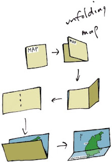
When designing, I often consider the benefit of workflow I have experienced in the past. Consider maps. When I was a kid, driving across the US in summer, I collected maps from gas stations (back when they still had them). I was trying to collect a map for each state. This is when I became familiar with the basics of functional design. A map had to be compact, and yet describe many places with sufficient accuracy for navigation.
I observed how both sides of a map were useful for different purposes. How many locations of interest were indicated with icons. A legend indicated what the icons meant. This was a time of real curiosity for me. Of essential discovery.
Such hobbies as building geodesic domes and technical illustration kept me focused on function for the longest time. But eventually, in high school, I discovered Graphis, an international magazine of graphic design. This struck a chord with my innate drawing talents. And suddenly I was also focused on form.
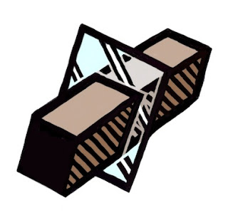
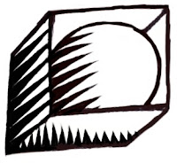
And then it was impossible function that caught my eye. At Fractal Design, I continued this design philosophy. Here is an illustration from those days, reinterpreted in my modern style that expresses form. A wooden block penetrates through glass. This is ostensibly impossible, of course, but it was in tune with my sense of materials and their simulation in UI.
At the time, I was lost in a maze of twisty passages, all alike: the labyrinth of UI design.
John Derry and I were concentrating on media, and had been since Dabbler introduced wooden drawers into paint program interfaces. Like the paint can, it was a return to the physical in design. Interfaces needed something for users to conceptually grab onto: a physical connotation that made the interface obvious to the user.

One project I was developing at the time was Headline Studio. This was an application specifically intended to create moving banners for web ads. It concentrated on moving text. So when working on a hero logotype, I sketched out these letters. The idea was that, in a static illustration, the letters might appear to be walking in. And the addition of the cursor was a functional cue. This ended up being pretty much what we used.
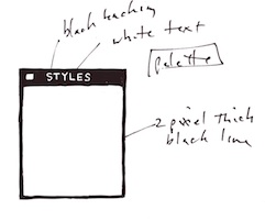
Every bit of Headline Studio was designed in minute detail. This included many designs that were not used. For instance, I show here a palette that was rejected because it was thought to be too dark.
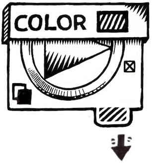
This brings up the subject of visual cues. To visually cue the user to thinking of a palette as something to adjust the image, we chose simpler designs that those we used for windows. But sometimes we went overboard on palettes, as you know from
the Painter UI design.
In the Headline Studio timeframe, we started thinking about
three-dimensional UI. We considered different three-dimensional functions. For instance, we considered the window shade.
A window shade is hidden when you want to see out, and you pull it down when you want to block the view. At the time, there was a trend to make a window collapse to just its title bar when when you double-clicked it there. I considered that to be an extension of the window shade.
And by extension, we could turn palettes into window shades so their controls could be accessed only when they were needed.
Eventually this technique was replaced by the expanding list with the disclosure triangle. We liked this because when the list was closed, certain crucial data could be displayed in the list element. The user could thus discover the current state of the most important controls in a quick glance, even when the list was closed.
You get a bit of that here where the current color is displayed even when the palette is rolled up.
And like a real window shade, a small amount is shown to grab and slide down. This sort of technique would work even now in the multi-touch era.
You can also see a nod to the three-dimensional look, because the palette bar has depth. This makes it more sensible to the user that it can somehow contain the rolled-up shade.
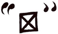
The real cost of producing a three-dimensional UI is the need to develop an visual language of controls. Take for example the humble check box.
It has been a box with an X, a box with a check coming out of it, even a simple bump that becomes a different-colored indentation. Eventually the box with the X became a close square in a typical window (though Mac OS X uses little colored balls. Which really are very nice, I think. The close ball uses an X, of course).
But the check box is really an on-off item. It could easily be a ball in a box that just changes color when you tap on it, for instance. On and Off? Red and Green? Or it could be a 1 and a 0.
You become endlessly mired in an array of choices when it comes to this necessary visual language. And some things just don't make sense. Eventually we came to the conclusion that
objects were more useful than icons. Because the objects become more readable and their behavior is already known.
When we came to sliders, we realized that they were also used as visual indicators. Having played a pipe organ from time to time when I was a teenager, I found that drawbars might make a nice physical metaphor.
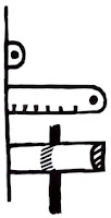
Here is a prototype for the actual sliders themselves. One of the metaphors used was like a ruler with a dot at the end. This dot marked a grab-point. You could tap and grab at that location to extend the slider to the right. This would increase its value. The marks at the bottom give you an indication of the magnitude of the slider's value. Another more drawbar-like metaphor is the glass semicylindrical rod. You can see its magnitude based on the number of lines you cross (and which refract into the rod as you drag them over).
This was an example of form leading function, but it was compelling enough to experiment with. If you turn this one into a real control, it must be possible to have several of them, like drawbars on an organ.
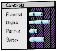
Another way to look at them is as a bar chart. Each parameter has a magnitude that is indicated by the length of the glass rod. The interface is three-dimensional, as you can see. The section to the left of the bars is thick enough for the bars to be embedded into.
Probably the inclusion of even more shadows would make it visually more interesting and also more easy and obvious to interpret.
These are re-drawings of my original sketches from 1999, colored and rendered using a woodcut look.
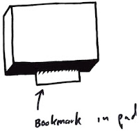
The idea of using a sticky note that sticks out of the edge of a three-dimensional pad was one simple physical construction that seemed useful. But how? In real life it is used to mark a place. Sometimes it is used to specify where in a large document you need to sign.
Either way, it was similar to a bookmark in the web: a quick way to get back to a specific place that you want to remember
The pad signifies a multi-page document, like a PDF. So, how might this be envisioned in actual use? I actually drew out a few examples. And here is one.
This shows an idea for a storyboard project. The storyboard is the multi-page document, with frames showing in sequential order. Different scenes might be marked using colored tags. The blue arrows allow the user to sequence through the pages in the normal linear ordering.
Probably the colored tags would live in small piles like a sticky pad. The user can click and drag a sticky note from the pad to tear one off and continue to drag the note to the document for use as a placeholder on the current page.
A nice, clean three-dimensional interface for non-linear access to a linear document!
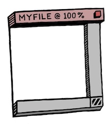
Here's another three-dimensional interface, used for a document window. It's kind of a gratuitous use of 3D though, as you can see. Still, it features an infinitely thin document, like paper, stretched in a frame made up of the scroll bars and the title bar.
Perhaps the red item in the corner is a close box.
Down in the corner is a kind of tactile device used for adjusting the window size. All of these parallel what a window has in it right now, of course, and has always had in it.
It's all about using a different visual language for the UI elements, which is something you have to choose before developing a UI in general.
Here is another, more generic example, devoid of the accoutrements of a title bar. It shows that it might be possible to put transparent stuff into an interface as well.
It is unlikely that I had any idea why I wanted a transparent element in the interfaces (I have colored it green to single it out). It is another example of form leading function.
I am still interested in how such an element can be used, though. It does look cool. It is also possible to make the document itself transparent. This might even be a nice frame for a layer in a touch environment. Consider touching the layer, and then having some controls appear around it. In this case, the three-dimensional interface makes more sense since they are like objects that appear on touch command.
But you can consider elements like the blue arrows in the storyboard example above. They could be made transparent easily, with no real loss of readability. And that would look cool as well.
And what, I wonder, is the shadow being cast on? The elements seem to float in space in the example. It is an example of a visually interesting impossibility. If we were going for true realism, this wouldn't qualify.
And that, in a nutshell, is one of the endearing qualities of three-dimensional UI. It doesn't have to simulate something totally real. It can be magic, simply transcending reality.
The amazing thing is that, as a user, you still get it.
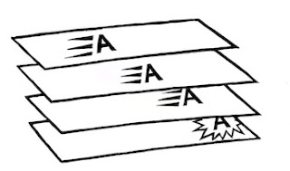
When it came to the Headline Studio packaging, I needed to come up with a way of showing animation on the box: a completely non-moving way of showing animation. I came up with several ideas, but this one stuck in my mind as a good way to show it.
Once again, three dimensional design becomes a useful tool, because it helps to replace the missing dimension of time.
 You can look at things from different points of view. And this can help in almost everything you do.
 Degrees of Freedom
 Human Interface
 The use of three-dimensional interfaces is another interesting design consideration.
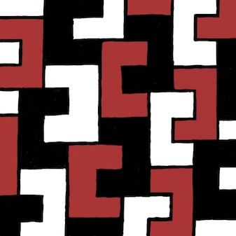 Fit Together
 Did things ever line up quite so right?


