Showing posts with label interlock. Show all posts

Thursday, November 15, 2012

Patterns, Part 6

Tiling patterns are the subject of an application I have written specifically for exploring the San Marco Basilica tiling patterns I recorded in my notebooks in May, 1997.

The original tilings were simply sketched. This is not because I was without a camera. I certainly had a very good one with me. No, I sketched the tilings by hand because the church authorities would not allow photographs in the Basilica!

What mathematicians and others have done is to buy the post cards (I think I have a few of them as well), scan them, and post their pictures online. Usually as a challenge for students to determine which repeating group is represented in the tiling.

You can find all about the regular pattern repeating groups in the Handbook of Regular Patterns. My copy of this book is well dog-eared.

The pattern of five-square C-tiles from an earlier post of mine, Different Perspectives, is seen here. This was an early test case for my new application, which I call Tile Patterns.

This C-tile is one of the twelve pentominoes. All of the pentominoes can tile the plane in one way or another, though some of the tiling bases are a bit larger than this one.

For information on the grid, basis, and segments used to define the tiles, consult my last post, Patterns, Part 5.

My test cases for this application make pretty designs. And some are rather busy in an op-art fashion.

Here is one, which has tiles that seem to simulate cut jewels, which must certainly qualify as a 1990's video game background!

This one broke my program a few times before I got it to work. Mostly because some of the polygons actually have holes in them!

Since the last post, I have implemented a few new things. Before, the application had the ability to set a grid, adjust and specify a basis parallelogram, and draw segments. As you draw, segments appear in all repeats of the basis area.

I have added the ability to divide up the segments when they touch or cross. Then I extracted a set of nodes (all on grid points) that bound each segment. Then I added the code to identify all closed polygon areas. As I mentioned, this includes some holes as well, particularly in the jewel tiling. Finally, the ability to specify the color for each closed polygonal area has been added. This allowed me to create all the tiling patterns you see here.

When I work this way, I only have to specify each polygon's color once, and all repeats of that polygon get colored. So I don't have to (laboriously) do the coloring in Painter. I get a cleaner result also. With this tiling, you can just see the parallelogram basis in red. Oops, I left it in!

Each of these patterns represents a new test case that broke the new application in some way.

The ability to save and restore patterns was the first feature I made. Then, when I built the extraction of polygons, I had to write save and restore of the polygons and their colors. This was an exercise in versioning, since I had saved several patterns already, but only the segments were stored.

Really what is needed (beyond what I have written so far) is the ability to maintain a palette of colors that is easy to pick from. And an easy way to deposit color into the polygons, with just a click.

The traditional way of doing this, along with adding segments, is a toolbox. Which is kind of passé, when you look at modern multitouch UI.

The ability to edit segments (in case I make a mistake) was another important feature to add.


Without that feature, I would have to clear and start over. Very troublesome!

So a segment selection and adjustment capability was necessary to implement. The requirement was either moving the entire segment or moving one of its ends. I just snapped the mouse point to the grid and looked for a segment end at that point.

For picking in the middle of a segment, I used a pick tolerance (really just a few pixels) to decide if I was close enough to the center of the line to pick it. Still, I had to implement point-to-segment distance, which is the only hard geometric computation.

Having implemented Shapes as part of Painter (and part of ColorStudio), I am very familiar with grid snapping and geometry editing. Actually very little coding was required.

I also used the San Marco Basilica tiling patterns as test cases. The first few patterns are really not as three-dimensional as some of the patterns. I think these were some of the first patterns laid down on the Basilica floor.

This pattern shows a black field with interspersed gray and light brown rectangles. Or you could view it as a checkerboard with turned gray squares inside the black ones.

The challenge for the tilers was to create diamonds that are just rotated squares. The larger light brown diamonds have an edge length that is sqrt(2) times larger than the smaller gray squares. That must have been fun.

The next pattern shows a lattice design.

This design has a brown field with small black squares inside it. Each black square has a gray diamond inside it.

Clearly, the later the tile work was designed, the more complicated it becomes. Notice here that the brown field is actually made of hexagons that interlock. It's hard to show that here, though.

In the real Basilica, the tiles are all made of marble. So there is a strong texture to all of them, and also quite a bit of color variation.

That may be the next thing for me to implement, to simulate the marble texture. Of course I have some ideas on how to do that. Also, simulating the grout will be of importance. That turns out to be pretty easy, since I already have a way to render that (as I showed in the previous post).

With this one, the patterns are getting a bit more three-dimensional.

There's just the suggestion of a square box with a white bottom. This is inside a kind of square corner.

Of course, all the tile work is two-dimensional since it is just a floor.

The tilers took on the challenge of making their work more and more three-dimensional with time. By the time we get to the renaissance, most of the designs were faux three-dimensional designs, as we will see with later examples. Perhaps this one is more like a coat of arms.

The next one shows a feature that is quite common on the Basilica floor: the checkerboard.

Checkerboard occur most commonly in frieze work (borders) and often go around curves on the Basilica floor.

This shows the artisan's skill more than ever.

This pattern is found on the floor, along with some that only feature four checkers on a side.

I figure the high contrast of the checkerboard was a visual stimulant. But in reality, the tilers were influenced by what they could get from the quarries. In the year this was made, there was probably a surplus of white and black marble.

No patterns on the Basilica floor are more striking, or more difficult to create, than the ones that feature circles.

Here I have approximated the circular arcs with polygons, but you get the picture.

The really cool thing about this one is the way the circles intersect each other so perfectly.

Oh, and by the way, you see the pattern is incomplete at the top. Its another bug I'm chasing! You will see this on three or four of the tile images in this post.

Nonetheless, this image shows the magic of tile patterns.

This shows another kind of tile pattern. I think the design has the downwards diagonals in a kind of three-dimensional design to indicate some kind of depth.

And traditionally, the black field allows you to see the other elements as objects on that field.

In this case, the black is less used for shading than for simple depth.

This is another example of a half-drop pattern, as it would be called in Painter. Half-drop patterns are typically used for wallpaper. But wallpaper is really not very long-lasting. Not compared with a marble tile floor, which has been known to last thousands of years.

This pattern was featured in my last post. Here the colors are a little closer to the actual pattern taken from the Basilica floor.

With this one, the illusion of depth and three-dimensional structure is excellent.

The black diamond tile is used to show the inside of a box. The top of the box is shown in two colors, giving it a kind of silvery sheen. The side of the box is in natural wood colors. In all, it is an exquisite pattern.

This one was probably sixteenth century.


This next pattern shows clearly the three-dimensional structure.

The rendering of this pattern also shows clearly the grid at the top, the guide lines, and then the tile colors below.

Actually this is a bug, but I find it to be instructional.

With this pattern, the gray diamonds are the bottom of diamond-shaped pits. The white rectangles are the tops of the lattice. And something new: black diamonds form the intersections of the lattice.

It is visually interesting and also something quite new. Each tiling shows the style of its creator. It shows that the Basilica floor was designed by many artisans over the centuries, and that they were influenced by each other.

This tile pattern is an exquisitely detailed one. It is entirely three-dimensional. One thing about these tilings is that they have the concept of an assumed light source.

This imposes a rule that allows the designer to consistently shade the shapes. Of course this means that several different colors of tile are needed. In varying quantities also!

Various pyramidal shapes inhabit this one and so you see it is a different kind of surface depiction than we have seen so far.

Like the black diamonds of the previous tiling, this one features smaller pyramids (or indentations?) at each intersection. So most likely this one was created after the previous one.

Minecrafters will probably recognize this pattern: the corner cube pattern.

It was certainly not invented in Minecraft, which certainly appeared a few centuries earlier on tile floors in Italy.

It shows most clearly that consistent shading is required to get the best illusion of three-dimensional shape.

This is one of my favorite patterns due to its simplicity and its optically convincing form.

So this pattern is one of the more mature three-dimensional forms, rivaled closely by the next pattern.

This pattern is like the previous, but entirely in pyramids.

Ever seen the pyramids at Giza in a satellite reconnaissance photo? What I want to see here are the shadows of each pyramid being cast on their neighbors.

Well, perhaps that was beyond the thirteenth-century tile masters.

One thing needs mentioning. The tile patterns are quite similar to modern quilt patterns. I have even seen some of the San Marco tile patterns worked carefully into quilts (even with the marbled textures in the cloth). I can imagine them in latch-hook rugs as well.

I think this tile pattern shows that the tile masters were both aware and interested in shadows. The black triangle could be one facet of the three-dimensional geometry. But I think it's a shadow.

I see it as a shadow being cast into the trough that has been carved into the floor only in dark squares of the checkerboard pattern.

Walking on a floor with this kind of tiling, or in fact any three-dimensional depiction in a tile floor, would be a trip!

Literally. I would be worried about getting my foot caught in the apparent holes!

I found many depictions of this pattern on the floors in the old churches of Byzantium. This one differs from the earlier one both in color (four colors are used, subtly) and also in the angles of the squares.

Thus also in the width of the diamonds. They liked to use sixty-degree angles, so the diamonds would be "double triangles".

This one is shown at about fifty degrees. Mostly because I used a relatively small grid to construct it. It almost reminds me of the harlequin pattern, which is really only a diamond grid in a two-tone checkerboard. When you shade it in this way, it becomes three-dimensional, and can fool you into thinking it is a real surface.

This ornament is found on the floor at the San Marco Basilica. It is quite complex!

It reminds me of the American Indian rug patterns found at the Ahwahnee hotel in Yosemite.

But the Venetian tile floor will be still there long after the American Indian tapestries have turned to dust.

Unless, of course, global warming takes its toll and submerges the Piazza San Marco in the Adriatic.

In the meanwhile, let's keep the art and science of tiling patterns alive!

Patterns are a part of our lives. Our clothes, our wallpaper, our tapestries and hangings, our rugs, and many touchstones in our very existence show the influence of art and mathematics. The art of making patterns promotes spatial reasoning and creativity.

These are some of the reasons that I have featured textures and patterns in my blog. Also, of course, they dazzle our eyes and provide for wonderful illusions: the illusion of depth, the illusion of interlock, the illusion of spatial connectedness and completeness.

When a tiling pattern has a flaw, we automatically see it.

Patterns are literally built right into our consciousness.

Friday, November 9, 2012

Patterns, Part 5

I have decided to write an application to help me return to the original subject of this series of posts: tiling patterns. As you may remember, I was once impressed by the amazing floor of the San Marco Basilica in Venice. The floor is laid out in tiled marble, using a style referred to as Opus Sectile.

In one of my notebooks, I carefully transcribed the design and colors used by the tiles. You see tiling number 7 here, a wonderful pattern rendered in approximately the same shades as the original.

My first attempt at writing a tiling application became the origin of my San Marco series of applications that also saw the construction of the Painter 6 brushes.

For this app, I have simplified the method of how the patterns are constructed. First I lay down a square grid, similar to grid paper.

Most everything can be laid out on a grid. But grids may lead to inaccuracy of aspect ratio and relative sizes of the tiles. So I created the provision for doubling the grid in place on demand. This takes care of the need for additional accuracy and still keeps grid snapping.

Constraint-based systems make things easier, usually. Here is an example of the grid. All the examples are shown at 50% scale.

The next thing is to allow a basis to be designed on the grid.

A basis is a parallelogram that defines the repeat block of the tiling pattern. This repeat block can be any parallelogram shape.

Here it is a rotated square. You will see why the basis is required in a moment.

You will first notice that the basis is defined on the grid. It really consists of an origin and two vectors. One vector, (3, 1) defines the X axis of the basis, and the other vector (-1, 3) defines the Y axis.

Now, in my previous attempt to design a tiling program, I concentrated on a limited set of graph-theoretical operators. Upon reflection I have decided that this is too limiting.

Instead, I rely on simply drawing lines.

Here I draw a single line intersecting the origin of the basis (at the bottom) and extending over the entire width of it. This line gets replicated into all its instances: there is one for each repeat of the basis within the plane.

All the lines are constrained to fall on grid points. This turns out to be handy when it comes to making the line segments meet.

This tiling pattern only requires two lines, it turns out

The second line passes through the opposite (upper right) point of the basis and extends over its entire height.

It also gets replicated into all its instances. Each instance is defined to exist at one of the copies of the basis as it tiles the plane.

Together these lines form the tiling pattern. In this case, the pattern is a 3 by 3 square and a 1 by 1 square, perfectly fitting together.

Because the basis has edges that are length sqrt(10), and because it is square, the repeating elements in the tiling pattern must have area 10 square grid units by definition.

Next, I can remove the grid and basis, change the lines to black, and render it to create the desired tiling pattern.

I have chosen this tiling pattern to start with to show a useful kind of repeat that doesn't fall into the class of patterns easily designed in Painter.

In Painter 4, which was released in November 1995 (a very crucial period in my life!), I implemented the means to paint directly into a pattern and achieve seamless results. This included rectangular patterns and also patterns with horizontal and vertical half-drops.

In this new program, these kinds of patterns can be easily designed, but also both a horizontal and a vertical offset can be applied simultaneously. Sure, this kind of pattern could be designed in Painter. But you would need a square that is ten units on an edge to create it. Well, you could use a half-drop by using a rectangle that is ten units high and three units wide, and a half-drop offset of ten percent. But these are much messier ways of defining the pattern.

I bring the rendered tiling pattern into Painter so I can apply coloring to it. This gives me some ideas for new patterns.

But ideally I would do this inside the new program, which I call Tile Patterns.

It is easy to design a number of patterns using this fresh approach.

You might assume, just because the basis is a parallelogram, that it wouldn't be possible to design triangular shapes, hexagons, or perhaps strangely interlocking shapes.

That would not be a correct assumption. Here a triangular pattern is designed using the grid and a parallelogram whose shape matches the appropriate shape (two triangles attached).

So in this case, the repeat pattern is actually two triangles.

Here I have used an approximation for sqrt(3)/2 which I arrived at using continued fractions. The actual number is 0.8660254... but it can be successively approximated by these fractions:

1/1, 6/7, 13/15, 84/97, ...

I have chosen 6/7, an approximation equal to 0.857... to represent the irrational number, so it's only off by about 1%.

Hexagons can also be designed using this program. Here I am using the same rational approximation to sqrt(3)/2. As with the triangular design, this design uses three lines (which you can see inside the basis parallelogram).

But, unlike the triangular design, the area of the basis is equal to the area of the hexagon.

So far I have only shown convex shapes, but it is also possible to design interlocking concave shapes. This is another kind of interlock, of course, but one which is cyclical in another way: in a lattice.

Consider this pattern. Here I show interlocking plus symbols.

Yes, as you can see, the area of the plus symbol is five square grid units, and so the basis rectangle also has the same area, with edges that are sqrt(5) in length.

I can design interlocking patterns just as easily, but it does take a bit of planning beforehand.

I like to sketch out the pattern first and then draw the basis on top. This gives me a blueprint for how to proceed inside the Tile Patterns program.

Here you see a simple interlocking pattern.

You can see it is designed on the same basis as the first pattern I showed. There are an extremely large number of patterns on this one basis alone.

Tiling is an intellectual exercise. When I was younger, I used to buy grid paper in hexagons and triangles and then color inside the tiles to make patterns. You can see one of these in my three-dimensional thinking blog post. So in the same vein, I color the tiling patterns I create, looking for novel color combinations.

Here is an example of this kind of fun.

Sometimes I just line to make patterns that show color and delight the eyes, and sometimes I am in it for the pattern: really more of a contrasty dotted kind of thing.

It is useful to realize that the tiles do not have to fill the entire space within the plane. I can create individual structures with some separation in between them to give a kind of hand-designed formulation.

In Painter, I can soften and increase contrast (anneal) the pattern to get rounder forms when I want.

This is the technique I used to create this new pattern, a candy-coated array of dots.

They are quite pleasant!

I am not sure where I want to go with this application in the future. Most likely the next step is to have the app automatically enumerate the closed shapes that define the repeats (though, as you can see, there might not be any closed shapes, as in the case of the maze pattern below).

It seems like a merging of the San Marco application capabilities with the line-drawing capabilities of the new app would be a good way to proceed.

Perhaps a nice way to save out tiling patterns as Painter patterns would be useful.

As I referred to earlier, the ability to color the tiles inside the application is a capability I will code up very soon.

Here is a pseudo-maze pattern I have created using this application. This shows that I can control the thickness of the lines when rendering them in black-on-white.

And the final pattern I will show is another tiling pattern from my notebooks on the San Marco Basilica.

Of course the grout spacing is nearly zero in the actual Basilica floor. Those artisans in the twelfth century were actually quite good!

Saturday, October 27, 2012

Triangular Forms

Noteworthy

Looking through my notes, I have found several instances of triangular shapes that form an interesting group of figures. I have completed a rendering of the triangular form of the Borromean rings, featured earlier in Interlock. This time it's much cleaner and crisp. Here we can see the interlock a bit better and I have also added some woodcut-style shading and some sumptuous color that makes it resemble a real hand-crafted object.

This comes from an original rendering that was done of the triangular rings themselves, but without color and shading. The idea was to make a visual illusion. Without the color and shading it's almost too much to take in all at once. Some confusion sets in.


The Borromean rings are, of course, related to the Valknut. A fantastic impossible Valknut is featured in my blog post Drawing On Your Creativity. My old notes are full of the Valknut and also of impossible figures.

Yet, I have a few pages of handwritten notes where I dwell specifically on triangular figures.

The Borromean rings are remarkable as a three-way-dependent group. If you remove one, the other two fall apart. This is the essence of interlock, of course. The very definition.

Valknut

But the Borromean rings that were used by the Vikings had a very different overlap than this one. And they were usually shown pointing up, not down (though not always).

Here is the correct rendering (though some versions differ in left-to-right reflection from others), with bright colors for each ring. This is clearly distinguished from the first rendering because the insides of the triangles are V shapes.

There are many more ways to show it as well, each with its own overlap formula. If each successive overlap has an over-under-over pattern, though, there are only two, which you see here.

There are two forms for the Valknut, and here is another one. Sometimes this form is called the Triquetra. These two figures have existed for at least a thousand years or longer, in exactly these forms. Most depictions of it on runestones from the Viking age show it as thick and tightly formed. All apparitions of the Valknut are associated with Odin. It is said that it symbolizes Odin's promise that the dead Viking warriors have a place in Valhalla. Those who receive the Valknut are the chosen warriors. So, on thousand-year-old runestones in Denmark and Sweden, you often see a battle scene depicted and a Valknut appears marking the heroic figure.

As far as I'm concerned, though, the Valknut is a cool figure, exhibiting strong interweaving and geometry. My take on this Valknut is that it resembles, at least topologically, the trefoil knot.

Taking it Further

I drew this figure while trying to create a Valknut. But I hadn't allocated enough space for the inner portion, and so I had to join the triangles in the middle. I got another idea or two and sculpted it into its current format.

Isn't it interesting how triangular forms can so quickly become logo-worthy? They catch the eye. This form seems to express that the motion of the form is an internal force, rather than an outwards-moving force. It is closed in on itself, in a way.

One of the main issues with triangular figures is that it forces me to think before I draw. I have to plan ahead.

Here is another figure I drew recently. I think I was onto something with the three points on the right and bottom edge.

With such a triangular network, many possibilities exist. Sometimes I like the irregular forms, because they add character to the shape.

But usually the forms, as they were used in antiquity, were as regular as possible because that form clearly resonated with the ones who made them.

The form I was going for appears to be the Triquetra form with an interlocking triangle.

Inspired

Here is my rendering of this figure, with shadows to make the overlap a bit easier to grasp. By coloring each single thread, the interlocking nature of the figure becomes perfectly clear.

This form becomes almost inspiring in its simultaneous simplicity and complexity. It is no great surprise that this Triquetra form, in various mutations, has been used for so many thousands of years. Though usually the interconnected figure was a circle and the corners were rounded off to make it more like a trefoil knot.

The Book of Kells has one. A runestone on Gotland has a few. With the rise of Christianity in Scandinavia this figure became a cross by connecting four of them (the Carolingan cross). A round Triquetra is used to symbolize the holy trinity on some bibles.

But you can take this format even further. Imagine those who are fascinated by the Valknut (which, to me, symbolizes an idea), separated but entangled by their interest. Here is their symbol.

Nothing can break it.

It's almost like a heraldic mark or insignia.

A badge of fascination.

It shows that the interest for such things never dies. It gets carried on by those who discover the symbol anew. And so it has gone for thousands of years.

Those who practice the art of creating symbology know that there is an inherent interest built right into humanity for what graphic symbols convey to their observer.

The essence and practice of logo forms is rooted in our natural Jungian response to symbols. We can't help our response to them. Yet some logo forms come to stand for evil and other logo forms come to represent eternity. How does this happen? Will these forms forever be etched into our collective memories? The Valknut proves that a symbol can easily last thousands of years.

My sense is that forms are chosen by political groups and companies for a reason. A simple intelligent form can be chosen as a symbol that is easy to remember, to help propagate the brand by creating a catchy figure that can be expressed anywhere. That it can create such a strong impression often testifies to the strength of the designer and their understanding of how we respond to symbols.

Isn't graphic design wonderful?

Sunday, September 16, 2012

Why I Like to Draw


Drawing seems like something that is just built in. When I want to visualize something, I just put pen to paper. But why do I like to do that?

It exercises my creativity, for one. And my right brain needs a bit of exercise and use after doing programming all day. But it's more than just exercise I seek.

I also seek to bring what I see inside into some kind of reality. I like the interrelationships between the spaces I see. Positive space and negative space. Three-dimensional space. Containment. Folding. Entrances and exits. Liquid spaces.

All these qualities are enfolded into a single unit: the illustration. I feel there should always be more than one way to look at it because is multi-sided.

It Starts With Media

I have been drawing for quite a while. But I think I learned most of my craft in early grade school. When I went into High School, as a freshman, a friend and I took an advanced Art class and this is when I started drawing ever more ambitious projects. Mostly I worked in felt pen, which suits me even now, since I have been using Sharpie on thick white paper as my main medium. Or at least my main traditional medium.

But I also liked to use pencil. I bought Faber Castell Ebony pencils and thick, rough paper.

It's really this medium that got me started on Painter in 1990. I loved the rough grain and the progressive overlay of strokes to create shading. Shading brought out the spaces I could see in my mind, and made then into real objects.

My main medium has become something quite different now. It is Painter.

Disrupting the Art World?

What happened when Painter was introduced? Well, there were a lot of artists who didn't need to go to art stores any more. This was a form of disruption, I think. But I doubt that art stores will go away any time soon. The traditional media are still quite compelling. And they are probably the quickest way to learn.

Yet disruption is like chopping off the golden tip of the pyramid and walking away with it. The old one crumbles slowly, having lost its luster, and the new one becomes a smaller, faster, better version of the old. And because it's mobile, you can have it in your hand rather than having to go out to the old brick-and-mortar to see the pyramid. In the digital world, this is like digital delivery: you can read the book on your iPad without having to go to the library or bookstore. The advantages are easy to see.

In the same way, Painter has all but eliminated my need to buy pencils. The Ebony pencils I own are ten years old at least.

The Mechanics of Replacing Traditional Styles

I learned to shade in Painter, using one of my first creations, the Just Add Water brush. I would apply colored pencils, which gave me a varied color with grain. In a shade that wasn't too primary. And then I would use the Just Add Water brush and smooth it out into a cohesive shading, like watercolors.

Recently I have taken to a woodcut-like shading technique. It's a bit like engraving. Usually black lines delineate the subject and the shading is applied in a manner similar to the way a linoleum-cutting tool works.

In Painter, I sculpt each of these shading lines separately, often going over the edge of it five or six times.

Drawing From the Mind

But the main thing for me is the form I am drawing, like a two-dimensional sculpture. Many times a drawing is really a projection of a three-dimensional concept onto a two-dimensional surface.

To enhance the rendering, I sometimes employ a "watercolor overlay", which is a layer with a Gel composite method. I can draw into this layer to add color to the illustration. I can use Just Add Water to soften the edges of a color change.

While traditional media are still the easiest way to learn illustration, Painter may be the easiest way to experiment with different media.

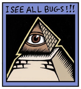
Most of my recent illustrations concentrate on three-dimensional relationships. The letter A with some depth, but hand-wrought. Interconnected boxes. A pyramid with an eye in it. Some of these are new versions of my older sketches. But all of them feature some overlap, folding, interlock, or holes.

Take for example this piece. Two S-shaped pieces of rebar interconnect, showing a very small weaving. There is over and under, interlock, shadows, and also shading. It's all tied up in the way I think about things, and what I find interesting.

I draw because I want to show what I'm thinking about. I want to freeze the thoughts and make then concrete.

And the way the illustration interweaves with my text is also quite important. Sometimes the drawing gives me ideas, and even defines the discourse.

Sometimes drawing can be like solving a puzzle to me. I must figure out where the pieces have to go before I can compose them properly. Painter saves me because in the digital world I can draw construction lines and totally erase them afterwards. Or I can draw crudely and then rework edges to make them straighter after the fact. The digital medium is extremely malleable. It has changed the habits of artists since Painter came out. Features like mixed media all in one package, undo, and perfect erase make the digital medium the ideal place to try stuff out for your next illustration.

Inspiring Sources

When I draw, it is therapeutic to me. And the good thing is to produce something you can look at.

The style I choose is a bit like engraving, as I have mentioned. These are inspired in part by the Flora Danica prints and illuminated manuscripts.

Chet Phillips, who has inspired me by his creativity, also likes to use the scratchboard-watercolor style. His imagination in creating characters seems to be unparalleled. And much like in the old work of Fractal Design, old items are repurposed in style and substance to make new fantasies of illustration and storytelling. He even uses magically-transformed packaging to build his works.

More Than an Illustration

The whole package, extending illustration into more than just pictures, is also why I like to write. While an illustration can leave me hanging by a thread when I look at it, a full-blown explanation can cinch the knot tight around your subject and create an artful connection to the reader's mind.