I have been able to resurrect my old History disk. I am amazed that it still works. But in the process I discovered some very rare splash screens and art that really brought back the memories! You might remember the
Illustrated Evolution of Painter UI post I did last month. For that post, I had to get the screen shots from
another web site. And that web site's author contacted me yesterday. It turns out he is the collector of all things Painter, Toshio Doi from Osaka!

After a correspondence with dddo (Toshio Doi), a Painter collector in Japan, I learned that he was missing the Painter X2 splash screen. So, after some luck, I found this image among my files. The Painter X2 splash screen was John Derry's work. Together, we designed the X2 logo form with its distinctive metallic beveled look and the raised 2 with the triangle beneath. He has used an earth-sky gradient as a reflection map to create the look. John loved to create skeuomorphism designs, and in this case, he has duplicated the look of a shiny metal plaque that we saw on the front of some building in New York. Even down to the screws that hold it to the wall!
We called Painter X2 "Painter 2.0 with Expert Extensions (hence the X2), although it was a completely new version of Painter that
implemented layers. We were ahead of our time at Fractal Design.

I also came across the original splash screen for Painter 1.0. The Painter 1.2 splash screen was taken directly from this, but of course I had to change the version number and the copyright info.
I believe the image was taken from the original image of the paint can that appears on the actual paint can of version 1.0.
I have been getting the material together to do the definitive post on the creation of much of the complex Painter art that I have done over the years, including the original paint can image, the paint can image used for Painter 5, the Miracle of the Paint Can mosaic, Mount Brushmore, and other images.
I will post this soon, I think.

One of the real discoveries was the Detailer splash screen, which was the 3D paint program we released. It was originally called Voodoo. Perhaps it was a code name. Detailer began its life as Painter X3, a secret demo version. Back when the PowerPC was introduced and the Macintosh began the transition from Motorola 68000-based processors to IBM PowerPC based processors (fabricated by Motorola), I was in the habit of going around and demoing X3 to international crowds as part of a demonstration of what was new and possible on the fast floating point systems of PowerPCs.
This was a hard project to complete, and it eventually was called Detailer.

The Detailer look was changed from the Voodoo look as you can see. It's too bad. I really liked the shadows of the voodoo letters, sharp where they touched the world behind them, and soft as they drape back over it.
But I guess that marketing didn't think Voodoo was a good name. Eventually it became Detailer.
That's my hand holding the letters, by the way!
We went with a red design instead of green. Somebody wanted it to read darker, more professional.

With Painter 4, there as a separate splash screen for the Mac than there was for Windows. This Splash screen shows that,, for Windows, the particular JPEG technology we were using on the Mac wasn't available on Windows, and we had to use another solution.
That's why it is missing one line of text from the Painter 4 splash screen from the Mac.
With this splash screen, John Derry used the new Painter 4 mosaic tool, which was so much fun to create as well as use. A totally new medium! Well, one resurrected from antiquity, but nonetheless new on the computer.

For Painter 5, we had a provisional splash screen that was used for a while during development, a humorous treatment that showed that Painter 5 was just a reworked copy of Painter 4. Of course, each new revision was exactly that.
John Derry removed some tiles, decreased the shadow, and put a new numeral inside with its own textured background. You can also see the JPEG line in the boilerplate text below.
Painter 5 was a remarkable process in development, but also in visual theme. This took us from the look of the past to the looks of the future.

The Painter 5 splash screen shows exactly what this means. Elements of space, including motion-blurred stars and a comet. Golden shiny liquid metal letters. Water refracting the texture below it. Heavy texture of Impasto, and even fire!
We had an impressive new selection of brushes in Painter 5. It was Painter 5 and 6 where the brushes really took off in a big way.
You also see the influence of product management in the splash screens: Jon Bass.
Jon, as product manager for Painter, lost a few points from me by creating an art contest to "paint the hair on Mark Zimmer". I think it was around that time that I began to wonder about the value of being famous.

The Painter Classic splash screen was John Derry's creation from start to finish.
The first version of the splash screen was colorful and playful, but it just didn't have the panache that John usually put into his graphics. You can see the Classic letters in a chrome format similar to that of the logo of an old car.
The Painter brush logo, originally created by Cleo Huggins, is shown in puffy 3D letters. There's even some bloom on the shines to make them more interesting visually.
Also note the trefoil knot used for the MetaCreations logo.

Well, this splash screen look was only a placeholder, because John Derry had a much more ambitious idea in mind for the splash screen.
John created a still-life scene with draped fabric, a frame, and a paint pot. But what made this really interesting was that it was a sketch that was coming to life: in the process of being painted into reality.
Everything in this image was very painterly from the start. The only thing missing was the hand of the artist. But that wasn't quite right: it had to be the brush painting the picture!

This concept of a brush painting a picture that turns into reality is a very common theme in artists' minds. It occurs quite often, and I know I have seen a few treatments like this in the past.
John put a brush into the scene, and made it paint the picture. Very nice.
Perhaps you didn't notice, but the brush has the words Painter Classic pressed into it, in light detail. This
hero shot, as John referred to it, was to be the basis of the Painter Classic splash screen. But the brush turned out to be a confusing issue and detract from the company logo, so it was removed.

Here is the preliminary splash screen. A nice design treatment of the letters was chosen, with a black background for the Painter brush script and a drop-out black for the Classic letters.
The authors names are inserted, and a blank space was carved out for the serial number and the customer's name.
The presence of the MetaCreations logotype and the boilerplate text underneath required John to remove the brush he had added to the hero shot.
The piece was cropped on top and on right.

But John complained about the loss of the chrome letterforms of the placeholder splash screen, and so he reinserted them and altered the gold treatment to be a bit more like brushed metal.
It was important to reference as many visual aspects of reality as possible, John thought.
The final piece went through review and he was required to put in the MetaCreations text above the Painter brush script, since it corresponded to the actual copyright that we had filed for.
And John put the brush back in, to the side.
This was better placement, and was actually similar to the insertion of my hand coming in from the side in the Detailer splash screen.
Placement operates subordinate to function in good designs.
 Fabric sure does take a long time to sketch! I can't let a single feature of it go unmodified or un-enhanced.
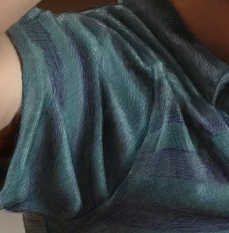 Then I used the tiniest brush (size 1.0) with a very desaturated purple. This brush was set to Buildup:Soft Buildup in Painter. And I used a very light opacity, at 18%. Then I simply sketched into the stripes with lines at different angles. When I wanted the sketchy result to be smaller, I pressed harder. And I often went over the same area with strokes at different angles. This is one way I shade, particularly with a Sharpie.
 Then I switched the brush method to Eraser:Paint Remover at the same width and opacity to do my highlight work on top. When I created a highlight, I woke as lightly with my hand as possible so the highlights wouldn't be too brazen and abrupt.
 This image took hours and hours of time, mostly at night, and it taught me a few more things about rendering fabric. Probably, the next time I will choose a more shiny fabric like leather (not actually woven fabric, but you know what I mean!).


