Showing posts with label illustration. Show all posts

Saturday, October 12, 2013

Knots, Part 2

In an earlier post, I talked about knots. And knots are entanglement, there is no doubt. They serve to bind, secure, to tie down, to hang up, and even to keep our shoes on.

In this post I will talk about knots as a way to entangle two threads. I will continue to use the planar method of showing knots, combined with precedence at crossover points. An over-under rule is used to keep the knots maximally entangled.

In addition, I will show how to draw knots using my drawing style, which is a little bit scratchboard-watercolor, a little bit woodcut, and a lot retro. You can find more of my style (and lots more knots) at my Pinterest artwork board.

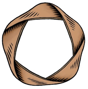
The over-under rule characterizes one of the best ways to organize the making of a knot. In its simplest form, you can see a less confusing, more iconic representation.

This knot is a clover interleaved with a ring. The ancient name for the clover symbol is the Saint John's Arms. The clover is used to symbolize places of interest on a map, the command key on Macs, and cultural heritage monuments in Nordic countries, Estonia, and a few other places. This symbol has been around for at least 1500 years.

The other day while working on a complicated programming problem, and I drew such a clover absent-mindedly and realized suddenly that I could pass a ring through its loops, hence this figure. When you draw the clover as a knot, it is also called the Bowen knot.

It seemed like the simplest thing at the time. Then I tried to draw it in its current form: not so easy! After a few hours (off and on) with Painter yesterday I finally had this figure smoothed out in nice outlines. Today I shaded and colored it. Sure, maybe the purple is a bit much, but I like the simple forms and the way they intertwine.

After making this figure originally, I went back to my programming. But there was a nagging question in the back of my head. What was the simplest intertwined figure that had a twist in it? I had to think simple, so I drew an infinity as a twisted bit of rope.

Then I wondered how a ring might enter the picture. I tried one way and then it hit me: use the over-under rule.

This is the figure I ended up with. Now that's much simpler than the first, and iconic in its own way, I think. It could be a logo in an even simpler form. O-infinity? Well, there's nothing like a logo created for no particular reason!

But how are such knots created, really? Is there an easy way?

Start with a line drawing showing the paths of the two threads. This is how I started. I put them at an angle because I drew the oval first. This was a natural angle for me to draw it right-handed.

Then I turned the page and drew the infinity so that the oval passed through each of the figure-eight's loops.

It wasn't exactly symmetric. Though I do like symmetry, I like even more to make my drawings a bit imperfect to show that they are hand-drawn. If I were designing for a logo, though, I'm not sure I'd make the same choice.

Next I drew the figure again, but with an indication (by breaking the lines so they don't quite cross over each other) of which thread is on top and which crosses under.

Here is my first attempt.

But there is a basic flaw: if I were to grab the oval and pull it, it would easily come loose from the figure-eight! Needless to say this wasn't the knot I was looking for so I redrew it again using the tried-and-true over-under rule which states this: as you pass along a thread, it must pass first over and then under the other threads, alternating in succession.

Here is the result of redrawing it. As you can see, it has a much nicer integrity. It seems to be entangled properly.

So now I have a basic plan for the entanglement of the knot. Now I must plan to draw the knot using outlines for each thread. This means that each thread must really be two lines that are parallel to each other. I call this the schematic version.

I use the original line drawing as a guide and draw two lines parallel to the original line, one line on each side. Originally I worked in black ultra-fine Sharpie on thick 32# copy paper.

The wide lines drawing, as you can see, is getting a bit complicated. But fortunately I have a legend for which lines to draw in and which lines to erase: the second hidden-line diagram above.

I use this as a template so I can redraw the image, using only the new wide lines. With this I can create a hidden-line version of the wider knot. It is easy to accomplish this by placing the blank sheet over the original and using it as tracing paper.

Of course when I do this, I avoid drawing the centerline. This keeps the drawing simple. In this way, you can see that the centerline was a for-reference-only diagram for what follows.

Here is the wide hidden-line version. This one is much clearer and certainly much closer to what I was trying to create.

But it is a bit flat, like a road. And the crossings are really dimensionless.

I brought this into Painter and smoothed out the lines, making them a bit more consistent. Then I worked a bit of magic by using my woodcut style.

How do I do that?

I'm glad you asked! At each crossover, I draw three or four lines on the "under" sides of the crossover. Then I draw to create wedges of black that meet very close to the "over" lines. Finally I use a small white brush to sculpt the points of the wedges, making them very pointy.

This simulates what could be created using a V-shaped ductal tool with linoleum or wood.

Well, this process takes a bit of time. If you count, you can see I had to create about 40 wedges, sculpting each of them into a perfect line or curve. But I am patient.

Sometimes I widened the "under" lines to meet the outermost wedges. This makes a more natural-looking woodcut.

Finally, in Painter I use a gel layer and fill in color on top, filling in each area of the thread using a slightly different color.

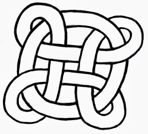
This gives me the final result, a unified entanglement of two interesting threads! This result is quite similar to the scratchboard-watercolor look that I like. I used the same technique exactly to create the knot at the top of this post. In past posts, I have used this technique to create many illustrations, of course. I like this look because it's easy to print and it is good for creating logos.

For instance, if I take the plain wide line version and blacken the white background, I get a version that can be manipulated into a logo form. After that, I invert the colors of the image and that gives me a clean black logo on white. Then I use a layer in Screen mode to colorize the black segments of the threads.

Here is a logo version of the knot, expressed in colorful tones. But this won't do for O-infinity at all! It might easily be an O in purple and the figure-eight in navy blue. On black.

But that's not my idea of a good company name, so I will leave it like this!

There are plenty of styles for redrawing this knot that make interesting illustrations.

This one is not a knot, really. But it is an interesting redrawing of the figure.

This is called an inline treatment.

Remember the Neuland Inline font that was used for the movie Jurassic Park?

This figure can be used as the start of about 100 different illustrations, depending upon which crossings you want to black in or erase.

I tried several before I realized that it wasn't the direction I wanted to go with the logo.

Trial-and-error is often the way with creativity!

I have other knots I'd like to draw, but they certainly do take time! It's good to be drawing again.

Saturday, October 27, 2012

Triangular Forms

Noteworthy

Looking through my notes, I have found several instances of triangular shapes that form an interesting group of figures. I have completed a rendering of the triangular form of the Borromean rings, featured earlier in Interlock. This time it's much cleaner and crisp. Here we can see the interlock a bit better and I have also added some woodcut-style shading and some sumptuous color that makes it resemble a real hand-crafted object.

This comes from an original rendering that was done of the triangular rings themselves, but without color and shading. The idea was to make a visual illusion. Without the color and shading it's almost too much to take in all at once. Some confusion sets in.


The Borromean rings are, of course, related to the Valknut. A fantastic impossible Valknut is featured in my blog post Drawing On Your Creativity. My old notes are full of the Valknut and also of impossible figures.

Yet, I have a few pages of handwritten notes where I dwell specifically on triangular figures.

The Borromean rings are remarkable as a three-way-dependent group. If you remove one, the other two fall apart. This is the essence of interlock, of course. The very definition.

Valknut

But the Borromean rings that were used by the Vikings had a very different overlap than this one. And they were usually shown pointing up, not down (though not always).

Here is the correct rendering (though some versions differ in left-to-right reflection from others), with bright colors for each ring. This is clearly distinguished from the first rendering because the insides of the triangles are V shapes.

There are many more ways to show it as well, each with its own overlap formula. If each successive overlap has an over-under-over pattern, though, there are only two, which you see here.

There are two forms for the Valknut, and here is another one. Sometimes this form is called the Triquetra. These two figures have existed for at least a thousand years or longer, in exactly these forms. Most depictions of it on runestones from the Viking age show it as thick and tightly formed. All apparitions of the Valknut are associated with Odin. It is said that it symbolizes Odin's promise that the dead Viking warriors have a place in Valhalla. Those who receive the Valknut are the chosen warriors. So, on thousand-year-old runestones in Denmark and Sweden, you often see a battle scene depicted and a Valknut appears marking the heroic figure.

As far as I'm concerned, though, the Valknut is a cool figure, exhibiting strong interweaving and geometry. My take on this Valknut is that it resembles, at least topologically, the trefoil knot.

Taking it Further

I drew this figure while trying to create a Valknut. But I hadn't allocated enough space for the inner portion, and so I had to join the triangles in the middle. I got another idea or two and sculpted it into its current format.

Isn't it interesting how triangular forms can so quickly become logo-worthy? They catch the eye. This form seems to express that the motion of the form is an internal force, rather than an outwards-moving force. It is closed in on itself, in a way.

One of the main issues with triangular figures is that it forces me to think before I draw. I have to plan ahead.

Here is another figure I drew recently. I think I was onto something with the three points on the right and bottom edge.

With such a triangular network, many possibilities exist. Sometimes I like the irregular forms, because they add character to the shape.

But usually the forms, as they were used in antiquity, were as regular as possible because that form clearly resonated with the ones who made them.

The form I was going for appears to be the Triquetra form with an interlocking triangle.

Inspired

Here is my rendering of this figure, with shadows to make the overlap a bit easier to grasp. By coloring each single thread, the interlocking nature of the figure becomes perfectly clear.

This form becomes almost inspiring in its simultaneous simplicity and complexity. It is no great surprise that this Triquetra form, in various mutations, has been used for so many thousands of years. Though usually the interconnected figure was a circle and the corners were rounded off to make it more like a trefoil knot.

The Book of Kells has one. A runestone on Gotland has a few. With the rise of Christianity in Scandinavia this figure became a cross by connecting four of them (the Carolingan cross). A round Triquetra is used to symbolize the holy trinity on some bibles.

But you can take this format even further. Imagine those who are fascinated by the Valknut (which, to me, symbolizes an idea), separated but entangled by their interest. Here is their symbol.

Nothing can break it.

It's almost like a heraldic mark or insignia.

A badge of fascination.

It shows that the interest for such things never dies. It gets carried on by those who discover the symbol anew. And so it has gone for thousands of years.

Those who practice the art of creating symbology know that there is an inherent interest built right into humanity for what graphic symbols convey to their observer.

The essence and practice of logo forms is rooted in our natural Jungian response to symbols. We can't help our response to them. Yet some logo forms come to stand for evil and other logo forms come to represent eternity. How does this happen? Will these forms forever be etched into our collective memories? The Valknut proves that a symbol can easily last thousands of years.

My sense is that forms are chosen by political groups and companies for a reason. A simple intelligent form can be chosen as a symbol that is easy to remember, to help propagate the brand by creating a catchy figure that can be expressed anywhere. That it can create such a strong impression often testifies to the strength of the designer and their understanding of how we respond to symbols.

Isn't graphic design wonderful?

Friday, September 28, 2012

Developing a Style

In 1992, when John Derry joined Fractal Design, he introduced me to the traditional scratchboard tool. And the art of designing icons! The scratchboard tool was a tool that could scratch a thin layer of black paint off a white board. It was a very specialized traditional process, involving specially-prepared scratchboard and a special tool, like a crow-quill pen, with a changeable nib for scratching the black paint off.

In 1993, when Painter 2.0 came out, Fractal Design introduced the Scratchboard Tool to digital media. This tool had a very hard 1-pixel anti-aliased edge and also a width-changing ability that helped you create tapering lines very easily in response to pressure.

The above image is a redrawing of one of my original scratchboard sketches (then using traditional media), as depicted in Style and the Digital Era.

The scratchboard tool and its digital version pushed me to create more high-contrast art that came very close to a woodcut look. Some of my pieces from 1994 and 1995 are shown in Art From Deep Inside the Psyche.

This piece is from 1993 and shows some of my first work with Painter's Scratchboard Tool.

It also shows my Neuland Inline-inspired chop mark from that era.

It exhibits use of positive and negative space, even showing it several levels deep. Also, my preference for texture is shown in the overly-obsessive wood grain. I have cleaned this image up and colored it for display here.

You are acquainted with my modern woodcut style, having seen a few posts in this blog, and I present for you here some interesting icons I sketched in 1999 but have now completed in this style. This set of icons is the Disasters of Nature set.

Here is the "Earthquake" icon. Really the ground doesn't crack open in an earthquake, though! Why is it that most earthquakes seem to happen on bright cheerful sunny days? Because I have only been in an earthquake in California, thats why!

Yes, I was here for the 1989 earthquake, a 7.1 on the Richter scale. Although it was known as the San Francisco quake, it's actual epicenter was in Aptos, about 5 miles from where I lived, in the forest of Nisene Marks.

My friend Tom Hedges was actually hiking in that very forest when the earthquake hit! He said the trees shook and a huge amount of pollen and chaff came down from them.

The next is the "Wildfire" icon. A raging fire is another disaster, particularly here in California where every summer and autumn the fires come very close to homes.

There have even been some terrible fires close to my home, some as close as a half-mile.

You see, earthquakes strike without warning, and quickly start moving. It's really unnerving. Wildfire is also terrifying, because you can see it coming closer. Our firefighters always do their best and always contain them, but sometimes there is no way to prevent them from burning our homes.

California forests are all about renewal. After a fire, the wooded area grows back.

Lightning is another disastrous force of nature that can have devastating effects. Living near the coast, we find that many weather systems traveling frictionless over the ocean will suddenly release their energy quite close to us, as they reach land. This means torrential rain and, occasionally, lightning.

Such a powerful electrical discharge is really a grounding of the enormous potential energy stored in storm cloud systems.

A particularly strong lightning strike can easily possess a hundred thousand amps of current.

Humankind cannot yet duplicate the voltage and current of lighting, evidence that we still have a ways to go.

A hurricane icon depicts a fierce wind, blowing trees over and flooding with its massive overpowering storm surge waves.

Typhoons and hurricanes cause incalculable damage, sometimes flooding huge areas of cities, like New Orleans' Ninth Ward.

Although hurricanes never attack California north of the tip of Baja California, we do get some heavy weather here. Trees have been known to fall in the heavy weather.

And lightning has been known to strike the field outside my house as well, splitting trees from time to time. This is the consequence of living near the coast.

Tornados are a major destructive force of nature! Their winds lift objects weighing tons and throw them through the air, leaving a path of destruction sometimes a half-mile wide, like a scar on the earth.

The US is famous for its "tornado alley" stretching from Abilene to Fargo where one week can sometimes see hundreds of tornadoes.

I have seen a tornado in Japan. I was driving back from Hakone to Tokyo and one appeared less than a mile to my left. At one point it struck a lake and turned into a shiny silver waterspout. I was in no danger because the terrain was a bit mountainous and its vortex was trapped in a little valley while I drove by.

I will get back to these icons in the future, because it's clear that I have forgotten avalanches and volcanoes, both of which I have first-hand knowledge!


Saturday, September 22, 2012

Three-Dimensional Design

It takes awhile for a design to unfold in my mind. It starts with a dream of how something can best function, and, with real work, iterates into the optimal form for that workflow. Yet it's not until it assumes real form that I can say whether I'm satisfied with it.

When designing, I often consider the benefit of workflow I have experienced in the past. Consider maps. When I was a kid, driving across the US in summer, I collected maps from gas stations (back when they still had them). I was trying to collect a map for each state. This is when I became familiar with the basics of functional design. A map had to be compact, and yet describe many places with sufficient accuracy for navigation.

I observed how both sides of a map were useful for different purposes. How many locations of interest were indicated with icons. A legend indicated what the icons meant. This was a time of real curiosity for me. Of essential discovery.

Such hobbies as building geodesic domes and technical illustration kept me focused on function for the longest time. But eventually, in high school, I discovered Graphis, an international magazine of graphic design. This struck a chord with my innate drawing talents. And suddenly I was also focused on form.

And then it was impossible function that caught my eye. At Fractal Design, I continued this design philosophy. Here is an illustration from those days, reinterpreted in my modern style that expresses form. A wooden block penetrates through glass. This is ostensibly impossible, of course, but it was in tune with my sense of materials and their simulation in UI.

At the time, I was lost in a maze of twisty passages, all alike: the labyrinth of UI design.

John Derry and I were concentrating on media, and had been since Dabbler introduced wooden drawers into paint program interfaces. Like the paint can, it was a return to the physical in design. Interfaces needed something for users to conceptually grab onto: a physical connotation that made the interface obvious to the user.

One project I was developing at the time was Headline Studio. This was an application specifically intended to create moving banners for web ads. It concentrated on moving text. So when working on a hero logotype, I sketched out these letters. The idea was that, in a static illustration, the letters might appear to be walking in. And the addition of the cursor was a functional cue. This ended up being pretty much what we used.

Every bit of Headline Studio was designed in minute detail. This included many designs that were not used. For instance, I show here a palette that was rejected because it was thought to be too dark.

This brings up the subject of visual cues. To visually cue the user to thinking of a palette as something to adjust the image, we chose simpler designs that those we used for windows. But sometimes we went overboard on palettes, as you know from the Painter UI design.

In the Headline Studio timeframe, we started thinking about three-dimensional UI. We considered different three-dimensional functions. For instance, we considered the window shade.


A window shade is hidden when you want to see out, and you pull it down when you want to block the view. At the time, there was a trend to make a window collapse to just its title bar when when you double-clicked it there. I considered that to be an extension of the window shade.

And by extension, we could turn palettes into window shades so their controls could be accessed only when they were needed.

Eventually this technique was replaced by the expanding list with the disclosure triangle. We liked this because when the list was closed, certain crucial data could be displayed in the list element. The user could thus discover the current state of the most important controls in a quick glance, even when the list was closed.

You get a bit of that here where the current color is displayed even when the palette is rolled up.

And like a real window shade, a small amount is shown to grab and slide down. This sort of technique would work even now in the multi-touch era.

You can also see a nod to the three-dimensional look, because the palette bar has depth. This makes it more sensible to the user that it can somehow contain the rolled-up shade.

The real cost of producing a three-dimensional UI is the need to develop an visual language of controls. Take for example the humble check box.

It has been a box with an X, a box with a check coming out of it, even a simple bump that becomes a different-colored indentation. Eventually the box with the X became a close square in a typical window (though Mac OS X uses little colored balls. Which really are very nice, I think. The close ball uses an X, of course).

But the check box is really an on-off item. It could easily be a ball in a box that just changes color when you tap on it, for instance. On and Off? Red and Green? Or it could be a 1 and a 0.

You become endlessly mired in an array of choices when it comes to this necessary visual language. And some things just don't make sense. Eventually we came to the conclusion that objects were more useful than icons. Because the objects become more readable and their behavior is already known.

When we came to sliders, we realized that they were also used as visual indicators. Having played a pipe organ from time to time when I was a teenager, I found that drawbars might make a nice physical metaphor.

Here is a prototype for the actual sliders themselves. One of the metaphors used was like a ruler with a dot at the end. This dot marked a grab-point. You could tap and grab at that location to extend the slider to the right. This would increase its value. The marks at the bottom give you an indication of the magnitude of the slider's value. Another more drawbar-like metaphor is the glass semicylindrical rod. You can see its magnitude based on the number of lines you cross (and which refract into the rod as you drag them over).

This was an example of form leading function, but it was compelling enough to experiment with. If you turn this one into a real control, it must be possible to have several of them, like drawbars on an organ.

Another way to look at them is as a bar chart. Each parameter has a magnitude that is indicated by the length of the glass rod. The interface is three-dimensional, as you can see. The section to the left of the bars is thick enough for the bars to be embedded into.

Probably the inclusion of even more shadows would make it visually more interesting and also more easy and obvious to interpret.

These are re-drawings of my original sketches from 1999, colored and rendered using a woodcut look.

The idea of using a sticky note that sticks out of the edge of a three-dimensional pad was one simple physical construction that seemed useful. But how? In real life it is used to mark a place. Sometimes it is used to specify where in a large document you need to sign.

Either way, it was similar to a bookmark in the web: a quick way to get back to a specific place that you want to remember

The pad signifies a multi-page document, like a PDF. So, how might this be envisioned in actual use? I actually drew out a few examples. And here is one.

This shows an idea for a storyboard project. The storyboard is the multi-page document, with frames showing in sequential order. Different scenes might be marked using colored tags. The blue arrows allow the user to sequence through the pages in the normal linear ordering.

Probably the colored tags would live in small piles like a sticky pad. The user can click and drag a sticky note from the pad to tear one off and continue to drag the note to the document for use as a placeholder on the current page.

A nice, clean three-dimensional interface for non-linear access to a linear document!

Here's another three-dimensional interface, used for a document window. It's kind of a gratuitous use of 3D though, as you can see. Still, it features an infinitely thin document, like paper, stretched in a frame made up of the scroll bars and the title bar.

Perhaps the red item in the corner is a close box.

Down in the corner is a kind of tactile device used for adjusting the window size. All of these parallel what a window has in it right now, of course, and has always had in it.

It's all about using a different visual language for the UI elements, which is something you have to choose before developing a UI in general.

Here is another, more generic example, devoid of the accoutrements of a title bar. It shows that it might be possible to put transparent stuff into an interface as well.

It is unlikely that I had any idea why I wanted a transparent element in the interfaces (I have colored it green to single it out). It is another example of form leading function.

I am still interested in how such an element can be used, though. It does look cool. It is also possible to make the document itself transparent. This might even be a nice frame for a layer in a touch environment. Consider touching the layer, and then having some controls appear around it. In this case, the three-dimensional interface makes more sense since they are like objects that appear on touch command.

But you can consider elements like the blue arrows in the storyboard example above. They could be made transparent easily, with no real loss of readability. And that would look cool as well.

And what, I wonder, is the shadow being cast on? The elements seem to float in space in the example. It is an example of a visually interesting impossibility. If we were going for true realism, this wouldn't qualify.

And that, in a nutshell, is one of the endearing qualities of three-dimensional UI. It doesn't have to simulate something totally real. It can be magic, simply transcending reality.

The amazing thing is that, as a user, you still get it.

When it came to the Headline Studio packaging, I needed to come up with a way of showing animation on the box: a completely non-moving way of showing animation. I came up with several ideas, but this one stuck in my mind as a good way to show it.

Once again, three dimensional design becomes a useful tool, because it helps to replace the missing dimension of time.

Sunday, September 16, 2012

Why I Like to Draw


Drawing seems like something that is just built in. When I want to visualize something, I just put pen to paper. But why do I like to do that?

It exercises my creativity, for one. And my right brain needs a bit of exercise and use after doing programming all day. But it's more than just exercise I seek.

I also seek to bring what I see inside into some kind of reality. I like the interrelationships between the spaces I see. Positive space and negative space. Three-dimensional space. Containment. Folding. Entrances and exits. Liquid spaces.

All these qualities are enfolded into a single unit: the illustration. I feel there should always be more than one way to look at it because is multi-sided.

It Starts With Media

I have been drawing for quite a while. But I think I learned most of my craft in early grade school. When I went into High School, as a freshman, a friend and I took an advanced Art class and this is when I started drawing ever more ambitious projects. Mostly I worked in felt pen, which suits me even now, since I have been using Sharpie on thick white paper as my main medium. Or at least my main traditional medium.

But I also liked to use pencil. I bought Faber Castell Ebony pencils and thick, rough paper.

It's really this medium that got me started on Painter in 1990. I loved the rough grain and the progressive overlay of strokes to create shading. Shading brought out the spaces I could see in my mind, and made then into real objects.

My main medium has become something quite different now. It is Painter.

Disrupting the Art World?

What happened when Painter was introduced? Well, there were a lot of artists who didn't need to go to art stores any more. This was a form of disruption, I think. But I doubt that art stores will go away any time soon. The traditional media are still quite compelling. And they are probably the quickest way to learn.

Yet disruption is like chopping off the golden tip of the pyramid and walking away with it. The old one crumbles slowly, having lost its luster, and the new one becomes a smaller, faster, better version of the old. And because it's mobile, you can have it in your hand rather than having to go out to the old brick-and-mortar to see the pyramid. In the digital world, this is like digital delivery: you can read the book on your iPad without having to go to the library or bookstore. The advantages are easy to see.

In the same way, Painter has all but eliminated my need to buy pencils. The Ebony pencils I own are ten years old at least.

The Mechanics of Replacing Traditional Styles

I learned to shade in Painter, using one of my first creations, the Just Add Water brush. I would apply colored pencils, which gave me a varied color with grain. In a shade that wasn't too primary. And then I would use the Just Add Water brush and smooth it out into a cohesive shading, like watercolors.

Recently I have taken to a woodcut-like shading technique. It's a bit like engraving. Usually black lines delineate the subject and the shading is applied in a manner similar to the way a linoleum-cutting tool works.

In Painter, I sculpt each of these shading lines separately, often going over the edge of it five or six times.

Drawing From the Mind

But the main thing for me is the form I am drawing, like a two-dimensional sculpture. Many times a drawing is really a projection of a three-dimensional concept onto a two-dimensional surface.

To enhance the rendering, I sometimes employ a "watercolor overlay", which is a layer with a Gel composite method. I can draw into this layer to add color to the illustration. I can use Just Add Water to soften the edges of a color change.

While traditional media are still the easiest way to learn illustration, Painter may be the easiest way to experiment with different media.

Most of my recent illustrations concentrate on three-dimensional relationships. The letter A with some depth, but hand-wrought. Interconnected boxes. A pyramid with an eye in it. Some of these are new versions of my older sketches. But all of them feature some overlap, folding, interlock, or holes.

Take for example this piece. Two S-shaped pieces of rebar interconnect, showing a very small weaving. There is over and under, interlock, shadows, and also shading. It's all tied up in the way I think about things, and what I find interesting.

I draw because I want to show what I'm thinking about. I want to freeze the thoughts and make then concrete.

And the way the illustration interweaves with my text is also quite important. Sometimes the drawing gives me ideas, and even defines the discourse.

Sometimes drawing can be like solving a puzzle to me. I must figure out where the pieces have to go before I can compose them properly. Painter saves me because in the digital world I can draw construction lines and totally erase them afterwards. Or I can draw crudely and then rework edges to make them straighter after the fact. The digital medium is extremely malleable. It has changed the habits of artists since Painter came out. Features like mixed media all in one package, undo, and perfect erase make the digital medium the ideal place to try stuff out for your next illustration.

Inspiring Sources

When I draw, it is therapeutic to me. And the good thing is to produce something you can look at.

The style I choose is a bit like engraving, as I have mentioned. These are inspired in part by the Flora Danica prints and illuminated manuscripts.

Chet Phillips, who has inspired me by his creativity, also likes to use the scratchboard-watercolor style. His imagination in creating characters seems to be unparalleled. And much like in the old work of Fractal Design, old items are repurposed in style and substance to make new fantasies of illustration and storytelling. He even uses magically-transformed packaging to build his works.

More Than an Illustration

The whole package, extending illustration into more than just pictures, is also why I like to write. While an illustration can leave me hanging by a thread when I look at it, a full-blown explanation can cinch the knot tight around your subject and create an artful connection to the reader's mind.