Thursday, February 9, 2012

Texture, Part 4

There are still numerous ways to make textures that have yet to be discussed. One of these, annealing, is particularly visually appealing in a graphic kind of way. In this post, I will discuss the finer nuances of slice-and-dice textures. But first, I think I will show annealing.

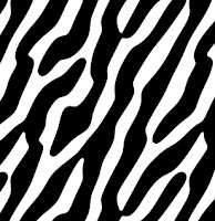
To the right you see an annealed texture. The annealing processes based on the technique of simulated annealing. In my interpretation of it, I employ two operations that work against each other iteratively to hone the look of a graphic.

In this case it the first operation is blur. This softens the image. The second operation is increase contrast. This hardens the edges of an image and creates a graphic print look.

As you iteratively apply annealing to an image, it is converted into a graphic representation of that same image, with clean, smooth, rounded black and white areas. With each iteration, the results get a bit smoother, and small features are eliminated also. Simulated annealing comes from metallurgy, where a bit of metal is heated and softened, and then cooled in increments to create different tensile strengths and even crystallization.

In image processing, I have borrowed the term and used it to create a similar process in which an image can be resolved into its most basic forms, and under the control of the user.

For instance, this lacunar image is opened in texture, adjusted 15% lighter, and then it is annealed five times using a small 1.82 pixel blur interleaved with a contrast increase with a slope of about 3.9. You see the five steps in the above example. Obviously, this drastically changes the character of the image.

Now, our task is to use several tricks to create the interesting texture you see at the top of this page (well, at least something a bit like it).

The trick comes from the Fourier transform. An image of spots may be filtered using the Fourier transform and using the spot-shaped filter on the left. This spot is elongated in the frequency domain, and, as I explained in Texture, Part 3, this makes the image spots (in the spatial domain) elongate in the perpendicular direction. Once this is done, the spots lengthen and merge and the result may be filtered with a notch filter to accentuate the spatial frequency that corresponds to the distance between the spots. This process can create stripes, but when you use speckle patterns to seed it, the stripes don't always line up and they create a cool irregular pattern, like the stripes on a zebra or a tiger.

Another technique, called reaction-diffusion, can also generate this kind of pattern.

Anyway, here is an image created using speckle-pattern synthesis and Fourier-domain filtering. The brain looks at this and sees patterns in sand dunes.

Actually, once, on the island of Fanø on the west coast of Jutland, I was driving on the large flat beach they have there. On that particular day, the wind direction and speed was in exactly the same direction and speed that I was driving. This made the patterns in the sand, which were pushed by the wind, become stationary relative to the car. Except that they were still evolving: annealed by the force of the wind, countered by the weight of the sand particles. Patterns soon formed and it was quite an experience, I have to say, to watch them twist and turn, evolving and convolving. The experience only lasted for a few minutes, and it has never occurred again, but I think it might still be made on a computer. I'll look into it.

So, after annealing this pattern, we get a graphic result that matches, but is still different. That's because the pattern does tend to evolve and simplify during the annealing steps.

It is an unusual effect, but I like it.

Though annealing is a metallurgical process, reaction-diffusion is a chemical process, and is readily simulated on a computer. We graphics guys are always looking for new cool-looking techniques to exploit!

And now I think I will exploit speckle patterns some more with some slice-and-dice patterns I made today.

Speckle patterns, like the one you see on the right, are like stippling patterns, but tiling inside the unit square so they can be repeated indefinitely. This works to my advantage, because Texture is used to create these tiling patterns. Like the paper textures in Painter.

In between the spots, you see the Voronoi tessellation. This partitions the tile into cellular areas. Inside each of these cells, we can place some bit of an image. When that image is the same for every cell, you get a very interesting effect.

I placed a bit of light and darkness into each of these cells, using an additive crossfade between each of the cells, and then I softened the result using a slight lowpass filter using the Fourier transform.

The texture I got was like a cellular bump texture, but shaded. You can see it to the left here. I get the shading by offsetting the light area to the lower left of each cell, leaving the darker area to the upper right of each cell.

Then I softened the result to make it appear very physically real and realizable.

Then I did something interesting. I created a speckle with about 150% of the spots, so each cell was smaller. This allowed me considerable play in which shaded portion to place in the cell, since I was using the above image as a source.

I ended up with the image you see to the right. This image is even more physically real, with shadows and catchlights on each cell. And because I used the z-buffer crossfade technique with a very large crossfade width, the edges of each cell are compressed into each other in a novel way, like the seeds on a sunflower.

This technique can make the lines that delineate each cell curved. It's all a function of the z-buffer compositing technique used in merging the cells.

This technique, using a previously sliced-and-diced image as the source for the next one is an iterative technique I used to get more and more complex textures. The trick is deciding which point in the source texture should be used inside all of the cells of the next. It really smacks of genetic programming. I say this because my eye becomes the agent of natural selection as the texture evolves from iteration to iteration.

Today, while making textures, I had a line pattern (which was wavy in one section) and I used that section to slice-and-dice into another texture, using z-buffering to merge the cells.

You can actually see where the fingers of texture interweave into each other on occasion. This is the value of z-buffering over the additive cell merging method: the texture looks more physically real.

Fortunately this technique scales. Here is an example with 5000 stones laid out in a paving stone pattern (or at least a nice pattern). See if you can find the repeat (it's only slightly larger than the amount I have shown).

I'm having way too much fun today!


Tuesday, February 7, 2012

Texture, Part 3

An incredible technique has resurfaced: slice-and-dice textures. This technique, responsible for many of Painter's remarkable paper texture patterns, is once again functional. In part 3, I will show it to you.

This technique can be used to create patterns of bumps, knits, interlocking detail, stone fields, and things I can't actually describe in words! Yes, the only way is to show them in all their intricate interweavings and convolutions.

In Texture, Part 1, I showed how a speckle pattern could be used to create a set of mutually-avoiding points that tile the plane.  Some call them stippling patterns, in fact the brilliant Adrian Secord worked on this independently to great effect ten years after Texture was written. These points automatically fool the eye into thinking there is no pattern to them; no rhyme or reason to their placement. They are similar in configuration to the ways that cells grow. Speckle patterns are a specialized form of tiling texture that uses anti-gravity iterations as a generator, loosely borrowed from the discipline of physics. The theory of the placement of the speckle points is related to the discipline of physiology.

The next step was to show how speckle patterns could create actual cell structure, where each cell was carefully delineated so that its edge could be accurately discerned and could also form the border to the neighboring cells. These are called Voronoi tessellations. You can see them in the diagram above. This comes from the discipline of computational geometry.

I also discussed spanning trees, the interconnection of speckle points to make interesting branching patterns. It is technique borrowed from the discipline of graph theory.

In Part 2, I discussed the usefulness of Fourier transforms for moving a texture into the frequency domain for the purpose of filtering it, or manipulating its attributes in new ways. This comes from the discipline of signal processing theory, and is akin to the kind of processing required to make radar and MRI scans work.

To the right you can see the frequency domain magnitude plot of the knit-structure texture that I create here. In the frequency domain, features near the center make up the large features of the image. A directionality to the texture corresponds to a directionality in the frequency domain, but rotated 90 degrees.

I suppose the best thing about creativity is taking something from one discipline and applying it to another discipline. Here, I have taken things from five disciplines and combined them artfully to make a really cool capability for creating new kinds of textures.

I specialize in synthesis.

Crossfades

The first tool I had to create was, for me, the capability to render into a Voronoi tessellation from another texture. And to do it so that the cell walls are invisible. This took some thought, and involves crossfades.

When trying to get non-tiling textures to mesh, one of the not-so-successful techniques is to create a rectangular crossfade.

This technique creates soft mask edges on the borders of an image, called crossfade regions. You can decide how big to make them based on the typical feature size in your image.

The crossfade regions are rectangles that line the border of your non-tiling texture. The first thing is to fade them back. This means multiplying them by tapering functions. These tapering functions are 1 on the insides of the tile, and 0 at the edges.

Then, take the right crossfade region, and add it into the left crossfade region. This is like applying a soft mask. This assures that the right edge of the tile will mesh with the left edge.

Similarly, take the bottom crossfade region and add it into the top crossfade region.

Note: if you use a linear or a smoothstep tapering function, the general levels of the texture are preserved. The actual preservation of the levels is accomplished by any tapering function opacity = f(x) such that f(x) + f(1-x) = 1.

Once you have moved the crossfade regions over, you must them trim the texture down so it doesn't include the right and bottom crossfade regions. And your texture now tiles seamlessly.

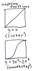
By the way, tapering functions are an interesting subject in themselves. The two most commonly-used tapering functions are shown to the right here. I have mentioned,= linear, which is self-descriptive, and is defined by y = x. This means that the opacity varies linearly across the crossfade region. This may be applied in one of four orientations, of course, depending upon which edge is faded.

The second most commonly-used tapering function is the smoothstep function. It is defined as shown by a simple cubic function. This one has the advantage of having a zero slope at either end of the taper, and so is less visible.

A linear function can leave a visible mach band at each end of the taper. Note also that, at the corners where the tapering functions overlap, we usually just multiply them. This makes trouble for the linear tapering function, though. So sometimes the tapering functions are combined using other means at the overlap.

OK, so now we understand rectangular crossfades. If it's so good, then why don't I use it? Because it's not good, that's why! There are several big drawbacks of this technique. Here are the worst three:

  • eyes can see rectangular repeats very easily.
  • features don't line up usually.
  • the crossfaded region has a smoother texture than the rest of the pattern.

As an example, consider this captured grain, produced by scanning rough watercolor paper. If you look closely, you can see the horizontal and vertical flaws in the texture near the top, bottom, left, and right edges.

Features do not line up at the flaw edges of the texture, and this is the primary reason we can even see the flaw. Remember, if we use the texture as a paper grain in Painter, that the flaw will be magnified and made even more visible since the paper grain is quite visible in the brush stroke. Once we apply a crossfade to this texture, we should get a clean meshing of edges. At least, there should not be any visible horizontal and vertical edges.

But, after applying a 32-pixel crossfade, which should be large enough to prevent the unnecessary clipping of a 16-20 pixel feature, we can see (below the original) that there is a texture difference at the seams.

What we see is that the texture is not as contrasty. And the structure of the texture appears to be different at the seams, perhaps smoother.

Such seams are made even more visible because of the rectangular repeat of the tile.

To combat this, we need to examine the actual instruments we use to judge the texture: our eyes.

The photoreceptor cells in the back of our eyes are arranged in a pattern that avoids obvious patterns. If we arrange cells of a texture in a similar way, the repeating pattern may be hidden.

So, conceptually, we replace the rectangular tile with tiles of various cellular shapes: we use the Voronoi tessellation to define the crossfaded cells, and the cells are in turn based on the speckle pattern which defies regularity so well.

Voronoi Tessellation Crossfade Mask Sets

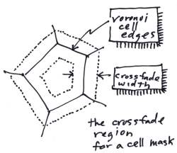
First, a mask for each cell of the Voronoi tessellation is constructed. One such cell is seen at right, conceptually. The cell is pentagonal in nature in this case, and a crossfade region is associated with the cell. This crossfade region is bounded by a dotted line, and has a constant width around the perimeter of the cell.

The region straddles the edge of the cell, and intrudes into the neighboring cells by the half-width. Each neighboring cell has a corresponding crossfade region, that overlaps with this one. Because the crossfade regions straddle the edge of the cell, a cell's crossfade region actually dovetails with the neighboring cells' crossfade regions.

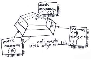
You can also imagine the cell mask as a three-dimensional surface, where the mask's maximum opacity value is 1 at the center of the cell (within the inside edges of the crossfade region) and zero at the outside edges of the crossfade region. The value of the cell mask is exactly 1/2 at the cell edges.

I create edge functions at each edge that are defined to be 1 at the inner edge and 0 at the outer edge. These functions are clamped to never go beyond the range [0...1]. Then I simply take the minimum value over all the edge functions for all edges of the cell.

But there is one more thing to do to make the cell masks correct: they must be normalized.

Our objective is to simply add up all the masks to produce a clean value of 1 for every pixel of the image. This should work perfectly within the cells, and also along the edges. This is because I have arranged for the edges to be a tapering function. But at the corners where three cells meet, these values will not sum to 1.

So we normalize the arrangement, and this assures us that the entire set of cell masks over the entire tessellation will add up to 1 at every pixel.

Assembling a New Texture Using the Crossfade Mask Set

This part is easy. For each cell, choose a swatch from the source texture, mask it by the cell mask, and add all the masked swatches, within each cell, into the new texture. This produces the new texture.

But wait, there's more.

A straight addition produces a particular look. To get other looks, I decided on using a z-buffer approach. Here the swatch of source texture is multiplied by the mask (as in the additive approach) but instead of adding in each mask, we take the maximum value at the pixel of all the masked swatch pixels that land on the pixel. This actually can have the effect of changing the apparent edge of the cell.

To right is one such created texture. For this one, I chose an 80-point speckle and a 20-pixel crossfade. I used z-buffering to merge the cells, and this shows the effect of edge straddle on the result: the softness actually provides the zone of wiggle-room for the apparent edge of the cell.

The source texture is a highly softened result filtered by the FFT using a small 20-pixel ring.

If we use a shorter crossfade, and a slightly offset bright spot for the source swatch, we get this result. This shows the effect of not using edge straddle for z-buffering. In this technique, the mask edge stays 1 to the edge of the cell, and then falls off to zero in a mere half-width. It is this technique that works best for z-buffering.

It might not be apparent, but this is the same 80-point speckle that was used for the last example, but with a different crossfade and also a different edge function.

This result looks like bubbles on a surface and this is a result of using the same source swatch in every cell.

We can also use a different source swatch for each cell, as an option. This is more along the line of actual slice-and-dice, since it's really more of a jumble. But remember, with a random choice it's possible to choose the same swatch twice.

This shows the effect of random swatch choice and placement within the same 80-point speckle with a 20-pixel crossfade. Some glimmers of the same source texture swatch can be seen.

In this example, the additive technique was used for combining the cells, with edge straddle.

This method is useful for creating messy rock field textures and other strewn results.

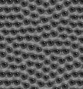
Of course, the ultimate kind of slice and dice work comes from using a recognizable image as the source swatch and making sure it gets used for all cells. Such an example is shows at the end: an eye, complete with iris, pupil, and specular shine. And, of course, a bit of eyelid!

There's nothing that say texture can't work in color, but for now it is a grayscale application designed for the production of paper textures and grains.

The beauty of texture is that I'm only about 50% finished resurrecting it. It used to have movie capabilities as well, that helped me see what was happening when I changed a control over a given range.

Watching Fourier phase change in an image is endlessly fascinating.

The next part of the Texture series will complete the investigation into crossfade sets and show how you can use this technique to create cross-hatchings.

Then, we will concentrate on the more typical image processing operations that help us do things like anneal the image: operating directly on a texture.

Here's looking at you!


Sunday, February 5, 2012

Texture, Part 2

The Texture application was a secret application I created at Fractal Design for creating paper textures and for testing out new technologies. But it fell into disrepair, and so it hasn't worked since 1996. But I have been resurrecting it under Mac OS X, and it is just now starting to come back to life. In part 1, I explained what speckles are. They are a basic area of technology used by Texture. Here in part 2, I will give you an overview of another area: FFTs.

The Spatial and Frequency Domains

For instance, the FFT window has a section for the spatial domain and another section for the frequency domain. The spatial domain is the one in which we can open and save textures. The frequency domain is used for applying sophisticated filters and other operations to.

You can apply filters to the frequency domain, and see the filtered result in the spatial domain in real time.

But, you may be asking yourself, what is an FFT? An FFT is a Fast Fourier Transform: a fast way of transforming spatially-varying information into its frequency-domain equivalent and back again.
Above you see a diagram of the process. Texture information is imported into the spatial domain. A forwards transform converts that data (using an FFT) into frequency data in the frequency domain. Also, a backwards transform converts the frequency domain data back to the spatial domain (also using an FFT). In the window above, you see the True-Lizard texture and its frequency-domain representation.

The frequency domain is organized so that the center of the square has the bias of the data (you can think of that as the average of all the pixels into just one gray level). Around it are a small number of pixels corresponding to the biggest wavelengths. The farther you go out from the center, the smaller the wavelength of the corresponding spatial data. It's kind of like an inside-out representation of the texture.

Operating in the frequency domain has several advantages. You can easily filter the data to create different versions of it that are constrained to a limited number of wavelengths.

Another basic advantage of the FFT in particular is that it works really well with wrap-around data. It's just made to work with tiling textures. All of the outputs of the FFT are tiling textures by definition! And, generally, they are powers of two in length, so most of the textures you see here are 256 x 256. But you can easily construct 512 x 512 and 1024 x 1024 textures, and larger. Well, there are some constraints, but these properties do make FFTs ideal for processing wrap-around tiling textures.

So, how do you filter in the frequency domain? Convolution is the best way. And that works by multiplying in the frequency domain. You can multiply two frequency domain FFTs to convolve their textures. Or you can just multiply by a spot function.

Here is the spot function window. You can define the size, hole size, the softness of the edge, and you can even define spots that are elongated and at different angles.

In this case, I have dialed up a small spot, and in the frequency domain section, I have checked Filtered and so when I adjust the spot, I can see the spatial domain image change in real time.

This is particularly cool, and this also means that I can turn the lizard texture into a leopard-skin texture with just a slider-move.

You see that the texture closely resembles the original. The spot with a hole in it makes a bandpass filter that limits the spatial frequencies of the texture, but totally preserves its wrap-around quality.

Another thing that works easily in the frequency domain is the creation of fractals. In fact, I have a Make Fractal button in the frequency section.

In the frequency domain this means creating a 1/f frequency spectrum, and randomizing the phase. You can also use the Make button in the spatial domain section to make a spot and then randomize its phase in the frequency domain section.

Either way, this creates a perfect wrap-around fractal, which you see here. To get different fractals, just randomize its phase. Filter a fractal, and you can limit its spatial frequencies. This means you can make it appear to be composed of several smaller clouds instead of one large cloud.

Here is the result of filtering it using a highpass filter (where the inside of the spot is black and the outside of the spot is all white to the edge).

The remarkable thing is that it's the same fractal. You can see some of the features are still in the filtered result. Really the only difference is that the slowest-varying features are removed from the fractal.

Now that's cool!

The neat thing about fractals is that they also can make excellent paper grains.

When I filter this same fractal using a highpass filter so that only the smallest features get through, I end up with a pretty good paper texture just like that.

So, you can see how I can create a large number of paper textures with grains of arbitrary size and softness from one pattern. And remember, all I have to do is randomize the phase in the frequency domain, and I have another one just as good as the previous one, but with entirely different features.

I was quite clever in the Fractal Design days, but it appears that I am actually much more clever now because I have considerably more knowledge of the frequency domain. You see, it all makes much more sense to me now than it did then.

For instance, now I have arranged it so I can adjust a slider to change the filter and thus the look of the texture in real time. I couldn't do that before.

So part of the fun is that I am using Cocoa on Mac OS X to make the UI work. And it's much faster to write that now. And part of it is that computers are a bit faster than they used to be. Maybe about 100 times faster, and with multiple cores too. And GPUs to get things to run really fast. That's what I do for a living now.

Which is why Texture is coming up to speed at an amazing pace, considering how long it has been since it worked.

Anyway, back to the frequency domain.

So, I cal also construct a lowpass filter. By making a spot that's white on the inside and black on the outside, and using that to filter he frequency domain. This allows me to create softer versions of something. Which can be quite useful.

For instance, I can load an existing texture, thick-knit. This texture was made using an interesting technology for one of the future parts of the Texture posts. That technology was called slice-and-dice, although it was based on crossfades made of Voronoi cells on a tile.

It made for quite complex programming, but it produced some of the more interesting textures I produced.

This texture has a lot of tiny details, and if I apply a subtle lowpass filter to the details, I get a slightly different result. Because I can change the edge softness of the spot, I can also control how hard or soft the lowpass filter's edge is. This is extremely useful in achieving specific visual looks.

In this case, a very natural blur is imparted. But with none of the ringiness of a Gaussian blur.

Real or Imaginary?

The FFT operates on complex-valued data. This means that each pixel consists of two floating-point numbers: the real part and the imaginary part. Each complex number is of the form:

a + bi

where i represents the square root of -1. That's how I can alter the phase of the information independently. When I say that the phase is randomized, I mean that, in the frequency domain, I have to convert the complex number (a,b) into a polar coordinates (R, theta), put a random value into the phase angle theta, and finally convert it back to Cartesian coordinates.

When I'm all done with the operation, and I've transformed it back to the spatial domain, then the real value becomes the texture value.

So, when I randomize the phase of the low passed thick-knit pattern, I get the texture you see to the right. It's kind of like a shag carpet. But some of the features, like the tilt of the texture come through. This is called anisotropic texture, which means that it favors some angles. Like the original think-knit texture.

Texture Synthesis From Geometry

In Part 1, I showed how speckles can be used to create cellular patterns called Voronoi tesselations, tree-like patterns called spanning trees, and now I have mentioned crossfade sets.

Here is a diagram for how these work together with textures to create even more textures.


In the next part, I will show how crossfade sets can generate the most interesting patterns by reference through the cellular arrangements derived from speckles.

Wednesday, February 1, 2012

Where Do Ideas Come From?

Sometimes I have too many ideas. The problem becomes: which ideas might pan out, and how do they interrelate? But for most, it's more a question of: where do ideas come from? Let's talk about the various places.

Spontaneous Head Combustion

Sometimes an idea just pops into your head. I think this is because brains are always processing in the background. I had a calculus teacher in high school, Mr. Pearson, who said that the solution to a particular differential equation he had been working on would sometimes come to him while shaving.

Though that was a fairly nerdy thing to say, he wasn't far off my point.

The process of spontaneous idea generation is related to why we dream: the brain always wants to exercise in periods of disuse. When shaving or driving, your brain is not fully engaged. This means there are cycles that can be put to use. We will return to this later. But some people dream in ways that are connected to stuff they are working on. During my most productive periods when I get a cool idea and then rush to implement it (especially a very complex one that will probably take several days of constant work) I am told that I sometimes talk in my sleep: I'm mumbling variables and data structures. This definitely happened to me when I was working on Mosaics in Painter.

Hmm. Maybe I work too much!

But a simple way to use this is to think about a problem before you go to sleep, and your mind may come up with a solution while you sleep. In fact, I used to listen to music in my head right when I was going to sleep. I liked to listen to Beethoven's 9th Symphony in this state. Not really listening, per se. Actually just hearing it in my mind, every note and phrase. It was great practice for musical composition.

Sketch It Up

I like to sketch things out, and get ideas that way too. I guess it's because I'm a visual person. But, for me, lots of graphical ideas work themselves out on paper. A doodle can quickly become something larger.

I was working on borders and corners one day when I realized, as many people have, that you could represent the corners as four image pieces and the edges as another four image pieces. And the edges could be stretched or repeated. So I drew one of my favorite things, and I have reproduced it at left. I suppose it's a good example of three-dimensional thinking.

I draw in guide lines that showed the corner pieces and the edge pieces succinctly. Then I realized that these corners and edges could be filled with pretty much any image.

So i drew cylinders with pipes interconnecting them, like you see at right here. I realized that even shadows could be part of these clipped images. Note: this 3 x 3 partitioning is used to create buttons and other UI elements, also. In fact, that was what I was using it for at the time.

But I didn't want the UI to be constrained to be a rectangle. No matter! These pieces will still work, as long as all the corners are squarish. For instance:

At right, I have shown something that can be made out of the usual eight pieces, just rearranged in a different fashion from the typical arrangement I have shown so far.

This goes to show that it doesn't matter how you design it. If you take a little care, that design can service a much larger class of objects.

This design really hinged on two things: the corners and the edges. So I concentrated on the corners. What could the corner possibly be? A number of three-dimensional things popped into my head, and I sketched them up.

Here are a number of possibilities that occurred to me, drawn as corners. To left: a gabled approach that exhibits shading and has pyramidal corners. To right: that same approach, but with different edges. The edges can have their own articulations as well.  There are plenty of three-dimensional things that can grace the corner of a design.

Here, I explore the use of cubes and balls. To right I considered using a stake at each corner and a taut piece of rope in between. And knots on the rope in between the corners.

Of course, there are a number of articulations on the edge that can be used in addition to knots and spikes. Really, any repeating line pattern can be employed along the edge.
Here are some line patterns: wavy lines, beads, and twisted rope. Of course braids and yarn motifs are useful as well. But plain patterns, like stripes and diagonal "candy" stripes are also useful.


Exercising Your Brain

When I am otherwise not mentally engaged, I use that time for practice. Sometimes I do something tedious like factoring five-digit numbers in my head. You know, I like prime numbers. For instance, today I passed a house on San Jose-Soquel Road that had a number of 24,769. (I look on the right side as I'm driving home and there are often odd numbers like this one, which means they won't be divisible by 2.) I'll cut to the chase and tell you that it's 17 x 31 x 47. It took me about 4 minutes to determine that, performing long division in my head. Then, when I got home, I checked it using Siri.

It may be tedious, but it does help to keep my brain sharp when it comes to numbers. Another activity I do while driving is writing songs. I compose the melody and lyrics simultaneously. When I get an idea, I record it into Voice Notes, an iPhone app. I will go over the lyrics a few times and record a verse or a refrain.

This process keeps my creativity working while I would otherwise be bored. Exercising the right side of my brain. I used to turn on the radio while driving. I don't do that any more. I let my mind fill the silence.

I also got a great idea for a novel while driving. So I used Voice Notes to get it all down.

And, by the way, it might be a good idea to pull over, if you get too involved in an idea while driving!

Know Your Subject?

When I am wracking my brain for ideas on a particular thing, I can easily come to a standstill. It is at moments such as this that I take a step back. Specifically, this is called meta-level thinking. This process can actually be impeded by knowing too much about a subject. You can get into the mindset of thinking that it's all been said and done.

When writing a novel, it can be as simple as taking a step back and considering a character's arc. When writing music, this can manifest itself as rearranging the structure. Or adding in a full break or another device that so often makes songs interesting to our ears.

The Beatles practiced this. In We Can Work It Out, for instance, there is a section that breaks into triplets in an otherwise foursquare piece. On the back side of Abbey Road, they ran all the songs together into a single homogenous piece, a structural device.  In Getting Better, one of the verses becomes one long melody instead of several broken up melodies. On All You Need Is Love, the verses contain an extra half-measure per phrase, which helps to offset the otherwise foursquare melody (the Beatles called it the Dirge), the device of changing the time signature.  Or just having two authors can create a cognitive dissonance that can make a piece remarkable. On I've Got A Feeling, arguably the last composition that Lennon and McCartney wrote together (unless you consider the back side of Abbey Road to be a single piece), their contributions are quite different, and improve the song immeasurably. It goes on and on.

When programming, it helps to look at the problem in a different way. This can be a meta-level approach when you look at multiple ways of solving the problem, or you find a way to combine what would otherwise be different methods. This is particularly good when there is something you are missing.

Sometimes it's just a matter of employing multiple modes of thought at the same time.

Ideas Travel In Groups

When finding another person that is likewise creative, it is often possible to have a huge idea session. This has happened to me countless times with various people, including Tom Hedges and John Derry, the co-authors of early Painter.

A single session can generate hundreds of good ideas, I have found. When you get onto an interesting or fruitful subject, the result can be a veritable treasure trove of ideas.

This may be the Lennon and McCartney effect: the influence of two brains on creation is synergistically better than if the two created separately.

I have experienced this effect with John Derry on several occasions. Together we thought up Painter's image hose, for instance.

Combining Expertise

When you become an expert on one subject, it can help to give you the ability to solve problems in that subject. But is thorough research a ticket to stagnation?

I have found that it helps to be an expert on several subjects and then to combine the knowledge between the subjects. I'm a pretty good programmer, for instance, and I know how to draw. Combining them produced Painter.

Anyway, it's hard to ignore the profound influence of general thinking: knowing a reasonable amount about several subjects and thinking about how they relate.

Grist For the Mill

I'm not sure why it is, but I am equally sure that this is true: when we have emotional experiences, we are driven to create. This is typified by Lord Byron clutching his forehead at the top of the stair: the tortured artist. Or by Michelangelo undergoing great pains to complete the Sistene Chapel's frescoes: the agony and the ecstasy. Is it a cliché that only through pain can we create?

No, I don't think that it is. After hitting a patch of black ice and crashing my car in Denmark on the night of December 28, 1995, I sat down and wrote 7 really good poems. Sure, I write song lyrics, but poems? I was in a rare mood that evening after some wonderful "Good Samaritan" Danes stopped to pick me up and kindly delivered me to my Hotel in Copenhagen. Note that this near-death experience is not chronicled in my post Handling Serious Events. It seems I have more than my share of such events.

But, seriously, how many love songs are there? How many my baby done left me songs are there? I tell you: there's something to this theory of emotional distress and creativity. It's grist for the mill.