Friday, February 17, 2012

The Fractal Design Formula

There was a formula for creating great software at Fractal Design, where we created Painter. And it was built into our every employee. As friends, we shared the load. We all had our specializations. We collaborated. We argued, and forgave. We had a band, and performed sometimes at company summer parties. Like a family, we watched each other get married, have kids, go through tough times, and we cared.

Our products tended to sell themselves because they served a real purpose: to enable artists to do more. We captured the nuance of human expression and faithfully reproduced it, allowing the artists' style to come through.

And Painter, now advanced by Corel, still does that wonderfully.

John Derry
To build our products, we had the gang of 3: Tom Hedges, John Derry, and myself. We always worked in the same room. So our offices tended to be a bit strange. We might have been the nexus of development, but there were many others who put their hearts to the task. We had a formidable QA department headed by Michael Cinque, who came to us from Letraset; he worked with ColorStudio in the early days, Tom recruited him, and he came out west to join the Fractal team. QA people like Steve Rathmann, Stanley Veale, Steve Yatson, Joe Grover, Adam Croston, and others helped us perfect our products.

The gang of 3 were patiently overseen by our admins a: Kim Hinrichsen (now Kim Kern) and later Karen Carpenter (now Karen Cooper).

Our engineering always made me proud. Priscilla Shih (now Priscilla Cinque), Shelby Moore, Bob Lansdon, Glenn Reid, Christy Hall (now Christy Brandt), Vahe Avedissian, Scott Cooper, Matthew Kaufman, Qaren Van Brink, and Erik Johnson worked on the Painter family of products. In 1996, Fractal Design merged with Ray Dream, and this brought with it a fantastic staff of engineers like Pierre Berkaloff (who ran our combined R&D), Pascal Belloncle, Nicholas Barry, Emil Valkov, Damien Saint Macary, and Alexandre Clappier. Ian Sullivan was a framework guy, and I totally respected his work. He always kept up with demand and that couldn't have been easy! The Ray Dream engineers helped our engineering move forwards because their systems work clearly matched our own in sophistication. Larry Weinberg, the Poser author, was clearly in a class by himself. It put a totally new aspect to human expression into our products. Seath Ahrens became part of the Poser team in the late 90s.

Tom Hedges
Tom Hedges was always a great engineer. Between Tom and me, we had several advantages. His systems work got us so far, with innovations like tiled virtual image memory, plug-in capabilities, and scanner drivers. There wasn't a problem that Tom couldn't figure out.

Tom was the consummate finisher and polisher. He was the best debugger I have ever met, a true genius. And honesty was his policy always.

Sometimes Tom and I would get into an argument over how to do something, and we could really yell! But we always worked it out the next day. It was worrisome to the others at Fractal, but eventually they came to know it as "our way".

We had great customer support, too. Bud Daumen, Laurie Hemnes (now Laurie Becker), Karena Vance, and Andrea Godkin (now Andrea Reid) were very hard workers. And our products definitely needed support!

Our manuals were the best in the business and were prime examples of quality work. They were, almost without exception, full color and featured the work of many talented artists. The early manuals were designed by Steve Manousos and written by Karen Sperling. They certainly set the standard for graphics manuals in the early days of color Macintosh and Windows applications. But the floridly illustrated and well-organized Painter 3, 4, 5, and 6 manuals were designed, organized, and edited by Mary Mathis-Meltzer (now Mary Zimmer), who we affectionately called M3. Mary also managed a crew of writers and designers using these years, a herculean task to say the least. All supported by our IT guy, Tom Tilmant. The artwork for the manuals came from a stable of artists managed partly by Mary and partly by our PR person, Daryl Wise. On-staff artists and designers like Rich O'Reilly, Arena Reed, Brent Houston, Aaron Begley, and Brian Moose kept our looks fresh. And Rafael Rodriguez coordinated quite a bit as a Project Manager. By the way, Daryl was also responsible for all the large Fractal Design events, such as the Winter of Love concerts we held at the Fillmore during January MacWorld shows in the 90s. This was because he actually once worked with Bill Graham Presents.

Later, after the Meta merger, Sallie Olmstead ran our PR.

Like I said, we all had our specializations. And each of us did the work of many people.

Our sales and marketing team was also quite talented, and they were quite active. Steve Manousos managed sales at Fractal and Fred Brown managed sales quite a bit later when we were MetaCreations. Working for Steve, we had Karen Bria, Mike Popolo, Jennifer Andrew, Cori Garnero (now Cori Tuck), Dawn Hannah (now Dawn Bercow), and Katherine Howard (now Katherine Kehl). And Tad Shelby, who was quite capable, sometimes had issues with his bright red hair in Japan. Today he has shaved it all off, and I like the look!

Our international team was more often than not supported by those people who, without their constant help, we would have been utterly lost. I'm thinking of Gilles Lyonnet and Claude Swimer in France. Their endless enthusiasm, effort, and help will always be appreciated. And french artists Jean-Luc Touillon and Sibertin-Blanc Pascal seemed to keep support flowing.

As Fractal got larger, we recruited talent like our well-qualified and diligent CFO, Les Wright and our product managers Steve Guttman, Jon Bass, Lora Williams, Sandra Knox (now Sandra Heuckroth), Steve Cooper (the Poser product manager), and the impressive John Leddy. Our product managers were talented, organized, and they also put up with a lot from the engineers. Our operations guy, John Hartnett is one of the most professional people I have ever met. I'm sure he still is! And it seems I was constantly impressed by Cian Hughes. Our irish operations team were always top notch, period!

Down south in Hollywood, we had Dan DiPaola, who ran the office there and managed our representation with the studios and power service bureaus that make up the industries. He was famous for having the most powerful machines on the block. He introduced John and I to more artistic talent than I probably deserved. Like Dan Clark (who is responsible for many movie posters), Lee Varis, and so many others. Other friends like Tony Redhead at Electric Paint kept us in the know and made us aware of what it really took to create high-quality artwork for the studios.

While we thought that the Ray Dream merger was quite a complex and turbulent task, it actually went swimmingly. This was in comparison to the merger with MetaTools, when MetaCreations was born.

But from MetaTools came another set of talented engineers and product managers. Engineers like Ben Weiss (the smartest guy I know), Sree Kotay, Michael Herf, Ales Holecek, Moe Doucet, Javier Roca, and Scott Fegette. And designers like Kai Gradert and Phil Clevenger, whose command of UI is legendary now at Adobe. And, of course the wildly creative Kai Krause. Responsible for epic products like KPT, Kai's Power Goo, and Bryce, they really set a very high quality bar for their software. They always wanted the experience of using their software to be the greatest of all. And they succeeded.

For Painter 5, our theme A Monument to Creativity led me to construct Mount Brushmore for the Painter poster. Here you see Tom Hedges, John Derry, Kai Krause, and myself carved out of the stone of a mountain.

OK it was kind of corny! But we did have fun in those days. In a future post, I'll tell you more about how this piece was constructed.

MetaTools had an office in Princeton that did work that was destined to be a web-centric way of communicating images and 3D data. At some point, the Meta board of directors decided that the web was the future and then they wanted to sell off the software. I was recruited once more as CEO to do that. And that was that for our packaged software business.

I guess I will always look fondly upon the Fractal Design and MetaCreations years as some of the most creative years of my life. And I will always be proud of the formula that made it all work: the people.

I can't really remember all the people that worked at our company, but, when I do, I'll probably add them to this post. It was a unique place and time

Thursday, February 16, 2012

Writing Songs

Creativity serves us well, as a source of ideas. Sometimes it comes from the cross-pollenation of ideas between disciplines. Sometimes it seemingly comes from the blue when our minds work when we are asleep or when we are idle, mentally. And sometimes creativity is a visceral thing, springing forth from situations of trauma or intense joy, as our souls try to heal themselves or simply work to process what they have gone through.

This last source is so often the one that makes us sing.

When I get overwhelmed or troubled, I usually turn to the piano to work out my angst. And heaven help me if I don't have something to record it. I have captured these improvisations from time to time, and some days there are two or three.

I like to write songs, because I'm somebody who feels things. They are a great outlet. You can find some of my songs on Soundcloud. Check out Not Enough Time for instance.

Starting Songs

How do I write songs? I start three ways. The first way, I have something to say. If it needs to get out, melody and words will occur to me simultaneously. The second way, I think up a melody and I then need to put words to it. The third way, I write a song instrumentally, and I record it and play it back, writing words and framing phrases as I sing to it. But these three methods are only how it all starts.

Once it's started, then it needs to be completed.

Songs are typically made up of sections. You probably know these: verse, refrain, bridge, intro, outro, hook, etc.

Verse

Verses are the body of the song, where most of the matter of a song occurs. But what's in a verse?

A song can tell a story. Then the verses do the telling, scene by scene. A good example of this is Rocky Raccoon, by the Beatles. No doubt that's what is going on in that song!

A verse can tell a point of view; a later verse can alter that point of view. One verse can have my point of view, and the second can have your point of view. A third verse can apply to a group.

Verses can be similar in form and structure. For instance, Joni Mitchell's Clouds has three verses with similar structure. The first is about clouds, the second is about life, the third is about love. This is a common pattern, because, as listeners, we want to see where the songwriter is going with it. The similarity forms a comfort zone, a familiarity that helps us absorb each verse. Also, a principle of songwriting is: if you repeat something, do something different with it. So, for instance, you might bring in the drums and the bass on the second verse, for example. This is called buildup.

Sometimes having a similar structure can simply mean repeating the same words at the beginning of the verse (like Dear Prudence).

There is plenty of creativity in verses.

Verse patterns can also be interesting. Countless songs have two verses of vocals and the third verse is taken up by the solo. Then, the fourth verse often returns to vocals.

Refrain

Usually a hit song will have a refrain, or chorus. A refrain is most commonly a headline phrase, like Here Comes the Sun. A songwriter will save the most catchy melody or chord change for the refrain. It is generally the most memorable part of the song, and this is by design.

Sometimes the refrain is a round, or a four or eight bar phrase that gets repeated. Think Hey Jude. Even when the refrain is not a round, it can get repeated, so be prepared to rework the end of the refrain for the purpose of dovetailing with the beginning of the next repeat.

Usually you won't repeat the refrain the first time you introduce it. Repeats of the refrain are simply more common at the end of the song, because you want to leave the listener with the best and most catchy part in their mind when the song is done.

Bridge

The bridge, or middle eight, can link the verse to the refrain, or just be a nice contrast with the repetitive nature of the song. Sometimes the bridge is the jewel of the song. In my song Tagman, the bridge is a flash of virtuosity.

Often, in the bridge, I modulate to another key, for instance the relative minor. Then the trick is to modulate back into the main key of the song.

I like the texture of the bridge to be different from the rest of the song. This can mean a different rhythm (say, triplets), a more edgy drum beat, or even a totally different treatment like a classical version or a blues version.

Intro

The intro of the song is the part that gets the listener's attention. This is usually something novel. In Wish U Were Here, Pink Floyd begins their song with an AM radio-compressed guitar solo that another guitar, seemingly more live, begins to jam with. Now that's novel.

Some songs don't have an intro, like Ruby Tuesday, by the Rolling Stones. It just begins with the first verse directly. Other songs use the hook as their intro, which is quite common. Think Day Tripper, Satisfaction, and I Want To Tell You.

One particularly useful kind of intro is the rhythm intro, where the drums begin the rhythm of the song and it gets amplified with each repeat. Here, songs like Steve Winwood's Higher Love and Rob Thomas' Her Diamonds are good examples.

Some songs have two intros, like Queen's Somebody To Love. You get an a cappella section followed by a short piano intro.

Outro

Many songs use a modified intro as their outro. This provides a sense of closure, and is often poetic.

I think an outro is essential, because I tire of songs that just repeat a round at the end. Well, Hey Jude did it and others followed ad nauseam. But it seems like the sign of a song that isn't finished, when it just fades out at the end. But even epic, classic songs like Procol Harum's Whiter Shade of Pale do this.

The traditional musical term for outro is actually coda.

Hook

A hook is a riff that catches the ear directly because it has a novel rhythm and melody. Rock music is so full of good hooks. The opening bars of Tom Petty's Mary Jane's Last Dance certainly suffice as a simple example: a guitar riff that helps to build the rhythm of the song while catching the ear. The Beatles' Day Tripper also has the quintessential prime example.

But a hook must be integral with the song. If it is stand-alone then the song can seem manufactured, or formula.

I traditional music, the hook is often called the motiv.

An Example

Here I will take apart one of my songs. It's a bit like the reverse of what I did to put it together, and it's also a bit like how I put it together in the first place. But you can take apart any song, really. I think it makes me a little odd: instead of listening to a song in an unbiased way, I take it apart. "Oh, listen to that bridge!" "Wow - third verse a cappella, very interesting!" That sort of stuff. I probably drive people crazy with this.

The song Not Enough Time shows I have some organization when I write my songs. To the right you see page 1 of the lyric sheet. These were not just written the way you see them here. They were changed, listened to, endlessly edited, tried out, and rearranged.

First, I usually just get a verse idea in my head. Then it's just a problem of making sure its a good lead-in verse. For this one, the really big problem was getting the second two lines of the first verse right.

Then one day, it just occurred to me that dictionary could be pronounced the British way, and it all fit together. I was trying to get the cadence of accents of the syllables to fit into my meter.

One day, probably a year after I wrote the basic verse melody (which also fits the round) I figured out a nice bridge format. Then I sat down at the piano and put some chords down. Pretty soon I could play it reasonably well. This is the first step in becoming comfortable with a new section in a song.

The second lyric sheet has very few lyrics, but it highlights another problem with Not Enough Time.

How do you end a piece?

I referenced a concept before called an outro, which is a modern term for coda, the end of a composition. At the end there might be some kind of definitive statement. The Beatles used to sometimes end their songs on an unusual chord, like the fourth of the scale. This is used to great effect in And Your Bird Can Sing.

Interspersed in the lyrics is a reference to a round. This serves as the refrain in this piece.

You see, the more I played with the verse, the more I wanted to sculpt it into a 4-chord round.

Modern commercials are the home of the 4-chord round these days. And it does kind of make me a little ill. In the case of this song, it took probably three years before I had it right enough to produce.

Here you see the score sheet for the round. The piano part is very foursquare. That's to contrast with the rest of it, which tends to be syncopated.

Vocals 1 to 3 are harmony vocals that define the chord structure of the round: D - A - Gadd2 - A.

The 3 flutes are additional orchestration that adds color to the round.

The bass is highly idiosyncratic and natural. It bounces at first and then proceeds in small scales. Note that the bass has a different ending for the second repeat of the round.

The drums add a fast beat to the round, giving it energy. The kick and snare are flammed: in other words doubled.

The other two vocals actually wrap around the round, stretching into the next repeat. This is a nice trick if you can carry it off, and it makes the round seem much more natural.

Here we have the structure of the song. I always write a structure sheet out so I can remember the chords. If you forget the chords, all is lost!

Also notice the exact timing of the song is given, in mm (stands for Maelzel Metronome) and it is the number of beats per minute. In this case, it is the number of quarter notes per minute.

Here I give the round as D - A - G - A twice in a row. This also serves as the chord sequence of the verse. Except that the back end of the verse has a quite different set of chords.

The bridge is notable, with a chromatic bassline in the tail end.

The secret chords of the coda are revealed here, and they are quite a parallel harmony indeed.

For the back end of the verse, I did some harmonization using multi tracked vocals. This required some planning beforehand, to get the chords right, particularly when the G is compressed into a G2 chord, since the third of the scale (B) becomes replaced with the second (A) in the chord.
Here you can see that I did three vocals. My trick is to double-track each of the backing vocals to give a bit of chorusing to the sound. It makes the backing vocal fatter and slightly more ethereal.

Other vocals were multi tracked, and required a bit of preparation as well.

When you look at the structure, you see that the round serves as the intro, and the second round backs up the solo.

If you listen to the song, you might notice the backwards guitar solo in the second round, just before verse 3. I reversed the entire section, recorded three solos to it, and chose the one that sounded the best when I re-reversed the section (with the solos) back to forwards.

It is a bit disorienting to listen and practice to music that has been reversed. You should try it sometime. It really has a spooky feel to it.

This serves to show a bit about how I write songs. Most of it is hard work and meticulous planning. And the real ideas come after quite a while of letting the piece percolate into you brain.

I have a confession: this song is not typical. Most songs I can crank out in a couple of days. But songs always sound better when you sit back and listen to them after leaving them alone for a while. And new ideas are easier to come up with too.

When I write songs now, I usually start by singing them into an iPhone while driving. I use VoiceNotes for this, because it is simple and very handy for capturing ideas. Then, when I get home, and I have a moment of relative silence, I create a piano backing for the song. This I record using an iPad or some other handy tool, just so I can comp up the song in GarageBand. Quick and dirty.

I have used tools like ProTools in the past, for multitracking. I find that modern hardware has more than enough horsepower to do the same task without expensive outboard DSP cards.

I do love living in the future.

Sunday, February 12, 2012

The Miracle of the Paint Can

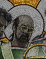
On September 2, 1995, I began work on a poster image for Painter 4. Our theme was decided: Painter Through the Ages. This was partly because I had implemented the mosaic tool. We began securing artists for the poster, which was to contain the usual 5 images. Our timetable was short, so we picked out some friends, Hal Rucker and Mark Jenkins from Rucker Design, the same designers that brought us the paint can design.

John Derry and Steve Guttman decided to do the other two pieces, because I was doing one of them this time. Remember, I was left out on the Painter 3 poster: too many things to do.

For Painter 4, I wanted to use the new mosaic tool. This was so I could show off the feature, partly. But, even more importantly, I needed to beat on it. I wanted to accomplish a real project so I could shake out the bugs in the mosaics feature. I had to be my own biggest critic.

I began implementing mosaics in the summer of 1995, while staying at the Hotel Skagen, at the tip of Jutland. Shortly after spending the summer solstice in Roskilde, after checking out the bonfires by the fjord, Ruth and I drove to Skagen to stay and rest. I had brought my black PowerBook 540c with me and I spent lots of time in the hotel working on mosaics. And we also spent time walking around the beaches at Skagen, looking for amber.

The mosaic problem was a very difficult one, because it involved chopping vector-outline shapes to other vector-outline shapes. Also, because mosaic has a grout, it also involved reliably creating outset shapes for each mosaic tile. These are hard problems, because they involve general polygon Boolean operations.

In July, I had tested the mosaic tool back in the Fractal Design offices in Aptos, using a comp'ed up version of the product, clipped from pictures of real mosaics from Ravenna.

You can see this to the right, here.

The letters' styles come from the Byzantine era, almost 900 years ago. It's actually amazing for me to think that something can last a thousand years.

This was just a test run, but I was seriously trying to create something with the tool. At this point, there was only very little control over the width.

I used this image as a clone source and sketched over it using the mosaic brush.

It's actually interesting to see how similar the tessellation is between the letters. Perhaps I used them as a guide.

With some trial runs, I turned back to the code and added the ability to vary with based on pressure, created a control panel for mosaics, and figured out what the modality of the mosaic control panel was to be. It was an unusual tool, because of the vector information that comes out of the brush as you draw. You get the point: lots to do!

Once September rolled around, I realized that I needed to be very careful and plan ahead in order to create a design with mosaics that was coherent enough to be seen as a Byzantine mosaic.

I drew a version of it on the whiteboard in the office shared by Tom Hedges, John Derry, and me. Suggestions from the various team members were made based on this strawman depiction of the idea.

Next, I created a small-size proxy that showed the basic organization of the piece. It was a very rough version. I was indicating white circles behind the heads, which showed saints in the original mosaics of the Byzantine era.

The paint can was to have a similar treatment, originally. Also, I showed John Derry (to far left) holding a burning ice cube, a reference to the theme used in Painter 2.0.

Initially there were only going to be four of us, but we thought to include the venerable Glenn Reid, who had just come onto the R&D staff at Fractal. So I had to modify the original design, but that was hardly a big issue.

The main problem was to get each of the figures in place. I decided to use layers to do this, because then I would only have to capture a photo of each one time. But I would have to make sure that each person was captured with the same lighting, of course.

So here you can see the original captures, done with a cruddy video camera, attached to a PowerMac 8100/80av. I supplied the facial angle for each person, and, as you can see, they were all being taken in the same location, so the lighting would match. The outer people (John Derry and Steve Guttman) I had hold their hands in a position of classical adoration.

I wanted the folds of the fabric in the shirts they were wearing to be visible, so I could use them in creating the folds of the garments that the figures were wearing. All of the portraits were done at appallingly low resolution, because it only had to be the resolution of the mosaic tiles themselves. They all worked except for Tom's frame grab, because he was staring at the camera in a classic thousand yard stare. Hmm.

Then I masked each of the photos and composited them in layers into a single image. This allowed me to move them around and adjust them to create a better pose. I adjusted their brightness and contrast a bit to create more visual cohesion.

I also adjusted each person so that their actual height was indicated as well. Tom Hedges was quite tall, so he got to be taller than the rest of us.

Here you can see how Tom Hedges' image sticks out because of his stare directly at the camera. But initially I thought I could work with it.

My next task was to choose the garment styles for each person. Their styles were taken from the mosaics of Emperor Justinian and his bishops and officers, depicted in the Basilica of San Vitale in Ravenna, which I have seen personally. My sash is actually designed based on that of one of his bishops.

But in mine, I replaced the cruciform figure with a 4 and a crude Fractal Design logo. My initial design for John Derry's robe was rather freeform. But you can see how I used the existing fabric folds to create the look of the folded garments. I extended them down using my brush.

I also adjusted Glenn Reid's height so that he showed the appropriate height. It also made his garments a bit more visible, which was another goal at the time.

I painted most of the robes on the night of September 12th, and I was up past 11 PM doing the brushwork. I used a small-radius airbrush that was adjusted to 90% opacity to sketch in the colors, which were approximated from those used in reference mosaics from the fourth century. I then used Just Add Water to blend the colors together and create smoother fabric. The gold background was added, a reference to the common practice in Byzantine mosaics.

But I had to fix that look on Tom Hedges face! I broke out the video camera again and persuaded him to stand for another portrait on September 13th, the next day.

The next iteration of the photo was done by 5:00 PM on the 13th: I had replaced Tom's head with a better frame grab that had a much better expression on his face. It was also focusing in the right direction, and I had reworked his shoulders to accommodate the new head position.

I placed an image of Painter's paint can in the image and put a nice glow around it, making it seem a little magical.

All I had was an image of the Painter 3 can, taken from a photo shoot we had done professionally. But I could see it all coming together. I made it unusually large to accentuate the fact that it was in front, and floating.

I was really not satisfied with John Derry's robes. I looked back at the San Vitale images I had in an old Dutch book on Mosaics I had found in Amsterdam the year before. I found a reasonable style to rework it into: a bishop's robes.

John is on the left. It was an arduous process reworking John's robes to make something that matched his style. I had noticed that the bishops often had a section in front drawn over and pinned near their collarbones. And on the font section they often had diagonal rectangular patches of color.

For John, I created a red pattern featuring a checkerboard pattern, one of John's signature style elements.

For Steve, on the right side, I knew I needed to extend the robes lower and complete the double-white borders of his sleeves. I did that, also creating subtle shadows under the hands to make them a bit more realistic.

I began to realize that real Byzantine mosaics didn't feature people with watches and glasses. But I wryly decided to leave them in, to give the piece an interesting tilt. And I had decided that a floating paint can was even more magical if it was floating above something.

So I created a red table with draped fabric, in order to make the floating even more realistic.

I had to put the shadows of John's and Steve's hands on the red velvet tablecloth, as if the shadows were cast by the magical light from the paint can.

At this point, I put in the halos as layers behind the people. I also put some Byzantine-style text behind the figures. The text is latin, and says "Natural Media Forever". It was kind of my Strawberry Fields Forever moment, so to speak. I had to be careful about the thickness of the letters, because I knew they would be rendered in mosaics. I also used my experience with the images near the top of this post to sculpt the letters. They were done three months before.

Above, a blue field with green circles suggests the vaulted ceiling of the Mausoleum of Galla Placidia in Ravenna.

I had to further extend John's and Steve's robes to the bottom of the image, which was designed to be the right shape for the Painter 4 poster entries.

It was a very lengthy task, and by midday on September 14th I had completed the proxies. But that was, unfortunately, only the beginning!

The next step was to clone the image using Effects:Esoterica:Make Mosaic which is still available in Painter 12, by the way for those of you who see this and want to travel down the same road). That night at about midnight, I started making the mosaic. The first thirty minutes were spent detailing the faces of John, Glenn, and Tom, and also the paint can. Then I gave up for the night.

The next morning, in the office, I started working on the image and I worked all day. At about three in the afternoon, it crashed and I lost all of my work for the day! I had finished most of John and his robes, my face and Steve's face. It was painstaking work. So I spent a couple of hours figuring out what went wrong: there was an error in the mosaic vector data structure pack and unpack. So it crashed on save!


To left, you see how much progress I had made. This image can be opened, but the mosaic data cannot be recognized. Imagine my chagrin!

Six hours of tedious, painstaking work was lost.

Anguished, I fixed that problem and went on. Since I and only I was responsible for the error, I had nobody to complain to but myself on this project!

Such is the life of a developer who uses his own tools on grandiose projects.

It is probably good that I found this error, though. Better that it happens to me than to a user of the product after it has shipped. In all, I found several bugs in mosaics during this process, and added several features that made it easier for me (and easier for future users as well).

Starting again from my only backup from 12:30 AM early that morning (to me the night before), I continued undaunted. Well, I would like to think I was undaunted but actually I was weary and crestfallen. And by 6 PM I had only finished additionally my face.

You see the state of it at the right.

Needless to say, at this point I started saving backups every hour.

I went home and continued my work there after a quick meal. I'm sure I was hell to get along with at this point.

Next I did the halos, which were fairly easy work, starting on the outside of the rings and filling in from there.

I continued to work, and by about 11 PM the night of September 15th, I had finally reached the point I had reached at 3 PM that afternoon when Painter had crashed.

If you look closely, you can see that I had to do it all over again, and made several different choices of placement, particularly with Steve's face. And the color of his glasses.

I was also much more careful in the placement of the mosaic tiles in the rendering of John's robes, which I wanted to be eye-catching.

You may be wondering why I left the faces and hands in grayscale colors. For the most part, this was what the Byzantines did in their mosaics. I did color the glasses though!

By the time I went to bed at about 12:30 AM, I had finished almost all of the central figures, as you can see here.

So far I had worked thirteen hours on the mosaic part of this task, and six of them had been wasted!

The strategy of saving once an hour was paying off. There were other crashes but they only caused me to lose a minimum of time. And they gave me an opportunity to fix other problems, as was my responsibility.

For the background, I wanted the glittery golden look of the Byzantine mosaics, and so I used color variation to create the look. I painted in a green background below, and finished Steve's robes.

Also, it took me several hours the next day to paint in the letters in the arch above the main figures. The letters were rendered in the crude, yet stylish typography used by the mosaic artists of the fourth century.

I still hadn't figured out what I wanted to do with the area above the arch. It was certainly unfinished.

At left is the state of the mosaic by about 5 PM on the 16th of September. By this time, I had spent about 20 hours of time on the mosaic part of this task.

I went home and, working from there, I spent another two hours recoloring the background at the bottom and drawing in the symbols above the arch. At the left, I put in a P4 (for Painter 4), and at the right, I put in a burning ice cube.

I cleverly allowed the dripping water from the burning ice cube to overlap the arch on the right hand side.

Two green diamonds, another common Byzantine symbol, filled the center portion above the arch.

I decided that the faces truly did lack some color, and so I added in a pale skin tone to their shading. Each mosaic tile has its own color assigned to it, and you can change tile colors after you place the tile.

I painstakingly redid every awkward mosaic section I could find, to make it more like a real artisan had placed the tiles, one by one, by hand.

Even still, there are things I would do to improve this picture. There is one errant green tile just next to the top of the U in NATURAE. That should be fixed!

By 6PM on September 17th, I was done working on the mosaic portion of the task. With some 22 hours of work on the mosaic. And probably ten or so working on the proxies before.

At this point, my main task was to resize the piece to be used at the resolution required by the poster. This was possible because the mosaic was vector art. It was stored in sub-pixel vector locations and rendered from that form into pixels.

So all I had to do was resize the picture and the mosaic art was also resized in place.

Then I used the mosaic information to create a mask (using Render Tiles Into Mask) and that mask was used to create a three-dimensional look to the tiles with Effects:Surface Control:Apply Surface Texture.

Whew! Only 29,000 tiles later, the mosaic was finished!

Painter 4 was a real success for us at Fractal Design: the world had never seen anything quite like it!

And, thankfully, several bugs were fixed in the process: at my expense!

Such is the life of a developer.


Here is an interlocking P and 4, designed based on the interlocking royal monogram of king Christian the 4th of Denmark. I saw this in the Cathedral at Roskilde back in June. A mosaic monogram was the result.

Ahhh, we were clever back then!

Painter Splash Screens

I have been able to resurrect my old History disk. I am amazed that it still works. But in the process I discovered some very rare splash screens and art that really brought back the memories! You might remember the Illustrated Evolution of Painter UI post I did last month. For that post, I had to get the screen shots from another web site. And that web site's author contacted me yesterday. It turns out he is the collector of all things Painter, Toshio Doi from Osaka!

After a correspondence with dddo (Toshio Doi), a Painter collector in Japan, I learned that he was missing the Painter X2 splash screen. So, after some luck, I found this image among my files. The Painter X2 splash screen was John Derry's work. Together, we designed the X2 logo form with its distinctive metallic beveled look and the raised 2 with the triangle beneath. He has used an earth-sky gradient as a reflection map to create the look. John loved to create skeuomorphism designs, and in this case, he has duplicated the look of a shiny metal plaque that we saw on the front of some building in New York. Even down to the screws that hold it to the wall!

We called Painter X2 "Painter 2.0 with Expert Extensions (hence the X2), although it was a completely new version of Painter that implemented layers. We were ahead of our time at Fractal Design.

I also came across the original splash screen for Painter 1.0. The Painter 1.2 splash screen was taken directly from this, but of course I had to change the version number and the copyright info.

I believe the image was taken from the original image of the paint can that appears on the actual paint can of version 1.0.

I have been getting the material together to do the definitive post on the creation of much of the complex Painter art that I have done over the years, including the original paint can image, the paint can image used for Painter 5, the Miracle of the Paint Can mosaic, Mount Brushmore, and other images.

I will post this soon, I think.

One of the real discoveries was the Detailer splash screen, which was the 3D paint program we released. It was originally called Voodoo. Perhaps it was a code name. Detailer began its life as Painter X3, a secret demo version. Back when the PowerPC was introduced and the Macintosh began the transition from Motorola 68000-based processors to IBM PowerPC based processors (fabricated by Motorola), I was in the habit of going around and demoing X3 to international crowds as part of a demonstration of what was new and possible on the fast floating point systems of PowerPCs.

This was a hard project to complete, and it eventually was called Detailer.

The Detailer look was changed from the Voodoo look as you can see. It's too bad. I really liked the shadows of the voodoo letters, sharp where they touched the world behind them, and soft as they drape back over it.

But I guess that marketing didn't think Voodoo was a good name. Eventually it became Detailer.

That's my hand holding the letters, by the way!

We went with a red design instead of green. Somebody wanted it to read darker, more professional.

With Painter 4, there as a separate splash screen for the Mac than there was for Windows. This Splash screen shows that,, for Windows, the particular JPEG technology we were using on the Mac wasn't available on Windows, and we had to use another solution.

That's why it is missing one line of text from the Painter 4 splash screen from the Mac.

With this splash screen, John Derry used the new Painter 4 mosaic tool, which was so much fun to create as well as use. A totally new medium! Well, one resurrected from antiquity, but nonetheless new on the computer.

For Painter 5, we had a provisional splash screen that was used for a while during development, a humorous treatment that showed that Painter 5 was just a reworked copy of Painter 4. Of course, each new revision was exactly that.

John Derry removed some tiles, decreased the shadow, and put a new numeral inside with its own textured background. You can also see the JPEG line in the boilerplate text below.

Painter 5 was a remarkable process in development, but also in visual theme. This took us from the look of the past to the looks of the future.

The Painter 5 splash screen shows exactly what this means. Elements of space, including motion-blurred stars and a comet. Golden shiny liquid metal letters. Water refracting the texture below it. Heavy texture of Impasto, and even fire!

We had an impressive new selection of brushes in Painter 5. It was Painter 5 and 6 where the brushes really took off in a big way.

You also see the influence of product management in the splash screens: Jon Bass.

Jon, as product manager for Painter, lost a few points from me by creating an art contest to "paint the hair on Mark Zimmer". I think it was around that time that I began to wonder about the value of being famous.

The Painter Classic splash screen was John Derry's creation from start to finish.

The first version of the splash screen was colorful and playful, but it just didn't have the panache that John usually put into his graphics. You can see the Classic letters in a chrome format similar to that of the logo of an old car.

The Painter brush logo, originally created by Cleo Huggins, is shown in puffy 3D letters. There's even some bloom on the shines to make them more interesting visually.

Also note the trefoil knot used for the MetaCreations logo.

Well, this splash screen look was only a placeholder, because John Derry had a much more ambitious idea in mind for the splash screen.

John created a still-life scene with draped fabric, a frame, and a paint pot. But what made this really interesting was that it was a sketch that was coming to life: in the process of being painted into reality.

Everything in this image was very painterly from the start. The only thing missing was the hand of the artist. But that wasn't quite right: it had to be the brush painting the picture!

This concept of a brush painting a picture that turns into reality is a very common theme in artists' minds. It occurs quite often, and I know I have seen a few treatments like this in the past.

John put a brush into the scene, and made it paint the picture. Very nice.

Perhaps you didn't notice, but the brush has the words Painter Classic pressed into it, in light detail. This hero shot, as John referred to it, was to be the basis of the Painter Classic splash screen. But the brush turned out to be a confusing issue and detract from the company logo, so it was removed.

Here is the preliminary splash screen. A nice design treatment of the letters was chosen, with a black background for the Painter brush script and a drop-out black for the Classic letters.

The authors names are inserted, and a blank space was carved out for the serial number and the customer's name.

The presence of the MetaCreations logotype and the boilerplate text underneath required John to remove the brush he had added to the hero shot.

The piece was cropped on top and on right.


But John complained about the loss of the chrome letterforms of the placeholder splash screen, and so he reinserted them and altered the gold treatment to be a bit more like brushed metal.

It was important to reference as many visual aspects of reality as possible, John thought.

The final piece went through review and he was required to put in the MetaCreations text above the Painter brush script, since it corresponded to the actual copyright that we had filed for.

And John put the brush back in, to the side.

This was better placement, and was actually similar to the insertion of my hand coming in from the side in the Detailer splash screen.

Placement operates subordinate to function in good designs.

Saturday, February 11, 2012

Texture, Part 5

I have often wanted to create cross-hatching using the computer, since it is a favorite drawing technique. In the previous two parts of the Texture post series, I have described how it is possible to create speckles, mutually avoiding points in the tiled plane (like stippling patterns), create cells around each point, cleanly delineated using Voronoi tessellation, then construct crossfade mask sets for the cells, enabling you to place images within each cell to create arranged textures. This technique may be further exploited to create hatching patterns by expressing a hatching within each cell.

Speckle patterns are the key to arrangement in a random, pleasing pattern. And Voronoi tessellations are the key to providing a natural partitioning of the tiled plane into adjoining cells.

But what about the hatches themselves? What function makes them look best? What can be done with them?

The first thing is to control the crossfade amount. This is the amount of softness between the cells. With z-buffer cell merging, this creates a kind of interpenetration of hatches.

Next, we try changing the crossfade amount with linear additive cell merging. This creates a very pleasing regularity like rolling over clay with a roller with evenly spaced ridges, but with different angles in different places.

In fact, the last one is so convincing that we try it with different hatch spacings. Awesome regularity of the pattern quickly becomes chaos. Because we are using hatches that are regularly spaced with different angles, we end up with extremely band-limited results.

It's as if we applied a notch filter to some random texture! But this is not produced using Fourier transforms or notch (combined lowpass and highpass) filters. It is straight linear synthesis.

Also, it's tough to make pleasing hatches that satisfy the eye. This is done by assigning random angles to each of the cells, but looking at the neighbors and trying to not match the neighbors' angles. In fact, once we see the neighbors' angles, we look for the biggest gap and simply bisect that angular gap to create the angle for our cell. It makes for a pretty random-looking result. Pure randomness would not look as random, oddly enough.

If we restrict ourselves to only put out one hatch per cell, then we get a curious pattern of random sticks.

We can vary the number of hatches that occur inside each cell. If we increase the crossfade to a large amount and increase the spacing to a similarly large amount, we get a really complicated mesh of sticks strewn into a pile.

Cut down on the spacing and we end up with a very complex fibrous structure not unlike a kind of matting.

It is very satisfying to see the range of cool patterns that can result from hatching. Other patterns will probably be even more interesting inside crossfade masks.

So now we have a way of making stippling patterns, hatching patterns, and cellular patterns. And we have found that combining the techniques can lead us to incredible texture synthesis possibilities.

I want to end this post with a really interesting texture I created today, using Fourier synthesis. The original source was a hatching, derived from linear additive cell merging with an incredibly large crossfade, and then processed with a notch filter. Finally, I viewed magnitude and changed the edge of the filter to provide some interesting shines in between the main convolutions of the pattern. The result is dark and visceral, like something from H. R. Giger. Enjoy!