Tuesday, January 24, 2012

Patterns, Part 2

Back in 1993, I tested a special capability that, unfortunately, has since disappeared. It allowed you to devise patterns that used a set of basis tiles, so that each tile could be chosen from this basis set. I call these tiling grammars.

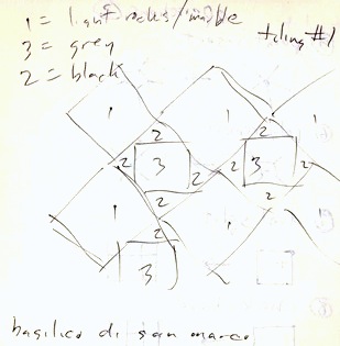
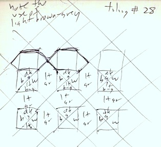
At the right is an example of such a pattern. When I write pattern, I mean a non-repeating arrangement of items taken from a small set.

In this case, you can easily see how a space-filling curve can be generated from a small set. But what isn't really obvious is that this image is made by randomly placing square images into a grid.

Each grid element can have one of two images in it. With this image, I have taken care to create an image that (almost) doesn't have any obvious loops in it.

Well, OK, it does have one, in the lower left corner. But it doesn't have any circles in it. That, it turns out would be legal in this particular pattern grammar. Loops (and loops within loops within loops) would also be legal.
Here is the basis set for this particular image. It consists of two tiles as you can see. In each square, one tile connects the middle of the top edge with the middle of the right edge and also connects the middle of the left edge with the middle of the bottom edge. The other tile is either a mirror-symmetry of the first, or it is rotated 90 degrees from the first, whichever you like.

But wait, there are more options along these lines. For instance, I can create two more tiles that connect vertically and horizontally. In one tile, the horizontal crossing takes precedence, and in the other, the vertical crossing takes precedence. Now what would happen if we randomly expressed a tile from this basis?

Well, we can easily generate this test as well. Here, to the left, we see that suddenly, this image is starting to look like a subway map.

This grammar can generate interweavings of any kind. Weavings are made of warp (vertical threads) and weft (horizontal threads). Since one element is warp-over and another element is weft-over, we can represent all possible interweavings.

But what makes this interesting is that the threads can also turn.

You can represent knots as well, of course, since we include pass-under and pass-over elements.

Suddenly, this pattern has taken on more dimensions than before. Just 4 elements and so much richness of representation!

I thought on this, and realized that I could also include ends: threads that do not cross the tile, but rather end. I increased the basis by 4 more tiles. This time, the four diagonal sad-faces were added.

It is not obvious to me what this grammar will generate. But I think it's going to be interesting nonetheless! This seems to leading to noodles and other patterns made of threads that have ends. What will it look like?

Here is an example output randomly from this grammar. The most interesting part is that the complexity has definitely increased. Notice that the threads seem to look like bacteria in a culture mold. But regular, of course.

One obvious thing is that dots have appeared. And letters, like lower-case f and t.

You can identify each thread by itself, and where it goes.

And yes, a sad face has appeared in upper right.

After making this, it occurred to me that it would be possible to add 3 more elements to the basis. A tile containing 4 ends, and horizontal and vertical crossings with ends on the other sides of the tile.

Here is the new basis set, with the three new tiles added.

Perhaps the new elements look like the division symbol. But with the interconnections, this will likely be obscured by the neighboring elements, hiding it.

One thing we can say just by looking at the basis set: there might be more dots than in the last generated example. And more vertical and horizontal lines, particularly those which have no other line crossing them. So this will undoubtedly lead to more open space in some areas.

Here is the result of generating a random placement using this new basis set.

The result is using fewer and fewer curves. There are twice as many free-floating dots as in the last one.

One thing to remember is that each previous level is really just a subset of this next level.

Perhaps even more interesting than ends is the possibility of branching. We can assume that there are no curves and try to construct a maze grammar.

This would not have crossings, per se, rather it would be more square, with cross, the four t's, horizontal and vertical paths, with ends as well, but not really circular or curved. It occurs to me to try this case.

Here is the new basis, that operates only horizontally and vertically, and contains branching. I don't think it could generate a maze, though. On the average, it will probably generate circuits (closed loops).

This grammar is very foursquare. I have rounded off the edges to make it a little more presentable.

Here is the result of generating a random placement from this basis set.

It is a very busy pattern with very few dots. It does tend to be a little maze-like, and the pieces in it are heavily connected.

The tiling grammars I have presented here are reminiscent of Wang tilings.

Perhaps they are even closer to Thue-Morse tilings.

All of these are related to the work I did back in 1993, when the image hose was just invented and I realized that it might bear on this class of tiling grammars.

Monday, January 23, 2012

Painter's Image Hose

In Painter 3, a new kind of brush was added: the Image Hose. With this tool, you could draw using random snippets of image data. Each bit of image data could be individually masked and even shadowed. So you could literally paint with reality. To right, I have included an image created with Corel Painter 12. First a background of dirt was drawn with the image hose, and then some leaves we're drawn on top, also with the image hose.


How did the image hose begin? John Derry and I were sitting outside at a Restaurant in Chicago on July 31, 1992 and he suddenly wanted to be able to paint with the tree. I considered this for a while, and then i took down a note. My note said: analyze and grow texture from an example. But how??


Imagine each of the tree's leaves had a picture and they could be placed randomly. I remember we came to the conclusion that with only a few leaf pictures and perhaps some randomness of rotation angle or shading that you could paint a reasonable tree image. This was ideal since memory was, and continues to be, at a premium. In those days, that would be true on a Mac. In these days, that would be true on an iOS device, like an iPad.

The idea was in our heads that we could store a few images and draw using the set of images. So I came up with a way of doing it, which was initially called the structured clone.

As shown on the left, by October 1992 I already had some idea that the images could be stored in an array. Each element was individually w by h pixels, and they were arranged into a potentially three-dimensional structure. Each element is clearly spelled out to have an arbitrary 24-bit color image with an 8-bit alpha mask, treated like a penmask in the usual way.

A penmask is what we called the mask of a dab of paint. In those days, a brush stroke was always made up of a sequence of paint dabs placed along the bush storke's path. In this case, the brush stroke could be made up of a sequence of masked images instead.

I say it can be indexed by 0, 1, 2, or even 3 parameters - this is the dimensionality of the image hose, what I called the rank.
These parameters were such things as random, pressure, tilt, bearing, velocity, etc. In the random case, a new image element was chosen for that rank each time a new dab was placed along the stroke.

Let's imagine an example. I create 36 images in a 6x6 array. The rows contain six different orientations of a leaf, one orientation for each row. The columns contain six different sizes for each leaf, from small to large. I could use pressure to index the column, so the harder I press, the larger the leaf. I could use stroke direction or even stylus bearing to access the rows, which might allow me to control the orientation of the leaves by using my hand also. In this way, you could have more control over creating a tree just be drawing leaves.

Another thing we started doing was giving each image hose element a drop shadow. This meant that as you drew a pile of leaves, the leaves begin to shadow each other and thus shading would develop, making the pile appear to be three-dimensional.

To the right I have included a pile of randomly-oriented cubes created with the Image Hose in Painter 12. The drop shadow on each one is down and slightly to the right. This produces a slight shading below.

When we finished working on the Image Hose, we filed a patent in December 1995. You can find the details in the US Patent Office; it is patent number 5,767,860. It is one of the only things we decided to patent at Fractal Design, and so it is the only patent I share with John Derry.

Thoughts on How I Might Do It Differently


Today, there are quite a few different constraints on how things work, but compute power is much greater than it was in the early 1990s. The main thing I would do differently is to compute most of the changes on th fly. In Painter 4, we decided to do just that, computing scale, rotation, and opacity on the fly. But nowadays, I would probably allow for hue, saturation, and lightness changes, shadow depth, shadow opacity, and shadow feather to change on the fly as well.

This would mean that the only thing stored in the image hose database definition would be the random elements themselves. This would prevent much of the hand work in creating an image hose "nozzle".
It would be good to allow for 3D rotation and scaling as well. So that might mean creating a 3D definition for each element, which could be a bit complicated. The shading could also change on the fly.

I would probably allow for the nozzle to be made of several kinds of items, and separate them into groups. For example, you could make one group the stems, another group the leaves, and a final group the flowers. They would be stored into a single image hose nozzle definition. Then you might use pressure to choose between them, or you can hold down some modifier key, such as the command key or the command and open key to get each level when drawing.

Another thing I would like is to draw into a lens layer using an image hose, so that distortions can be applied s you draw. For example, you could draw shiny stones, then you could draw the water distortions on top to make the stones look like they are in a stream bed. And then perhaps the shines could be drawn on top as the sun sparkles on the water using another kind of image hose.

Something I tried but isn't still available in Painter is a grid-based image hose. This one draws each element inside a grid. You can randomly choose elements that are designed to connect with each other.

Here is an example of a tile design that could go into an image hose element and then placed randomly. Each element is designed to match at top, left, bottom and right, and so it won't matter how you place them, they will always match.

I would like to try this in square and hexagonal arrangements. Even in half-drop arrangements. It would be easy to design elements, since Painter supports drawing into half-drop patterns.

In this way, the image hose could help you to create mazes and other kinds of patterns that repeat, but without really repeating.

Saturday, January 21, 2012

The Most Useful Painter Feature

In early 1993, we were finishing up Painter 2.0, I had several things on my mind. The Van Gogh and multi-bristle brush styles were made to be real-time.we had added sharpen, resize, soften, color separations, and previews to most effects so you could visualize the results before you committed them. Saving the user time and allowing for more flexibility was the theme we were working to implement. Painter 2.0 also implemented full scripting and playing back of scripts at a new higher resolution. New effects like apply lighting, glass distortion, and marbling brought even more new looks to designers. In short, we had expanded Painter on all fronts simultaneously.

Painter was being finished, debugged and cleaned up, mostly by Tom Hedges, when I broke from the development process to work on new features. This didn't sit well with Tom, but by then he had learned to give me a bit of leeway in my implementation. Mostly because I was on a roll.

We were proud of our new work on Painter 2.0 and I knew we would have a great story, and plenty to sell. But rust never sleeps, so I continued development.

Back in 1984, when MacPaint came out, it introduced the concept of a floating selection. You select, and then click into it to move it around. In April 1993, a friend, Daniel Clark, asked John Derry and I if we could implement multiple floating selections. If each one was floating and on a separate layer, then a lot of the design work might be made easier.

That was the beginning of the process of implementing layers in Painter, the most useful feature ever. We had heard that Micrografx had implemented multiple floating selections, but we found that their selections weren't antialiased or sub-pixel aligned. They had no list of floating selections. Accessing one was tough, and required sequencing through all of them. I found it to be a useless approach. They didn't even allow you to paint into the mask of the floating selection and extend it.

So we began working on a better way to do it. We knew that the users needed to have continuous tone layers with soft-edged masks, and sub-pixel accuracy to the mask edge. Fortunately our friskets (what we called selections, and which we're used for airbrush masking) already had this. Our feathering used a real Gaussian convolution.


And the result was Painter X2. It began working about 9 days after we talked with Daniel Clark.

We called it Painter X2 because we felt that multiple layers easily doubled the user's ability to design more freely. In those days we called them Floaters. The name was a mistake, because eventually Layers became the standard jargon for floating selections. I implemented grouping of layers, and a nice list with an open/closed state for the group of layers. I also added compositing methods, ways of compositing a layer with what was behind it.

Even more interesting was the Portfolio, a place where layers could be stored and reused, like clip art. This was John Derry's idea. We figured that designers had objects that could be used again and again, and that, given an original layer, many things could be tried on it. Without destroying the original piece.

In fact, it was this philosophy that we were trying to further: the ability to try things and to change your mind again and again and again. Picture a designer, a client, and an art director. The designer has to keep their options open because they need multiple designs to show their client using the same basic artwork. Also, the designer needs to keep their designs fluid to quickly respond to suggestions and design decisions of the art director.

This signaled a move of Painter towards the design ethic more than ever. Not only could you use the traditional tools of the designer, but we could also emulate paste-up better than any other application at the time.

It turns out that Photoshop introduced layers in September 1994, long after Painter X2 shipped.


Our logotype designs for X2 were bold and interesting. Here I show an X2 sketch that featured Neuland Inline-type letters and an early catchphrase, true 2 form. We were always thinking about the catchphrase. The concept of changing your mind again and again made it onto the box.

As shown above, Painter X2 came in a box, and was sold as an expert extension to Painter, intended for the expert designer. Of course, the features were all rolled into Painter 3 when it came along. And Painter X2 came so soon after Painter 2.0, that we were struggling to get a way for users to justify the expenditure. We had that problem a lot, when you consider Painter 1.2, Painter 3.1, and Painter 5.5 were all intermediate releases. We really wanted a new release to be loaded with new groundbreaking features, so we often saved the new numbers for what we considered to be major releases.


This sketch shows that we were considering our new features to be industrial strength, with a metallic beveled-edge logo form and even rivets in it. Other concepts included the atomic X2, where electrons whirled around the letters. And, strangely, even a radiation symbol with X2 underneath it.

What I was thinking, I will never know!

Perhaps there is even a hint at the biohazard symbol. But I guess I didn't quite know how to draw it. And that was probably a good thing.


In this sketch, we see a part of the final logo form for X2, with it's angular letters, the raised 2 with a triangle below it.

Other things were tried such as negative space letters, vertical alignments, and other such crazy treatments. I like the flying paint can that's dripping paint onto something that looks quite like a Mac IIci.

In the end, the angular letterforms and the beveled metal look won out and we had a logo form for X2. But John Derry was convinced we needed to do something new with the paint can. Not necessarily with the can we were actually shipping, but something that made it more animated.


Some of the ideas were just plain wacky: popping it's lid, a stir-stick with a tagline stir up your imagination. A can dripping with paint. And all of them with faces! I wasn't sure where he was going with it, but we did consider it for quite a while.

One of the cans is astonished, and exploding with paint. Perhaps like a user exploding with ideas when presented with the new range of ideas that come from the freedom to design like never before.

By the way, the stir stick has the letters OSH on it, which stands for Orchard Supply Hardware, a hardware store in Silicon Valley and also in Capitola and Watsonville where we sometimes went to look at paint cans and paint in general.


OK I will admit we were a bit out there! At the top is a triangle with an eye in it, like on the US dollar bill, but it's carrying paint cans. In the center is a paint can running away from freshly having applied a coat of dripping paint to a box clearly labeled ADOBE. At the bottom, a lens in a frame, part of the symbology used on the Adobe Photoshop box, with a pitchfork and a barbed devil-tail, examines a roll of 35-mm film on the ground. And it seems to be dragging a mouse. Note the blank space behind it where the frame has been lifted off the wall.

I think all that time designing and coding was taking its toll. This is John Derry's sketch, but I'm sure I felt very much the same at the time.


We even started thinking about X3 as you can see. Like I said, rust never sleeps. I think the most interesting thing here is the bill of floating selection rights, the declaration of floating selection independence, that your floating selections at no longer slaves to the deselect command (which previously always dropped the floating selection back into the canvas).

We were definitely onto something new!

The Domain of the Apostrophe

Ever rethink a decision? When we say would've, might've, and should've we enter what I call the Domain of the Apostrophe: the uncertain and unprovable world of what might have been, if only. With 20-20 hindsight we can often this see clearer than what actually did happen.

In Fiction

In writing, there is a specific genre for this kind of speculation: alternative history fiction. What if Nixon were still president? (This is part of the plot line of Watchmen). What if Hitler or Napoleon had thought better and sought peace before their ill-fated Russian incursions? What if the South had won the American Civil War? If you can conceive of it, probably somebody has written a piece on it.

This genre is a kind of mash-up between sci-fi and historical fiction.

Yet another genre along these lines is time-travel fiction. What if you went back in time and shot Hitler? What if you went back in time and shot your own grandfather? This kind of fiction is interesting because it deals with paradox. Lots of movies and stories feature this device: the Terminator series is the most famous example. Alternate realities are created and a common theme is a time traveler going back into the past to change something to gain an advantage or, more importantly, to prevent an adversary from becoming a problem. This sort of plot is featured in Time Cop. Traveling back in time to prevent a global calamity is the main theme of Terry Gilliam's 12 Monkeys. Traveling back in time and accidentally changing history with disastrous results is the theme of the Harlan Ellison-originated screenplay for the famous Star Trek episode The City On The Edge Of Forever. The Doctor Who series is loaded with time travel as well.

The world line theory says that, when you make a decision, you are actually charting a course through a series of realities. If you had made a different decision, you would be in a different reality. The theory says both realities exist, but the one you are actually in is determined by the decisions made. So the world line you are on charts a course along the decisions you make. But what if you could travel between world lines?

Some authors call each world line an alternate reality. Others call them alternities, or just alternate earths. The Sliders series, with Jerry O'Connell, featured this specific kind of travel.

In Reality

Is there any physics to these stories or is it really only the stuff of fiction?

Consider dark matter. This is matter with mass, or at least gravitational effects, but with no discernible interaction with the electromagnetic spectrum. In other words, it is matter that is not directly observable, possibly phased out of existence, but which can still be detected. It can be detected by its gravitational lensing effect, for instance.

Estimates point to a majority of the mass of our universe coming from dark matter. What if dark matter were a manifestation of mass from a parallel universe? An alternate dark reality? Knowledge of dark matter could forever change the ways we think about our universe, and the ways we interact with it.

Consider dark energy. This is the energy and inter-workings of space itself. When we talk about a photon or even gravity as a wave, there must be something in space to transport it. The notion of a Bose-Einstein Condensate, which is theorized to permeate the fabric of space itself, helps us to comprehend what is meant by dark energy: energy contained in the vacuum of space. Extracting such energy is an opportunity that we should concentrate on: imagine plentiful free energy and the effect it could have on the world.

But when we figure out how to tweak the internal workings of space itself, then something new and wonderful can happen. We can fully understand it and probe the secrets of dark matter and once and for all satisfy ourselves whether alternate realities and mirror universes can actually exist.

We can never access alternate realities without a fuller understanding of the universe.

Perhaps the most interesting and singular scientific development lies in the concept of quantum entanglement, sometimes known as quantum teleportation. In this property of physics, two particles, such as photons, can be entangled and they can share quantum states. But, once entangled, they can nonetheless be separated by arbitrary distance and they still share a quantum state. When you change one of them, the quantum state of the other also changes. This has been verified by experimenters over kilometers. And the state change propagates out at the speed of light.

Were the state change instantaneous, it might indicate that somehow the particles are really somehow next to each other in some topology of space. But, since the state change propagates outward at the speed of light, it indicates that information inherently takes time to propagate through the fabric of the universe.

It doesn't seem to make any difference what matter is in between the separated paired particles. This state change happens anyway.

The really cool thing is that this property clearly may be exploited for quantum communications. And, of course, it could be used to make messages secure and unblockable.

My point here is that there are properties of the universe that we still do not fully comprehend. And we need to know why these properties exist and exactly how they function. Once we know this, our discoveries and knowledge will lead us to greater things.

Perhaps alternate realities will never be possible. Perhaps causality, the deterministic nature of cause-and-effect, will never be successfully undone. And perhaps we will all be safer for it.

Thursday, January 19, 2012

Creativity and Painter, Part 4

Painter 5 was a bit of a transition for the core team. John Derry and I were no longer really in charge of the taglines and the copy. But we totally rose to the occasion when it came to the UI and the features. John and I redid the UI to cut down on screen real estate, which required endless work. I implemented a whole host of new brushes.

I could go on and on about the new brushes. When Tom Hedges and Bob Lansdon created the first version of watercolors for Painter 2.0, To added an ability to allocate more than just 32 bits per pixel to either the canvas or even a layer above the canvas. As time went on, we used this feature more and more. For the new water droplet and liquid metal brushes in Painter 5, we allocated another 32 bits per pixel and made it a floating point height field. As we added items to the height field, it could be thresholded, and height-compensated to make it look like there was surface tension, and then rendered into the main 32-bits of the layer, which had the RGB color and an 8-bit alpha mask.

There was plenty of work to do, with these and many other new features. My friend Udo Gauss came out to Aptos during this time frame and I showed him a metaballs implementation, the basis for these new layers. We talked endlessly about how it might be of use to Painter users.

John and I, meanwhile, worked on a monogram-style logotype for Painter 5. John was keen on using a human hand as a primary image, because one of the basic things about Painter is that you use your hands to make art, and Painter is just an amplifier for your talent as a mark-maker and an artist.

Above, you can see an interlocking logo form for Painter 5, with a P and a 5 intertwined that I drew. I got this idea by looking at the royal interlocking monogram chiseled into Danish King Christian IV's sarcophagus in the Roskilde cathedral.

John's take, shown to left, is a 5-pointed star, the numeral 5 overlaying a pentagon. I think the brickwork is another bit of charm in this one. His attention to detail goes on and on. For a quick sketch, it's not bad.

To the right is another example of a joint work page from a notebook. Almost all of the numerals are John's work. The seven-cube design is my work, it looks like.

The really interesting symbol on the page is a 5 with a small p inside it. I think this might have been used in a coin he saw once, perhaps a five pence coin from England.

In the top right, several 5's are shown with varying degrees of thin-line styling, perhaps similar to letters from the Art Deco or Art Nouveau eras. Some of them even have serifs.

I really like the squat 5 in the lower right, with its bold line. This shows the endless doodling we did that often produced interesting results, and sometimes ended up in ad copy, splash screens, and other graphic work we produced.

For every genuine idea we had, really only a small percentage of them actually got into actual use. I think it is often that way with designers in search of a good logotype. I have been to design houses, in particular Landor Associates in San Francisco, and I totally respect their work and the attention to detail and the perception of their client's customers.

With Painter 5, we were trying to think up something to do with the paint can. With Painter 3, we used the paint can in the posters, and the tagline Pour It On was used. With Painter 4, the can was done in mosaics.

To the left is a sheet of John's ideas for the logotype and for the paint can itself. It is really no great wonder that we didn't use the cloudy thunderbolt paint can.

In the upper right you can see John's take on the interlocking monogram concept. Both of us vetoed it. Some of his stylings to the left show a P5 logo with the top of the 5 missing, so it resembles Pb, the atomic symbol for lead.

Umm, no.

John returns to the squat 5 concept again at the bottom. I still like it, but I'm not sure how it can serve with Painter.

So, the question got raised: exactly what was the best symbol for 5? Was there a symbol that meant the most to artists? We decided to sketch out a few and see what stuck in our minds.

To the right is a sketch I did that summarized what I thought might work from a standpoint of straight symbolism. I also drew a few clumsy numbers out as well.

The first and most useful was the human hand. Once again, the mark-making instrument, the center of the artist's expression, was used.

A 5-pointed star also has sticking power. Though, I pointed out, it also symbolizes glitz and fame. Not necessarily good for Painter.

A pentagon wasn't too bad a symbol. But it had military significance, especially since a pentagonal building houses the department of defense here in the US.

A pentagram was an occult symbol. Neither John nor I was necessarily wild about going down that particular path.

The Roman V for 5 was a good, ancient reference to the numeral 5. Very old-time. Maybe.

The dodecahedron was a bit abstruse for the Painter audience, but I had to put it in. In the end, the human hand was chosen as the symbol.

Here is a sketch I did with several references to the number 5, and in many forms. Annotations were applied to it, because we were thinking of using it as an ad design.

Ok, it looks dumb.

When we did an ad design for Painter 5, I actually did the ad myself. It was a hand, with fingers spread, the fingers were on fire, and the numeral 5 was done in liquid metal in the palm.

This was a reference to a scene from my youth where my dad showed us kids the element Mercury. I actually had some in my hand. Had I known it was terribly poisonous, I wouldn't have done that.

The ad, when done, had a kind of illuminati look to it. It was actually my hand, too. Crazy. The ad ran in lots of magazines, but I don't have a copy to show you, I'm afraid. Update: I found it! The artwork for the Painter 5 ad piece with the hand and the burning fingers and the liquid metal 5 can be found in this blog post toward the end.

The work on a monogram something we found to be quite fun, and very much pure design work.

Here, my sketches for monograms are shown to the right. The can is present, with a radiant brilliance coming out of it. Beveled pentagonal tiles are in front of it.

The Albrecht DĂĽrer monogram is alluded to (though he did it with the D below the mid-line of the A).

I did a little John Derry monogram in the middle.

I have no idea what the M5 monograms were getting at. But we had lots of fun in the process.

In the end, we used a brush stroke version of the numeral 5, to match the Painter brush logo.


Tuesday, January 17, 2012

Patterns, Part 1

Patterns are found everywhere in nature, from the crystalline structure of the sodium and chlorine atoms in salt to the six-fold symmetry of snowflakes to the spiral arrangement of sunflower seeds. We humans make a habit of copying nature's patterns, and adding a few of our own.

As we saw in my post on image sensors, a very regular pattern of red, green, and blue photosites is employed to make up the Bayer pattern that nearly all image sensors use. The pattern of green pixels, for instance, resembles a checkerboard.

We take advantage of this pattern to create images using a process called demosaicing. This is the process of turning the mosaic of red, green, and blue pixels into full-quality RGB image data.

Behind the demosaicing process is an art so well-studied that it goes back into antiquity: mosaics. The Romans had two kinds of mosaic work. The first was called opus sectile and the second was called opus vermiculum.

Opus sectile is the laying of shaped tiles to create a beautiful regular pattern.

Opus vermiculum is the laying of tiny tiles (usually in rows) to create a picture. Each tile has its own color and the result gives us some of our oldest color portraiture.

San Marco Basilica

I once had a chance to visit the Basilico di San Marco in Venice, Italy. Inside it I found every kind of regular tile work I could think of, and a few more. So I took out my notebook and began sketching and detailing all of them.

I'll show a few patterns from my notebook. Tiling 1 has diamonds with inscribed squares. The colors give it depth.

I gave each color a number and gave each tile a number so you can color by numbers to get the actual tile pattern I saw at the Basilico. It was actually breathtaking, because there was hundreds of years of artwork located in one place. I could imagine the artisans passing the knowledge of their craft down from generation to generation. Each one had to add something new and novel.

In the case of tiling 28, there was something more than meets the eye in my flat sketch. The colors gave an appearance of three-dimensional form to the flat tile floor.

Here there is a base surround consisting of six-sided tiles all done in a light gray, and a center square, cut into triangles that appears to be a pyramid.

But this look only occurs because of the shading imparted to the square.

And that shading comes from the colors of the marble tiles that make up the floor itself.

I found it to be brilliantly designed.

Here you can see a hand-drawn image of it, but note that the bottom triangle of the square actually gets a little bit of brown-gray. This makes the pyramid seem a bit shiny, as if the black and white were shadow and specular shine, and the brown was the actual color of the pyramid.

It was little touches like this that drew my eye to each new tiling pattern.

I found and drew up 36 tiling patterns I found there. Yes, I am detail-oriented. But I have to say that the art of Byzantium really did capture my interest.

Another three-dimensional kind of shading was found in tiling 23. Here a lattice work is suggested, by an oblique grid set in white to bring it to the foreground.

Within each diamond in the lattice is a tessellation that makes it look like the diamond is really a rectangular hole. The base of the hole is black, and the two sides are set in various grays.

This is typical of the ingenuity of the Venetian craftsmen from the Renaissance and also from the Byzantine era.

The tiling schemes often employed this kind of optical illusion of shading and depth.

It so closely matches some of my sketch work, since I sometimes work in basic shapes.

This one is from Tiling 19 and once again has hexagonal tiles that form a lighter base.

But this time, the center squares are set as a black square with an inscribed white diamond.

I remember that the tour went on as I stood and took down every kind of tile pattern I could find. I had the sense that it would be quite creative to make a program that could create these kinds of tiles.

And, as the author of Painter, such things were my bread-and-butter. Plus, I wouldn't have created Painter if I weren't obsessed with art, craft, and patterns.

So, my approach was to find a way of factoring the tiling patterns into a kind of topological language, a set of operations that could, when applied in clever ways, produce all the San Marco patterns.

So, reproduced here is the set of topological operations I thought up that might be able to create the tile patterns.

For instance, let's try to make tiling 28 using operations. First start with a big square. Then apply operation 8, checkerboard, to make a bunch of squares inside it. Then, on each internal point where four squares meet, use operation 5, point insert, to replace the point with a diamond. Finally, on each diamond, use operation 4, star, to split the diamond into four triangles.

Then you can color each six-sided shape light gray, and go about coloring the four triangles inside the diamond so that they look like a pyramid.

Well, actually, I have created tiling 28 rotated 45 degrees, but you see the prices nonetheless.

The more places I went in Venice, the more operations I found might be necessary to create the tiling patterns.

To the left are two more operations I thought would be necessary to incorporate circular portions into the tiles.

Ravenna

After Venice, we went to Ravenna. This is a vertical Mecca for mosaic artists. The mausoleum of Galla Placidia is a total shrine to mosaics. After I had implemented the mosaic tool set in Painter 4, this was a necessary pilgrimage for me. 

In the modern day, opus vermiculum is used quite often when creating mosaics, just as it was in the middle ages.

Here we see part of a floor mosaic I found in Hawaii on the big island in Hilo.

It's use of color and the run-of-tiles technique is straight out of the Ravenna textbook.

Also in Ravenna, I found more opus sec tile work, tiled floors. The Byzantine artisans practically invented this kind of tile. So I got out my notebook again, and started cataloging all the tile patterns I could find.

The Byzantines did like the mirrored symmetries, particularly combined with tilted forms.

This particular pattern combines rotated squares in a pattern that is mirrored in both x and y, with thin diamond-shaped separators.

Painter Paper Textures

In Painter, all of the paper textures are designed as repeating tiles. The whole idea of repeating tiles is to create a tile where you cannot see a flaw at the edges. I spent inordinate amounts of time working out how to create those tiled paper textures without losing the punch of the texture. At the time, the standard way of making a repeating tile was to use one crossfade between the top and bottom edges and another crossfade between the left and right edges. But this technique always creates a loss of contrast of the paper texture. So I had to invent new techniques that just grew the tiles from scratch.

Some techniques used FFTs (Fast Fourier Transforms). This was convenient because 2D Fourier transforms automatically wrap around. Here's the formula: first salt an image with some kind of texture with a given desired spatial frequency, convert to the Fourier (frequency) domain, randomize the phase, and convert back to the spatial domain. Voilá! Wrap-around repeating tile textures.

Other techniques built wrap-around structures that were used to automatically create wrap-around tiles. Like a Voronoi pattern designed to exist in a wrap-around tile. Then fill the Voronoi tiles with texture. This was used to create the random hatching patterns. But it's complicated, so don't try it at home! You might waste a few years making it work.

Painter Mosaics

I Implemented mosaics in Painter 4, and to do it I had to solve the problem of offsetting closed polygons, and clipping of polygons against other polygons. This was required to create the grout.

For the occasion of the Painter 4 poster, I created a mosaic called the Miracle of the Paint Can. This took me about 36 hours of laborious work. And I was using beta software, so it crashed a few times along the way, which was quite a bad thing for me since I was on a deadline!

From left to right, I put the portraits of John Derry, Glenn Reid, myself, Tom Hedges, and Steve Guttman into the image.

Painter Mazes

The maze effect in Painter is designed to create a maze with no discernible pattern.

To do this, I create the maze in a binary representation and then expand it into a Painter bitmap. But to make the maze in the first place, I had to solve the problem of creating a proper spanning tree, randomly connecting spanning trees until there are only two trees. This is to ensure a single unique solution to the maze, from the upper left corner to the lower right corner. Try it!

I first implemented the maze algorithm in 1978 at Calma. It was after taking a graph theory course from Dick Karp at Berkeley, who has since won the Turing Award.

I Love Patterns

Like this raindrops pattern. One day it was raining and I took pictures of the sunroof of my car. I love how the raindrops avoid each other. It's so organic.

One more picture. This is a note from the Palazzo Pitti in Florence, Italy. It had a tiling pattern that comes from weaving. With the tiles apparently crossing over and under each other. But in this case, the "holes" in between the strands are colored white.

I'm not sure what they were getting at, but I like it anyway.


Monday, January 16, 2012

Seven Songs

This post has seven of my songs embedded in it, hosted by soundcloud.

By the way, mysterytrain is my soundcloud handle in case you wanted to scan for future postings or follow my songs. I'll be putting some more recent things up too, and some not-necessarily-finished stuff. Just so you can get an idea what I'm doing musically these days.

Hope you like 'em!

Tagman is a song with a catchy rhythm about a guy that flies a spaceship and stakes claims on mineral-rich asteroids. It's about someone who's the best. It has a nice descending-bass refrain and a virtuosic bridge. It was written in March 2001.

Tagman by mystery train

The song I Know You Know is kind of an elegy to spymasters, with a heavy dose of sarcasm. It was written in December 2000. It features a lush piano part and sections with very heavy vocal overdubs. One thing I was trying out were actual tiny silences interspersed with the music, interrupting its continuity. It seems like it works to great effect.

I Know You Know by mystery train

Give and Take was written in October 2001. It is about a relationship that has descended into spy vs. spy but should be a love relationship. Like I said in the notes on soundcloud, I always wanted to write a song with a kick like this one.

Give And Take by mystery train

Forever is a love song that talks about unending love. It has kind of a haunting guitar part and it was written in April 2002.

Forever by mystery train

Wonder Why was written in January 2002 and is more of a jazzy kind of a song. It has an interlude where piano, bass, drums, and guitar do a jam. Although all 4 parts were actually recorded separately by me. It has one of the more complicated rhythms of all my songs.

Wonder Why by mystery train

Baby, I was written in November 2001. It is an experiment that has a pop song, interspersed with small classical interludes. And it has a few ironic lyrics to it as well. The chords in the refrain are classic rock chords all the way.

Baby, I by mystery train

Not Enough Time is quite approachable and poppy. The lyrics and basic melody line was written in May 1995 and produced up in 2000. I think you'll like this one.

Not Enough Time by mystery train