Thursday, November 15, 2012

Patterns, Part 6

Tiling patterns are the subject of an application I have written specifically for exploring the San Marco Basilica tiling patterns I recorded in my notebooks in May, 1997.

The original tilings were simply sketched. This is not because I was without a camera. I certainly had a very good one with me. No, I sketched the tilings by hand because the church authorities would not allow photographs in the Basilica!

What mathematicians and others have done is to buy the post cards (I think I have a few of them as well), scan them, and post their pictures online. Usually as a challenge for students to determine which repeating group is represented in the tiling.

You can find all about the regular pattern repeating groups in the Handbook of Regular Patterns. My copy of this book is well dog-eared.

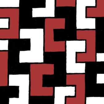
The pattern of five-square C-tiles from an earlier post of mine, Different Perspectives, is seen here. This was an early test case for my new application, which I call Tile Patterns.

This C-tile is one of the twelve pentominoes. All of the pentominoes can tile the plane in one way or another, though some of the tiling bases are a bit larger than this one.

For information on the grid, basis, and segments used to define the tiles, consult my last post, Patterns, Part 5.

My test cases for this application make pretty designs. And some are rather busy in an op-art fashion.

Here is one, which has tiles that seem to simulate cut jewels, which must certainly qualify as a 1990's video game background!

This one broke my program a few times before I got it to work. Mostly because some of the polygons actually have holes in them!

Since the last post, I have implemented a few new things. Before, the application had the ability to set a grid, adjust and specify a basis parallelogram, and draw segments. As you draw, segments appear in all repeats of the basis area.

I have added the ability to divide up the segments when they touch or cross. Then I extracted a set of nodes (all on grid points) that bound each segment. Then I added the code to identify all closed polygon areas. As I mentioned, this includes some holes as well, particularly in the jewel tiling. Finally, the ability to specify the color for each closed polygonal area has been added. This allowed me to create all the tiling patterns you see here.

When I work this way, I only have to specify each polygon's color once, and all repeats of that polygon get colored. So I don't have to (laboriously) do the coloring in Painter. I get a cleaner result also. With this tiling, you can just see the parallelogram basis in red. Oops, I left it in!

Each of these patterns represents a new test case that broke the new application in some way.

The ability to save and restore patterns was the first feature I made. Then, when I built the extraction of polygons, I had to write save and restore of the polygons and their colors. This was an exercise in versioning, since I had saved several patterns already, but only the segments were stored.

Really what is needed (beyond what I have written so far) is the ability to maintain a palette of colors that is easy to pick from. And an easy way to deposit color into the polygons, with just a click.

The traditional way of doing this, along with adding segments, is a toolbox. Which is kind of passé, when you look at modern multitouch UI.

The ability to edit segments (in case I make a mistake) was another important feature to add.


Without that feature, I would have to clear and start over. Very troublesome!

So a segment selection and adjustment capability was necessary to implement. The requirement was either moving the entire segment or moving one of its ends. I just snapped the mouse point to the grid and looked for a segment end at that point.

For picking in the middle of a segment, I used a pick tolerance (really just a few pixels) to decide if I was close enough to the center of the line to pick it. Still, I had to implement point-to-segment distance, which is the only hard geometric computation.

Having implemented Shapes as part of Painter (and part of ColorStudio), I am very familiar with grid snapping and geometry editing. Actually very little coding was required.

I also used the San Marco Basilica tiling patterns as test cases. The first few patterns are really not as three-dimensional as some of the patterns. I think these were some of the first patterns laid down on the Basilica floor.

This pattern shows a black field with interspersed gray and light brown rectangles. Or you could view it as a checkerboard with turned gray squares inside the black ones.

The challenge for the tilers was to create diamonds that are just rotated squares. The larger light brown diamonds have an edge length that is sqrt(2) times larger than the smaller gray squares. That must have been fun.

The next pattern shows a lattice design.

This design has a brown field with small black squares inside it. Each black square has a gray diamond inside it.

Clearly, the later the tile work was designed, the more complicated it becomes. Notice here that the brown field is actually made of hexagons that interlock. It's hard to show that here, though.

In the real Basilica, the tiles are all made of marble. So there is a strong texture to all of them, and also quite a bit of color variation.

That may be the next thing for me to implement, to simulate the marble texture. Of course I have some ideas on how to do that. Also, simulating the grout will be of importance. That turns out to be pretty easy, since I already have a way to render that (as I showed in the previous post).

With this one, the patterns are getting a bit more three-dimensional.

There's just the suggestion of a square box with a white bottom. This is inside a kind of square corner.

Of course, all the tile work is two-dimensional since it is just a floor.

The tilers took on the challenge of making their work more and more three-dimensional with time. By the time we get to the renaissance, most of the designs were faux three-dimensional designs, as we will see with later examples. Perhaps this one is more like a coat of arms.

The next one shows a feature that is quite common on the Basilica floor: the checkerboard.

Checkerboard occur most commonly in frieze work (borders) and often go around curves on the Basilica floor.

This shows the artisan's skill more than ever.

This pattern is found on the floor, along with some that only feature four checkers on a side.

I figure the high contrast of the checkerboard was a visual stimulant. But in reality, the tilers were influenced by what they could get from the quarries. In the year this was made, there was probably a surplus of white and black marble.

No patterns on the Basilica floor are more striking, or more difficult to create, than the ones that feature circles.

Here I have approximated the circular arcs with polygons, but you get the picture.

The really cool thing about this one is the way the circles intersect each other so perfectly.

Oh, and by the way, you see the pattern is incomplete at the top. Its another bug I'm chasing! You will see this on three or four of the tile images in this post.

Nonetheless, this image shows the magic of tile patterns.

This shows another kind of tile pattern. I think the design has the downwards diagonals in a kind of three-dimensional design to indicate some kind of depth.

And traditionally, the black field allows you to see the other elements as objects on that field.

In this case, the black is less used for shading than for simple depth.

This is another example of a half-drop pattern, as it would be called in Painter. Half-drop patterns are typically used for wallpaper. But wallpaper is really not very long-lasting. Not compared with a marble tile floor, which has been known to last thousands of years.

This pattern was featured in my last post. Here the colors are a little closer to the actual pattern taken from the Basilica floor.

With this one, the illusion of depth and three-dimensional structure is excellent.

The black diamond tile is used to show the inside of a box. The top of the box is shown in two colors, giving it a kind of silvery sheen. The side of the box is in natural wood colors. In all, it is an exquisite pattern.

This one was probably sixteenth century.


This next pattern shows clearly the three-dimensional structure.

The rendering of this pattern also shows clearly the grid at the top, the guide lines, and then the tile colors below.

Actually this is a bug, but I find it to be instructional.

With this pattern, the gray diamonds are the bottom of diamond-shaped pits. The white rectangles are the tops of the lattice. And something new: black diamonds form the intersections of the lattice.

It is visually interesting and also something quite new. Each tiling shows the style of its creator. It shows that the Basilica floor was designed by many artisans over the centuries, and that they were influenced by each other.

This tile pattern is an exquisitely detailed one. It is entirely three-dimensional. One thing about these tilings is that they have the concept of an assumed light source.

This imposes a rule that allows the designer to consistently shade the shapes. Of course this means that several different colors of tile are needed. In varying quantities also!

Various pyramidal shapes inhabit this one and so you see it is a different kind of surface depiction than we have seen so far.

Like the black diamonds of the previous tiling, this one features smaller pyramids (or indentations?) at each intersection. So most likely this one was created after the previous one.

Minecrafters will probably recognize this pattern: the corner cube pattern.

It was certainly not invented in Minecraft, which certainly appeared a few centuries earlier on tile floors in Italy.

It shows most clearly that consistent shading is required to get the best illusion of three-dimensional shape.

This is one of my favorite patterns due to its simplicity and its optically convincing form.

So this pattern is one of the more mature three-dimensional forms, rivaled closely by the next pattern.

This pattern is like the previous, but entirely in pyramids.

Ever seen the pyramids at Giza in a satellite reconnaissance photo? What I want to see here are the shadows of each pyramid being cast on their neighbors.

Well, perhaps that was beyond the thirteenth-century tile masters.

One thing needs mentioning. The tile patterns are quite similar to modern quilt patterns. I have even seen some of the San Marco tile patterns worked carefully into quilts (even with the marbled textures in the cloth). I can imagine them in latch-hook rugs as well.

I think this tile pattern shows that the tile masters were both aware and interested in shadows. The black triangle could be one facet of the three-dimensional geometry. But I think it's a shadow.

I see it as a shadow being cast into the trough that has been carved into the floor only in dark squares of the checkerboard pattern.

Walking on a floor with this kind of tiling, or in fact any three-dimensional depiction in a tile floor, would be a trip!

Literally. I would be worried about getting my foot caught in the apparent holes!

I found many depictions of this pattern on the floors in the old churches of Byzantium. This one differs from the earlier one both in color (four colors are used, subtly) and also in the angles of the squares.

Thus also in the width of the diamonds. They liked to use sixty-degree angles, so the diamonds would be "double triangles".

This one is shown at about fifty degrees. Mostly because I used a relatively small grid to construct it. It almost reminds me of the harlequin pattern, which is really only a diamond grid in a two-tone checkerboard. When you shade it in this way, it becomes three-dimensional, and can fool you into thinking it is a real surface.

This ornament is found on the floor at the San Marco Basilica. It is quite complex!

It reminds me of the American Indian rug patterns found at the Ahwahnee hotel in Yosemite.

But the Venetian tile floor will be still there long after the American Indian tapestries have turned to dust.

Unless, of course, global warming takes its toll and submerges the Piazza San Marco in the Adriatic.

In the meanwhile, let's keep the art and science of tiling patterns alive!

Patterns are a part of our lives. Our clothes, our wallpaper, our tapestries and hangings, our rugs, and many touchstones in our very existence show the influence of art and mathematics. The art of making patterns promotes spatial reasoning and creativity.

These are some of the reasons that I have featured textures and patterns in my blog. Also, of course, they dazzle our eyes and provide for wonderful illusions: the illusion of depth, the illusion of interlock, the illusion of spatial connectedness and completeness.

When a tiling pattern has a flaw, we automatically see it.

Patterns are literally built right into our consciousness.

Friday, November 9, 2012

Patterns, Part 5

I have decided to write an application to help me return to the original subject of this series of posts: tiling patterns. As you may remember, I was once impressed by the amazing floor of the San Marco Basilica in Venice. The floor is laid out in tiled marble, using a style referred to as Opus Sectile.

In one of my notebooks, I carefully transcribed the design and colors used by the tiles. You see tiling number 7 here, a wonderful pattern rendered in approximately the same shades as the original.

My first attempt at writing a tiling application became the origin of my San Marco series of applications that also saw the construction of the Painter 6 brushes.

For this app, I have simplified the method of how the patterns are constructed. First I lay down a square grid, similar to grid paper.

Most everything can be laid out on a grid. But grids may lead to inaccuracy of aspect ratio and relative sizes of the tiles. So I created the provision for doubling the grid in place on demand. This takes care of the need for additional accuracy and still keeps grid snapping.

Constraint-based systems make things easier, usually. Here is an example of the grid. All the examples are shown at 50% scale.

The next thing is to allow a basis to be designed on the grid.

A basis is a parallelogram that defines the repeat block of the tiling pattern. This repeat block can be any parallelogram shape.

Here it is a rotated square. You will see why the basis is required in a moment.

You will first notice that the basis is defined on the grid. It really consists of an origin and two vectors. One vector, (3, 1) defines the X axis of the basis, and the other vector (-1, 3) defines the Y axis.

Now, in my previous attempt to design a tiling program, I concentrated on a limited set of graph-theoretical operators. Upon reflection I have decided that this is too limiting.

Instead, I rely on simply drawing lines.

Here I draw a single line intersecting the origin of the basis (at the bottom) and extending over the entire width of it. This line gets replicated into all its instances: there is one for each repeat of the basis within the plane.

All the lines are constrained to fall on grid points. This turns out to be handy when it comes to making the line segments meet.

This tiling pattern only requires two lines, it turns out

The second line passes through the opposite (upper right) point of the basis and extends over its entire height.

It also gets replicated into all its instances. Each instance is defined to exist at one of the copies of the basis as it tiles the plane.

Together these lines form the tiling pattern. In this case, the pattern is a 3 by 3 square and a 1 by 1 square, perfectly fitting together.

Because the basis has edges that are length sqrt(10), and because it is square, the repeating elements in the tiling pattern must have area 10 square grid units by definition.

Next, I can remove the grid and basis, change the lines to black, and render it to create the desired tiling pattern.

I have chosen this tiling pattern to start with to show a useful kind of repeat that doesn't fall into the class of patterns easily designed in Painter.

In Painter 4, which was released in November 1995 (a very crucial period in my life!), I implemented the means to paint directly into a pattern and achieve seamless results. This included rectangular patterns and also patterns with horizontal and vertical half-drops.

In this new program, these kinds of patterns can be easily designed, but also both a horizontal and a vertical offset can be applied simultaneously. Sure, this kind of pattern could be designed in Painter. But you would need a square that is ten units on an edge to create it. Well, you could use a half-drop by using a rectangle that is ten units high and three units wide, and a half-drop offset of ten percent. But these are much messier ways of defining the pattern.

I bring the rendered tiling pattern into Painter so I can apply coloring to it. This gives me some ideas for new patterns.

But ideally I would do this inside the new program, which I call Tile Patterns.

It is easy to design a number of patterns using this fresh approach.

You might assume, just because the basis is a parallelogram, that it wouldn't be possible to design triangular shapes, hexagons, or perhaps strangely interlocking shapes.

That would not be a correct assumption. Here a triangular pattern is designed using the grid and a parallelogram whose shape matches the appropriate shape (two triangles attached).

So in this case, the repeat pattern is actually two triangles.

Here I have used an approximation for sqrt(3)/2 which I arrived at using continued fractions. The actual number is 0.8660254... but it can be successively approximated by these fractions:

1/1, 6/7, 13/15, 84/97, ...

I have chosen 6/7, an approximation equal to 0.857... to represent the irrational number, so it's only off by about 1%.

Hexagons can also be designed using this program. Here I am using the same rational approximation to sqrt(3)/2. As with the triangular design, this design uses three lines (which you can see inside the basis parallelogram).

But, unlike the triangular design, the area of the basis is equal to the area of the hexagon.

So far I have only shown convex shapes, but it is also possible to design interlocking concave shapes. This is another kind of interlock, of course, but one which is cyclical in another way: in a lattice.

Consider this pattern. Here I show interlocking plus symbols.

Yes, as you can see, the area of the plus symbol is five square grid units, and so the basis rectangle also has the same area, with edges that are sqrt(5) in length.

I can design interlocking patterns just as easily, but it does take a bit of planning beforehand.

I like to sketch out the pattern first and then draw the basis on top. This gives me a blueprint for how to proceed inside the Tile Patterns program.

Here you see a simple interlocking pattern.

You can see it is designed on the same basis as the first pattern I showed. There are an extremely large number of patterns on this one basis alone.

Tiling is an intellectual exercise. When I was younger, I used to buy grid paper in hexagons and triangles and then color inside the tiles to make patterns. You can see one of these in my three-dimensional thinking blog post. So in the same vein, I color the tiling patterns I create, looking for novel color combinations.

Here is an example of this kind of fun.

Sometimes I just line to make patterns that show color and delight the eyes, and sometimes I am in it for the pattern: really more of a contrasty dotted kind of thing.

It is useful to realize that the tiles do not have to fill the entire space within the plane. I can create individual structures with some separation in between them to give a kind of hand-designed formulation.

In Painter, I can soften and increase contrast (anneal) the pattern to get rounder forms when I want.

This is the technique I used to create this new pattern, a candy-coated array of dots.

They are quite pleasant!

I am not sure where I want to go with this application in the future. Most likely the next step is to have the app automatically enumerate the closed shapes that define the repeats (though, as you can see, there might not be any closed shapes, as in the case of the maze pattern below).

It seems like a merging of the San Marco application capabilities with the line-drawing capabilities of the new app would be a good way to proceed.

Perhaps a nice way to save out tiling patterns as Painter patterns would be useful.

As I referred to earlier, the ability to color the tiles inside the application is a capability I will code up very soon.

Here is a pseudo-maze pattern I have created using this application. This shows that I can control the thickness of the lines when rendering them in black-on-white.

And the final pattern I will show is another tiling pattern from my notebooks on the San Marco Basilica.

Of course the grout spacing is nearly zero in the actual Basilica floor. Those artisans in the twelfth century were actually quite good!

Friday, November 2, 2012

Different Perspectives

You can look at things from different points of view. And this can help in almost everything you do.

Look at each new point of view as a degree of freedom in understanding. The more degrees of freedom, the more independently your thoughts can move.

With each new degree of freedom, concepts that you once thought of as constant can now change. Perhaps things you once took for granted can become emergent truths of your new frame of mind.

Or become surprisingly refutable.

One thing is certainly true: if you don't at least try to look at things from different perspectives, you become stagnant.

Degrees of Freedom

Look for a dimension along which there is some give and take. Perhaps things are not completely fixed and immutable.

When technology changes, for instance, slippage occurs and a new dimension of possibility opens up. This can cause disruption.

Once it was cheap to send megabytes through the Internet, intangibles like music and movies could be easily sent.

Record stores and video stores died.

So find that degree of freedom before it finds you.

Human Interface

With true-color displays and greater ability to compute, transparency became possible in interfaces. A new dimension opened up: opacity. But in this case, a little overuse quickly showed that things could get confusing.

Nonetheless, in modeless situations that are optional, such as heads-up displays, inspectors, and the like, transparency does still get used.

In UI, transparency really refers to whether the use of a control is obvious. Aside from this attribute, ergonomics and simplicity are also paramount design considerations.

To make an interface item cool without regard to its function is simply gratuitous. I have certainly done that from time to time, but I suspect those days are over. Or are they?

The use of three-dimensional interfaces is another interesting design consideration.

There have been a few attempts at creating fully three-dimensional interfaces, such as SGI's button-fly interface. Our approach to three-dimensional interface is much more sophisticated today, and integrated into our workflow.

Two-year-olds and grandmas alike have been brought to the computer as never before by glass and multitouch.

Nonetheless, Minecraft is quite popular, as is Spore and The Sims, all three-dimensional worlds manipulated directly. It's important to teach three-dimensional thinking.

And it is true that some interfaces appear to be three-dimensional, like Apple's cover flow. Put simply, magic counts.

But form still follows function.

Fit Together

Things must fit together and dovetail perfectly. Seamlessness counts. When human interfaces are inconsistent, something feels wrong. Even to two-year-olds and grandmas.

Both workmanship and workflow fall into one category now: fit.

Once again, when you consider fit as a guide rule, suddenly things might reorganize themselves in a wholly different way. A new pattern emerges because you discovered the right degree of freedom to work from. You found the right perspective.

Did things ever line up quite so right?

The value of your creative output is at stake.

Saturday, October 27, 2012

Triangular Forms

Noteworthy

Looking through my notes, I have found several instances of triangular shapes that form an interesting group of figures. I have completed a rendering of the triangular form of the Borromean rings, featured earlier in Interlock. This time it's much cleaner and crisp. Here we can see the interlock a bit better and I have also added some woodcut-style shading and some sumptuous color that makes it resemble a real hand-crafted object.

This comes from an original rendering that was done of the triangular rings themselves, but without color and shading. The idea was to make a visual illusion. Without the color and shading it's almost too much to take in all at once. Some confusion sets in.


The Borromean rings are, of course, related to the Valknut. A fantastic impossible Valknut is featured in my blog post Drawing On Your Creativity. My old notes are full of the Valknut and also of impossible figures.

Yet, I have a few pages of handwritten notes where I dwell specifically on triangular figures.

The Borromean rings are remarkable as a three-way-dependent group. If you remove one, the other two fall apart. This is the essence of interlock, of course. The very definition.

Valknut

But the Borromean rings that were used by the Vikings had a very different overlap than this one. And they were usually shown pointing up, not down (though not always).

Here is the correct rendering (though some versions differ in left-to-right reflection from others), with bright colors for each ring. This is clearly distinguished from the first rendering because the insides of the triangles are V shapes.

There are many more ways to show it as well, each with its own overlap formula. If each successive overlap has an over-under-over pattern, though, there are only two, which you see here.

There are two forms for the Valknut, and here is another one. Sometimes this form is called the Triquetra. These two figures have existed for at least a thousand years or longer, in exactly these forms. Most depictions of it on runestones from the Viking age show it as thick and tightly formed. All apparitions of the Valknut are associated with Odin. It is said that it symbolizes Odin's promise that the dead Viking warriors have a place in Valhalla. Those who receive the Valknut are the chosen warriors. So, on thousand-year-old runestones in Denmark and Sweden, you often see a battle scene depicted and a Valknut appears marking the heroic figure.

As far as I'm concerned, though, the Valknut is a cool figure, exhibiting strong interweaving and geometry. My take on this Valknut is that it resembles, at least topologically, the trefoil knot.

Taking it Further

I drew this figure while trying to create a Valknut. But I hadn't allocated enough space for the inner portion, and so I had to join the triangles in the middle. I got another idea or two and sculpted it into its current format.

Isn't it interesting how triangular forms can so quickly become logo-worthy? They catch the eye. This form seems to express that the motion of the form is an internal force, rather than an outwards-moving force. It is closed in on itself, in a way.

One of the main issues with triangular figures is that it forces me to think before I draw. I have to plan ahead.

Here is another figure I drew recently. I think I was onto something with the three points on the right and bottom edge.

With such a triangular network, many possibilities exist. Sometimes I like the irregular forms, because they add character to the shape.

But usually the forms, as they were used in antiquity, were as regular as possible because that form clearly resonated with the ones who made them.

The form I was going for appears to be the Triquetra form with an interlocking triangle.

Inspired

Here is my rendering of this figure, with shadows to make the overlap a bit easier to grasp. By coloring each single thread, the interlocking nature of the figure becomes perfectly clear.

This form becomes almost inspiring in its simultaneous simplicity and complexity. It is no great surprise that this Triquetra form, in various mutations, has been used for so many thousands of years. Though usually the interconnected figure was a circle and the corners were rounded off to make it more like a trefoil knot.

The Book of Kells has one. A runestone on Gotland has a few. With the rise of Christianity in Scandinavia this figure became a cross by connecting four of them (the Carolingan cross). A round Triquetra is used to symbolize the holy trinity on some bibles.

But you can take this format even further. Imagine those who are fascinated by the Valknut (which, to me, symbolizes an idea), separated but entangled by their interest. Here is their symbol.

Nothing can break it.

It's almost like a heraldic mark or insignia.

A badge of fascination.

It shows that the interest for such things never dies. It gets carried on by those who discover the symbol anew. And so it has gone for thousands of years.

Those who practice the art of creating symbology know that there is an inherent interest built right into humanity for what graphic symbols convey to their observer.

The essence and practice of logo forms is rooted in our natural Jungian response to symbols. We can't help our response to them. Yet some logo forms come to stand for evil and other logo forms come to represent eternity. How does this happen? Will these forms forever be etched into our collective memories? The Valknut proves that a symbol can easily last thousands of years.

My sense is that forms are chosen by political groups and companies for a reason. A simple intelligent form can be chosen as a symbol that is easy to remember, to help propagate the brand by creating a catchy figure that can be expressed anywhere. That it can create such a strong impression often testifies to the strength of the designer and their understanding of how we respond to symbols.

Isn't graphic design wonderful?

Monday, October 22, 2012

Creativity and Invention

Invention is the act of making something entirely new or of discovering an entirely new way of accomplishing something, and so often this is a result of trying many different approaches. For me, when one method doesn't work or achieve the results I need, I just try something else. Yet what will make an approach different from someone else's approach is the spark of creativity. To solve the problem, try applying a technique or a principle that, at first glance, doesn't seem to apply.

When I invent things, I know I'm trying to solve a problem. I'm exhausting all of the possible ways to solve it. I'm looking for an efficient way to make use of the information or progress that has been made so far. I'm finding a better way to do it. Or a way to do it at all.

Try Something Unlikely

In ancient Egypt, blacksmiths were good at forming swords other rudimentary tools by holding a piece of iron into a fire to make it malleable and beating it with a hammer. The hammer and anvil had been used for many years, having been invented in the iron age. But sometime around 1450 BCE in ancient Egypt during the reign of Twthomosis III somebody decided that a leather bag could serve as a bellows, and that the increase of forced air would make the fire hotter. Because of this, metal became more malleable, and could even be melted.

This is a clear example of using an unlikely object in common use for something else entirely. A leather bag, used for carrying things, becomes a bellows for metallurgy. Many inventions, in fact, require this kind of discovery.

To make these kinds of discoveries, we must learn about as many things as possible, but perhaps not in depth. Absorbing a little about plenty of subjects is food for invention. It helps you make connections between things that are, for all intents and purposes, not connected in the first place.

For instance: knowing about Voronoi diagrams helped me figure out how best to render fascinating patterns like those produced by raindrops on a windshield. My blog post on where ideas come from is helpful in understanding how to exercise your brain to make such connections.

Try Try Again

But even more discoveries happen a small bit at a time. And the light bulb is the perfect example. Most people associate Thomas Edison with the discovery of the light bulb. But really, he only participated in part of the invention: the part that made it practical.

In 1800, Humphry Davy, in Britain, discovered that applying electricity to a carbon filament could make it glow, demonstrating the electric arc. Some 77 years later, American Charles Francis Bush manufactured carbon arc lamps to illuminate Cleveland, keeping the filament in a glass bottle. Two years later, Thomas Alva Edison discovered that filaments in an oxygen-free bulb would still glow. Then he tried literally thousands of materials before settling upon carbonized bamboo for the filament. The new bulb could last 1200 hours. And it had a screw-in base! But it wasn't until 1911 when modern sintered ductile tungsten filaments were invented at General Electric, that their useful lifetime was increased substantially. Then, in 1913, Irving Langmuir started using inert (electrically nonconductive) gases like argon (instead of a vacuum) inside the bulb, which increased luminosity by a factor of two and also reduced bulb blackening. Nitrogen, xenon, argon, neon, and krypton are routinely used inside bulbs today. However, when mercury vapor is used, the gas itself is the conductor, producing blue-green electric arc.

Of course, light bulbs are being reinvented every few years now. Fluorescent bulbs are used in businesses largely because they are four to six times the efficiency of incandescent bulbs. Then there were compact fluorescent light (CFL) bulbs, sharing the same efficiency advantage, but in a compact light bulb form factor. And now light-emitting diode (LED) lighting. These new bulbs save about 80-90% of the energy (over incandescent bulbs) required to illuminate us. And they last about 25 times longer than CFL bulbs.

The future is going to be just as much about conserving energy as it is about producing it.

Try Harder

The main use for creativity in invention is simply so you can solve the hardest problems of all. These are the problems that don't have an apparent solution.

Two supreme examples of this kind of problem are computer vision and computer cognition. Teaching a computer to understand everyday objects like faces, kinds of clothing, the make and model of a car, and even something as simple as a tree is incredibly difficult. Humans do this very well, of course, and this belies its complexity. Teaching a computer to read and understand a book is also hard beyond comprehension. Small parts of this, like optical character recognition and a small amount of natural language processing have been accomplished. But for the computer to actually understand the subject matter and discuss it, or even better to learn from it, is practically impossible. People dedicate their lives to solving this problem.

A small example of the problem of computer cognition is what I once dreamt about: subject space. I envisioned a space where all concepts are related in different ways. Each concept is a node in the graph of subject space and arcs between the nodes relate them.

Here I show is-a relations as a green arrow between two objects. So the green arrow between FLEA and BUG represents the information that a flea is a kind of bug. Similarly meat, rice, and carrot are a kind of food. This is a subset relationship. Another kind of relationship has to do with ownership or possession. A cyan arrow from one object to another means that the source object can possess the destination. A dog has legs, and so does a bug. A has relation can have other information associated with it. For instance, a dog has 4 legs and a bug has 6 or 8 legs. Any relation, which generally is where the verbs live in this space, can have additional information associated with it, in the form of an adverb. For instance the eats relation can have quickly associated with it.

Action relations concern a direct or indirect object. These are shown in indigo. Legs walk on the floor. A human buys food, and a dog eats the food. A flea lives on the dog. In this way buys, walk-on, lives-on, and eats are relations. And by definition, those relations can have a timestamp associated with them. The sequence in which actions occur affect the semantics. Sometimes in a causal way.

Very complicated relations are two way arcs, like the dog-master relationship. There are other obvious relationships, like is-an-attribute-of, where appropriate adjectives may be associated with subjects. Even idiomatic expressions get their representations here. For instance hair of the dog is slang for an alcoholic drink.

Note that a human has legs but I didn't include an arc for that relationship. This shows that subject space is not planar. In fact, it is n-dimensional.

Such a graph is useful in understanding and parsing the grammar of text or spoken language. A sentence can then be encoded into a series of factual semantic concepts. For instance, if you know the man buys food, then you will have to determine what the food consists of. Based on this graph, it could be meat, carrot, or rice, or some combination of them.

Also, the relation eats really means can eat. When parsing text, the fact that a given dog is eating or has eaten food is yet to be discovered. Once discovered, this subject space graph helps the semantic understanding system codify the actions that occur.

Sometimes the solution, however complex, can come to you in a dream. And this shows a creatively-applied technique, graph theory, and how it is applied to a nearly impossible problem, computer understanding.

Trial and Error

It is quite remarkable when a discovery gets made by accident!

Physicist Henri Becquerel was looking for X-rays from naturally-fluorescent materials in 1986. He knew that phosphorus would collect energy by being exposed to sunlight. And he had a naturally-fluorescent material: uranium. But there was one main problem: it was winter and the days were all overcast.

So the put his materials together in a drawer, including a bit of uranium and a photographic plate, and waited for a day when the sun would come out. When that day came, he removed the materials from the drawer and soon found that the photographic plates were affected by the uranium without being first exposed to sunlight.

And radioactivity was discovered.

My point is that sometimes a discovery is the result of unintended consequences. As for me, I have invented a few effects by accidentally creating a bug in a program I wrote. This is part of the pleasure of working in graphics. In fact, the cool visual effect in my Mess and Creativity post was discovered as the result of a bug in a program that computed image directions.

Trials and Tribulations

One problem, the lofting problem, was an elusive problem to me for years. I spent a lot of time constructing better and faster Gaussian Blur algorithms over the years, and even learned of a few new ones from such people as Michael Herf and Ben Weiss. But it wasn't until late 2004 that Kok Chen suggested that I apply constraints to the blur. And an iterative algorithm to solve this problem was born. This is detailed in my Hard Problems post.


Saturday, October 13, 2012

How Old Is Your Software?

Let's look at software vulnerability. What kinds of software are the most vulnerable?

Well, duh! The oldest, most crufty kinds of course! Whenever you add onto software year after year, you unwittingly create opportunities for exploitation. We say that our data are secure, yet we do not test software in anywhere near the rigorous fashion it requires!

This leaves us with highly-functional yet completely-vulnerable software. And the users don't even realize it. Business users, corporate users, individual users, you.

Which Software is the Most Vulnerable?

Means: Programmers only need to be connected to the Internet and have a computer capable of being programmed to become a hacker. This makes up basically every person on the planet in all but the seriously developing nations. So let's just say there is a large sample set of possible hackers.

Motive: To be vulnerable, you also have to be hiding something desirable, interesting, or perhaps embarrassing. In other words: valuable to someone who just needs some street cred. What holds this kind of data? Your computer, your hard disk, your database, managed by operating systems, software that routinely gets installed or updated, things like distributed database server software also that protect huge amounts of data. For more motives for hacking, see my first blog post on Hackers.

Opportunity: So, let's look at software that has enjoyed release after release year after year. These releases are generally done for the purposes of:
  • increasing their feature set
  • making them faster
  • fixing their security holes
So let's examine systems which do this. Operating systems, like Windows, Mac OS X, iOS, and Android certainly are updated quite often. System software for supporting desirable things like videos are updated often as well, like Adobe's Flash. So are things like their suite of programs the Creative Suite. In business, the Oracle SQL Server is updated quite often also, to add features and, more often, to patch vulnerabilities. Programming capabilities like Java site updated a lot also. Even GNU, the Free Software Foundation's operating system, which declares proudly that GNU's Not Unix (though it is identical to it in every way I can see) is updated quite often.

These are the most vulnerable software systems on the planet, merely because they are updated so often. And because so many people and businesses use them.

What Makes These Vulnerabilities?

The best positive marketing driver is the first one: increasing their feature set. To do this, it is often necessary to allow other developers to add to their feature set. We see this in nearly every OS platform in history. Supporting Applications. Allowing Plug-ins. Enabling programmability.

Being able to program something is highly desirable. It is also exactly what causes the vulnerabilities.

In 1984, I bought my first Macintosh. Actually it was an original 128K Mac. And the first thing I did was to take it apart, with a long Torx screwdriver and some splints to crack open the shell. My business partner in Fractal Software, Tom Hedges, was doing the exact same thing in the very same room. We both came to the conclusion that it needed a real hard drive, which was an interesting hardware task. We also came to the conclusion that we wanted to program it.

I wanted to create a new application.

We met an Apple person, Owen Densmore, at Siggraph that year and he put us in touch with a key developer, Bill Duvall, who had built the Consulair C system with a text editor. Owen gave us the external terminal debugging capability, called TermBugA, that we could use to debug our applications. He put us in touch with Steve Jasik, who authored MacNosy, and had disassembled the entire ROMs in a Mac. We built our first apps for the Mac within a couple of weeks and began our development career.

This is the old school method. The very ability to program a device has a name now: pwn. This means "owning it" but it also has a whiff of programmability to it.

If a device is a computer of any kind, then the desire to program it freely is a natural consequence of these old school ways.

But those ways must change.

How Are The Vulnerabilities Exploited?

The goal is to become a privileged user on the computer. This will enable the hacker to install their programs, get access to whatever data is available without restriction, and basically to take over the computer. Once this is done, then malware can be installed. Things that log your keystrokes. Or watch you through your webcam. Or check which web sites you use, remembering whatever passwords you use to access them.

This enables them to steal your identity or your money. Or you can be blackmailed with whatever incriminating data is present. In other words, criminal activity that exploits you, your business, or your customers.

But overwhelmingly, your computer can become something that is not under your control and can be used as a base for expansion, virus propagation, or as a machine to support DDoS attacks as well.

How do they get control of your computer? Often it is with a very small bug.

Now, software above a certain size always has bugs in it, and that's the problem in a nutshell.

The kind of bugs that hackers look for are primarily buffer overrun bugs. Because all machines are Von Neumann machines, data is stored in the same place as code. This means that all the hacker needs to do is insert their code into your system and transfer control to it.

A buffer overrun bug allows them to do this because, by definition, once a buffer (a fixed-size place in memory to store data) is overrun then the program has lost control of what is going into memory. With a little cleverness, after overrunning the buffer, the data will go someplace that is a tender spot. This can cause another bug to happen or it can be a spot where program control will end up soon enough in the future.

And voilá, the hacker is running their own native code on your computer.

Their next trick is to become a superuser. This is sometimes referred to as becoming root. These terms come from UNIX, which is the basis for many operating systems, like Mac OS X and Linux.

This can be done several ways, but the most effective way is apparently to masquerade as a routine install of familiar software. Like Photoshop, Flash, a Windows Service Pack, etc.

But the process of taking over a computer, which comprises a rootkit, is often a several-step process.

Perhaps the computer becomes a bot, simply running jobs for the hacker: sending email spam at random times, using the computer's position in the network to attack other local computers, making the computer be part of a Distributed Denial of Service (DDoS) attack.

Perhaps the hacker only wants to get the data in that computer. The easiest way is to gain superuser access, and then you have the privileges to access all the files. Maybe the hacker just wants to watch the user and gain information like bank account numbers and passwords.

Sometimes the hacker just wants to get access to databases. The databases contain information that might be sensitive, like credit card information, telephone numbers. Since these databases are generally SQL servers, a specific kind of attack is used: SQL Injection attacks.

Poorly-written SQL can have statements in it that evaluate a string and execute it. Rather than running code with pre-specified bind variables. It is these strings that make SQL vulnerable to being co-opted by a hacker, who can modify the SQL program simply by changing its parameters. When the string gets changed to SQL code of the hacker's choice, it can be executed and the hacker can, for instance, extract all of the database records, instead of the usual case where the records on certain date may be accessed. Or the hacker can change the fields that get extracted to all the fields instead of a small number of them.

How Do We Combat This?

It is easy to say there is no way to fight system vulnerabilities, but you would be wrong.

The strongest way to stop it is curation. One form of curation is the ability of a supervisor to prevent malware from becoming installed on a system. When a system allows plug-ins and applications, these must be curated and examined for malware and the backdoors and errors that allow malware to take hold. And they must be limited in their scope to prevent conscription of the operating system and applications that run them.

In the case of Apple, curation means examining every App built for its platform for malware or even the whiff of impropriety. And this is a really good thing in itself, because it means that far less malware attacks iOS than does Android.

In the case of SQL injection attacks, rewrite your SQL to not use executed strings.

But general practices need to be followed religiously. Make sure your passwords are not guessable. Use firewalls to prevent unintended connections. Beware phishing attacks.


Friday, October 12, 2012

Cubic Nesting

For some reason humanity is obsessed with the cube. We build our skyscrapers based on it. We study its symmetries. We ship products in it (excepting, of course, Painter, which came in a cylindrical package).

Nature has cubic symmetry built right into the salt crystal. And, as we will presently see, many other shapes have cubic structure built right into them, by virtue of polyhedral nesting geometry.

If you snub the corners off a cube all the way to the midpoints of the edges, you get a cuboctahedron.

This shape, shown here, fits perfectly inside a cube and you can immediately see how the corners of the cube may be removed. As far as I know, this is one of the few examples of a 14-face polyhedron.

It is natural in the sense that the cuboctahedron has one face for each face and vertex of the cube.

It has been said that if you pack clay spheres into a space and press them down that each clay ball will have approximately 14 facets.

You could think of the spheres as mutually-avoiding points in space. The polyhedra made by the mid planes between the points would then be a three-dimensional Voronoi diagram.

Another naturally-occurring polyhedron is the rhombic dodecahedron. This is the natural shape of a garnet crystal. It is bounded by 12 rhomboids whose diagonals have the ratio 1::sqrt(2).

The cool thing about the rhombic dodecahedron is that it can tessellate space. So it makes a nice packing form. Honeybees use it to form the cells of their honeycomb.

If you look closely, a cube can nestle perfectly inside a rhombic dodecahedron. In particular, this shape has one face for each edge of the cube.

The rhombic dodecahedron is the dual of the cuboctahedron because you can construct each solid by putting a vertex in the center of each face of the dual. But these are not the only solids that nestle with a cube.

Perhaps the coolest solid to nestle with the cube is the dodecahedron itself. This shape is bounded by 12 pentagons.

This shape is used for the 12-sided die in Dungeons and Dragons because it is a regular polyhedron.

Here, if you look closely you can see the cube nestled inside. In fact, there are five distinct nestlings. This is because each cube edge travels along exactly one of the five diagonals of each pentagon.

This shape is ruled by the golden section: (1 + sqrt(5))/2 or 1.6180339.... This number is the limit of the ratio between successive Fibonacci numbers, defined by the recurrence relation Fn = Fn-1 + Fn-2.

The Fibonacci sequence is 0, 1, 1, 2, 3, 5, 8, 13, 21, 34, 55, 89, 144, ... and it gets used for a lot of different purposes. For instance polyphase merge sorting and optimal one-dimensional searching.

If you connect the four vertices of a cube that don't neighbor each other, you get a tetrahedron. Each of the other four vertices caps a right tetrahedron.

Here I show it as an exploded view. The cube can be made up from five tetrahedra. One is of the platonic form, and nestles inside the cube perfectly (the center one).

This is one tessellation used for better cubic interpolation, it turns out. Diagonals become smooth when you interpolate in this way. Any tetrahedral tessellation converts more easily to barycentric interpolation, which is easier than trilinear, and offers less distortion on the diagonals.

Cubes can also be split into cubes, as everybody knows who has solved a soma cube or played with a Rubik's cube.

Or played Minecraft.

When you split cubes into cubes, you can irregularly cut a cube up into a paired set. This set consists of two pieces that are keyed to each other. The more sub-cubes you split a cube into, the more possibilities for keyed sets exist.

Here is a possibility, one of several, that exist when a cube is split into a 3X3X3 array of sub-cubes.

In all (but the trivial uninteresting) cases, a concavity on one side is met with a convexity on the other.

I have turned one of the pieces by 60 degrees so you can see that symmetry figures into how many of these keys there are.

For those people interested in splitting things up into pieces, you can see my Pieces post. For more secrets of three-dimensional thinking, my Three-Dimensional Thinking post, or my Three-Dimensional Design post.

Cheers!