 I like to draw. I just can't help it. The process of sketching and drawing has always interested me. As with music, if I stop for a while and then start again, it all comes pouring out!
As the original author of Painter, of course, I had to study drawing from many angles. Now, when I draw, I feel a certain freedom in simply returning to the art without the burden of analysis. And I can begin to realize just why I started drawing in the first place.
Doing the Clean Line-Art Style
I keep thick pieces of standard-size paper around to sketch on, my favorite creative weapon being an ultra-fine Sharpie (retractable!). Drawing, for me, is a way to exercise my creativity.
My process for making art has been documented in this blog post series before: scan into Preview using a networked scanner, tonally adjust and crop, export to JPEG, import into Painter, clean up, resize to blog-compatible sizes using Preview again. Sometimes I will use a gel layer in Painter to colorize, particularly when I'm doing a technical illustration.
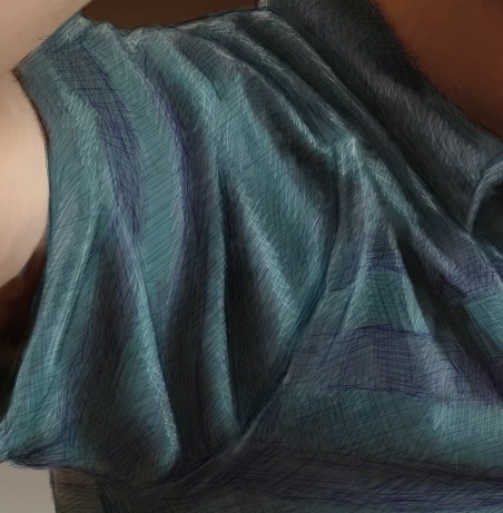
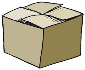
 One of my styles is thus a clean, line art style with the hand-wrought look that is usually lost with Adobe Illustrator. A little like a woodcut. All of the pieces shown here were done in this manner, in the last few days. I have been practicing my implied edges: a cool form of negative space.
I like to use my desktop for most of my posts because it simplifies my process and allows me some very nice editing opportunities. I like to edit using the Wacom tablet in Painter.
Rotating the Image for Sketching
One of the reasons I like this is because I can rotate the image, making all my hand work more natural and ergonomic. In Painter, you can hold down the space bar and the option (alt) key and rotate your image by direct click-and-drag in the image. With the same keys held down, a single click restores the normal orientation. But, as I draw and clean up lines, I generally keep the drawing rotated at whatever angle most makes sense.
I learned this workflow with sketching by watching Disney artists in studio. Their old-school sketch workstations had a turnable easel. I would bet that they have something much more like Painter these days. Because I thought to migrate that workflow to the computer.
 Ideation
So, I'll get an idea and ponder over how to express it in this style. When I get an idea, I like it to be one that's out of the box, not in the box.
Sometimes I will go back to the old sketches from the Painter days and I'll get an idea that I might have pursued once, but is lost to me now. And to re-examine it and explore it afresh is exhilarating. So much has been packed away. There is so much to rediscover.
Other times I will think of an idea, like Up and Down and have an internal vision for how I would like it to appear. When it intersects another of my favorite pastimes, like impossible figures, then it is settled. I begin to draw. So it's all in the perspective: how you look at it.
 With Up and Down, I actually drew it a few times before I got the right shape for it.
I chose the impossible picture, with entrances going into space that simply can't exist, to make the sketch more of a personal expression, more my style.
When I was a kid, I used to have my room in the upper floor, and then later in the basement. So I know the feeling of going up and down stairs quite well, and the feelings when it changes from up to down.
I chose to let the color connote shading in this one. And the blue for sky and red for, well, the fiery depths. More allegory. Just a tiny bit of symbolism. But in my house as a kid, the upper floors had more sunlight or overcast light, which had a bluer color temperature. The lower floors had a redder light, because we used incandescents there.
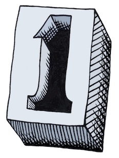
In my post about iconic things, I draw several figures that derive from the concept of One. When I was drawing them, I imagined a mould that you could pour lead into that could make a three-dimensional one.
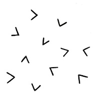
Some Technique
 This is what I could envision. I just now drew it but I used a creative technique for the cross-hatching. This time, when I sketched it, I did the cross-hatching by hand. Then when I brought it into Painter, I brought each of the different directions of hatching into a separate layer so I could sculpt their shapes separately.
I tend to use a tiger-stripe technique for simulating woodcut looks. This comes from the V-shaped tool that is used to carve out linoleum and wood blocks and the shapes that they make in the blocks.
In scratchboard, a similar look is achieved. This ease of width-control was the reason I created the original scratchboard tool in Painter.
So this sketch actually comes from a six-layer image.
Iconic Patterns
 I demonstrated in the iconic things post that there were speckles that didn't just use dots when you render them. The old Good'n'Plenty design. Here we have a design where there is a complete 360-degree freedom to each placed item, which is the ultimate speckle. Even the hatchings that I demonstrated before only had a 180-degree freedom to their placement.
I can imagine controlling the direction of each item by a random process, like the one I used to create the hatchings, or by using the directions from a vector field. You could create random flockings of bird-symbols in this way.
Often, in architectural renderings, random tree placement, with different sizes, is used to stylistically symbolize a grouping of trees. Sometimes this kind of pattern was used in the formica tables of the 1960s. It's worth looking up. Thinking about patterns and the way they fit together is one of those little creative things you can do.
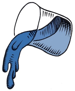
 Liquids and Different Perspectives
In a continuation of the earlier pieces here, I thought I would do more liquid stuff, because I have been doing that kind of rendering since I was young. It was always an excuse for shading, and as you may know by now, I do like to shade things.
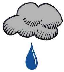
Drops of water or oil are fascinating to me. When I was a kid, I would sometimes look at the world through the drops or rainwater on the outside of the car window. I could see the world as a microcosm of distorted figures, and back then it was a good exercise for my brain to see things from a different perspective. I love the pattern of raindrops on a windshield: the way they avoid each other, the way they coalesce, the natural pattern of their look.
Real raindrops don't actually look like these. They are really globules of liquid, and they move and wobble as they fall. Kind of like metaballs, they have a shape defined by surface tension and equilibrium. Water drops are free from many forces, when they are in flight.

But these liquid renderings are more about stark shading than reflections and refractions.
Rendering the quality of reflection and refraction in line art is rather complex but a laudable goal. When you hold a drop of water on your finger, I often have watched the fingerprints beneath become magnified to a huge extent, and the skin also took on an interesting glow inside the drop, due to the caustics (concentration of light by the bending of rays by refraction) created by the shape of the bead of water.
 Along with a bright shine on the drop, it creates a marvelous miniature scene, allowing us to watch yet another perspective: one magnified instead of the one viewed through the car window that seems to shrink the entire world into a single drop of rainwater.
As a small kid, I was nearsighted, and so things like this would constantly be of interest to me.
Other perspectives interested me as well, as a kid.
 Like the doorway. Both entrance and exit, it was the thing that kept the kids captive in the schoolroom, or kept them out. Being the guardian of in and out, a door seemed more profound to me than just a block of wood on hinges.
And, while I was at it, what made the inside in and the outside out? Why couldn't things switch? Another perspective change, quite relevant in the 1960s.
After all, I watched Star Trek, so I knew that doorways could be more than just a way in and out. A door could be a portal to another planet or even to another dimension.
 So, when I tried my hand at Up and Down, initially I thought of something we were looking into directly, even with glass doors.
This is the original sketch for Up and Down. Actually, unlike the final product, it didn't really have any magic. That's when I thought about the impossible version.
It is the change of perspective that makes this kind of piece work. When you get to drawing, liquify your workflow to make your sketching smoother. And pour on the creativity!