Showing posts with label shading. Show all posts

Sunday, June 2, 2013

Mastering Nature's Patterns: Basalt Formations

I love patterns. This all originally stems from my observations of nature's patterns. A lot of the objects I draw (and develop in code mathematically) come directly from nature.

Strikingly, nature will often conspire to produce objects of great beauty, ones which we cannot match without tremendous effort. An example of this are the basalt formations. Created by volcanic upwelling, great pressure leading to crystallization, and fracturing during cooling, they are nature's brilliant tessellations, awe-inspiring extrusions, and mad ravings simultaneously.

They resemble three-dimensional bar graphs. Their fracture pattern, in two dimensions, is a natural Voronoi diagram. I first saw this pattern in nature while observing the way that soap bubbles join. Without fully understanding it, this observation introduced me to the mathematical laws of geometry when I was very young. Little did I know that I would never stop trying to duplicate it.

In this post, I show you how I duplicated this particular kind of nature. And I did it in my style, as you can see.

To create a drawing of a basalt formation, I actually used a rendered Voronoi diagram, which you see here, transformed it into a subtle perspective, establishing two vanishing points. Then I made three copies arranged as layers in a way that approximated placing them on three-dimensional transparent layers at various depths. This was so I could see the levels, and so the third vanishing point could be right.

Of course, I used Painter's Free Transform to do this!

I kept each layer a little bit transparent so I could get an intuitive feeling for which layer was on the top and which layer was on the bottom. This technique is called depth-cueing.

As you can see, it worked pretty well. I stopped at three layers because I didn't want the drawing project to get too complicated. But, of course, like all of my projects, it soon did!


Next, on a new layer, I drew lines on top of the the lines that I wanted to represent the three-dimensional surface of the basalt formation. This meant choosing a three-dimensional height for each cell. The base layer that extended to the outside of the drawing was the lowest height, of course, and a second and third layer was built on top of it.

This causes cells to raise out of the base layer and appear to become extruded.

When I consulted some real images of basalt formations as a guide, I found that they were quite imperfect and usually were cracked, damaged, or eroded in some way.

I really wanted my drawing to represent a perfect un-eroded result.

I used an extra transparent layer (behind the layer with the lines) and marked each cell with a three-dimensional height index so I could be sure which heights corresponded with each cells. This told me where to put the shading and also told me how to interpret the extrusion lines.

This layer was for informational purposes only. You see here the original small layer with crudely drawn lines. It's actually kind of hard to see the three-dimensional relative positions of the cells in some cases, which is another reason I labelled each cell with a height index.

Once I had designed it, I found that the drawing was way too small to shade the way I like to (using a woodcut technique) and so I resized the image and went over each of the lines by hand to make it crystal clear at the new resolution.

That only took a few days.

Why? After resizing the image, I found that each line was unusually soft. This meant that I had to go over the lines with a small brush, darkening and resolving the line. Then I had to go around it with white to create a clean edge. This is what really took the time!

Naturally I do lots of other things than just draw all the time, and so I had to use extra minutes here and there. I kept the Painter file on my laptop and brought my Wacom tablet with me in my bag.

I spent probably ten or twenty hours drawing this image.

Once the lines were perfect, the next step was shading. But of course it had to be in my style, and this also took quite a bit of time.

I used woodcut shading to create shadows and accessibility shading. This created a very nice look.

To do this, I drew parallel lines at a desired spacing, taking care to make them correspond in length and position to the shading and shadows that would result from a light coming from the left side.

I thickened the lines at their base, and made them a bit triangular. Then at the end, I used a small white brush to erode and sharpen the point and clean the sides of each shading line to get the right appearance.

The final step was coloring the tops and the sides, using a gel layer.

I colored each layer using a different shade of slightly bluish gray. The top layer got the lightest shade.

Here you can see a close-up of the final image, which was very high resolution indeed.

Even though I started out with a computer-generated fracturing pattern, I was able to retain a hand-wrought look to the final image. None of the lines are really computer-prefect

Yes, nature's patterns often take a bit of time to master!

Friday, November 30, 2012

Patterns, Part 7

The Tile Pattern Designer is coming along. In it, you design a tile pattern in a parallelogram repeat block. This gives you quite a bit of leeway, with the ability to design triangular and hexagonal tiles, as shown in Patterns, Part 5. Using a grid to design tile patterns in this way is sufficient to plot out most of the tile patterns from the floor of the San Marco Basilica in Venice, as shown in Patterns, Part 6.

Now I will show you some of its features, all based on complex analytic geometry, which you can learn about in How Does It Work, Part 2.

First I design a pattern by drawing lines between grid points. This one took only eight lines, using a slightly rotated rectangle as the basis. I am careful to leave a few unusual shapes for open areas. This is so I can show you how the beveling works later.

I base it on a staggered block pattern, but I also place some rotated rectangles inside the largest rectangle.

I suppose I could have been a little more fancy in my design, but I wanted to show a few of the characteristics that you can control to render your tile patterns. The first, which you are familiar with, is the automatic recognition of closed polygonal areas.

Here I show the polygon areas.

The pattern is really made up of line segments that are automatically divided up. Then they are arranged into a graph, with nodes at the places where the segment ends meet. Then I mark each segment so both sides of it get visited. And start tracing counterclockwise to collect closed polygon areas. The complex part is how to handle holes and stand-alone polygons, but we'll talk about that some other time.


By the way, the graph is special because it wraps around just like the pattern does.


There is a tool to put color into each of the polygons directly. I have chosen an "earth and aqua" color scheme: surf and turf.

Next I bevel the edges of the polygons. This is actually complicated. It involves a gabling operation as we will see in a moment.

A bevel is shaded using an interesting model which predicts its color in HSV space based on the base color of the polygon and shading from the angle of the edge it is derived from. You can adjust the overall light angle in the interface.

The cool thing about polygonal display is that you only need to create the polygons once. Then you just need to evaluate all the copies on screen within the view. It's a bit messy to do that!

The bevel width is controllable, allowing you to magically adjust the look of the tiles directly with a slider. For me, it's a bit disorienting to change the bevel width, because I am not used to seeing this occur in real time in the real world.

I have made the computation of the bevel geometries bulletproof, a thing I was not able to accomplish at Fractal Design (and Metacreations) when I was trying to create the first version of this tool.

It appears that I've learned a few things since then! With previous posts, I have created the bevels by hand, by designing polygons on the grid. Now The bevels can be created automatically from the source polygons using a non-destructive procedural process. In other words, they can also be turned off if you like.

There is also a grout control. This means you can change the grout width in real time with a slider as well. This can make tiles that look a bit more real, since real tiles do have grout in between them.

The grout operation uses the beveling engine, so even if a tile disappears because the grout is so large, it knows not to output it.

And yes, it is disorienting to change the grout width in real time as well! When you move the slider fast, it's just crazy!

And, of course, you can turn the grout off if you like.

The beveling is completely general. If you crank up the beveling width until it is large enough, the center parts of the tiles disappear. This is why I call this a gabling operation.

The actual polygons output are really equivalent to the computations required by architects when they are producing gables for a roof of an oddly-shaped house.

I'm glad it works, because sometimes the polygon shapes are non-intuitive! It seems to be bulletproof now, and works in the general case. Like I said, I use this same engine for the grout computation as well.

One more problem presented itself when I was building this tool: the matte edge problem. When rendering polygons that abut each other, you get a tiny matte edge. I have made the background black to make this more obvious.

This problem occurs because I am using a standard polygon renderer (CoreGraphics bezierPath) and each polygon is output with anti-aliasing. This means that the edges will have a one-pixel-thick one-quarter-intensity dropout between them.

I remedy this by enlarging each polygon by 0.24 pixels before I render it. This can't really be done properly by stroking the edge (as in Postscript). It must be done by widening the polygon. So I built a widening engine into my tile engine.

All of the other diagrams show the result of this widening setting.

I think next I will do some work in refraction. With just a bit of work, it could look just like stained glass. This would require me to make the results actually 3D. Actually, that's not too hard, given the gabling model I use to compute the bevels.

Perhaps one tile could shade its neighbor. Or a global illumination model could give the rendering a bit more life.

Now, what does real marble look like?

Thursday, November 15, 2012

Patterns, Part 6

Tiling patterns are the subject of an application I have written specifically for exploring the San Marco Basilica tiling patterns I recorded in my notebooks in May, 1997.

The original tilings were simply sketched. This is not because I was without a camera. I certainly had a very good one with me. No, I sketched the tilings by hand because the church authorities would not allow photographs in the Basilica!

What mathematicians and others have done is to buy the post cards (I think I have a few of them as well), scan them, and post their pictures online. Usually as a challenge for students to determine which repeating group is represented in the tiling.

You can find all about the regular pattern repeating groups in the Handbook of Regular Patterns. My copy of this book is well dog-eared.

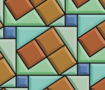
The pattern of five-square C-tiles from an earlier post of mine, Different Perspectives, is seen here. This was an early test case for my new application, which I call Tile Patterns.

This C-tile is one of the twelve pentominoes. All of the pentominoes can tile the plane in one way or another, though some of the tiling bases are a bit larger than this one.

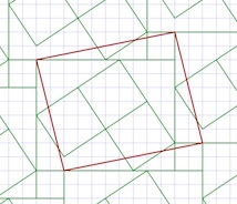
For information on the grid, basis, and segments used to define the tiles, consult my last post, Patterns, Part 5.

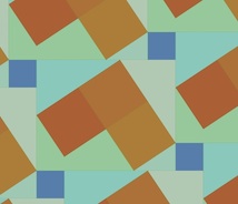
My test cases for this application make pretty designs. And some are rather busy in an op-art fashion.

Here is one, which has tiles that seem to simulate cut jewels, which must certainly qualify as a 1990's video game background!

This one broke my program a few times before I got it to work. Mostly because some of the polygons actually have holes in them!

Since the last post, I have implemented a few new things. Before, the application had the ability to set a grid, adjust and specify a basis parallelogram, and draw segments. As you draw, segments appear in all repeats of the basis area.

I have added the ability to divide up the segments when they touch or cross. Then I extracted a set of nodes (all on grid points) that bound each segment. Then I added the code to identify all closed polygon areas. As I mentioned, this includes some holes as well, particularly in the jewel tiling. Finally, the ability to specify the color for each closed polygonal area has been added. This allowed me to create all the tiling patterns you see here.

When I work this way, I only have to specify each polygon's color once, and all repeats of that polygon get colored. So I don't have to (laboriously) do the coloring in Painter. I get a cleaner result also. With this tiling, you can just see the parallelogram basis in red. Oops, I left it in!

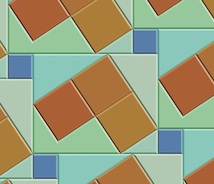
Each of these patterns represents a new test case that broke the new application in some way.

The ability to save and restore patterns was the first feature I made. Then, when I built the extraction of polygons, I had to write save and restore of the polygons and their colors. This was an exercise in versioning, since I had saved several patterns already, but only the segments were stored.

Really what is needed (beyond what I have written so far) is the ability to maintain a palette of colors that is easy to pick from. And an easy way to deposit color into the polygons, with just a click.

The traditional way of doing this, along with adding segments, is a toolbox. Which is kind of passé, when you look at modern multitouch UI.

The ability to edit segments (in case I make a mistake) was another important feature to add.


Without that feature, I would have to clear and start over. Very troublesome!

So a segment selection and adjustment capability was necessary to implement. The requirement was either moving the entire segment or moving one of its ends. I just snapped the mouse point to the grid and looked for a segment end at that point.

For picking in the middle of a segment, I used a pick tolerance (really just a few pixels) to decide if I was close enough to the center of the line to pick it. Still, I had to implement point-to-segment distance, which is the only hard geometric computation.

Having implemented Shapes as part of Painter (and part of ColorStudio), I am very familiar with grid snapping and geometry editing. Actually very little coding was required.

I also used the San Marco Basilica tiling patterns as test cases. The first few patterns are really not as three-dimensional as some of the patterns. I think these were some of the first patterns laid down on the Basilica floor.

This pattern shows a black field with interspersed gray and light brown rectangles. Or you could view it as a checkerboard with turned gray squares inside the black ones.

The challenge for the tilers was to create diamonds that are just rotated squares. The larger light brown diamonds have an edge length that is sqrt(2) times larger than the smaller gray squares. That must have been fun.

The next pattern shows a lattice design.

This design has a brown field with small black squares inside it. Each black square has a gray diamond inside it.

Clearly, the later the tile work was designed, the more complicated it becomes. Notice here that the brown field is actually made of hexagons that interlock. It's hard to show that here, though.

In the real Basilica, the tiles are all made of marble. So there is a strong texture to all of them, and also quite a bit of color variation.

That may be the next thing for me to implement, to simulate the marble texture. Of course I have some ideas on how to do that. Also, simulating the grout will be of importance. That turns out to be pretty easy, since I already have a way to render that (as I showed in the previous post).

With this one, the patterns are getting a bit more three-dimensional.

There's just the suggestion of a square box with a white bottom. This is inside a kind of square corner.

Of course, all the tile work is two-dimensional since it is just a floor.

The tilers took on the challenge of making their work more and more three-dimensional with time. By the time we get to the renaissance, most of the designs were faux three-dimensional designs, as we will see with later examples. Perhaps this one is more like a coat of arms.

The next one shows a feature that is quite common on the Basilica floor: the checkerboard.

Checkerboard occur most commonly in frieze work (borders) and often go around curves on the Basilica floor.

This shows the artisan's skill more than ever.

This pattern is found on the floor, along with some that only feature four checkers on a side.

I figure the high contrast of the checkerboard was a visual stimulant. But in reality, the tilers were influenced by what they could get from the quarries. In the year this was made, there was probably a surplus of white and black marble.

No patterns on the Basilica floor are more striking, or more difficult to create, than the ones that feature circles.

Here I have approximated the circular arcs with polygons, but you get the picture.

The really cool thing about this one is the way the circles intersect each other so perfectly.

Oh, and by the way, you see the pattern is incomplete at the top. Its another bug I'm chasing! You will see this on three or four of the tile images in this post.

Nonetheless, this image shows the magic of tile patterns.

This shows another kind of tile pattern. I think the design has the downwards diagonals in a kind of three-dimensional design to indicate some kind of depth.

And traditionally, the black field allows you to see the other elements as objects on that field.

In this case, the black is less used for shading than for simple depth.

This is another example of a half-drop pattern, as it would be called in Painter. Half-drop patterns are typically used for wallpaper. But wallpaper is really not very long-lasting. Not compared with a marble tile floor, which has been known to last thousands of years.

This pattern was featured in my last post. Here the colors are a little closer to the actual pattern taken from the Basilica floor.

With this one, the illusion of depth and three-dimensional structure is excellent.

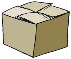
The black diamond tile is used to show the inside of a box. The top of the box is shown in two colors, giving it a kind of silvery sheen. The side of the box is in natural wood colors. In all, it is an exquisite pattern.

This one was probably sixteenth century.


This next pattern shows clearly the three-dimensional structure.

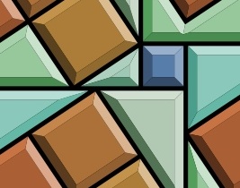
The rendering of this pattern also shows clearly the grid at the top, the guide lines, and then the tile colors below.

Actually this is a bug, but I find it to be instructional.

With this pattern, the gray diamonds are the bottom of diamond-shaped pits. The white rectangles are the tops of the lattice. And something new: black diamonds form the intersections of the lattice.

It is visually interesting and also something quite new. Each tiling shows the style of its creator. It shows that the Basilica floor was designed by many artisans over the centuries, and that they were influenced by each other.

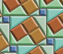
This tile pattern is an exquisitely detailed one. It is entirely three-dimensional. One thing about these tilings is that they have the concept of an assumed light source.

This imposes a rule that allows the designer to consistently shade the shapes. Of course this means that several different colors of tile are needed. In varying quantities also!

Various pyramidal shapes inhabit this one and so you see it is a different kind of surface depiction than we have seen so far.

Like the black diamonds of the previous tiling, this one features smaller pyramids (or indentations?) at each intersection. So most likely this one was created after the previous one.

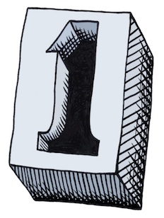
Minecrafters will probably recognize this pattern: the corner cube pattern.

It was certainly not invented in Minecraft, which certainly appeared a few centuries earlier on tile floors in Italy.

It shows most clearly that consistent shading is required to get the best illusion of three-dimensional shape.

This is one of my favorite patterns due to its simplicity and its optically convincing form.

So this pattern is one of the more mature three-dimensional forms, rivaled closely by the next pattern.

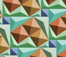
This pattern is like the previous, but entirely in pyramids.

Ever seen the pyramids at Giza in a satellite reconnaissance photo? What I want to see here are the shadows of each pyramid being cast on their neighbors.

Well, perhaps that was beyond the thirteenth-century tile masters.

One thing needs mentioning. The tile patterns are quite similar to modern quilt patterns. I have even seen some of the San Marco tile patterns worked carefully into quilts (even with the marbled textures in the cloth). I can imagine them in latch-hook rugs as well.

I think this tile pattern shows that the tile masters were both aware and interested in shadows. The black triangle could be one facet of the three-dimensional geometry. But I think it's a shadow.

I see it as a shadow being cast into the trough that has been carved into the floor only in dark squares of the checkerboard pattern.

Walking on a floor with this kind of tiling, or in fact any three-dimensional depiction in a tile floor, would be a trip!

Literally. I would be worried about getting my foot caught in the apparent holes!

I found many depictions of this pattern on the floors in the old churches of Byzantium. This one differs from the earlier one both in color (four colors are used, subtly) and also in the angles of the squares.

Thus also in the width of the diamonds. They liked to use sixty-degree angles, so the diamonds would be "double triangles".

This one is shown at about fifty degrees. Mostly because I used a relatively small grid to construct it. It almost reminds me of the harlequin pattern, which is really only a diamond grid in a two-tone checkerboard. When you shade it in this way, it becomes three-dimensional, and can fool you into thinking it is a real surface.

This ornament is found on the floor at the San Marco Basilica. It is quite complex!

It reminds me of the American Indian rug patterns found at the Ahwahnee hotel in Yosemite.

But the Venetian tile floor will be still there long after the American Indian tapestries have turned to dust.

Unless, of course, global warming takes its toll and submerges the Piazza San Marco in the Adriatic.

In the meanwhile, let's keep the art and science of tiling patterns alive!

Patterns are a part of our lives. Our clothes, our wallpaper, our tapestries and hangings, our rugs, and many touchstones in our very existence show the influence of art and mathematics. The art of making patterns promotes spatial reasoning and creativity.

These are some of the reasons that I have featured textures and patterns in my blog. Also, of course, they dazzle our eyes and provide for wonderful illusions: the illusion of depth, the illusion of interlock, the illusion of spatial connectedness and completeness.

When a tiling pattern has a flaw, we automatically see it.

Patterns are literally built right into our consciousness.

Sunday, May 20, 2012

Drawing On Your Creativity, Part 3

I like to draw. I just can't help it. The process of sketching and drawing has always interested me. As with music, if I stop for a while and then start again, it all comes pouring out!

As the original author of Painter, of course, I had to study drawing from many angles. Now, when I draw, I feel a certain freedom in simply returning to the art without the burden of analysis. And I can begin to realize just why I started drawing in the first place.

Doing the Clean Line-Art Style

I keep thick pieces of standard-size paper around to sketch on, my favorite creative weapon being an ultra-fine Sharpie (retractable!). Drawing, for me, is a way to exercise my creativity.

My process for making art has been documented in this blog post series before: scan into Preview using a networked scanner, tonally adjust and crop, export to JPEG, import into Painter, clean up, resize to blog-compatible sizes using Preview again. Sometimes I will use a gel layer in Painter to colorize, particularly when I'm doing a technical illustration.

One of my styles is thus a clean, line art style with the hand-wrought look that is usually lost with Adobe Illustrator. A little like a woodcut. All of the pieces shown here were done in this manner, in the last few days. I have been practicing my implied edges: a cool form of negative space.

I like to use my desktop for most of my posts because it simplifies my process and allows me some very nice editing opportunities. I like to edit using the Wacom tablet in Painter.

Rotating the Image for Sketching

One of the reasons I like this is because I can rotate the image, making all my hand work more natural and ergonomic. In Painter, you can hold down the space bar and the option (alt) key and rotate your image by direct click-and-drag in the image. With the same keys held down, a single click restores the normal orientation. But, as I draw and clean up lines, I generally keep the drawing rotated at whatever angle most makes sense.

I learned this workflow with sketching by watching Disney artists in studio. Their old-school sketch workstations had a turnable easel. I would bet that they have something much more like Painter these days. Because I thought to migrate that workflow to the computer.

Ideation

So, I'll get an idea and ponder over how to express it in this style. When I get an idea, I like it to be one that's out of the box, not in the box.

Sometimes I will go back to the old sketches from the Painter days and I'll get an idea that I might have pursued once, but is lost to me now. And to re-examine it and explore it afresh is exhilarating. So much has been packed away. There is so much to rediscover.

Other times I will think of an idea, like Up and Down and have an internal vision for how I would like it to appear. When it intersects another of my favorite pastimes, like impossible figures, then it is settled. I begin to draw. So it's all in the perspective: how you look at it.

With Up and Down, I actually drew it a few times before I got the right shape for it.

I chose the impossible picture, with entrances going into space that simply can't exist, to make the sketch more of a personal expression, more my style.

When I was a kid, I used to have my room in the upper floor, and then later in the basement. So I know the feeling of going up and down stairs quite well, and the feelings when it changes from up to down.

I chose to let the color connote shading in this one. And the blue for sky and red for, well, the fiery depths. More allegory. Just a tiny bit of symbolism. But in my house as a kid, the upper floors had more sunlight or overcast light, which had a bluer color temperature. The lower floors had a redder light, because we used incandescents there.

In my post about iconic things, I draw several figures that derive from the concept of One. When I was drawing them, I imagined a mould that you could pour lead into that could make a three-dimensional one.

Some Technique

This is what I could envision. I just now drew it but I used a creative technique for the cross-hatching. This time, when I sketched it, I did the cross-hatching by hand. Then when I brought it into Painter, I brought each of the different directions of hatching into a separate layer so I could sculpt their shapes separately.

I tend to use a tiger-stripe technique for simulating woodcut looks. This comes from the V-shaped tool that is used to carve out linoleum and wood blocks and the shapes that they make in the blocks.

In scratchboard, a similar look is achieved. This ease of width-control was the reason I created the original scratchboard tool in Painter.

So this sketch actually comes from a six-layer image.

Iconic Patterns

I demonstrated in the iconic things post that there were speckles that didn't just use dots when you render them. The old Good'n'Plenty design. Here we have a design where there is a complete 360-degree freedom to each placed item, which is the ultimate speckle. Even the hatchings that I demonstrated before only had a 180-degree freedom to their placement.

I can imagine controlling the direction of each item by a random process, like the one I used to create the hatchings, or by using the directions from a vector field. You could create random flockings of bird-symbols in this way.

Often, in architectural renderings, random tree placement, with different sizes, is used to stylistically symbolize a grouping of trees. Sometimes this kind of pattern was used in the formica tables of the 1960s. It's worth looking up. Thinking about patterns and the way they fit together is one of those little creative things you can do.

Liquids and Different Perspectives

In a continuation of the earlier pieces here, I thought I would do more liquid stuff, because I have been doing that kind of rendering since I was young. It was always an excuse for shading, and as you may know by now, I do like to shade things.

Drops of water or oil are fascinating to me. When I was a kid, I would sometimes look at the world through the drops or rainwater on the outside of the car window. I could see the world as a microcosm of distorted figures, and back then it was a good exercise for my brain to see things from a different perspective. I love the pattern of raindrops on a windshield: the way they avoid each other, the way they coalesce, the natural pattern of their look.

Real raindrops don't actually look like these. They are really globules of liquid, and they move and wobble as they fall. Kind of like metaballs, they have a shape defined by surface tension and equilibrium. Water drops are free from many forces, when they are in flight.

I used to look at liquid mercury, and marvel at the shines. I think that reflection and refraction have always been of interest to artists' perceptions. I'm thinking Vermeer, of course.

But these liquid renderings are more about stark shading than reflections and refractions.

Rendering the quality of reflection and refraction in line art is rather complex but a laudable goal. When you hold a drop of water on your finger, I often have watched the fingerprints beneath become magnified to a huge extent, and the skin also took on an interesting glow inside the drop, due to the caustics (concentration of light by the bending of rays by refraction) created by the shape of the bead of water.

Along with a bright shine on the drop, it creates a marvelous miniature scene, allowing us to watch yet another perspective: one magnified instead of the one viewed through the car window that seems to shrink the entire world into a single drop of rainwater.

As a small kid, I was nearsighted, and so things like this would constantly be of interest to me.

Other perspectives interested me as well, as a kid.

Like the doorway. Both entrance and exit, it was the thing that kept the kids captive in the schoolroom, or kept them out. Being the guardian of in and out, a door seemed more profound to me than just a block of wood on hinges.

And, while I was at it, what made the inside in and the outside out? Why couldn't things switch? Another perspective change, quite relevant in the 1960s.

After all, I watched Star Trek, so I knew that doorways could be more than just a way in and out. A door could be a portal to another planet or even to another dimension.

So, when I tried my hand at Up and Down, initially I thought of something we were looking into directly, even with glass doors.

This is the original sketch for Up and Down. Actually, unlike the final product, it didn't really have any magic. That's when I thought about the impossible version.

It is the change of perspective that makes this kind of piece work. When you get to drawing, liquify your workflow to make your sketching smoother. And pour on the creativity!

Friday, January 13, 2012

Style and the Digital Era

Before there was Painter, what was my style like? Did Painter change my style? Or did it just extend it into new media?

When I was young, I was obsessive at drawing. And, as you can see with this self-portrait, done when I was 19 or so, I had considerably more hair. And this as my look: a white button-down shirt with a collar, photo-gray glasses, a mustache, and near-shoulder-length hair. For a nerd, I was a bit cooler than most. This was drawn using a photograph as a reference, and you can see my left eye opened a bit wider than my right eye. It still does.

My obsession with drawing became valuable to me as I moved onto the computer. When I was 25, I developed my first paint program. This was at Tricad, a company that made computer-aided design (CAD) workstations for architects, engineers, and construction. It was doomed to failure because only a few years later all that kind of work was destined to be done on PCs and not VAXs.

But, in those years, I had access to frame buffers and raster displays that allowed me to start working on paint. Five years later, that business had failed (I wasn't running it) and I had joined with Tom Hedges in our partnership, Fractal Software. That was when I created ImageStudio, my second paint program. ColorStudio, created a few years later, was my third. Although Tom was the lead programmer on ColorStudio, I was responsible for all the painting and color primitives. So I was the artistic side, and Tom was the systems architecture side.

One and a half years after that, I started work on Painter, my fourth paint program. That one persists to this day, and I am proud of it. Corel sells Painter 12, currently. But the main reason I created it in the first place was so that my drawing talents could migrate onto the computer. I knew it wasn't going to happen overnight.

I was into landscapes, fantasy intertwinings, three-dimensional visualizations, positive and negative space, and so many other things before I ever got into computers.

Here is a sketch for a planned painting I was doing. There are mountain ranges, valleys, and rivers. There is a planned cloudscape with swirling and directions, indicated by arrows. The foreground of the scene is intended to be a terrain ledge, a vantage point. Click to zoom in. The location of the sun and its effects are made plain.

When this transferred into Painter, there were initial limitations with the medium. The works I did were sketches that were smudged around using Painter's Just Add Water tool. But I did do quite a bit of sketching with the Wacom tablet and using pencils in Painter as well.

It is funny. My art became the first Painter screen shots that were distributed to the press. I considered them naive, but they were all I had to offer at the moment, as I improved relentlessly on Painter's capabilities. You can see my style come through, although the hand-drawn traditional art was certainly more complex.

Another bit of art from my younger days, perhaps in 1975, was done in an EBONY pencil on plain old cotton bond. I liked my paper to have a little bit of grain so I could get the extra high density and therefore the high contrast. You see a stream with a stone in it.

The main things to look at are the reflections and the shading. You can see the unfinished hills in the back where I hadn't yet applied the shading. There is an overall shadowing in the stream that is shown as a swath of darker shading towards the right bank.

The way I portrayed light and shadow was something that did translate into my painter work.

Here, a rough sketch for a paint can is dated in 1991, when Painter was being finished. The reflection of the can can be seen, and it shows a similar kind of attention to shadows and reflections. The background is shaded just for the sake of having texture. One thing that interested me was using the eraser in Painter to create negative shading: highlights.

Artists used to use silverpoint and also white charcoal to create highlights in their drawings. I used the density eraser to achieve similar effects without just creating white streaks.

So my drawing style had to adapt to the new tools I created in Painter. The arrival of John Derry at Fractal Design led to the creation of the Wet Lab, a place for exploring traditional media and studying both their effects and the manner in which traditional artists use them. In the Wet Lab, we explored scratchboard, silk screen, acrylic paint, airbrush, and many other tools.

I found scratchboard to be very satisfying indeed, and I used it to explore my preference for positive and negative space in a new way.

Here, in the very first scratchboard piece I ever did, you can see the scratching away of the black ink layer, leaving the white enamel layer. I worked on perfecting the light strokes and also the overlaying of strokes. At the bottom right is a gradation using hatching that I experimented with.

While drawing in scratchboard was initially, for me, just a way to draw in negative, I eventually got into finding ways to surround dark objects and define their edges.

This is a follow-up piece with the cat. My black cat at the time was named Cheshire, and he was a bit scruffy. Cheshire had the habit of defending his territory. Once, Tom Hedges with his (then) wife Caroline, came to our house and entered with their dog. Pokey (kind of a pathetic name for a full-size German Shepherd) was immediately cowed into the corner by the door by a very aggressive Cheshire. We found it hilarious.

Cheshire the fearless cat!

So here we have 3-dimensional form, perspective, and just enough light and shadow to make it convincing. I was always looking for ways to increase the number of levels of any image I worked on. I quickly decided that scratchboard required a lot of planning, due to its write-once nature.

Once we finished the scratchboard tool, it became a part of the new toolset for Painter 2.0. This attracted some new artists to the Painter stable, including the fabulous Chet Phillips. It seems scratchboard and watercolor were wonderful to use together. I guess Painter, with undo and easy re-inking, became a much easier way to create scratchboard.

My earlier art often had high-contrast figures, but they were almost always dark-on-light. I had to turn my brain around to make scratchboard work.

Here you see some of my more hard-edged work. This one is from 1978 and shows me at a Hazeltine Honeybee terminal (which had amber letters on a black screen) with a listing opened beside me on the table.

A single hanging incandescent bulb lights the scene, in harsh light.

There was no mouse in those days, just a keyboard. But there were mouse holes, it appears!

While defining positive and negative space were part of my style in one way, they also were in another. Often I would draw with lines instead of areas. And the negative space would simply be constructed in 3D. Then the negative space would appear as real holes in 3D objects, or niches that were carved out of them

For instance, I could start with a cube and take away sections of it, like knocking away cubes in minecraft.

Then maybe I could make something new from the leftover cubes. In this case a symmetric pattern is etched out of a cube, and a rotationally-symmetric pattern surrounds another cube, with some rectangular "pipes" passing through the center of it in three different directions. Unlike with scratchboard, I could erase pencil marks when necessary. This made it easier to explore the possibilities. Perhaps that's why Painter got undo!

Roads, tunnels, spires, bridges, and upside-down mountains might describe this piece, although it is named "city". The tunnels are the negative space. There are also holes and even a keyhole.

The upside-down mountains are just another one of my signatures: looking for different directions. Freeing myself from physical limitations.

Drawing doesn't have to be literal, and that is its advantage.

With Painter, the line drawing seemed to no longer be my concern. Instead I dwelt on shape and shading. So the line drawing was just the medium. And Painter, with lots more media, became a place to explore. It enabled me to try new things.

In a similar vein, this wild image shows that forms are plastic and interchangeable with human features.

Note the dark clouds at the top. I loved to create rounded shading. But I knew that they would look even better with catchlights on their edge: the silver lining.

Note next the windows in the leaning building. They are specifically designed to not be straight.

A shaded skyline is visible in the background. And there is also another one, upside-down at the bottom.

Another stylistic signature feature was the water drop. At the lower left, below the tongue, are some drops. Below them are buildings that just appear to be blocks in space, disjointed and floating.

Holes appear as negative space, and often the roads find them.

In Painter in 1991, some similar stylistic points appear in this piece that was used for so many press kits and was used for the original announcement of Painter in MacWeek, when Connie Guglielmo first wrote us up.

You see the clouds (this time with catchlights, courtesy of airbrush and frisket) at the top. Also, you see the water droplets (this time transparent, also tanks to airbrush and frisket).

Painter's tools provided me more depth in this way, allowing me to express my style in new and different ways. But you can see that some of the complexity is gone. It was early, folks!

Some elements of my early style went beyond positive and negative space, and traveled into the domain of the impossible.

This image, "inside/outside", shows the dual nature of inside and outside.

The last image (found below) is called "many views", and it shows the join in of a water hose with a landscape, and then finally with a scroll of paper. Shapes, shading, and knots adorn it. It can be viewed, like so many other of my early images, both right-side-up and upside-down.

I'm glad I got a chance to make Painter. It taught me a few things. And it set me on a journey to meet great artists, find friends, and expand my style. And at least some of the stylistic expression of the hairy 19-year-old me came through.